The in-app preview to show you how your writing will be rendered has always been sub-par. This is for two reasons:
- Every browser and email client has their own inconsistencies and quirks, so it's hard to get a perfect preview — and we were slightly worried about engendering a higher level of trust in our preview than would be warranted, since what you really need to do is send yourself a draft to see how the thing looks.
- Abject laziness — it's really hard to build out a good previewing and rendering engine, and we've been focused on other things.
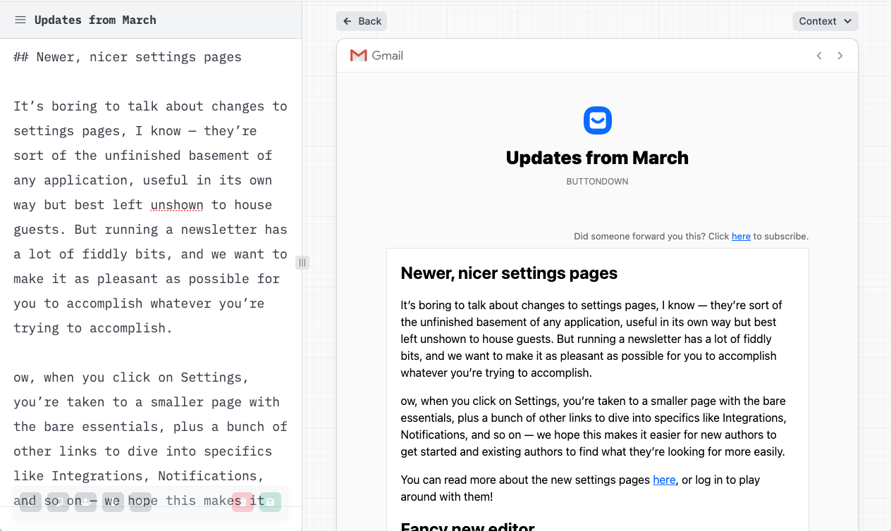
This has been a very common complaint, and we've been working on it for a while. It's launched now, and it's way better. Here's what it looks like:

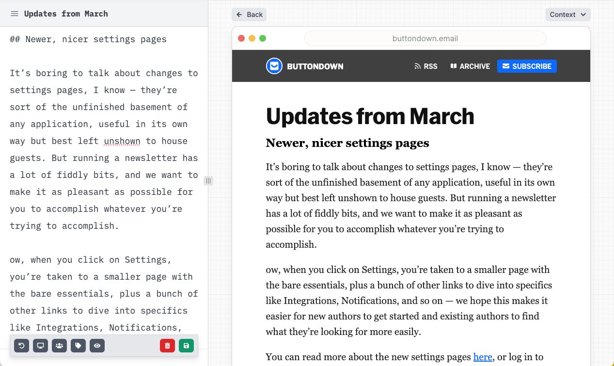
Or, of course, you can see your email in a web context:

This is the latest in a series of changes to make the act of iterating on your content and design easier. Some other changes in this vein that will be coming later this spring include:
- Adding this exact same previewing functionality to the settings pages, so you can preview new CSS, scaffolding, and theme/icon changes live;
- Adding this exact same previewing functionality to other "email-shaped" parts of the app such as custom transactional emails or automation-borne emails;
- Allowing you to switch not just between "web and email" contexts but between mobile and desktop ones, as well as different subscriber contexts ("how does this look for a free subscriber vs. a paid one?")
Thank you for your patience on this. We're excited to make it even better very, very soon.
