
The headline of this blog post reads like a privileged bro wrote it on LinkedIn. This is hilarious if you know me, because I tend to err on the side of caution when running experiments. When you’re moving slowly & fixing things, you learn quickly how compound interest works. A bunch of small wins add up to a big impact in aggregate.
I run the small wins department at Buttondown. On the rare occasions when something big happens, I check the numbers hard. Usually things are too good to be true, and it’s good to exercise caution when writing up reports for a curious CEO, because the reputational cost of misrepresentation is high.
So we got one of these big wins, and we did it by fixing a small thing on the pricing page that had bothered me for a while.
The problem
Our pricing page formerly looked like this:
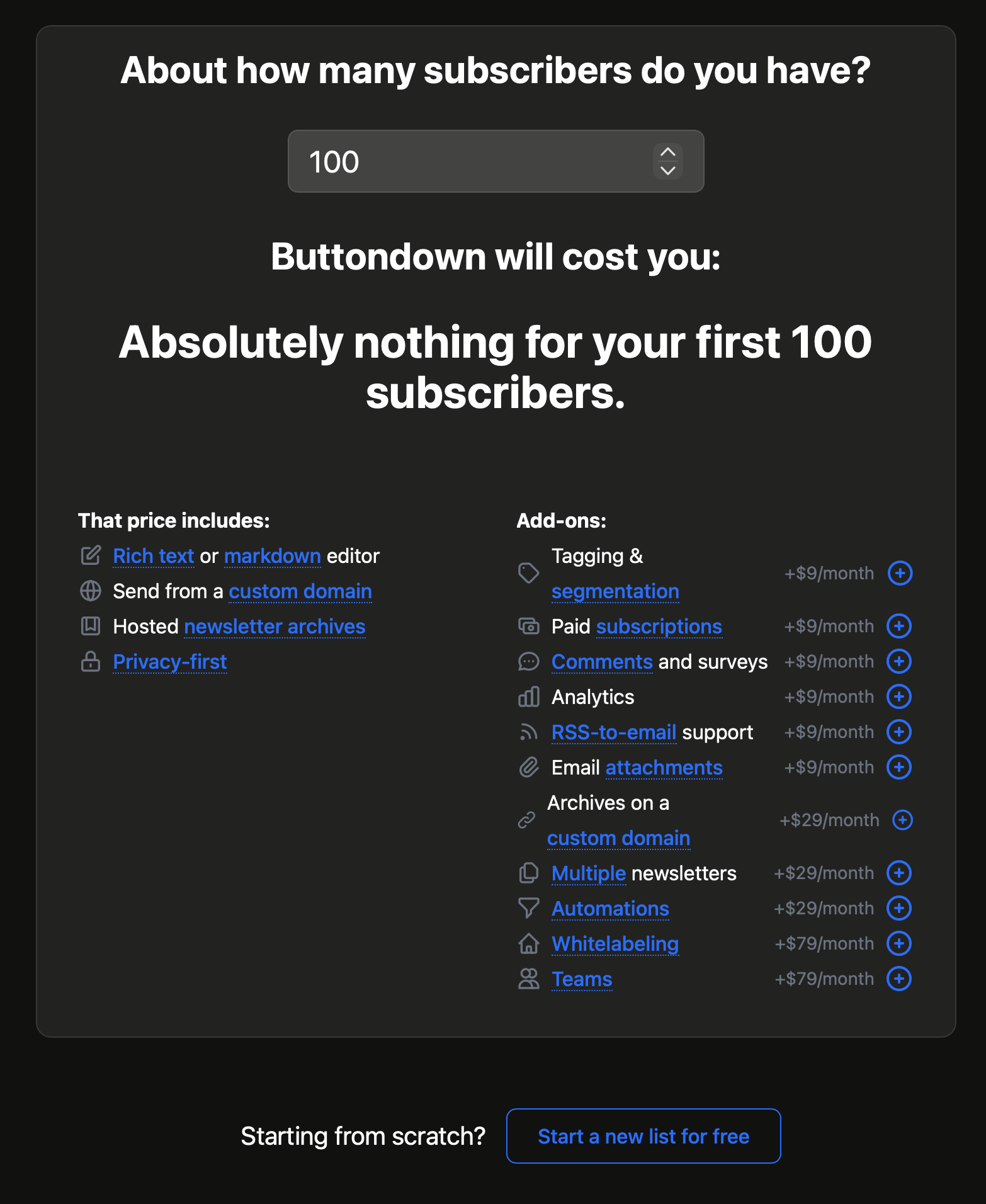
I designed that a year ago. At one point the original comp had a solid blue “get started for free” button. This is denotatively true: you don’t need a credit card to sign up for Buttondown, only to use advanced features or send emails to lists beyond 100 subscribers.
But that got built, and so there are two issues:
- The calculator itself looks like a dead-end for any existing lists. Over 20% of new Buttondown customers import lists from elsewhere. The only callout is “Starting from scratch?”
- The primary call to action, the thing that moves you one step down the most important funnel on our whole site, is a ghost button set outside of the calculator.
The solution
So we did two changes at once, removing the “starting from scratch” callout and moving it into the calculator:
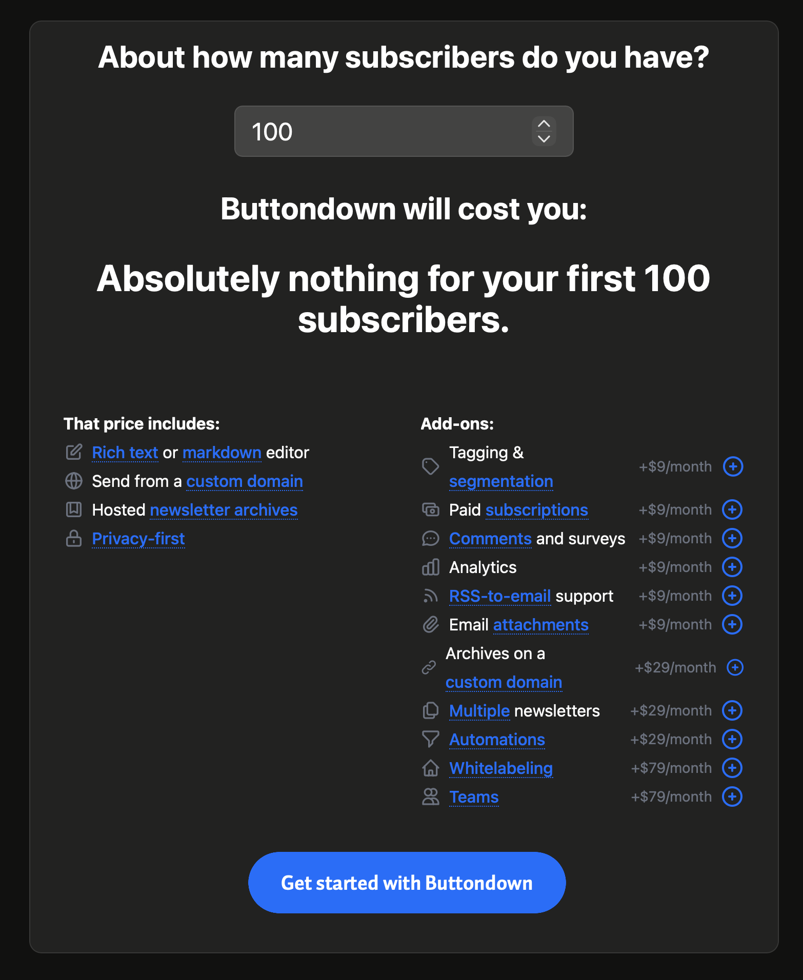
Why test this? It looks like an obvious improvement. The answer is twofold: in order to reduce risk (the pricing page is super important, don’t break it, run it for only half of visitors first); and to measure the precise impact of the decision, which is empowering in and of itself. We want to know if we hit on something that matters!
It mattered.
The results
We’ve built our own home-rolled A/B testing framework for our marketing site, collected anonymously & run through a privacy-forward analytics package. Since we’re already pretty far down the funnel on the pricing page, all we care about is people who actually completed registration. Of those who visited the original design, 6.7% did so. Of those who visited the rework, 9.5% did so. We ran a chi-squared test on the results and came back with 100% statistical confidence. These numbers were good enough that I looked into each segment and date range and checked the results again.
When we’re running experiments like these, our goal is to know: was this the right call? Because we actually have no idea. Nobody has any idea in tech. We don’t know what you’re doing behind that device of yours. We also don’t know if the things that commonly “work” for others will also fare well for us. So we test with humility and care, knowing we don’t have all of the answers – because nobody does, no matter how smart we think we are.
In order to stay fully transparent about what we’re doing, we keep a public log of every experiment we run, alongside its results – no matter if it lost or won.
And whether you work in software and are curious how we’ve implemented testing at Buttondown, or you’re a customer and have questions of your own, feel free to reach out – I’d be happy to chat!