Hot on the heels of our two new themes, we've expanded the ways you can customize your archive pages without writing any CSS.
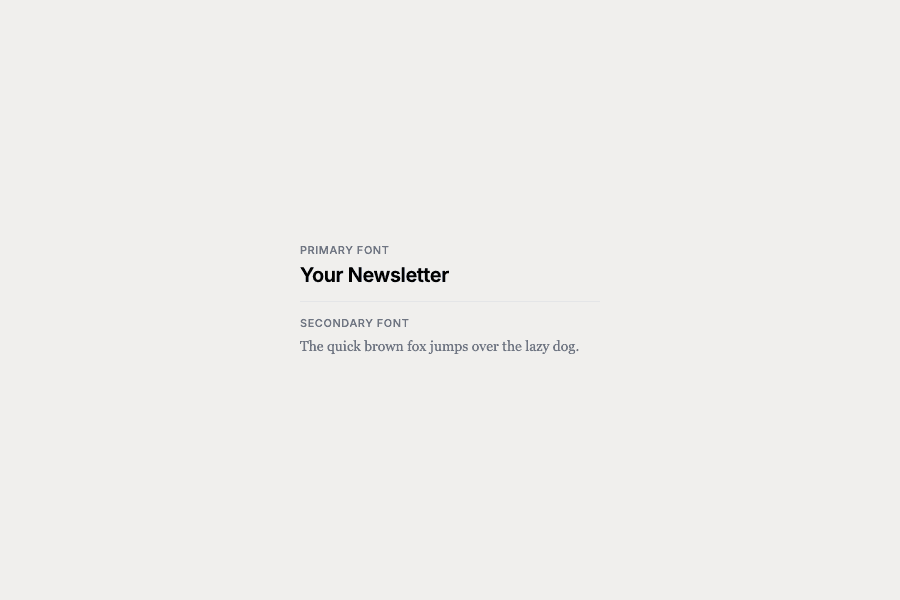
The big one: custom fonts. You can now pick a primary font (for headings and titles) and a secondary font (for body text) from a curated list of web-safe options. Want your archives to feel more editorial? Try a serif. Prefer something cleaner? Go with a sans-serif. It's all in your archive settings.
We've also added controls for things like accent colors, link styling, and spacing — the kind of tweaks that previously required digging into CSS.
This is part of a larger effort to make archives more flexible for everyone. Our goal is to keep expanding these options so that CSS becomes a power-user tool rather than a prerequisite. You should be able to make your archives feel like yours without needing to know what font-family means.
Of course, if you do want to drop down to CSS, that's still there. We're not taking anything away — just adding a nicer on-ramp.

