

A newsletter subscriber is worth 10x more than a website visitor. You have no way to tell a website visitor anything after they've left your site. No way to show them your newest project or announce a special discount. Unless you use (shudder) retargeting ads. When someone gives you their email address, though, that’s a commitment to listen.
Years before Ryan Holiday published his first bestseller, he had a newsletter. It started with 50 friends before exploding to 250,000 subscribers a few years later. Writing about that journey, he argued “Building an email list is the single best way to communicate with your audience, period. Better than Facebook, better than Twitter, better than ads. Because you own it. …no one can get in the way.”
Some of the list’s growth was thanks to a single line at the bottom of emails encouraging people to forward to them their friends. But signups through Holiday’s website were always the best way to establish “a relationship of mutual trust and opt-ins.” And as long as you have something worth saying or selling, the same goes for your site.
Ask early, ask often
Everyone with a website and an email newsletter needs a signup form for the latter on every page of the former. Full stop. On the homepage, the form should be above the fold, visible before visitors begin scrolling. This is true for anyone with a personal website, from software developers to self-published authors to corgi photographers.
Go to Cassidy Williams’s website and the first thing you’ll see is:
“Hi! I’m Cassidy, and I like to make memes and dreams and software! I’m a startup advisor and investor, developer experience expert, open source-er, and meme-maker on the internet. I enjoy building mechanical keyboards, playing music, hanging out with my family and friends, and teaching in my free time. You should subscribe to my newsletter.”
The signup invitation is high on the page but, crucially, after she introduces herself.
Elliot Jay Stocks does something similar on his website, describing his expertise before asking for the signup:
*“Hello, I’m Elliot—a designer, author, and typography enthusiast. You might know my work with Google Fonts & Adobe Fonts, or the magazines 8 Faces & Lagom. Sign up to my newsletter.”
He doesn’t stop there. Elliot also has a newsletter signup form above the fold on every page of his website. His portfolio page. Blog. Contact and About me pages. The page dedicated to his podcast and his masterclass. Every one of them.
The goal isn’t so much to get people to sign up as soon as possible. Not many folks would sign up for Love is Blind: Email Newsletters (I’m down if you are, Netflix). They first want to vet creators before giving them a coveted spot in their inbox. Instead, the idea of Ask Early, Ask Often is making sure that there’s always a signup form in sight, no matter what page they’re on, the moment they’re ready.
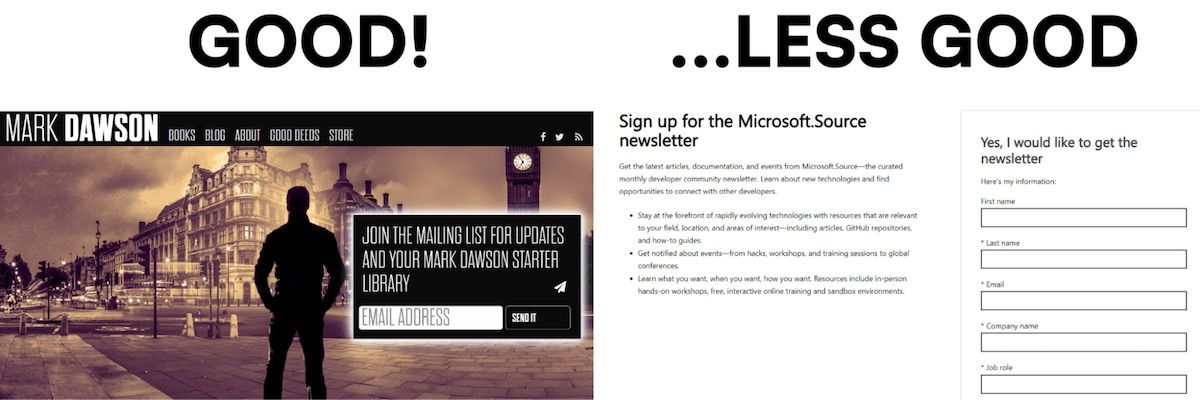
Make the forms on your homepage and elsewhere small and unobtrusive. A single email field if you can manage it, maybe including spots for first and last names. That should be low-profile enough to avoid annoying site visitors jumping around from page to page.
Ideally, each form would also have its own ID, allowing you to track where each signup came from. You might find that one page is responsible for the lion’s share of submissions and replicate whatever makes it better than the rest.
Hype the particulars
If website visitors are worried that your emails are all desperate pleas to buybuybuy or navel-gazing introspections, they’re not going to sign up via the minimalist forms on your homepage et al. They need assurances (and corgi photos).
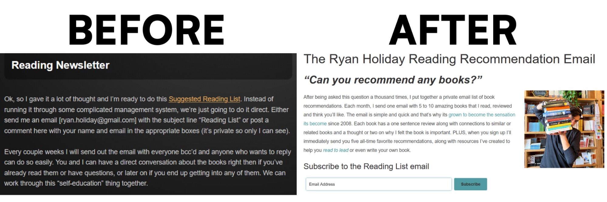
Ryan Holiday always had a page on his site outlining the newsletter. But it wasn’t doing much heavy lifting until he gave it a facelift, adding “a clear explanation of what the list was, why people should sign up and what they’d get out of it. It [did] wonders for the number of new subscribers.” All it took was a few lines about the newsletter cadence, contents, and commitments to readers.
For instance, every email from Cassidy Williams includes an Interview Question of the Week, which she explains on her newsletter details page. Below that she promises not to spam subscribers’ inboxes and links to an archive of previous newsletters. In less than 100 words, she gives website visitors everything they need to decide whether or not to join the list.
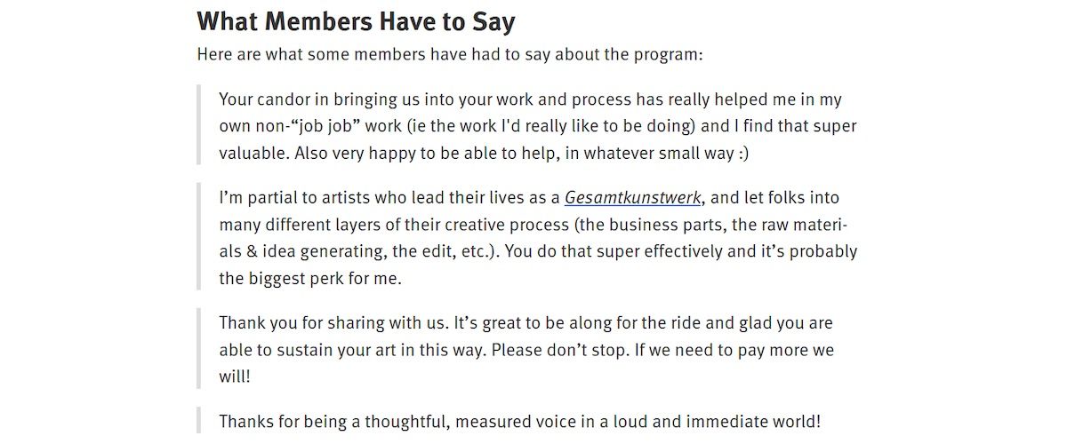
Below the context and details of what to expect, you might include a nod to the people who love your emails. On author and photographer Craig Mod’s signup page, the What Members Have to Say section does double duty as evidence of the newsletter’s popularity and descriptions of Mod’s style and tone. It’s often called “social proof” and can also come in the form of subscriber totals or average subscription length. Anything that establishes credibility and makes a signup feel less risky.
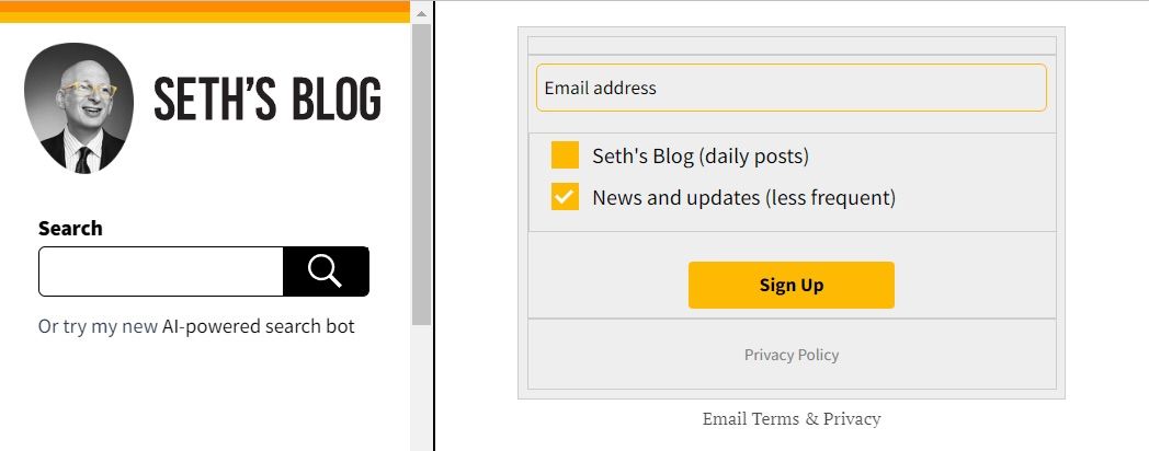
Then, a newsletter details page needs a signup form. Although not necessarily the same one you use elsewhere. Visitors who made it to this page are less likely to be put off by a form (what else did they think they’d find?). So you might add fields that ask subscribers to indicate their preferences and automatically add tags based on their answers. That would help you segment your list, sure, but also reinforce the personalization and specificity of what’s on offer.
An author, for example, might ask subscribers if they want bi-weekly book updates or less frequent book launch emails. Or if they only want emails about a specific series, genre, or character. Seeing the thing they want listed as an option makes the form that much easier to fill out.
At the end of the day, every page of your website should carefully encourage visitors to sign up for your newsletter. For the people who are interested but unconvinced, you have a newsletter landing page with all of the details they might want.
Meet them halfway
Now matter how much urgency you inject into your website’s language, some people just aren’t ready to “Sign up now” or “Join today”. So give them an option with less commitment. Link to a video or PDF excerpt from a course or a book you’re selling, no email signup required, with a reminder about the newsletter tagged onto the end. Or invite visitors to sign up for a series of five automated weekly emails with a promise to stop there unless they opt for more. They aren’t committing to anything long term, and yet they haven’t walked away entirely. Something for everyone!
Like most self-promotion projects, “get more newsletter signups from website,” can seem pretty straightforward before unraveling into an open-ended, neverending mess. There are countless ways you could go about it. First, focus solely on making sure every page of your site has a signup form. Nothing fancy, just Name, Email, and a Subscribe button.
On the homepage and anywhere else that makes sense, toss in a 1-2 sentence pitch just above the form.
Next, create a dedicated newsletter page with 100-200 words worth of details about the newsletter, and a form that has a few get-to-know-you questions.
Finally, add some free ungated (i.e., not behind a form) resources (book excerpts, video explainers, infographic cheatsheets, etc.) and slap a link to your newsletter on the final pages.
All that, plus a few pictures of your dog, will almost certainly move the needle.