
Nuance was never the internet’s forte.
Shouting, on the other hand, came naturally. 135 years before the internet, New York’s Spirit of the Times already equated ALL CAPS with shouting. “This time he shouted it out in capital letters,” the anonymous author wrote in a syndicated piece. When the internet came along a century and change later, the CAPS LOCK key stood ready to convey our emotional outbursts.
More subtle emotional shifts bedeviled writers. Early printing presses and computers alike came with a single font face, one containing every character of the alphabet set vertically. No italics, no bold. The only option was a bit of human ingenuity paired with the punctuation and random extra characters that Unicode afforded.
Early netizens would know it as Hacker Writing Style or proper “Netiquette.”
We’d come to know it as Markdown.
To underscore a point
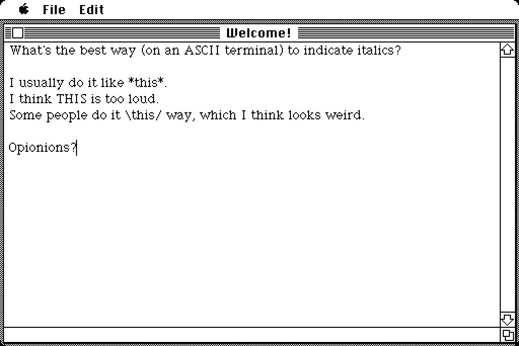
“What’s the best way (on an ASCII terminal) to indicate italics?,” asked Jack Applin in a 1983 Usenet email discussion, six months before Steve Jobs would unveil the first Macintosh.
I usually do it like this. I think THIS is too loud. Some people do it \this/ way, which I think looks weird.
Applin was early to the formula that John Gruber, 21 years later, would standardize as Markdown, one perhaps inspired by early Peanuts comics in the 1960’s where Charlie Brown would *sigh*. But using extra characters for emphasis started far earlier, in the early days of typewriters, before the asterisk key was added to keyboards (around 1932, for IBM punchcards).
Underscore, in fact, was the original key for emphasis.
“Each typewriter initially had just one font,” noted Marcin Wichary in Shift Happens, all in capital letters, with no options for bold or italics. “Your only option for emphasis was the _ key ... invented for the typewriter to indicate uppercase letters.”
Shift happened, with keyboards in 1870 that contained both upper and lowercase letters. Underline stuck around, though, for emphasis.
“The underline reigned supreme as a cheap alternative to bold and italic,” noted Wichary. It was ingrained enough in the typists’ minds that by 1984 the Xerox 860, one of the earliest word processors, had a separate key for underlining along with the underscore character, but no options for bold and italics.
Early computer users took that idea and ran with it. No matter your computer or keyboard manufacturer, no matter how rudimentary your early software, you could always count on underscore, asterisk, slashes, and other unicode characters to pad your writing.
And that’s how email got formatting.
Standardizing ad-hoc formatting
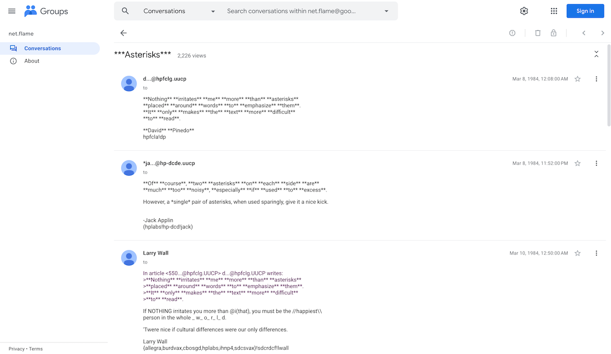
**Nothing** **irritates** **me** **more** **than** **asterisks** **placed** **around** **words** **to** **emphasize** **them**, typed David Pinedo in a Usenet email discussion on March 8, 1984—two months after the first Macintosh was unveiled.
Two asterisks could be too much, chimed Jack Applin, who himself had suggested simpler formatting in an earlier discussion. However, a *single* pair of asterisks, when used sparingly, give it a nice kick.
All-caps was suggested, then shouted down (“Capitalizing whole words gives the impression that you're shouting”). Slashes were used in passing for emphasis, both as //happiest\\ and \slashes/.
Extra characters to indicate emphasis were well accepted. Which specific characters? That was left to personal preference. But by 1996, when the fourth edition of the Jargon File was published, asterisks for emphasis was a de facto standard. Also as usual, *not* knowing the slang (or using it inappropriately) defines one as an outsider, suggested the manual, using the internet slang of asterisks as formatting without even taking note of it.
Email by email, chat by chat, formatting text on computers took on a life of its own. Even as HTML and rich text email came into existence, special characters persisted as a way to quickly emphasize and mark up messages.
Sometimes the conventions came from software. Lines from previous messages in that discussion were offset with >, a tradition that’d started with the reply tool in some of the earliest email apps. Dashes for bullet points, or numbers for numbered lists, seemed straightforward enough.
And the hash # symbol, while not often used in emails, was used in punchcards to note the end of commands, then adopted on IRC—the early online chat—to designate channel names. “Channels names are strings (beginning with a '&', '#', '+' or '!' character),” wrote Christophe Kalt in RFC 2811, with most of the channel features reserved for those starting with #.
Marking it down
All that was left was standardizing things.
Which is what John Gruber did in 2004. Collaborating with the late Aaron Swartz, creator of RSS and technical architect for Creative Commons, Gruber set out to make a format for “web writers to compose text using a simple, readable, plain text formatting syntax.”
Swartz had taken a first stab, two years earlier, with atx. “I’m sick of bringing my writing down to the level of the computer,” he wrote, and listed his preferred plain text formatting. A *single asterisk* around words would mark them as bold, while _single underscores_ would italicize them. Headings would use # hash signs, code would use |vertical lines|. Links? “I need to figure out some way of doing links,” Swartz wrote.
Gruber started building his plain text formatting with the goal of publishing text on the internet, and the inspiration of his favorite form of writing. “Email is my favorite writing medium,” wrote Gruber. “The conventions of plain text email allow me to express myself clearly and precisely, without ever getting in my way.”
“Thus, Markdown. Email-style writing for the web.”
Markdown was a bit less prescriptive than atx. Have a strong preference for asterisks or underscores? Markdown accepts either. It allows both to Applin’s ideal italics and the overdone bold that Pinedo despised. You italicize text with _single underscores_ or *single asterisks*, and bold it with __double underscores__ or **asterisks**. Code blocks are equally permissive, using either backticks or tabs.
Links are required for publishing on the web, so Gruber’s Markdown defined them as [square brackets around linked text](https://link.com/) with the link in parentheses afterwards. Quotes, email style, are prefixed with > greater-than symbols. Bullet lists, with dashes or numbers, as again in emails. Headers, chat-style, with # hash signs.
When writing formatted text, “the words would still flow, from page to mind,” wrote Gruber. As in email, so in Markdown.
And it stuck.
The de-facto internet formatting style.
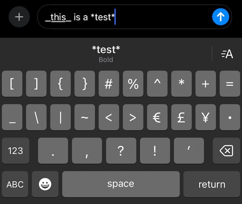
Markdown—or, at least, the bits and pieces of email-style formatting—today is ubiquitous in tech. Wrap a word in asterisks in Apple’s iMessage, and it’ll offer to turn it bold, instead. Same on Slack in what it calls “Markup” formatting, where single asterisks turn text bold and single underscores italicize it, ATK-style. Hacker News supports asterisks for italics, plus indention for code blocks. Notion (and many other modern apps—including Buttondown in Fancy Mode) eats Markdown: Type *this* or **that** and it’ll automatically turn into an italicized this and bold that with nary an asterisk or underscore in sight.
I’m fond of an alternate history version take on Markdown-style formatting, with slashes to indicate italics, like /this/. “It's claimed that the first slash pushes the letters over to the right to make them italic, and the second keeps them from falling over,” says the Jargon File, and that’s just fun.
But the argument for standardization—for Markdown as Gruber defined it—is strong. It’s still flexible enough that you can choose how to bold, italicize, and codify text (even its original documentation goes back-and-forth on header styles). It’s strict enough that Markdown text pasted into almost any software designed around Markdown should render correctly. And it’s simple enough that if you accidentally sent your Markdown email as-is, everyone would still be able to read it.
“A Markdown-formatted document should be publishable as-is, as plain text, without looking like it’s been marked up with tags or formatting instructions,” says the original spec. And, indeed, the plain-text version of that article is still supremely readable.
That makes for a pretty good standard, one I’m proud to have built Buttondown around.