You are perhaps familiar with the concept of Readme Driven Development: writing your Readme first and using it to backtest the interface for your CLI.
I'd like to propose a similar mental exercise for thinking about your pricing model: pricing page driven development. As in: when thinking about your monetization strategy, write a pricing page first and work your way backwards into something that makes sense.
Some context about Buttondown
Buttondown is API-first software for sending emails and managing subscriptions. (Think Mailchimp, except for people who don't want to spend all day inside Mailchimp.) Sending emails cost money; running servers costs money; paying a mortgage costs money. So I charge for the service, albeit with a free tier.
Some context about pricing strategy
What makes a good pricing model? More than anything else, you want to think about two numbers:
- Conversion rate — how many prospective users become paying customers?
- Lifetime value — how much does each customer pay you over their lifetime? (You can think about this separately as ARPU and churn, but the two tend to have a tight relationship.)
Buttondown's old pricing model (2020)
Conversion rate: 5% · LTV: $455
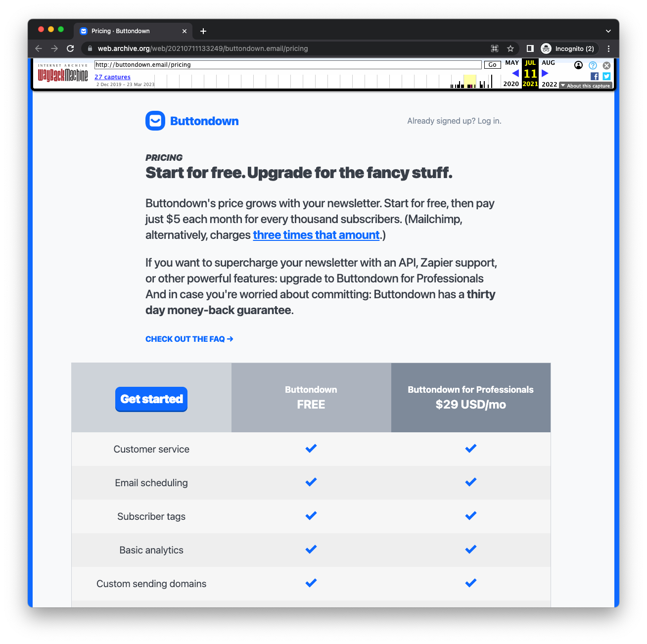
When we launched in 2018, Buttondown had a hybrid model: you pay ~at-cost for the amount of emails you send, and then you also pay an additional $29/mo for additional functionality such as custom domains or whitelabeling. I considered this a very clever approach to align incentives — I "give away" the rails for free and then charge for the fancy stuff!

The problem here was in communication. The vast majority of new customers would have to begin their journey by emailing me some variation of "wait, so how much do I need to pay?" — rarely a good sign.
Buttondown's new pricing model (2022)
Conversion rate: 8.5% · LTV: $397
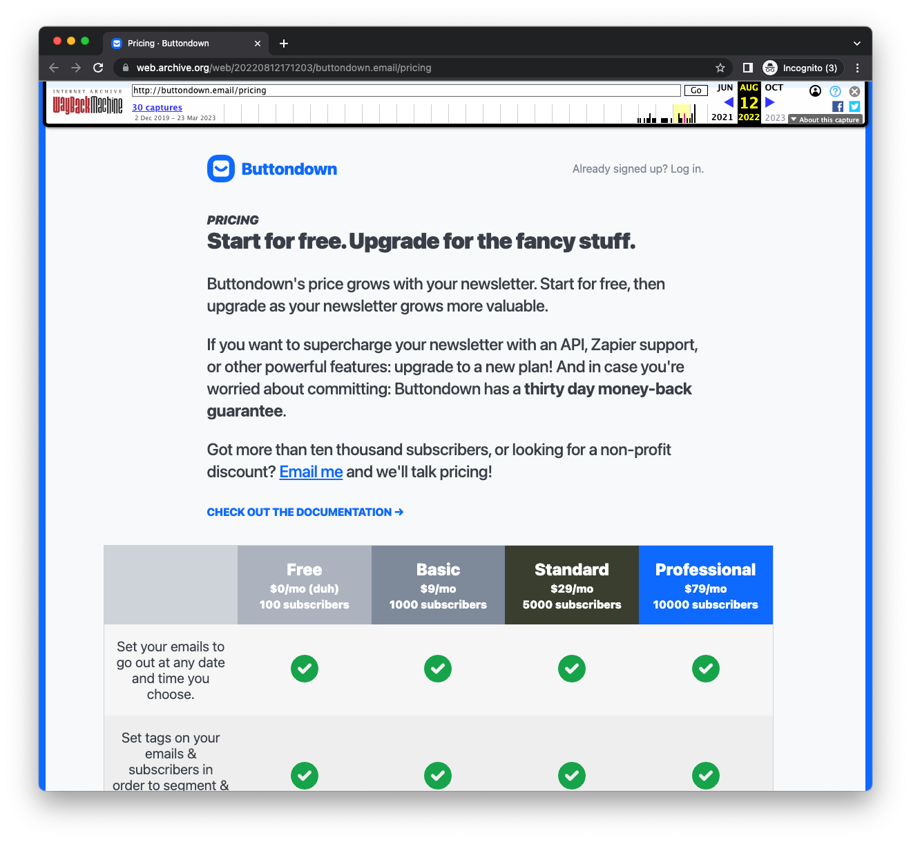
Last year, I did what many founders do — admit defeat and swear newfound fealty to the almighty three-column SaaS grid. Out goes the clever combination of usage-and-feature-based pricing, in comes the cascading waterfall of checkboxes and the various price tiers:

The combination of both a usage cliff (you have too many subscribers, time to upgrade!) and a feature cliff (you want to use Zapier, time to upgrade!) proved efficacious: ARPU and expansion revenue steadily rose as new customers coalesced around the $29/mo plan.
While the bones of the new pricing model were solid, I found myself running into two core issues:
- Expansion revenue from the $29/mo tier into the $79/mo tier was tiny: businesses with hundreds of thousands of dollars of MRR were happily sitting in the $29/mo tier and I didn't have an obvious lever to incentivize them.
- Enterprise/volume-based revenue was the wild west: larger customers were put off by the fact that there weren't any obvious tiers for them, and I had to YOLO answers for their costs each time they reached out.
Once again, the pricing page presaged the outcome: of course folks weren't voluntarily expanding because they had no reason to! of course enterprise customers were harder to convert because the messaging for them was terrible!
Expanding Buttondown's pricing model (2023)
Conversion rate: 9.2% · LTV: $511
Earlier this year, I shipped two changes to address both problems:
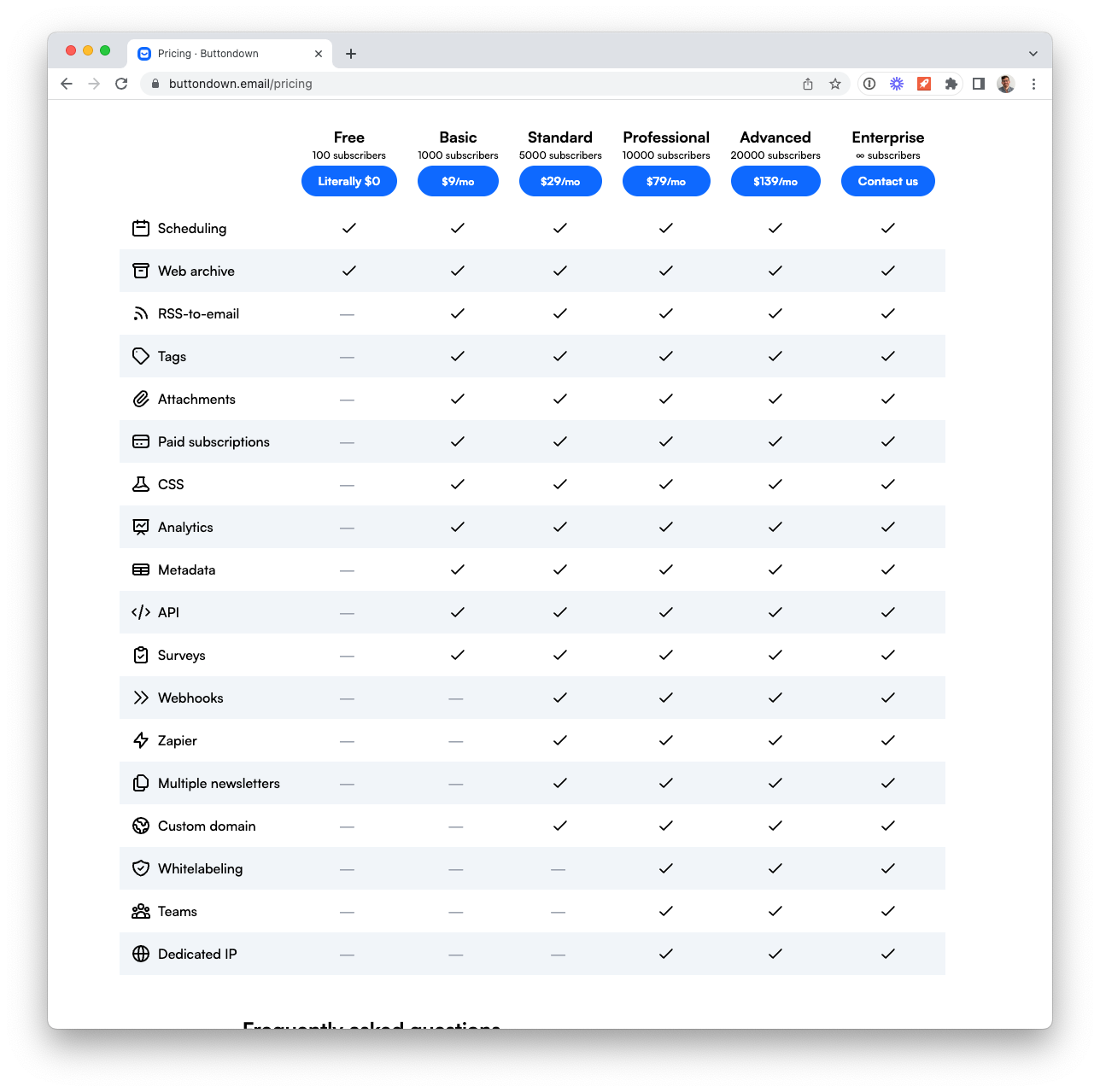
First, I added and shift functionality to incentivize moving towards Professional — gating whitelabeling behind a higher tier and adding support for teams + dedicated IPs, two long-standing asks:

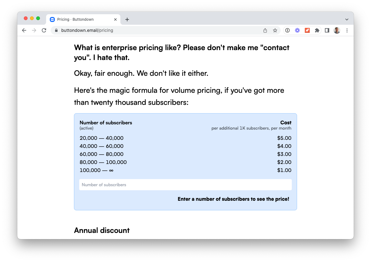
Second, I added obvious enterprise pricing based on the same value metric that the existing prices were on:

(I dithered between having the public-facing enterprise pricing be based on "emails sent", which is more common in the industry, vs. "number of subscribers" — ultimately landing on the latter because it feels more cohesive with the other prices.)
Buttondown's pricing isn't perfect — for instance, now I need to think about levers to incentivize upselling into the $139/mo plan — but it's much better than it was 24 months ago. (Much better being defined as ARPU is up and conversion rate is up and churn is down.)
(This pricing page is live, btw!)
All of this is to say
An underrated part of pricing is "does this make sense to users?" Users think about your pricing primarily through your pricing page (and secondarily through your competitor's pricing page.) If rationale or price can't be concisely explained on a page devoted to the subject, then something is probably wrong.
