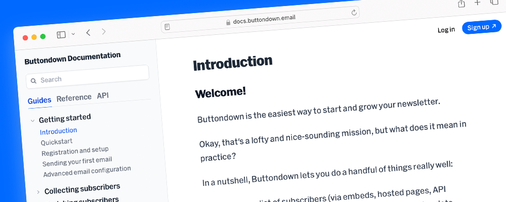
We just launched a rebuilt documentation site, complete with a slew of new content and improved API documentation!
What was wrong with the old site?
Although our previous documentation site has served dutifully, it was starting to show its age:
- The codebase wasn’t super extensible — it had this feeling of being somewhat creaky, and that changing anything was a bit of a lost art.
- New writing had to be contributed via markdown to the GitHub repository.
- API documentation wasn’t super clear and was buried.
However, we noticed that a lot of customers writing in to customer support were referencing having searched the docs for an answer. Sometimes we did have docs on what they were looking for, but the taxonomy and search were failing them. Other times, it was something we really should have documented, but didn’t.
Email newsletters are also a somewhat uniquely thorny prosumer product — there’s a lot of edge cases and varying setups, which warrant good documentation.
Breaking ground on a new site
With a need and interest established, we started working on a new documentation site at the end of last year.
The overarching goal has been to make it easier to establish new content, both for engineers and non-engineers. That means:
- It shouldn’t require opening a code editor to contribute.
- This helps with non-engineers being able to contribute, but even for developers writing in VS Code isn’t an ideal experience.
- It should be clear where in the taxonomy new content should be added.
Making authoring easy
The first point above was solved using Keystatic, a wonderful tool from Thinkmill that bolts a content editing interface onto your website, which ultimately saves files back to your GitHub repository.
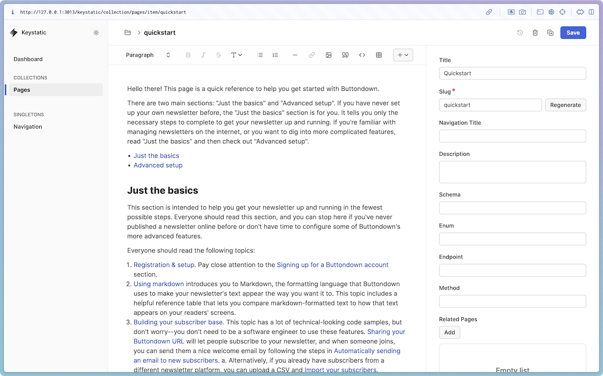
Keystatic is super customizable, which allowed us to extend the editor with custom components. Our previous site was written in MDX, so it was important that we had some way of porting over custom components (Keystatic stores its content in Markdoc, so a similar idea).
For example, some of our pages include a “Live Code Block,” which shows code alongside with a live preview of the code’s result:
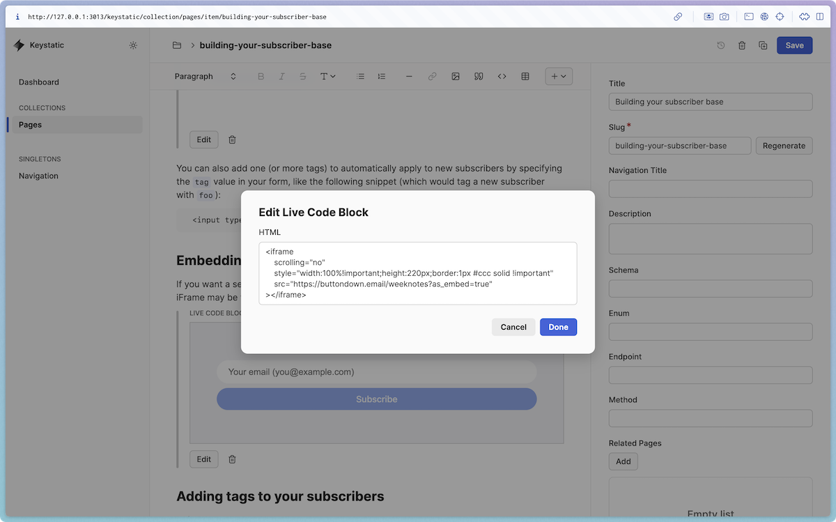
In Keystatic it’s super simple to define this component:
And then we separately define how the component should render on the page as a React component:
Flattening the taxonomy
Another goal was to make it easier for authors to determine where new pages should go.
Our old docs site had pages grouped into categories in the left sidebar, but the categories were created over time, leading to weasel-y categories like “Advanced Features”.
The URLs of the pages also contained the category, like /advanced-features/surveys, meaning that we couldn’t easily rearrange the categories without breaking links.
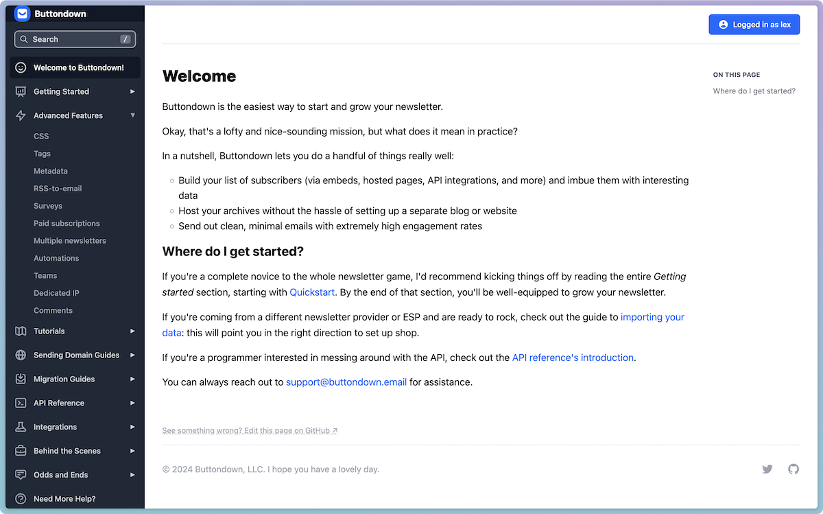
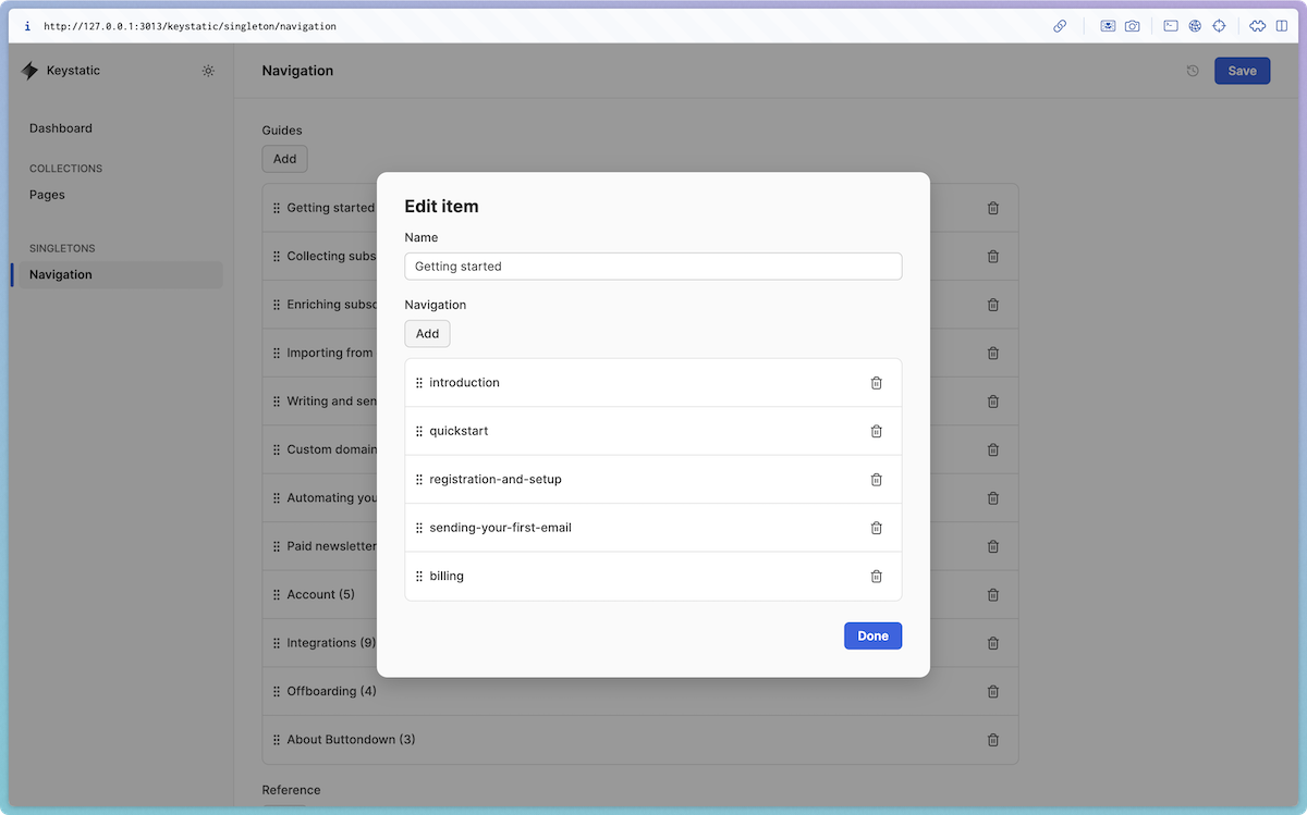
In the new docs site, every page is at the root — like /surveys. This means that we can continually rearrange the navigation hierarchy (using a custom Keystatic editing interface!) without breaking any links.
We’ve also split out separate sections of the docs: Guides, Reference, and API. It felt strange to mix long-form tutorials and guides (”How to collect metadata for your subscribers”) with more one-off pieces of reference material (”What happens if I edit an automation while it’s active?”).
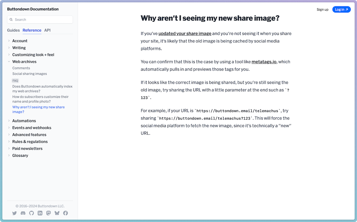
With the taxonomy improved, we can feel better about creating mounds of documentation (big and small), knowing that it all has a reasonable place to go.
Also, we’re still not fully happy with the taxonomy we’ve ended up with and the content will grow over time, so this allows us to rearrange the taxonomy without breaking links in the future.
Help me find stuff
Another problem was that we had documentation on certain topics, but that our search was a bit clunky.
In classic fashion, I did a bit of over-engineering, and we’re now using OpenAI’s vector embeddings to process every bit of writing on the site, and then matching it to search queries by comparing the distance from your query to every piece of writing.
It’s not perfect, but it’s noticeably better at finding results that are semantically similar but not syntactically similar (for example, “image” and “photo”).
Why roll your own documentation site?
There’s a ton of solutions off the shelf, but ultimately, documentation is a core part of Buttondown’s product. One way that we differentiate is by providing a superior customer support experience, and this documentation site paves the way for us to extract more knowledge out of one-off customer support replies and into reusable and into publicly searchable documentation.
We could have used something prebuilt, but our slightly quirky needs (custom components, a custom navigation hierarchy, improved API docs) plus room to grow (vector embeddings search, affordances for related documentation pages and FAQs) mean that we feel more confident and future-proof rolling our own site.

