
“A well-structured page, a blind person can navigate that potentially faster than a sighted person,” according to Joel Dodson, a blind software developer. Newsletters, with their (mostly) standardized and linear layouts, are typically more accessible by default than web apps and landing pages. But email will never be perfectly accessible.
Sheri Byrne-Haber sums it up nicely in her newsletter, writing that “Any article or product hinting that all the reader/user has to think about is ten things to get accessibility right is delusional and misleading.” So while I provide a handful of tips in this article, I suggest that you approach this post as less of a list of to-dos and more of an introduction to a subject you should continue exploring for as long as you publish content online.
Now, it doesn’t make any sense for me–someone who has not specialized in accessibility–to provide you with an introduction to this topic. While I know enough to provide some basic tips, any advice of substance you follow should come directly from accessibility specialists, and those using assistive technology every day. These are the people we should be learning from and this article puts their quotes and expertise front and center.
The email experience with assistive technology
Before jumping in, though, I think it’s important to have some context about what the email experience is like with a screen reader. While it’s not the only assistive technology that affects newsletter accessibility, it’s a good place to start. Blind content creator and disability activist Lucy Edwards has a great YouTube Short showcasing how she reads email on mobile.
Now you see what Joel meant about a blind person experiencing the content faster than a sighted person. Desktop screen reader experiences are similar, albeit with more granular keyboard controls and navigation that should inform the structure of an accessible newsletter. Let’s start there.
Create descriptive headings and link text
“Sighted people get intimidated watching experienced screen reader users parse through content,” accessibility expert EJ Mason explains in an interview with Assistiv Labs. “I think most people may not know that it’s possible to navigate by the types of elements on a page – like jumping between headings or between links.” Although that may sound like the same type of skimming that most sighted people also practice, it's very different.
Sometimes, screen reader users will start near the top of the page and use a keyboard shortcut to jump down to the first link. Their screen reader of choice will read the anchor text (the part that’s underlined) and the URL, but not the words before or after that. You can imagine how jarring and confusing it would be to cycle through a bunch of vague, uninformative link descriptions (think “this post,” “last month,” “here,” etc.).
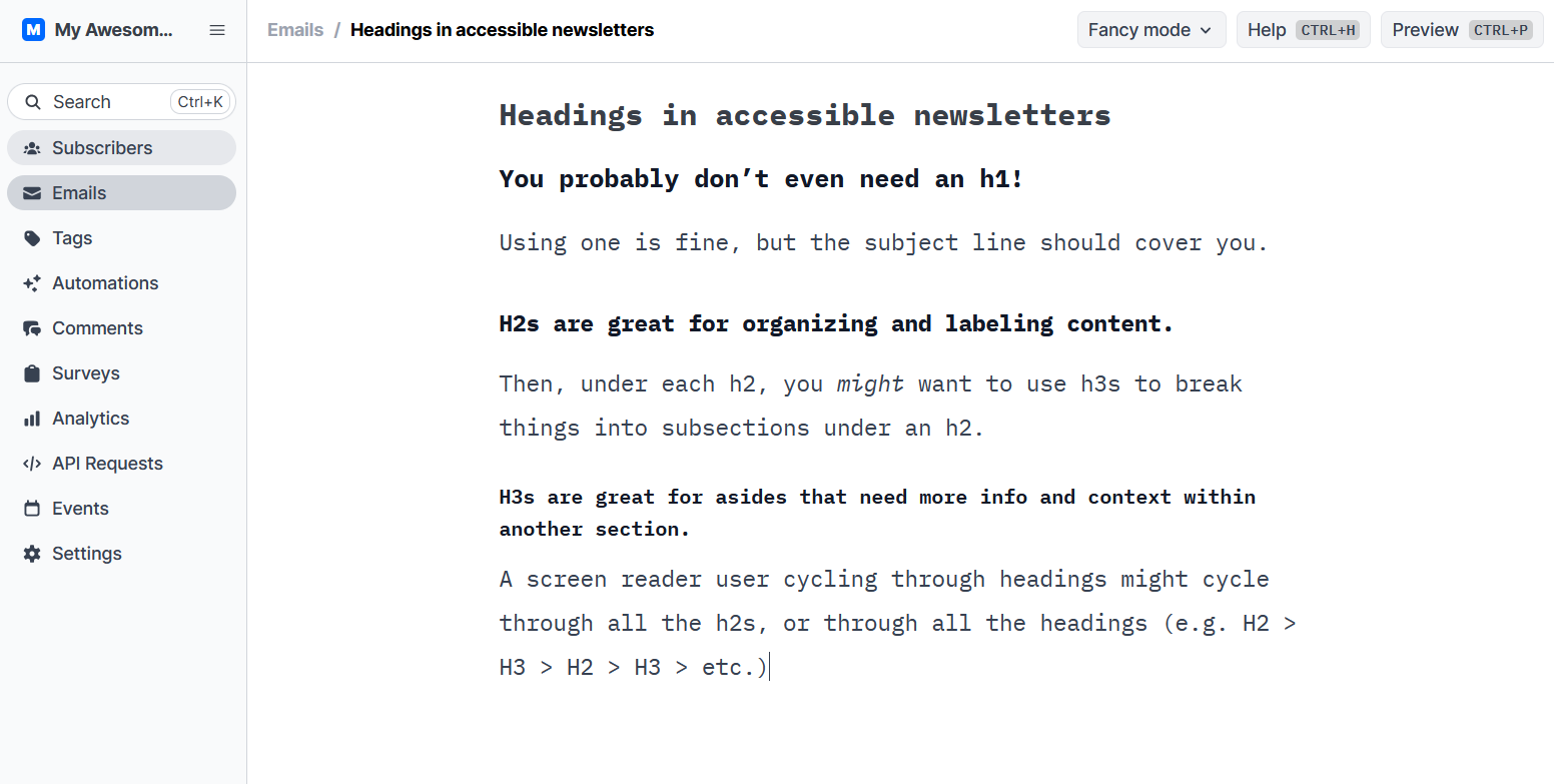
Headings are another popular navigation shortcut. Joel says “The first thing I’ll do when I go to a site is I’ll type 1 to go to the H1 heading, and then I can just type h to go to the next heading.” If you think of headings as little more than a way to visually break up walls of text or insert a bit of humor (I’m guilty of this!), your newsletter will be harder to read and enjoy.
The A11y Project’s recommendations for headings include “Use one unique h1 per page that describes what that page is about…Do not use an HTML heading just to make the text appear bigger or stand out…give the most important sections an h2, and, if needed, add an h3 or maybe even an h4 to divide the content in the h2 section.”
Headings should be hierarchical and indicate what the section will discuss. Link text should provide all subscribers with a clear idea of where they lead. And whenever possible avoid including a URL that is not formatted with anchor text in your newsletter. Screen readers may not cycle through it when navigating by links and, what’s worse, read it aloud one letter at a time.
Summarize every image with alt text
Lucy Edwards showed us how screen readers handle subject lines and regular text, but not images. For that, check out blind filmmaker Juan Alcazar’s YouTube Short, showcasing how screen readers announce alt text.
In Buttondown, for instance, you set alt text by clicking the pen icon in the upper right corner of an embedded image and adding a description in the associated field. Similar to Juan’s advice, accessibility expert and assistive technology user Veronica Lewis frames it as “The goal of alt text and image descriptions is to describe all relevant and important visual information to understand an image.” Doing it well is harder than it sounds!
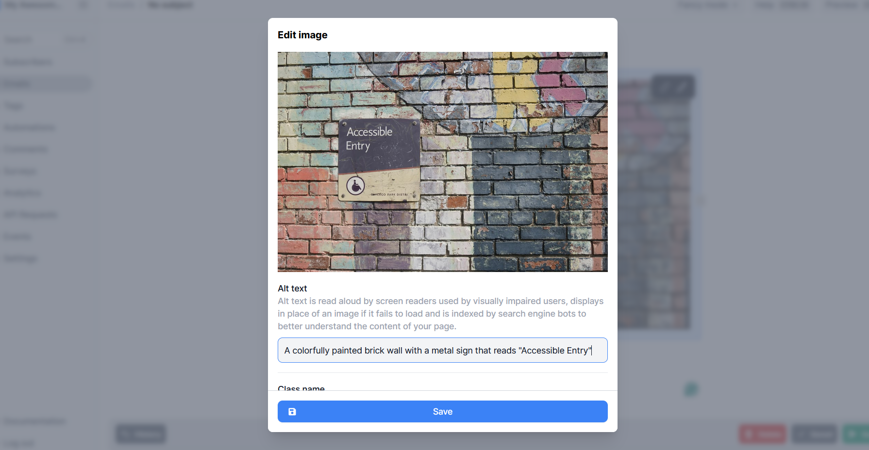
Veronica recommends starting with the type of image, then writing about the subjects or items in it, the setting or location, gestures and emotions, colors, text, and other interesting details. Another fantastic reference is Adrian Roselli’s examples of good vs bad alt text.
Every image in your newsletter should have alt text. Full stop. Start by making that a habit, then revisit advice from experts and disabled users to continue improving.
Make layouts, colors, and formatting easily legible
Depending on the newsletter platform you use and the types of emails you’re sending, you may already be doing this by default. In fact, in Buttondown, you’d have to go out of your way to create a layout that is unfriendly to screen readers. I believe that email should be simple and our feature set reflects that philosophy. There are plenty of edge cases though.
Here, again, Adrian shines a spotlight on content that seems breezy and lighthearted at first but is actually immensely annoying for assistive technology users. Splicing too many emojis between words and using ASCII art as text, for example, both turn screen readers into babbling nonsense.
Far more mundane (and, sadly, common) is adding too much complexity to the page. Things like nested tables, confusing column layouts, and generally anything that breaks the top-to-bottom flow. I don’t see this from Buttondown users too much and it’s definitely more of an issue for company newsletters.
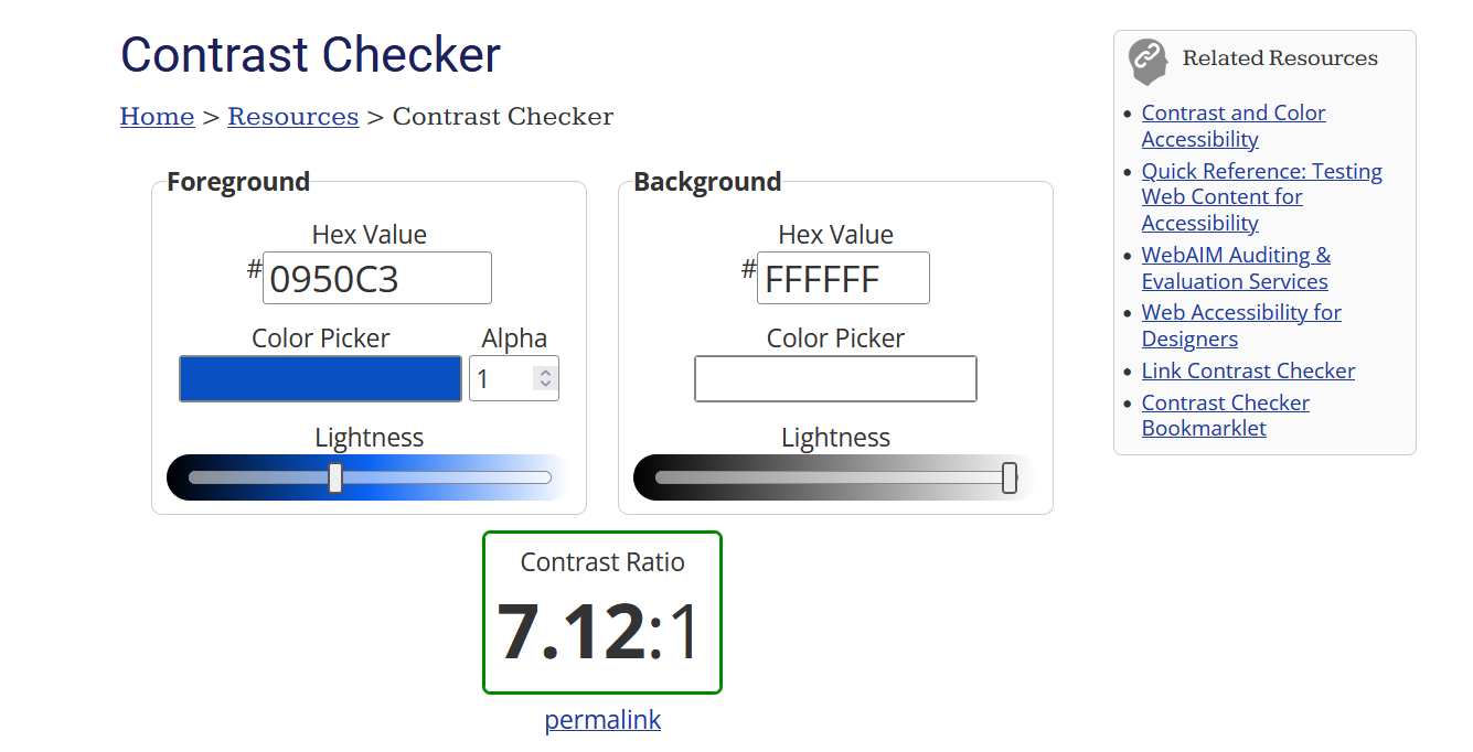
It’s at this point that we need to start expanding our scope of accessibility beyond screen reader compatibility, a sort of virtuous tornado of newsletter design. That includes avoiding using color to convey information and using high-contrast colors for the 4% of the population with color blindness (this tool helps). Or embedding audio or video without subtitles, making them inaccessible to people with hearing loss. Your accessibility knowledge and updates should grow to include more and more groups of people as time goes on. That’s how you reach more people, which is what most of us want, right?
“A rising disability inclusion tide needs to raise ALL the boats, not just the boats of a small subsection of people with disabilities,” writes Sheri Byrne-Haber. “Good accessibility does not benefit a screen reader user at the expense of a keyboard-only user.”
Where to go from here
First, if you or any of your subscribers have an accessibility concern with Buttondown itself, please let us know about it. We still (and will always!) have work to do on this front and it’s a high priority for us.
To continue learning and expanding your understanding of accessible newsletter creation, we have some accessibility guidance in the Buttondown documentation. For broader, more general recommendations the A11y Project is one of the most comprehensive resources out there. Equal Entry and A11y Weekly (a Buttondown user!) both have excellent newsletters. And Gov.uk has a surprisingly helpful series of accessibility articles, including this collection of Designing For… posters.
Email is one of the most open, accessible platforms around. Let’s all work on keeping it that way for as long as possible.