Adventures in Typography logo

Adventures in Typography

Archives
Subscribe

Adventures in Typography

Archive

💀 Color Fonts Are Dead (Not really, but kinda)

adventures-banner.jpg


Sorry for being so political here, but: color fonts are beautiful.

Back in 2014, Roel Nieskens wrote a blog post called Colorful typography on the web where he argued that web typography would soon get much more interesting with a whole new font format: color fonts. Back then we couldn’t change parts of a font or highlight one part of a letter in a specific color and so a few formats popped up to solve that problem, all of them described as “color fonts” though.

October 24, 2022
Read more

🔠 The Shackles of the Baseline

Friends! Chooms! Ayer Deck Appreciators!

example-99.png

The most embarrassing thing about this here newsletter is my limited field of view: topics range from Latin-based scripts to Latin-based scripts. If you speak English, German, French, Italian, or Spanish, then don’t worry, I’ve got you. But this newsletter makes out as if other languages simply don’t exist. This is wrong! And short-sighted! And...kinda mean!

That’s why I got so excited when I saw that Pooja Saxena recently started a great newsletter called I Spy with my Typographic Eye. Pooja—aka Matra Type—is a type designer and letterer specializing in Indic scripts such as Devanagari, working alongside the excellent folks at TypeTogether.

October 2, 2022
Read more

🔠 Always Read the Specimen

Friends!

example2.jpg

‘A’ from Elfreth with Service Gothic’s manicules


September 25, 2022
Read more

🔠 “Negatively Spaced Within a Pica Of Its Life”

Type pals!

Robin here. Last week I mentioned that I should just write the damn book and so I’ve decided to get to it. I’m kicking off a brand new project and weekly newsletter so that you can follow along with my progress.

It’s called How Not To Make a Book. Go subscribe!

hntmab.png

September 4, 2022
Read more

🔠 Just Make the Damn Book

Friends! Colleagues! Typophiles!

alphabet 1.png

Here’s some beautiful lettering by Ukranian type designers Victoria and Vitalina Lopukhina, as spotted in this fantastic Alphabettes post. Look at the extended leg of that K! This proves my theory that typography is more punk than punk rock.

But, this week, a revelation: what if I stop talking about it and just make the damn book?

August 27, 2022
Read more

🔠 The Bizarre Bodoni Bastard

CleanShot 2022-08-14 at 10.43.26@2x.png

Friends!

This weekend I fell into a Pyte Foundry shaped rabbit hole, trawling through everything that Ellmer Stefan has ever made. For the last few hours I’ve been excavating the weirdest of wonders in the dark, and now I’m thoroughly stuck. What lured me into this hole was Kinckq, a typeface that Ellmer describes as “a digital reanimation of a unique brainchild emerging from the pantographically distorted minds of North American wood type manufacturers.”

Here’s what those words mean in practice:

August 14, 2022
Read more

🔠 Typography as Time Travel

“When I look at a Victorian type specimen book, I feel like time flattens out.” writes David Jonathan Ross for his Font of the Month Club.

“I’ll catch the 1880 vibes, for sure, but also whiffs of 1970 and 2022. I’ll see frilly fonts on one page that feel hopelessly antiquated, relics of a bygone era. Next to them, I’ll see fonts that feel strikingly contemporary, virtually indistinguishable from what’s popular today. It’s funny to see them coexist, and it reminds me of how limited my definition of ‘contemporary’ can be.”

I have two thoughts here. First off, I love Ross’s latest typeface Glyptic.

adventures.jpg

August 7, 2022
Read more

🔠 Anaheim

Friends!

It’s my birthday today, I’m 32 years old, and I’m sitting in the heartland of America, the very center/centre of this country; a nondescript hotel in a city made of hotels, Anaheim, California. I’m here for Disneyland.

After crossing the little gate yesterday into the happiest place on Earth I found the scale of this grand illusion to be utterly mind boggling. And no matter how cynical you might be, no matter how goth you are, there’s not a cynic alive who can walk down Main Street without a big dumb smile on their face. It’s simply impossible.

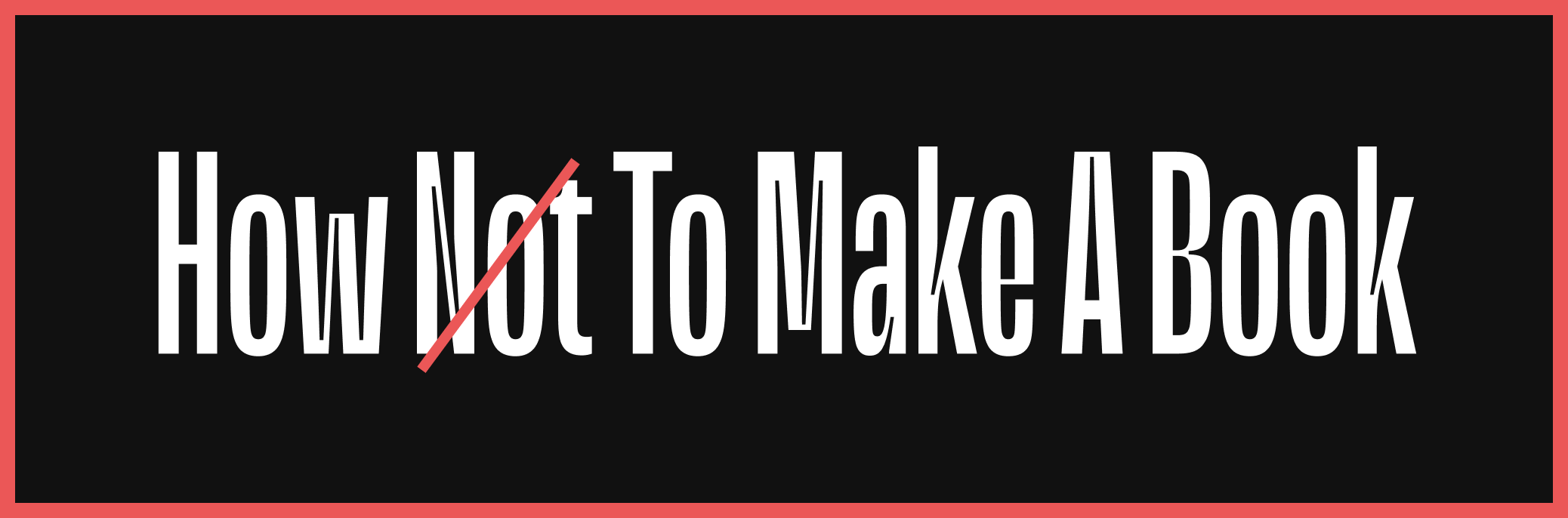
So here’s a short one for you all today in celebration of some tiny type things that I spotted in Disneyland today. Next weekend I’ll be back for hot takes and more typographic drama. I’ll see you then.

July 26, 2022
Read more

🔠 The Art of Emphasis

Allo allo!

It’s me, Robin Rendle, and this is Adventures in Typography. It’s been a while! I took a year-long break but now I figure it’s time to rant about fonts again. So from July to December I’ll be writing this newsletter once a week.

Prepare yourselves. You cannot escape.


July 18, 2022
Read more

🔠 Pirate Fonts

Pals!

When it comes to typography, my tastes fluctuate and change over time. Sometimes I want loud interfaces, buck-wild swashes, and daring shapes that shove me about and challenge me. Other times I admire subtlety and caution; I want a typeface that looks like a professor all buttoned up, hands firmly in pockets.

But for the past month or so I‘ve been looking at a series of utterly bonkers typefaces that are not the usual pristine, posh, and fancy things that catch my eye. I‘ve found myself drawn to typefaces such as Adams Regular and .

March 14, 2021
Read more

🔠 What makes a typeface good?

Comrades!

This week two things caught my eye.

First up: Codelia by Toshi Omagari which is described as a “monospaced humanist sans” on MyFonts and more accurately described by me as a “heck yeah” font. Just look at this thing and all it’s extreme heck yeah-ness:

March 8, 2021
Read more

🔠 A Picture of a Thing

Friends!

This week I have no rant, only homework.

After I wrote about Columba last month I fell down a rabbit hole and read this excellent post by the designer Lewis Mcguffie called . It’s about the difficulties of designing type, sure, but really—secretly—it’s about understanding scale when working on a big project:

February 22, 2021
Read more

🔠 The Homepage is a Nightmare

Friends!

Okay so I had a really good idea for the homepage last night. Well. Maybe. Let’s see. It all began when I mentioned in the CSS-Tricks newsletter the other day that designing a homepage of a website is the single most impossible thing in the universe:

Designing the homepage of a website is harder than learning a new framework, more difficult than building an enormous website, and more challenging than memorizing all the values and properties of CSS. In short, the absolute worst thing about the entire field of web development is designing the homepage. It’s just the worst.

I mention this because I’m redesigning the homepage for my website right now and I had a big question I want to answer: how do I make the essays stand out a bit more? I put a lot of time into those and if you aren’t familiar with my work then that might be the best “hello!” I can pull off.

February 15, 2021
Read more

🔠 Connections

Friends!

I’m sat at my desk and it’s a cold morning here in Bernal Heights. But before you begin to worry too much about me—fear not!—it’s important to note that despite my nose being cold and my focus wondering all over the darn place, I have drunk at least a gallon of coffee and propped up in front of me is Keith Houston’s book about books called—somewhat mysteriously—.

February 7, 2021
Read more

🔠 Kickflip Typography

Friends!

I don’t understand why. Just. .

February 1, 2021
Read more

🔠 Why do you care so much about fonts?

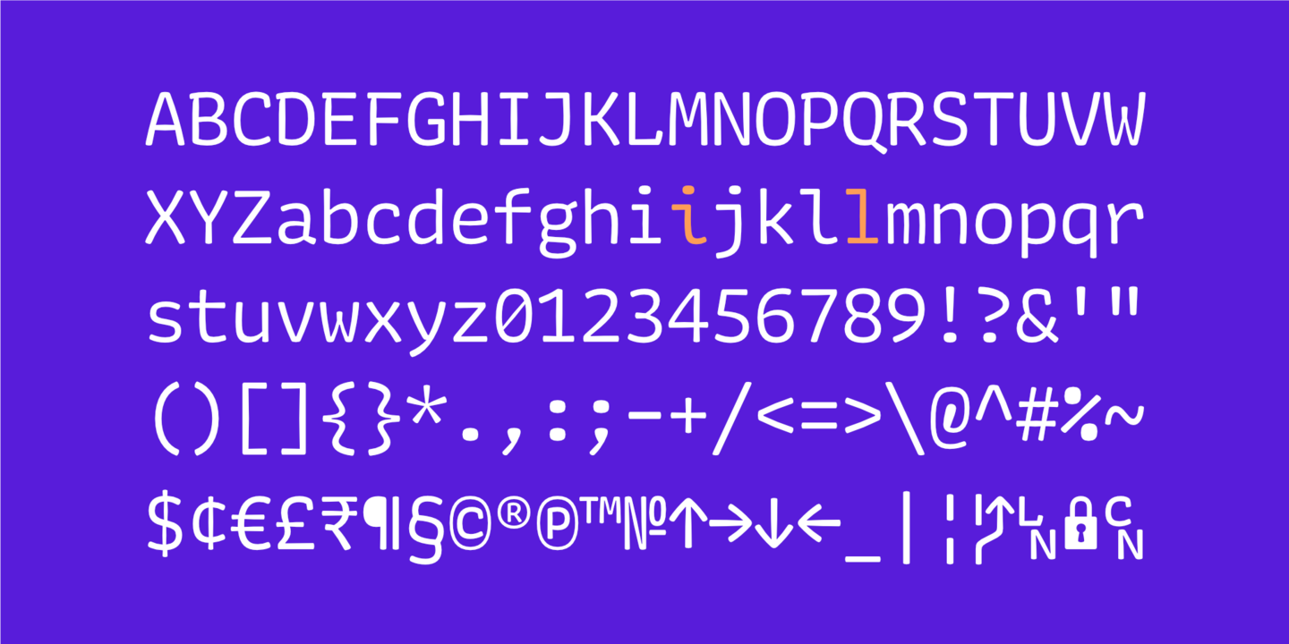
The curious shapes of Almost by Jérôme Knebusch caught my eye last week when I read Laura Meseguer’s review.


Friends!

January 23, 2021
Read more

🔠 Newsletters

Wood engraving by Julien Turgan, 1875


Friends!

I’m getting the band back together. This here is Adventures in Typography, a newsletter by your friendly neighborhood Robin Rendle where I uncontrollably ramble about fonts from time to time. And with this email I hereby announce season three of Adventures, with the plan being to publish one of these every Saturday until spring.

January 17, 2021
Read more

🔠 Let Fonts Be Fonts

Pals!

The website for GT Flexa is wondrous; enormous animations, pitch-perfect typesetting, and with writing that doesn’t make me want to walk into the nearest ocean. The combination of these things shows just how much laser-like focus was trained on these letters but they also tell a galloping story about how the designers wanted their typeface to be as flexible as possible:

August 29, 2020
Read more

🔠 Continental Types

Friends!

Did you know that you can buy type specimens? If you leave the Darkest Web behind and hop onto the Loveliest, Sweetest Web you’ll find a treasure trove of graphic design and typesetting—the likes of which you’ve never seen before.

Ah, but where are my manners? Let me re-introduce myself. I’m Robin Rendle and you’re receiving this newsletter because you subscribed to it some time ago. I took something of a hiatus recently but am now returning for Season 3 of Adventures in Typography.

Let’s make a big mess together and talk about fonts.

August 17, 2020
Read more

🔠 Do justice and let the skies fall

Friends, comrades.

Adventures is on hiatus right now but let’s get right to it: there are organizations that need our help. There are people out there doing hard work and fighting like hell. And here’s one small way you can help them:

  • Support a bail fund
  • Or Reclaim the Block
  • And donate to the ACLU
June 5, 2020
Read more
Older archives