DisAssemble

Archives
Subscribe

DisAssemble

Archive

Solutions to misinformation need human-centered design

Designing news for the modern consumer can help overcome misinformation. Photo by Mike Ackerman

Where can we find the solution to the spread of digital misinformation? In technology? Media literacy? Fact-checking? Legislation?

There’s no question that these are useful entry points to attack the problem of misinformation — but what of the root of the problem? The root of misinformation at any given time involves our relationship, both conceptually and practically, with the news. We’re the readers, we’re the ones who misinformation is for. If we want to attack the problem at stem and root, we have to step back and consider our ‘experience’ of the news.

Most proposed solutions to misinformation seem to lack this perspective. This may cause, and indeed has caused, solutions to misinformation to be ineffective. Case in point, current solutions seem to be operating with the following premise: users think news is a repository of factual information about current events.

Solutions inheriting this premise very reasonably attempt to address this problem by increasing people’s media literacy through fact checking and displaying the outcomes of said fact-checking. There have been many approaches like this:

  • The Credibility Coalition are working on implementing ‘credibility indicators.’ These indicators attempt to show how credible a news story and a source is. This endeavour is at an early stage, but in application, it would seemingly involve some sort of visual indicator to the user, which would note that a particular news source is trustworthy, untrustworthy, or somewhere in between.

  • The Trust Project also provides an indicator system, this time on news organization’s ethics and other standards for fairness and accuracy. It appears as a logo on news organisations who have been verified by the Project.

  • Even UX-first solutions have honed in on technologically-centred solutions. In this article, UX architect Jason Salowitz presents a credibility framework for news stories. He discusses a ‘validation engine’ and a number of indicators that could help users determine the validity of particular articles and news sources.

These solutions are like an objective judge of the news’ validity, determining the ‘truthiness’ of an article or validity of a news organisation.

But if we pull back, if we think with a human-centred approach, we can begin questioning the efficacy of these solutions: do they integrate with how people live their lives, and meld with their conceptualisation of the news?

So what would a human-centred view of news engagement tell us? Let’s investigate, and in doing so, we can question whether our view of the news as an abstract reporting of facts is accurate. It will also help us generate some UX takeaways that should be considered in misinformation solutions.

Principle 1: Readers don’t make a particular ‘intent’ to consume news:

In previous eras, engaging with the news was causally related to an intent to look at the news. You had to choose to pick up a newspaper or turn to a news TV program. Now, news is typically posts on social media, comments on posts, and chat messages to one another. ‘News’ tends to live as an ever-present entity that takes almost no effort to view.

This means any solutions need to mesh well with the embedded experience of the news. Solution frameworks should engage the reader in a similar manner as the news. They should be embedded in our everyday experience, not abstracted from it.

Principle 2: We are accustomed to receiving news without context

As noted, news often manifests as tweets, posts or comments that frame or respond to news articles. In this way, ‘news’ is separated from the requisite factual bedding that news stories have historically had in media such as newspapers and television. Compounding this de-contextualisation, 60 percent of people don’t read past the headline. News organisations have responded to the atomisation of news and corresponding user habits by making news articles shorter and punchier than ever, often in the form of bullet points or inflammatory headlines.

This means solutions shouldn’t provide context or other useful information through vague approaches which require users to continually chase down facts and figures and rationales. If we expect that people won’t read past the headlines, it’s unrealistic to expect users to innately want to understand the broader context of why a particular story is treated as misinformation.

This also means that asking the user to understand complicated mental models are likely going to be ineffective. Self-imposed and external time pressures mean that solutions need to do what they do quickly.

Principle 3: We use the news to formulate our identity

We are more partisan than ever. Filter bubbles, the immediacy of news, user comments, memes and mobile phones have all contributed to this state of affairs. We don’t have to dig very deeply to understand who represents our views and who does not.

This means that solutions can’t simply ignore or act in contradiction to a user’s associative group structure, rather they must work within the parameters of peoples’ tribes. This isn’t to say that these tribes are good or useful, but merely that they exist and need to be accounted for. Solutions that tend towards partisanship — or even hint at it — will likely be unsuccessful.

So how might these principles be incorporated into solutions? Here’s just a few ways.

Facilitate opportunities for providing context & serendipity

Incorporating more credible articles next to less credible articles can help educate readers not only on a more authentic description of events, but can help users to understand what accurate stories ‘look like.’ An objective isn’t necessarily only to show more plausible contrasting accounts, but to get people to explore out of their comfort zones. This is a form of what is known in information studies as serendipitously finding information. Users can ‘accidentally’ come across information that is of value to them in a way that is embedded in their existing news consumption.

This has been proven successful previously, as a highly detailed and insightful report from the Shorenstein Center notes:

Experimental research by Leticia Bode in 2015 suggested that when a Facebook post that includes mis-information is immediately contextualised in their ‘related stories’ feature underneath, misperceptions are significantly reduced.

Facebook’s related articles feature

Utilise social proof

Encouraging contextual exploration and serendipity is useful, but it doesn’t mean that what users are discovering necessarily embeds satisfactorily with their beliefs, identity, and their associative group.

Therefore, a credibility framework can be enhanced by nudging users to explore content through the provision that other people like them are also looking outside of a single information source. No one wants to feel as though they are less knowledgeable or competent than others, so messages noting that others are looking at related content could prove valuable.

Here’s a quick wireframe of how social proof and contextual articles could work together:

Including related content and articles can “nudge” users to explore more information. Mockup by Vikram Singh.

A story is rarely presented without a social layer, given that news is already filtered and editorialised by friends and people you follow. Accordingly, this approach embeds well with a user’s experience.

Engage users in the meta narrative

Misinformation thrives on ignorance and a lack of context. As such, we want users to be able to understand the broader picture of a news story, but without overloading them or categorically shutting down their political perspective, so that they can better navigate away from misinformation.

For example, take a look at a new site entitled “Kialo”, which hosts debates by topic. Each topic has arguments for and against, with each of these arguments containing sub-arguments for and against the arguments (and so on, deeper into specific sub-arguments). Each argument and sub-argument is voted on.

Here’s how the topic (the grey box) of whether the US should pay reparations for slavery is structured, with arguments and sub arguments — green ‘for’ a orange ‘against’:

Kialo thus encourages users to navigate away from a single information source using a tree structure.

Users are able to explore the totality of a topic in a familiar format (most people are used to tree structures). In a validation framework, if we’re able to harness not only validity of content but also theme, something like this would be an exceptionally powerful way to fight misinformation.

Here’s a wireframe of how it might look:

A validation framework could include a variety of related articles on the same topic. Mockup by Vikram Singh.

Of course, this could get unwieldy and confusing to a user. This approach would likely need to be strictly limited to the amount of articles present, with only those of the highest credibility appearing. Primarily, this could act as a contextual element next to articles that have poor credibility ratings. In this way, you can work with with highly partisan users and their associative groups.

Conduct User Research

Users ‘in the wild’ consume news in ways that are unpredictable to the creators of news and the designers of news experiences. Our hubris leads us to imagine that we can control how people will use a system we create — but we can’t design particular a experience, we can only design for it.

The only real way to understand if solutions to misinformation are effective is to continually test them with real users and iterate on the solutions based on their feedback.

The Trust Project did some interviews to understand how people consume the news, and despite being fairly difficult to parse, their report has some good information. Unfortunately they committed the sin of letting users design the solutions rather than observing how users use the news, or watching how users use prototype solutions (get users to do, not tell):

The Trust Project’s Research Report

I’m not so clever to know I have all the answers to misinformation, but I do believe we are not thinking broadly enough. Solutions to misinformation thus far may only be effective towards people with high digital literacy and educational backgrounds, rather than to users/readers at large.

So I’d love to hear your opinions on how solutions to fake news can be better integrated into our daily experience, and your opinions on my suggested solutions. Ultimately, we’re all victims of misinformation, even if we aren’t consumers of it.

#21
January 18, 2018
Read more

The problems with the solutions to fake news — Part II: The UX

How can we effectively embed solutions to fake news into daily life?

This was the essence of the question I was asking in Part 1 of this series, where I dug into the theoretical underpinnings of our relationship with news. I’d like to answer that question here, by combining a user-centred approach with the principles for solutions I outlined previously, which indicated that solutions must:

  • Mesh well with the experience of the news. Solution frameworks should engage the reader in a similar manner as the news.

  • Be embodied in a way that is both easily understandable and easily to conceptualise for the reader.

  • Not require the understanding of new mental models or actors that could provoke questions of authority and trustworthiness for any new concepts involved in the solution framework.

  • Not disrupt readers sense of self-identity

  • Fit in with reader’s associative group structure

Again, existing solutions — while generally excellent, haven’t seemed to address most of these aspects. It may be the case that solutions are not a stage where they are able to consider these aspects, but if they continue to ignore them, it’s very unlikely that solutions to fake news will be successful.

Aside from increasing literacy, solutions to the problem that is fake news have generally centred around measuring and indicating the credibility or trustworthiness of news articles or sources.

Facebook’s ‘disputed’ label

It certainly is difficult to imagine a successful future fighting fake news without a validation/credibility framework. But the perspective from which concerns are mounted often don’t seem to consider the wider paradigm of how we interact with, perceive and experience news.

The Trust Project’s ‘Trust Mark’

As I noted previously, it is difficult to understand how and why most users would care about these trust indicators, let alone trust them. Why, for instance, would a steel worker in Texas or a waiter in Nigeria engage in trust indicators the way we want them to?

Do we honestly think that credibility indicators are targeting the right people, those who often have low digital literacy and high partisanship?

So the question remains as to how we can we improve these credibility/trustworthiness solutions.

I’d like to offer a series of solutions here that integrate with the above-mentioned principles. They are:

  • Facilitate opportunities for discovery & serendipity

  • Utilise social proof

  • Engage people in a meta story

  • Conduct continued user research

The idea behind these solutions is that people will be able to make use of otherwise abstract credibility indicators, which are seemingly on the way to be provided without context or narrative. By considering the following mechanisms, we can encourage users to engage in trajectories that make fake news ineffectual.

Note that these mechanisms rely on an underlying framework of credibility of articles — this isn’t about how to establish credibility, but rather how to present credibility.

Facilitate opportunities for discovery & serendipity

On their own, trustworthiness indicators are devoid of context.

Why is an article trustworthy? Says who? What part of it is trustworthy? Is the trustworthiness indicator trustworthy?

A solution is to provide context to help the user in terms of definitions, further evidence, and further debates on validity, but we then run the risk of overloading the user with cognitive labour (put simply: people are lazy), and could potentially cause them to avoid acknowledging the indicators whatsoever. This is what Facebook has done with their “About the publication” efforts.

Facebook’s trust indicator project requires users to dig down into the background of an article

However context can be provided by showing other related articles. Varying accounts of phenomena can provide context of why one account may be more factually questionable than another. The objective isn’t necessarily to show contrasting accounts, but to get people to explore out of their comfort zones.

In this way, discovery & serendipity is of huge value. Discovery is providing users the opportunity to find new information, and serendipity is encouraging to read something useful they wouldn’t otherwise. This fits with the engaging nature of news and are easy to conceptualise, as they are familiar mechanisms. We’re all familiar with “Related” pieces of media — situated next to videos, articles and songs.

There’s been much talk about algorithmically related content channeling users to ever more radical content. This is not to be taken lightly. That’s why only articles rated as ‘high credibility’ should be shown in discovery mechanisms.

This has been proven successful previously, as a highly detailed and insightful report from the Shorenstein Centre notes:

Experimental research by Leticia Bode in 2015 suggested that when a Facebook post that includes mis-information is immediately contextualised in their ‘related stories’ feature underneath, misperceptions are significantly reduced.

How Facebook used Discovery

Utilise social proof

Encouraging discovery is very useful, but it doesn’t necessarily fit with someone’s life, with their identity, and with their associative group identity.

Therefore, nudging users to explore content through the provision of evidence that others are looking outside of a singular information source can help embed discovery into a user’s life. No one wants to feel as though they are less knowledgable or competent than others, so messages noting that others are looking at more and ancillary content could prove valuable.

This ‘social proof’ works well because it activates the intersubjectivity (the meaning we make together) and a feeling of trust in others. We know that people rarely make decisions about identity themselves, it’s a collective enterprise. Additionally, should any system of indicators be linked to social feeds, it could indicate how many of your friends read these “adjacent” articles.

Social proof could manifest as language that encourages discovery, like:

“Most people who viewed this article, also viewed on this one”.

“Users who read this article were interested in this article, which provides a different account”.

“This is a complex topic. Here are other accounts that are very popular with users”

“[username] read the article listed below”

Here’s a quick mock up of how social proof and discovery could work together:

News is already filtered and editorialised by friends and people you follow. A story is rarely presented with a social layer. Accordingly, this approach meshes well with a user’s experience.

Engage users in the meta story

Any additional layer on the web needs to be incorporated into our existing mental models and associations. Who’s doing the assessing of fake news, and what bits are being assessed? But more than that it also needs to be incorporated into the narrative, the actual story that people tell themselves, both about how a credibility scheme fits into the meta story of news, and how it fits into their lives.

It’s easy for the players in the abstract layers of digital ecosystems to become vague and amorphous. I’ve written extensively how people ‘satisfice’, that is, they take the first best option or assumption for what a thing is. It’s fair to say that users will assume the worst if they aren’t give a strong sense of who the key players are and how they interact with their digital life-world, given the cynicism engendered from a digital framework that presents worst in politicians, the media and digital marketers.

This is a very difficult problem, especially in that it speaks to larger questions about identity and narratology. But it provides opportunities as well: How can we allow people to situate themselves in the story, with the actors in the story, with the tellers of the story?

In the tagging of an article or news source as credible or non-credible, it seems to me that it is just as easy to tag this article as specifically situated within a dialogue. Put simply: what’s being argued here and by whom?

Imagine theming articles by topic, or by granularity of premise.

As an example, I recently came across a new site entitled “Kialo”, which hosts debates by topic. Each topic has arguments for and against, with each of these arguments containing sub-arguments for and against the arguments (and so on, deeper into specific sub-arguments). Each argument and sub-argument is voted on.

I find this to be an intelligent yet simple way of organising arguments. It’s visually easily understandable and could translate well to a large ecosystem of news.

Here’s how the topic (the grey box) of whether the US should pay reparations for slavery is structured, with arguments and sub arguments — green ‘for’ a orange ‘against’:

Imagine one of these trees for each news topic, with each news article being arguments and sub arguments. Rather than voting, articles could be shown by credibility. Less credible articles could simply drop-off the chart.

Of course, this could very easily get unwieldy and confusing to a user. This approach would need careful curation and would likely need to be strictly limited to the amount of articles present. Indeed, something like this would be suitable for only the highest credibility articles.

Primarily, this could act as a ‘discovery’ element next to articles that have poor credibility ratings. Or it could be integrated next to low credibility articles about to be posted: “This article is about [topic], but is of low credibility. These articles have higher credibility”.

The advantage is that you can show both sides of an argument — but only shows high credibility posts. In this way, you can work with an associative group structure, with partisan users.

It’s also a very simple, visible structure, that is easy to conceputalise. Of course, it’s still doesn’t show who is doing the credibility decision making or why particular articles are shown. Making this visible while keeping cognitive overhead to a minimum is doubtlessly a challenging task, and one that I don’t have a strong idea for at this time.

Yet the hope here is to present consumers of fake news with a familiar tree-like framework with related articles that are bi-partisan and are of a high quality.

There’s little worse than genuine effort creating in ineffectual results. That’s why suggestions like the mechanisms I illustrate here need to be taken seriously in the creation of credibility indicators.

But perhaps most important is the need to research solutions to fake news with users.

Ultimately people make use of spaces how they want. Fake news is an incredibly basic concept yet it was not predicted and thus defended against by anyone in any meaningful way. Facebook, Twitter and indeed the world were caught unawares.

This is simply because people make use of spaces to create places and activities that we can’t perceive. We can only understand this by conducting research with people, by observing them and by seeing where trends are occurring.

Our hubris leads us to imagine that we can control how people will use a system we create — but we can’t design particular a experience, we can only design for it. In other words, users will create the places, we can only seek to encourage the creation of places with certain qualities.

So ultimately, all the recommendations I’ve listed here are moot if they are not tested first. But this goes for all solutions, as well.

The Trust Project clearly did some interviews to understand how people consume the news, and despite being difficult to parse and rather unstructured there is some good information. Unfortunately they tend to commit the ultimate sin of letting users design the solutions rather than observing how users use the news, or watching how users use prototype solutions (get users to do, not tell):

An example of how the Trust Project got users to design solutions, rather than observing how they interacted with solutions or with the news generally

Exploratory, formative, and evaluative user research need to be continually conducted on any and all proposed solutions to fake news.

But there’s plenty more we can do. I’m not so clever to know I have all the answers, but I do think we are not thinking widely enough. Solutions to fake news certainly seem to predicated on solutions that we think would be effective to us, rather than effective to users/readers writ large.

So I’d love to hear your opinions on how solutions to fake news can be better integrated into our daily experience, and your opinions on my suggested solutions. Because ultimately we’re all victims of fake news, even if we aren’t consumers of it.

#20
December 10, 2017
Read more

The problems with the solutions to fake news — Part I

People know this is fake. Why would they still read it?

Despite all the ugly ramification of fake news, it has been heartening to see a herculean effort being amassed against it. The majority of efforts, however, have been directed at data, verification, and literacy.

What these solutions don’t seem to consider is our conceptual relationship with news.

Is the news still ‘the news’ to us? How do we interact, intellectually, emotionally and physically with news?

We’re all operating with the idea that people have the same idea of news as they have had in the past: news is the factual information about current events. Solutions to the fake news phenomena approach this problem with this conceptual framework.

Take this article from Jason Salowitz. I certainly do think there’s some good ideas in it. Jason’s clearly put a lot of effort into how the solution would work. In it, he discusses a way to “UX the F***out of Fake News”. He discusses a number of examples that could help users determine the validity of particular articles and news sources.

There’s also a number of organisations that are aiming to determine the validity of news stories and present this information to users: the Credibility Coalition and the Trust Project are working on ‘credibility indicators’. These indicators attempt to show how a validation engine would define how credible a new story and a news source is. Usually, this includes some sort of visual indicator to the user, noting that a particular news source is trustworthy, untrustworthy, or somewhere in between. Or, it shows a mark of authority, that a particular source is ‘trusted’. In this way, it’s sort of like an objective adjudicator of the news’ validity.

A screenshot from Joe Salowitz’s article about Fake News

But would these work? Would people trust, use, or even care about these indicators?

Facebook’s ‘disputed’ label

Jason and others see fake news framed within technology and reporting, not within the user/reader. In their eyes making it clear what news is credible, and what is not is the key to success. The experience, according to these and others, is predicated on the assumption that an abstractly assessed news source would be effective (and affective…) to the reader.

Yet this view does not take into the account the peculiarities of individual reader’s experiences. Would user’s trust these indicators themselves? Who is the arbiter of the indicators? Would users see bias in the indicators themselves and move to other platforms?

Imagine a steel-worker in Indiana, glancing at his phone, or a teenager in Newcastle, or a water carrier in Gujarat — would each of them truly understand, care about, or engage in the intended way with the status indicators of a particular article?

But more than that, would they believe trust/credibility indicators ? In an article in Vanity Fair, Maya Kosoff talks about hyper-partisan fake news articles:

But the very readers such articles are aimed at — those who subscribe to the theories they disprove — are arguably the least amenable to them. If a reader has already decided to trust a site like [Alex] Jones’s over The New York Times, for example, then Snopes’ efforts will do about as much to sway them as Facebook’s new trust indicator.

Do we honestly believe that most people are going to dig down into understanding trust indicators, into believing them, or are they more likely to just ignore them and click ‘post’?

These are explicit challenges that need addressing.

We have to start addressing them by considering the way we engage with the news. Each of us creates our news bubble: The idea of a ‘daily me’ — of a newspaper customised to a person’s individual needs — has been around a long time. However that concept has gone off the deep end — we now have the capability to control our feeds of information to the degree that we can largely exist solely in echo chambers.

But our individualised news experience is more than just a filter, a ‘daily me’.

If we drill down past the idea of a personalised filter to the theoretical underpinnings of what is happening in a user’s experience of news we can get a better perspective of how we engage with the news, and what factors solutions to the fake news phenomena we need to consider.

Let’s start by establishing the structure of this underpinning, as I see it, then dig down into it. Here it is, in a sentence:

The news is part of our tightly bound ecosystem of knowledge……

so we don’t make particular intentions to look at the news……

meaning news providers begin to alter their news accordingly……

so we in turn conceive of the news itself differently……

and begin to define ourselves in the news.

Let’s break that down:

The news is part of our tightly bound ecosystem of knowledge…

We like to think of the news as an abstract entity which we intentionally engage with.

But consider the last time you checked Twitter, Facebook or Google anything. It was likely part of your ambient level behaviour, like sipping a coffee or checking the time.

In this way, we build up technological and informational ecosystem for ourselves that is quite literally a part of ourselves. Like a lost limb, a lost phone is a incessant, noticeable absence. Our phones, which have news as part of their techno-social structure, are embedded in our daily behaviour. Our daily behaviour is thus indistinct from a web of information, and of feeds of information. When we want any information we have it directly at hand.

…so we don’t make particular intentions to look at the news…

What does it mean if it is embedded in our daily behaviour?

It means that we consume news differently.

Previously we would have to make conscious efforts to pick up a newspaper, or turn on the television. Even on the web, prior to social media, we would have to explore news websites. Now, the degree to which you need to decide that you are ‘looking at the news’ is of an extremely low order. Indeed, absent mindedly looking at a gadget in your pocket, seeing the headline of an email newsletter, receiving a Whatsapp message with a link from a friend or any other numerous, highly passive events can be considered being exposed to — and digesting — news.

…meaning news providers begin to alter their news accordingly…

Individualised information ecosystems have changed how news is presented and structured. News articles are increasingly brief, with bullet points bringing the facts to the fore, and videos reducing the need to even read. But beyond that, news consumption is regulated in a piecemeal disconnected fashion, with ‘news’ being headlines (many people don’t click on the full article — I’m not going to link any studies here, it’s really depressing — there are just so many), tweets, editorials, or vlogs. Beyond that, news is filtered and editorialised by our friends, family and strangers. Media has atomised into a wide array of formats such that it’s difficult to discern what news is and what news is not.

…so we in turn conceive of the news itself differently…

It’s one thing if we have a different relationship to the news, it’s another if we think about news differently.

Because of the piecemeal nature of the news and because it is so embedded in our lives, we begin to conceptualise news differently.

Think about it like this: Your email client, when you first used it, might have been perceived as simply a receptacle of communication. Certainly that’s how most people perceived it. However, through your usage of this email (especially work email), you may come to associate each email as an item that needs doing. In this way, your email may be perceived to you not as a receptacle of information, but as a to-do list. Google is clearly aware of this, with reminders, theme bundling and checkboxes all forming a structure closer to a to list rather than a communication mechanism.

This is called enactive cognition, our doing with something changes how we think of that thing. In the case of the news — the ‘doing’ is simply being a person. We conceptualise the news through our repeated access to it, given it is an embedded, atomised element in our ecosystem. Simply because it is consumed and situated in our lives differently from the broadsheet stack landing on our doorstep, we think of it in a functionally very different manner.

So in this way we’ve started thinking of the news not as news but as something else. But what?

…and begin to define ourselves in the news.

Let’s consider.

We’ve said how people curate their information ecology to be what they want. What do people want? To be the people they want to be.

The news, as it stands, is an expression of self. This ‘self’ is validated through your everyday actions. How you in-group identify: what you wear, what you like and the books you read are all expressions of who you are but more importantly who you see yourself as. What tweets you read, who you follow, what news you agree with, how you feel when you read posts, what you ignore — all of these embedded activities are solidifying you as a person.

This is know as self-categorisation. We accentuate the differences between our group — how we identify — as well as the similarities within our group. The self categorisation is dependent on the situation, however. If I’m a cardiologist and in a room with another cardiologist and an ophthalmologist, I’ll identify as a cardiologist. But if a lawyer enters the room, I’ll be more inclined to categorise myself with the other two medical professionals as ‘doctor’.

Self-categorisation comparison effect

As our groups get tighter so does ‘who we are’. The points of comparison to others become hot button issues — easily identified shibboleths in the form of key words: Trump, SJW, woke, rape culture (and different keywords for different countries, cultures and subcultures). These and numerous others either in themselves are identifiers, or are representations of two sides.

So, within my information ecosystem, I am constantly exposed to expressions that are in opposition to my ‘self’ category. Normally, it’s easiest to simply cull those feeds, those that are the flag bearers of the ‘other side’.

The media acutely preys on this by aligning itself with categories and writing headlines and stories that are biased against outgroups.

It’s incredibly difficult not to have an opinion on these atomised micro-dialectics that enter your information ecosystem on a minute-by-minute basis, are filled with vitriol, signalling and feedback mechanisms.

That opinion, that expression, makes the news a tool of our expression.

So, in review, reworded a bit differently than before:

  • The ‘news’ as it stands is embedded in our everyday activity in tight but rich information ecosystems

  • Which require very little intention to look at

  • Meaning news accords itself with this embeddedness and low intention-activity

  • So we think of news differently

  • And see ourselves categorised and defined through and in the news

What’s being discussed here is by no means ground-breaking. Indeed, it’s well know (I’m merely attempting to pull some threads together) but not well applied, especially with regards to the fake news phenomenon.

Just recently an extremely important and valuable report from the Shorestein Centre on fake news was released that repeated many of the points I make here:

…we must recognize that communication plays a fundamental role in representing shared beliefs. It is not just information, but drama — “a portrayal of the contending forces in the world.

This tribal mentality partly explains why many social media users distribute dis-information when they don’t necessarily trust the veracity of the information they are sharing: they would like to conform and belong to a group, and they ‘perform’ accordingly

Check them out — they do good work

This is why it seems problematic to call this phenomena a ‘filter bubble’: It doesn’t describe the full breadth of precisely the phenomena at work here. What that term does illustrate though is the nature of the problem: you can’t gently break a bubble. Once it pops, the whole thing disappears — but popping the whole thing would cause chaos, it would mean effectively destroying the news. A key then, is to consider how this ecosystem, this bubble, could be massaged such that users could be exposed to more credible information.

So what’s the solution?

We must consider how the news fits into users’ information ecosystems. Solutions must sit within our ecosystems, and not be abstracted away from them. Solutions also must:

  • Involve little to no effort on the part of the reader to understand. The best solutions should be largely indistinct from the news itself in terms of implementation.

  • Mesh well with the experience of the news. Solution frameworks should engage the reader in a similar manner as the news.

  • Be embodied in a way that is both easily understandable and easily to conceptualise for the reader.

  • Not require the understanding of new mental models or actors that could provoke questions of authority and trustworthiness for any new concepts involved in the solution framework.

  • Fit in with reader’s associative group structure

It’s excellent that there are so many efforts to fight fake news. Many of these, such as the Credibility Coalition, The Trust Project and others are well structured and thoughtful. Yet most don’t seem to be taking into account the life-embedded nature of news.

I believe this requires careful UX design adhering to the principles I discussed, and I will discuss how this could look in Part 2.

#19
December 2, 2017
Read more

Interesting. What do you mean “score” here? Score from a user testing perspective?

Interesting. What do you mean “score” here? Score from a user testing perspective?

#18
November 12, 2017
Read more

The Information Architecture of Time

The Mirage of Time (Yves Tanguy)

We build our filing systems based on metadata. This metadata can often be changed: the author, the type of file, the tags, and so forth. But one thing that can’t be altered about a file is its timestamp. Time is a fastidious, stern data point that refuses to be altered. Or if it is altered, it loses meaning — the original ‘time’ of a digital artifact is of the utmost importance to us.

This became particularly apparent to me when I was dealing with Spotify. As I streamed and liked music, I realised something: my music ‘library’ is a mere a chronological list of when I ‘liked’ particular songs.

These are all just lists of when items were saved

Unfortunately, this creates a rather poorly organised structure. In a list of “liked” items, there is no relation in terms of theme or any other metadata — when it was liked is the sole data point of reference. What’s more, if you accidentally unlike a liked item it is impossible to place it back where it previously was.

Now, perhaps you’re a more spontaneous information architect than me, and you group your songs into playlists. But I don’t — the act of filing and sorting, I’ve always felt, removes you from the task at hand (in this case, listening to music) and forces you to shift your focus away from what you’re doing to the act of filing.

There’s enough HCI practitioners who rally against this manual form of filing to make me feel like I’m not alone. Indeed, the Principle of Least Effort indicates that we are innately driven to find the past of least resistance in our business of living. And why shouldn’t we? The focus of our behaviour shouldn’t be on filing our life, it should be about living our life.

So those of us who don’t file our songs are forced to rely on knowing where one is by recalling when we liked that song. It’s a bit odd, making a “place” in a list out of time. So how does placemaking work when situated using only time?

We certainly don’t think “I liked that one Youtube video June 23rd, 2015”. We simply don’t think in the geometry of mathematical time, but spatially, relativistically, emotionally and episodically.

When I scan through my list of songs I know the relative time of it. I don’t know the time in an explicit numerical sense, but I can place the time of it relative to other songs and how far I have to scroll.

So, each song’s proximity to another song can help to give it a “place”. Each song has a relative distance to another of which I am at least vaguely aware. And length of time is paralleled as the distance of a scroll — the further the scroll, the more distant in the past. It’s rather odd, if you think about it, we literally create a ‘physical’ object out of time. In a way, we reify ‘time’, assigning it distance. Again, however, this distance is relative, in this case to the total amount of songs liked.

Yet this is very different from how you would look at other media that are chronologically related to you. For example, if you were looking at photos, you wouldn’t need the context of a list, or other photos, you’d know from the visual content: the clothes, the quality of the picture, the people you were with, etc. tells you when it is from. Perhaps you also feel an emotional connection to the picture, which may also help situate you.

Lists of ‘liked’ media also have an episodic-emotional layer. This layer sits on top of the relative/distance layer. It’s an emotional resonance we have with the media we imbibe and save.

For example, if you were looking at a list of your Youtube videos, you might see a bunch of videos about crocheting. You might recall that time, 2 years ago, when you were trying to learn this dark art. You gave up on it and feel a slight regret.

A point in time when I was listening to 80’s music

Another example: I was recently looking in my library of songs for “Bigmouth Strikes Again” by the Smiths. When I came across the above songs, I thought (implicitly) “oh yeah, I’m in the bit when I was listening to 80’s Post punk, it must be near here...”. I remember the ‘episode’ of my life when I was listening to 80’s post-punk, it helps situate my memories, forming a feedback loop with these songs.

Despite its shortcomings, a chronological filing system is something that we are very familiar with. When Instagram changed their feed from being chronologically ordered to one based on a cryptic algorithm, users freaked out. Indeed, cells of insurgent users have banded together to fight these algorithms by attempting to like each others posts in the hopes that they will have the visibility they once had.

So, a chronological list provides an important situatedness. However it doesn’t provide a good structure for exploring or grouping your music. In other words, it has both disadvantages and advantages — how can we limit the disadvantages?

Lets’ consider the scope of what we mean by a “liked” entity. Each thing liked isn’t just an expression of a preference. It represents a series of data points about you — a topic, a band or perhaps a person you were interested in. A song that represented a feeling you had about someone. A video that connects to your love of physics.

Each of these form something deeper than simply you performing a “like”. Each liked entity represents a confluence of mental, emotional and socio-cultural characteristics.

Let’s draw a parallel to language. Like a list of songs, language is also constructed using a chronological sequence of signs.

In linguistics, you’d call each word a paradigm. A paradigm (again, in the linguistics nomenclature — it has different meaning elsewhere) is a word that can be replaced with another word.

“ A sign enters into paradigmatic relations with all the signs which can also occur in the same context but not at the same time” — Langholz Leyore

So in the sentence “I like to be around cats”, cats could be replaced with other words which hold certain similarities and can grammatically fit. So cats could be replaced with “dogs”, “people” or even “fire”(!).

In linguistics, a sequence of paradigms forms a sentence, creating what’s called a syntagm. “I like to be around cats” is a basic syntagm, constructed of chosen paradigms. It’s a chain of words that adhere to an appropriate grammatical rules to create meaning.

I could change a single word (paradigm) and the sentence (syntagym) would have a slightly different meaning — “I like to be around cats”, “I like to be around fire”(!).

from: Differencebetween.com

So, let’s think of each song as a paradigm. A single song that is like other songs, that could be replaced with other songs.

And, let’s think of a library of liked songs (paradigms) as a syntagm.

This list of songs, like a syntagm, adheres to rules (of chronology and individual activity) and as such, provide meaning.

But we can break down our library into smaller syntagms. Much as a novel is one long syntagm made of smaller ones, so to is a library of songs made up of small groupings.

But what are these groupings?

Users often like songs, or videos in bunches. For example, a friend might tell you about a band, and you might like a bunch of songs from that band all at once. You might also be in a melancholy mood, and like a bunch of sing-songwriter music. These groupings then, could easily be identified by a system — tagging it as a syntagm.

Of course, from the user’s perspective, this grouping could be labelled in a less technical way — “group” or something metaphorical, like “suite”.

The advantage of this is that we can find similar syntagyms, or similar paradigms that could go in that paradigm/syntagym. This isn’t just generally “related” music. It’s a grouping as defined episodically — that is, a chronological segment.

Much like we can change “cat” to “dog” in a sentence so too can we switch out one or more songs for another that is structurally or thematically similar.

How syntagms might show in Spotify

In other words: in our list of liked music, if we were to change some of the music to similar music, it would change the content of that list, but that list would still have meaning, albeit slightly different from what the user knew before.

What’s vital however, is that the sequence of syntagms stays put, that the user is situated in their chronology of songs. A book only has meaning if it’s sytagms are ordered in a manner that provides meaning to the reader. In a similar fashion, the sequence of liked songs, or videos has to stay static.

This is why it’s so vital that the order of the syntagyms should not be manipulated — the user has to stay in context of their chronologically “liked” songs, because it provides meaning, both episodically and distance-relativistically, as noted previously. Don’t mess with the user’s ‘book’. Related songs, videos, etc. do this, removing the user from the chronology.

Display-wise syntagms would thus be required to be placed within the context of the chronology of “liked” entities, either by replacing syntagms, or through some sort of progressive disclosure — accordions for instance. The mock up above shows one way this may look,

I know it’s perfectly possible to like one song at a time. For example if you are using a “Discover” or “Recommended for you” feature, then the songs may have no relation other than being generally related to your preferences. So these songs can be treated as syntagms in and of themselves.

Is our chronology so important as to be the prime intra-connector of our libraries? Well, perhaps not, general themes can be determined, or genres. But these don’t relate to a user’s activity or chronology, missing out on leveraging what is in essence our trace on the digital world.

#17
October 25, 2017
Read more

Mimesis: Beyond mental models in HCI

Before we think, we use metaphor to conceive — how can we use this understanding in UX and HCI?

Speeding Train (Treno in corsa), 1922, Ivo Pannaggi.

#16
September 29, 2017
Read more

Beyond Mental Models: Tackling Complexity in Interaction Part II

In the first part of this series, I explored how mental models are insufficient for fully understanding human cognitive behaviour in digital systems — especially websites.

A main sticking point, I argued, was that interacting with digital systems is not a fully cognitive experience that is constituent of abstract models.

There’s a further step to take, however. Inasmuch as we don’t, or aren’t always capable of mentally modelling systems, we nonetheless merge with systems in deep ways, ways that are fundamentally enough to actually be part of our cognition. It’s tempting to imagine this as a science fiction conceit — our brains amalgamated with computers, our sentience spanning cables and microchips. But that’s not at all what I mean.

We regularly offload our cognition to the environment — especially our digital environment. Indeed, I’ve written at length about this in other articles. In a sense, we form such tight feedback loops with out environment that they become part of our extended mind.

Indeed, it’s difficult to consider “thinking” as occurring anywhere that somewhere in between the neurons in your brain.

Pick up your phone. Open Chrome or Safari, or whatever browser you are using — how many tabs do you have open? I’m guessing dozens. Each one of them is an environmental cognitive artifact. Each tab contains information that you fundamentally know you have access to at any given moment, and each tab also acts as a reminder or a sign of further downstream knowledge that you have access to, either in your head, or within the phone itself. Importantly, you know that that particular information is there (to varying degrees) and you can rely on it be readily accessible.

As such, interacting with out environment in this particular way — our extended mind — is no longer interacting with the environment as one would swing a hammer or catch a ball. Rather, we interact with out environment to uncover thoughts or memories that we have stored externally, much as you would shift and explore thoughts in your head to reveal more thoughts or memories.

Epistemic action in Tetris: studies have shown people find it much easier and more useful to flip shapes on screen rather in their mind to see if they’ll fit.

This is what is known as “epistemic action”. Importantly, the systems we use, especially websites, are areas of epistemic activity as much as they are systems that we use for a task. Epistemic activity is an activity of revealing information to yourself, rather than an activity that you do for a particular task. Looking at a piece of paper to read a phone number or opening a Word file to recall a password are examples of epistemic activity.

We think about and alter our informational environment, forming a feedback loop, much as we would through thinking about and altering our own thoughts. Each though or memory in turn spurs further thoughts. Where the thinking takes place is irrelevant — what is of concern is the function the activity has in revealing information.

But to the question at hand — can and do we mentally model this epistemic activity, this extended mind?

Let’s consider: As I write this article, I have a number of browser tabs open, including the ebook, New Science of the Mind, my Onenote file with my written notes, as well as a number of other tabs about the same topic. As much as I use them for reference, they are also there as reminders for topics that I can integrate into this article. My mental model of how these systems work is largely irrelevant here because they are so implicit in my behaviour that I treat them as extensions of myself.

When you are considering a piece of information, let’s say where you should travel to Italy, you aren’t considering the structure of the webpage or the notepad or the book about Italy, you are thinking about your task, and the information involved. At this point, these feedback systems are the furthest thing from disembodied containers of information that you mentally model.

I mentioned coupling in the last article — maintaining and managing the chain of things that allow us to do something. Managing each external cognitive artifact requires that you couple with it well. As noted, coupling isn’t something that you do consciously. You don’t consciously “couple” with your own thoughts, hence you don’t actively couple with cognitive artifacts. You just cognate using your thoughts, you don’t say, “I’m going to think this thought”.

So here mental models are again insufficient in describing what, in this case, a website means to us. So the question still remains: how can we better model how we couple with digital systems, especially websites?

More on that in Part III.

#15
August 17, 2017
Read more

Beyond Mental Models: Tackling Complexity in Interaction Part I

How we interact with computers is bewilderingly complicated.

A shallow examination into of our most basic digital behaviour reveals this utter complexity.

To open a document, we have to understand what globs of pixels mean that somehow indicate the structure of an invisible filing system. We need to understand how (double)clicking on a particular bundle of pixels labelled with particular text will move the present state of the system to a different part of the invisible filing system.

Yet using a computer is second nature to us and thus the cocktail of perception and cognitive processing involved is utterly invisible.

Watching an older person interact with computers (especially some time ago when computers were a newer phenomena) shines a spotlight on the complexity the digital native takes for granted. Elderly people will trepidatiously approach a computer, carefully examining each element. They misunderstand the conceptual metaphors on screen. They struggle to understand what is interactive. It’s only through usage that we becomes sufficiently integrated with that of “the digital” for us to use it seamlessly. Much like a rock climber able to navigate a seemingly impassable wall of rock by seeing hand and footholds where the rest of us would see jagged stone, we’re able to understand the meaning behind a wall of pixels, navigating our way through and across it.

How does this happen, this implicit understanding?

Norman’s description of the mental model

Is it a singular, unified cognitive process, rational and well disembodied that we we sculpt and adhere to whenever we engage in using a system? This is what Don Norman’s mental models suggests. Stating that we formulate our behaviour towards interactive systems by mentally modelling how that system works, Norman sees us as rational, disembodied actors. While useful for understanding whether the broad framework of a basic application is sensible, the model fails to account for numerous other factors:

  • we only mentally model what we perceive, and we may not perceive an entire system and thus be unable to model it, especially when it comes to webpages where we non-sequentially perceived sections attract our interest

  • the messaging involved, including sales messaging, may affect a user’s view of the system

  • we rarely have the time, inclination or mental state to rationally create a model of system

  • on most websites functionality isn’t the main purpose of a website for a user, it is our task at hand

Look at this website for the Porsche 911. What would be a user’s mental model of it? Would the user stand back and create rational mental model of each structure on the page’s elements before they scroll through? Or would they scan the page for information of interest, not taking the time form a clear, disembodied structure of what they are looking at?

As another example, take my usage of this very site. When I choose to name an article I click a button at the top of the page and a menu appears allowing me to write in the name of the post, its subtitle and description. Medium autosaves posts when you write. I expect the fields in this menu also to be autosaved when I click away.

What I see when click the edit post name button

That’s not the case. There’s a save button and every single time I edit the fields, I forget about the save button.

I don’t see the Save button in the menu because I don’t take the time to model how the menu works — I make assumptions, I think about my actions, not about the structure of the system that is being presented to me.

Human-computer interaction, like any type of human action, is to varying degrees not a fully cognitive experience. We act using tools, rather than thinking about the tools.

At the risk of overusing an example from Heidegger many people probably are already aware of, consider a hammer: you don’t think about the hammer when you use it, you just use it to do a task. You see that it affords hammering (i.e. the shape and structure of it allows for hammering), so you hammer. There is no higher level cognition there, it’s a mere sensory perception coupled with your desire to do something. You don’t need to think about the hammer when you use it, you are thinking about what you are trying to get done; in this way Heidegger calls the hammer ready-at-hand. Indeed, you only reflect on whether it is a hammer if, upon using it, you realise it’s a non-fully functional hammer. Heidegger called this being present-at-hand with the hammer.

Our tasks are collocated and necessarily part of the objects and our world. This is called having intentionality toward something. That is, we act towards something, our thoughts are engaged towards a particular object or activity. When you think about clicking “buy” on a computer screen, you aren’t thinking about the clicking of the button, you are thinking “I’m ordering this package”. Thinking about intentionality is important because it helps us consider our actions not as abstracted away from our goals.

(As a side note, it’s an important connection to something else I wrote about — the extended mind thesis: whether the structure you act through is outside of your brain or thoughts inside your brain is often irrelevant, the task at hand is more relevant.)

What I’ve been discussing is the concept of embodied interaction. It was formulated by Paul Dourish in the late 90’s. It has a strong philosophical foundation, engendered under philosophers such as Husserl, Heidegger, Gibson and Merleau-Ponty.

Husserl was one of the first to study the nature of our experience

Maintaining and managing what these and other philosophers describe as intentionality is a process in and of itself. We don’t just recognise a particular set of objects at hand and use them for our actions. We need to make them effective, to manage this chain of physicality.

To do this, we engage in what these philosophers have called coupling.

I’ll let Paul Dourish himself describe what coupling is:

“As I move a mouse, the mouse itself is the focus of my attention; sometimes I am directed instead toward the cursor that it controls on the screen; at other times, I am directed toward the button I want to push, the e-mail message I want to send, or the lunch engagement I am trying to make.”

So, coupling in interactive systems is not simply a matter of mapping a user’s immediate concerns onto the appropriate level of technical description. Coupling is a more complex phenomenon through which, first, users can select, from out of the variety of effective entities offered to them, the ones that are relevant to their immediate activity and, second, can put those together in order to effect action. Coupling allows us to revise and reconfigure our relationship toward the world in use, turning it into a set of tools to accomplish different tasks.”

Coupling then, is how we continually balance and make use of the physical world, our intentionality. We couple with series of objects to varying level of at-handedness to fulfil our needs.

As noted previously, how we interact with computers is extraordinarily complicated, so modelling coupling would be extraordinarily difficult. It’s nearly impossible to develop a structured calculus that incorporates every existing variable. You’d have to model the level of perception or cognition of each element of an interaction (mouse, graphics on screen etc), and determine whether each conceptualisation was more ready-at-hand or present-at hand —and that’s all just for a single step in any given task.

At a basic level, we can say that without a doubt we couple through an amalgam of ready-at-hand and present-at-hand conceptions. This framework activates in the triggering of our intents.

I’m going to suggest it is worth engaging in activities that involve examining whether our systems of coupling can align properly with interactive systems.

A basic example can illustrate how this is relevant in the most fundamental of tasks: reading a webpage requires you to understand the words, obviously, but it also requires you to be aligned with the structure of how the words are presented (the format, layout etc), how to see more words (e.g. scrolling) and what the system is trying to tell you (e.g, “you should read this article”).

More on that in Part II.

#14
August 5, 2017
Read more

A Semiotic Approach to the Digital, Part II: Over-interpreting the Digital

Please take a look at Part I here — it’s not necessary, but it will give you a good background on the sign-making theory of Charles Sanders Pierce.

Part II: Over-interpreting the digital

A groundhog, emerging from a long winter, peeps out of its burrow, seeking — seemingly — to detect the weather. The climate it finds will determine the weather for the weeks to come. Should it be sunny out, this new trend will continue. But should it be cloudy (somehow cloudy enough for a groundhog to see it’s shadow mind you) the groundhog will scurry back into its burrow and winter will persist for 6 more weeks.

What does his behaviour portend? A lot, actually.

I don’t claim to be an expert on a groundhog’s meteorological acumen or general behaviour, but it certainly seems suspect that a groundhog will:

  • check the weather at a particular time

  • at a particular place

  • and that these actions will be definitively predictive of the forthcoming climate.

Absurd, comical, whimsical — fine, “literal” isn’t one of the adjectives you would use to describe Groundhog Day’s rituals. But the holiday is built from our ritualistic approach to our interpretation of signs. It’s an example of how threadbare we can make the association of a sign to it’s object.

We are so insistent in inserting signs into the phenomena around us that we actually layer semiotic behaviour on top of itself: the groundhog sees a sign, which then becomes a sign for us to interpret.

Needless to say, we are susceptible to over-interpreting our world.

This is damaging, because sometimes a sign actually isn’t a sign for anything at all, and other times it is a sign for something wildly different that what we think. But, more than either of these:

We far to often create an erroneous chain of meaning from a single sign

This is caused in no small part to our insatiable appetite for interpretation.

One of the founders of semiotics — Charles Sanders Pierce — saw us as actors who would inexorably see all the phenomena around us as a series of signs. He felt this way during his lifetime — and he lived the better part of his life in the 1800's.

How would he feel now, with the utter saturation of our mental space with information from every conceivable angle about every conceivable topic?

Take this picture:

It was paraded around after the recent London attacks as evidence of Muslims’ general disinterest in the plight of those terrorised. For the purposes of this article, I’m unconcerned with the politics or truth of this statement. What I am concerned with is the poor sign-making process that a conclusion like this results from.

Initially, this was just seen as a photo of the event itself— Pierce would classify this as a type of index because it indicates (or points) to an actual event that happened. However, it is by no means just an index. Commentators began to see this as a visual metaphor — what Pierce would term as a type of icon (think of a folder icon as a visual metaphor for a folder). In this case, each aspect of the picture had a metaphorical correlate: the woman is a visual representation of the Muslim population as a whole, the fallen man represents the effects of terrorism, and the other people represent the Western public. Hence, the overall metaphor would be one of Muslim indifference toward the terrorist attack.

However, over time, as this gained more and more views, and accrued more and more meaning through discussion of what it “means” writ large, it took on a new form.

People began to no longer seen this image primarily as an index of an event that happened, or as a visual metaphor, but as an object within the socio-political landscape than has an affective meaning. It became a cultural artifact embodying a dialectical entity within the zeitgeist; in plain English: a collection of pixels that represent a current topic in society. It had become a symbol. A symbol, if you’ll recall bears no visual resemblance to what it represents, but rather represents its object through cultural consensus.

Depending on your viewpoint, the entire picture may be a symbol of anti-immigration, of the racism of the West, or in my case, our over-eagerness to treat individual pieces of digital media as representative of society as a whole.

The above screenshot of a video— not even necessarily the full video — is a sign as well. Very likely, you have seen the video. A professor being interviewed via Skype on the BBC is interrupted by his children. Quite comical, yes, but it began to accrue semiotic content.

Again, a basic interpretation would be that is a video of an event that happened — an index. However, it gathered steam as people identified individual elements as representative of a greater whole: a visual metaphor (an icon, as noted earlier). The man’s actions in the video were construed as a metaphor for his indifference toward children. But again, as it gained meaning through exposure and discourse, it became a symbol. Pictures of it, indeed it’s very mention, gained particular meaning.

Some the video as a whole as a sign for how men and women may differently treat children. Others saw it as a sign of how our work/private lives are no longer separate and what we should do to prepare. Once again, it inexorably became a symbol. This act of semiosis— while generally not nearly as toxic as that of the Muslim woman walking on London Bridge, still merits us examining the accuracy of our interpretations.

But why are we so keen to so infinitely interpret all that we see?

Famed, late semiotician and novelist Umberto Eco would call this unlimited semiosis, meaning that what we interpret always leads to further interpretants. Philosopher Jacques Lacan would argue that this successive chain of interpretants would accrue until we reached a final interpretant called the master signifier, that is, a deep concept that a person identifies with. Rather than seeing each sign as just a simple index of an event, or even a metaphor for an event, each sign accrues meaning — becomes a sign for further meaning (or interpretants) — through constant discussion and overwrought semiosis. At each step each sign bears less and less resemblance to the actual indexical object of the sign. Of course, as they stray further are further away from the initial objects, the signs usually take the form of a symbol.

An object points to a sign, which then becomes a chain of other interpretations (the “d” and “I” represent dynamic and immediate, but don’t worry about that for now, unless you’re interested)

Then, these final interpretants that reflect our most closely held beliefs are used to structure our ontological assumptions and our orientation in the world. These final interpretants allow us to see the world through the structures that we know, that we think of as important. It saves us cognitive labour of building a new ontological structure with which to understand the world, and thus provides us with actionable outcomes as these interpretations build towards or against our most important beliefs.

Building on this is the media, social media, and the various other appendages of the digital that all seek to reinforce this semiotic/ontological structure. The media follows and encourages these semiotic chains, never letting us forget that what we are looking at is anything less than the master signifier.

The problems with this, of course, cannot be overstated. Every mob, every pointed finger, and every reductive argument is borne from seeing something that isn’t there. The lingering question, of course, is what can we do about this, and can we do anything that won’t inhibit otherwise useful semiotic interpretation.

The battle’s a tough one — there’s not doubt about it. But there are some activities we can do.

Balance is the required tool against our unlimited semiosis as a guard against find meaning in specious contexts. It’s a personal tool that requires us to consider — to ask — for if this is truly representative. What if an image, video, or other piece of media went viral that represented the opposite of our beliefs? Would we feel that it was still representative? Carefully considering whether we would feel the same if the semiotic activity was working against us allows us to be removed from our interpretations.

Context is a vital tool in our fight against our over interpretation. It’s far too easy to look at any piece of media and assume conclusions. But what about the context? What were the people feeling? Who else was there? What didn’t we see/hear? Reserving our impulse to impose meaning until we understand context means that we can see the world for what it is: connected, ambiguous and something we can only understand through the appropriate context-sensitive perspectives.

There’s an automatic, active workflow that works for us, but that also against us. It’s the mechanisms of our brain which seek to automatically find meanin. We often don’t actively try to make meanings, rather it is a learned (what Daniel Kahneman would called system 1) behaviour that triggers without our conscious knowledge. Much like reading, it’s often an activity that fires within our brain that doesn’t require an active will to do. We have to use the more logical part of our brain (what Kahneman would call system 2) to understand whether these often automatic interpretations are indeed valid.

It’s work, it’s tough, but it’s more important than it’s ever been.

#13
June 15, 2017
Read more

The Extended Mind of HCI, Part I: Thinking Through Tabs

Part I: Thinking through tabs

Our own bodies and minds allow us to experience the world, but we are also inexorably bound by our bodies. Our bodies of experience — the apparatus of ‘us’ — are both our mediator and our prison. In a fundamental sense, we are unable to extend our physical and mental physiology into our environment.

In some distant future, we likely won’t be so bound by our biology. Our minds and bodies will likely be deconstructed and reconstructed among the universe. It’s difficult to imagine a scenario where this isn’t the case, in fact. Transhumanists have long felt this way.

“Humans+”, the transhumanist idea that we will be more than human

They see a a future in which our minds, enhanced by computers, biology, and artificial intelligence will be scarcely recognisable. Our bodies, formerly structurally bound by an epidermal layer, will be porous, extending and encompassing appendages of our choosing.

But I submit — as do many a philosopher — that this future is already here. Our cognition already extends beyond the barrier of our skull.

The evidence for this is abundant, as evidenced by something that is perhaps just a glance away from you now: browser tabs.

Browsers tabs have long been seen as a useful way of collocating informational experiences such that they are easily accessed. A browser’s tabs lowers the amount of activity required to locate a pre-existing information source and negates the need to end engagement with a particular information source. Of course, windows previously have had this ability, but tabs are less distributed across the computer ecosystem — they are more immediate representations of information artifacts.

But in the digital climate we find ourselves in, tabs also act as what is known as external cognition or computational offloading. What these terms collectively indicate is a method for using external representations to reduce the amount of cognitive effort required by a particular agent — usually a person. Essentially, using this definition, tabs are more than just a method to easily re-access information, they act as reminders for what you were doing.

Notes to oneself are the most typical examples of external cognition.

Like writing on a sticky note, putting your keys near the door so you won’t forget them, or highlighting some text of importance, external cognition relies on the environment to help you cognate.

But the extended mind thesis takes this a step further. It would say that:

Tabs act as processes that form cognitive feedback loops based on on epistemic action.

What in god’s name do I mean by that?

It’s a well established that we take incomplete pictures of information — when we glance at a wallpaper full of pictures of identical Marilyn Monroes, we don’t encode every Marilyn Monroe — a full composite picture — rather we satisfice to get an overall understanding of what is being represented. We know that the wallpaper is “a series of images of Marilyn Monroe”; we don’t take a high resolution image in our mind. If we were asked to recall the wallpaper and examine it in our mind to determine which Marilyn was different, we’d fail miserably.

You’re not a camera, you don’t take high resolution pictures.

To fill the gaps in these incomplete pictures, we use what’s known as epistemic action to get information “just in time”. Epistemic (i.e. about knowledge or its validation) action is the act of manipulating that which will help us with the mental activity of a task. It is distinguished from pragmatic action, which is the activity that is the completing of the task. Turning a puzzle piece around to check and see if the shape will fit (rather than turning it around in our mind) is an epistemic action. Placing the piece in the puzzle is a pragmatic action.

Put another way: we use epistemic action as a way of by transforming the structures in our environment so we can sample them. So, if we are doing our taxes, we might have some papers around us, because it’s easier to glance at a paper with a number on it than to remember the numbers, especially if there are many of them. I might glance at a piece of paper, or move one closer to me, or I might highlight a transaction I am uncertain of. I’ll also glance at the wallpaper of Marilyn Monroes to remember which one is different.

But another principle — the principle of ecological assembly — states that we recruit resources to cognitively sample only and as justifiably as necessary. So lets take the example of browser tabs — sometimes it may do just to look at a tab heading to remember pertinent information that that tab contains, or what that tab represents. At other times, it may require actually clicking the tab to get the information required. Both of these; looking, and looking and clicking, are epistemic activities that involve sampling the environment to get just enough of what information is required. We need just what is required- just enough to fill in our incomplete picture. (Incidentally, the requirement just to look at the tabs headings to recall the pertinent information within requires an effective form of semiosis on the part of both the tab and the interpreter — see my article on semiotics in HCI).

But is information you haven’t read on tabs part of your extended mind? Well, what matters is that you know what that tabs contain and you endorse it as effectively true. I have used this example in a previous article, but imagine Otto who has Alzheimer’s and can’t remember where the Museum is. However, he carries a notebook around with him all the time and knows that the information is in his notebook. In this case, we’d say that the notebook is part of his extended mind as he knows — or believes — the whereabouts of the museum is in there. Were it in his head or in his book, the process of retrieving the information is functionally the same (that is, it performs the same function), if not technically.

So, with tabs, I might create an environment (let’s called it by its proper academic name — “cognitive niche”) where each tab relates to something I am thinking about.This cognitive niche may not necessarily be one I designed through an ontological structure (i.e. sorted by certain self-defined categories) but rather may be one created by chance. So I may have a series of tabs sequenced next to one another randomly — perhaps only defined by the chronology by which I opened each tab. But I am of the creator of this niche, and can adjust as need be.

Now, if this cognitive niche were in your head in the form of memories, what would be the difference? We sample and manipulate memories in a similar way to the way we sample and manipulate tabs. We regularly have incomplete pictures in our minds and have to consider and recall a variety of thoughts. The thesis here then is that browsers tabs are part of our mind in terms of function. That is to say, what has the information doesn’t matter, it matters that it performs a particular function for us.

But, you might say, isn’t this boundless? Surely we can say any activity or interaction with the physical world is extended cognition. Browsing a library, shopping, or even talking to people might be included. And where would it end? Wouldn’t the chain of cognition continue increasing until the entirety of the internet or even the world is part of our extended cognition?

Yet there’s a number of important factors that differentiate tabs, specifically:

  • Assumptions about the personal availability of information

  • Extremely low levels of epistemic activity result in information

  • Ecological assembly integration through multiple dimensions

  1. Personal availability of information

Information in a browser tab is extremely accessible. It sits within a digital environment, it can be carried in a laptop (and in a phone, though in a different format). It is predictably accessible as well — moreso than a memory. Unlike a book or a piece of paper it can have multiple instantiations, appearing in multiple different mobile and non-mobile iterations. It’s reasonable to assume that a group of books spread around you, with bookmarks and notes in each may too act an extended mind, but relative to tabs, a group of books would be much less easily accessible, and thus it’s a lesser form of the extended mind. Tabs have a high quotient of “being at hand”, moreso than any preexisting cognitive niche.

2. Low levels of epistemic effort

Information within tabs is available with extremely low levels of effort to recover. Tab names are initially accessible through a simple saccade and fixation of the eye — less time than it takes to access most memories. This has been well studied by Ballard, who found that most people would flick their eyes to a figure than try to remember it when solving a problem involving that figure. Additionally, accessing the tab takes less than a second as well — a simple mouse movement and click. Here then, information is accessed faster than most memories. Unlike other potential forms of the extended mind — conversation, books — tabs require very little epistemic activity. However, information on these tabs requiring further clicks to access is less your extended mind as it requires more epistemic activity to recall. It’s also less likely you can functionally believe you know information that is further clicks away.

3. Ecological assembly integration through multiple dimensions

Let’s say you were doing research on Huskies — there was one at the shelter and you were wondering if it was right for you. You google Huskies and open 3 tabs:

  1. A tab containing the Wikipedia tab about Huskies

  2. A tab containing a webpage about Huskies’ history

  3. A tab containing an online forum for Husky owners

You quickly read each through. You have an amalgamated cognitive niche about Huskies within your mind, but you’ve also created a feedback loop where you have each ‘container’ of information within each tab — a cognitive niche outside your mind. Information relating to the tab is accessible through the “reminder” of looking at the tab at the top of your window (which, as noted, can generate thought related to the information within the tab) and also clicking on the tab to actually read the information therein. So if you were reading about the history of Huskies on the Wikipedia page you would reflect on the knowledge you’ve created within the husky history tab or the husky forum via:

  • the information within your physical brain — by remembering what you’ve read

  • your extended mind by using epistemic activity to reference that information within the tabs (by glancing at the tab at the top of your browser or by clicking on the tab and reading that information)

This happens on multiple feedback levels. You are thinking about multiple things when you research a topic — whether you want to or not — by referencing previously instantiated information (again, either by remembering in your brain or by using epistemic activity). This information is instantiated both in your brain and in tabs, and as noted, is similarly accessible and personal.

What’s key about all 3 of these factors is that they enable your brain to expect and integrate the information available via the tabs. In this way a loop is formed between your cognition and your browser tabs.

So, we have a personal, supremely accessible, customised system of inputs looped into our cognition on a multidimensional basis. Now, you might argue that you’re certain don’t use tabs this way, and perhaps you really don’t. Or perhaps — and I’d argue this is much more likely — you do in a way that this simply isn’t apparent to you.

Remember, the nature of our brains makes it such that being aware of our cognition is in fact unhelpful when we don’t infact intend to “meta-cognate”. In other words, self-reflection is useful, but as Heidegger noted, when we are using a tool we aren’t reflecting on that tool, we are focusing on our goal. We only focus on the tool, or in this case the tab, when something goes wrong.

So it’s very likely that you aren’t aware of your extended mind because it happens through effective unconscious operation.

But, in the end, isn’t this all just a trick of language? Why does it matter what we decide is part of our mind or is not part of our mind?

Were we to consider interfaces/information as part of our cognition, this would free us from the user-tool based conceptual restrictions, allowing us to conceive of new and more effective ways to actually think. For example, if we were to think of tabs not as just browser functions but as cognitive feedback loops we would perceive their utility and hence the design of them, much differently.

Imagine if hovering a mouse cursor over a tab over-layed the current page with that tab’s page until the mouse was moved again. Or perhaps users could highlight areas of content within a tab, and that content would appear when the mouse cursor was over the tab. Or what if tabs themselves had better and perhaps customisable signs on them that allowed us to recall the information therein with more ease. These are roughly thought out examples, but they reframe our perception of how we think of tabs.

Hovering over a tab could show a relevant section of text from that tab

With the extended mind in mind (sorry), our focus would be lowering barriers to accessing information, and by making it more instantly accessible and more personalised. It’s much much easier to consider how we relate our internal and external thoughts within and between each other when we utilise the extended mind thesis.

The extended mind’s conceptual structure helps us to understand how epistemic action should be prioritised over pragmatic action in information rich environments. The ability to quickly collocate, immediately access and cross-reference information becomes of paramount importance.

Of course, the difficulty with this is that, as I’ve noted in a previous article, the structure of digital systems are metaphors or extensions of preexisting physical systems. This means that systems are not intrinsically set up to support extended minds.

In the case of the tab, its development followed from the structure of the webpage, itself a metaphor of a physical, paper page. Webpages, in essence, are a metaphor for a millennia old system of recording linear spoken language rather than something sensitive to the potentiality of new forms of cognition.

The same is true for interactive physical systems. Rather than using a new system of typing that could leave one had free to engage in epistemic action, we used the keyboard, a hangover from the typewriter, as the main interaction device with computer.

The father of HCI, Douglas Englebart invented a unique system for one handed typing that allowed the other hand to use a mouse. This would have allowed the other hand to be involved in epistemic action, but his vision died for being “too complicated”.

Douglas Englebart’s one handed “keyset” . Taken from http://web.stanford.edu

But things might slowly be changing.

Material design seems to make epistemic action important by allowing for the movement of panels of information on multiple axes.

Cross integration of multiple programs using single sign-on allows the quick access and transfer of information.

Still, we are a long ways away from what could be. And because of our familiarity with the current system, and, more importantly, our deterministic belief toward what constitutes cognition, progress is slow going.

#12
April 23, 2017
Read more

A Semiotic Approach to the Digital: Part I

When I was much younger I loved video games.

My rather strict father did not.

So I only played them when he was out of the house. When I heard him come home, I’d switch the Super Nintendo off, slide it under the TV and scamper upstairs.

Ours was a fairly noisy neighbourhood, so I’d have to pay attention for a particular set of sounds peculiar to his presence. His car let loose a unique groan as it heaved to a stop, and if I missed that, his weighty march up our stairs was my last cue to make a quick escape.

These were signs to me, in that they were things which represented something else that had an effect on me. The engine groaning let me know of the presence of my father’s car, which in term had the effect of communicating the fact that my father was home and that I should quickly find a save point and shut off the Super Nintendo.

The brilliant pragmatist philosopher Charles Sanders Pierce would give this sign a definite structure using his triadic theory of semiotics (signs): the groan of the car was the sign, which was motivated by the object, my father’s car, which told me that I should shut the games off, the interpretant.

Pierce believed we are a sign-making species, that we fathom our world as a series of shortcuts. We perceive our speech, our visual world, even our thoughts as representative of a further meaning.

Pierce spent decades formulating a complicated theory of signs, stating that this was different from conceptions of how we understood language (though he saw language as a library of signs as well). Of particular importance was his notion that the effect that signs have could not be pre-determined.

This is important for a variety of reasons to Human-Computer Interaction. We input code into computers and computers work within and between themselves on a code-by-code basis, in which interpretation isn’t a factor: computers process using a term-to-term relation, with a single pre-determined correct response. Humans , however, have a very personal and individual sign-making process that results us in each having a varying array of interpretations to the signs around us.

Nowhere is this more true than within how we perceive computers, which are systems of signs outputted to us. Were we able to process these signs unambiguously using a term-to-term relation like computers, developers and designers jobs would be much easier. Sadly, we are not able to do this— hence the field of user experience attempting to scry our varied interpretations.

The signs that computers reveal to us are essentially communicative mechanisms for an entire array of meaning that a developer or designer is trying to communicate. Unfortunately, the bandwidth for this communication is limited, usually by a particular set of pixels in a particular area of the screen.

Now, anything can be a sign. Anyone can think that a particular set of visual stimuli can indicate something, within the realm of computers we often think think of icons as the only signs.

An icon, a typical HCI sign

Yet what we might call ‘icons’ are actually not icons as defined in semiotics. See, Pierce came up with a further triadic breakdown of signs — ‘the sign making process’. That is, how signs point to their objects or how objects “motivate” their signs, as Pierce would describe it. There are numerous extremely clumsy explanations of this on the internet, so I’ll endeavour to be more accurate without being horribly convoluted:

An icon of a woman

There are icons, which share visual characteristics with the sign of something that may or may not exist (a human character in a comic book would be an icon of a human).

An index of something burning

Indexes point to the occurrence of something that exists. It simply says “here is something” (smoke is an index of fire — or at least burning). What’s important with indexes is that their objects have to exist “dietically”, that is within the context of the sign. Indexes are hugely important in HCI, because almost every visual artefact is structured by a designer to point to particular functionality or information.

A symbol of peace

Symbols are signs that we know through custom or law. We have to have a previous set of knowledge to understand what they mean (you wouldn’t know that a dove referred to peace unless you were told or you knew from experience).

It’s important to note that each one of these aren’t mutually elusive, to varying degrees we can see how a sign can motivate it’s object to varying degrees by all 3 of these processes.

Let’s conduct a simple analysis to get this straight.

Take a look at the signs (I’m going to say signs rather than “icons” because as I’ve noted, an icon is a type of sign-making process) along the left side of Hootsuite, the social media management platform.

Hootsuite

Examine the 3 bars sign

If I run my cursor over it, it reveals that it is a button indicating analytics. So we can say that the object of the sign is the analytics page. But how does it indicate this? It shares a visual quality with analytics themselves by showing a part of analytics — the bar chart. Thus, we can say this is mostly an icon.

Now let’s look at the gear at the bottom of the sidebar:

I run my cursour over it and I can see that it indicates “Settings”. So how is it indicating this? It’s a gear, but the ‘Settings’ themselves don’t contain any “gears” as such —so there’s no visual similarity between the gears and the settings. It is however a visual metaphor for inner workings (gears are to a machine vaguely what settings are to a computer) so it slightly iconic. But ultimately, you have to know that this is the accepted symbol for settings — an object that was used in machines and now, through some continued process of semiosis has come to be accepted to mean “settings”. This then, is mostly a symbol.

But now let’s look at the little puzzle piece:

If I run my cursor over it it indicates that it is an ‘App Directory’. Does it share a visual characteristic with an ‘App Directory’? Not at all — perhaps it is a visual metaphor but if it is, it’s a very stretched one. Is it a commonly understood symbol? I can’t imagine that anyone would say that it is a commonly understood symbol for an App store. So we might say that this is doing a pretty poor job of its indicative process. It’s object is doing a poor job of motivating its sign.

We haven’t looked at any indexes within this context. But an association with context will allow most users to understand that these are indicators of something within that context. Following Gestalt’s rules, we know simple ideas of proximity and bounding are important to users, and in themselves are indexical. All of the above signs say “here”; they all point, act as a reference, to a particular thing that actually exists in the context of the sign.

But let’s widen the scope of Hootsuite and think about an index that perhaps isn’t more an icon or a symbol — something more abstract: the grey header of a page.

If this is a sign, what’s it’s object? Well it seems to be saying “here are the meta functions”. Yet it’s certainly doesn’t have any visual characteristics of search. Does it point to anything? Well yes — it seems to state “here” are the objects. Is it symbolic? This seems less convincing. Certainly headers are an accepted model for meta functions, but they hardly require a user to understand an existing law to understand the object. What’s more its not indicating an object in the abstract, its indicating something within its context. The symbol, if there is one, is very mild, perhaps just saying “this is a known meta-type grouping” . It can be difficult to understand how this works with all of the other symbols involved — so let’s reduce the page to a low-fi wireframe.

The indexical signs now become clearer. We can get a feel for the overall groupings and how they point to the objects that sit within them. There might be roughly 3 indexical groupings, the white, the light grey and dark grey headers.

Let’s recap. Each of the signs looked at has different degrees to which it motivates its object. We can rank them based in a bar graph. Each of these signs are, to varying degrees an icon, index or symbol.

Each one of these — bar one — has one type of sign-object relationship that is stronger than one another, strong enough that it defines the sign. That is to say, the defining characteristic to the user of the analytics sign is that it looks like an icon, the defining characteristic to the user of the gear is that it is a known symbol, and the defining characteristic of the header is that it points to objects near it.

What we can understand is that anything can variously have some type of sign-object relationship to a degree but it has to be at least enough of one type of sign-object to be interpreted.

One of these signs doesn’t have enough of a sign-object relationship to be properly interpreted. The puzzle piece sign, notable in the bar graph by a lack of sufficiently long green bar, isn’t enough of an icon, index, or symbol. To a degree, it is all of an icon, an index, and a sign, but it isn’t enough of one to sufficiently represent of its object. The semiotic process falls apart.

A cursory view of the signs in websites and apps will reveal all sorts of signs that fail this test. It’s safe to say then, that developers and designers must pick one of these sign-object relationships to be the primary driver behind their signs meaning. And if they don’t?

Well, they’ll likely be serving up a confused array of interpretants.

More on that, and the problems with uncontrolled semiosis in Part II.

#11
April 3, 2017
Read more

On Reader-Centred Writing on the Web

What is a page?

If you speak English (and you are reading this, so let’s assume you do), it’s likely that you have quite a good grasp of what “page” means: a thing you write and thus read on.

But the etymology of “page” uncovers deeper connotations behind the word. “Page” comes from Old French, pangere to “mark the boundaries of”, or to “fasten”. Pangere was also used to describe the bounds one entered into in a contract. This is the essence of the word, to structure something as to be presented in a singularly comprehensible way. It reflects the physical, linear nature of the book; and earlier than that, the codex; earlier than that, the scroll and so on.

The page and its predecessors afforded the presentation of information in a linear fashion, meant for linear comprehension. There was simply no feasible way of writing in more than one dimension on these media.

Writing from thousands of years ago is fundamentally the same as today in format

Writing has been bound to its media since its inception. More than bound, the media that we write on have come to structure how we write and read, and how we expect to read and write. In writing we are “bound” or “fastened” to medium, which as noted, is linear format. This, however, is not reflected in how we think or how we hold conversations. Think about the idiosyncratic, branching, and unexpected way conversations proceed. Famously, Socrates refused to write anything down — he felt that “dead” paper was incapable of truly expressing thought and discourse. Our brains themselves are not even linear structures, or even branching tree structures, but rather networks of neurons and synapses that fire multilaterally.

Yet in creating the web Tim Berners-Lee, following the lead of Vannevar Bush with his Memex, chose to replicate the concept of the page in a digital format. The web, then, like other computer applications (files, folders etc.) were based on a metaphor of the physical.

In being bound to metaphors of paper, digital text inherited the limitations of the linearity of the physical page. And despite the addition of a futuristic sounding prefix, hypertext lacked invention with regards to the fundamental character of writing and reading.

Certainly, hyperlinks embedded in text were a novel creation in that they allowed different pages to connect to one another within the context of a sentence. This of course impacted the connectivity between writing, but not the writing itself. Pages themselves were and are still read in a singularly linear format. As professor of information Andrew Dillon noted:

“Hypertexts, despite their node and link structure, are still composed of units of text and there is no reason to believe that, at the paragraph level at least, these are read any differently from units of conventional paper or other electronic text”. -

But linear writing needn’t exist on the web, since the web could facilitate writing of a fundamental different character than traditional writing — one which could cut across and through dimensions of understanding and perspective.

Dimension of literature

Dimensions: think stratified layers. Imagine these layers of writing, eroded or aggregated for different readers. Or picture writing on branches, which twist and split, yet all emanate from the same root. Imagine writing akin to a conversation, not because it is idiomatic and shorthand, but because it can go any direction — it is subject to interactions with the viewer/reader/listener. The focus, in this sense, could be participatory rather than unilaterally ascribed linearity.

But return to the page, and its linear, bounded format. This primacy of bounded linearity underscores the importance of telling, or depicting, rather than exploring. Articles, then, drive towards a primary point, the theses, as defined by the author. The act of writing an “article” (increasingly an vague term) either implicitly or explicitly has this framework (this article as included).

It is arguable, then, that writing — the bounded linear structure — behoves the arguer, the writer, the teller, but not the reader. The reader, the self-driven exploratory learner, is damned to a fractured relationship between individual static texts. The reader, left to her own devices, works to find additional texts when clarity in singular texts are insufficient.

The closest we have come to user-centred reading…

Of course the primacy of this framework, increasingly, is subject to question, certainly in part due to our shorter attention spans and the simplicity with which we can be distracted by competing digital information. How does a writer-centred text structure itself within the digital sphere of feeds and notifications? The reader has ever increasing reasons to discontinue following a single thread.

But more than potentially being anachronistic, the focus-oriented linear article contains other delimiting characteristics. It assumes that each person has the same breadth and depth of knowledge; it is insensitive to the peculiarities of the reader.

Theory aside, new dimensions in writing/reading are reified in specific web applications — some of which are (unfortunately barely) in use today. These dimensions embody a branching, layered structure while doing away with the limitations of the page.

Here’s just a few.

Stretch-text

Reader-centred writing is exemplified in stretch text. Stretch text was a concept developed by Ted Nelson (creator of a competitor to HTML) in 1967. In essence, stretch allows users to determine the level of detail of a document.

Below is really simple javascript example which typifies stretch text, which seemingly should be a basic, hard-coded part of the web (or a given part of any CMS)

A simple but incredibly powerful concept, dropdowns or accordions exist in interface interactions, but not as a dimension of digital literature. There’s no reason that this is so other than the seemingly innate conservatism we have towards literacy.

This user-centred form of reading allows readers to have concepts they may not understand explained to them, and readers who understand these concepts not to be bogged down by heavy headed expositions. It can help battle some fundamental limitations of writing, of which Socrates details quite nicely:

“When it has once been written down, every discourse roams about everywhere, reaching indiscriminately those with understanding no less than those who have no business with it, and it doesn’t know to whom it should speak and to whom it should not.”

Stretchtext also allows those readers who find particular topics fascinating to pursue them in the context and voice of the article. As George Landow says in Hypertext 3.0:

Stretchtext does not fragment the text like other forms of hypermedia. Instead, it retains the text on the screen that provides a context to an anchor formed by word or phrase even after it has been activated.

Users needn’t leave a page to pursue a topic, fragmenting their experience. Similar to Stretchtext, modular forms of writing can cultivate a reader-centred experience.

Modularity

While expandable content reaches into the authors content repertoire, modularity reaches into the web to pull content into articles.

Take BBC labs’ Explainers.

In it, simply however over a keyword pulls out relevant content from other articles as a popup.

Establishing a keywords as gateways to pull in content from other articles allows users to see definitions of concepts they may be disinclined to investigate should they be required to leave the page. The ease of use by virtue of simply resting a cursor should not be overstated, nor should the barrier of commitment involved on clicking a link be understated; numerous studies have shown users are disinclined to click links to investigate topics.

Inline Dialectics

The degree of polarisation in socio-political discourse seems to parallel the degree to which digital media is present in our lives, which is of course on a soaring upswing. Whereas The Digital once promised cosmopolitan worldliness, increasingly our news sources are filtered through outlets that represent our most niche of beliefs, and are thronged by scores of like minded commenters banging the drum of groupthink. Over the next few years,

“the online environment may erode editorial influence over the public’s agenda as a result of the multiplications of news outlets and the resulting fragmentation of the audience”

Pablo Javier Boczkowski and Eugenia Mitchelstein say, authors of The News Gap.

Groupthink and polarisation, of course, are exemplified by the linear and the bounded. In environments with high walls intended to keep out external voices, echoes tend to be more resonant.

What I’m referring to as in-line dialectics then, can eat away at this rabid insularity. In-line dialectics is writing that argues with itself — for each point made an opposing, contradictory point can be seen. Take this example I developed for this article, below:

Here in line text sidles up next to the current article. Distracting, yes, but the point is too force the reader to engage with opposing viewpoints. Beyond that, a function such as this is far more immediately relevant than those digital distractions pressing upon a user at any given moment. This, at least, provides an opposing view to the reader, without requiring the reader’s ability, volition (or even intent) to seek it out.

Picture this normalised: text that was structured with opposing points built into it. Singular points from either viewpoint can be traced against one another. The reader can opt, with minimal effort, to see an inline dialectic. Where once we witnessed the words of sole demagogues, we could instead witness the dialogue of two interlocutors.

A preemptive response

There’s an argument that what I present here is tantamount to endorsing a celebration of our inability to focus, of our collective ADHD.

But focus can continue in a more superordinate sense; that is, the focus is on a larger topic with a free range to explore within that topic or argument. Focus too moves from writer to reader.

An argument could also be made that in moving from the focus from writer to reader points, arguments, syllogisms cannot be made — we would wander through information senselessly. But firstly, reader-centred writing doesn’t preclude more writer-centred reading, it can sit along side it. Moreover, none of what has been suggested precludes the fundamental premise-conclusion format of an thesis, rather, it simply creates a interactive, branching format to that conclusion. In doing so a reader gets a more evocative, personal picture that works to inform them rather than simply telling them. Writers may protest, but with new dimensions of reading come new potentials for writers.

But aside from the potential disruption of the sacrosanct writer-reader paradigm, reader-centered writing can progress beyond relatively unimaginative conceptions of the web. Writing is a vast component of the web, but the web isn’t writing, it is information, and information is, to again reference Ted Nelson, “Intertwingled”:

“EVERYTHING IS DEEPLY INTERTWINGLED. In an important sense there are no “subjects” at all; there is only all knowledge, since the cross-connections among the myriad topics of this world simply cannot be divided up neatly.”

Information isn’t a page, bounded and linear. It is cross-cut, interwoven and multi-dimensional. Information is our lived, real world, and our world isn’t bound to singular linear focus. Our writing and reading shouldn’t be either.

#10
September 25, 2016
Read more

The Necessity of Cognitively Dissonant Information Experiences

You read an article about your absolutely favourite movie. It’s not flattering — it rips the movie apart. The article says the movie is…

….trite, overlong, hackneyed, and filled with cringe-worthy lines.

It argues that the movie contains….

….hamfisted and overtly political themes.

The author even…

…bemoans the generation that celebrates the movie.

Immediately, the synapses in a very particular part of your brain fire.

Something is happening, but you, such as “you” are, are not aware of it: your brain is trying to reduce the cognitive dissonance between this new information about the movie and your preexisting opinions and feelings about the movie.

Thoughts pop up in your head:

The movie probably offends the author’s sensibilities or it doesn’t align with his political opinion.

I was young when I liked it and it holds a special place to me, he and I are considering basically a different movie you think.

He’s out of touch.

He’s an idiot.

There’s no good reason why he doesn’t like the movie.

Mechanisms in your brain are attempting to save you from expending energy, thinking about his points, considering them. Your brain is preventing you from expending the mental effort of holding onto two contrary opinions or taking the time to properly evaluate this new information.

Cognitive dissonance is the mental stress we feel when we hold competing information, ideas or beliefs in our head. When we get it, we have an urge to correct it, eliminate this inconsistency in our brain. Clearly this is a useful apparatus. We can’t “know” two contradictory things to be true. Practically, we don’t know what to believe or how to act if we don’t know the truth of the matter.

So when new, contradictory information comes we evaluate it against old information, ideally using a rubric of rationality and empiricism. Of course we don’t always do this.

We don’t have the time to carefully evaluate each side of an argument or search the web for a counter-argument. We don’t want to or can’t expend the effort. We’re busy. Internal and external pressures abound. And indeed, the payoff may not be worth it. Why would you spend hours and hours examining the validity of a writer's opinions and reading other sources just to determine whether he was right?

So we end up doing the above, rationalising, minimising and ignoring.

But the fact is that we do have access to reasonable opposing voices that we should listen to. The web gives us access to a multiplicity of opinion, of argument, of counter argument. Information is moving thicker and faster than it ever has. We’re flooded with information that can and should cause us to have dissonant ideas about our values, beliefs, and actions.

We can’t possibly evaluate all of these sources, yet we also shouldn’t use poor reasoning or insufficient evidence to evaluate competing opinions.

Unfortunately, the experience of the web is unconcerned and even opposed to presenting balanced points of views. The common tenor among think-pieces today is one of polemics, of demagoguery. The internet think piece does not tell you to think, it tells you what to think.

But a nuanced delivery of information, however, can help cognitive dissonance act as a weighted scale of sorts. Encouraging users to interact with information in new ways can strengthen the framework of their thought.

Although I mentioned earlier that we can’t “know” two contradictory things to be true, we can be faced with two opposing ideas, and sort out which one is true (or more true, as it were). Doing this, however, requires cognitive dissonance to be built in to the very information design.

Let’s say you come across an article

As you read it something happens

Another article pokes its head in, literally (and figuratively) nudging into the user’s viewline. A user can see that there is “more to the story” just out of reach. They’re able to drag the screen over, and see the rest.

The article that is revealed contradicts the first in that it provides an opposing view, with a counterpoint for every point made in the first. Here, we are foisting cognitive dissonance upon the user.

Of course, users are not required to read the opposing article, but it’s very obviousness, it’s salience, increases the chance that an opposing view might be seen. Normally finding such an article requires intent on the part of the reader— this experience does not. Some might call this a “digital nudge”.

In essence, this is a dialectic forced upon the reader, rather than a point of view forced upon the reader. This dialectic creates a cognitive dissonance that the user must sort out.

A reader might be persuaded more by their own emotions, or groupthink rather than any more rational or empirical evidence, but at least they are being exposed to an opposing point of view.

Implementing this requires a change in how we interact with information, but it also, obviously, requires a change in the mindset of how we produce content. This may seem more onerous than it actually is. Wouldn't you want the ability to see the opposing side of any argument? If anything, I believe it is a business opportunity.

But there’s more than just business. A proper and full dialectic is a necessity of good media practice, one that is intertwined with a good society.

Facilitating this means empowering people with two matched, sound points of view and making it difficult for them to rely on lazy ways to reduce their cognitive dissonance.

And UX and interaction designers can help to make this happen. All they need to give is just a bit of gentle nudging.

Subscribe to The UX Blog
The freshest user experience content on the web. Period.

#9
July 2, 2016
Read more

On slouching inwards

Any historian will tell you that there’s essentially nothing uniform about progress. Divining the future is at best guesswork and at worst alarmism. But the one element has been consistent in humanity’s progress is an overarching increase in the level of conceptual thinking. High-minded conceptual thinking, thinking bigger than yourself, naturally involves considering the underlying humanity we all share, not the superficial differences.

Some would call this march of progress ‘humanism’, others just ‘basic civility’. Certainly there are ups and downs but overall sectarian strife and inward looking groupthink have declined in the face of a deeper shared understanding of who we are.

That’s why the Brexit has been so utterly depressing. Chest-thumping nationalism, blind hatred toward some confused otherness, and the angry un-tethering of joint relations are symptomatic of a downswing in deeper conceptual thought, in humanism.

It’s not difficult to lose your idealism for high-minded concepts in the face of severe pragmatic hardships, but when people are relatively well off — as they are in Britain today — inward facing tribal thought is difficult to rationalise.

In the lead up to the referendum vague ideas about recovering Britishess and controlling one’s own destiny were churned out by politicians. It may be argued that these ideas are conceptual — or even humanistic — and perhaps in some ways they are. But they are wrapped up in fear, in the unfound anxiety towards a fictional future: immigrants overrunning Britain, Brussels controlling the government, and the English way of life dissipating.

Conversely, ideas about worldliness, about underlying connections, rely on humanism and deep connections involving culture, ideas, and art.

We bridge together because of these things, things bigger than us, and we divide when we look at things smaller than us. But the bridges that make smaller groups into bigger groups collapse when they aren’t supported by high-minded thoughts, and without bridges we see less of the “other”, only making us more insular and more afraid.

In the end one can only hope this is a temporary setback — a blip in the quest for the greater good — that we are facing. And whatever happens, holding on to the high-minded ideals of transnational humanism has never seemed more acutely important, especially when the English Channel seems deeper and wider than it has ever been.

#8
June 25, 2016
Read more

Prototyping the Extended Mind

There have been conversations I've had where, after a case of forgetfulness or curiosity, I've paused the conversation to look up pertinent information on my phone. “Paused the conversation” is perhaps a bit of a euphemism, “blithely ignored the other person” may be more apt. But I’m hardly unique - I’m sure you’ve done the same.

I’ve heard arguments that claim our memories will wither if we rely on smartphones to look everything up rather than attempting to remember it. I’ve listened to claim after claim that the art of conversation is sullied when people ignore others to look at their phone mid-conversation.

But allow me to take a rather provocative stance:

There is no functional difference between recalling information via your physical brain or via your phone. Our memory is as external as internal.

In academic literature, this is known as the extended mind hypothesis. The extended mind (EM) hypothesis is perhaps best exemplified by an an anecdote, drawn from the originators’ journal article:

Inga hears from a friend that there is an exhibition at the Museum of Modern Art, and decides to go see it. She thinks for a moment and recalls that the museum is on 53rd Street, so she walks to 53rd Street and goes into the museum. It seems clear that Inga believes that the museum is on 53rd Street, and that she believed this even before she consulted her memory. It was not previously an occurrent belief, but then neither are most of our beliefs. Rather, the belief was sitting somewhere in memory, waiting to be accessed.

Now consider Otto. Otto suffers from Alzheimer’s disease, and like many Alzheimer’s patients, he relies on information in the environment to help structure his life. In particular, Otto carries a notebook around with him everywhere he goes. When he learns new information, he writes it down in his notebook. When he needs some old information, he looks it up. For Otto, his notebook plays the role usually played by a biological memory. Today, Otto hears about the exhibition at the Museum of Modern Art, and decides to go see it. He consults the notebook, which says that the museum is on 53rd Street, so he walks to 53rd Street and goes into the museum.

Otto believes he has access to his memory, much as Inga does. Though it may take a second or two for Inga to remember it, it may only take a short time more for Otto to open his book to the page where he wrote down the address. Isn’t this just a difference of quantity of time rather than anything more fundamental?

There are certainly differences in the experiences of retrieving this information, and anyone who has studied memory will tell you memory is not analogous to a simple filing system. Nevertheless memory is a system of recall and retrieval, as is the extended mind.

With smartphones, the plausibility of the EM hypothesis is even greater. Our friend Otto is actually at a disadvantage than us smartphone-equipped and able-memoried folk. Not only does Otto not know where the MOMA is, he doesn’t know exactly where in his notebook that information is. And arguably, his access is slower than Google (since he may need to search through his notebook) and a smartphone contains knowledge that you haven’t necessarily recorded previously — it is a repository with nearly limitless encyclopedic qualities.

The thinner the division between access and realisation (i.e. full awareness) of the information the more convincing the extended mind hypothesis becomes.

Memory is not the only cognitive capacity extended through our tools. Examine web browsing — the activity which you are, or were just engaged in. How did you get here? Twitter? Medium? Reflect on the path that you’ve taken to achieve this route. There’s a particular quality to it in that you forged it; it reflected your thoughts in that your thoughts impelled the retrieval of the information on the screen. A feedback loop forms where your thoughts are splayed out on screen in a tangible way. Each new query forms a new thought which forms a new query, and so on.

In this way, it’s reflective of not only what you are thinking about but your thinking in and of itself. Your curiosity, your need or desire to remember something, are represented by the inputting of queries, or the clicking of links. Your browsing behaviour is a map, a record of your thought in much the same way as writing down something in a notebook is. Yet on the web, we can take it further — because you aren’t just recording your input on an empty page, you are interacting with, and reacting to, information. The content of what you are looking at and your reaction to it intertwine and become inexorably manifested to form an external mind.

But the manifestation of this thought is difficult to play with, to be “within”; it is insubstantial. The challenge is giving a corporeal form to our extended browsing mind, such that we can reflect on it and work with it as we do our own thoughts.

Yes. we have a we have our web histories, but they are simply lists of pages, not representations of our branching, query-laden thought process.

In viewing a map of our thoughts, we can recall what we were thinking about, how various thoughts (manifested as pages, clicks, and queries) are interrelated, and reflect on the nature of our curiosities and thinking patterns. Importantly, this also lets algorithms visibly work with us, within our extended mind.

Let’s take an example. In the gif below, a user googles a word she vaguely knows, ‘acedia’:

As she searches, her browsing — her extended mind — is mapped in an area above the browser.

She enters the Wikipedia article, then goes back to the Google search.

Slowly her cognition becomes visible.

Acedia, by the way is “ is a state of listlessness or torpor, of not caring or not being concerned with one’s position or condition in the world.”

Finally, we see her her clicking a link to a related topic, “ennui”.

How does “ennui” and “acedia” relate? They involve meaninglessness — a lack of purpose. Accordingly, we can see that the system recommends an article , “Leo Tolstoy on Finding Meaning in a Meaningless World”. Algorithms work to find relations between words that she searches, find common themes and ideas. From there is she is able to find similarly themed articles, based on her history (great care of course, needs to be taken with such a thing to avoid filter-like bubbles).

And perhaps she was feeling empty, forlorn, and was Googling these words. But on viewing her extended mind in this way, she could take a bird’s eye view, and perhaps realise something about herself she hadn’t otherwise known.

But it’s not just the work of semantic algorithms that could exist within an extended mind. Importantly, this “thinking” is all mapped for her to recall at a alter date. She could tag the grouping of browsing, or have it tagged automatically. Much like one might remember the name of a friend of a friend by recalling the closer friend, new understandings can be sought by recalling how one browsed.

Pages become nodes of activity that have been determined by the cognition of the user. In this way the cognition of the user and the system work hand in hand to aid the user.

Interfaces are our bodily proxies to an intangible world — the world of information.

However it’s difficult to be within our space within the realm because we don’t have the phenomenological awareness that we have in real life. What does it “feel” to think on the web?

Making this feeling more visible, more tangible, is a first step to narrowing the gap of experience. Yet this gap will never be crossed if we don’t make that first leap — the leap of understanding that our minds extend beyond the matter within our skull.

#7
June 12, 2016
Read more

Facilitating Digital Musical Exploration

Discovering new music is an experience for me like little other. It’s exciting. It’s stimulating. When I find some amazing new music, I spread its gospel to whomever will listen.

When I was doing my Masters, I spent long nights alone in front of the computer. In between studying my disjointed notes and designing wireframes, I browsed Youtube, much as one would browse through records in a record store. But unlike a record store, on Youtube I could listen to music with no more effort than it took me to look at it.

I spent hours wandering through the weird and the wonderful, coming across gems, but also a lot of crap.

Moondog, an odd spectacle of a man, was one of the gems I came across. His music, which ranged from odd chants, to classical compositions, to child-like rhymes, all were composed with utter virtuosity. I found out more by Googling him — he was homeless often, and would stand on New York street corners in a horned Viking helmet. An outsider musician, he was called (a fascinating subject in its own right).

#6
April 29, 2016
Read more

The User Experience of News

As much as we may wish it, informed citizens are not a natural result of a democratic society. Nor are they necessarily the result of simply wanting to be informed. In large part, this is because news and information acquired by even the most well-meaning among us is often emotionally manipulative, agenda-driven, or just simply clickbait.

For citizens to be informed, something is needed from those who disseminate the news. New organisations must ensure that the content they produce fits in with their readers lives, and is structured around how they consume, read and think. Even more importantly perhaps, news organisations have to work to ensure that citizens want to consume news of relevance.

This doesn’t mean news organisations must make their stories sensational, ribald or dumbed-down in order to collect as many clicks as possible. It means that news must be designed around an experience — the user’s experience.

I’m hardly the only one making such declarations. The American Press Institute recently invited 40 top thinkers in digital news to one of their Thought Leader Summits in which the theme was thinking of “news as a product”.

Thinking of news as a product gets us thinking about how users experience the news, rather than simply consuming it.

We cannot just think of readers as consumers, who are happy to simply consume news in a layout and format that is hundreds of years old in design and character. Approaching the news holistically, understanding how the editorial process integrates with the design process means that we can leverage the properties of digital to give the user the best experience possible. Giving the user the best experience is vital for the news — there’s cuts upon cuts as news leaves websites and jumps to social platforms.

There’s a number of avenues that news and journalism can pursue in order to incorporate user experience into their product — here’s just a few.

News as education

News is education in the sense that it allows users to experience and understand the world in terms of current events. But it can also be a gateway, a catalyst for an educational journey. If you read about Boko Haram in the news, you might realise you don’t know much about Nigeria, so you Google it, and find out facts you never knew: the country is host to 182 million people, and more than 500 ethnic groups.

The idea that news can remove the Googling aspect and facilitate these educational journeys within the context of news is well within the realm of possibility, but sadly, is rarely occurring.

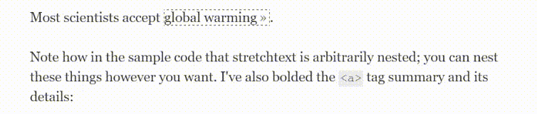
BBC Labs is is the BBC’s “innovation incubator” aimed at driving innovation in the organisation. Take a look at BBC’s explainers project, a BBC labs initiative. In it, the BBC is trying to embed “explainer” interactions into the words of articles that would create dialogs that help define concepts, and link to other articles that are tagged with the concept.

BBC’s explainer Project. Via: http://bbcnewslabs.co.uk/projects/explainers/

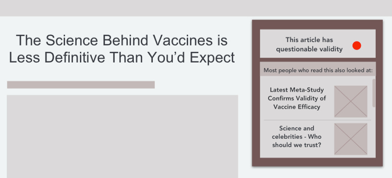
Our experience of news, however, is so much more than whether we understand it. Our experience of news is tied intimately into how it’s written. News can affect our worldview simply by linguistic style, the use of particular words, or a focus on certain aspects of information.

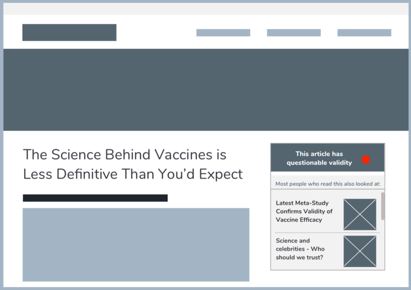
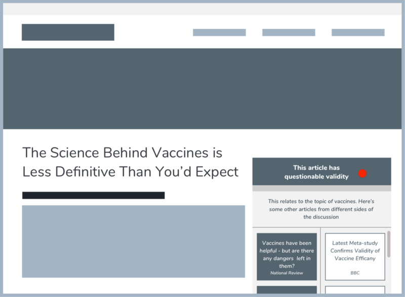
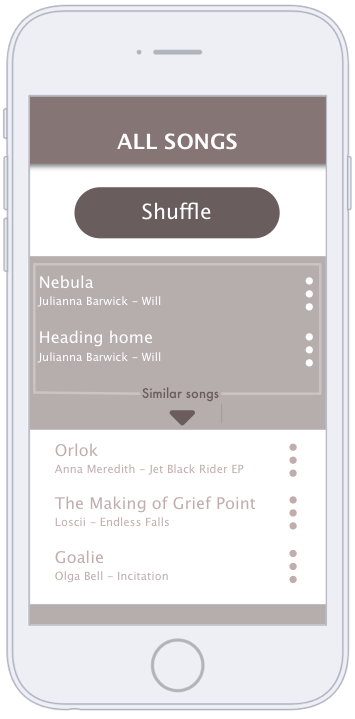
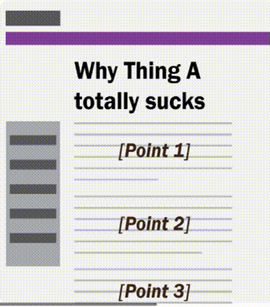
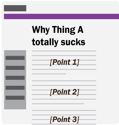
Technology could provide us with the means to be more critical of the news. Take a look at the rough wireframe I’ve mocked up below. In it, various semantic and syntactic choices in the journalist made are highlighted by the click of a button. With it, we can see how an application may detect words, syntax, and other features of language to sway opinion.

Those involved in creating the news can be taken to task with an app such as this. News organisations and journalists could be viewed with a much more critical eye. But how does this help news organisations? If readers can become more educated and critical of journalism itself, journalists and news organisations are forced to become better at their job, and produce a more accurate, robust and effective product. Users demanding more means that the news becomes better.

User Research

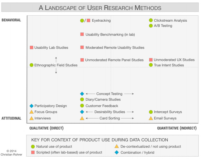
One of the key takeaways from the aforementioned Thought Leader Summit was the importance of user research. User research can reveal an enormous amount, but most importantly it can discover:

  • how users read the news

  • how users consumption of the news revolves around their daily routine

  • the formats that users want to, and are most are able to, consume the news

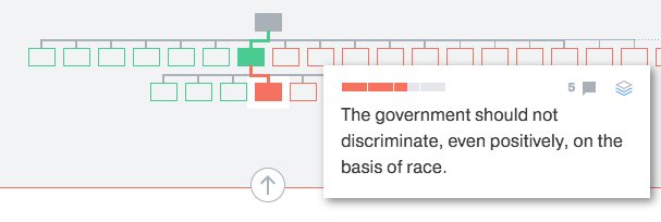
Many might think that all user research may be with regard to the news is analytics, but analytics can’t describe the characteristics listed above, least of all any of the why’s involved in them. For that, more qualitative user research is needed, such as user testing (in person or remote), surveys, interviews, focus groups, diary studies, guerrilla research or numerous other methods.

A map of some of the techniques that can be used for user research.

As Nieman Journalism Lab reported, both ProPublica and the New York Times have undertaken user testing, from long form diary studies to remote user testing.

Any new features that are aimed to enhance UX must be tested thoroughly, with an eye toward usability, user experience metrics (such as comprehension or usability), as well as other more ethnographic data, such as at what point in their day might someone use a feature.

Personalisation

Integrating UX into news is a prospect rife with difficult issues. Matching news to a user’s needs risks losing objectivity as a user with particular political stripes may only want to hear news reflecting their political outlook. Imbuing UX into news risks corralling users into “walled gardens” of news. Users may want only news on a particular subject or outlook, but as noted earlier, it’s the news’ jobs to make citizens fully informed of the world.

On the other hand, not all users want to hear everything, and some users want to hear more than others. Or, as Nieman Lab pointed out:

“People who know a lot about a story get bored by obligatory background; people who don’t know a lot about a story don’t get enough context”

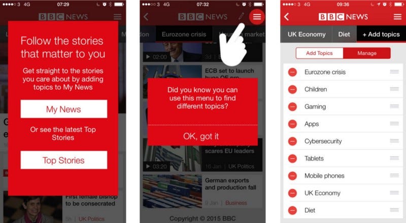
The BBC’s app revamp in 2015 was aimed at personalising the news experience without cutting the user off from regular news feeds. The updated app allowed users to add topics to follow, providing a “My News” section beside “Most Read”, “Most Popular”, etc. In this way, users have a personalised experience, but also aren’t walled off from the rest of the news world.

There’s a fine balance between telling users what they want to know and what they need to know. But news stories can also be personalised by making certain parts of news stories relevant to people. This can only be done by granulating the various bits of news stories into taggable, flexible chunks that can be reformed into stories and other narrative structures more appealing to users. One might call this atomisation.

Atomisation

The long and short form news article is a leftover from an era of the broadsheet and tabloid. These aren’t formats that leverage the capabilities of the digital. I’m not just talking about the potential of multimedia integration (video, commenting etc.), but rather an experience of the news that has the individual elements of stories structured around user needs. Content, even of individual stories, need not be the same for everyone — everyone’s information consumption habits are different.

Kevin Delaney, the editor-in-chief, president and co-founder of Quartz, a digital only start-up, feels that the normalcy of the 800-word article has to end. He argues for the atomisation of news into pertinent, mobile chunks that can form personalised news dashboards. Delaney says this isn't too great a loss anyway:

“A lot of the 800-word stories have been padded out with the B matter. It’s called B matter because it’s B grade, not A matter, which is the focal point of the story.”

Refer back to BBC Labs again. One of their workstreams, atomized news, involves projects aimed at playing with granular elements of stories. They describe their initiative:

“Some segments of the audience find existing BBC approaches to news unwelcoming. We set out to explore if taking a completely different approach, segmenting stories into their constituent parts, would be more attractive to them”

The possibilities of such projects are endless. Imagine a news feed that is able to reach into breaking stories to look for and pull out events, people, or places, that you’ve previously read about. Consider news stories or even headlines of stories reformatted to reflect details you’re interested in.

Of course, the risk of this is that news becomes uncompelling, lacking a strong narrative, a human voice. The App “Circa” found this out last year when it was forced to shut down. Based around chunking content into ever-updating stories, it failed to garner a following, and subsequently, enough capital. The UX was perhaps not looked at holistically — the concept was solid, but the content of the concept didn’t reflect user needs. Hopefully this will be a important lesson for future atomisers of the news.

News as reflection

What is the purpose of news? To inform readers of current events, and thus create a society of informed citizens, most would say. But being aware of current events doesn’t necessarily mean being informed of current events. Being aware of current events means truly understanding what is happening, why it is happening, and what means to humanity at large.

Take a look at two unique examples.

Lapham’s Quarterly is a beautiful, thoughtful magazine that discusses topics within the tapestry of history. However, the magazine fascinatingly contrasts topical events and culture with historical parallels. During Daylight savings time, the magazine posted a letter written by Benjamin Franklin about how to make use of the daylight we have to us —

“Every morning, as soon as the sun rises, let all the bells in every church be set ringing; and if that is not sufficient, let cannons be fired in every street to wake the sluggards effectually, and make them open their eyes to see their true interest.”

— and infographics compare an English Duke’s from the 14th century to Donald Trump’s.

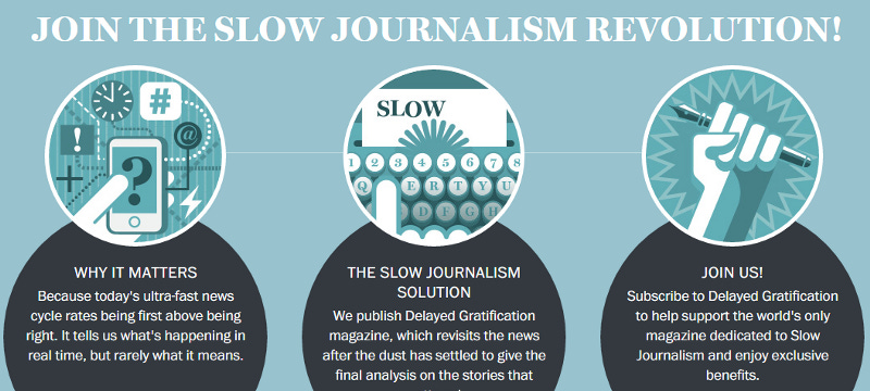
Slow Journalism magazine is a magazine that involves stories that broke no fewer than 3 months ago. It provides long form journalism that explores the context of a story, letting time accrue to examine how a formerly current event has panned out. In this way, it contrasts itself to other news organisations, who seek to be the first to break news.

Slow Journalism’s homepage

News as a reflection of the past, or in the context of time accrued, refocuses news away from the cult of the “breaking”. This opens up whole new experiences of the news to the user, experiences that are unique, insightful, and thought-provoking. To be among the first to do this is an attractive option for any news organisation.

Readers as Participants

Understanding readers as participants is not really a new concept as commonly understood. Citizen blogs pepper news sites, and front-line journalists are being replaced with someone with a twitter event near breaking news . But that’s a single reliance on readers as an outlet, not a editor, curator, navigator, or a sense-maker of the story.

Often even more apparent than that, there’s an idea that citizens are just ‘reactors’ to the news.

“Exploring the relationship between journalism and active audiences, most research has suggested that legacy news media resist rather than embrace such participation. Journalists typically see users as “active recipients” who are encouraged to react to journalists’ work but not contribute to the actual process of its creation”

-Lewis and Westlund write in their paper Actors, Actant, Audiences and Activities in Cross Media News Work.

The expansive roles that readers can play in the news has hitherto hardly been examined.

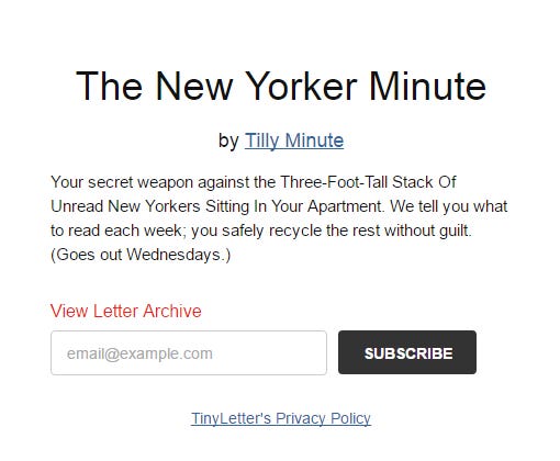
One example may be The New York Minute, an email bulletin periodically sent out by anonymous few New Yorker readers that summarise each of the magazines’ stories,and recommends which stories should be read. This is a fascinating example of atomising long form journalism in such a way that the depth and breadth of an article is not lost; users are able to comprehend the full context of each issue, and move forward from there. However, it is New Yorker readers who take it upon themselves to write succinct summaries/reviews of New Yorker stories, not anyone who works for the magazine.

The New Yorker Minute simple signup page

But there is a more obvious example.

More often that not, news is passed through sites (Huffpo, the Guardian, NYT, Washington Post, etc) then editoralised by our friends and family members on Facebook or Twitter. We witness content through the prism of our friends, peers and thought leaders words. Users pick new sources to share, as well, reflecting their own tastes and beliefs.

In this way users are curators, editoralisers, sense-makers and navigators of our shared news world. News organisations need to realise how their news is being filtered and steered by users — users are creating an experience for other users. They are not just reactors, they are presenters, filters, sense-makers and thought-provokers.

In order to grasp this phenomenon, a holistic understanding of how news is framed by other users must be incorporated into the user experience research and conceptual development of news UX.

None of this far fetched. As noted, many news organisations are already beginning to incorporate some of these ideas. Most are not. Budgets are a constraint, but news’ UX can certainly be done cheaply. Indeed, just an awareness of these concepts alone means that news organisations can stay one step ahead.

And news and UX aren’t so different. As Alex Schmidt notes, there’s a lot of commonalities between journalism and UX. They both require careful observation, the ability to ask questions, and a whole whack of other parallels.

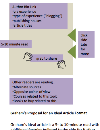
It’s not unreasonable to say it’s we are flooded with new ways to learn about the world. Ensuring these experiences are robust, effective, and enjoyable isn’t just something that’s good for new organisations, it’s good for all of humanity.

#5
April 21, 2016
Read more

To Focus on Why, not What, in User Research

A significant difficulty involved in tackling user research is finding a way into the user’s head. Many researchers avoid this entirely, and focus simply on what a user does.

Accordingly, focusing on what a user does can lead to a magnification of the importance of a single aspect that the user is engaged with.

Let’s take an example (a simplified, reduced example, but one that it is illustrative nonetheless). You are user testing a retail website. A user browses to a sewing machine and clicks on photographs of it. When doing a thinkaloud, she may casually tell you that she liked the photo.

Now, you take that information back and report on it: “Photos appreciated by users”. You might then prototype and test a design with more product photos.

The rationale for the user’s actions, however, is not truly understood in this scenario. This is especially important for something like this, where a usability issue is not involved. Yes, the user liked the photo, but why? Was it because she liked the aesthetics of the photo? She recognised the brand of the sewing machine? She thought she recognised something in the photo that was useful or novel?

If any of these reasons were the case, the conclusion that more photos = better may be a specious, or at least an exceedingly shallow conclusion to draw from the data.

Continuing the example, if we had pressed the user and examined why she liked the photo, we may have found that perhaps, she was curious about the size of the sewing machine and that clicking on the photo was the best method to understand how large it was.

What are the aspects a user is interested in?

If we understood this we would glean much more than the conclusion “add more photos”, which may be fundamentally not what users are interested in, but only a superficial manifestation of a deeper rationale. Understanding this rationale, this why, allows user researchers to grasp the cognition of a user.

Returning to the sewing machine example, the user essentially wanted to understand how the sewing machine would integrate with her life, in a physical sense. In understanding that users on this site are interested in understanding how products integrate with their lives, we might want to prototype methods that facilitate this. We might want to user test a prototype that displayed pictures of multiple angles of a product, or showed the product in context with a person, or allowed users to see a video of a product in use, or even allowed users to superimpose pictures of the product on pictures of their home or person.

I recently completed my Masters thesis on this very topic — why users undertake interactions when they are using the web. After a bout of research, I developed a typology of the rationales users used to describe why they do what they do when browsing the web. These were not rationales for overall goals for web browsing, but rationales for single browsing interactions (clicking on various elements).

These types of rationales were divided into 4 categories: (in actuality the rationales were reactions to the content they were looking at, which then informed the rationale for their interactivity — but that’s perhaps needlessly in depth!)

  • Appeal: Users perform an interaction because they quite simply find something appealing or unappealing. This appeal may be due to the visuals, where it is in the hierarchy of the site (e.g. near the top of the page), the emotions it elicits, or many other aspects.

  • Apprehension: Users sometimes doing things because they want to “apprehend” content. These rationales involved a user seeking to, or failing to, acquire or comprehend content. For example, this might involve a user clicking because he wants to further understand some written content, or could involve a user clicking “back” because he fails to understand content.

  • Congruence: Sometimes users are looking for something, and what they see may be congruent or incongruent with the idea of what they are looking for, thus they’ll often click on a link that when the content is congruent with their expectations, and click ‘back’ when it is not. For example, a user may have the name of particular person in mind, and not seeing it listed, they may hit ‘back’. This is the main reason for interactions people use when they are “finding” things. This idea is also closely related to the idea of “information scent”.

  • Life-world Orientation: Sometimes content that a user sees impacts their life, or zone of experience that is their world. This content might affect their past, current, or future life, (or it might not) so they perform an interaction.

Note that these typologies are not mutually exclusive — their may be multifaceted reasons as to why a user does something.

On identifying these rationales in users, we can consider design suggestions that acknowledge and reflect these rationales. I developed a framework of these suggestions for my MSc. You can check it out here. It’s lengthy, and expects that you know the sub-types of user rationales.

But a good deal of them are self-explanatory.

For example, if we did user testing where we looked at a user’s rationale, and we kept discovering that users were clicking back because they read everything on the page, we might categorise their rationale in the realm of Apprehension, in that they clicked back because they apprehended and exhausted all pertinent information.

What can this tell us?

That users are interested in the information and they likely want more. We can see that users want more of this particular type of content, and that we should structure this page, or collection of pages, around this. For example, we might work to create more related links.

It may be that it is in the site’s best interests that the users do exhaust all the information, so they perform an action (like click a call to action for more information). This is a positive outcome, and would require no change in the site, but even then, seeing this result allows us to understand and confirm that this is a quality on the page that is eliciting a preferred user interaction.

Indeed, understanding why a user does what they do helps understanding the user’s cognition as a whole. It makes it far easier to empathise with a user and model their cognitive behaviour.

Investigating the user rationale is a concept with a great deal of facets and depth — I’ll certainly write about it more. But in the meantime, should you want to learn more, click here to take a look at my Masters thesis, which has a whole lot more detail about what I have been discussing.

#4
April 10, 2016
Read more

Media Literacy : Applications and

I

The premise behind self improvement applications is that we can become better, more efficient people.

II

There are numerous applications that aid self-improvement:

#3
February 2, 2016
Read more

The Vast Emptiness of the Daily News

Our attention and emotional output are better spent elsewhere.

In 1846 Kierkegaard had a profound realization:

“Even if my life had no other significance, I am satisfied with having discovered the absolutely demoralizing existence of the daily press.”

He was struck by how the public reacted to the daily uptake of news, a relatively recent construct. He found that the public were no longer constrained by their locality — relegated to the news of the extended family and village. Instead, they were privy to the wider sphere of their existence — politics, trade, scandals and more.

#2
June 1, 2015
Read more
  Newer archives Older archives  
Powered by Buttondown, the easiest way to start and grow your newsletter.