When I was much younger I loved video games.
My rather strict father did not.
So I only played them when he was out of the house. When I heard him come home, I’d switch the Super Nintendo off, slide it under the TV and scamper upstairs.
Ours was a fairly noisy neighbourhood, so I’d have to pay attention for a particular set of sounds peculiar to his presence. His car let loose a unique groan as it heaved to a stop, and if I missed that, his weighty march up our stairs was my last cue to make a quick escape.
These were signs to me, in that they were things which represented something else that had an effect on me. The engine groaning let me know of the presence of my father’s car, which in term had the effect of communicating the fact that my father was home and that I should quickly find a save point and shut off the Super Nintendo.
The brilliant pragmatist philosopher Charles Sanders Pierce would give this sign a definite structure using his triadic theory of semiotics (signs): the groan of the car was the sign, which was motivated by the object, my father’s car, which told me that I should shut the games off, the interpretant.
Pierce believed we are a sign-making species, that we fathom our world as a series of shortcuts. We perceive our speech, our visual world, even our thoughts as representative of a further meaning.
Pierce spent decades formulating a complicated theory of signs, stating that this was different from conceptions of how we understood language (though he saw language as a library of signs as well). Of particular importance was his notion that the effect that signs have could not be pre-determined.
This is important for a variety of reasons to Human-Computer Interaction. We input code into computers and computers work within and between themselves on a code-by-code basis, in which interpretation isn’t a factor: computers process using a term-to-term relation, with a single pre-determined correct response. Humans , however, have a very personal and individual sign-making process that results us in each having a varying array of interpretations to the signs around us.
Nowhere is this more true than within how we perceive computers, which are systems of signs outputted to us. Were we able to process these signs unambiguously using a term-to-term relation like computers, developers and designers jobs would be much easier. Sadly, we are not able to do this— hence the field of user experience attempting to scry our varied interpretations.
The signs that computers reveal to us are essentially communicative mechanisms for an entire array of meaning that a developer or designer is trying to communicate. Unfortunately, the bandwidth for this communication is limited, usually by a particular set of pixels in a particular area of the screen.
Now, anything can be a sign. Anyone can think that a particular set of visual stimuli can indicate something, within the realm of computers we often think think of icons as the only signs.

An icon, a typical HCI sign
Yet what we might call ‘icons’ are actually not icons as defined in semiotics. See, Pierce came up with a further triadic breakdown of signs — ‘the sign making process’. That is, how signs point to their objects or how objects “motivate” their signs, as Pierce would describe it. There are numerous extremely clumsy explanations of this on the internet, so I’ll endeavour to be more accurate without being horribly convoluted:

An icon of a woman
There are icons, which share visual characteristics with the sign of something that may or may not exist (a human character in a comic book would be an icon of a human).

An index of something burning
Indexes point to the occurrence of something that exists. It simply says “here is something” (smoke is an index of fire — or at least burning). What’s important with indexes is that their objects have to exist “dietically”, that is within the context of the sign. Indexes are hugely important in HCI, because almost every visual artefact is structured by a designer to point to particular functionality or information.

A symbol of peace
Symbols are signs that we know through custom or law. We have to have a previous set of knowledge to understand what they mean (you wouldn’t know that a dove referred to peace unless you were told or you knew from experience).
It’s important to note that each one of these aren’t mutually elusive, to varying degrees we can see how a sign can motivate it’s object to varying degrees by all 3 of these processes.
Let’s conduct a simple analysis to get this straight.
Take a look at the signs (I’m going to say signs rather than “icons” because as I’ve noted, an icon is a type of sign-making process) along the left side of Hootsuite, the social media management platform.
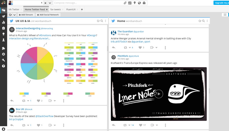
Hootsuite
Examine the 3 bars sign

If I run my cursor over it, it reveals that it is a button indicating analytics. So we can say that the object of the sign is the analytics page. But how does it indicate this? It shares a visual quality with analytics themselves by showing a part of analytics — the bar chart. Thus, we can say this is mostly an icon.
Now let’s look at the gear at the bottom of the sidebar:

I run my cursour over it and I can see that it indicates “Settings”. So how is it indicating this? It’s a gear, but the ‘Settings’ themselves don’t contain any “gears” as such —so there’s no visual similarity between the gears and the settings. It is however a visual metaphor for inner workings (gears are to a machine vaguely what settings are to a computer) so it slightly iconic. But ultimately, you have to know that this is the accepted symbol for settings — an object that was used in machines and now, through some continued process of semiosis has come to be accepted to mean “settings”. This then, is mostly a symbol.
But now let’s look at the little puzzle piece:

If I run my cursor over it it indicates that it is an ‘App Directory’. Does it share a visual characteristic with an ‘App Directory’? Not at all — perhaps it is a visual metaphor but if it is, it’s a very stretched one. Is it a commonly understood symbol? I can’t imagine that anyone would say that it is a commonly understood symbol for an App store. So we might say that this is doing a pretty poor job of its indicative process. It’s object is doing a poor job of motivating its sign.
We haven’t looked at any indexes within this context. But an association with context will allow most users to understand that these are indicators of something within that context. Following Gestalt’s rules, we know simple ideas of proximity and bounding are important to users, and in themselves are indexical. All of the above signs say “here”; they all point, act as a reference, to a particular thing that actually exists in the context of the sign.
But let’s widen the scope of Hootsuite and think about an index that perhaps isn’t more an icon or a symbol — something more abstract: the grey header of a page.
If this is a sign, what’s it’s object? Well it seems to be saying “here are the meta functions”. Yet it’s certainly doesn’t have any visual characteristics of search. Does it point to anything? Well yes — it seems to state “here” are the objects. Is it symbolic? This seems less convincing. Certainly headers are an accepted model for meta functions, but they hardly require a user to understand an existing law to understand the object. What’s more its not indicating an object in the abstract, its indicating something within its context. The symbol, if there is one, is very mild, perhaps just saying “this is a known meta-type grouping” . It can be difficult to understand how this works with all of the other symbols involved — so let’s reduce the page to a low-fi wireframe.
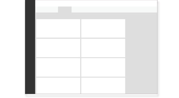
The indexical signs now become clearer. We can get a feel for the overall groupings and how they point to the objects that sit within them. There might be roughly 3 indexical groupings, the white, the light grey and dark grey headers.
Let’s recap. Each of the signs looked at has different degrees to which it motivates its object. We can rank them based in a bar graph. Each of these signs are, to varying degrees an icon, index or symbol.
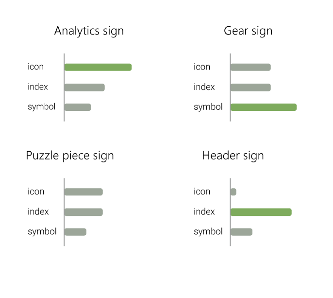
Each one of these — bar one — has one type of sign-object relationship that is stronger than one another, strong enough that it defines the sign. That is to say, the defining characteristic to the user of the analytics sign is that it looks like an icon, the defining characteristic to the user of the gear is that it is a known symbol, and the defining characteristic of the header is that it points to objects near it.
What we can understand is that anything can variously have some type of sign-object relationship to a degree but it has to be at least enough of one type of sign-object to be interpreted.
One of these signs doesn’t have enough of a sign-object relationship to be properly interpreted. The puzzle piece sign, notable in the bar graph by a lack of sufficiently long green bar, isn’t enough of an icon, index, or symbol. To a degree, it is all of an icon, an index, and a sign, but it isn’t enough of one to sufficiently represent of its object. The semiotic process falls apart.
A cursory view of the signs in websites and apps will reveal all sorts of signs that fail this test. It’s safe to say then, that developers and designers must pick one of these sign-object relationships to be the primary driver behind their signs meaning. And if they don’t?
Well, they’ll likely be serving up a confused array of interpretants.
More on that, and the problems with uncontrolled semiosis in Part II.
You just read issue #11 of DisAssemble. You can also browse the full archives of this newsletter.