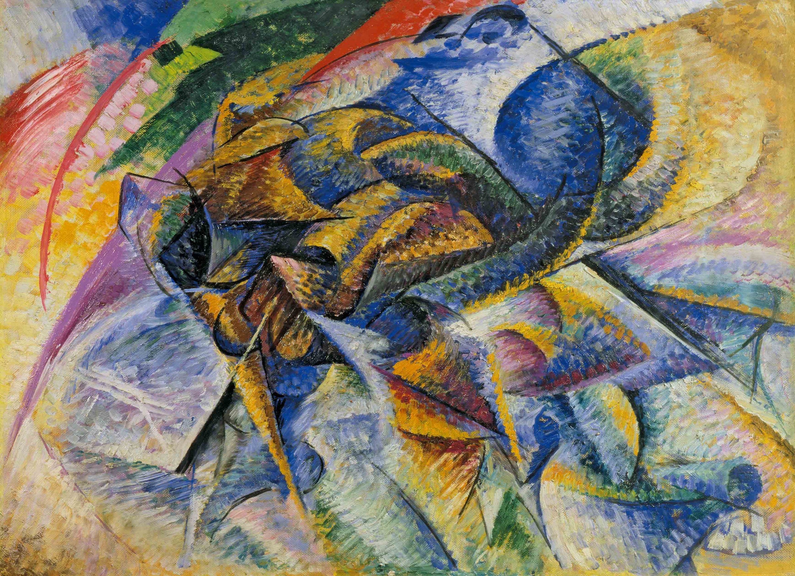
Umberto Boccioni, 1913, Dynamism of a Cyclist
I spend my working days at a company that builds a social media management platform for charities. We recently conducted user testing on landing pages that advertised our product and kicked off our onboarding process. The idea was to explicitly ‘get across’ what our platform was like prior to having users sign up and actually use the platform. We wanted users to ‘get it’, and understand the advantages of our platform without actually having to use it first (as signing up can be a barrier for some people).
But in testing our advertising and landing pages, we received a lot of comments like:
“I wanted to know what the tool feels like”
“I just want to get to grips with it”
“I want to just have a bit of a play around”
People seemed to want a visceral experience with the tool. We tried clearly explaining what our platform was like in videos, descriptions, and images. We represented the platform and what it does in explicit detail. But it wasn’t enough. The participants had an almost indescribable urge for tangible experience, to know what each step of our tool felt like. They couldn’t put their finger on it, they just needed to use the platform.
Why do people feel like this? Why do people need to try out tools to ‘know’ them, even if they’ve seen them represented in explicit detail?
We like to think that we are in essence just brains floating ‘outside’ the world as impartial observers, with sensory apparatus like our eyes inputting data that we can process and act upon. We consider our cognition — our ability to understand — to be akin to computer processing.
So, when we talk about our cognition, we say things like “I need to process that”. We analogise the brain as hardware and thoughts as software, as though we are in essence an electronic machine. Importantly, we also consider thinking a linear sequence of perceiving, planning, doing, and interpreting, much like a computer program. We input data into our mind, process it, make a plan, then enact it, and interpret the results. You might call this a ‘computationalist’ theory of mind. Of course, it’s more than a theory, it’s a sociological metaphor. Metaphors are extremely powerful; the philosophers Lakoff and Johnson argue that we understand our world through metaphors.
Accordingly, a great deal of tools we use have been designed in such a way to reflect this metaphor of our cognition.
But we are not computers.
The way we go about knowing the world is fundamentally different.
We have bodies. We evolved with bodies. We evolved with our environment.
As our brains are parts of our bodies, they evolved with the rest of our bodies, and alongside our environment as well. Our ability to think wasn’t ‘created’ and it certainly wasn’t ‘created’ with an end goal in mind, such as processing information.
Think of our cognition, then, as being embodied — as part of our bodies, as a thing that has a context, a materiality, and a history of development. This means our cognition isn’t just thinking with the brain, it’s a systematic whole that involves perceiving and acting in and on the world.
Our perception is linked to interpretation — seeing faces in clouds, not noticing changes (‘in-attentional blindness’). Even basic things like recognising shapes, shadows, edges, movement — these are constructed as a perceptive act. We see the world not just subjectively, not just from a different angle as other people, but as a unique, on-the-fly construction. Our perception is attuned to interpret sensory input in a way that constructs meaning, based on past experience and from our biological evolution (we are attuned to recognise faces, for example). But we do not consciously think any of this out — rather, it is anticipatory, immediate, and implicit. Yet it is sensible to say that perception is part of cognition, in that it is a part of how we enact our individualised sense of the world.
We use our actions to alter the world to help us think. We organise our world to help us remember where things are, or that we have to do something: a note by the door; all forks in the drawer by the fridge; clean clothes in that basket not that one. Action reveals, organises and groups — it interacts with how we think about our world. Acting on the world can take the burden off our brain — and in doing so it becomes a cognitive act (the Academic David Kirsch referred to these as ‘epistemic actions’ — actions intended to facilitate information processing rather than pragmatic result).
These two elements — action and perception — are tied very closely to one another as well. The philosopher Merleau-Ponty gave the example of a blind man using a long stick to help him navigate his world through touch. The stick becomes ‘transparent’ to the man — he stops being aware of the stick as a separate object in space, but instead his focus is on how the stick interacts with objects in space. Perception and action are intertwined in an act of cognition.The same is true of all objects we interact with when we use them as tools, as well as our bodies.
This man is not focusing on the stick, but the the feel of his surroundings via an embodied stick
So, let’s start a sentence that builds on this point:
Perceiving and action are part of cognition.
Great. But it isn’t just that action and perception are a part of cognition, they are creative acts that feedback into themselves.
It’s perhaps easiest to understand this by comparing our cognition to a computer’s processing. You don’t plan your actions then enact them robotically the way a computer would. You just act , you just perceive— your actions aren’t analogous to you explicitly thinking: “Now I’m going to look to my left; next, I’ll reach over with my left hand to grasp a magazine”. While we are aware to varying degrees of how our body is engaged with the world, we are to a greater degree reflecting on wants, desires, feelings, etc, and that output of manifests as actions and perception. Ours is a generalised intent rather than a specific plan.
What’s more, as you act/perceive, the feedback from you doing it informs the next action/perception activity you undertake. Think how you explore what you are saying as you are saying it; when you are drawing, the act of drawing helps you to understand the shape and detail of the drawing as you are drawing it. Each action is an expression of cognition, of what you are thinking. Each act is a feedback loop that is inseparable from the next act. We do something and in that doing we learn more about what we are doing.
The anthropologist/philosopher Lambros Malafouris has argued that, in this way, cognition cannot be divided from our world “‘material culture is potentially co-extensive and consubstantial with the mind”.
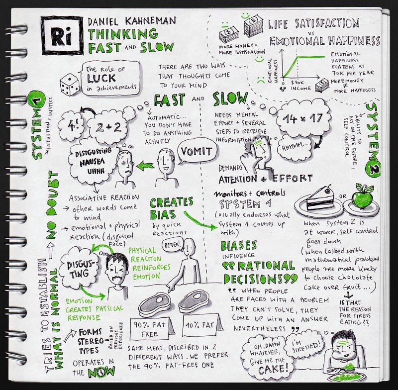
So, normally, our immediate actions aren’t explicit. They are responsive, instinctual, implicit activity — more of a vague intention that a plan. Much like Daniel Kahneman’s System 1 thinking, we act and perceive without carefully modelling each activity we are going to do, and then planning how each activity is going to ‘run’ on the world. We just perceive and act to help us create an understanding.
Kahneman and Tversky’s System 1 and System 2. Via Eva-Lotta Lamm
This gets very abstract in certain actions which seemingly have no relation to what we are thinking about. Think about gesturing — people think it’s a way of communicating, but that’s very often not the case. Blind people gesture, for example.
This is why my research participants earlier couldn’t specify exactly what they meant — it’s very challenging to express how the combination of action and perception can help you understand things. It’s an intuitive understanding that isn’t just about impartially observing how things work, but implicitly understanding a process or tool by conducting a sort of acting/perceiving loop upon it. And it’s worth noticing that this is different from ‘practice’ — practice is about improving on an existing knowledge base, not creating an initial experience of embodied knowledge.
Let’s update that sentence:
Perceiving and action are an embodied part of our cognition that helps us intuitively create an implicit understanding of our world.
But of course, we can’t just create a world to understand out of nothing. Our world only allows for explorations that ‘afford’ it. This idea was pioneered by JJ Gibson who also coined the term ‘affordances’. Affordance, in his reckoning, simply meant a situation that enabled a possibility for for action. A stick can be used to hit someone with, or to point with, or a sensory tool for our previously mentioned blind friend. But different objects afford different actions better than others. Stairs afford stepping given their shape — you would be hard pressed to do something like lie down on them, a bed would afford that much more effectively. Affordances don’t even require our awareness: a hole can be used to hide in, but it can also be fallen into by the unawares.
The handles affords a specific type of grasping
Again, let’s update that sentence:
Perceiving and action are an embodied part of our cognition that helps us intuitively create an implicit understanding of our world through affordances.
So taking us back to our original question: we need to act and perceive to help us create an understanding of our world through affordances. And when we do, it’s often implicit action formed through generalised intentions rather than plans. And of course, these can only happen through affordances. This is what my research participants wanted to do.
There’s a problem in all this however.
The problem is that computers and the software on it are designed for people who act like computers. Obviously this was worse in the past, but it still remains.
We still ask users to create mental models of information and interaction structures that they can’t possibly grasp without significant experience with our products. And people find it difficult, or at best laborious, to understand the situation that doesn’t reveal itself through the kind of embodied cognition discussed. We force users to build representations and then make them navigate those representations in their mind to understand how an interaction would work. We force them to model it rather than generate implicit understanding through embodied cognition.
It’s much easier to define a structure that expects a person to linearly process concepts rationally into a whole than to apply concepts of intuitive understand through perception/feedback loops, as I’ve discussed.
But the divide of the world into perceiving, thinking and doing is a false one, or at least false enough that it has harmed the efficacy of digital products. This division between perceiving, thinking and doing is an artefact of the society and culture we find ourselves in. There’s no reason it has to be this way. It’s just the computer metaphor.
To be fair, it can be very difficult to create an embodied learning within the realm of digital products. HCI academic Paul Dourish touched on this in his book, Where the Action is. He notes that we implicitly ‘couple’ with things in our world (like a hammer) to get things done through affordances, but it’s very difficult to parse how we ‘couple’ with digital technologies because of the many layers of abstraction. In this way, it can be difficult to parse where the embodied action ‘lies’.
Still, there is a lot we can do to allow for — so let’s remember our sentence and look at some examples of how to implement it:
Perceiving and action are an embodied part of our cognition that helps us intuitively create an implicit understanding of our world through affordances.
Allow for guided doing
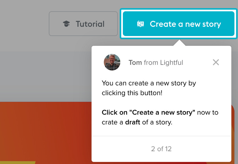
Computers and touchscreens are notoriously poor at providing clear affordance of action, given that screens are not tangible in any real sense, and are buried under layers of abstraction and interface. What I call ‘guided doing’ is the act of helping to create an intuitive understanding. By gently guiding someone through an action we allow them to understand the situation and how they are embodied in it.
You can see this in product tours — ours here as an example:
We at Lightful created gentle, stepwise product tours that got users to take the steps to connect their social media accounts and create draft posts. While some users closed the tour, a good portion of our users continued through it. New users who went through the tour posted more using our platform by quite a large margin.
Product tours are not perfect because it’s not just an implicit action-response the user undertakes. Instead users are required to read and ascribe an embodied meaning of the action through words, rather than just through action. However, product tours help by normally blocking out parts of the screen, and focussing on a single step in a way where perceiving and acting are the key activities, rather than explicit thinking. The objective of product tours is not just ‘showing rather than telling’, it’s requiring users to practice actions, integrating intuitive, visceral understanding of the rhythms, affordances and feedback of the product.
At Lightful, we tried explaining our our product , as though that would be sufficient — ‘if they can read about it then they understand it’, we thought. But this wasn’t nearly as effective as just getting someone to use the product in a way that embodied their understanding.
Words can be interpreted very differently. Semantics can’t communicate the implicit, embodied knowledge that embodied cognition brings. And this is vital for someone knowing and liking a product. When we got people to use our product with product tours the knowledge they received was unambiguous — there was an intuitive understanding framed by semantics.
Abstracted play
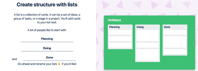
Abstracted play is the divorcing of the UI layer — the ‘noise’ — from the page to get the user to focus on what is relevant in a simplified, abstracted way.
You can see how Trello does this by creating a simple wireframe of their site and describing in simple words how to use their product. This is part of their onboarding process, in which people are still understanding the affordances.
Trello’s efforts brings affordances into clear view. The perceiving and acting become very simple. Our perception-action-cycle isn’t overwhelmed, trying to make meaning and finding affordances in a busy UI — it’s stripped back so the perception-action is straightforward.
What’s more, the user can see the result of their action in a highly visible manner. As they type, they see the names appear on the Trello columns to the right.
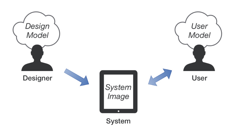
You might call this making the ‘system image’ clearer in Don Norman’s mental model structure.
However we aren’t asking the user to understand ‘system image’ explicitly. The perception/action loop is doing the work. Much like the blind man with the stick, the more ‘transparent’ you can make the correlation between the instrument and the effect, the better the embodied the understanding will be.
Microinteractions
There are so many microinteractions that do nothing to give the user an indication of what is happening. Rather, they look flashy, and pat a visual designer’s ego. Sure, some of them add an aesthetic flair, but many actually get in the way of an embodied understanding. Take a look over at Dribbble for some over-engineered animated microinteractions (I won’t place any here so as not to insult anyone).
Microinteractions should work as signifiers, affordances or feedback. Material design is an aspect of a larger system of microinteractions.
As the material guidelines state
“Motion focuses attention and maintains continuity, through subtle feedback and coherent transitions. As elements appear on screen, they transform and reorganize the environment, with interactions generating new transformations.”
Of course, material design isn’t a microinteraction, it’s more of a design system, but it contains a number of useful microinteractions. These include panels and drawers ‘swiping’ ‘in’ and ‘out’. The user can interact and get immediate feedback which then feeds into future actions.
The problem with material design is that it not always clear what affords what. Can you swipe everything? How do things that slide offscreen re-appear? Affordances, we remember, are possibilities for action.
The best microinteractions are those that are visible, have a clear affordance, and clear feedback when interacted with. Scroll bars are so successful because they require only perceiving and acting to understand. If you didn’t know how scroll bars worked, you could intuit it through action and perception: the scroll bar moves as you go up and down the screen.
Don’t require people to build a model of how things work
In the past 10 years or so, new digital creative tools have overwhelmed existing legacy tools. Adobe and Microsoft’s tools and many other older legacy software tools have been pushed from the spotlight. Sketch and Figma have replaced Illustrator and Photoshop in many areas. Keynote and Google Slides have shown Powerpoint the door. And so on.
Why?
Legacy tools have an underlying structure that belies how they see the user: as a computer, as a non-embodied cognitive agent.
These tools have many modes, invisible to the user. They don’t clearly reveal a user’s action. They overwhelm with unclear affordance in their UIs. They require that a user be taught how the symbolic creates an action (rather than just affording action), and how the model of all of the actions work with one another. It’s a significant cognitive overhead for the user that, in the past, engineers would claim is necessary.
You may argue “But I get Illustrator, it’s so simple”. Well, it’s likely because you have been trained, or watched videos about it, or Googled a great deal to understand the interplay of the modes, settings, tools symbols etc. You cannot pick it up and start using effectively like you would a hammer, Sketch, or Figma.
This symbolic knowledge is predicated on a lot of pre-existing learning
It’s increasingly clear that good design must incorporate a sense of embodied cognition to make tools more immediately useful and usable.
But this principle far far, from the ‘less UI is better’ canard. Indeed, less UI can often hide affordance, make it very difficult for a user to get an embodied understanding of a tool — everything becomes invisible and hidden.
Remember how we were talking about how distinguishing between thought and action was a fool’s errand? Well this should be reflected in tools. If I want to do something, it should just happen in a way where the goal is what is relevant, not the tool to use the achieve goal (ready-to-hand in Heideggerian terminology).
Context sensitivity, awareness of skill level, feedback, and consistent, predictable patterns can all help. When I act, there should be a clear reaction to my actions because I will attempt to both implicitly and explicitly make meaning of my actions regardless — and we should use that to help a user to understand. We shouldn’t ask them to build an enormous, complicated mental model of our tool, then shove them out into it. We should let them poke at it, and show what happens when they do. In that way, the tool can reveal itself to them through an embodied understanding.
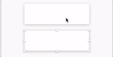
One of the most basic features in Sketch, for example is by pressing CTRL, you can visually see how elements interact, their space, their alignment to one another:
There’s no question as to what’s happening — spaces are shown and by moving objects we can see line length and space change. A user does not have to imbibe an entire mental model to understand this interaction.
There’s certainly some highly technical tools where embodied interaction is difficult. Obviously, an aircraft controller won’t be able to poke and prod her away around tools in an embodied way — the entire mental model needs to be understood prior to using the tool. That, however, does not mean that the learning methods for the tool can not be embodied.
The fallacy of separating the mind from the body has a lot of pernicious effects. Crappy digital products are probably the least of the problems associated with it. Still, starting from the ground up can change cultural practices on deeper levels. So, when designing something interactive, ask yourself these questions:
How can I embody the user’s actions?
How can I ensure that users don’t need to fill in the gaps of an interaction model in their mind, and instead represent it all onscreen?
How can I make feedback as reactive as possible to action?
How can I ensure each action leads to a better understanding of the next action?
How could I build my tool in such a way that a user who couldn’t read would understand it?
And we’ll all be well on our way to a more embodied word.
 (22790692681).jpg - Wikimedia Commons")