Before we think, we use metaphor to conceive — how can we use this understanding in UX and HCI?

Speeding Train (Treno in corsa), 1922, Ivo Pannaggi.
What is happening here?

….Something bewildering to those with any amount of digital experience: people are attempting to search the web using the wall of a Facebook page titled “Google Search App”.
Witnessing some people’s interactive behaviour can be an utterly eye-opening experience. Trying to fathom how someone conceives a particular digital system is similar to exploring uncharted, foreign lands. To many of us, it’s like watching someone trying to hammer a nail using a saw.
But we shouldn’t rush to laugh at those who don’t comprehend a system in the way that we would, in the way that designers want users to. In all likelihood the people above saw “Google Search” and a form field, and other people posting searches. Without considering what the designer was thinking, or having a mental model of what they were looking at, they thought “I suppose this is where I search”.
This then, is less manifested as an abstract conception of what “Google” is than it is an intention, realised in a moment, based on a situated need, embodied in a device embedded in everyday life.
That is to say, it’s not based on them having a mental model of the thing that they’re using.
Importantly, and almost certainly, a user would explicate a post-hoc justification. That is, if you asked them, they’d then think create and think about the mental model of the system they were using, and rationalise their actions based on it.
But rarely do people consider the system they were using in the heat of the moment — especially for trivial tasks. Rather they have implicit, unconsidered mental models, or no mental models at all. They simply see a medium through which they could potentially complete a task.
I spent previous articles decrying the limitations of the theoretical concept of the mental model, and rather than repeating those here, I want suggest a an approach that fills in the gaps of the mental model approach, or indeed, replaces it when neccessary.
In summary, this approach is entailed by the following premises:
In everyday life, to do a task or fulfil an intention easily and efficiently, you think about the task or intention, not the object that allows you to do the task or fulfil the intention
To do the above you must “couple” with the object in question, that is integrate with it so you don’t think about it, you just use it to complete the task or fulfil the intention
Interactive systems are very difficult to couple with as they contain all sorts of physical and digital aspects
To varying degrees are we able to couple with systems, or not couple with them.
Therefore we must successfully couple with a requisite amount of aspects of a system of these at any given point to use the system without having to think about it
Therefore, the ultimate question becomes:
How can we successfully couple with systems to go about fulfilling our intentions?
with a sub question being:
What are all relevant aspects of a system we need to couple with to fulfil our intentions?
To answer the former, we need to understand the latter. But the mental models approach, as noted, are deficient. It’s much effective to think of ourselves as intertwined with a changing ecosystem. Obviously, this ecosystem includes individual digital aspects — accordions, pages, labels, as well as physical aspects — mice, keyboards, touchscreens.
But before we get into those aspects, which, though relevant, don’t get to the bigger picture. Thus we need an approach to think about how we understand interactive systems as wholes.
Because as much as we couple with individual elements of a system, we can couple with these much more effectively if they are bound in a holistic metaphorical superstructure, and if they rely on our existing, implicit metaphorical knowledge.
Accordingly, the first part of this theory involves mimetic coupling. The thesis is how we how can we design things with an idea of what things are like in mind.
A bit vague? Don’t worry. I’ll explain.
Coupling mimetically
Gino Severini was an Italian Futurist painter. He and other Futurists felt the modern world was akin to a train: an inexorable, fast-paced metallic hulk that was forever moving forward. And in the 1920’s it certainly was — technology was amplifying speed of people and information exponentially.
Severini saw this movement — in trains, planes, and machines. But it was reflected in the natural world as well. In his painting, Dancer = Propeller = Sea he visualises a parallel of essence of these 3 extant objects into a single object:

We can see and even fundamentally feel these objects running through the visual motifs of the painting. The propeller spinning, the dancer twirling, and the sea crashing.
This painting, then, is able to represent the implicit similarity of each of the 3 objects, with us forming the connection. We don’t specifically see the propeller, the sea, or the dancer, but we understand how they are conceptually related. This piece of art, then, is a mimetic expression.
Mimesis, you’ll note, shares the same root as “mime”. Imitation is the key idea here. This imitation, representation or mimicry — however you want to conceptualise it — are vital in how we structure our own experiences for self consumption, but also how we structure our experience for consumption by others. As noted, mimesis is an important concept in the arts as well. Acting, an important mimetic art, showed or represented actions of a dramatic scene. First discussed by Plato, he thought of mimesis as humans’ representation of nature.
In digital mimesis can come in basic levels — such as the folder metaphors that appear on your screen. But what I discuss here is something both more fundamental and overarching — the deep and holistic mimetic experience of a digital things.
Much as we can feel the movement of a dancer in simple lines indicating movement and grace, we can feel these mimetic concepts in digital systems. We understand what the superstructure of a digital system is like — a library, a database, for example. We feel barriers in systems, we feel paths, sequences and branches. We understand what parts move and what parts don’t.
Whether we are aware of it or not, we think of things as being like other things in very fundamental ways. We recognise basic patterns and similarities, and as such, we are easily able to perform tasks in our word.
In their seminal work Metaphors We Live By, George Lakoff and Mark Johson discuss how these basic concepts form metaphors that help us understand our universe. There are many ways we can do this, but at a basic level Lakoff and Johnson described how the very fundamentals of our conceputalisation process are metaphorically inclined. Our sense of good and happiness is up. We fathom “centralness” as the centre of our vision, thus things that are presented to our line of sight centrally are important. In this way, our sense of having a body in the world has given us these conceptual metaphors that we then map on to other phenomena in the world.
Lakoff and Johnson called image schemas and semiotician Umberto Eco called primary schemas. These were instances of how the very nature of the physical world works, and how we give those physical states meaning.
The representation is, however, is almost never a 1:1 relation, especially with digital. We take one piece from once concept and blend it with others to form new representations. This process is called conceptual blending. It’s a heavily studied field, in every day life it is such a ubiquitous mental mechanism it’s almost invisible. Simply put: if you compare things that are not identical to one another, you are engaging in conceptual blending. If you are using metaphor, simile, or analogy you are engaging in conceptual blending.

Gilles Fauconnier and Mark Turner’s model of conceptual blending
Our ability to conceptually blend is our primary way of utilising mimesis. It’s how we can use digital systems. As I noted in the previous articles, we think toward an intent or task, rather than the system that does the task; that is, we couple our intentions toward it and use it without thinking about it in any conscious manner, much as we would pick up a hammer and hit a nail without needing a mental model of a hammer.
We think of digital systems as somehow different from a hammer, that there is some nebulous concept of “intuitiveness” involved. But intuitiveness, as Phil Turner notes, is a silly concept. Really, it’s just simple familiarity. Our familiarity with digital systems, he says, relies on our unconscious cognition that itself is reliant on existing knowledge.
We might call this behaviour “pre-cognitive”. That is, it is not a considered result. Of course we can reflect on a structure and ask ourselves “what is this like?”, “what is this conceptually similar to?” but as we couple with our technology to do our tasks, we aren’t focusing on the technology, we are focusing on the task. The process by which we fathom this “putting together pieces to understand” is implicit. This cognitive activity is evidenced in the most basic of activities — for example, you cannot not read a simple word if you look at it (if you’re literate). It’s automatic and unconsidered.
Users satisfice. Study after study has show that users won’t seek to understand the totality of ways to do something, they seek to find the first, best path that comes to mind. That first, immediate path doesn’t rely on reflection as the primary motivator — what Daniel Kahneman would called System 2 thinking (reflective thinking). Rather, it is implicit, unconscious immediate thinking — System 1 thinking.
But, as noted previously we can’t do System 1 thinking if we are having difficulty in smoothly coupling with something — if we can’t couple with something mimetically, we’ll have a very difficult time using it.
So, if we don’t understand the vast majority of what we digitally encounter in the abstract , we instead use previously existing understandings of schema, how do we design for this? How do we map the structure of a digital system — or a multi-channel system that crosses digital devices and flows into physical systems and places as well? How do we design for this being aware of mimesis?
These are extremely fundamental questions to ask. Given that our core behaviours are more and more intimately related to digital and IoT devices, the questions around mimesis will only become more pressing. If we don’t consider them, we will have a weak, confusing framework that we’ll ask users to understand.
Think about cloud structures or single-sign on devices. What is the mimetic structure of Google? Does it have a consistent visible, digital structure, such as a content block styled in a particular way that conforms to the task of what we are doing? Or is it amorphous, appearing as feeds, maps, search results without a consistent structure?

From Google’s material design guidelines
Material design is a first stab that Google took at a consistent mimetic theme, but it doesn’t reflect the more conceptual “shape” of the experience. For example, what does an “account” that is able to appear at different points in our lives move and feel like? Is it an adaptive entity that grasps new information or does it wait for us to give it information? What is mimetic “shape” of a entity that can reference connections in old searches with new searches? How can this all be mimetically consistent with itself?
These of course, are issues that Google and its peers will wrestle with in the very near future.
But, at a more grounded level, you can consider the the holistic mimetic structure of an individual website. This is no doubt difficult when there are multiple stakeholders, departments, and a variety of different, dynamic content types.
But there are fundamental concepts that we can keep in mind. For example, the idea of the invariant structure. We create a sense of place and space by understanding what moves and what doesn’t. From the moment our eyes first open as babies, we understand that things that move less are further from us. Things that don’t move, or move with us at all times are us.This basic conceptual understanding holds a great deal of importance for users of websites. Static, mostly invariant structures give us a sense of place, like the Sun or a mountain. A mouse point never leaves a page, because it is representative of us.
But further delineations of how things “move” go beyond single elements staying or moving by virtue of user interactions. For example, in addition to elements that move when you interact with, or move from, a page, there are also elements that alter over time — for example, feeds. We can borrow from linguistics and call the former, structures that modulate over time, diachronic. Those that stay static over time, we can call synchronic structures.

Feeds change over time
Let’s take an example: On Facebook, we can see that it has variant structures and invariant structures. For example, feeds are diachronic — they move over time. In contrast, a profile is synchronic, in that it doesn’t change over time, but rather requires a user to change it. But a profile is also variant structure — when you click on a link in Facebook it disappears. This is unlike the header, which is a invariant structure, because it stays with you wherever you go on the site.
Giving each of these elements these labels allows us to group them, to decide how to apply them, but most importantly, can help us map out the mimetic structure of the site. If we can conceptualise these mimetic structures consistently and understandably, it’s fair to say that users will have an easier time with our websites.
We can see how, however, mimesis is very weakly applied to most sites. Most sites don’t have a overall structure that builds on consistent, intuitive applied representation. Indeed, most rely on a folder structure. They have topics, and in those topics further topics and content is nested. Meanwhile, content itself has its own structural metaphors, often at odds, or ignorant of the overall structure.
Let’s start with a good example — the new Lexus Europe site (full disclosure, the company I work for developed it — and I think it’s pretty awesome):
Lexus Europe: Luxury & Hybrid Cars
Engineered for luxury and performance, powered by cutting edge hybrid engine technology. Go to our Official Website and choose your Lexus.

On first glance, it is clear that there is movement, in the background but also in from the left to the right, as you hover over links. There’s an opening-like structure on the left that reveals content.
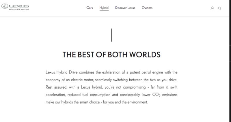
Meanwhile, as you move through the site, you can see an invariant header giving the site a stable structure. As you move through the site, it pushes you down, with movement of lines and pictures indicating localised areas to explore.
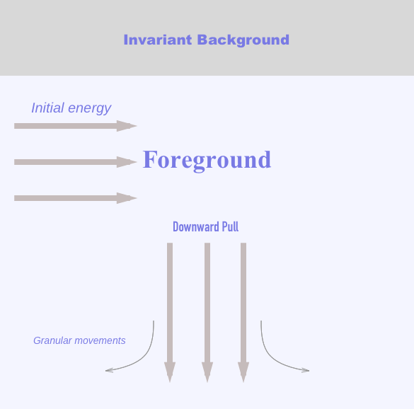
This is a rough graph of how the mimetic structure feels — as an overall emphasis. Naturally different users may have somewhat different interpretations if asked, but again, that would be a cognitive post-hoc justification. If a designer can approach a design with something like this in mind, the mimetic structure can be grasped naturally, without conscious thought.
Now let’s examine the mimetic structure of this site, the UK site for Lexus: https://www.lexus.eu/en/
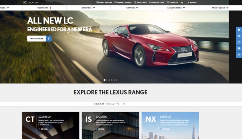
It’s difficult to understand what the site is trying to be other than itself. There’s no strong sense of movement, direction, place, or mimicry. It’s by no means a bad site, but the conceptual blending that needs to occur doesn’t cohere in anything we can even begin to agree on.
Where is general movement? To the left? Downward? Where is the direction of the site? There’s carousels, CTAs, content blocks, filters, and top navs. Now, this site obviously has a lot to do, but it’s clear that that what it’s structure is isn’t following a cohesive patterned mimetic structure.
Of course it’s difficult as sites by their nature follow a file and folder format, thus end up with pages that act as folders for other pages. Do all sites have to replicate a folder and file mimetic form? What else can they do? This is obviously a very important facet to examine, especially as sites become multi-channel, multi-device embedded and embodied experiences.
But newness in is mimicry always good. Let’s look at some less successful applications.
Keeping with Lexus, let’s look at their international website:

Home / Discover the Global World of Lexus
Where luxury and lifestyle meet, on the road and beyond.
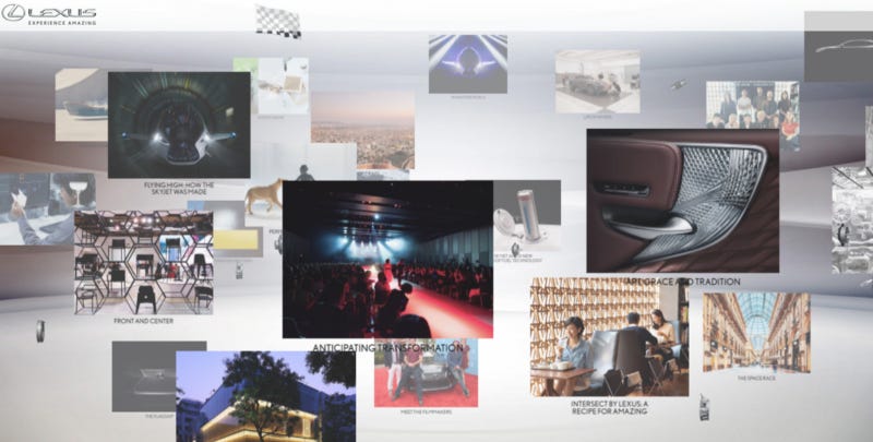
The Lexus international websites has stories, seemingly floating in space. The user can click and drag around the site to see different stories, of which some are in the background and some in the foreground.
Firstly, the user is confronted with instructions on how to navigate a website with what should be ostensibly basic content: they’re told to click to drag to see different stories. You may be aware of the maxim that, if you’re required to give the user instructions on how to use your system, you’ve got problems. Well that’s highly true for a website with basic content such as this.
But importantly, the site is forcing the user to create a mental model of the site, rather than just using a mimetic structure to allow them to navigate it easily!
Not only is this mimicry awkward to use, it’s difficult to see stories in the background. Additionally this representation is not consistent through the site. When you click a story you are faced with a flat text story.
There seems to be a goal of using a 3d space — a concept that we are very familiar with — but it still requires the user to pile on a mental model, and it’s awkward, and it’s inconsistent.
So, for different systems, we can see slightly different applications of mimetic structure. With social applications, it’s often interesting to ask, what are the diachronic and synchronic structures? With general purpose websites it’s interesting to ask, what are invariant and variant structures? With all types of websites and applications it’s interesting to ask — what is the mimetic feel of the site? What is the mimetic superstructure of the site?
But there are other applications — namely software — that rather than being directed toward information, are more directed toward the activity of performing a task. Microsoft Word, Axure, and Photoshop are all examples of this. This is often where mental models are useful. Rather than often being pre-cognitive, software takes deliberate learning in a bespoke manner. Due to the complexity involved in the acts of creation that these programs allow, users often think about them — or at least have to learn them — in a mentally assertive (System 2) way. But here too mimesis comes into play. Because software is to varying degrees is a remediation of existing media.
That is, new forms of media actively try to emulate existing forms. Communication Design professor Shaleph O’Neil discusses two ways that new media does this: through immediacy or through hypermedia.
Think about the word immediate — it is literally “i-mediate”, with “i” being a prefix of negation, in this case, of the media. So, new tech tries to hide the current medium. Think of a flight simulator, that attempts to show a view from a real cockpit, with no external elements. Hypermedia is the opposite- it contains overtly new elements that attract attention to the media in question rather than being separate from it.
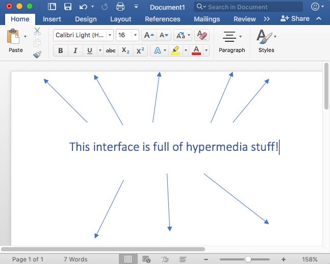
Consider MS Word, which adds all sorts of digital tools on top of what is a medium for writing — with its menus, options, and symbolic overlays.
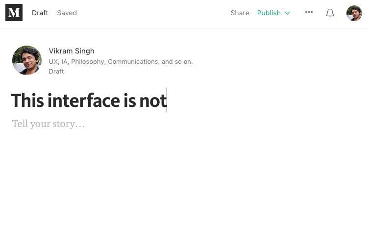
Medium on the other hand, with its clean, no-frills approach removes all extraneous elements other than the content and as such is more immediate (likely why it’s called “Medium”).
A key takeaway is the conceptual blending involved. What are the bits of old media that are the same from older media? Which bits are new, where are they from, and how are they blended with the new bits?
How is this media attempting to remiediate old media into new ones? Is it doing this through hypermedia or through immediacy?
A goal seems to be to have a experience be as immediate as possible — so that a user can focus on their intent rather than the display. But of course, this is very difficult — if you’re in UX, you’re very aware of the false promises of the invisible UI.
The way to approach this, then, is to think carefully about mimesis. Understanding the desired mimetic structure can help designers and creators to balance the immediate with the hypermediate in a way that is most suitable for the user.
What mimesis is is not modelling how something works. Because users don’t need a full model, they — we — aren’t nearly rational enough. Mimesis is how something seems. It’s what something seems like.
So what is it you are trying to mimic? Just another website?
If you’re still a bit confused: one last tip: look at the words that you use, or you want to use — they can help you. The mimetic concept of a “feed” for example comes from from an animal feed, a system for delivering food to livestock. Much like a river, it flowed into troughs for animals. A rather pejorative metaphor for its current digital application yes, but it shows how mimetic structure is often buried in a word’s etymology. Windows, feeds, tables — rarely are words pulled from nothing.
Same goes for systems you design.
You just read issue #16 of DisAssemble. You can also browse the full archives of this newsletter.