
Charts, skills, scales, and a strong beard game
There's a hedgehog at the end, at least
Hey friends, thanks for clicking in!
This week we’re doing design and business artifact facts, some of which are more fun than others, and none of which are as brief as I thought they’d be, right after these messages…
💝
[Past upcoming events snipped from archive]
If your team needs help with research, collaboration, or communicating across disciplines, get in touch about an in-house remote workshop, just for you.
Need strategy consulting, practice development, or anything else? We’re happy to receive your inquiry anytime: [email protected]
Charts, Skills, and Scales
It’s funny when you step back and think about what we consider as design or technology. Some things we pay special attention to or imbue with special expectations for somewhat arbitrary reasons. Others, we just stop thinking about and accept as givens in the world — concepts and methods and objects we use and don’t question — even though they’re formerly novel human inventions. (And, again, bummer that Heidegger was a Nazi, because he had interesting thoughts on this.)
Our topic this time around is familiar tools, techniques, and visualizations we use in research, business, and design.
It’s easy to get dogmatic, but it’s smart (and much more fun, until it gets upsetting, but it’s better to know) to stay curious and ask “Why do we do it like that?” or “Who was that Gantt guy anyway?”
So, this is a bit of a grab bag, and definitely a sketchy overview. I hope you find something that becomes a starting point for your own investigations, or at least an awkward conversation starter.
Content warnings for racism, eugenics, and slavery.
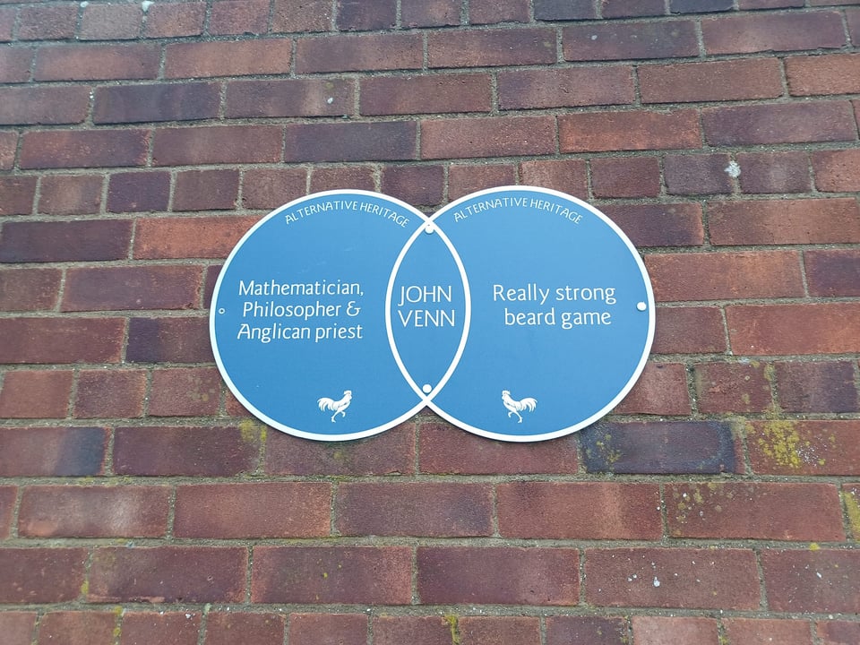
Venn Diagrams
John Venn (1834-1923) was an English mathematician and philosopher with very strong feelings about education. He loved math and hated being taught to the test as he was as a Cambridge undergraduate. After passing his 27(!) hours of exams, Venn sold his books and stomped off, becoming an Evangelical Anglican priest (like his departed dad). A few years later he returned to Cambridge and became a lecturer in logic and philosophy.
The overlapping circles that bear Venn’s name are his adaptation of diagrams created by the Swiss mathematician, all-around genius and reportedly nice guy, Leonhard Euler (you have to look at that amazing portrait). Venn, thinking like a good teacher, wanted to create a simple representation of logical relationships. His innovation was in visual communication rather than theory. Some theorists get salty about this.
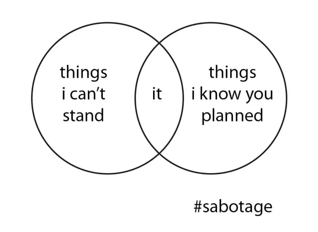
The wild popularity of the diagrams probably owes something to the fact that students subjected to the New Math (a short-lived educational trend post-Sputnik Cold War STEM freakout) grew up to make the Internet.
Set theory 🤝 memes.
Read: The Venn Behind the Diagram.
The Org Chart
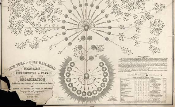
The world’s first org chart is actually really pretty as well as being an information design classic. It was conceived by Scottish-born American railroad engineer Daniel McCallum and drawn by George Holt Henshaw in 1855 for the New York and Erie Railroad as a way to get a handle on a very complex operation.
Our favorite org chart is that of Walt Disney Studios in 1943. The problem with most org charts these days is that they tend to specify the hierarchy and say less about how the roles interact with one another. While everything definitely flows down from Walt in this one, there’s at least a flow, to an outcome.
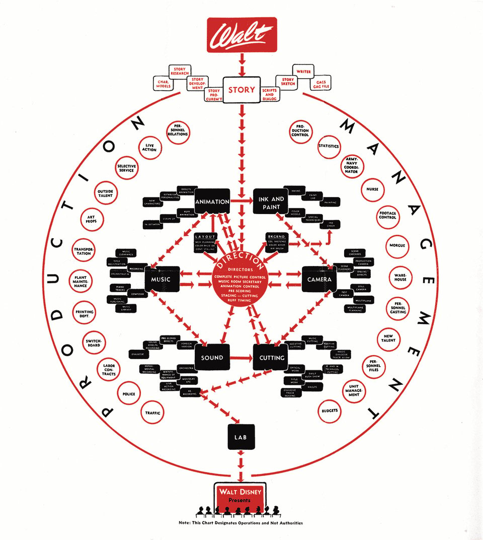
Organizational dysfunction often starts with those “higher up” being more concerned with status than outcomes, and increases with mutual ignorance of how various roles interact. A better diagram won’t totally solve this, but it could definitely help folks visualize how they’re supposed to work together in a more coherent way.
The Gantt Chart, and its antecedents
Brace yourselves, project managers. The Gantt chart, used to visualize production timelines with bars indicating the duration of each task, has a history worth sitting with for a minute.
Henry Gantt (1861-1919) was born on a Maryland plantation where more than 60 people were enslaved until after the Civil War. While Gantt opposed slavery and advocated for socially responsible business, many of the practices he and his colleague Frederick Winslow Taylor promoted as Scientific Management were directly inspired by the organization of labor under slavery. In particular, Gantt popularized a task-and-bonus system that parallels gig work today. His Marxist associate Walter Polakov brought Gantt charts to the Soviet Union where they were used to coordinate production during Stalin’s Five-Year Plans.
Polish engineer Karol Adamiecki arguably got there first and from a happier place, displaying interdependent processes on his harmonogram with nifty little movable paper strips. Because he published in Polish and Russian, his work didn’t have as much reach in the English-speaking world.
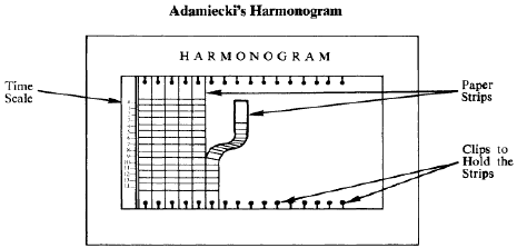
It’s worth mentioning William Playfair, another Scottish engineer and a scoundrel, who came up with the first known bar chart, and the pie chart, and did blackmail, and so much more.
And deadlines are even more upsetting when you learn the term originated in a Confederate military prison, designating the line beyond which prisoners would be shot dead if they crossed. In the early 20th century newspaper business it came to mean the absolute last minute copy could be sent to the printer.
The Likert Scale
(This bit is lifted from Just Enough Research)
The psychologist and pioneering social scientist Rensis Likert (pronounced LICK-urt) deserves better. His name is most closely associated with the survey scale he developed as part of his PhD thesis. Respondents specify their level of agreement or disagreement with a series of statements on a scale The scale is bipolar and symmetrical. It must contain an equal number of evenly distributed positive and negative choices. His goal in creating this scale was to improve on earlier methods and find a simpler, equally accurate, way to assess the distribution of attitudes in a population.

Likert went on to work for the USDA, surveying farmers about their feelings toward New Deal programs. He later joined a US military program to survey civilians in Japan (PDF, but worth it) and Germany (same) about their morale after being bombed. Then he founded the university of Michigan Institute for Social research (ISR), still one of the leading academic survey research organizations. He wrapped it all up as an organizational psychologist and author of several books on management science.
In other words, he put a lot of thought into his work. So don’t just slap a scale on something and call it a Likert. (And don’t treat responses as direct proxies for behavior.)
Multiple-Choice Questions
Choosing an answer from among a number of options is now such an ubiquitous interaction, it’s easy to forget someone had to invent this.
The civil service exams of Imperial China are the earliest known standardized tests, but the multiple choice question was a US innovation.
Frederick J. Kelly wrote the first multiple choice test as part of his dissertation at the Kansas State Teachers College in 1914. He was addressing the need for more “objective” tests that could be administered at scale because of the number of students entering the school system and the demands of industrialization. And then standardizing and quantifying education met quantifying intelligence, and we got bias at scale dressed up like science.
Dr. Robert Yerkes, president of the American Psychological Association, eugenicist and anti-immigrant racist, administered written intelligence exams (called the Army Alpha and Beta tests, anticipating Brave New World just a bit there) to over 1.7 million recruits in WWI.

After the war, his junior colleague Carl Brigham, eugenicist, white supremacist, and Princeton psychology professor, adapted these tests as the basis of the SAT. Never confuse measurable with objective.
This question format and its variations percolated into other fields as a research tool throughout the early 20th century.
Hard Skills and Soft Skills
We also have the US Army to thank for the completely made up skills dichotomy we can’t seem to shake.
In the late 1960s and early 1970s, Army psychologist Paul G. Whitmore (not a eugenicist) was working on codifying training to improve military readiness.
He defined hard skills first around 1968 as skills interacting with machinery, and then, just like how software followed from hardware (meaning computers), he thought, huh, what should we call everything that isn’t that.
The CONARC regulation on systems engineering of training (CON Reg 350-100-1) defines "soft" skills as:
"....job related skills involving actions affecting primarily people and paper, e.g., inspecting troops, supervising office personnel, conducting studies, preparing maintenance reports, preparing efficiency reports, designing bridge structures (p. 28).
If you need a beach read: The full Soft Skills Training Conference Report (PDF).
And now we have this arbitrary designation that carries connotations by association with gender, level of difficulty, fortitude, etc. These ways of evaluating soldiers during wartime find their way into education and management forever.
Net Promoter Score
Turns out the bane of so many designers and people who use and provide products and services is now the bane of the Bain consultant who created it.
Some time around Y2K, loyalty fiend Fred Reichheld heard the CEO of Enterprise Rent-a-Car describe a two-question survey every branch gave to some of the customers when they returned their rental, “one about the quality of their rental experience and the other about the likelihood that they would rent from the company again”. When the company published ranked results, they only counted the high rankings. So branch managers learned from what the best ones were doing right and this helped the company focus on a key driver of profitable growth, customers who were likely to rent again and recommend Enterprise to their friends.
Reichheld was so impressed by this approach, he spent 2 years refining the Enterprise approach into a generalizable tool with one question and a simple scale that required no knowledge of statistics. He introduced this to the world in a 2003 HBR article “The One Number You Need to Grow”. And now it’s ubiquitous. It seems like every business asks “How likely are you to recommend us to a friend?” at every opportunity, sometimes before you’ve even tried the service, and often when the question is nonsensical. Every time I go to an event at the Chase Center, I get a survey. I don’t have arena loyalty. I have that’s where the Valkyries and the popular acts play.
This situation he created has caused him so much consternation, he’s mentioned it in a few recent interviews.
“Customer goodwill has been abused by people misusing surveys. And we're now at the stage where it needs a little bit of reinvention and rethinking.”
The Concept Map
Concept maps are so easy to make in any medium, and so useful.
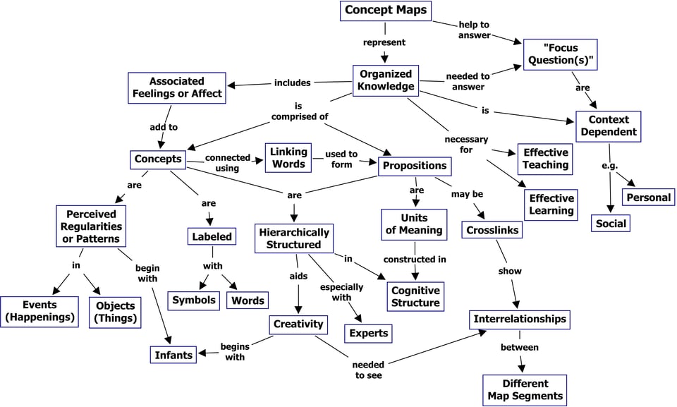
Joseph Novak, a professor of education at Cornell, created them in the early 1970s as tools for organizing and representing knowledge, specifically knowledge of science at first. His work was based on constructivism, a theory that emphasizes the importance of the learner being actively engaged in the process rather than a passive vessel for knowledge.
As part of the design process, the utility is in making it, alone or together, rather than presenting it or reviewing it. Going through the exercise of mapping an information space really helps clarify a topic or a system (and whether you understand it), before you go making changes. Making a concept map together can facilitate group understanding. And then, once you internalize the information, you may never look at it again.
I feel like designers used to talk about ontology a lot more.
Personas
And finally, somehow the most controversial design tool is the one created by one of the best people in any business, Alan Cooper. You should read Cooper’s history of personas in his own words before you say boo.
![Alan Cooper holding up a sign reading [This thing that isn't persona that I'm going to call personas] is really awful. But this [personas under some new name] is much better!](https://assets.buttondown.email/images/edfc1c3a-149d-4f10-937f-7ea88c08a911.webp?w=960&fit=max)
I’ve found these hypothetical archetypes very helpful over the years, because even when they aren’t perfect, they can help decision-makers think about other people who exist in the world as real people worthy of considering, and frankly, that is a huge deal. YMMV.
The success or failure of using personas has to do not only with how representative the behavioral data is, but how they’re used to tell a story that sticks. Research shows that reading fiction increases empathy, but only if the readers are emotionally transported.
Now, go forth and question every tool and convention!