
Linkfest #49: "Widthipedia", the Least Popular Birdsong, and the Dying Art of Embalming
Hello there!
It’s time for "the opposite of doomscrolling” — my latest “Linkfest”, an omnibus of all the finest items I can find in science, culture and technology.
(Apologies for the long delay in publishing — I was heads-down finishing my next book! Back to your regular programming now 🤘🤖)
If you’re a subscriber, thank you! If not, you can sign up here — it’s a Guardian-style, pay-whatevs-you-want affair; the folks who kick in help keep it free for everyone else. And also — forward this email to anyone you know who’d like it.
The full, free archives of the Linkfest (including this issue) are online here, if you’d prefer to read this on the web.
Let’s begin ...
1) 🔭 Gorgeous photos of Soviet scientific institutes
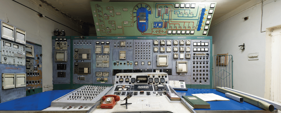
The USSR was incredibly serious about science, and spent big to build huge research centers — many of which operated in strict secrecy. As Eric Lusito writes …
The USSR spent lavishly to build ever bigger and more sophisticated machines, and eventually became a technological superpower. These utopian worlds of Soviet modernity were embodied in "big science" projects involving up to several thousand people. Science flourished but the research work, designed mostly for the military, was carried out behind closed doors in an atmosphere of complete secrecy.
The status of scientists, once prestigious, changed radically after the collapse of the system. During the turmoil of the 1990s, the institutes were virtually abandoned with no funding. The extremely low salaries — sometimes as little as $5 per month — led to disillusionment and a brain drain. Despite the hardships they faced, some scientists persevered and devoted their lives to saving their facilities.

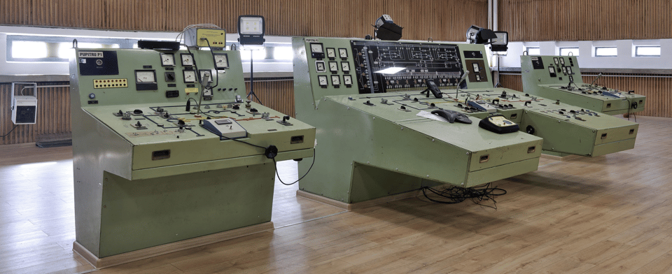
The equipment all looks like something you’d see in an episode of Fallout …
Synchrotron, high-voltage laboratory, nuclear research reactor, radio telescope, cyclotron, stellarator… These monumental installations could have been taken straight from the pages of a comic book or graphic novel, or from the works of science fiction writers such as Jules Verne and H. G. Wells. Their gigantic control panels and mysterious machinery bear witness to our never-ending quest for knowledge.
You can see more of Lusito’s photos here, or order the book right here. My copy is already on the way!
2) 🚲 Bicycles drawn from memory are incredibly weird
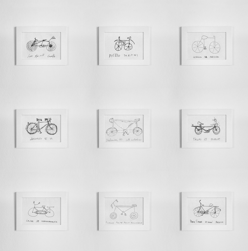
Back in 2009, the designer and architect Gianluca Gimini began asking friends and strangers to draw a bicycle.
It turns out they’d often totally mangle the key elements of a bicycle. The drawings would look bicycle-like, but on closer inspection, were hilariously unfunctional. If you look at those pictures above, you’ll see what Gimini found: Bikes where the chains connect to both the front and back wheels, or which don’t have chains at all, or where the frame is like a rectangle instead of a triangle.
Little I knew this is actually a test that psychologists use to demonstrate how our brain sometimes tricks us into thinking we know something even though we don’t.
Recently he went a step further, by producing 3D renderings of these cryptic unbikes. On his site he’s got versions of several, and they have a captivating uncanniness — it really nails the sense of “oh, that’s a bike” followed by “wait wait — what is going on there?”
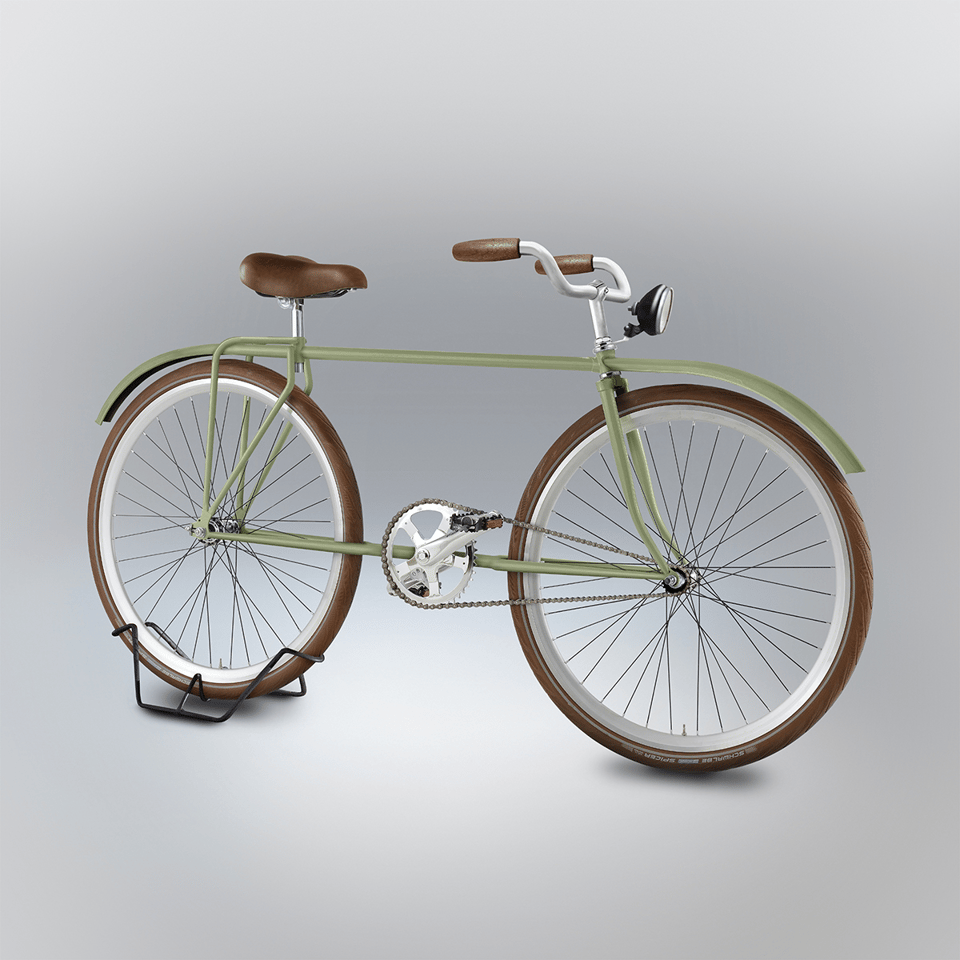
I selected those that I found most interesting and genuine and diverse, then rendered them as if they were real. I became the executor of these two minute projects by people who were mainly non-designers and confirmed my suspicion: everyone, regardless his age and job, can come up with extraordinary, wild, new and at times brilliant inventions.
Seriously, I would buy some of these bikes if they existed. Relatedly, I’d love to read a PhD thesis investigating the cognitive mechanics behind these weirdly-off rememberings.
3) 🐹 The hamster crushing personal records on Strava
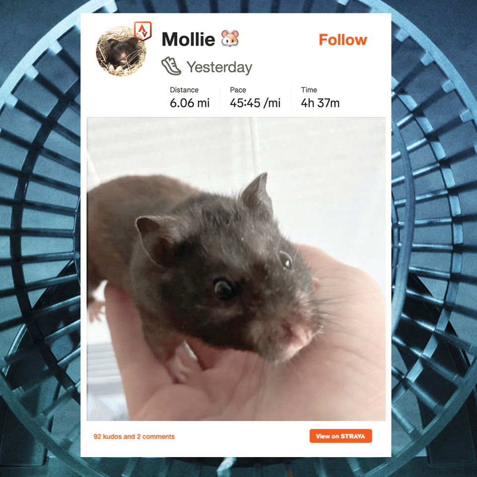
Strava is a social network for athletic activity; you log on and share how much you’ve been cycling, running, swimming, or doing any type of exercise. I’ve got an account myself (though you can only see if it you’re logged in, alas.)
But I just learned of the most delightful Strava account of all: Mollie, the hamster.
Mollie is the pet of Thijs de Buck, an MRI physicist based in Utrecht. de Buck wired up Mollie’s hamster-wheel with a sensor that calculates the distance Mollie runs each day, and how fast she runs.
Damn, that hamster books it. As Sean Abrams writes at Runner’s World …
One recent activity showed 6.06 miles in 4 hours and 37 minutes. The next night, Mollie logged 5.55 miles in 3 hours and 56 minutes. [snip]
De Buck said Mollie is averaging almost 10 kilometers per night, with a current record of 10.8 kilometers after the first week of tracking. [snip]
Mollie also has a weirdly consistent schedule for a hamster. Over one seven-day stretch, he started within the same 10-minute window on five nights, between 9:54 and 10:04 p.m. He tends to run in short bursts, sometimes reaching about 4 to 5 kilometers per hour on the live monitor, then hops off for water.
The hamster is running six miles in a single evening? Holy crap! That’s like going from my house in Brooklyn to the middle of Manhattan.
Go read the whole story — it’s a blast. The hardware hacks that de Buck had to finesse to get the hamster-wheel wired to Strava are pretty rad, too.
This confirms what I wrote in my original blog post about Strava, in which I called it “The World’s Sweetest Social Network” (gift link):
Unlike as with Twitter or Instagram or Youtube or TikTok or Reddit, you are not offering admiration for something someone else has written or said or expressed. You’re giving them a thumbs-up for something they did. They got outta their barcalounger and went for a two-mile brisk walk; they spent an hour rock-climbing; they cycled across the state. There is a wonderful tangibility to the exercise, which makes the act of offering praise — or receiving it — feel additionally earned.
What’s also incredibly nice about Strava is that we Strava users tend to be super approving and excited about literally any form of exercise, no matter how small. I have some cousins who’ll occasionally go for a 10-minute stroll, then post that to Strava. We, the followers, are instantly up in her feed mashing that “kudo” button and offering hot damn enthusiastic comments. I had another friend who had knee surgery and would report on Strava when he could finally manage to do a few minutes of reps as part of his physical therapy. We threw up the horns and excitedly cheered him on.
There is, in other words, a rather democratic joy expressed for any and all forms of ass-moving. Your friend did a grueling 16-hour Iron Man triathlon? Right on, kick ass! Another friend manages, like, seven push-ups? Fabulous, great work!
A hamster on a wheel fits perfectly into this vibe.
4) 🧠 The unusual brains of F1 drivers

F1 drivers experience the world at 220 miles an hour when they’re driving straight. Even when they’re cornering, they’re going 180 miles an hour. That’s faster than any animal in history has ever gone.
Which has long made neurological scientists wonder: How in heck are these drivers managing it? The drivers have to make incredibly fast decisions — they have to judge and react so quickly that “split second” is a generous way of putting it.
So back in 2013 and 2014, an Italian research team decided to examine the brains of F1 drivers and compare them to normal human brains. The big difference? It lay in the “retrosplenial cortex”, a part of the brain that ties together memory and spatial reasoning. The F1 drivers had a retrosplenial cortex that was thicker and more tightly networked with the rest of the brain.
And that appears to be a big part of their edge, as Erik Vance writes in the New York Times (gift link):
Whereas other parts of the brain might allow you to navigate unfamiliar places, this is the part of the brain that connects where you are now to where you have been before (and was heavily used by London taxi drivers in a 2006 study). A person with a damaged retrosplenial cortex, say, from Alzheimer’s disease, might recognize their home, the corner store and a nearby school, but would have no idea how to use one to find another.
The Italian team found that elite racecar drivers had more densely packed cells in this region and more connectivity to other parts of the brain. In other words, they can make highly detailed spatial maps of places they have been and pull them up quickly. What’s more, among the 11 professional drivers, more density in that region meant more racing victories.
But it’s not just about how many brain cells you have, it’s also about how well you use them. The studies also suggested that elite drivers use far less of their brains while racing than regular drivers
“This is what we call neural efficiency,” said Pietro Pietrini, an author on the paper and a professor of neuroscience at IMT School for Advanced Studies Lucca in Italy. “So if you are very skilled, you rely on less brain.”
That whole piece is worth reading: Apparently the other physical brutalities of F1 racing include blistering heat, massive G-forces, and rattling so intense they can get concussions.
5) 🎥 Flipbook-style animated-gif tool

Jonathan Andrew Myers is a designer who created this super fun tool — Fliiipbook, which lets you draw an animated gif by hand, frame by frame.
The results are nicely low-fi and janky. It took me a couple of minutes to draw that one above.
He also created “DRAWWW TIME”, an equally gnarly simple drawing tool that has some interesting pressure-sensitivity options. I’m gonna use this for a band poster at some point.
6) 🦉 Owls thrive on solar farms
At the Linkfest, I’ve long been obsessed with agrivoltaics — or, the increasing use of solar farms to grow crops or raise livestock. It turns out that many crops prefer the shade under solar panels, and in turn the plants cool down the panels, which makes them more productive. Meanwhile, goats and sheep also love the shade, and they eat the weeds that otherwise can rise to choke the panels. Win win win!
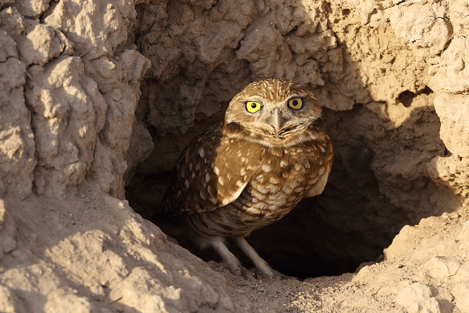
Here’s some more win — and, better yet, weirder win. It turns out that burrowing owls also love living under industrial solar arrays.
Burrowing owls, as their name suggests, live not in trees but in holes in the ground: They live in tunnels dug by prairie dogs, squirrels and badgers. But suburban development is increasingly destroying their habitat.
So a group of biologists recently did an experiment: They built a network of tunnels under a solar farm. Then took 19 burrowing owls that had been rendered homeless when a developer paved over their habitat, and released them at the solar farm.
The owls thrived. As Carrie Klein writes at Audobon Magazine …
One month in, all the females had laid eggs. “This is working,” Clark said. By late June, 36 chicks hatched. Within three months, 29 owlets had fledged, and Clark slowly weaned the birds off their meal deliveries to encourage the birds to start hunting on their own. He began seeing insect carcasses in their scat—an encouraging sign. At the end of August, Wild at Heart stopped feedings altogether.
Part of what works here is that solar farms need precisely the sort of open, flat land the owls also prefer. As Samad Khan writes …
Unlike trees or thick vegetation, which can hide predators, the open landscape lets the birds spot danger from far away.
“Solar panels don’t block the owl’s visibility,” Clark said. “The panels may even attract insects the owls can feed on. Though we’re still learning.” [snip]
Clark calls burrowing owls smart hunters who use the ground under the panels to hunt for insects, and “loaf” during the heat of the day. The term describes owls that are resting on the ground with their feet hidden, feathers fluffed and in compact pose that makes them resemble a tiny loaf of bread.
Another cool detail: Nearby residents often find solar farms ugly, and lobby against them — but their support shoots upwards if they learn the land is also being used for crops or livestock.
7) 💡 Stained glass lamps

I am smitten by these stained-glass lamps made by Shawn Michael Lewis. He uses the traditional Tiffany technique — each piece of glass wrapped in foil tape, then soldered together — but updates it with chunky modernist shapes and lines.
Go check his other creations at that page, or at his Instagram feed.
8) 📖 Abandon the Dewey Decimal system, get more library users

I love libraries, but I’ve never liked the Dewey decimal system. It’s incredibly weird and totally unintuitive!
So I was delighted to hear that the library in Deschutes County, Oregon, ditched the Dewey system and instead organized its books the way bookstores do — less for hunting down a specific book than for browsing.
As Patrick Sisson writes in Fast Company …
In the Dewey method, books are assigned numbers that correspond to their place in broad three-digit categories. For each book, that number is followed by a decimal point and a longer string of digits that correspond to subsections that convey greater specificity.
Wayfinder eliminates the Dewey reliance on mere numbers, and instead organizes into broad categories and subcategories. A book on growing tomatoes, for example, would be in the Arts and Crafts category, in the gardening subcategory. In the Dewey Decimal System, a book on gardening could potentially be in any of the four places in the system that contained gardening content. With Wayfinder, it’s all in the same place.
They also redesigned the shelves. Normally libraries have long parallel shelves; they made their shelving smaller and in cosier nooks … again, more like a bookstore than a library:
Since the Wayfinder system allowed more concise categories, books could be placed in more intimate spaces, creating what Baleiko called “little eddies” instead of blocky grids. [snip]
The new shelves weren’t laid out in a regular grid of shelves, making for a less linear browsing experience. Combined with a better system of topical organization, it’s designed to make it easier to linger and find an unexpected, exciting read.
And whaddya know — readership boomed:
When Deschutes County made the switch system-wise, circulation jumped; instead of averaging about 20% of the collection checked out at any one time, the libraries saw nearly 30% of books checked out thanks to Wayfinder. [snip]
The improvement was more pronounced for adult nonfiction—arguably the part of the catalog most constrained by Dewey’s shortcomings—where circulation leapt from 15% to 27%. In addition, the library has seen fewer requests for help at the front desk and a threefold increase in library card applications since opening.
I love this.
(BTW, Smithsonian recently published a short piece that explained part of why the Dewey decimal system is so unwieldy: Its taxonomy was designed for 1873, but the magisteria of knowledge has since expanded in ways Dewey didn’t foresee. “Some areas of study grew faster than others, generating ever-finer distinctions and unwieldy strings of numbers. Others barely changed at all.”)
9) ⚰️ The dying art of embalming

Apparently the mortician’s art is dying. Taking the deceased and making them presentable to the living? It is less and less in demand, for a bunch of reasons, as John Semley writes in Harpers …
There’s the decline in regular religious attendance, which now stands at 34 percent, and the corresponding waning of associated ceremonies. Some morticians cite the widespread adoption of smartphone cameras and the ready availability of photos of our loved ones, which may diminish people’s interest in creating what is sometimes called a memory picture, or final mental image, of the departed. There are environmental concerns that traditional burials monopolize too much land and employ toxins that can leach into the soil and groundwater. Cremation is often seen as a greener end-of-life option … But the most frequently cited reason for the plunge in traditional burial services is also the most obvious one: the cost.
In this fantastic long feature, Semley dives into the fascinating Civil-war emergence of embalming, its rise in the 20th century, and the subculture of young morticians who are attempting to keep the craft alive. The scenes are astonishing:
The woman on Colquitt’s table was a donor to Georgetown’s medical school about whom I was told very little and can publish even less. Let’s call her Madeline. Her body had recently arrived at the lab following a stay in hospice … The embalming process had considerably firmed up Madeline’s face, which made her easier to work on than the showcase’s dummies. But she also looked mummyish, sallow, and altogether unlovely. That gradually began to change over a few hours of Colquitt’s patient mending, shadowing, blushing, and eyelash-affixing …
Colquitt was a calm and methodical artisan. She pressed a slice of makeup sponge into the cut along Madeline’s cheek before sealing it with wax, then smoothed over the wound with a small shaping tool, a process that reminded me of applying a drywall patch and some plaster to cover a hole in a wall. Next, to make Madeline’s mouth appear less withered, Colquitt carved new lip lines for her using another wax, finessing them with her index finger for a softened effect. After filling in a silver-dollar-size divot in Madeline’s forehead, she began applying special mortuary foundation, as well as over-the-counter makeup. Colquitt prefers cosmetics with a slight red tint, which suggest a rosiness normally imparted by the blood in our capillaries. For the final step, she pulled out an electric hair straightener to tame a fussy black wig. Together, we gently affixed it to Madeline’s head, completing the work and the illusion.
A tremendous read.
10) 🛋️ Dataviz of the changing color of Ikea sofas
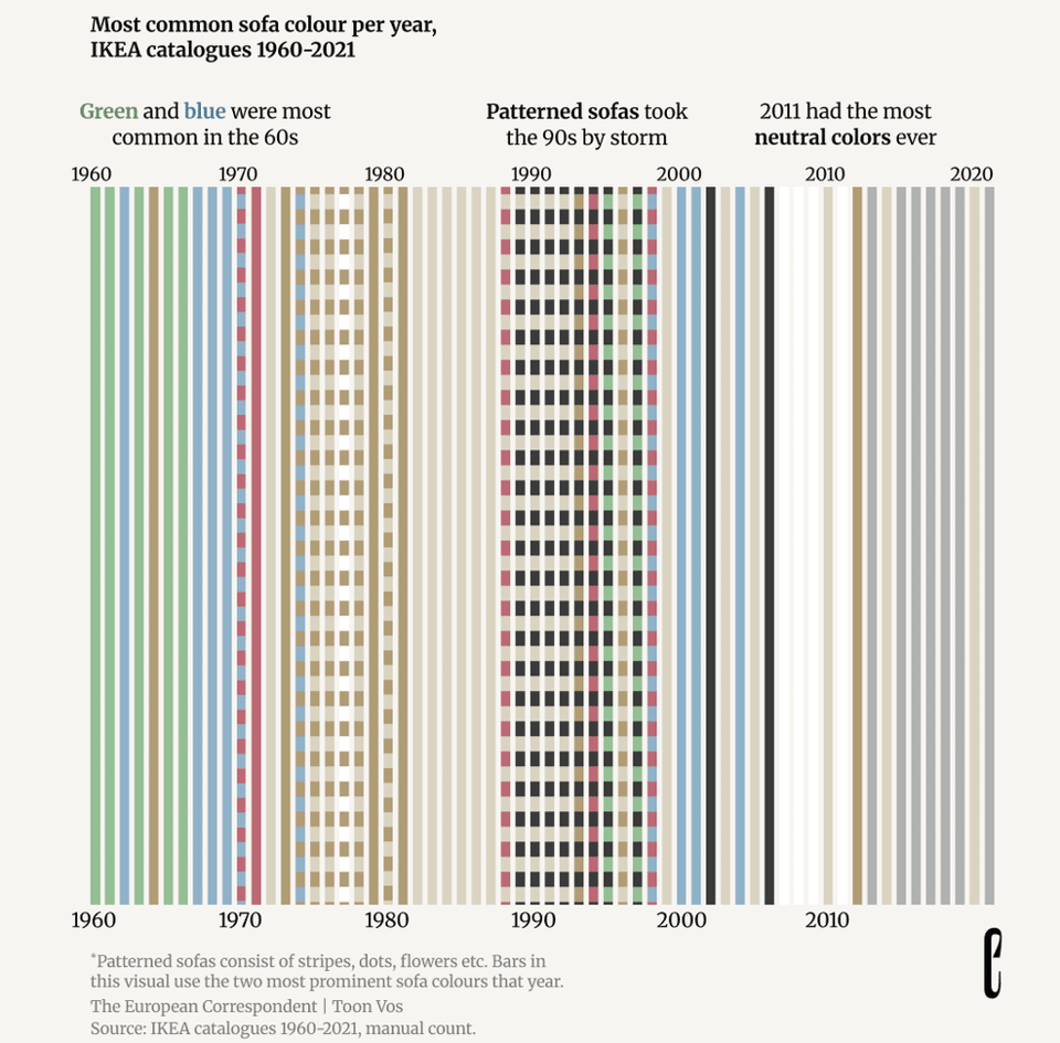
Toon Vos was getting ready to move, and was looking at his grey Ikea couch, and thought: Why did I buy such a drab sofa?
He realized that it wasn’t just him. A lot of interior design had become unbelievably bland — or at least, it seemed to him.
He wanted some firm data on this, though, so he gathered copies of all Ikea catalogues from 1960 to 2021. Then he charted the color of 3,500 couches over time.
The trends are fascinating! The 1960s and 70s were a riot of colors, but in the 80s it became a sea of beige. Then in the 90s there was a vogue for patterns … which, by the 2000s, fades into the monochrome dullness of today.
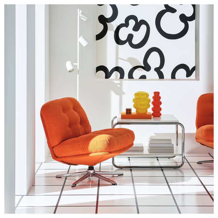
As Vos notes, there may be a glimmer of hope, though — Ikea has a new “NYTILLVERKAD collection”, which leans into retro colors and styles …
With the Nytillverkad collection, we are opening the IKEA treasure chest to share some of our favourite designs with a new generation. Reimagined in fresh colours and new materials, the products in the collection celebrate our unique take on design as simple, functional and always a little playful.
Look at this chair!
I am super down for this.
(If you missed it, by the way, check out item #3 in my second-last Linkfest — in which the data journalist Jon Keegan examined video footage of San Diego in the 1970s, and noticed that, much as with sofas, vehicles in the past displayed a peacock’s frenzy of colors. “Our world has lost its sense of whimsy,” he concluded.)
11) 🎶 The most — and least — popular birdsong

People often enjoy hearing birdsong. But are there particular types of songs we most prefer? Are there particular birds we enjoy hearing from?
A bunch of researchers wanted to find out, so they took clips from 123 songs of wild birds, played them for 84 people, and asked the subjects to rate them.
The winner? The blackbird — yep, the same one from the Beatles song. You can hear it here …
In contrast, the least favorite birdsong was the barn owl:
Man, I can understand why the poor barn owl lost out. Its song is pure horror-movie nightmare fuel.
As for why the blackbird won? The researchers found …
… a narrower bandwidth and greater complexity were perceived as more pleasant, as were birdsongs at a higher frequency or with a relatively low amplitude. The songs that scored highest also avoided a key frequency range where human hearing is highly sensitive.
“Greater complexity” + “low amplitude” is an interesting combo. Essentially, that means that while we enjoy birdsong that’s nuanced and filigreed, we don’t want it jumping around too much; we like the notes to be fairly close together.
And as to why people tend to prefer that combo, the scientists can only speculate, such as …
“We might be wired to prefer more variable sounds with moderate amplitudes and frequencies because they signal a safe, healthy, and restorative environment where we can relax,” said Kalb.
The original paper is here (unpaywalled), and here’s a CNN story about it.
12) 😢 The many Arabic words for sadness

Chereen Shurafa has written a fascinating essay on the many different Arabic words for sadness. As she notes …
Arabic words for types of sadness, grief or distress are difficult to reduce to simple positives or negatives. Take huzn (حزن) as an example. The word appears in the Quran, carried by the prophets, and in classical Arabic poetry as a mark of spiritual depth rather than weakness. To translate it simply as ‘sadness’ or even ‘grief’ is to strip it of that inheritance: huzn is oriented toward the past, toward a loss that has already occurred. By contrast, ghamm (غم) is felt in the present moment, an overwhelming suffocating weight so thick it covers the heart like a cloud. Ka‘aba (كآبة) is heavier still, a dejection so deep and prolonged it becomes visible on the face and body, a crushing of the spirit that the medieval Islamic scholar Ibn al-Qayyim described as distinct from both huzn and ghamm. Asaf (أسف) means sorrow filled with regret, but the two are not just synonyms for sadness. Each of these terms expresses a different type of experience. Each indicates a different type of relationship with suffering.
Part of Shurafa’s work involves sentiment analysis of Arabic social media posts and YouTube comments. The problem, as she writes, is that while she uses traditional software for classifying sentiment in a piece of writing, that software doesn’t have all the gradations you find in Arabic. So it’ll try to quantize these subtle gradations of grief into classifications that don’t quite match.
13) 🤝 An ode to holding hands

Roger Rosenblatt has written an ode to hand-holding, and it is absolutely lovely.
As he notes, hands are everywhere in our metaphors for emotion, cognition, and sociality …
The word “hand” has been enlarged to mean help itself: lend a hand. Hands also represent work: all hands on deck. They are signs of approval: give her a hand. Or the basic gesture of surrender: hands up. The sealing of a deal? Put it there, pal. If you need self-control, get a grip.
You pray with your hands. Use sign language with your hands. Some read the lines in your hands as predictive of your life. Approval is indicated by a show of hands. To celebrate, you give a high-five. Extend your hand toward a baby, and it will cling to a finger. [snip]
When people are ill or in mourning, we hold their hands. Idle hands may be the Devil’s workshop, but when your hands are holding other hands, it often means you have put everything else down or aside for someone else.
And:
In old age, holding hands is a guide to the past. Ginny and I held hands in high school. We hold hands today. They are not the same hands. Today’s hands are discolored, with roads of wrinkles and blue highways of veins. They have been through the mill and through the wars. That we hold hands still is partly an act of pride — and defiance. We can last. Our hands prove it.
Go read the whole thing; it’s short but every sentence is piercing.
14) 🎸 Behold “Prey”, the first video for my band’s upcoming album

When I’m not doing journalism or hoovering up the entire Internet for a Linkfest, my side hustle is as a musician — I’m a songwriter and guitarist for a couple of bands.
One of them is Lipstick Driver, a noisy little three-piece power-pop band — if you can imagine Hole thrown into a blender with the 90s-era Josie and the Pussycats, that’s … sort of the vibe? 😂
We spent last summer recording our first album with the fantastic producer Greg Griffith. His studio is in a renovated church that was built around 1800, and it is gorgeous (you can see it here on his Instagram). The whole eleven-song album will drop next summer, but we’re releasing singles periodically over the next few months …
… and this is the first one: “Prey”! Video — above — is an homage to the “Final Girl” trope, except in this case the Final Girl is chasing the psycho and is annoyed he isn’t paying any attention to her, lol.
The song is also on Bandcamp and the sundry streaming services, so have at it, you fine people!
Horror-movie trivia: The cinematographer who shot our video, James McConnell, used a “Cooke 18-100” lens, the same one Kubrick used in “The Shining”. (BTW, the superb director was G. Brett Williams; fun behind-the-scenes pix from the video shoot here by art director Cora Veltman.)
Clive trivia: Back in the early 00s, I emailed with Carol Clover, the academic who formulated the Final Girl theory (her original paper is here, brilliant, and free to read). I was asking her whether her theory might explain part of why young male gamers so strongly identified with playing as the perpetually-at-risk Lara Croft. Alas, Clover wasn’t familiar with games, so she didn’t want to hazard a guess.
15) 🛝 A final, sudden-death round of reading material
Pac-man, except you’re the ghost. 🛝 A Roomba carrying a Roomba. 🛝 Where “uppercase” and “lowercase” come from. 🛝 “Jolene” slowed down to 33 RPM. 🛝 Sheeps. 🛝 Infinite chess. 🛝 Conveyor-belt keyboard. 🛝 Cognitive mercantilism. 🛝 Diagrammatic sublime. 🛝 Green donuts in space. 🛝 Before the burbs. 🛝 Snakes that cartwheel. 🛝 World’s largest beaver dam. 🛝 The Pasilalinic-Sympathetic Compass. 🛝 The laser-armed submarine robots that kill sea lice. 🛝 Control a synth by whistling. 🛝 Jonathan Swift on the age of AI. 🛝 The t-shirt divide. 🛝 Cryptid stamps. 🛝 The physics behind why shoelaces keep coming undone. 🛝 Killdozer simulator. 🛝 Making a TV see through walls. 🛝 Braille printer built using Lego. 🛝 Infinite slop. 🛝 Sonic paintings. 🛝 Wavy data stream. 🛝 BikeNetKit. 🛝 UFO sightings by 18th century Jesuits. 🛝 A jail with a zoo. 🛝 Fog is becoming more common in Australia. 🛝 Rodney Dangerfield board game. 🛝 Six Finger Punch. 🛝 The Mundaneum. 🛝 Doom on a USB drive. 🛝 Illegal bread dumping. 🛝 Quahuru, a new browser board game. 🛝 Beep locator. 🛝 Emacs as a browser. 🛝 Drunken lampposts. 🛝 Jousting, on e-bikes. 🛝 Semicircle parking. 🛝 Compendium of abandoned greenhouses. 🛝 Teen pilots. 🛝 Ram-Altman. 🛝 Endless song generated by the digits of pi. 🛝 A dance of trees. 🛝 Widthapedia.
CODA ON SOURCING: I read a ton of blogs and sites every day to find this material. A few I relied on this week include Strange Company, Link Machine Go, Hackaday, Messy Nessy, Numlock News, 10 × 1 Things, the Awesomer, Book of Joe, the Morning News, and Mathew Ingram’s “When The Going Gets Weird”; check ‘em out!


