
Linkfest #47: A Decoy Font, "Reverse Minesweeper", and A Plant That Dies If You Look At Your Phone
Hello there!
Time for "the opposite of doomscrolling” — my latest “Linkfest”, in which I exhaustively read the entire known Internet from A to Z, looking for the finest items of science, culture and technology.
If you’re a subscriber, thank you! If not, you can sign up here — it’s a Guardian-style, pay-whatevs-you-want affair; the folks who kick in help keep it free for everyone else. And also — forward this email to anyone you know who’d like it!
Let’s begin ...
1) 🌿 A plant that dies if you look at your phone

Simone Giertz is a designer and hardware hacker famous for doing hilarious, offbeat projects. (Lots of videos of her builds on YouTube.)
Her latest? A plant inside a bell jar that contains a grow-light. There’s a slot at the bottom of the bell jar, into which she slides her phone. The grow-light only goes on if the phone is in the slot — so, in essence …
… if she doesn’t put her phone down for four hours a day, the plant will die.
As Giertz says at the end of the video:
There's something kind of poetic about it. Like if I'm on my phone, I'm not only taking away from my own life, I'm also taking away from the life of this plant.
Love it. My mother had an amazing green thumb, such that our house was crammed full of plants that flourished under her care. Alas, I seem to lack this skill. I have managed to keep two small plants alive for a decade in the window of my kitchen, but those are my only successes, ever; and in any case I’m pretty sure those plants are some variant of essentially unkillable weed.
This idea has promise, though! Giertz has only made this one-off prototype, but I bet she could bring it to market. People would be super into it.
2) 🔠 Anti-AI “decoy font”

Do you want to put a piece of writing online, but don’t want it to get scraped and used for training a large language model?
You could use “Decoy Font”, an experiment released by Mixfont, an “AI-powered digital font foundry”. “Decoy Font” produces a fuzzy “dark” letter in behind, which the human is intended to read, and a thin-outlined letter in front, which the web-scraper robot reads.
Decoy font is a font that prints a decoy for every letter, making it more difficult for AI to read what you type. The font works by using separate spatial frequencies to communicate two different letters in the same space. The foreground contains thin outlines, while the background is a low-frequency mass that is blurred. When overlaid on top of each other, what you see depends on how you look at the letter. If you’re having a hard time seeing the hidden message, move your screen farther away, or try squinting to see it.
So in that example above? The official message — for humans — is “DAY DREAM”. But if you feed it to an AI bot, it’ll generally read the thin-lined-letter message, “PAY BILLS”.
The problem, of course, is that human perception is also variable. My vision tends to land on the thin-outline letters; I find them more legible than the fuzzy backdrop letters!
Maybe I’m a robot?
3) 🚗 The color and whimsy in a 1970s photolog of San Diego
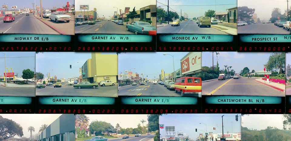
Back in the mid-20th century, states would often commission “photologs” — they’d hire someone to shoot video as they drove every mile of every road. It was like a lo-fi version of Google Street View.
A lot of these photologs have been uploaded to the Internet Archive, so Jon Keegan — an investigative data journalist — has been poking around in them. He recently discovered a trove of photologs from San Diego in the 1970s, and he did a wonderful blog post with oodles of gorgeous screenshots.
Keegan noticed something: The world back then had much more interesting, oddball aesthetics …
- The range of car colors was amazing, with tons of pastels, bright reds, and a wild variety of greens
- 🤠 Signs for businesses were WAY more creative, and well-designed with great typography. And many were spinning.
- 🦩 Our world has lost its sense of whimsy
He continues …
I’m really struck by just how colorful everything was. There are some moments captured on these frames that are just incredible compositions of color, geometry, and type … [snip]
The cars just look so simple. Heavy steel and glass, seat belts nobody used, and a rainbow of shiny colors. Today, cars seem to come in three colors: white, silver, and black. That’s pretty much it. It is truly sad to see how far the typical car has fallen from the colorful options that even basic cars had. [snip]
There is a dazzling array of signage in these frames. So many of the signs were motorized — actually spinning. Barber shops, fabric stores, dry cleaners, upholsterers, and tire shops all had beautifully made signs with inspired typography — to say nothing of their architecture. Comparing the rich variety of signs from these frames with today's bland storefronts makes me weep for an entire industry of sign-painters, neon shops, and fabricators that were probably killed by vinyl banners and LED-lit boxes.
It’s a phenomenal essay, and Keegan’s screenshots are gorgeously chosen. Go check it out!
Also, you can watch the original photolog videos at the Internet Archive. They’re pretty mesmerizing! I’d love for someone to sample this style for a video game.
4) 🐖 Guess the animal as the image zooms out
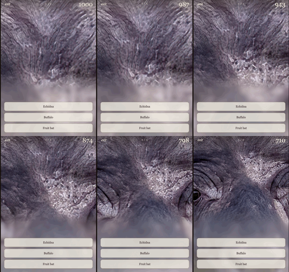
“Fable” is a fun game: It starts with a close-up zoom of an animal, and it slowly zooms out. Your goal is to guess the correct animal as quickly as possible.
It’s fun! By forcing you to look so closely at the zoomed-in features of these critters, it gets you to see them with fresh eyes … a nice aesthetic and existential effect.
You can pick a category of “birds”, “dogs”, or “all animals”, which I picked above. You can play against friends, racing to see who’s first to identify the game, or just do it in solo mode.
5) 🦉 How the great grey owl listens, and how we should, too
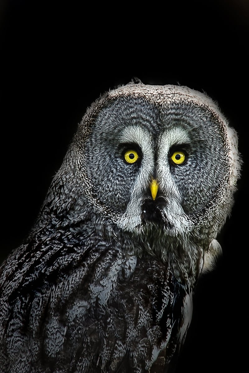
Great grey owls have an astounding ability to hear the slightest noise. They’ll perch high on a tree near a snowy field, listening for the infinitesimal rustle of a vole burrowing deep beneath the snow, hundreds of feet away — and they’ll hear it.
Brooks Riley has written a wonderful essay describing just how neatly engineered is the owls’ system of hearing …
The clownish circular face, slightly concave like a satellite dish, is filled with small hairs that guide the sound toward the ears. The ears are asymmetrically placed, so that the owl has been able to locate the vole through soundwave triangulation, not unlike how mobile phones are located via their signals to antenna masts. [snip}
Along a series of erratic flight patterns, the owl glides down toward the vole’s coordinates beneath the snow, to a tiny radius of accuracy directly over the vole (who also happens to have a fine set of ears).
It’s not just their ears — their entire body is designed to muffle noise, the better both to hear prey, and to prevent their prey from hearing them …
To maintain the silence necessary to carry out its surprise attack, the owl’s evolution has provided it with a mass of tiny hairs between the feathers, which muffle any whooshes that might give it away, especially as it hovers over the target.
That’s just the beginning of the essay; Riley goes on to talk about the value of listening in human life, too. This one’s really worth reading in full.
6) 🔫 Evidence of a 2,000-year-old machine gun
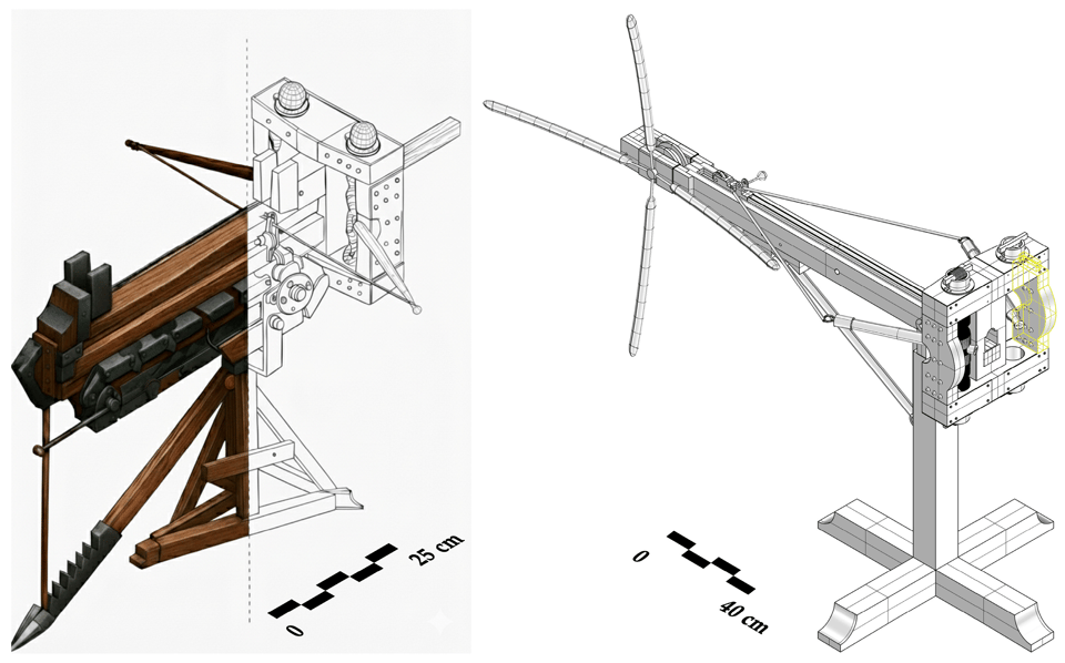
The ancient Greek inventor Dionysus of Alexandria is reputed to have invented the “polybolos” — a device that could fire arrows in rapid-fire bursts.
His design was a mechanical marvel for its time: a torsion-powered device featuring a chain drive and gear system that automatically loaded bolts into firing grooves, allowing it to launch projectiles in rapid, repeating bursts. Think of it as the ancient world’s closest analog to a belt-fed machine gun. The polybolos was described in detail by the Greek writer Philo of Byzantium, whose third-century B.C.E. text remains the primary historical source on the weapon.
Historians weren’t sure that anyone ever actually built a polybolos, though. It might have just been a design spec.
Until now! Recently a team of archaeologists found some evidence that suggests someone, back in the Roman city of Pompeii, did in fact build one and fire it.
The scientists found a pattern of damage along a wall that looks exactly like several arrows striking the wall in a tight cluster. As Newcomb notes …
A team led by Adriana Rossi of the University of Campania has identified a distinctive pattern of damage along the northern stretch of Pompeii’s fortified walls that they believe was made by a polybolos …
The evidence is striking. Tight, radial clusters of quadrangular cavities arranged at short, regular intervals along curved lines appear on the fortress walls near the gates of Vesuvius and Herculaneum. The shape and spacing of the indentations match the profile of military darts from the period—and nothing else in the known Roman arsenal fits the bill.
You can read the full, unpaywalled scientific paper here. Rossi and her team are now trying to see if they can use the written descriptions of the polybolos, and these arrow impacts, to produce a working polybolos prototype that shoots projectiles with the exact same pattern and destructiveness.
7) 📊 Data sets turned into bead bracelets
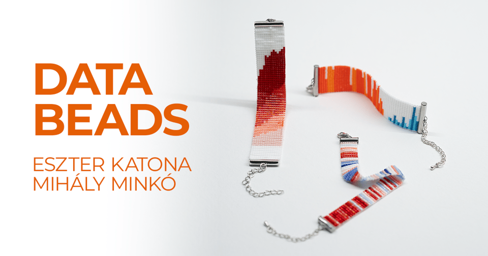
Eszter Katona and Mihály Minkó run the Data Beads project, where they “turn data into simple, easy-to-make bracelets, making data more approachable and fun.”
Below is the bracelet they made showing how the temperatures in Budapest have changed over the past 80 years …
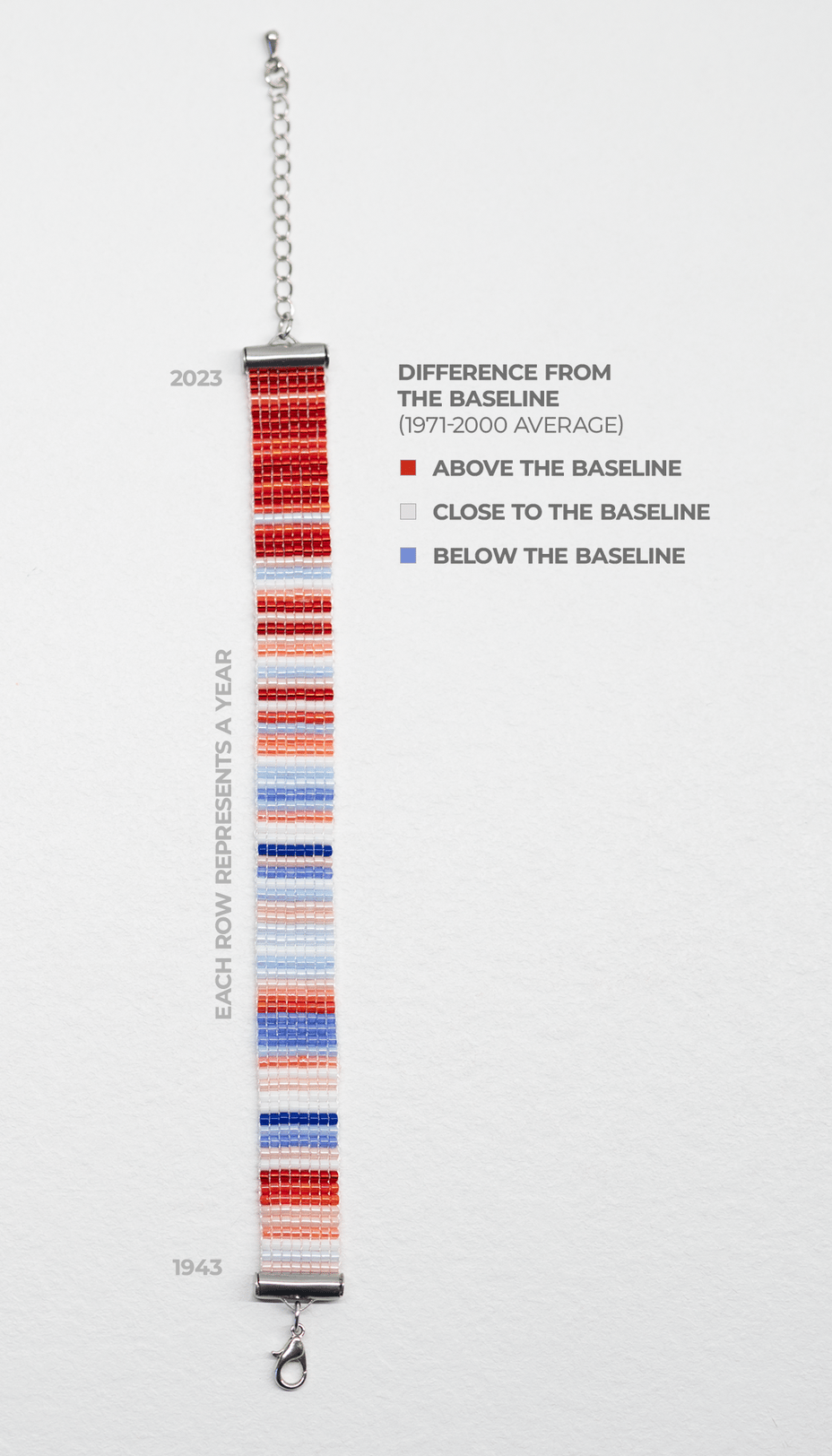
Data as a fashion accessory! In addition to looking cool, it has a nicely social quality. As they note …
These bracelets aren’t just accessories: they’re conversation starters that help break the ice around different topics, data and graphs, which can be difficult for many people to engage with. At the same time, we hope they spark curiosity and improve data literacy in a casual, creative way.
8) 🦖 Deep dive into the computers of Jurassic Park
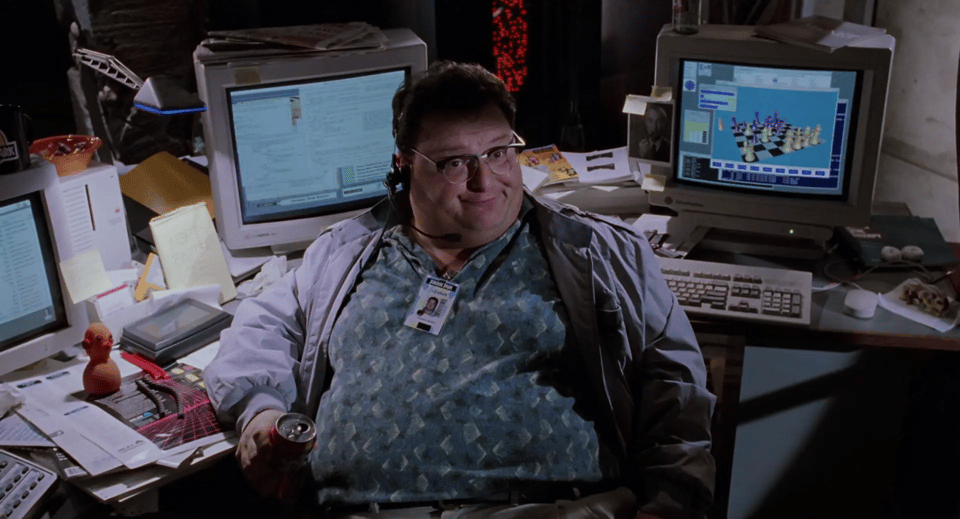
For a film shot in 1993 — when a lot of households still didn’t have computers — Jurassic Park contained a ton of them. The offices in the movie have everything from Mac powerbooks to high-end graphics-workstations and even supercomputers. Silicon Graphics donated $875,000 worth of computer equipment, Apple donated $350,000, and the filmmakers got another $500,000 of “additional hardware and software”.
Over at his blog, Fabian Sanglard has written a byzantine exegesis of every computer that appears onscreen; he’s got over three dozen screenshots, and he outlines every machine in each.
For example, in that picture above, you see two Macs and, on the far right …
Dennis Nedry's powerhouse workstation is an SGI IRIS Crimson. It is such a beast that it won't fit on his desk. It is on the floor on the right of his desk (red box).
Most of the time it is used to display a 3D chess game …
The SGI Crimson was a very powerful workstation released in 1992. Its main appeal was its panel of real-time 3D graphics cards. The CPU was also very powerful with hardware Floating-Point Unit, a luxury for 3D graphics.
One MIPS 100 MHz R4000 or 150 MHz R4400 processor
Choice of seven high-performance 3D graphics subsystems (Entry, XS, XS24, Elan, Extreme, Reality Engine, VGXT)
Up to 256 MB memory and internal disk capacity of up to 7.2 GB, expandable to more than 72 GB using additional enclosures
I/O subsystem includes four VMEbus expansion slots, Ethernet and two SCSI channels with disk striping support
Even more interesting is the small folded-up “personal digital assistant” you see on the left of the desk. It’s a “Motorola Envoy”, which included …
… a Motorola Dragon I/68349 microprocessor, 4 MB of read only memory (ROM), 1 MB of random access memory (RAM), and an LCD. Of particular interest were the wireless communications capabilities of the Envoy. Its built-in communication components included a radio modem capable of 4,800 bits per second communication, a fax and data modem, and an infrared transceiver capable of 38.4 kbit/s of data transfer.
This is a spectacular work of archival nerd research, go check out the whole piece!
9) 🎭 1886 manual on “dramatic expression”
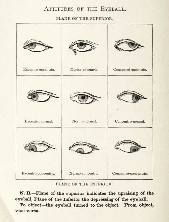
In the mid-1800s, the French singer and orator François Delsarte taught a system of “dramatic expression” — the precise ways to move and pose your limbs and your face when trying to act a scene. After he died, the actress Genevieve Stebbins wrote a huge, illustrated book setting down his ideas.
They’re hilariously precise. As Mathilde Montpetit writes in The Public Domain Review …
Every possible element of a gesture or expression was deconstructed and fit into this rubric, with specific exercises for the “Fingers, Hand, Fore arm, Entire arm, Head, Torso, Foot, Lower leg, Entire leg, Entire body, Eyelids, Lower jaw . . .” Stebbins provided helpful charts, like one that shows the “Simple Combinations of Upper Lid and Brow”. On the next page, she clarified that since both the brow and the lid each have nine possibilities each, there are in fact eighty-one possible combinations (she gave eighteen).
You can see the whole book embedded at that blog post or on the Internet Archive, and the illustrations are tres trippy, like these …
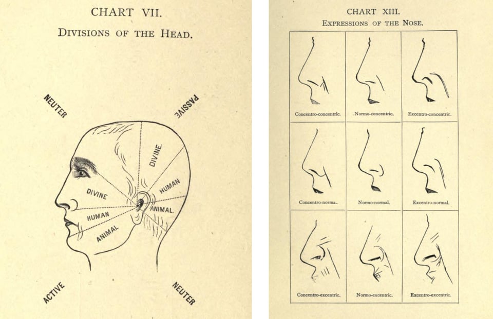
Apparently Delsarte’s system was influential enough that it got blamed, decades later, for the cheesy overacting in early silent film.
10) ⛈️ Weather app that picks a “plein air” painting to match your location
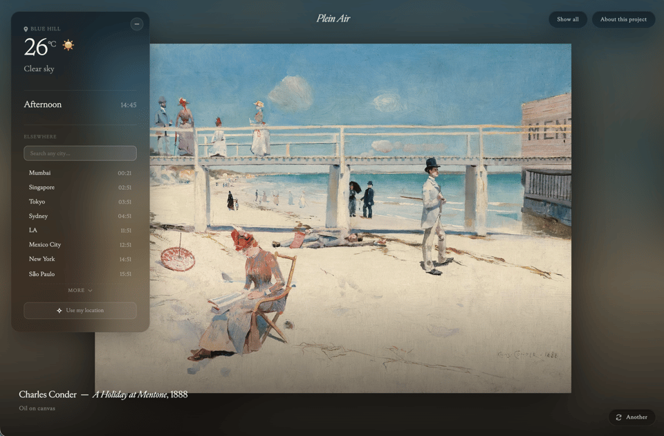
In the last Linkfest I included “Current Rothko”, a witty little web app by Joonas Virtenan that analyzed your local weather and picked a Rothko painting to match it.
Mind you, Rothko’s art can be a little abstruse; I couldn’t quite figure out how each painting mapped to my local weather, heh.
So Virtenan is back with a new app: “Plein Air”, which matches your local weather with a plein-air-style artwork.
As he describes it …
Plein Air — A painting for right now, wherever you are
Plein air — French for in the open air — was the discipline of painting outdoors, in front of the weather, the way Constable studied clouds in Suffolk meadows and Monet painted the same haystacks at every hour of every season. The painters took the canvas outside because the light couldn't be remembered later, only stood inside as you painted.
Plein Air stands you next to one of those paintings. The sky over your head and the sky in the painting share the same kind of hour — the same long afternoon, the same threatening storm, the same fog clinging to the river. One painting, chosen for right now. Tap the title to see why it was picked.
As I write this, I’m on vacation in Blue Hill, Maine; the day is sunny and blue-skied, and above is the painting I got!
11) 🐤 Do birds enjoy flying?

Birds fly. But do they enjoy flying?
Maybe? Probably? I mean, it sure looks like fun, right? But as a group of scientists recently — and drily — noted, “since birds cannot report (verbally) on their emotions, assigning such emotions has been notoriously difficult.”
So the scientists decided to run an experiment. They took a bunch of galahs — a type of cockatoo — and on different days, gave them the opportunity to fly, or to not fly. Then they ran a couple of tests to try and explore the birds’ level of well-being.
One test was just to observe them after the flight, to see if they engaged in behaviors — foraging, crest-raising, scratching — that indicate a good mood. The scientists also tested their birds using a little perceptual experiment, to see if they were in an “optimistic” mood. (Basically, you show the birds colored cups containing treats; depending on whether they’re feeling optimistic, they pick a certain color, hoping for an extra-awesome treat.) And they checked the chemical signatures of the bird’s poop.
The results?
Looks like birds do, indeed, get a mood boost from flying. After flight, the galahs engaged in much more upbeat behaviors and were considerably more optimistic on the test. The poop analyses were neutral.
It’s a fun study — you can read it here for free, or read the scientist’ press release.
The work also has some interesting moral implications, as the researchers note …
Our results should not only provide evidence for the fundamental discussion about whether animals have emotions or not, but should also lead the way in the search for ways to account for animal emotions in decisions regarding animal welfare.
12) 🕐 Wristwatch for kids with dyslexia
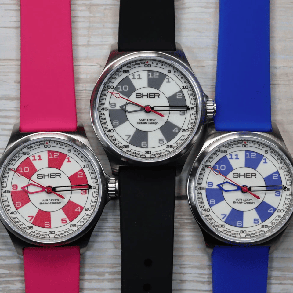
As a kid, Darren Sher loved wristwatches — but since he had dyslexia he sometimes struggled to correctly read the time. As an adult he noticed his son having the same problem.
So he designed a watch catered to kids with dyslexia. As Rachel Felder writes in the New York Times (gift link) …
The watch’s 32-millimeter round dial has a distinctive design that looks a bit like a dart board, with 12 pie-like slivers that are numbered slightly off-center to help the wearer discern which one is being indicated by the hour hand. Small numbers, from one to 59, run around the edge of the dial and are indicated by the larger minute hand.
A lovely note here:
Your children’s watch looks more solidly built than many other timepieces designed for kids. Did your son inspire that?
He said, “I want it to be a grown-up watch,” because often kids see what their parents are wearing and they want something the same. I was like, “Let me design a kids watch for all the specs I would want.’’
The Sher site is here.
13) 🥵 The heat wave that legalized shorts in the USA

Back in the 1930s, Americans were still accustomed to wearing a lot of layers, even in the hot summer. In fact there were often laws preventing you from wearing shorts and halter tops in the heat. As Geoff Williams writes in National Geographic …
People were used to dressing in a lot of layers. And while the materials in summer were lighter, they were still hot. That arrangement was tolerated most summers.Temperatures would climb, and everyone would grimace and bear it, sweating underneath coats and petticoats, vests and corsets, hats and gloves.
But then in 1936, an absolutely brutal heat wave came along …
In Wichita, Kansas, for instance, the high was 100 or more degrees for 20 days in a row. That same month, in August, Oklahoma City had 22 days in a row of 100 or more degrees. Earlier that summer, on July 14, it was as if Mother Nature placed the entire continent underneath a giant magnifying glass: more than 1,000 people officially were killed by the heat.
So, as Williams notes, something radical happened that summer: People started rebelling, by wearing shorts and t-shirts — and authorities began revising laws to allow it. Basically, the fight began to legalize summerwear …
Dr. Herman N. Bundesen, president of the Chicago Board of Health, said in a newspaper interview that the public should wear just enough clothes to satisfy the police. [snip]
In Yonkers, on June 21, two reporters from the New York Daily News — hoping to test the city's anti-shorts law—were arrested for wearing shorts in Yonkers after a hike. They were given the choice to leave the city or put on more appropriate clothing. They refused and were eventually brought forth before city judge Charles W. Boote. The judge was probably sweating underneath his robe when he made his decision on July 10, when the high was 102. Boote was sympathetic to the journalists, fining them $10 (adjusted for inflation about $240) but suspending the fines.
In the New York area, everybody had an opinion on whether shorts should be allowed. In the Bronx, people were hiking in shorts and halter tops freely. But about 40 miles away, in Westport, Connecticut, city officials discussed creating their own modesty law that would forbid shorts. In Farmingdale, a village of Long Island, the police chief declared that shorts were okay—unless citizens complained, and then he might have to rethink that.
Really fascinating stuff. I honestly couldn’t have told you when t-shirts became more common — I’d have guessed the 50s?
At any rate, this material is from Williams’ new book The Summer of Death: The Great Heat Wave of 1936 and the Making of Modern-Day America, which sounds both very cool and, given the scorching summer we’ve had, quite relevant.
14) 📖 3D-printed book
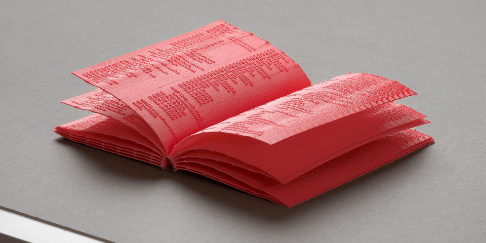
This one’s trippy — a book that was 3D printed, as an art project.
As Kat Barandy writes in designboom …
The object arrives with a strange directness. Its pages, binding, and raised marks are produced in one printing sequence, so the book comes off the print bed already formed. There is no separate assembly stage, no later binding process, no applied graphic layer. The marks belong to the same material logic as the pages themselves.
The content of the book is very meta: It’s a chunk of the computer code that drives the printer that printed the book.
Not exactly practical? But a cool use of 3D printing …
15) 🪑 Scrolly chair

Meher Amad enjoys social media, but worries that she too often gets sucked into a clickhole. She’d tried several ways to pull back — putting her phone on greyscale, etc — but nothing really worked.
What finally helped her out? She created “Scrolly chair”.
Basically, it’s an armchair in her living room where she keeps a wifi-only phone with her social apps. And it’s the only place she can use those apps; she took them off her regular phone.
So social media has become, in effect, a physical location in her house …
The Scrolly Chair allows me to tether my social media use to a single place. If I’m on the Scroll Phone, I must be on the Scrolly Chair. I even bought a phone stand shaped like a little piggy for the Scroll Phone to keep it on my shelf, a way to remind myself of what I’m doing when I pick it up: gobbling up social media like a pig at the trough. [snip]
When I settle into the Scrolly Chair, I do what we all do: enjoy the wash of the algorithm coming over me. I’ll catch up on DMs. Sometimes friends send me stories that have long since expired that I’m unable to see. Oh, well! If it were important, they’d screenshot it and text it to me. (It never is.) I have effectively created office hours to chat with people on the apps: when I’m home, on nights and weekend mornings. Sometimes when I interact with people on social media who know about the Scroll Phone, they’ll say, “omg ru on ur scroll phone?” If I’m responding to you on Instagram, you can be sure I’m writing to you from one very specific location in my apartment.
Amad is a millennial, so part of why this works for her is that it replicates her earliest experiences of the social internet — back in the early 00s, before smartphones or even wifi:
Looking at social media required stepping into a specific place; it was tethered to computers, which were tethered to Ethernet cables, which you basically had to be sitting down and indoors to have access to.
I dig this idea. Not enough to want to do it myself, lol. But I enjoy how she thought through the cognitive ergonomics of her online life.
16) 🙏 A programming language that requires you to say “PLEASE”
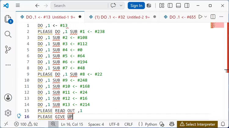
Nick Lewis has written a great essay about INTERCAL, a programming language from 1972 that is the strangest — and funniest — language I’ve heard of.
It’s like something Douglas Adams would have created. For example …
If you want to skip a line—like you do when you write debugging lines and comment it out—you use ABSTAIN instead. You can also use ABSTAIN to disable entire classes of functions. [snip]
In a 1990 version of the language, INTERCAL trades GOTO (which is considered poor form and archaic today) for COME FROM, which fills the same role as GOTO, but works in exactly the opposite way …
To top off all the other strange conventions, INTERCAL also enforces another unusual requirement: politeness. Every once in a while, you need to insert a please into your program.
If you don't, the compiler will throw an E079 "PROGRAMMER IS INSUFFICIENTLY POLITE" error.
To be safe, you might be tempted to always say please, but that doesn't work either. Just like with people, if you try too hard, the compiler will spot that you're being disingenuous and throw an E099 error—"PROGRAMMER IS OVERLY POLITE."
There’s more, too. Go read about the compiler, which behaves … erratically.
17) 📸 A final, sudden-death round of reading material
Anime user interfaces. 📸 Sugar in space. 📸 Super movers. 📸 Spectral analysis of the color of blue on Ulysses. 📸 The origins of exobiology. 📸 IpCrawl. 📸 “Circumgyrating”. 📸 Desalinization via centrifuge. 📸 Gerrymandle. 📸 Wikipedia as a 3D city. 📸 Fast flood fill. 📸 Fabulous typo in The Economist. 📸 I’m gonna play Spies Never Die. 📸 Self-moving chess pieces. 📸 Submarine cable map. 📸 Ghost watch. 📸 Climbing 1 million feet on a bike. 📸 Map of pub density in the UK. 📸 3D printable two-layer fidget spinner. 📸 Online audio editor. 📸 Making a first-person shooter in COBOL. 📸 1951 microcar. 📸 How Petrarch coined “the dark ages”. 📸 “Lucky dice” infinity cube. 📸 Can opener makes canned beer taste like draft. 📸 Soviet circus papercraft. 📸 The typeface “Sukoon”. 📸 Why amputees might make better astronauts. 📸 Fiber-optic bird nests. 📸 “Object Impermanence”, the game. 📸 Man and The Computer. 📸 Children of the magenta line. 📸 Weather jui-jitsu. 📸 The most efficient NASA missions. 📸 Guess the book by its writing. 📸 The “Problematic News Consumption” index. 📸 Trippy and pretty. 📸 Are you in the weights? 📸 Pocket telescope. 📸 Molecule of the month. 📸 Online ruler. 📸 The map of metal. 📸 Becoming a software developer in prison. 📸 Water that costs $120,000 per gallon. 📸 Reverse Minesweeper.
CODA ON SOURCING: I read a ton of blogs and sites every day to find this material. A few I relied on this week include Strange Company, Link Machine Go, Hackaday, Messy Nessy, Numlock News, 10 × 1 Things, the Awesomer, Book of Joe, the Morning News, and Mathew Ingram’s “When The Going Gets Weird”; check ‘em out!


