
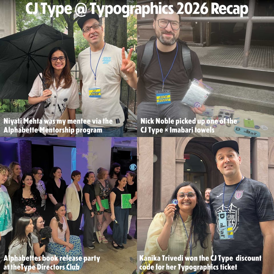
It was wonderful seeing everyone at the always insprining Typographics Conference, which CJ Type proudly sponsored. I was able to connect with amazing designers from around the world and am already looking forward to next year. By the way, if you don’t already know the organization Alphabettes, please check them out and you can buy their new book Alphabettes Soup. If we didn’t get a chance to connect at Typographics in person, please drop me a line and we can connect virtually.
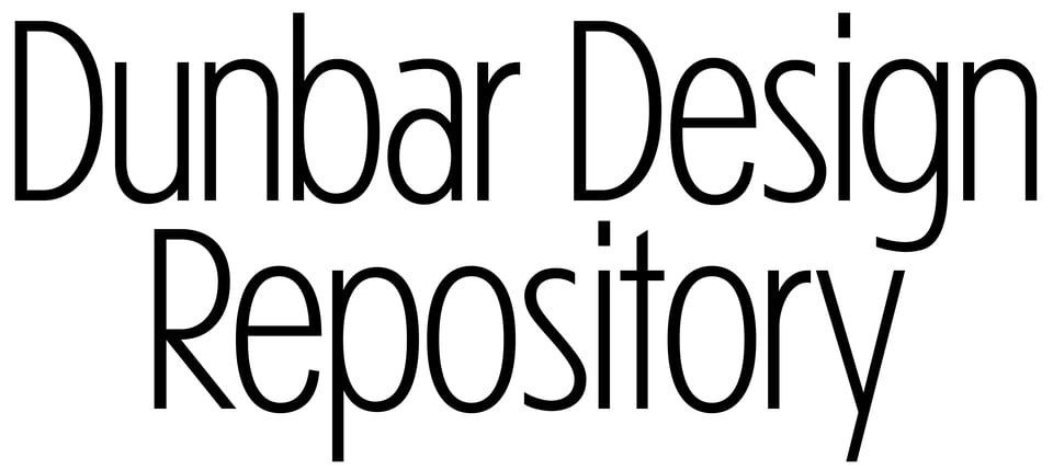
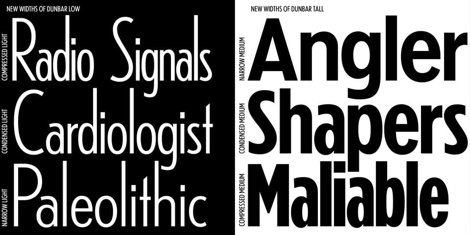
Just before the Typographics conference, in late June, the Narrow, Condensed, and Compressed styles of Dunbar were released. For this occasion we did a soft launch of what we’re calling the Dunbar Design Repository on CJType.com. The Design Repository, designed with Minkyoug Kim, aims to create a living archive of Dunbar’s design process and related materials. It explores what a typeface archive should contain now that the typeface design process now has less physical artifacts and more “digital” materials.
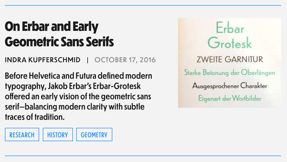
Part of the Design Repository is an “articles” section where I will be adding text related to Dunbar, historically relevant research, information about font technology that was relevant to the design process, and interviews with researchers and designers that I feel add context to Dunbar’s design. The Design Repository launched with the wonderful article by Indra Kupferschmid on Erbar and Early Geometric Sans Serifs, which was part of the original release of Dunbar in 2016.
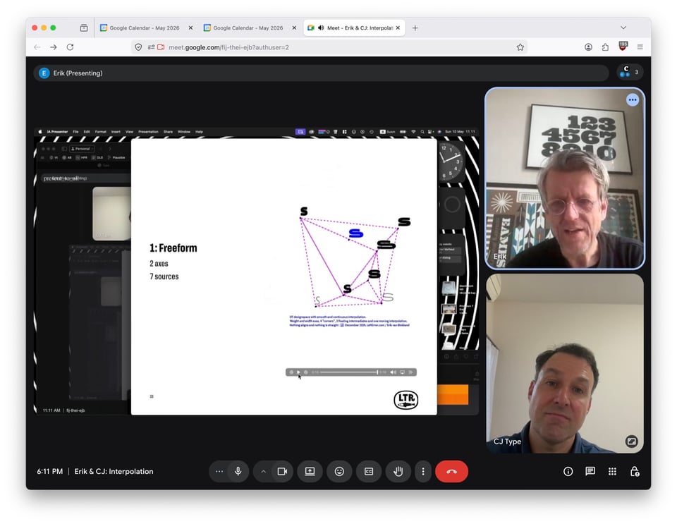
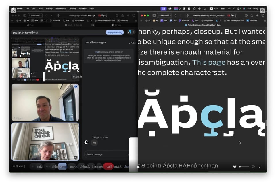
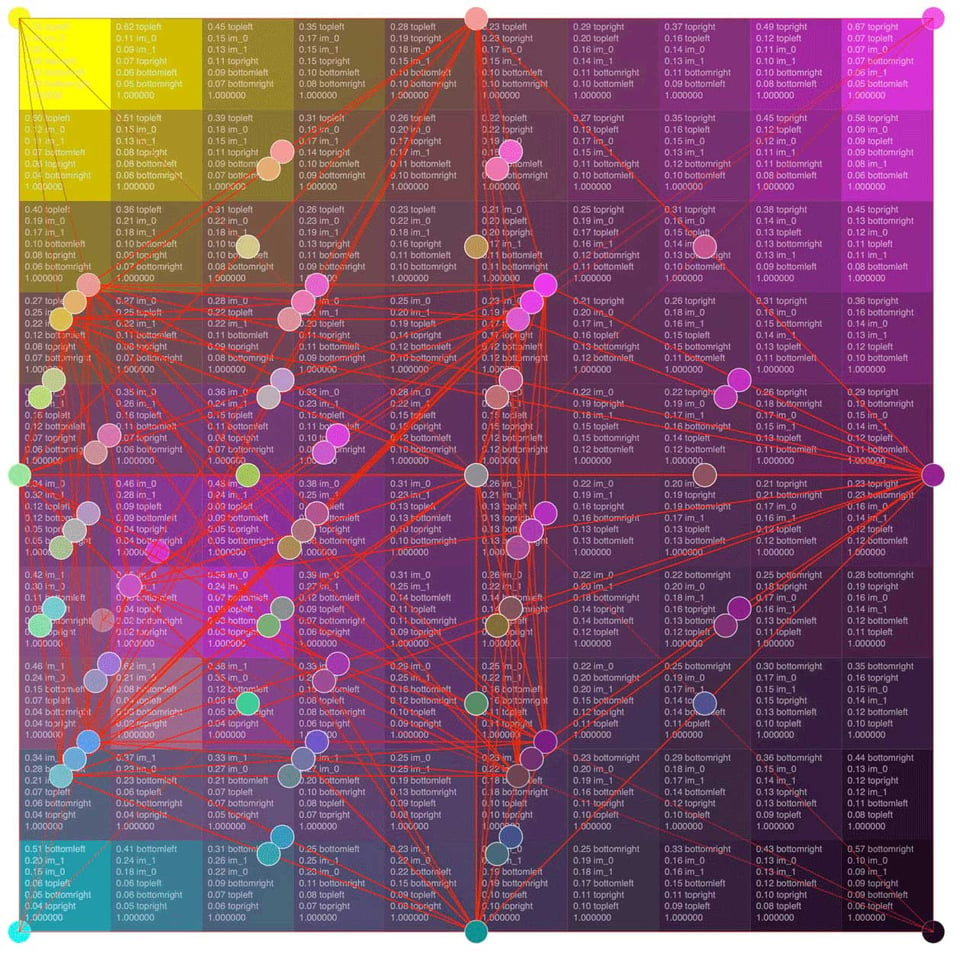
The newest article to go live on the Dunbar Design Repository is an interview I did with Erik van Blokland about Tools for Interpolation. Speaking with Erik feels like getting a peek into the future of typeface design along with an inside perspective of the font technology that led to where we are in type design today. Erik recaps interpolation technology leading up to variable fonts, triangular designspaces, and what went into his newest typeface Action Grotesque. It was a wonderful conversation and I’m so excited to share this with everyone.
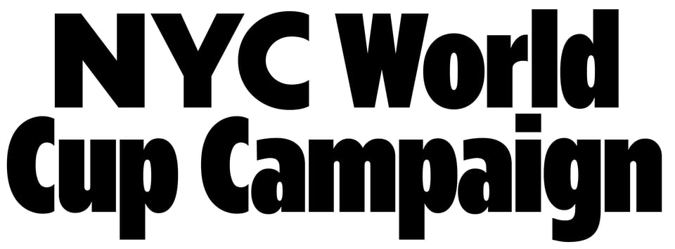
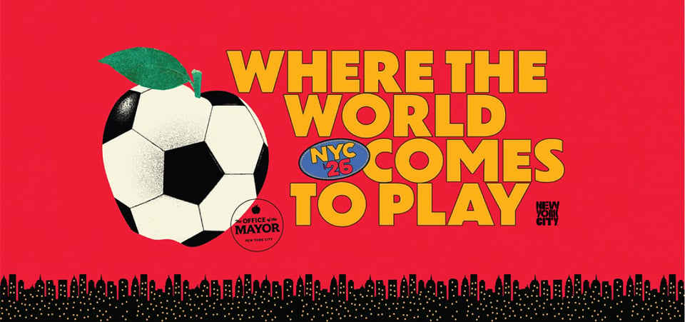
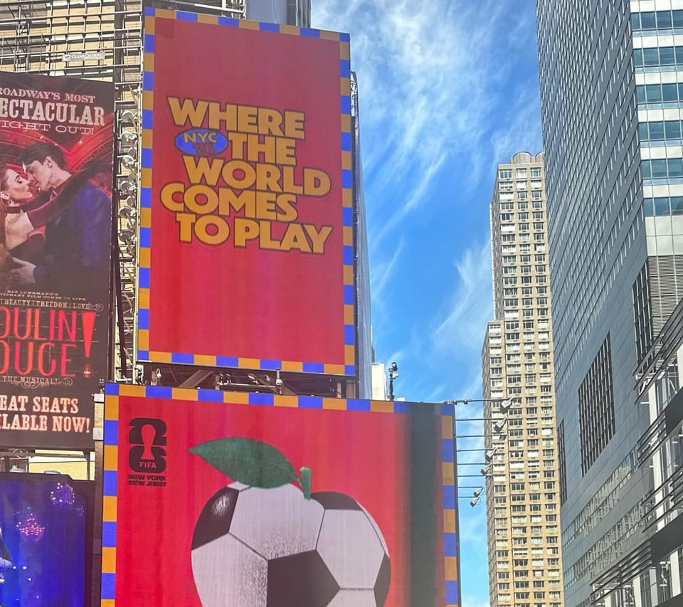
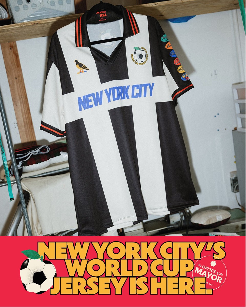
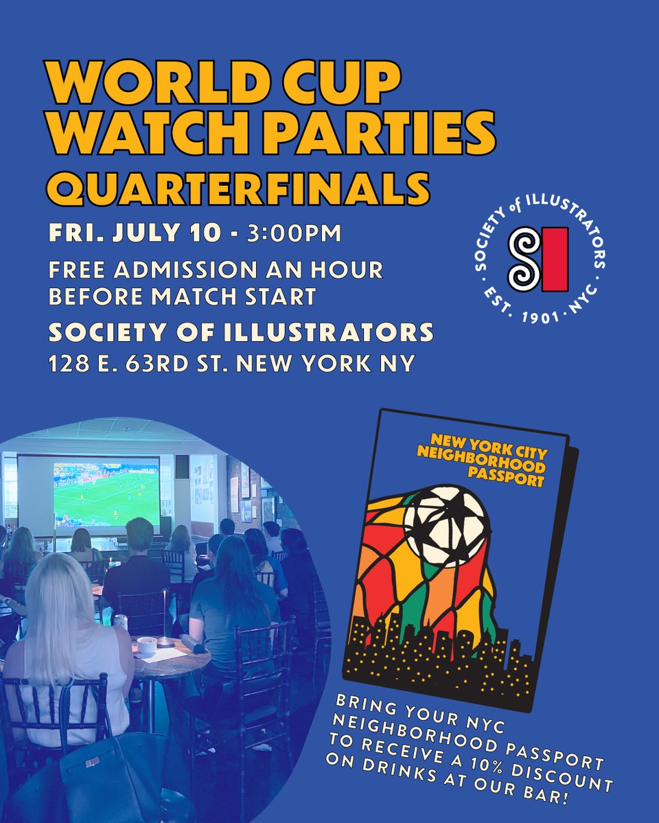
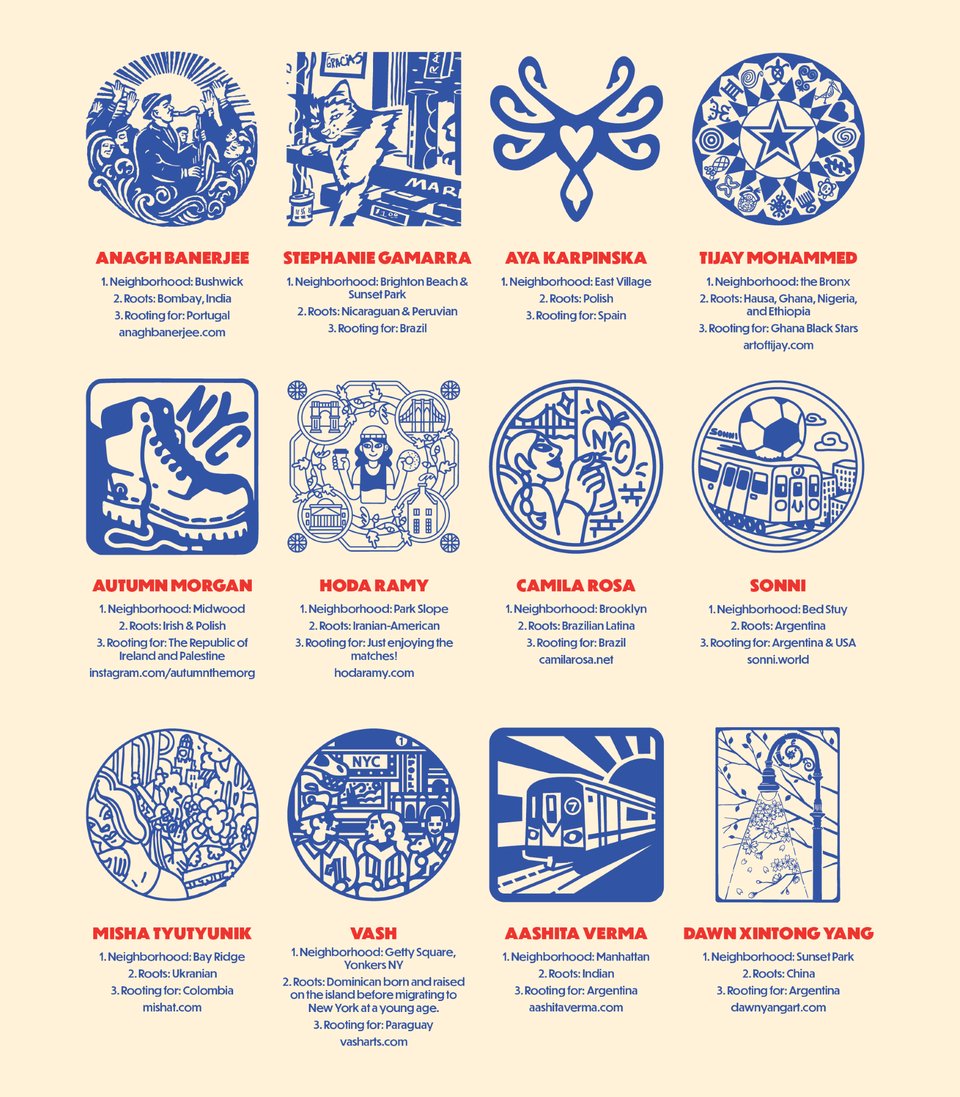
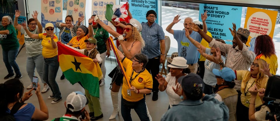
It has be amazing to see Dunbar used for NYC’s World Cup 2026 Campaign all over New York City, including on a huge animated billboard in Times Square. The campaign was designed by Arsh Raziuddin, working closely on the brand guidelines with Aneesh Bhoopathy who designed Zohran Mamdani’s campaign branding and is now a senior designer in the Mayor’s Office. It is inspired by sports memorabilia, city signage, a sticker collection, and the five boroughs. “There’s an energy that we wanted to capture and I think it’s matching New York as of right now in a way that feels really nice,” Raziuddin said, “One or two typefaces max was important for me.”
Keep an eye out on Fonts In Use for an upcoming post on this campaign.
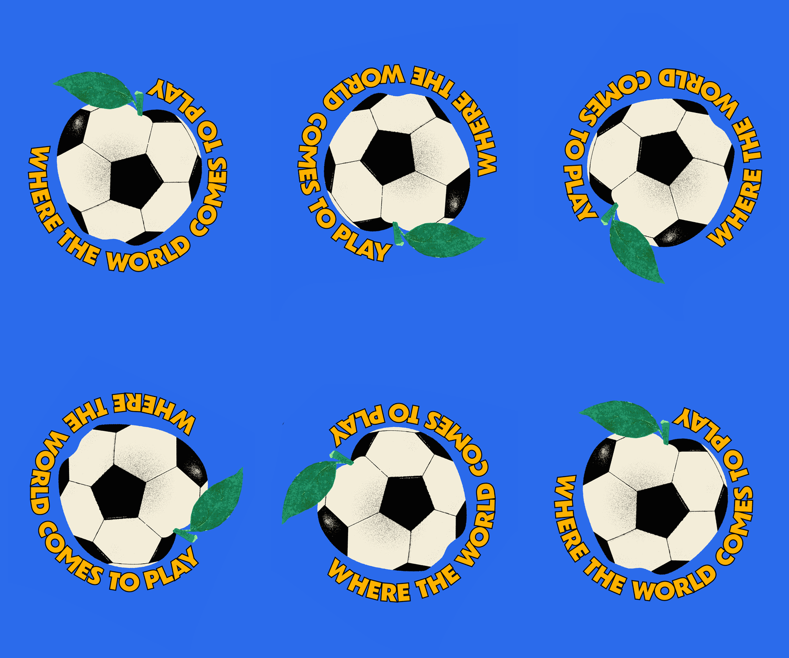
As always, if you have example of CJ Type fonts in use, please send them over! We love to see it.
You just read issue #6 of CJ Type News. You can also browse the full archives of this newsletter.