
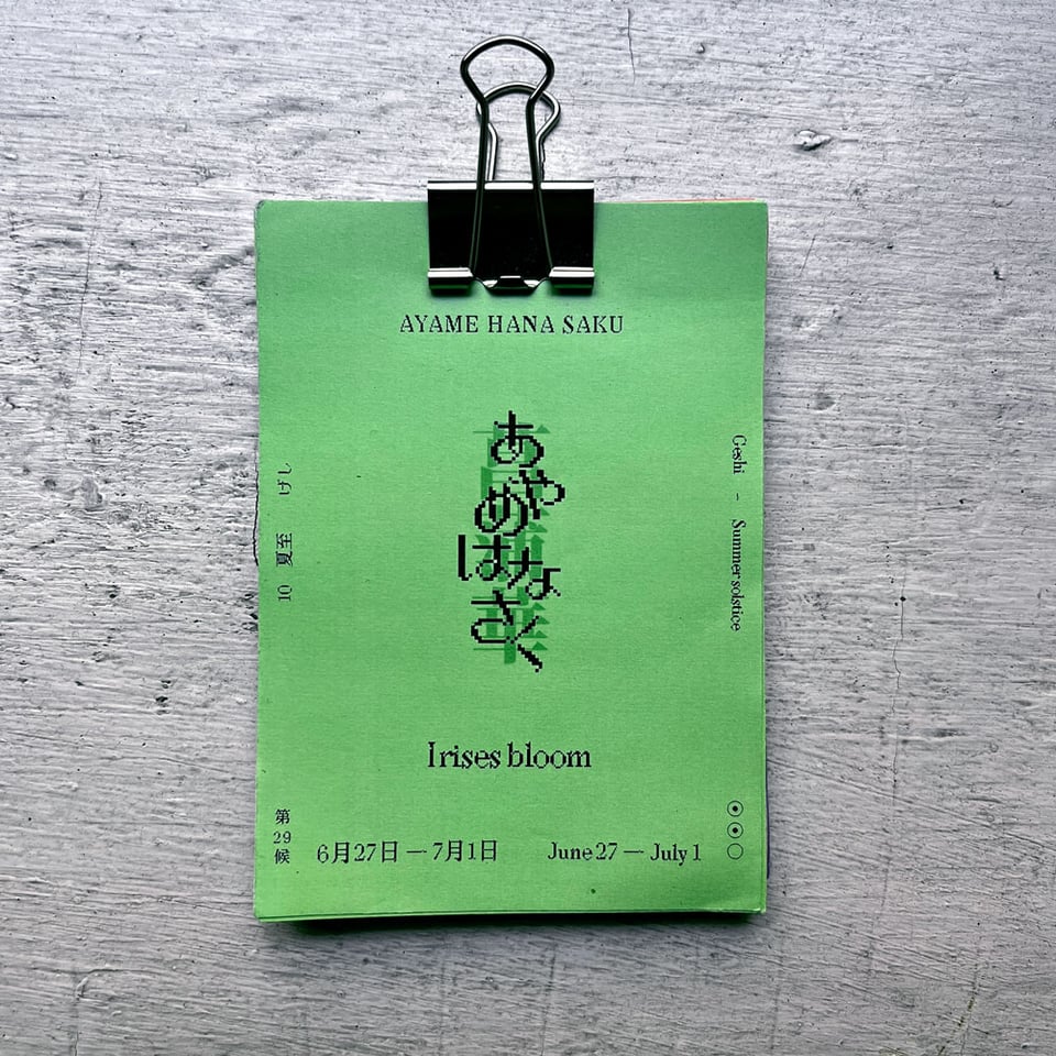
The summer solstice has now passed, and this weekend marks the start of the 29th microseason “Irises bloom.” The CJ Type library is also blooming with new styles.
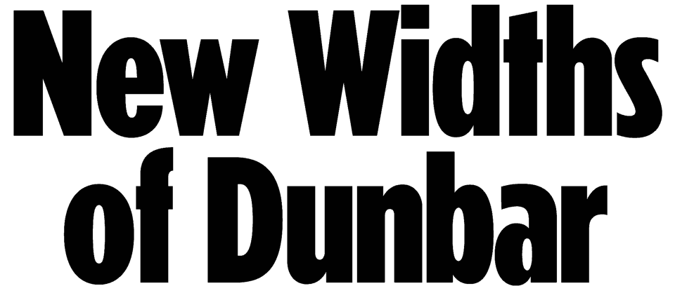
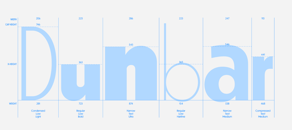
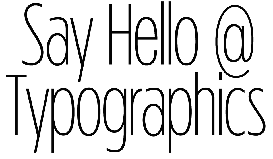
Dunbar was first released in the Fall of 2016 with the launch of CJ Type. Since then Italic styles have been added along with some custom Vietnamese and Cyrillic version. But by far the biggest update to Dunbar is the recent addition of new widths: Narrow, Condensed, and Tall. There will soon be an update to the CJ Type website where you can explore these new styles in detail. But for now here are some samples of the new widths.
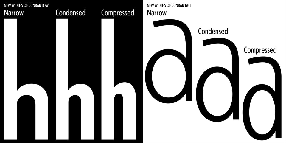
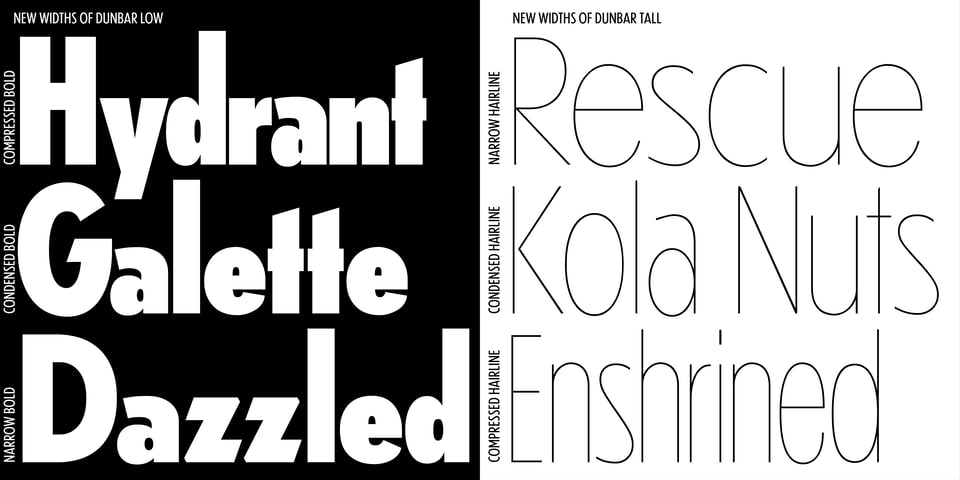
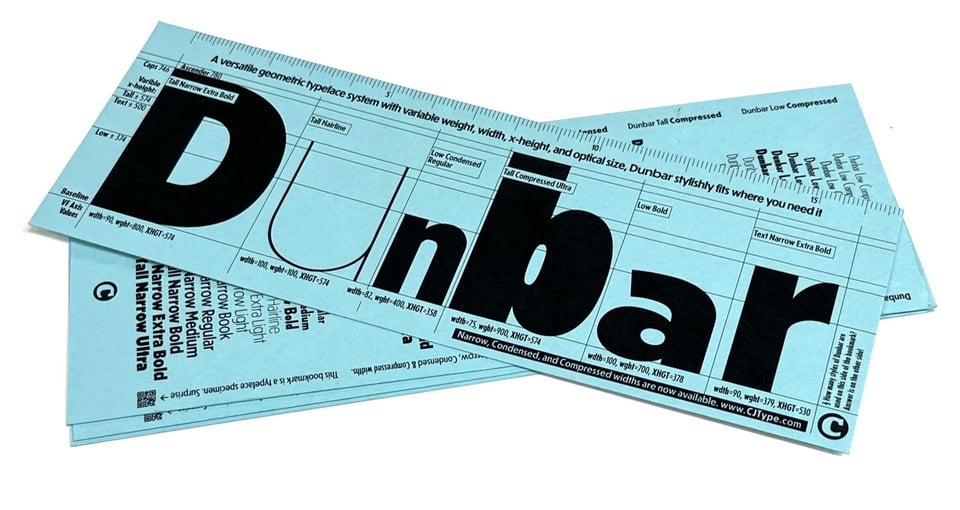
CJ Type is once again a proud sponsor of the Typographics conference and festival at The Cooper Union in New York City. If you are attending the conference please say hi! I will have stickers to give away and will have a limited amount of CJ Type merch, available in person only. And in your Typographics goody bag you will find this Dunbar bookmark showing the new Narrow, Condensed, and Compressed widths.
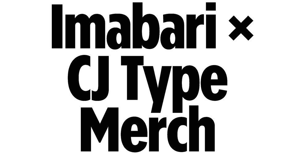


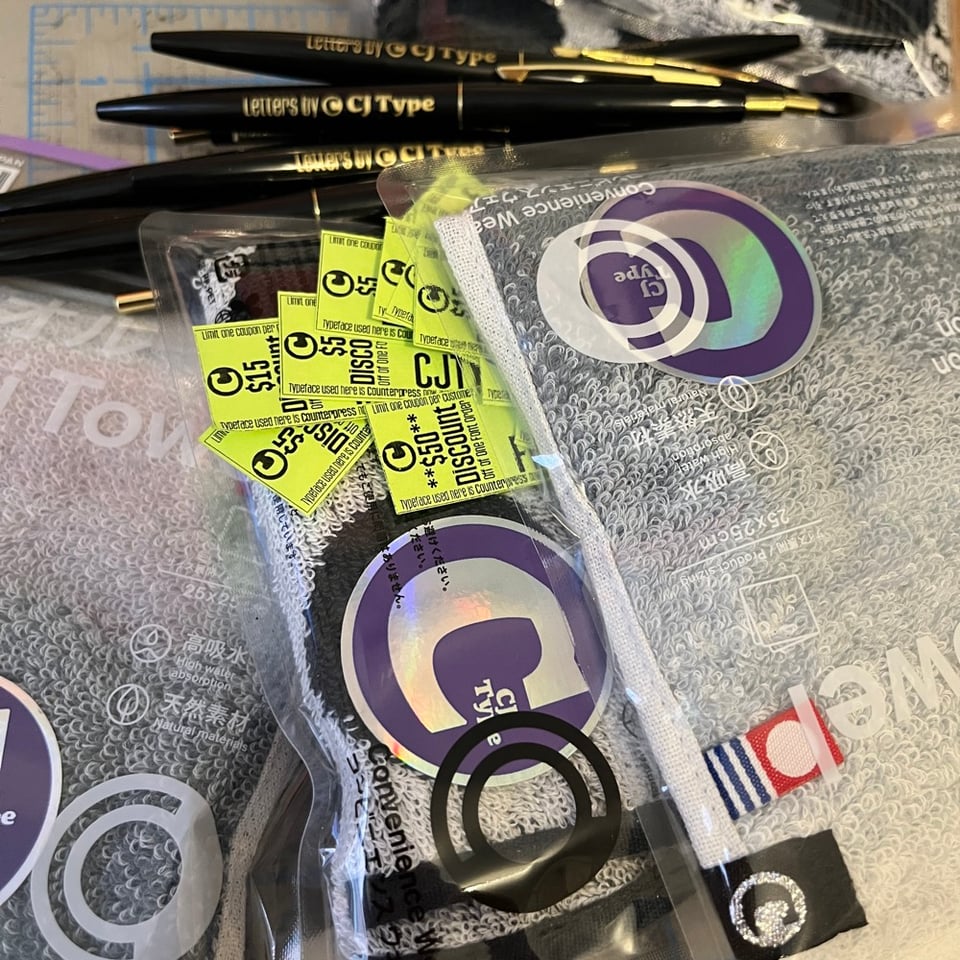
I love these hand towels which are made in Japan and are super soft. I customized a very small batch of (unofficial) CJ Type × Imabari merch to sell while I’m at Typographics. Each towel is $15 and it comes with a coupon code for at least $15 off of your order at CJType.com , which a few coupons for $50 off. You essentially get a free towel with the purchase of a font, or if you get lucky a free font with the purchase of a towel. Either way, you can’t go wrong.
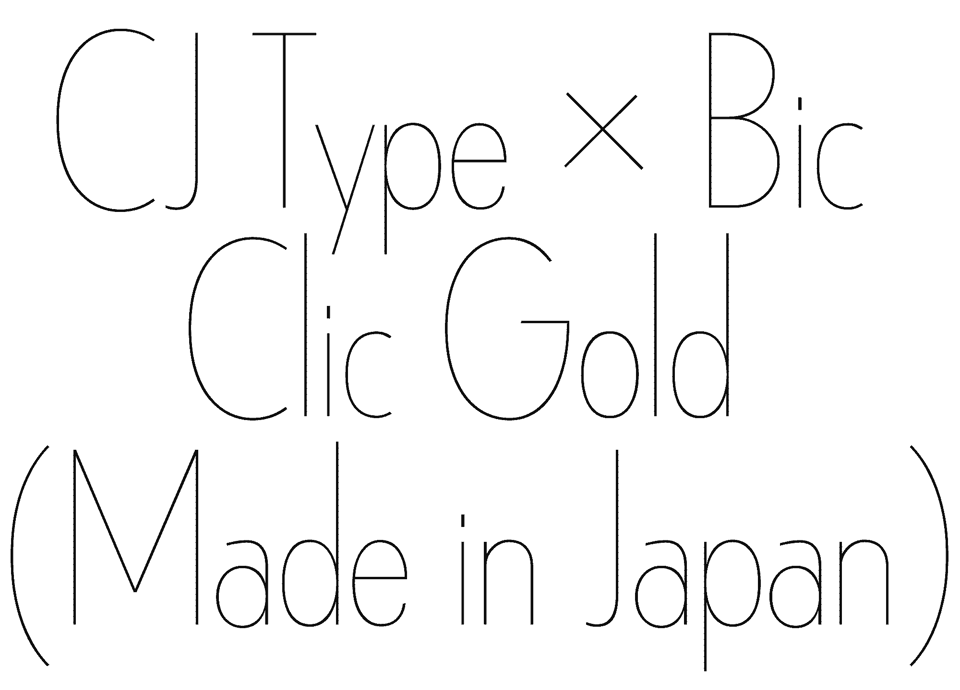
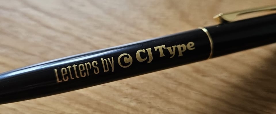
The Japan-made Bic Clic Gold pens are a joy to write with, so I customized some of these as well, typeset in metallic gold Counterpress reading “Letters by CJ Type”. Not to be outdone by the Imabari towels, pens will also come with a coupon code including some for $50 off of your purchase from CJType.com For now these are also only available in-person. Find me at Typographics or send me a message if you want to connect.
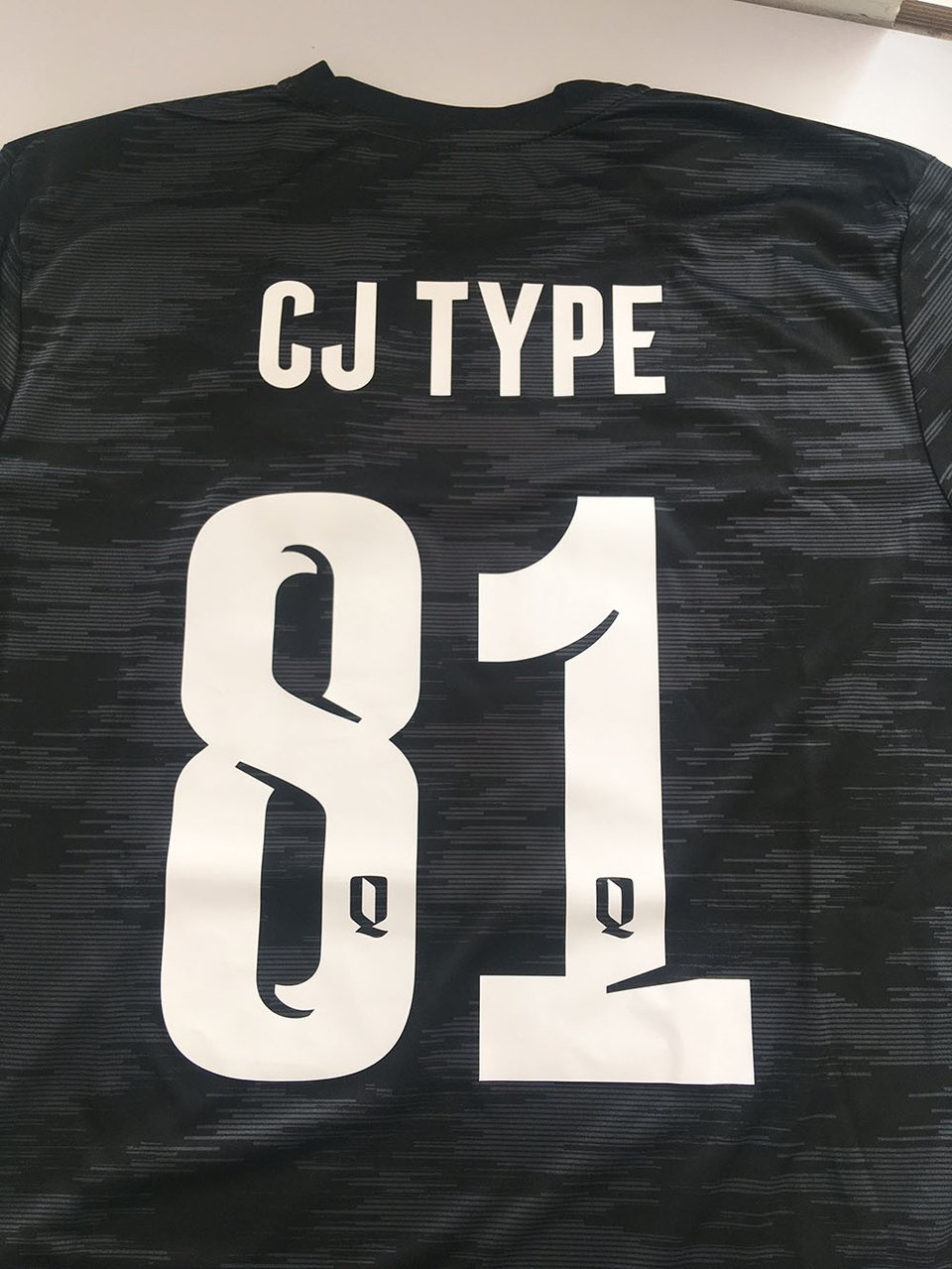
I’m enjoying watching the World Cup right now wearing my CJ Type jersey typeset in Counterpress. Read more about the history of Counterpress and its origins as the typeface for Queensboro FC. It started as just a single Bold weight and only uppercase, but now has 5 impactful weights ranging from Light to Bold with a full Extended Latin character set, for all of your typographic needs on and off of the pitch.
As always, if you have example of CJ Type fonts in use, please send them over! We love to see it.

You just read issue #5 of CJ Type News. You can also browse the full archives of this newsletter.