
“This would result in some serious street cred and respect.”
Welcome to this week’s digest of Unsung, a blog about software craft and quality. Here’s what was posted since last time:
View this issue in the browser with inline videos and better formatting
Movie review: General Magic
★★☆☆☆
2018 / 92 minutes
General Magic was a company started in 1990 by some of ex-Apple staffers, working on a pocket communication device and its operating system (Magic Cap, sporting a fascinating room user interface). The product launched in 1994, but swiftly failed in the market, similarly to and concurrently with its chief competitor, Apple Newton. Many alumni of the company – including Megan Smith, Kevin Lynch, Tony Fadell, and Pierre Omidyar – ended up having successful careers in tech after that, to a point that General Magic is referred to as “Fairchild Semiconductor of the 1990s.”

The eponymous documentary, released in 2018, was disappointing to me. Sure, it is well-edited, and particularly shines owing to a lot of archival footage shot during General Magic’s happy years.
Unfortunately, we get to see none of the sort of details I was hoping to see: no pre-release interface or hardware, no discussion of product nuances, no solid reflection on the company, the culture, or the zeitgeist. The movie drops so many fascinating questions and avenues, but doesn’t really follow up on them:
- At some point, Andy Hertzfeld reflects on setting a bad example by focusing on small playful details instead of rallying the team to ship stuff. Where did this realization come from and did that change him as a person going forward?
- In hindsight, did the company benefit or suffer from the culture of freewheeling “superstars” who are also perfectionists? In a strange, brief vignette, a few people talk about not wanting to have any managers – but that is not picked up again or resolved in any way.
- How did the company manage to hire all of this past and future talent? Are there any repeatable lessons in here?
- During the launch, there is a brief slide with “whole person thinking,” which felt unique for a tech product reveal. Near the end of the movie, Kara Swisher talks about worrying how mobile devices can affect and perhaps even impair human-to-human communication. Those two threads are not connected.
- About the only lesson learned and spoken out loud comes from Tony Fadell, who says: “with the iPod, we iterated a lot faster.” Would this have mattered if the premise of the movie seems to be that General Magic was too early on the market anyway?
- There was a mention of a skeuomorphic room interface done pretty much overnight by Andy Hertzfeld. From the perspective of today, it is the device’s perhaps most distinctive characteristic, but it’s not covered more than that one mention.
- In another very rare specific example, there is a beat talking how iPhone’s (very controversial, early on) software keyboard owes its existence to General Magic’s team trying that first. How did whoever created it feel about it?
- An external observer suggests that General Magic missed the early ascendance of the web, but we don’t see anyone from the company reflecting on it.
Unfortunately, I kept thinking of the movie as “generic magic” – a sort of interchangeable valorization of Silicon Valley’s “failure is secretly success in the fullness of time,” defaulting to romantic or rousing music, that must have felt obsolete even in 2018. It felt like the documentary could very well talk about one of the many other companies and efforts, which is frustrating, because there was something special and unique about General Magic.
I also kept remembering The Soul of the New Machine, Andy Hertzfeld’s own Folklore.org, and even Halt and Catch Fire, all of which more adeptly interspersed personal and emotional drama with specific details you could learn from and take home with you. I think General Magic deserved more.
(I do want to recognize that perhaps this wasn’t a movie for me. The documentary is free on YouTube if you want to check it out – it’s consistent throughout, so if you like the early minutes you might like the whole thing.)

To play with Magic Cap, go to Infinite Mac, click on Macintosh Garden tab at the bottom, search for “magic cap”, click on magic_cap_simulator.sit, go back to the emulator, double click on the Outside World icon, double click on Downloads, double click on the .sit file, wait for it to unpack, close the Downloads window, reopen it, double click on the Magic Cap Simulator icon.
Friday, August 21 / #apple / #history / #movie review / #review
YouTube’s right click relay
An interesting mechanism in YouTube I just learned of.
If you right click once, you get their context menu:

If you right click again, you get the native browser menu:

This is clunky and not discoverable, but I can see YouTube team’s bind here. As far as I know, it is not possible to extend browser’s native right click menu (even with user’s consent), or invoke it in some other way (so that, for example, they could have an entry point to the native menu in their menu).
At the same time it does feel like the correct use of a right click menu, to host quick functions like Miniplayer or Copy Video URL At Current Time or Copy Embed Code – and, you can also see how Chrome’s own menu has a lot of cruft in it.
In a way, this might be what is often called a “progressive enhancement.” It is better than blocking the native menu altogether, and I cannot think of any smarter alternative given the constraints. But it is clunky, as things often are when websites venture out to become web apps.
Saturday, August 22 / #mouse / #web
“A quick internet search should provide you with step-by-step instructions.”
In 2018, Tom Cruise and Christopher McQuarrie teamed up to make a short PSA about the dangers of frame rate interpolation, a.k.a. the soap opera effect:

It’s a strangely boring video from the men known for exciting filmmaking, but it captures a fascinating debate. TL; DR of their argument: Home TVs have an option to take a typical 24fps movie and create interim frames to make it feel like a 60fps production. It’s often on by default, but you should turn it off.
What’s interesting is that 60 or more fps is indeed in some ways objectively better: you see smoother movement, and you can notice more. Once you start paying attention, any whip pan or drastic movement in the cinematic 24fps appears very choppy…
…and, of course, that is completely missing the point. The argument for 24fps is that it’s simply cinema’s vernacular, right next to anamorphic lenses with their blue lens flares and vertical stretching. The movies are not about conveying information, but they are about conveying a certain feel. (And also, about tradition.)
I’m mentioning this because I spotted a similar battle happening when it comes to scrolling.
Go to any page in Vivaldi and hold a down arrow key for a while. That scrolls through the page, moving it in chunks, reacting immediately to the initial key press and then the synthesized autorepeat presses:
Firefox listens to the keys the same way, but it “upgrades” the choppiness to a 60fps movement by interpolating it:
And Safari does something different altogether – it approaches it more like a game physics engine would. It only listens to ↓ down (when it turns on the scrolling “motor”) and then ↓ up (when it turns it off):
This has an interesting effect: the movement is smoother than even Firefox’s – that’s because it doesn’t try to straighten something choppy, but it is itself smooth, by nature.
At the same time, this approach feels a bit loose, like driving an old 1960s car. It also takes away any control of speed; Safari pages always scroll at this rate, no matter your keyboard settings. (Arguably, however, control via the key repeat rate that other browsers respect is also an illusion, as it affects typing as well. Would you ever change it just to control the scroll speed?)
Of course, the analogy to frame interpolation doesn’t really make sense. Safari is not a soap opera, Firefox is not a smooth motion effect on your TV, and Vivaldi is not a cinematic experience. In contrast with movies and television, I don’t think there are any expectations or tradition here.
In this particular context, I believe Firefox and particularly Safari are better because this is about conveying information, and smoother scrolling does help your eyes and your brain connect all the little befores with all the little afters.
But I am sharing it mostly as a reminder that a keyboard is really just a button board by a different name. And sometimes it’s good to look at a key hold, and decide:
- is this a sequence of pulsating key presses,
- or is it a button being held down and then released up?
Sunday, August 23 / #interface design / #keyboard / #motion design / #youtube
Testing tip: Make your keyboard fast
I believe every modern operating system allows you to set the key repeat rate and the delay before first repeat:


By default, on a Mac, the initial delay is 500ms, and the key repeat rate 1000ms. You can adjust both:
- Initial delay goes from 250ms, to as long as 2s.
- Repeat rate goes from 2000ms (once every two seconds) all the way to a whopping 33ms (30 times a second).
On a PC, the shortest values are exactly the same, but Windows 11 only allows up to 405ms between key presses, and 1000ms of initial delay.
My suggestion is to make them both as short as possible for testing.
Why would that be helpful? There are two reasons.
First, it’s good to test whether your keystrokes behave well when repeated. Occasionally you might want your interface to suppress repeating, or do something special if the key is held longer.
Second, it’s a good test not just of repeating, but just the user pressing keys really fast. It’s very important for the UI to never make you wait for any animations or transition, and a lightning fast 30fps repeat rate is a good way to stress test your system this way.
Here’s me holding the Tab key in Figma at a standard key repeat speed:
It’s nice to see those transitions help you orient yourself as you’re thrown around the canvas. But look at what happens when I do the exact same thing with the key repeat cranked up:
The transitions are now slowing the UI so much that you can no longer see any canvas movement – the canvas only catches up when I release the Tab key.
The smooth movement assumed a certain minimum key rate, and perhaps wasn’t tested with a faster one.
There are of course ways about it, like speeding up the interactions, suppressing the transition smartly, or introducing a custom repeat rate if needed – I talked about it a bit in my essay about designing fast keyboard interfaces.
Here’s an example of an interface that suspends transitions at a fast keyboard rate and responds in real time:
This looks very chaotic especially since you’re not in a driver seat, but this interface is at least honest and doesn’t make the user wait. And it might not be pure madness – you would be surprised how fast people’s brains and fingers can react.
But first, you have to be aware of the problem, and I think setting up those key repeat values as short/fast as possible will help you find more of those kinds of issues.
(And you might choose to keep those high speeds anyway in regular use, like I do.)
Sunday, August 23 / #flow / #keyboard / #tips
“This would result in some serious street cred and respect.”
A fascinating 11-minute video by Modern Vintage Gamer about the PC videogame piracy in the 1990s:
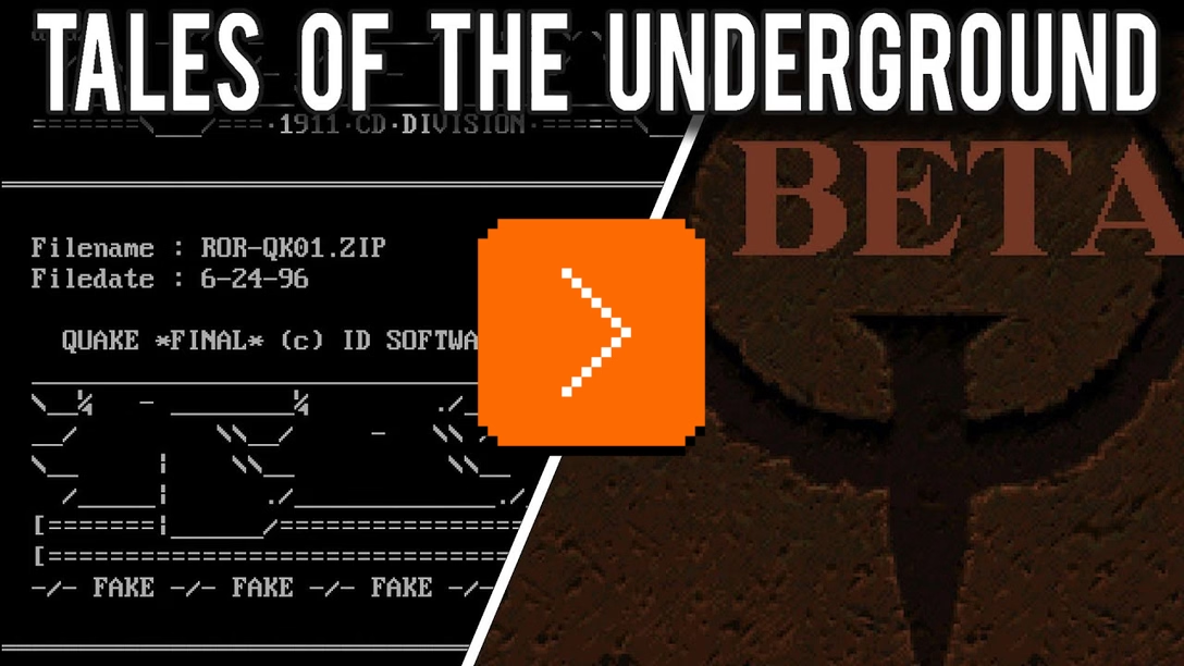
This is a “no honor among thieves” story about a few groups racing to pirate and release one of the most important videogames in history: 1996’s Quake.
There is a lot of interesting vernacular here: leetspeak, nfo files, cracktros, ASCII art, BBSes, IRC, a bunch of slang, and even specific font styles. At the same time there is also some unexpected bureaucracy – apparently videogame pirates had sort of a governing body, which perhaps was also somewhat corrupt?
Sunday, August 23 / #games / #piracy / #youtube
“This way, the interface does not get in the way.”
Ilya Birman on his blog talks about interfaces that unnecessarily slow people down, in a series of two posts.
In the first one, titled “Let me click,” Birman shows a few places that force the user to go through a roundabout series of clicks, instead of taking a direct route:

In Aegea’s comment settings, there is a “send by email” checkbox with an email-address field associated with it. If the checkbox is unchecked, there is no point filling in the field: the address is not needed for anything else. If the checkbox is checked while the address is blank, the system cannot send anything as it does not know the address. In short, these controls are interconnected.
Logically you could disable the input altogether if the checkbox is unchecked — there is no point filling it in anyway. But that is irritating. What if I want to enter the address and then turn on the checkbox? It would be even worse not to let me turn off the checkbox when the address is filled in. I want to turn it off — let me click!
In a follow-up, Birman talks about a specific example from the podcast app Overcast, whose creators faced with a tricky systemic challenge:
For any podcast, you can set how many episodes to keep downloaded on the device. Say you set the limit to three, then stop listening to a podcast regularly: the next three episodes download, and after that it stops downloading them — why waste the space? […]
[But,] what if someone manually asks to download an episode when they already have three downloaded? You can’t just immediately delete it to keep things tidy. […]
Finally, Marco’s wife Tiff suggests a solution to all the problems: just don’t let users download more episodes, she said, and show them a message, roughly: “Your episode limit is three, but this would be the fourth, denied”.
Marco liked the solution. I didn’t. Sure, it solves Marco’s problems, but not the user’s.
I haven’t seen the Overcast block in action, but all of Birman’s examples across both blog posts rang true to me. Motor memory wants what it wants, and stops for no one.
I wanted to add two things from my end.
1.
Birman presents this as “Let me click,” but I wanted to offer two alternative/complementary principles that helped me before:
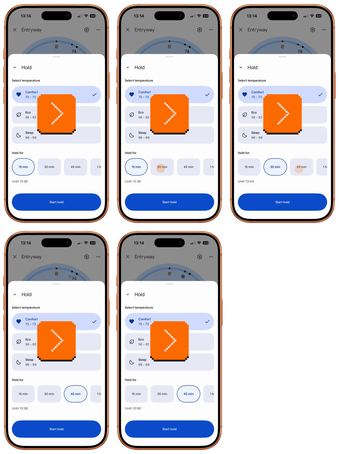
- Let me do things in any order. Here’s Google Home app, where I can change the temperature and the time for holding – but if I change the time first, it frustratingly resets when I subsequently change the temperature. It forces one specific order in an interface that suggests any order is okay:
- The current action has the most momentum. The user is right there, active, tapping on things, wanting to get stuff done. If Overcast indeed throws a “your episode limit is three” message, then it forces the user to remember how to get to the settings and change it. The momentum is lost. The decisions of past me should not be as important as the decisions of present me.
2.
I agree with all the examples given by Birman, but things can be stranger, and sometimes letting people click or do things in any order can make the interface harder to understand.
In Figma, each text box dimensions could be set to be completely automatic (automatic width and height – used for short labels), with only specific width (and automatic height – used for paragraphs of text), or with manual width and height (used for graphic elements):
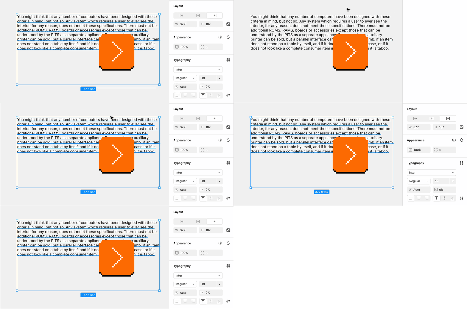
You can also see that in text boxes where width or height are automatic, the fields for those values are grayed out, and cannot be changed. In order to change them, you have to switch to a particular mode first, which makes the relevant fields active. This is to help people understand how those things relate to one another in a pretty tricky space, but it effectively means sometimes Figma won’t let you click, and will force you to do this in one specific order.
But this is only in those fields – you can always grab the object on the canvas and resize it, and it will switch to manual on its own, respecting the drag’s momentum:
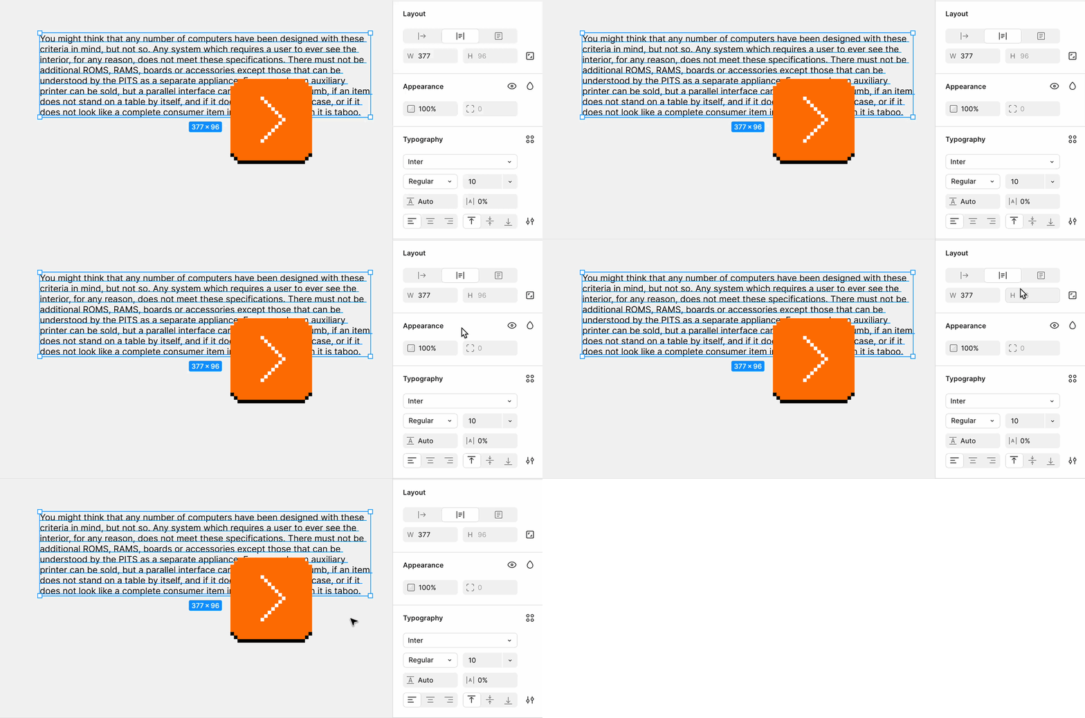
The inconsistency here is intentional. I’m not saying these are the right choices, and we indeed heard from some users frustrated that they cannot click easily when they already understand the system (unfortunately, I am aware of no good affordance for “breaking” a disabled field in modern GUIs, like a molly guard). I mostly wanted to share that these things can be hard, and the balance between “let me click” and “not being able to click can be helpful in understanding the system” tricky to achieve.
I keep thinking of the story from a decade ago when someone’s phone rang at the front row of a New York Philharmonic’s concert, prompting an actual performance halt, and anger from both the conductor and the audience. The ashamed patron’s eventual explanation was: “I turned the phone to silent, but I also had an alarm set up.”
Let’s assume this is actually true (in people’s reports, the phone rang the marimba ringtone, which isn’t standard for alarm – but people’s recollections are routinely flaky, too). This, I think, is a perfect example of “let me click” in action. You can set an alarm for a certain time, and you can subsequently turn the phone to silent. You can also do it in the opposite order. You just gave your phone two inconsistent instructions, and the phone logic decided in either case the alarm will win.
I can’t think of an easy interface solution here. It feels correct for the order to not matter here. It’s hard to imagine disallowing you switching to silent mode with any alarms on, since the silent mode also affects calls. It’s also hard for me to imagine any effective UI warnings at any given moment in the process. (Besides, back in the day, iPhone used to give you a gentle one via a little alarm icon visible in the top bar.)

The silent mode and the alarms are, as Birman put it, interconnected – but their connection is ultimately tricky to explain to the user.
Monday, August 24 / #case study / #details / #flow / #principles / #system design
Mark MacKay’s explainers
If you haven’t played Kern Type yet, you’re in for a treat – released by Mark MacKay in 2011, it’s a delightful browser game that teaches you the art and the math of text kerning:

If you have played it, you’re still in for a treat, as MacKay under the Method of Action label released a few similar games since:
- The Boolean Game (2019)
- The Bézier Game (2014)
- Color: A Color Matching Game (2012)
- ShapeType: A Letter Shaping Game (2011)
They’re interesting not just because you can explore the feel of visual, typographical, and color craft by play – but also because they’re also really nicely made explainers. Here, you can learn things, but also learn about making things that teach things.
For example, I liked the thoughtful onboarding, animations, and sound design of The Boolean Game, the keyboard navigation in Kern Type, and this general idea present in a few games that it’s fun to learn by fixing slightly broken things, rather than starting from scratch.
As far as I can tell, MacKay also occasionally revisits the older games, so Kern Type today might feel much better than when you played it last. MacKay also vibecoded a quick aspect ratio game, and is thinking of a new game to teach text editing, which excites me to no end.
I added a new tag to Unsung, #explainer, to cover explainers and playgrounds like these.
Tuesday, August 25 / #above and beyond / #colors / #explainer / #graphics / #text editing / #typography
Two previews for the price of one
A thoughtful moment in the Arrange Displays pop-up in macOS’s Settings when you choose to designate a screen to be a primary screen:
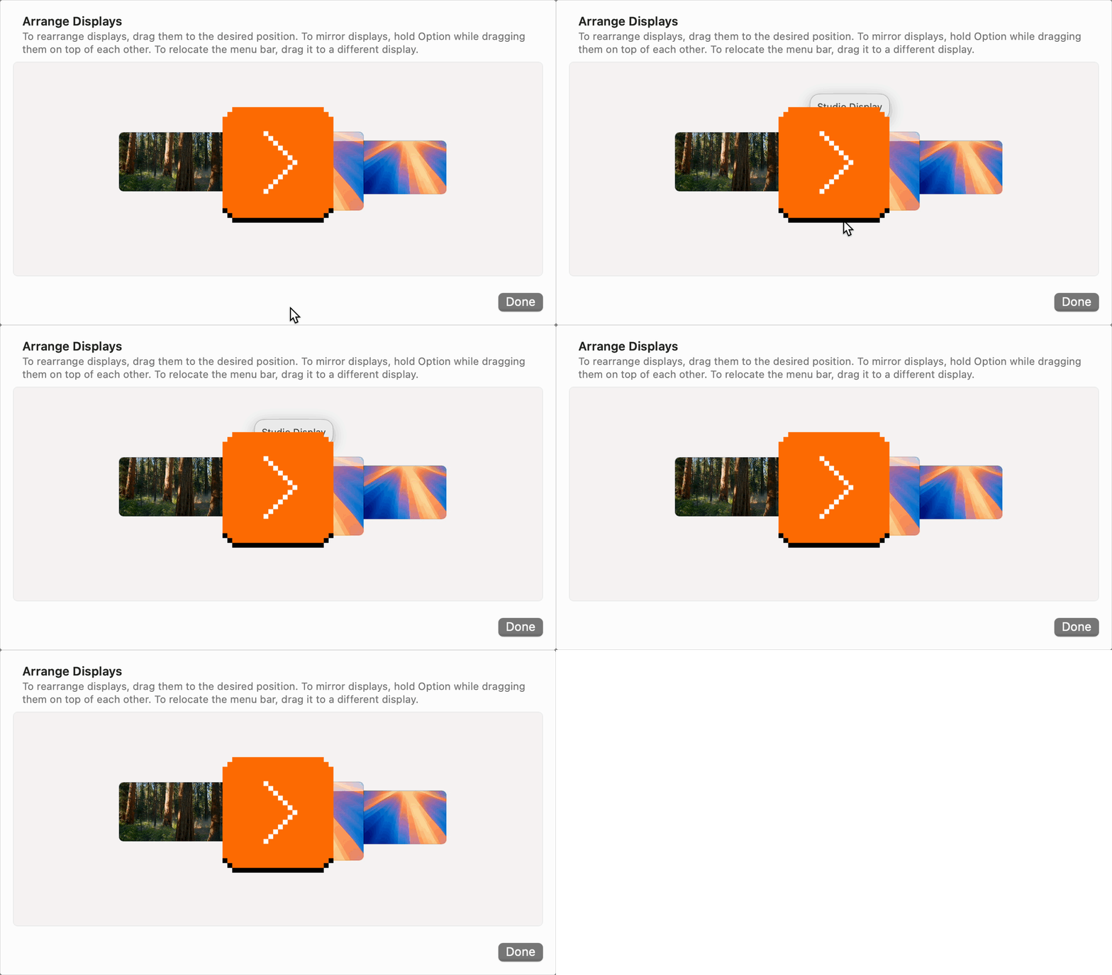
It not only shows a nice preview of where your menu is going to land, but also changes the shape of the menu proxy you’re holding, to help you connect the two.
(The whole interaction is probably obsolete, though – if I remember correctly, it used to be that you could only have a menu on one designated screen. Today, the menu is replicated on all screens.)
Tuesday, August 25 / #above and beyond / #mouse / #preview
Let me walk around
A perfect example of breaking the “let me click” slash “the current action has the most momentum” principles we just talked about, in macOS Settings. When you try to add a new keyboard layout, the layouts you already have added are completely disabled, not just from addition, but even from selection:
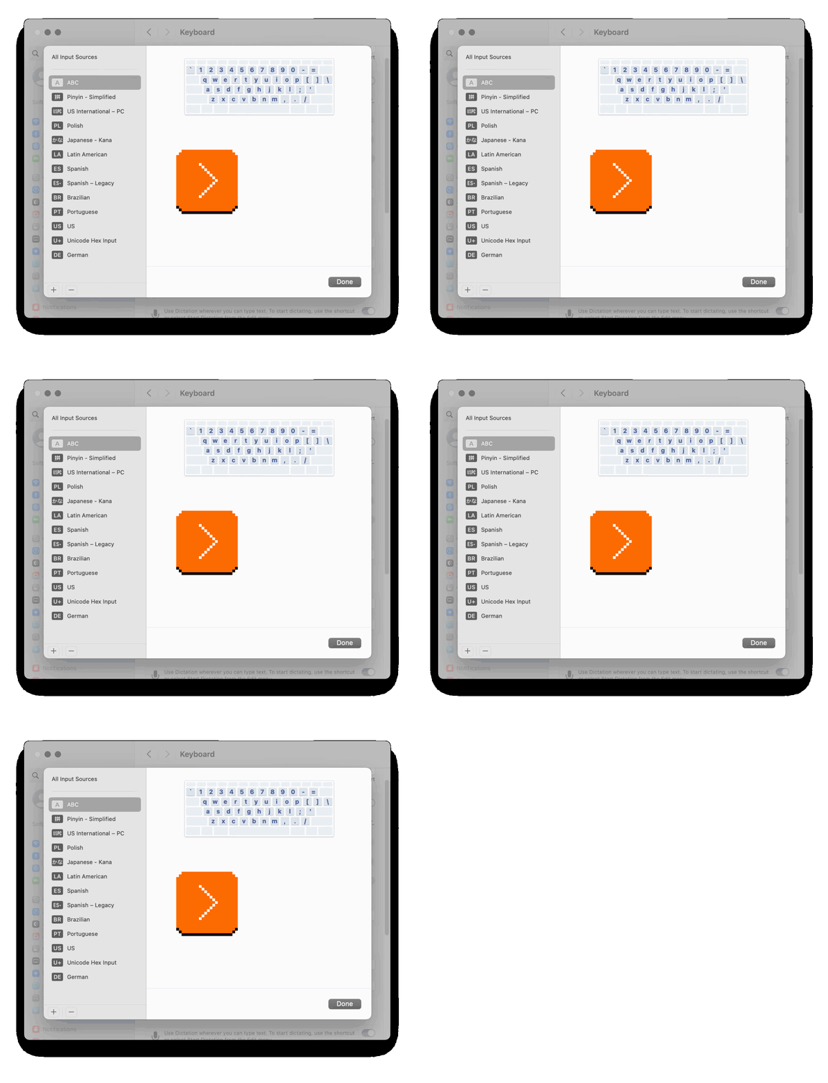
On a surface this seems useful, right? A good signal to help you understand what you’ve already done? But this implementation also makes it unable to compare layouts of keyboards you have installed with the layouts you have not, since they previews are now in two different places. And this is important, as the differences between those layouts can be tiny, but significant.
This breaks momentum, and in the process also makes it hard to establish a good map of the entire space, since you are not allowed to walk around it freely. A tactical solution seems to be relatively standard at this point – disable the Add button instead, and indicate the already-added layouts in some other way.
Unrelated, but also – this popup-on-a-popup reminded me of this glorious old tram bezel city I’ve seen in Melbourne:

Wednesday, August 26 / #flow / #interface design / #mac os / #preview
Medium’s writerly favicons
One of the small things I added to Medium in early 2016 was a change to the favicon:

It came from an observation about the writing process. When writing on Medium, you are likely to have a bunch of Medium tabs open with other posts, yours or otherwise, for reference… but you usually only have one tab you’re writing in. Why not make it extra visible so that you can easily come back to it?
But there was a second, more emotional reason. Writing is hard. Many people never touch the “New story” button, on Medium or otherwise. I wanted the writers to feel extra amazing, with the interface itself giving them a nod of recognition. (Visually, the hollow draft icon was also meant to be a “scaffolding” of the published story icon.)
I’d love to hear more about websites or web apps that are using favicons in a particularly useful or delightful fashion. If you have examples, I would appreciate a note!
Wednesday, August 26 / #details / #iconography / #marcin wichary / #web
“This time, there had to be a different ending.”
It is a testament to how much things have changed in competitive NES Tetris – a game released the same month the Berlin Wall fell – that this 1hr documentary by Summoning Salt that talks about the 2018 Tetris Championship covers the previous revolution in a play technique:
I don’t watch a lot of sports, but I think this is a sport movie: a battle between the classic DAS players – DAS stands for Delayed Auto Shift and means that the player just holds the left or right pad and have the piece slide on its own – and the new-at-the-time technique of hypertapping, which allowed to move the piece to the side faster, but was really demanding on the player’s hands.
It’s gripping at times – wait until the moment when a DAS player runs with a dangerous move called “quick tap” – but also surprisingly touching at the very end.
(If you are interested, the newer playing technique that was invented in the 2020s, and even more effective than hypertapping, is rolling.)