“The ghosts are fast and they don’t turn blue.”
Welcome to this week’s digest of Unsung, a blog about software craft and quality. Here’s what was posted since last time:
View this issue in the browser with inline videos and better formatting
“What actually happened was the birth of a genre in digital graphics.”
A really well-produced 27-minute video from Super Splash Wave about 8-bit and 16-bit pixel art:
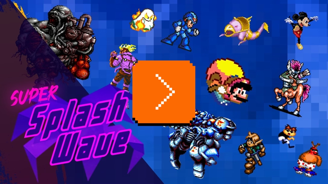
What I liked about the video is that it doesn’t just revel in nostalgia, but goes deeper into some techniques and trends and details in the videogame graphics of the 1980s and the 1990s: palette limitations, palette animation, sizes of objects, dithering, parallax, small ventures into 3D, etc.
It was also great to see specific changes and evolution of what from the distance of 2026 might seem like one monolithic era. The very first games used rigid grids and the assets were generally done by engineers themselves. Then, the work was split between artists doing the visuals, and engineers implementing then. Only after that, closer collaboration between engineering and artists allowed truly spectacular effects to take place, mirroring what we’ve seen in UX design when designers and front-end engineers work closely together.
Friday, August 14 / #games / #graphics / #history / #youtube
History doesn’t repeat itself, but it often tiles
Following (or, preceding) the previous post…
1.
Old computers loved 8×8 fonts and they also loved 8×8 graphics.
Since for many of those computers the graphics were displayed side by side without any gaps, the fonts had to waste a precious pixel or two to create some breathing room between the characters. But there was a benefit to this arrangement – you could seamlessly combine two or more tiles into something bigger.
You could see that already in built-in graphics for a late 1970s computer Ohio Scientific Challenger 1P: a lot of single-character graphics of houses, tanks, planes, and people – but also some that only made sense fused together, forming submarines, warships, or the U.S.S. Enterprise:

A later computer called Atari ST had an Atari logo spread across two characters, and an easter egg – a 16×16 face of “Bob”.

And Apple II’s character set allowed to combine a few glyphs into a running man, a folder, or a scrollbar:

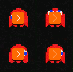
Arcade videogames did the same. Pac-Man’s maze was assembled out of solitary 8×8 characters, but Pac-Man and his frenemies were large, clocking in at 16×16:

You can even spot a fascinating technique above. The ghost could cleanly fit in a 2×2 grid, but instead it’s offset vertically and takes up a 2×3 slot. Why? Just so the eyes and the “skirt” could move independently without a combinatorial explosion of tiles needed:
2.
Not long ago, we looked at various installation graphics for Mac OS X apps. Those creatively used a new feature of Finder: a way to specify a background image.
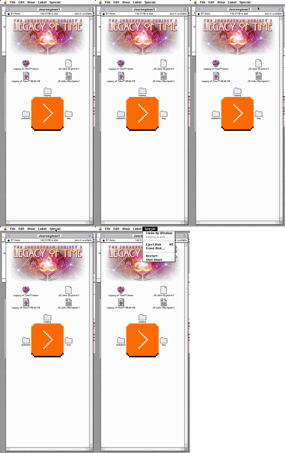
The Finder before Mac OS X, from 1984 to the late 1990s, didn’t have that feature, and yet you could occasionally see something like this:

How was it done? By splitting the graphics into many 32×32 icons, and then positioning them carefully inside the window.
The icons weren’t proxies of apps or even images. They were just there. The last ingredient was names composed of only whitespace, and it all started looking like one unbroken huge image… except when you invoked the Clean Up function, which proceeded to ruin the whole thing in a particularly delightful fashion:
3.
Ever since its launch in 2014, Slack allowed anyone at any workplace to create custom, shared emoji, and starting a year later, people could also use them in their reactions.

Those proved to be very popular, and many books could be written about how custom emoji reflect a given organization’s culture.

Many emoji could also be output side by side, and Slack chose not to put any space between them:

I think by now you know where this is going.
People started splicing bigger images into smaller emoji, first by hand…
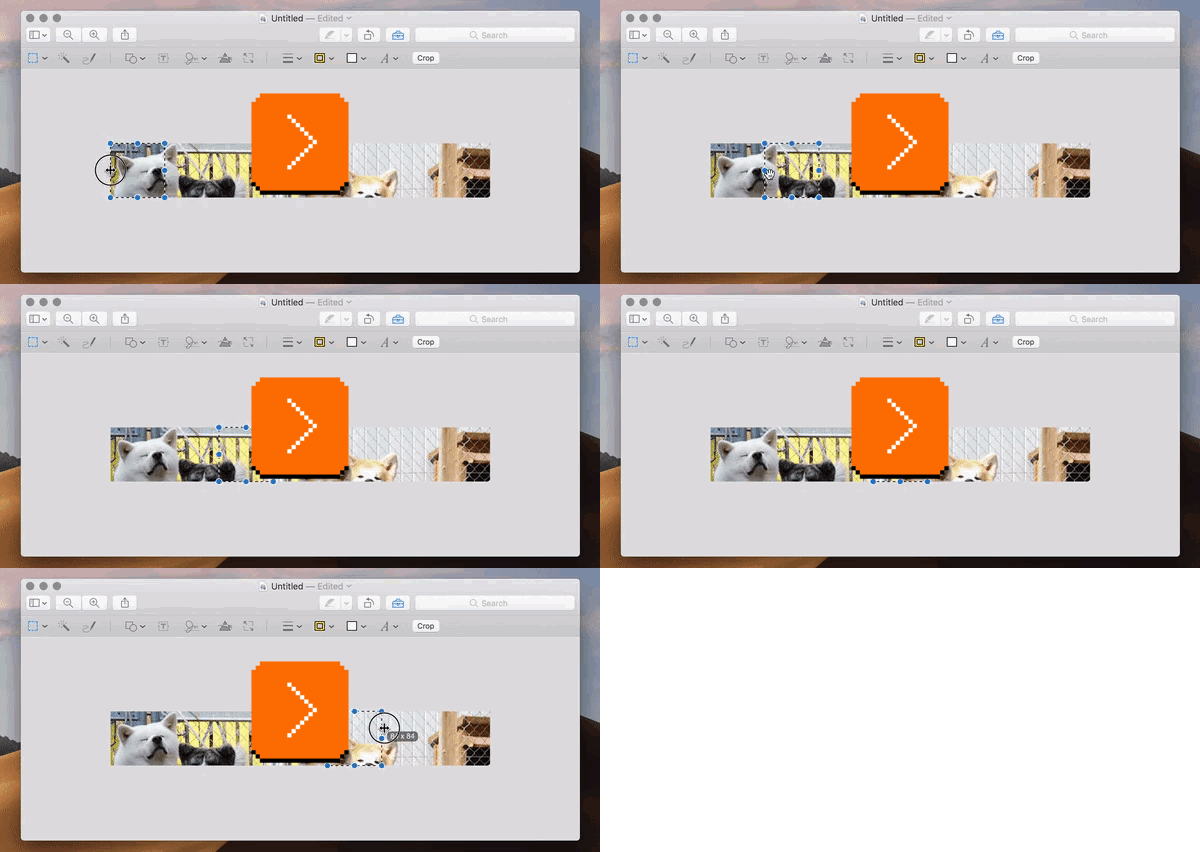
…then with limited automation, and then via fully automated tools with names like slack-big-emoji or slack-emoji-enlarger:
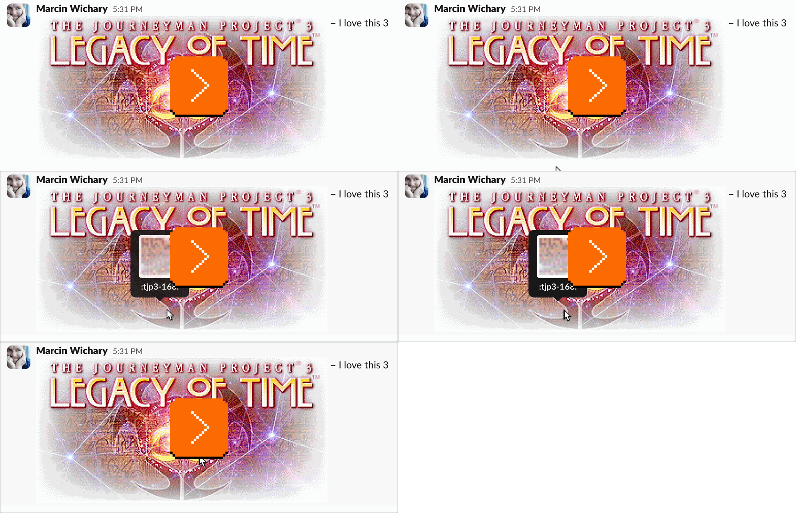
As in every other version of this technique, assembling the tiles the proper way is part of the challenge. The one above looks like this:
:tjp3-000::tjp3-001::tjp3-002::tjp3-003::tjp3-004::tjp3-005::tjp3-006::tjp3-007::tjp3-008::tjp3-009::tjp3-010::tjp3-011::tjp3-012::tjp3-013::tjp3-014::tjp3-015::tjp3-016::tjp3-017::tjp3-018::tjp3-019:
:tjp3-020::tjp3-021::tjp3-022::tjp3-023::tjp3-024::tjp3-025::tjp3-026::tjp3-027::tjp3-028::tjp3-029::tjp3-030::tjp3-031::tjp3-032::tjp3-033::tjp3-034::tjp3-035::tjp3-036::tjp3-037::tjp3-038::tjp3-039:
:tjp3-040::tjp3-041::tjp3-042::tjp3-043::tjp3-044::tjp3-045::tjp3-046::tjp3-047::tjp3-048::tjp3-049::tjp3-050::tjp3-051::tjp3-052::tjp3-053::tjp3-054::tjp3-055::tjp3-056::tjp3-057::tjp3-058::tjp3-059:
:tjp3-060::tjp3-061::tjp3-062::tjp3-063::tjp3-064::tjp3-065::tjp3-066::tjp3-067::tjp3-068::tjp3-069::tjp3-070::tjp3-071::tjp3-072::tjp3-073::tjp3-074::tjp3-075::tjp3-076::tjp3-077::tjp3-078::tjp3-079:
:tjp3-080::tjp3-081::tjp3-082::tjp3-083::tjp3-084::tjp3-085::tjp3-086::tjp3-087::tjp3-088::tjp3-089::tjp3-090::tjp3-091::tjp3-092::tjp3-093::tjp3-094::tjp3-095::tjp3-096::tjp3-097::tjp3-098::tjp3-099:
:tjp3-100::tjp3-101::tjp3-102::tjp3-103::tjp3-104::tjp3-105::tjp3-106::tjp3-107::tjp3-108::tjp3-109::tjp3-110::tjp3-111::tjp3-112::tjp3-113::tjp3-114::tjp3-115::tjp3-116::tjp3-117::tjp3-118::tjp3-119:
:tjp3-120::tjp3-121::tjp3-122::tjp3-123::tjp3-124::tjp3-125::tjp3-126::tjp3-127::tjp3-128::tjp3-129::tjp3-130::tjp3-131::tjp3-132::tjp3-133::tjp3-134::tjp3-135::tjp3-136::tjp3-137::tjp3-138::tjp3-139:
:tjp3-140::tjp3-141::tjp3-142::tjp3-143::tjp3-144::tjp3-145::tjp3-146::tjp3-147::tjp3-148::tjp3-149::tjp3-150::tjp3-151::tjp3-152::tjp3-153::tjp3-154::tjp3-155::tjp3-156::tjp3-157::tjp3-158::tjp3-159:
:tjp3-160::tjp3-161::tjp3-162::tjp3-163::tjp3-164::tjp3-165::tjp3-166::tjp3-167::tjp3-168::tjp3-169::tjp3-170::tjp3-171::tjp3-172::tjp3-173::tjp3-174::tjp3-175::tjp3-176::tjp3-177::tjp3-178::tjp3-179:
:tjp3-180::tjp3-181::tjp3-182::tjp3-183::tjp3-184::tjp3-185::tjp3-186::tjp3-187::tjp3-188::tjp3-189::tjp3-190::tjp3-191::tjp3-192::tjp3-193::tjp3-194::tjp3-195::tjp3-196::tjp3-197::tjp3-198::tjp3-199:
What’s the point, you might ask, if Slack also allows to share images?
I am not certain there is one. Sure, you can write around a tiled image in a way you cannot around a regular image, and you don’t get any chrome. But the real rationale here is, simply, the love of the game.
But this is why I love the details of history. You never know when an old detail chooses to come back to life again. Sometimes it will be a fun hack to try, but once in a while, it might be the only solution to a gnarly problem.
Thank you to Andrew Yaros for teaching me about tiling in classic Mac OS.
Friday, August 14 / #easter eggs / #finder / #games / #graphics / #hacks / #history
Deeper dive: Were Touch Bar’s problems software rather than hardware?
The Touch Bar arrived in 2016 seemingly already pre-doomed, on a generation of machines that had a “we’ve run out of ideas” smell all around them. The arrow keys were reshaped, the keyboard got a slimming down, and even the beloved MagSafe wasn’t, in fact, safe. All of these changes would prove unpopular and get reverted in time, and the axe would eventually come for the Touch Bar, too.
With an enormous benefit of hindsight, a decade after its arrival, and on the (rumored) eve of fully multitouch MacBooks, I wanted to look critically at the Touch Bar in more detail. I put a spicy title above this post, and while I’m not sure I can answer it in the affirmative, I feel I got surprisingly close to that.
What did the Touch Bar do?
The Touch Bar replaced the top row of the keyboard with a narrow touch screen and a Touch ID surface/button on the right.

The touch screen provided a constant virtual Esc key on the left, and the remainder could become one of a few things:
- app controls – whatever the app wanted (either buttons or more interactive surfaces):

- control strip – roughly the same as what function keys do today by default (brightness, transport controls, volume):

- a hybrid mode of smaller app controls on the left, and expandable control strip on the right:

- F1–F12 keys:

- a few smaller modes, like showing spaces, quick actions, or emoji:

- small submodes where only the middle of the Touch Bar would be taken over:

The Verge has a five-minute video that shows a lot of this stuff nicely.
Functionality
Touch Bar arrived with a hybrid of functionality for casual and pro users – some built into the macOS itself, and some coming from specific Apple-owned apps.
A few apps offered basically a subset of their toolbars (although often without customization), with an occasional submenu, like digging deeper into font options or choosing a color adjustment. Some apps like Safari and Photo would invest in tiny previews of objects.
Particularly demo-friendly were sliders for volume and brightness, and those in specific apps – playback in QuickTime, or swiping through the photo gallery, clearly inspired by similar controls on the iPhone. Even though Touch Bar was referred to as “multitouch,” it really only supported tapping and horizontal swiping, with just the latter being something classic function keys clearly couldn’t do.
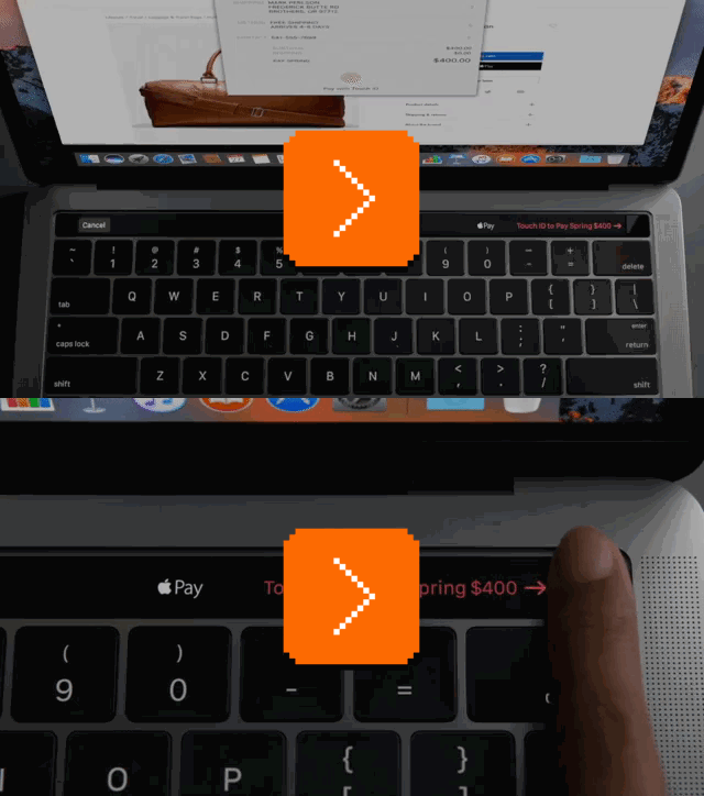
A simple but effective was also an arrow pointing to Touch ID authorization and payments – a small example of software proprioception – which Apple even included as a GIF in their press release:
But there were also some strange moments, the strategy feeling a bit like “let’s throw a lot of stuff at this and see what sticks” (then again, it worked for the first Apple Watch!):
- Any system dialog would show its buttons repeated in the Touch Bar. This felt puzzling to me, as those were already served well by both mouse interactions and keyboard (Esc/Enter).

- It was nice that you could drag the volume or brightness control, but then the slider would be disconnected from your finger and the volume would also appear in the old HUD on the screen, altogether feeling like different parts of the system weren’t aware of each other.
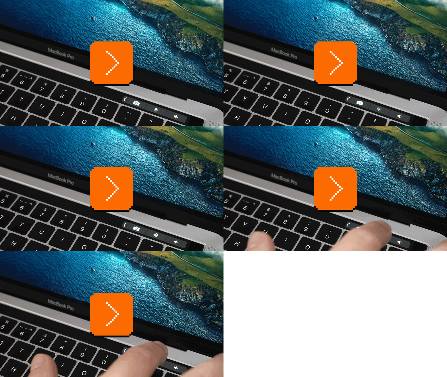
- Xcode offered a button to comment out the current line or selection, which must have felt almost insulting to programmers – is there anyone who’d prefer that over the ⌘/ key combination?
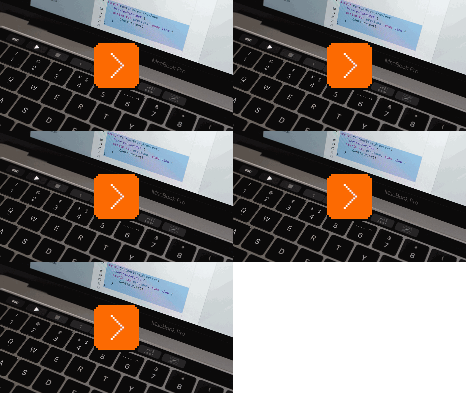
Lastly, for the first edition, the IA felt complex:
- Word completion was in the middle of the bar, but the emoji entry point was on the left.
- There were many kinds of chevrons (at least three!), and the action didn’t fully match their arrows – some of the chevrons indeed made the controls expand in an expected direction, but some instead drilled deeper and took half of the bar, and others took over the whole thing. (On top of that, some controls had regular horizontal scrolling.)

- Some controls that looked like regular buttons expanded on tap, too, so in effect it was never truly clear what a control would do when touched.
- The close boxes were sometimes on the left, and sometimes on the right of the buttons.
Settings
Strangely for such a high-profile feature, the Touch Bar settings arrived sprinkled in between older keyboard options, rather than in a separate Touch Bar tab that could help you understand the whole system easier, and also perhaps offer nice previews of what was possible.

Apple’s penchant to brand even small things also backfired a little bit – customizing the Touch Bar required facing strange phrases like Quick Actions, App Controls, and Control Strip (this is where the usually non-nostalgic Apple reused a classic name, rather than naming it System Controls to mirror App Controls).
On the other hand, the Customize Control Strip interaction here was an absolute highlight, providing a magical-feeling bridge between the world of the Touch Bar and the heavens above it – this was perhaps the best-designed part of the whole system:
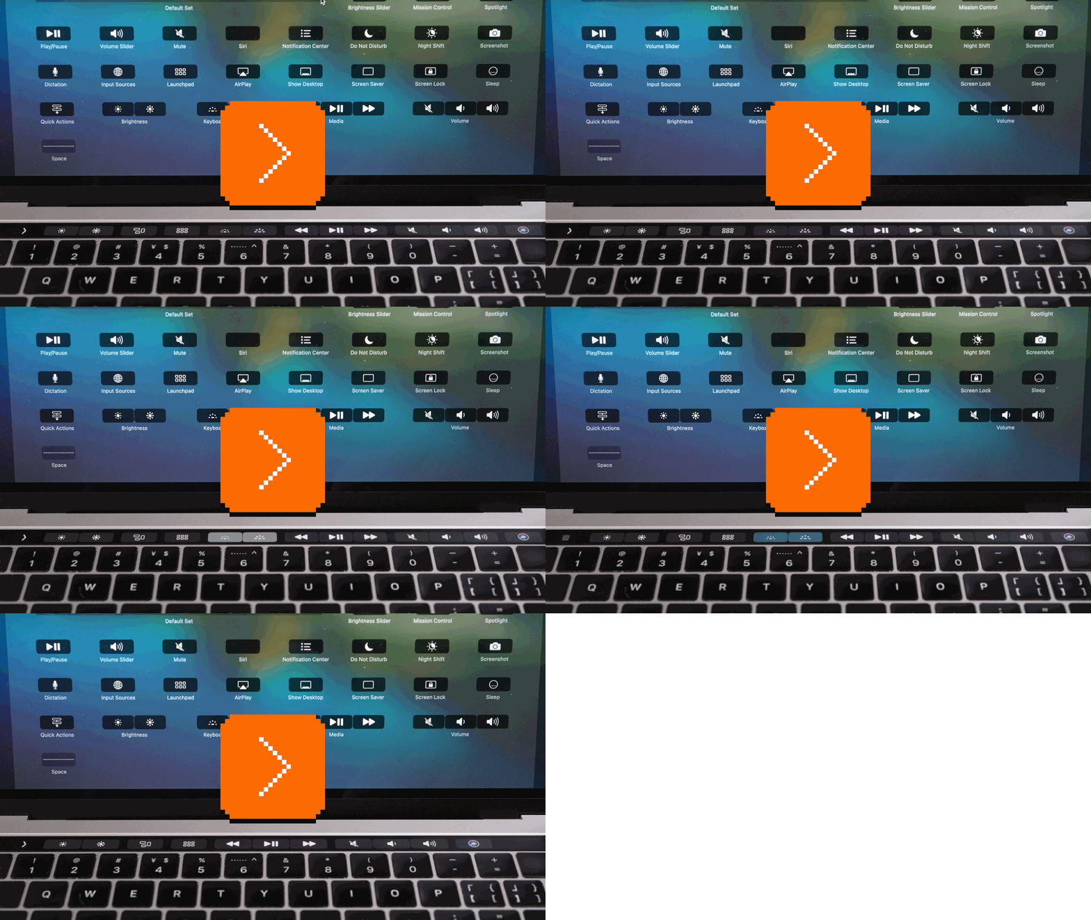
(That kind of customization was also available in some, but not all of the apps that supported the Touch Bar.)
By the way, Apple seems to have learned the settings lesson since 2016, or even overlearned; the action button introduced to the iPhone in 2023 came with a lavish new interface:
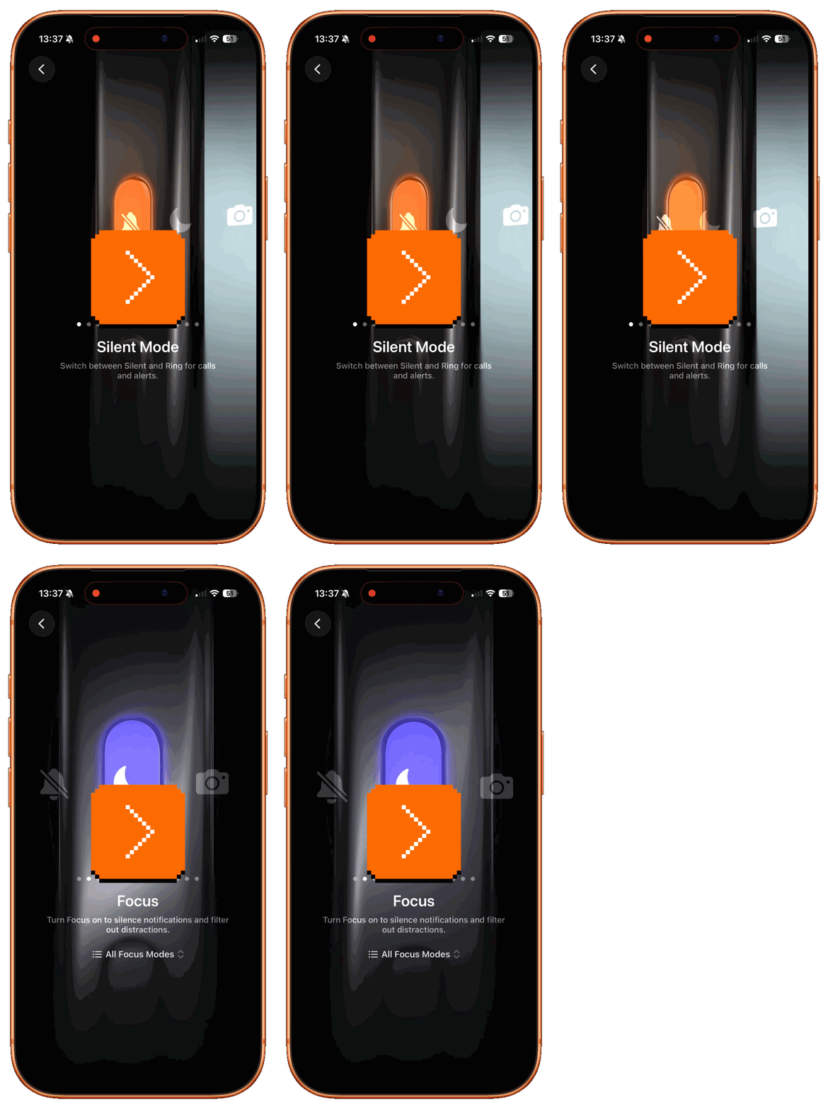
First public reactions and the evolution
Back in 2016, the Touch Bar arrived to muted optimism (“not great, perhaps promising, looking forward to season two and three”), mixed with loud frustration from seemingly every single person who relied on the physical Esc key.
Touch Bar was only revisited once, in 2019; this slight update reintroduced a mechanical Esc key, and felt slightly faster in use.

There were no other hardware improvements, and I believe zero software changes from Apple’s side during the whole lifetime of the feature. Some third-party apps added Touch Bar support in the first few years, but even then the verdict seemed somewhat reserved:
Most Final Cut Pro power users will be so used to using keyboard shortcuts for the editing functions they use regularly that they may not find the Touch Bar any quicker for simple editing and playback, but the sheer number of context-dependent settings means it’s likely to prove its value eventually.
The Touch Bar never made it to non-Pro MacBooks or other computers, and started being phased out altogether five years after its arrival. Perplexingly and for reasons we might never know, the project was “maintenanced” almost as soon as it launched, and it wasn’t immediately removed perhaps only to save face.
Haptics and ergonomics
Touch Bar felt unpleasant to fingers.
People’s ire around the Esc key was mostly in how “dead” it felt next to the other keys, which was especially important for something further in the periphery, used as an escape hatch or as a core interaction by programmers. (The key was also slightly offset, likely only to preserve symmetry vis-à-vis Touch ID on the other side.)
I bet that the unavoidable and constant comparison of the feel of the Touch Bar buttons to the real keys just below was what made the whole thing feel worse than it was, and I’ve always wondered if haptics could have helped here. What if a light touch offered gentle haptic feedback similar to feeling the “ridges” of the keys without pressing them, and a deeper press offered a proper haptic tap?
Already in 2016, Apple had similar tech in the trackpad underneath. I bet I’m underestimating how hard or expensive it would be to repurpose it, but: the iPods never had true haptic feedback, yet even in the first model they arrived with a little speaker that emitted haptic-like sounds on actions. It was surprisingly effective, and I was curious why Apple didn’t do the same thing here.
On top of that, while the row of function keys above is fun for an occasional press, it doesn’t ergonomically seem as great in prolonged use. Reaching up to the Touch Bar is more effort than reaching for the trackpad, whether you put it below or to the side – there’s a reason keyboards grow wider but they rarely grow taller. In The Verge video above, you can see the reviewer use a Touch Bar button as a modifier key while interacting with the trackpad below, and it feels unpleasant just watching that happen:
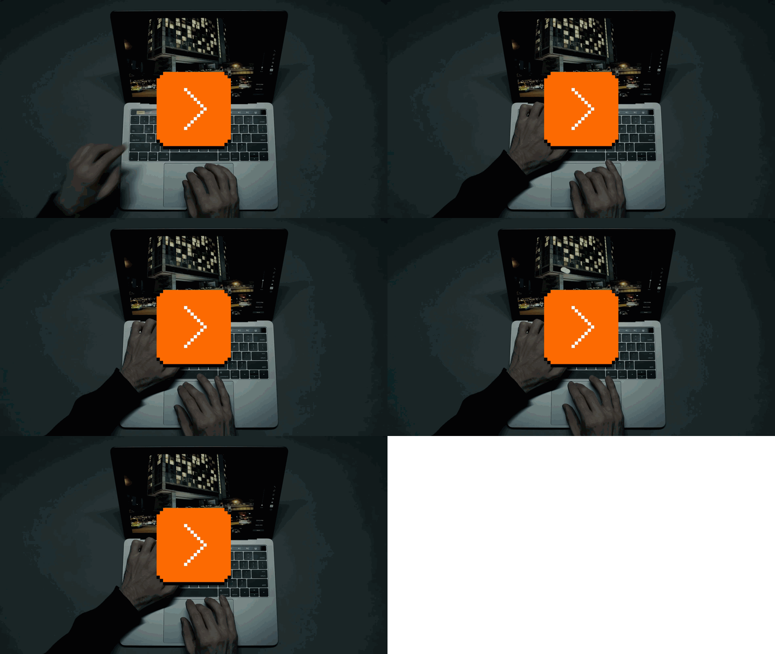
On top of that, the Touch Bar surface sat lower than the surface of the keys, which made it ever so slightly less pleasant to use – it didn’t only feel like it was above the keys, but also behind them.
There were other rough edges that added up:
- The Touch Bar would go to sleep eagerly (after only 60+15 seconds), hiding all its controls and forcing you to tap it or press a key to wake it up.
- The quality of the animations was not the same as on the other touch devices or the Apple TV.
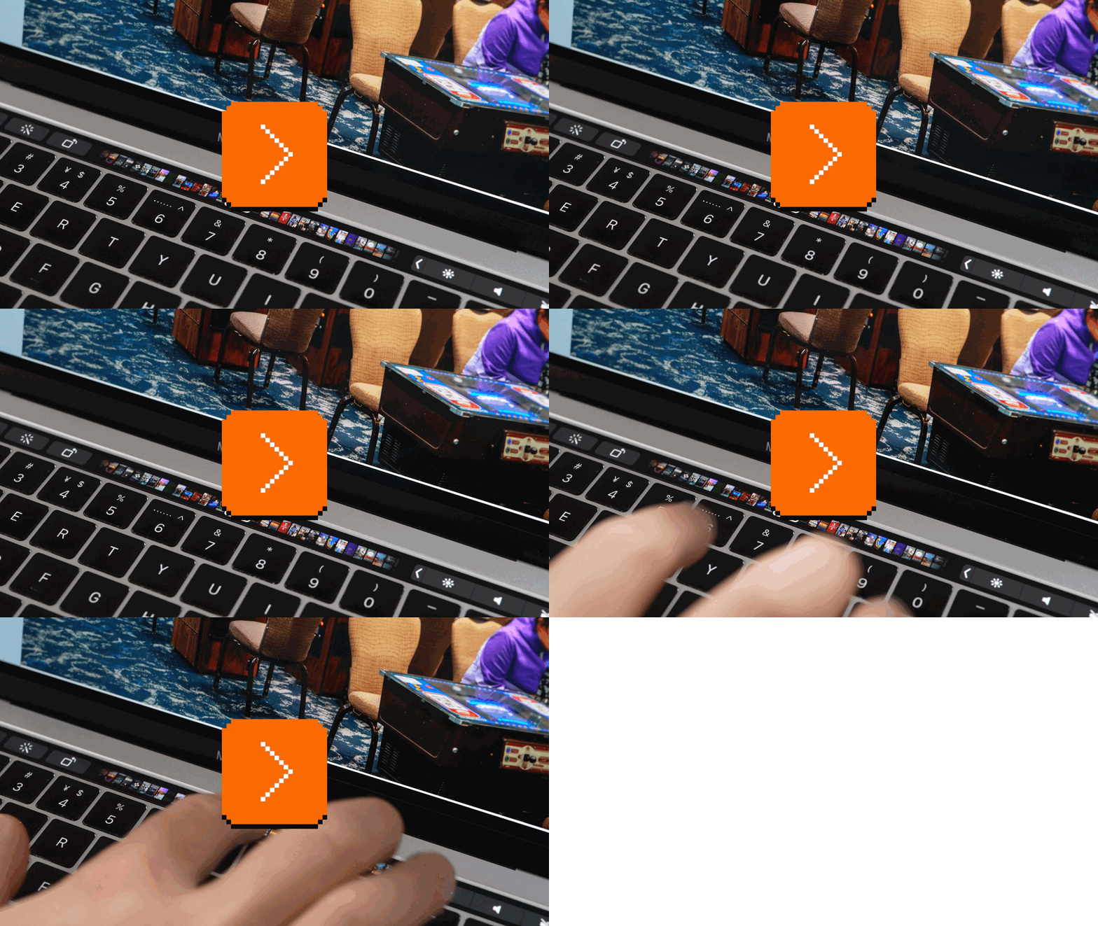
- While the Touch Bar itself was fast enough to support smooth scrolling, there was also some (I think intentional) delay when pressing the Fn key and some Touch Bar controls, plus a general slight, but perceivable latency on every touch.
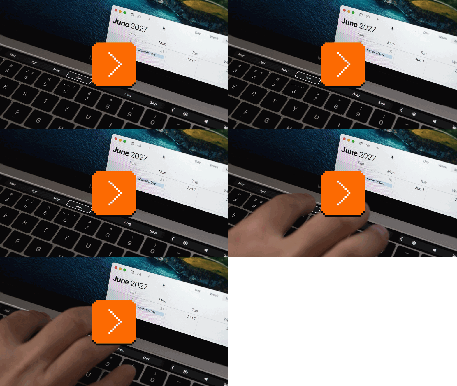
- Speaking of scrolling, it was uneven: in Calendar, you could use momentum scrolling but the calendar didn’t update in real time, and stopping the momentum by tapping anywhere like on the iPhone actually selected a different month:
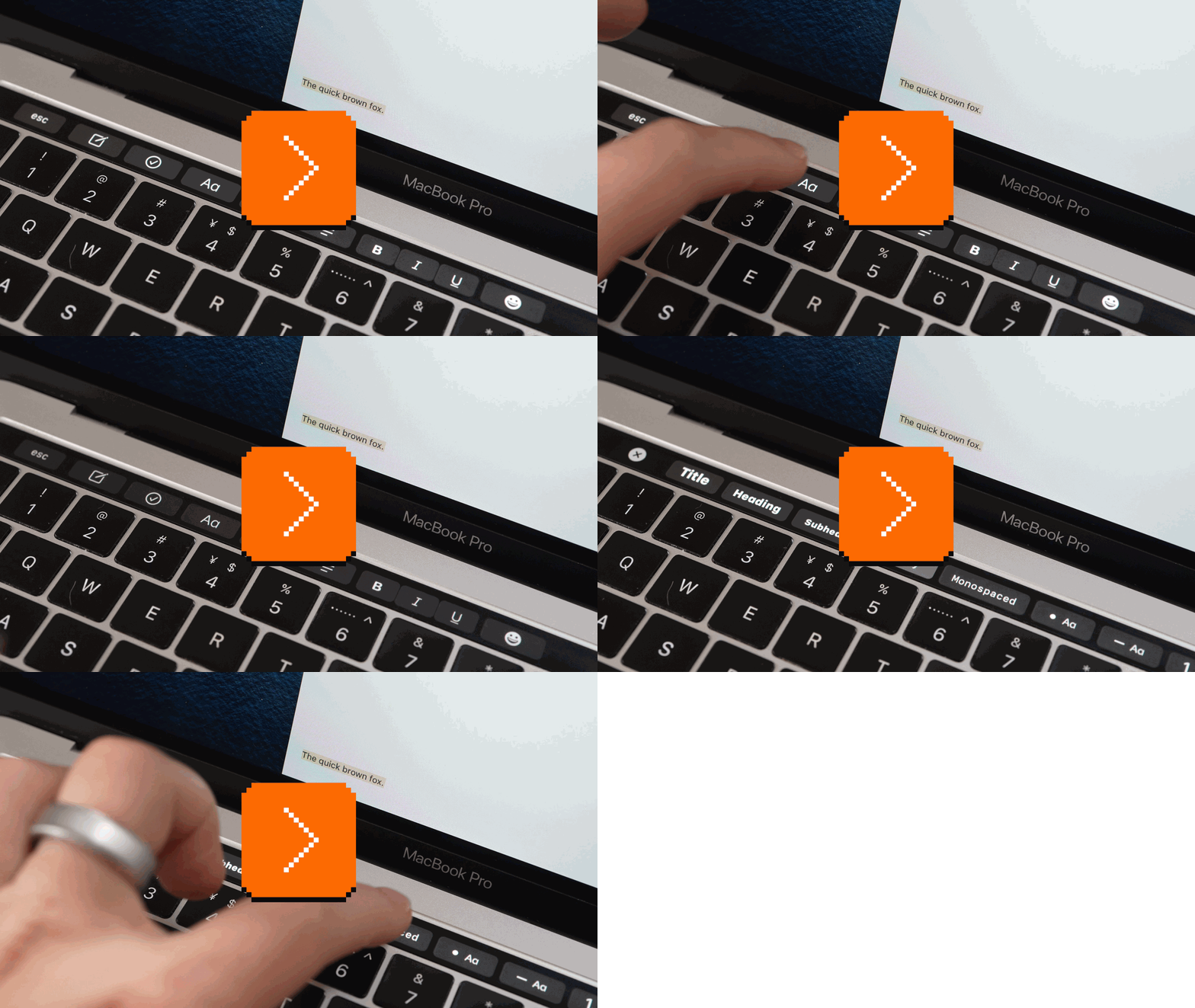
- Often the only way to escape a submode was to press a close box on the left, which was unpleasant given the position of your hand; there was no thoughtful shortcut, like double tapping an option, to exit faster.
Size
Using the Touch Bar was being constantly aware of its small size: The previews were tiny, your fingers overlapped content all the time, and scrolling only happened in the horizontal plane. (And you had to keep your finger in a straight line instead of a slight arc – not a natural gesture.)
Expanding the Control Strip required tapping on a very small chevron; there were tons of those tiny chevrons elsewhere, too, narrow and hard to press without haptic feedback. It made the interface feel fiddly, a strange compromise from a company that thoughtfully established and enforced the “44 pixels” minimum size for touch targets with the first iPhone. (The chevrons were exactly half of the recommended minimal physical width of any touch target on the 2007 iPhone – 3.5mm instead of 7mm.)
Many spaces felt tight in other ways, too. Craig Federighi’s keynote demo showing Safari previews was claustrophobic with just five tabs:

When using any typing surface, the Touch Bar would get divided into three areas: app controls, suggested words, and control strip on the right:

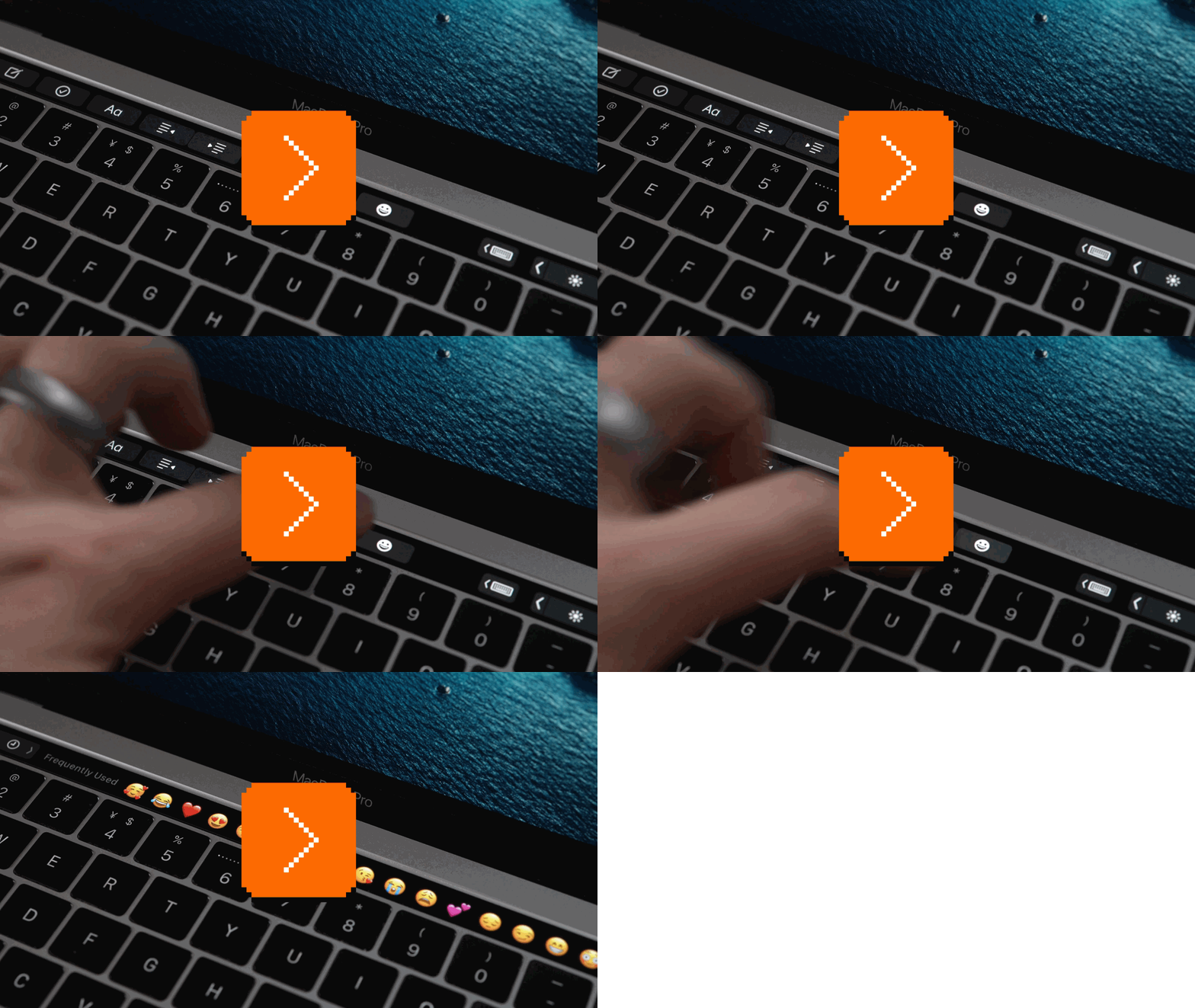
In other apps, some areas were scrollable, but there was no room for a scrollbar. Using the Touch Bar in any meaningful capacity felt like constantly guessing what’s movable and what isn’t, and constantly resizing tiny virtual windows, except without any pleasant resizing mechanics from Apple’s larger screens. Here, the emoji pane UI is doing some really clever things to help traverse hundreds of emoji, yet it still feels not enough:
The interactions in photo editing and a few other places felt so cramped and convoluted that I wonder why anyone would choose them over the spaciousness and precision of the screen above.
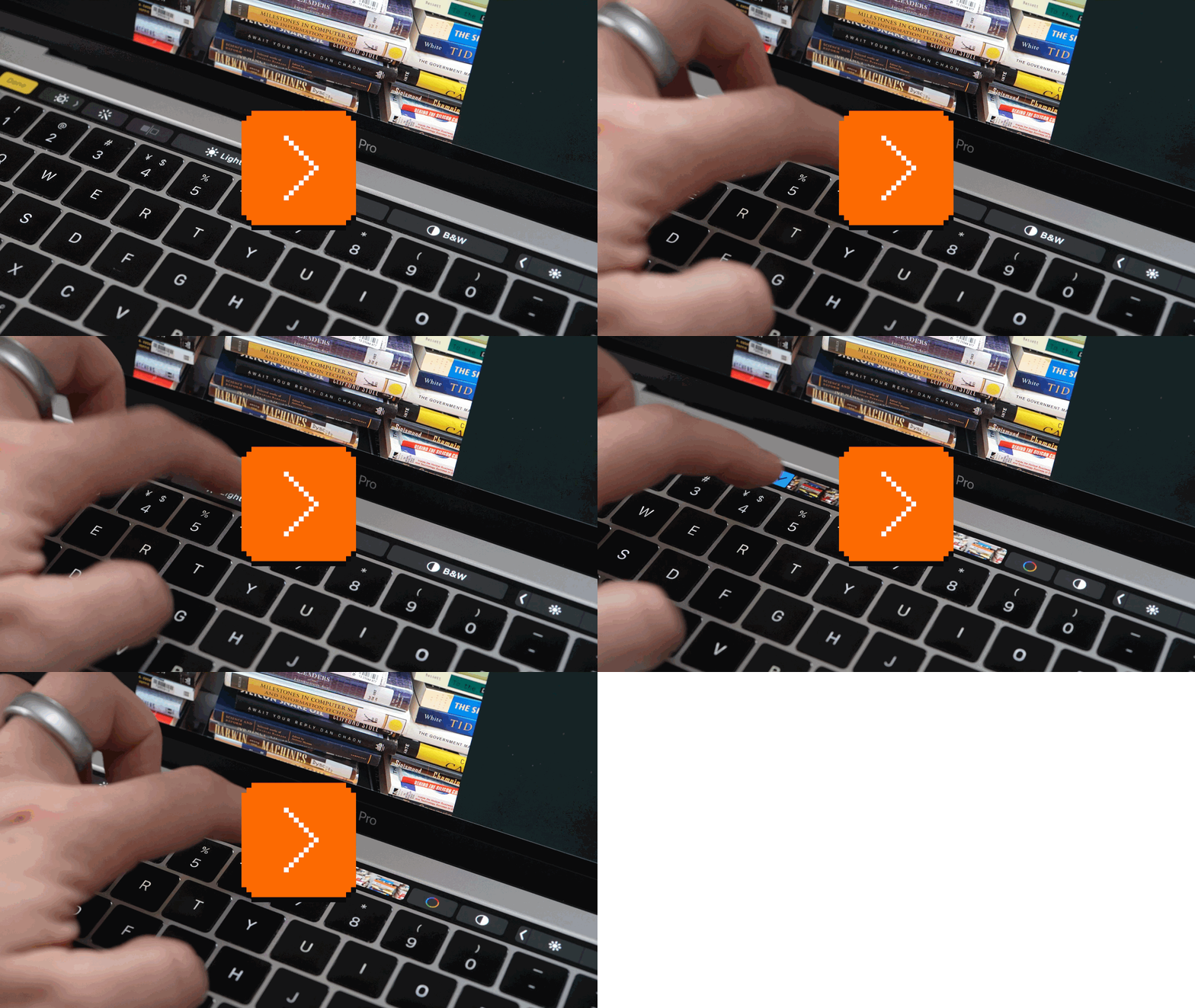
I wonder if the limited height also created other downstream effects. For example, drilling down did a (slow) fadeout/fade in effect, instead of scrolling down and up to help you understand the hierarchy – and showing the chevron pointing in that direction, too. I am guessing that was because the movement would suggest you can swipe up and down, and there simply wasn’t enough room for that gesture to feel good.
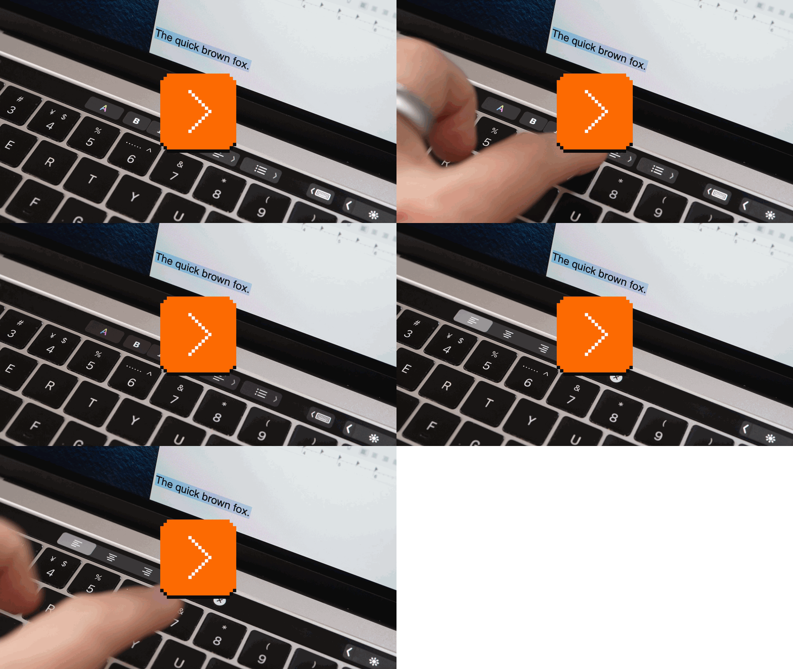
Using the Touch Bar, I kept thinking of the wonderful customization feature I mentioned that cleverly fused the Touch Bar with the screen above, and also a similar interaction from a 1980s Xerox machine (where pressing the key below More would show other options):

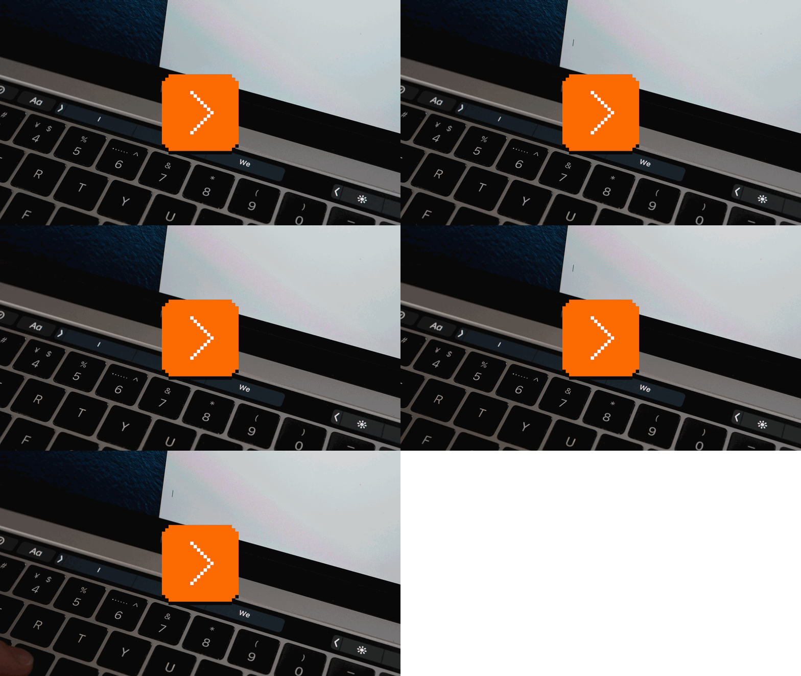
Could this have worked for other Touch Bar interactions to create more room, or would it become frustrating as your fingers would naturally want to tap the bottom of the screen? There is a small thoughtful integration like this in text editing, where the Touch Bar seems to be aware that while your fingers are downstairs, you might be looking up:
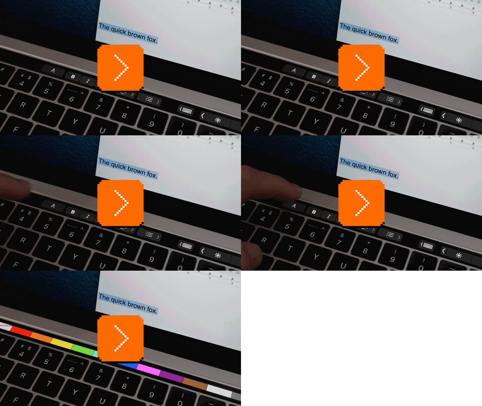
But then, in the same place, choosing a color is not integrated the same way:
All in all, the Touch Bar was new I/O sandwiched between an old O and an even older I, and it didn’t seem like all the relationships here were fully figured out.
Could Touch Bar just grow larger? Asus Zenbook Pro showed the endgame of this idea – it enabled some new interesting things, but threw in tons of more challenges like a missing trackpad, or deciding what to put on each surface:

I wouldn’t expect Touch Bar to go nearly as far, but I was curious to see it grow a little bit vertically to alleviate some of the pains.
Customization and infrastructure
Apple bet the Touch Bar house on individual app built-in support and a few core interactions. But I wonder in hindsight if the answer was user customization.
On that front, the Touch Bar exposed Apple’s underinvestment in the actions infrastructure. Keyboard customization in macOS has already felt ancient in 2016 and did not improve since, and Shortcuts app didn’t even exist then. This was Apple’s chance to provide a gentler Keyboard Maestro-like experience for the masses, but the Touch Bar didn’t allow you to plop in even a few function keys alongside the new features – the only option for that was the old-fashioned mode with F1–F12 with none of the benefits of the Touch Bar (you couldn’t even change the labels!), and also without haptics.
Sure, there was a gesture in this direction with Quick Actions, but those felt extremely underbaked; in my explorations with Automator and Touch Bar, I encountered some truly confusing settings and flows and could never make it work fully. Here, I had to go to a faraway System Preferences pane, and see various Quick Actions that were not talking to one another:


In a better setup, it would be possible to assign any key or action or menu command to any ground-floor Touch Bar button; something like SF Symbols (formalized in 2019) could provide all the necessary icons. Or, one could imagine some delightful integrated interactions like this one that would make it easy and pleasant to make the Touch Bar feel personally useful.
Or, how about sparklines or other tiny widgets that’d quickly show visual status, of the kind pro users like to put in the menu bar already, and easily pluggable to data sources (see the very recent TerminalWidget)? Or a left/right slide gesture, buttons, or a keyboard combination to swap between Touch Bar “spaces”?
How about learning what commands you use most often that don’t have keyboard shortcuts, per app, and suggesting them as the first five buttons on the Touch Bar?
Could the Touch Bar have been saved?
Today, it often feels like the Touch Bar chose revolution in the moments the right answer was evolution, and evolution in places that called for a revolution. With hindsight, after seeing projects like Stream Deck and Flux Keyboard capture people’s attention, maybe it could have worked this way:
- First version arrives with a physical Esc or at least “sound-based haptics,” and allows you to do more things via much nicer settings software: easy assigning of buttons to system actions, and icons so you no longer have to remember whether it was F3 or F7 doing your thing. Don’t treat the Touch Bar as repudiation of function keys, but as their enhancement. On top of that, add some easy-to-put-together widgetlets and sparklines. This is Pro hardware, and these feel like pro features.
- Staying tighter, focused, and reigning in some more complex interactions would help, too (problem: they look so good in videos!). Instead of boiling the ocean and recreating a lot of the existing GUI in a cramped space, focus on just one–two great interactions per app. Finder: Show the Quick Actions that were already customizable and not as easy to access in some views! Emoji: Paginate instead of scroll, but do a really clever pagination that highlights the power of a parallax swipe gesture that can only exist here. System: Add immediate screenshotting by default.
- If this worked, subsequent versions would add haptics, perhaps increase the size, and go mainstream from pro users to regular users, learning all the useful lessons along the way (also from third-party apps like Pock).
But I’m not sure. Touch is fun but there is, ultimately, a ceiling on value you can squeeze out of a small touch strip, and a floor on complexity of yet another input/output device.
And there was always an elephant in the hardware room – many pro users are likely to use computers on desks with separate keyboards, which puts the Touch Bar either too far away or makes it altogether inaccessible. In the decade since, Apple hasn’t even solved this for Touch ID, the only part of the Touch Bar that didn’t get sacrificed to the angry IBM 3270 terminal gods.
Would the Touch Bar have worked as a standalone device? Could it ever become good enough for you to want to pay for it twice?
Perhaps not. But had Apple improved the keyboard and action customization software for the Touch Bar, only to see it crash and burn, we could at least still keep the software.
Friday, August 14 / #apple / #deeper dives / #interface design / #keyboard / #system design
“If nothing happened, you probably did not press the button quickly enough the second time.”
I like learning new things, and I like learning new old things. I was looking at Apple Human Interface Guidelines from 1987 and this passage caught my attention:
The most common use of double-clicking is as a shortcut way to perform an action. For example, clicking twice on an icon is a faster way to open it than clicking once to select it, then choosing Open from the File menu; clicking twice on a word to select it is faster than dragging through it.
I knew that double click an icon was a shortcut to the first action (typically Open), but I never really thought of double-clicking a word as a faster way to drag across to select it – even though, in hindsight, it makes perfect sense.
Another vintage thing I learned of recently from a coworker is this, also covered in the 1987 HIG:
If the user begins a double-click sequence, but then drags the mouse between the mouse- down and the mouse-up of the second click, the selection becomes a range of words rather than a single word.
This doesn’t feel (to me) like a very pleasant gesture to perform repeatedly, but what feels nice about it is that it automatically snaps the selection to the endings of the words:
Part of me would prefer this to be the default behaviour when selecting more than 3 words, or so, so you could be less precise.
Anyway. The double clicking to perform default action applies to a lot of lists of things. Here are some examples from Scrivener, Word, and Lightroom – you can double click on each of these items to proceed, without having to select and click the button:


But sometimes the creators of such dialogs forget. Here’s Screen Sharing in MacOS, and a notification in Chrome where only the slow path is available – double clicking on items doesn’t do anything:


The tricky part about not being a good citizen of a shared user interface is that those omissions aren’t just local to your app – they can ruin the gesture in other places, as people’s fingers learn to distrust it in not just your app, but in general.
(The quote in the title is from Apple Macintosh User’s Handbook.)
Sunday, August 16 / #flow / #mouse / #text editing
“I think there’s a lot of value in these.”
Speaking of user interface guidelines, developer Matt Sephton and others compiled many of Apple’s human interface guidelines, starting from 1980, all the way to 2014, including some goodies like early drafts, NeXT, Newton, and so on.


Elsewhere, designer Geof Crowl put together his own list that goes broad instead of deep, including style guides other than Apple’s, too.
The list was made in 2020 and a few links are already broken, but there are some gems here like the modern Designing for Playdate, or the classic Zen of Palm from 2003. You can learn a lot just by grabbing one and scanning it.
Let me add a few more I know of:
- Amiga User Interface Style Guide (1991)
- Magic Cap Concepts (1995) with a strange subtitle “Everything right is wrong again”
- Java Look and Feel Design Guidelines (1999)
- Windows Interface Guidelines for Software Design (1995)


Sunday, August 16 / #interface design / #mouse / #principles / #style guides
“Behind their simplistic behavior is a fairly elegant system.”
For all these times we talked about Super Mario, we never covered another important game, Doom.
Here’s a 17-minute video from decino explaining how the Doom monsters move and attack the player (the “AI” in the old sense of the word):
What’s really fun about this video is how it uses annotated source code (in contrast to Super Mario, the Doom source code was officially released and open sourced), and particularly how it tasks the engine with explaining itself, setting sometimes elaborate stages just to show a principle or an algorithm – an absolutely perfect example of “show, don’t tell.”
decino has tons more of these kinds of videos (click on Popular!), distinguishable by their yellow covers, if you want to pick another aspect of Doom that interests you.
Monday, August 17 / #games / #youtube
The item vs. the position
I spotted this kind of a keyboard shortcut pattern the other day. Here it is in Photoshop:

Here it is in DevonThink:

And here in Linear:

Those “ordinal” keyboard shortcuts feel nice and orderly, and look so elegant, too. But beware! The moment you’ll want to introduce a new option, or even reorder the ones you have, you’ll be in trouble: Either you preserve people’s motor memories, and then the elegant ordering immediately goes to hell – or you will have to change an existing shortcut to something new, and frustrate your users. Might be best to be really confident in your selection being forever locked before attempting this.
But then there’s a similar treatment here in Linear:

Or here in Raycast (when you hold ⌘):

Or here in Ghostty:

Those three look like the same idea, but they worry me less.
Why? Because these shortcuts more clearly point to a position rather than a thing. Here, the mechanics of the UI themselves convey that people, commands, or tabs are going to be moving around. Of course, some will get used to “1 means assigning to Marcin,” or “⌘3 means the Unsung tab” – the same way we get used to “second item on the Recent list” or “at the top of the third search result page,” if they start repeating as a pattern – but at least it feels to me that the interface here is more honest about what it can promise.
I often think about this, by the way: Not what the interface conveys in the moment, but what it promises in the long run.
Monday, August 17 / #change management / #flow / #keyboard
The Swiss Cheese model, pt. 2
1.
Oh damn, you caught me in the middle of something. I was just trying to make a list of Windows versions for a friend – in Google Docs, of all things.
Should be easy. I already grabbed this one off of Wikipedia and massaged it a bit, but it’s still kinda ugly:

I don’t love the tight padding here. Let me try something bigger, like 0.08 inches? I’ll just select the first column and punch the number in, and…
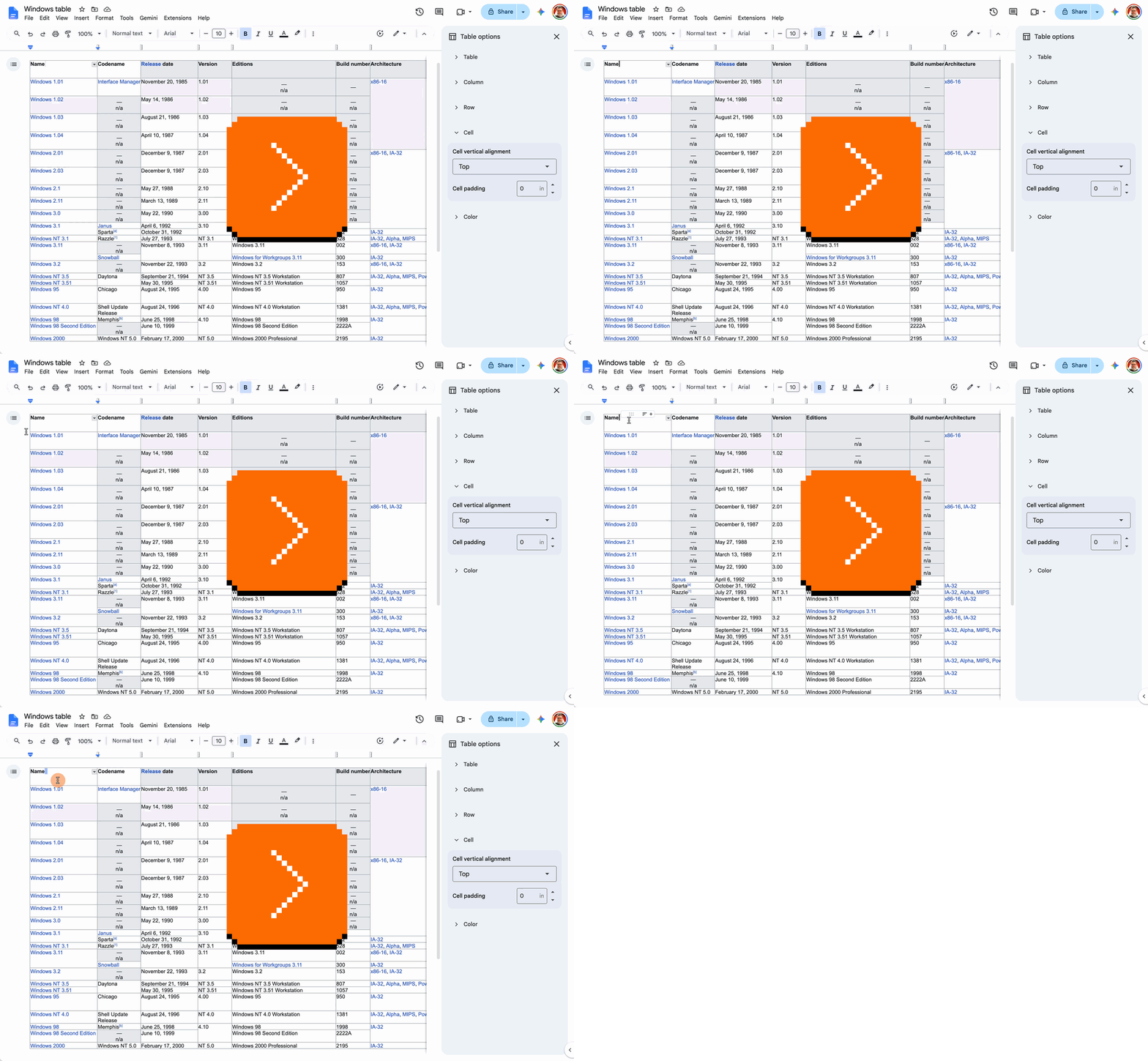
What the hell!!!
Jesus. What happened? Okay, let’s press ⌘Z to get out of it…
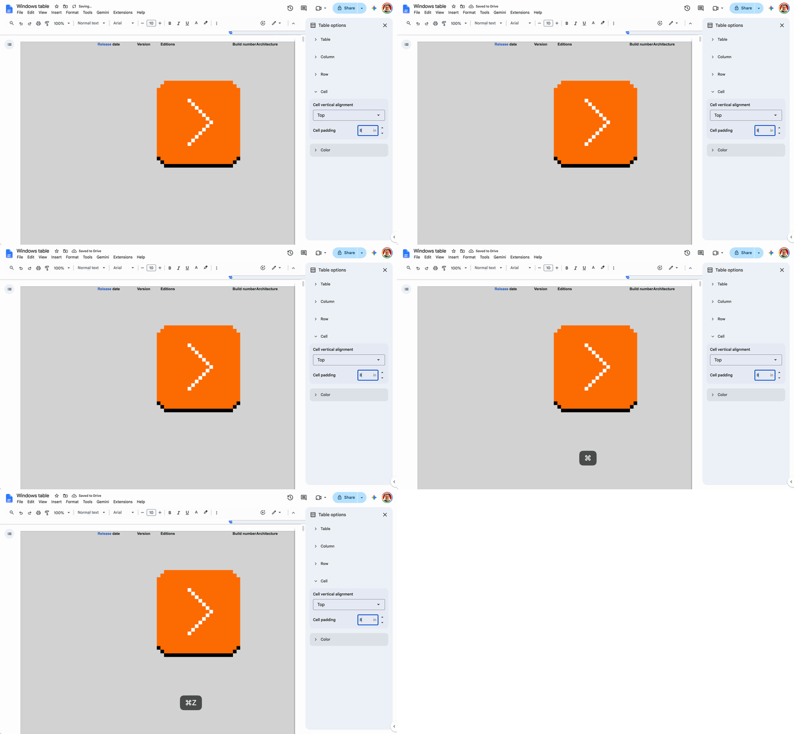
Oh, no. Maybe I can press Esc…
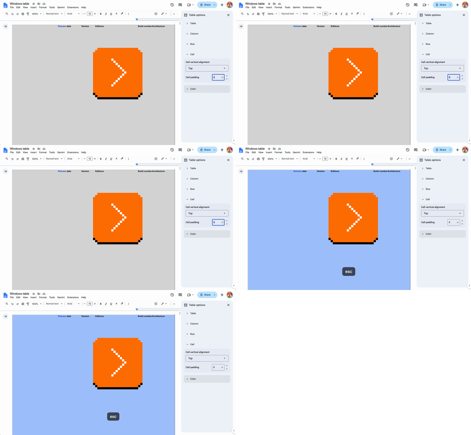
Shit.
2.
Okay, here’s what happened in precise detail:
- I pressed Backspace to delete an existing zero:

- I started to type “.08”. Pressing “.” was okay, although it showed a pretty thirsty tooltip:

- upon adding “0” Docs removed the “.” and so the output was just “0”:

- upon adding “8” Docs removed the leading zero and we ended up at just “8”:

- the page saw the resulting “8”, applied 8 inches of padding (a hundred times of what I wanted!), and just showed it to me in real time, resulting in a profoundly unrecognizable table that looked like something went horribly wrong,
- pressing ⌘Z didn’t do anything,
- pressing Esc only removed the focus from the input field.
I believe I can explain exactly the chain of reasoning and bugs here:
- To start with, any number entered is immediately previewed on the left. This generally feels good!
- Instead of fixing my input on commit (Enter), the input is being rewritten on the fly, as I’m typing. This wouldn’t be my recommendation, but I can understand this design decision.
- If I typed just “08,” it would be rewritten to “8”. This makes some sense since it normalizes the numbers, and makes them consistent.
- If I typed “.1”, it would be rewritten to “0.1”. Sure, fine, a similar idea.
- However, typing “.0” rewrites it to just “0”. I believe this is a bug or a lack of imagination – it should be rewritten to “0.0”.
- ⌘Z doesn’t work. I believe this is a bug where system’s rewrites of numbers don’t put the change on the undo stack. (As a matter of fact, it appears worse than that – pressing ⌘Z a few more times ended up rewriting my number to “80”, which would have made this even worse!)
So, in effect, my “.08” got mangled to “8”, applied immediately, and wasn’t easily undoable.
3.
This feels like a great example of the Swiss cheese model in action:

If just one of these bullet points below behaved differently, I would not end up in this situation:
- with numbers not being rewritten on the fly, there would be no problem,
- with “.” not be aggressively rewritten to “0.”, there would be no problem,
- without live preview, the rewrite could’ve been caught and fixed it by hand, instead of panicking seeing a huge change on the screen that felt like data loss,
- with a fully functioning input field undo, the moment of panic could be reverted,
- with Esc to abort instead of commit, likewise.
All of these decisions made sense and didn’t feel dangerous or important in isolation. Together, the holes in cheese aligned perfectly, creating a pretty scary experience.
Thank you to Ezra Spier for sharing this with me.
Tuesday, August 18 / #bugs / #flow / #google / #preview
“The ghosts are fast and they don’t turn blue.”
Some time ago, I shared a video talking about games that leaned into their bugs and made them part of their lore.
One not listed there, perhaps because it’s the most obvious example, is Pac-Man’s kill screen.
A few weekends ago at an arcade game convention, I spotted something really interesting. It was an arcade cabinet of Pac-Man, but with a twist: The game was modified and set up to start immediately at level 255, with all its challenges: fast timing, very angry ghosts, ineffective energizers.


And once you beat that, you immediately face level 256: the infamous kill screen.
I don’t think I have ever seen anything like this before. It reminded me of this joke someone made once about the olympics: that each competition should begin with the organizers grabbing regular people from the street to participate, just so the viewers can truly realize how impossibly hard those competitions are.
I know a lot of software onboarding starts gently, walking you through basic scenarios to make you comfortable and to have you understand basic concepts. But sometimes I wonder: for professional apps, would it also be cool to start with a really advanced use that would get you excited? A really well-made, complex spreadsheet? A really sophisticated graphic? Instead of gently propping you up, what if the onboarding was about breaking something really complex down?
I played the game a few times. I didn’t finish the level 255, and I never saw the kill screen. But it was a great challenge; if I had more time, I’d definitely spend it trying to make it happen.
Wednesday, August 19 / #bugs / #games / #onboarding
Got your back, pt. 7
Nice recent addition to Gmail – a little warning if you’re replying to a thread you were BCC’ed on.

Please note that I’m not necessarily endorsing the execution details, as I consider Gmail kind of a clunky operation overall. You can’t swat the message away with a swipe, the wrong quotation mark is used, and I’m perplexed about the location of this message – something tells me it was really cheap to do it this way rather than put it close to the recipient field, to help you understand the relation.
But still, I appreciate something shining at least a bit of light at the complex relations between To, CC, and BCC.
Thursday, August 20 / #google / #got your back
Zalgo: The good, the bad, and the very, very ugly
Have you ever seen this?
The best way to predict the future is t̷o̶ ì̴͇n̵͓̆v̶̝̕ȇ̷̝͈̩͊̇̾̄̂̀̈̔̀͛͋͆̓͒͘͝ͅn̸̦̙̣̤͓̜̼͙̲͔̺͚̮̬͆̇̇͐̇̽̒̎t̵̮͎̃̒͒̋̂̏̒̀̿͌͗̄͑̀̀͒̈̚͠͝ ȋ̸̧̛̭̠͈̰̰̦̹̥̜̖̈̂̀̽̿̋̊́̇̍̓̆̉̄̄̊͊̒̎͋̂̒̍̽̄͝ͅt̶̨̢̺̱̻̭̣͉͕̥͚̯͍̣͕͔̬̥͔̘̼͌̉̀̄̊̆͛̽̍̐̔̐̀̾̋̆͒̏̏̋͋̽͗̌͋͗.̸̧̨̧̡̢̪͙̦͙̝̜̦̞̳̤͖̟͍̮͖̘̙̳͉̳̲̲͉̠͎̽̍̓̒̅̿͂͑̎͊̋͒̈́̅̈́̆̽̒͛͐͛̉̀̈́̈̉̏̏̋̒͘͝͝͝
In the lore of the web, this kind of a strange glitchy text is known as Zalgo:
Zalgo is a meme where a popular picture/comic is edited in a way that “corrupts” it, producing scary results. The term “Zalgo” refers to the being apparently responsible for the corruption, whose name is uttered by its victims in an eldritch manner.
I’ll let you read up on that at the above link if you are curious, but what’s interesting for us here is that… Zalgo is text. You can grab the line above. You can copy and paste it. You can even try to edit it. But… what is that, and why is it possible to construct text this way?
In Unicode, ä is a completely independent character from ą, and they are both completely unrelated to a – any type designer treats them as a variant of the same base letter, but there’s nothing preventing them from making them look very, very different.
But now think of the Vietnamese language, which has six tones mapping to six accent characters, and many of them can be combined into pairs:

This gives us 104 accented letters, and 30 doubly accented letters, just for this one language.
Sure, you can imagine adding all of them as independent characters, but at some point another idea appears on the table: What if we just allowed a system where you can add an accent to any letter?
Instead of outputting ä as one letter, you could output a followed by ̈ , which then would be recombined by the rendering logic into ä. And to get two accents, output a and then ́ and ͆ , to get á͆.
Now, the zero-one-infinity rule says that once you open the door to two, you might as well allow three or even more. Add to it the fact that some accents go under the letter, and here you go: perfect conditions for the Zalgo meme that just creatively stacks up accents one after another – not for communication, but solely for aesthetics.
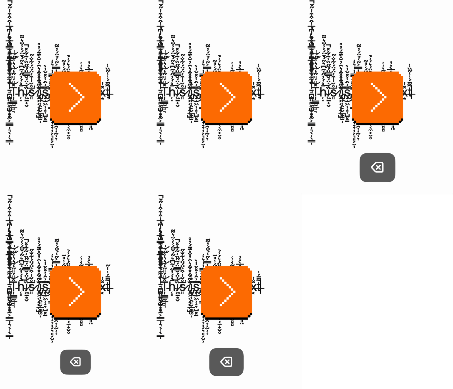
Today, there are a whopping 122 combining diacritical marks used in all sorts of occasions, and Zalgo generators know about them all. A fun thing to try in one of them is to let it do its thing, and then keep pressing Backspace:
Now you might ask, why do separate characters exist for ä and ą then? Why isn’t every accent combining? Two things: history (some pre-combined accented characters existed for as long as movable type was around) and complexity (combining accents are harder to process, to display, to edit, and even to design). There were many debates around this – you can open the History box on the above Wikipedia page and pore over the old documents to learn. (As a matter of fact, today all Vietnamese letters exist as precombined characters, too.)
A few bits that might be useful to know:
- Zalgo is a good reminder that while it’s hard to contain text, you can at least crop it – often you might see things like these, where in some places Zalgo is allowed to roam free, and in others the text is clipped so three or more accents fall outside of the clipped area.


- Eagle-eyed among you might have noticed above that ä and á͆ look different. As far as I understand, if the combination of a letter and accents isn’t supported by the current font, the entire combination falls back to a different font, rather than picking bits and pieces from different fonts.
- There are even more combining characters, and emoji use a similar system to add skin tone modifiers, gender, or turn a woman next to a fire truck into a female firefighter.
Lastly, I found this warning on the very Fandom page that explained Zalgo amusing:
Do not post Zalgo text in the discussion area or anywhere else on the wiki. Doing so will subject you to a ban.
Every warning tells a story; it seemed like more people were perhaps infatuated with the glitchy text than expected.