“If you aim for the king, you better not show up eight years late.”
Welcome to this week’s digest of Unsung, a blog about software craft and quality. Here’s what was posted since last time:
View this issue in the browser with inline videos and better formatting
“Solving a largely imaginary user goal”
On her blog, Lea Verou makes a case that each user-facing website dark-mode toggle should only ever show two options, but in a smart way.
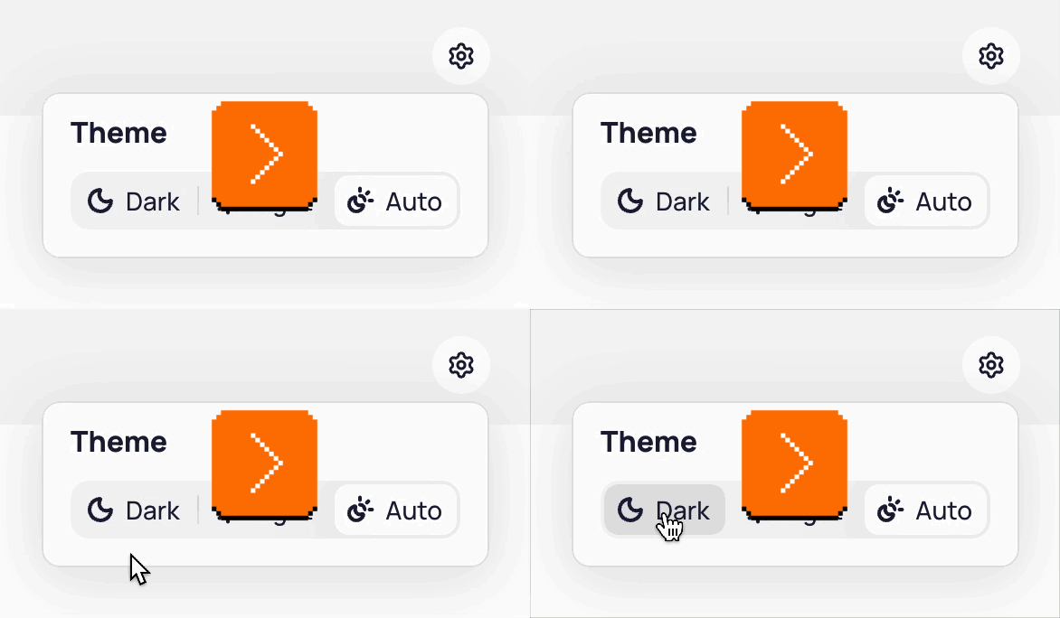
The challenge is that any dark mode toggle needs to actually accommodate three options: dark, light, and the default “whatever the system says” (which can be always dark, always light, or change with the time of day). Many toggles simply pass that complexity onto the user:
I want to get something out of the way: I don’t think Verou’s article as an article is fully successful. I feel like it spends a great amount of words to explain something not entirely as complex, and even the interactive playgrounds felt slightly too rigid and altogether confusing. If you care about (interactive) explainers, it might be an interesting case study in and of itself.
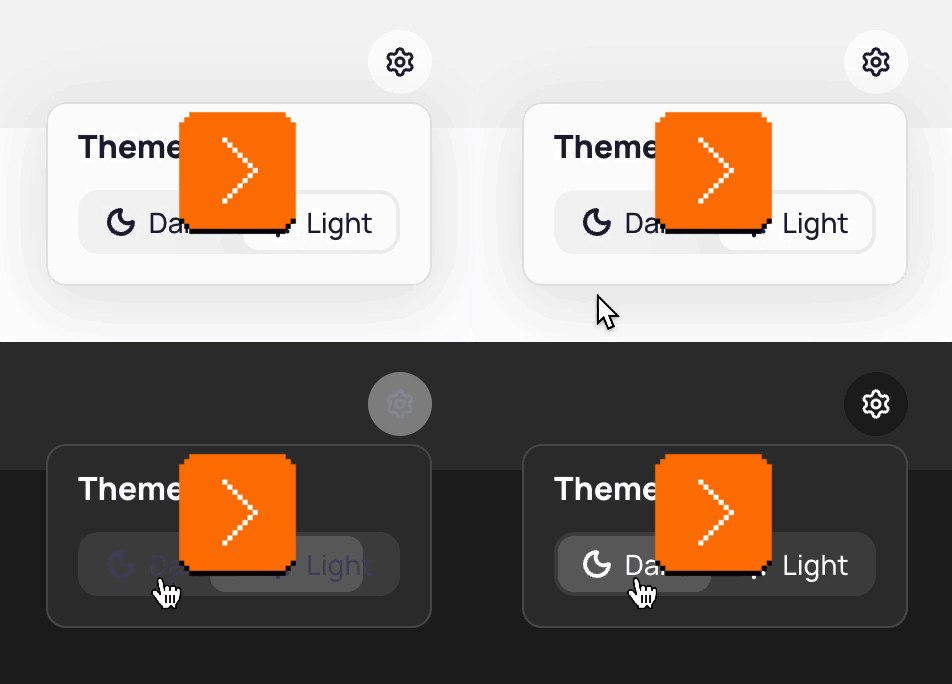
But I am very much much on board with the proposal and the line of thinking it represents. Verou suggests a “smart” dual state toggle, which still allows the website to follow the system, but shoves the complexity of the “whatever the system says” branch into the crevices between visible UI. Here’s how I understand it:
- The smart toggle only has two options: light and dark. Mechanically, clicking or tapping the toggle brings you to the opposite option. Simple.
- If your new option is the opposite of system (e.g. you switch the page to dark mode if your system is in light mode), it will stay in that theme forever, no matter what the system does in the future.
- If your new option is one that currently matches the system, it will then continue following the system in perpetuity (e.g. it’s back to the default behaviour).
This toggle will feel compromised, and you might immediately find some rare use case it doesn’t fully support – maybe attached to an imaginary user, or even an internal user giving you feedback in person. But Verou is absolutely correct in her insistence to fight through that:
Tri-state toggles are implementation-driven UI. One of the most common UX mistakes is designing UI around the underlying data model instead of user goals. Good interfaces abstract away the underlying model and expose a model that aligns with user goals (unless of course these happen to coincide, which is rare).
Now, it’s just a dark mode toggle. It might not seem like a difference between a smart dual state toggle and an explicit tri-state toggle is that much. But:
- “Whatever the system says” is not just one extra option. It’s also one extra weird option. It doesn’t feel like the other two. It’s seemingly repetitive. It’s often unclear what it does before clicking. It’s not obvious where to put it in order. Verou doesn’t mention this in her post, but even just seeing the word System next to Light and Dark feels complicated. (Auto is slightly better.) The cognitive load here might be larger than it seems.
- What is an interface if not a collection of a million challenges, each one seemingly insignificant on its own? Trivial things add up. One compromise here and one cheap decision there, and soon you’re talking real money.
- Thinking deeply about something like this gives one practice for dealing with complexity elsewhere, and facing even more difficult challenges where the stakes are higher and the compromises larger.
A similar example might be that of PC keyboards in the late 1990s, which also exposed system complexity and pestered people with Power/Sleep/Wake keys:
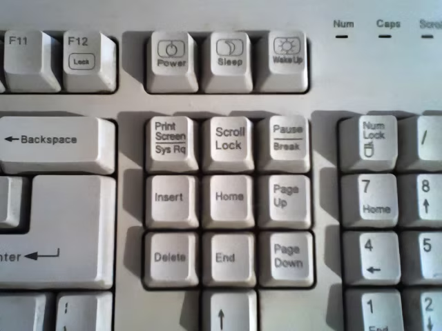
Computers do not do that anymore, simply having a smarter singular power button, piped to a more sophisticated logic underneath.
Friday, August 7 / #complexity / #dark mode / #keyboard / #web
Seeing like a state
The post about the dark mode toggle reminded me of two similar things rattling in my brain.
On the positive side, here’s a delightful interaction from macOS. I can easily maximize the window to take up half the screen, but the moment I start dragging it, it recalls and nicely restores itself to its original size:
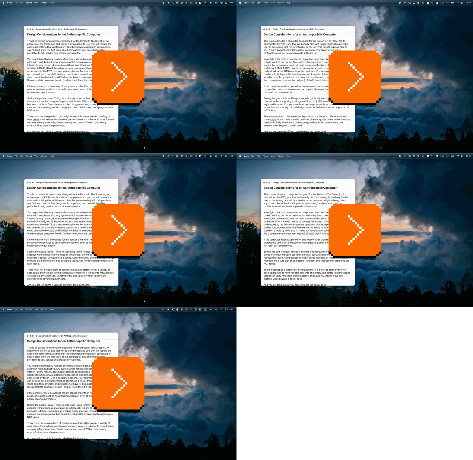
macOS designers correctly figured out that the window being maximized or half-maximized is a state – but it has to be a state dressed up as a size. The button entry point is the “state” version. But on the way in, there is also a more natural “size” version: you can have the window snap and maximize to half screen when you drag it to the right edge. And on the way out? You just saw it. You don’t have to switch the state to “non maximized” first, and you don’t have to restore to the original size by hand.
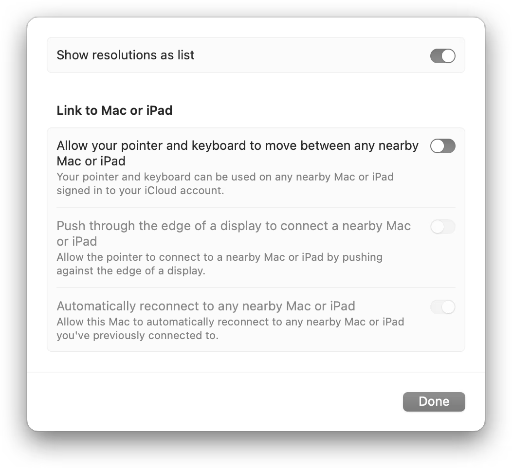
Here’s a bad example – one of the macOS’s horrible settings pages:
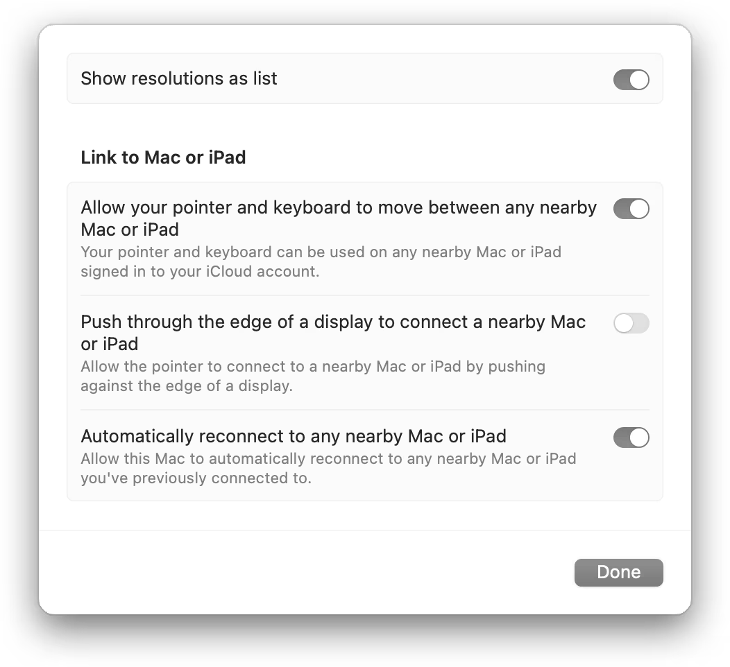
So far, it seems good. Some of the toggles are on, some off. You not only see a position of the switch change, but also the track under the switch is a different color to help you disambiguate. Nice.
But now look what happens when I toggle off the second option, which the third and fourth option rely on:
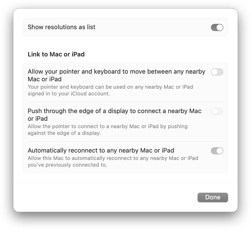
Processing this dialog visually, does it look like “on, off, disabled off, disabled on,” or does it look like “four toggles, each one inexplicably with a different shade of gray”?
There are many solutions here: some visual, some IA, some systemic. Also, I use the graphite accent color, which somewhat exacerbates the issue, although it’s there with any accent color.
But I wonder if one of the challenges here is that someone thought it’s important to show the state of the toggle even if it’s disabled, and everything else followed from that. This feels similar to the dark mode essay in that there will always be someone making that argument, and that argument will always feel stronger, because it will feel like it’s backed by logic. The system will make sense as a diagram. Each of its parts will come from a logical conclusion. So did the tri-state dark mode toggle. Or the Power/Sleep/Wake keyboard buttons. Or Abort, Retry, Fail in DOS.
Arguments for systemic completeness are always going to be easier to make than arguments for thoughtful simplicity.
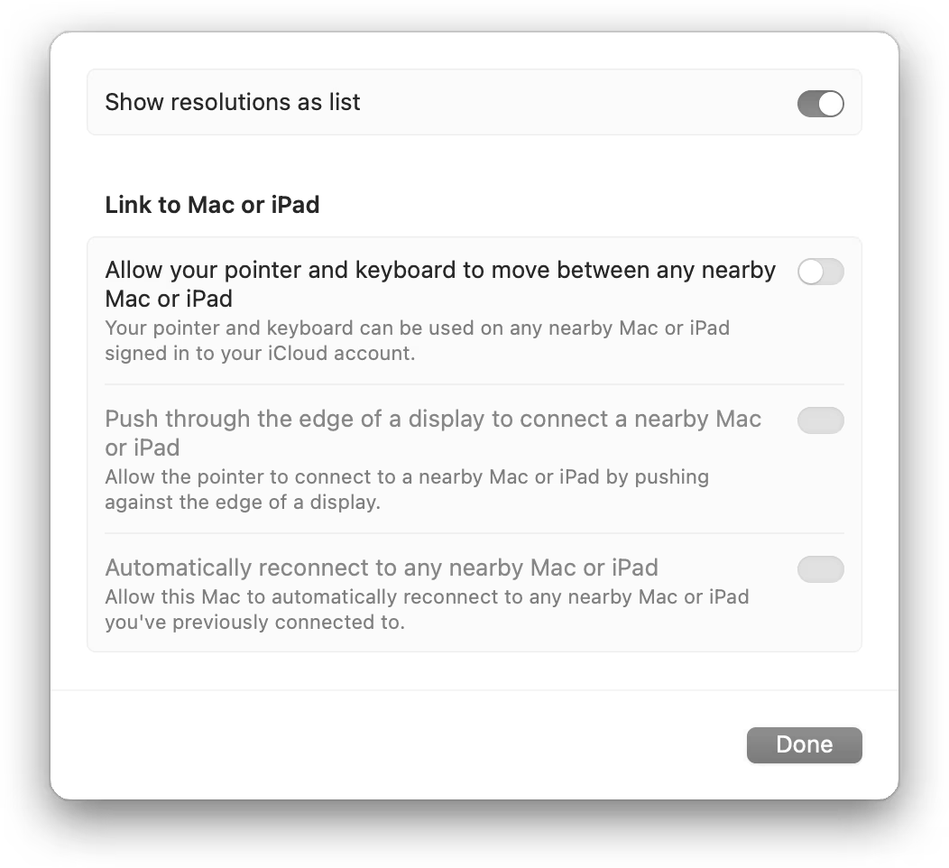
I sketched two possible solutions. They’re not the best ones, and you might recoil at them, since either one is a compromise. But that’s the point.
Friday, August 7 / #complexity / #interface design / #system design
The first notch is magical
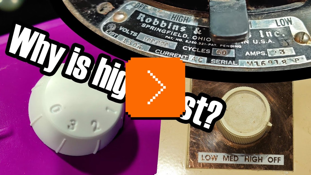
Some years ago, the inimitable channel Technology Connections posted a 17-minute video about the peculiar design quirk of ceiling and room fans – they usually order their options Off → High → Medium → Low rather than the more natural Off → Low → Medium → High. The video is a bit off topic for this channel, but check it out if you’re interested how sometimes weird physics considerations influence design in the real world:
In the video, the host also talks about the more natural order that typically looked like this:

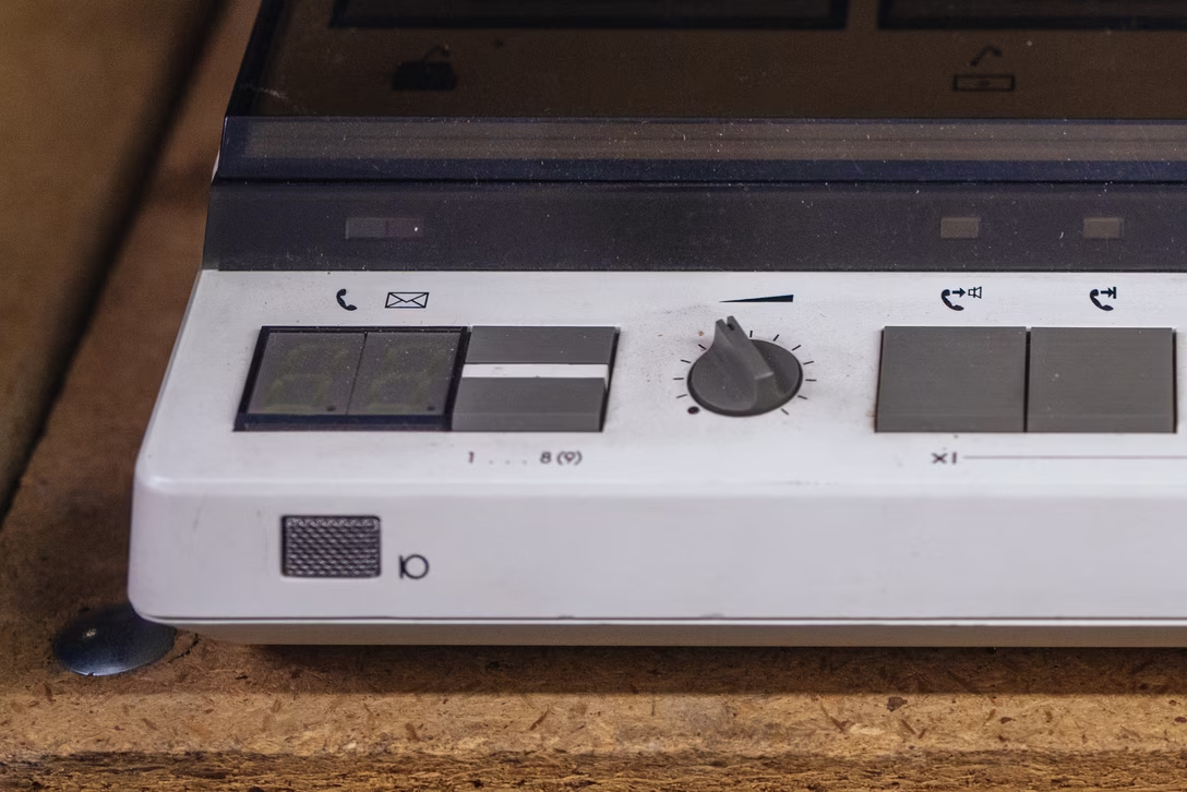



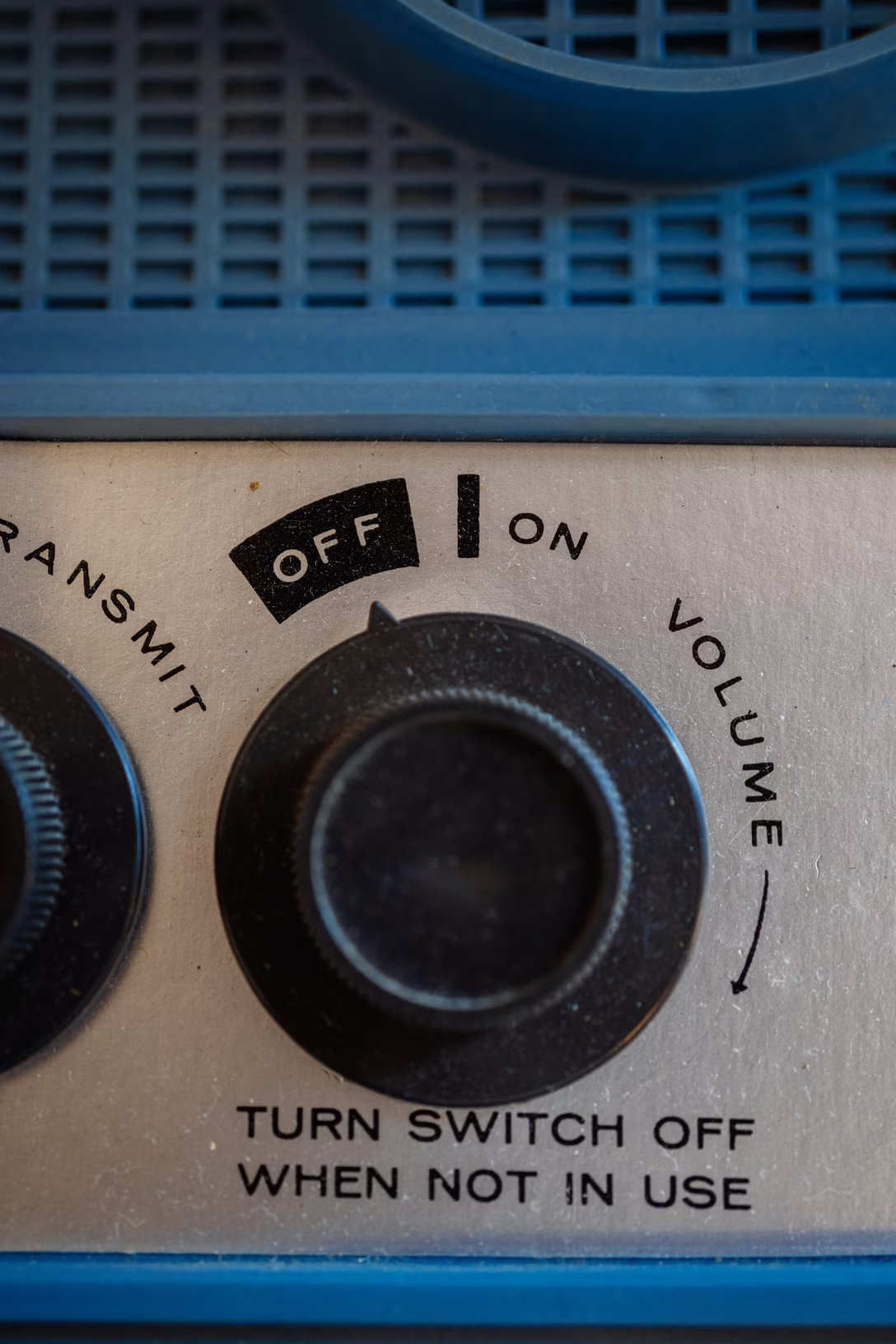
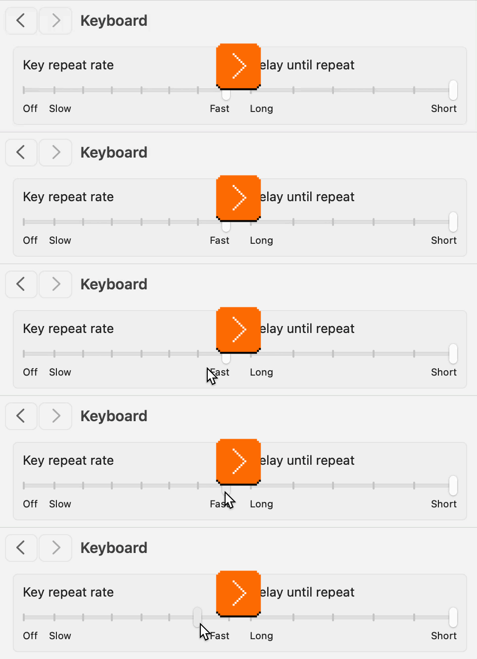
I wonder if you recognize this kind of an interface. I have a distinct memory of it from radios (where “zero volume” would mean “off”) and from TVs/early computer displays (where “zero brightness” meant “off,” too). There was something special about these controls that stuck in my memory, motor and otherwise: this tangible, heavy click when you ventured outside or back into “off,” almost as if you had to break the interface itself.
I thought this, too, was a convention from an old analog time. Yet, I keep occasionally finding the “the first notch is special” interfaces on screen.
Sometimes, they are pretty literal translations of the concept, like when you adjust the key repeat rate in macOS:
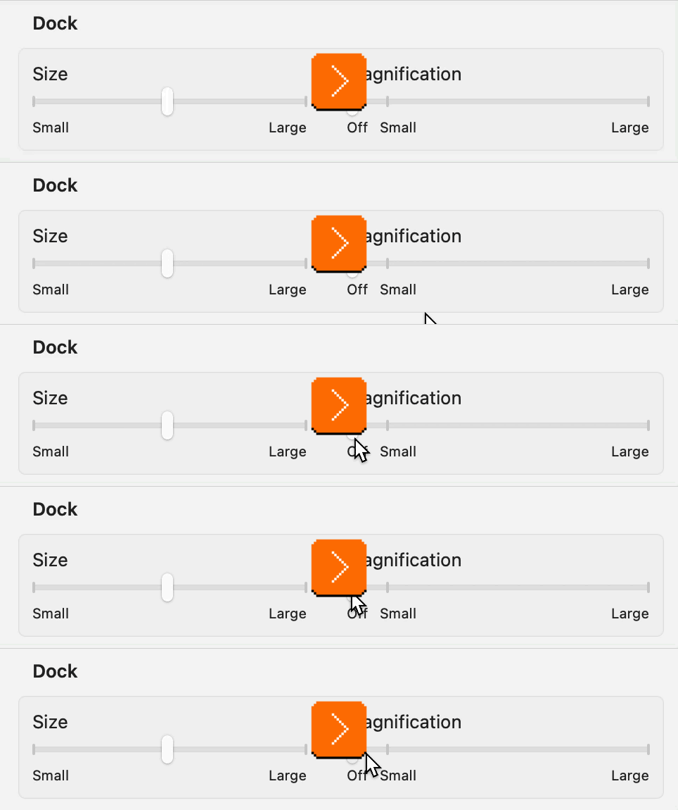
Or, similarly, when you choose the dock magnification:
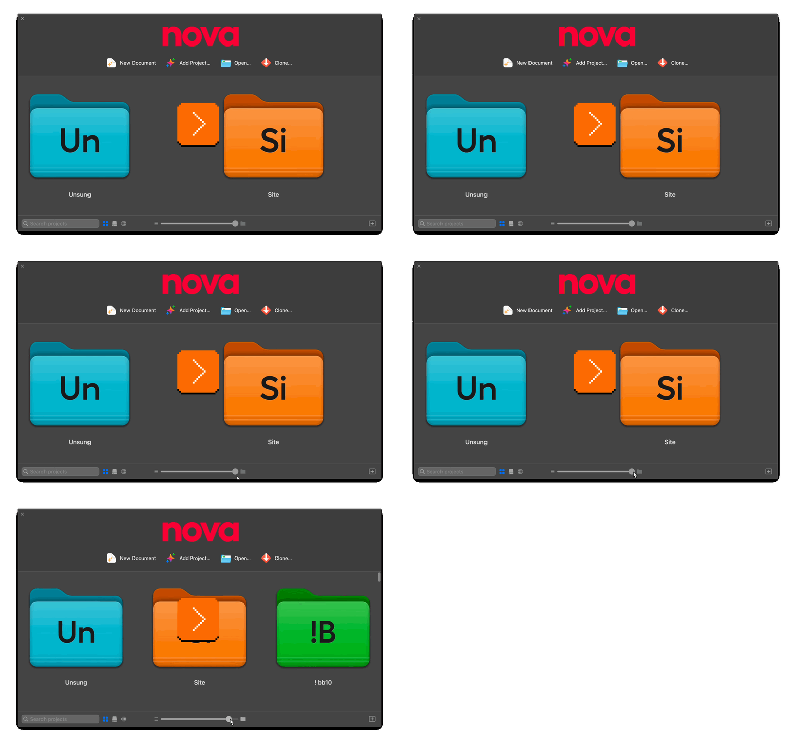
But sometimes they are a bit more conceptual. Here, Nova treats the first notch of the zoom scale as a “list” option:
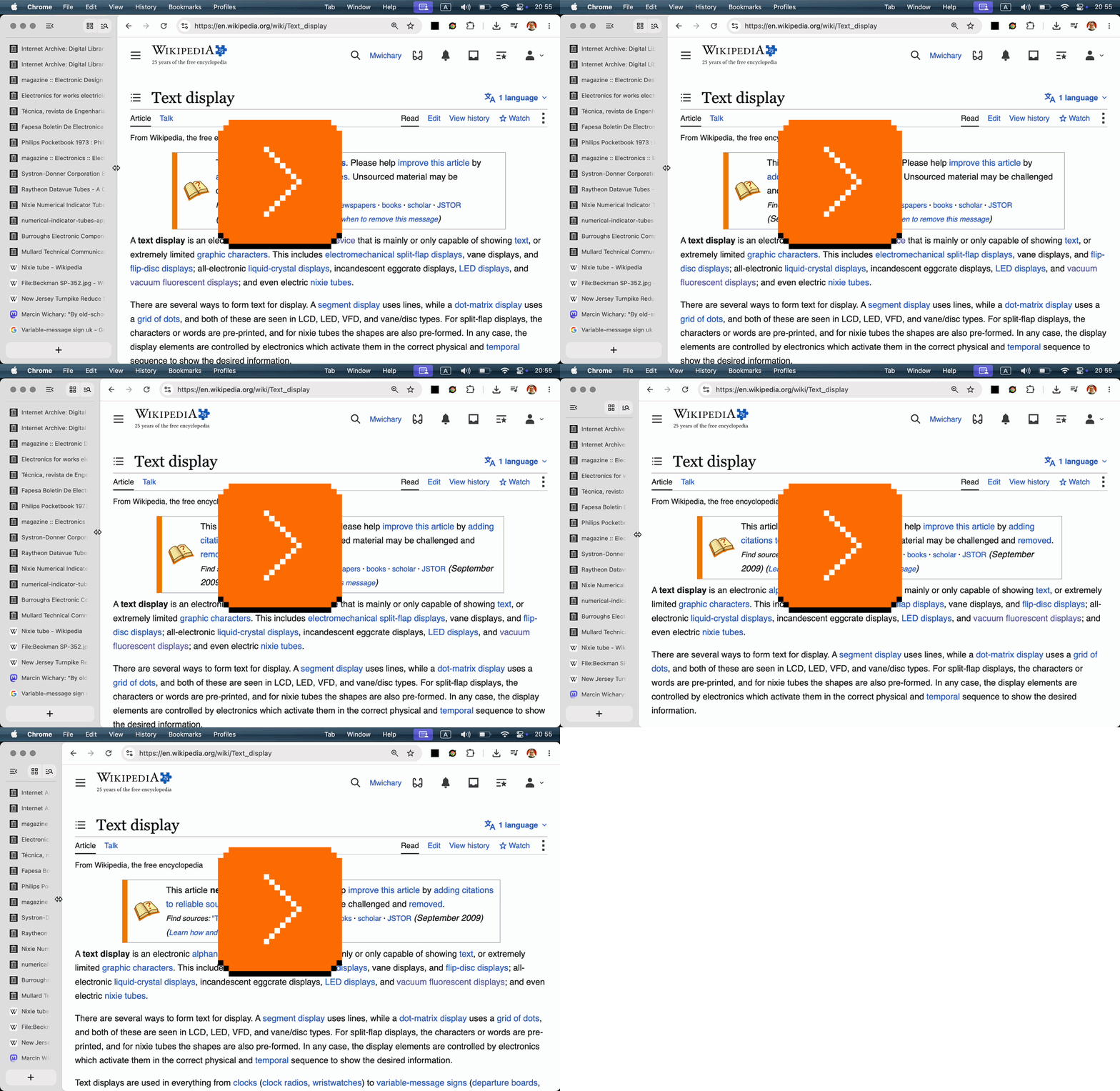
Or: The new horizontal tabs in Chrome allow you to resize to whatever width you want. Below 125px, however, they snap directly to the minimum 55px width, a one-off “column view” with streamlined and purely iconographic controls:
These all have pros and cons, too.
On the con side, just like the fan or volume controls, they miss any memory since turning them off physically moves the knob away from any “value”; if on/off was a separate button, you could just leave the radio at your preferred volume and never touch it again. They also won’t be as discoverable as a separate onscreen toggle would be. (Here’s an example of a more classic treatment from the Nothing Phone.)
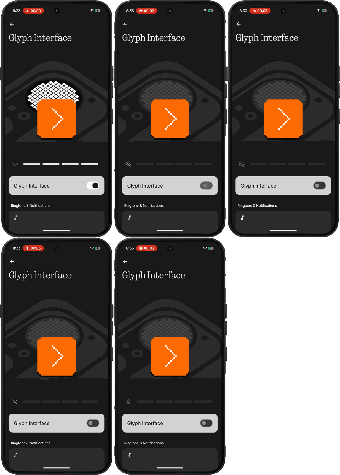
Pros? They are compact. They allow you to change from “off” to a value in one quick gesture, skipping an explicit “on” step. You could even argue they are simpler also in a visual sense.
But also, they are a bit… magical. I don’t know. That’s what to me unifies those old physical controls and their newer digital equivalents – they’re a little extra, a little different, a little special. They break the monotony of a predictable interface built out of boring, identical components. (Although, sadly, not a single onscreen example above uses haptics!)
And I think that’s kind of nice. Not just in the very functional sense of breaking up the UI through shape coding etc., but also in a sense of making UIs more interesting.
Speaking of volume, macOS used to show it as a sort of a HUD, using a treatment that borrowed from both the “first notch is special” radio knobs, and from early onscreen interfaces in TVs:

But after 20+ years, macOS Tahoe changed it so it now looks this way:
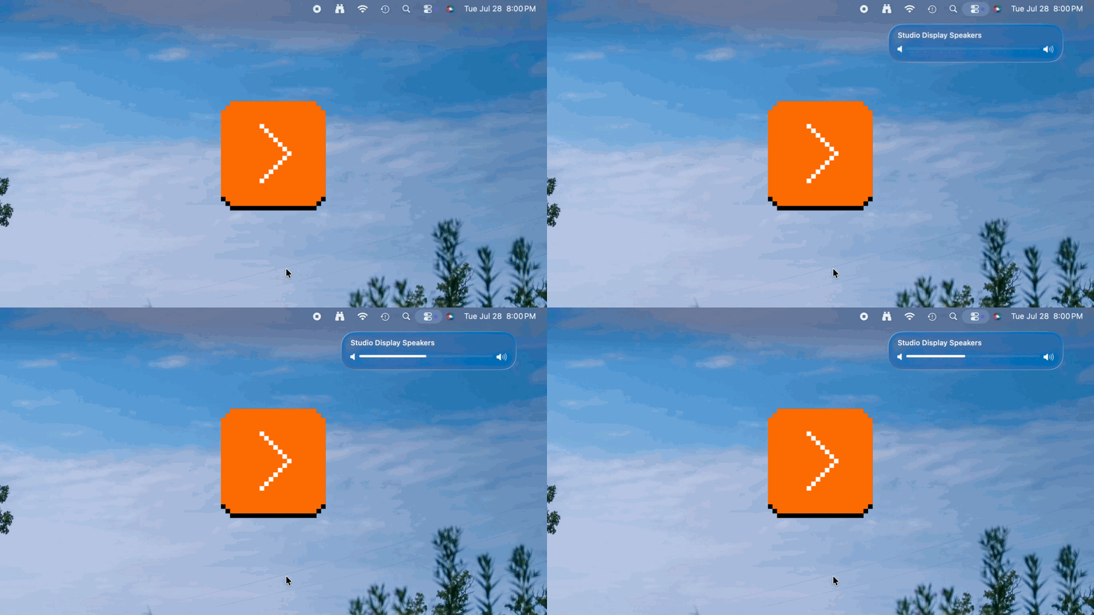
I can understand the argument that this is more consistent, and that it even teaches you – by proximity – that Control Center is what these controls call home. Yet I can’t help but think (and it seems I am not alone) that this is so boring and exactly how Windows would approach things – and that this change, just like the squared icons, is how macOS lost one more bit of magic.
Friday, August 7 / #apple / #craft / #hardware / #interface design / #real world / #youtube
iPod’s circular apps
iPhone’s home button and then the swipe up home gesture are so important and well done that they probably need to be covered as Unsung Heroes, but I wanted to mention something else today as we’re revisiting the whole “app icons in squircles” story (my most recent post + Louie Mantia’s post).
The first iPhone in 2007 put apps as squircles on the home screen, and it also put a matching shape on the home button:
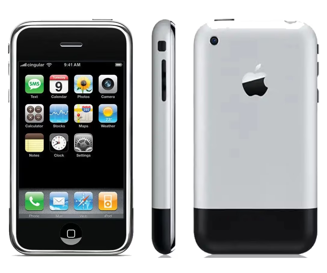
The shape on the button didn’t survive very long. It was removed starting with iPhone 5S in 2013, which introduced Touch ID – I guess it wasn’t possible to print the icon atop the button without sacrificing the finger detection accuracy. Then, in 2017, the button itself disappeared with the iPhone X.
The iPod Touch was the iPhone without the cellular radio – it was made from 2007 to 2019, supported all the same apps as the iPhone, and sported a home button with a squircle up until the end. (Ironically, despite its name, it never got a Touch ID.)
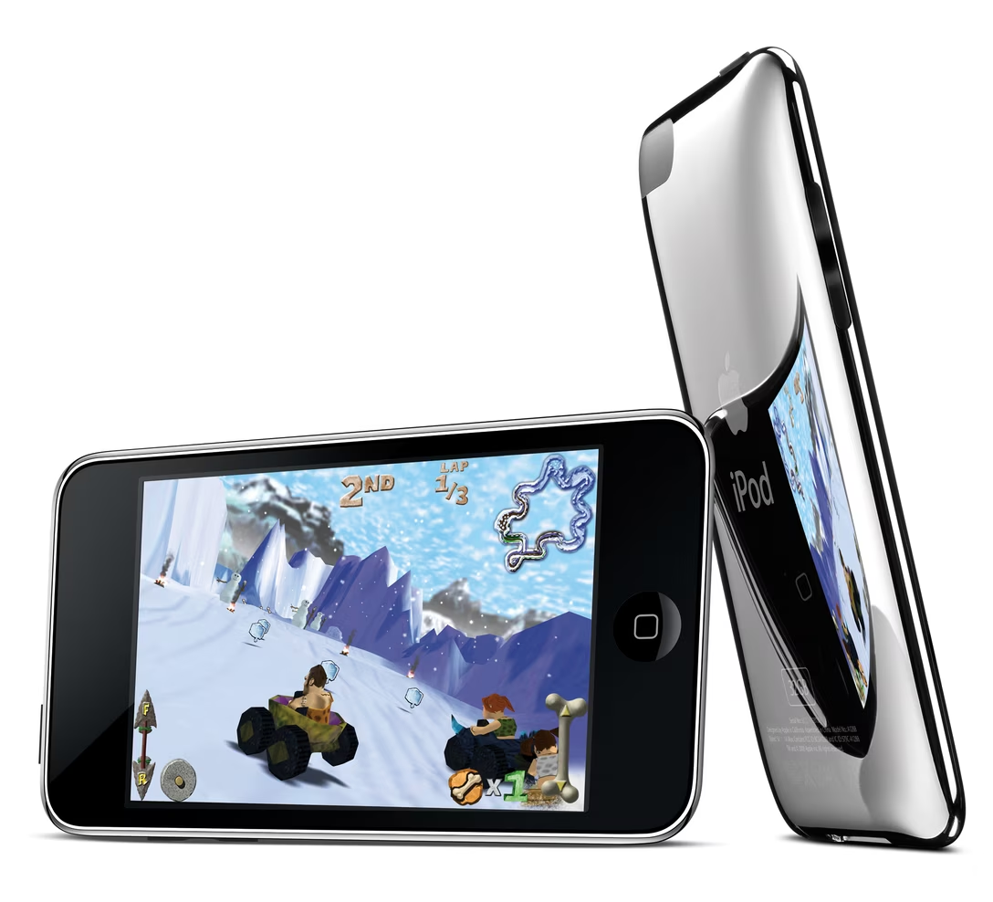
But there was another iPod that entered the app fray. It was the iPod Nano, whose last edition from 2012 had a home button – except it looked slightly different:

What was the reason? I don’t know if Apple ever explained it, but I believe the idea was that this iPod did not have downloadable apps, nor the App Store, nor even iOS. Those were all built-in apps, and I imagine Apple wanted to indicate visually that they’re different. Because it wasn’t just home button. The apps – eight of them, across 2 pages, although you could rearrange them! – all sported circular icons:
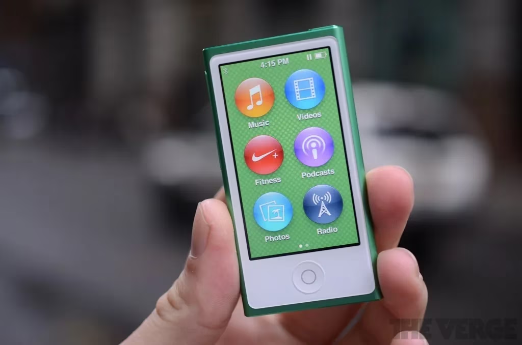
I don’t know if this approach was in any way effective, but I found it a funny little footnote.
Saturday, August 8 / #apple / #iconography
“I want to code; I’m not looking to make lifestyle choices.”
I still use Sublime Text for all of my programming and all of my newsletter-ing. […] The app is simple and superfast; I have it set up exactly the way I like it […], and it’s difficult for me to imagine ever switching to anything else.
Here is a piece of software as sturdy and obedient as a cast-iron pan.
Sloan links to a piece by David Bushnell about Sublime Text, who writes:
I don’t know who develops it and I don’t care. All I know is that I can place my text cursor and read the surrounding code without a bombardment of popovers, pop-unders, pop-left-and-rights, pop-inlines, pop-in-and-out-too-fast-to-sees. […]
The perfect dev stack is a collection of software that each does one job and doesn’t suffer main character syndrome. I want to code, I’m not looking to make lifestyle choices. I don’t want a bloated everything app. Don’t get me started on the “unified toolchain” plague! Show me the latest VC-backed build tool and I’ll show you ten lines of PHP that does a better job.
If you’re fed up of the absolute state of things, Sublime Text still works.
This is all very much in line with the post about TextEdit from a while back.
I do care who develops good software since, at the very least, I want to give them credit. This is the best I could find, if you too are curious. It was prompted by someone asking:
I’ve been a Sublime Text user for over a decade, and now a Sublime Merge user, too. But it occurs to me that I know almost nothing about the team/company behind it.
I wonder if this is a nice example of the (quiet) posture of the company matching the (utilitarian) personality of the software it is making.
Sunday, August 9 / #coding / #culture / #software evolution / #text editing
Arno Beck’s art
I am generally not a fan of typewritten art, because at some point it all starts to feel a bit same’y, and the gimmick of using a typewriter as a paintbrush wears off pretty quickly.

But these drawings by German artist Arno Beck caught my attention, because it feels like they playfully remix three eras:
- overtyping keyboard art (early 1900s),
- the sort of photorealistic smooth shading I most associate with ASCII/ANSI art (1990s),
- big pixels from early home videogames (1980s).
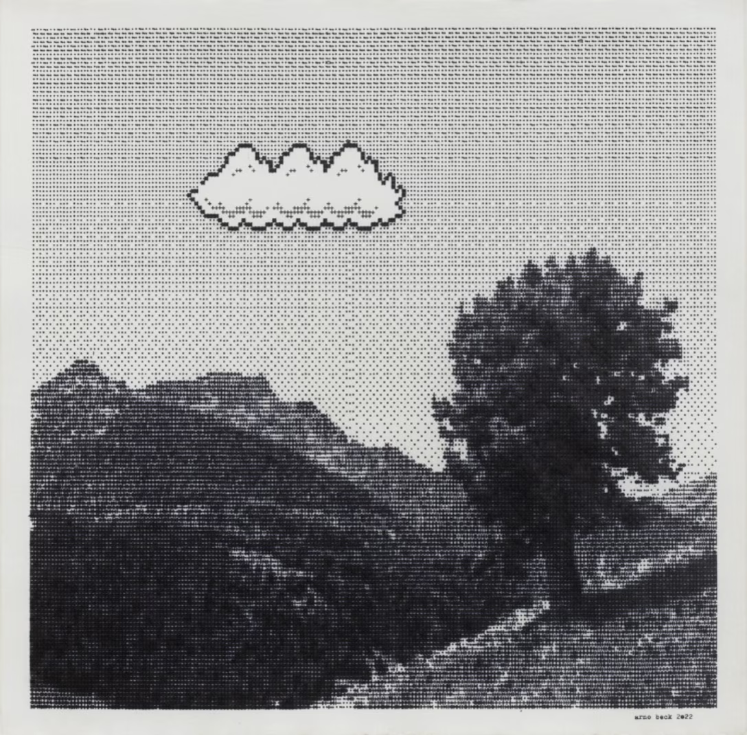

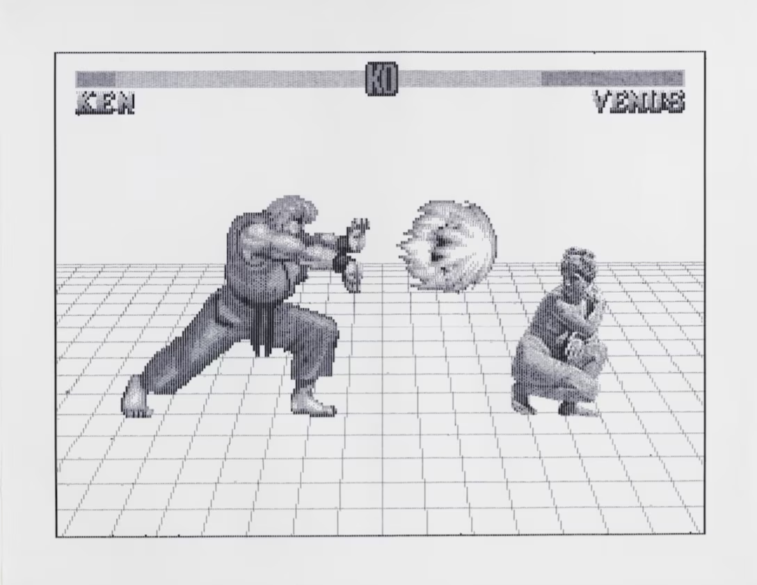
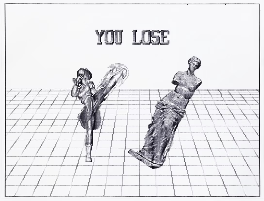
In case this interests you, in 2018 I gave a 46-minute talk called “The abridged history of having fun with keyboards” that’s a (hopefully fun) walkthrough of this whole space:
Sunday, August 9 / #art / #conference talk / #games / #marcin wichary / #youtube
“If you aim for the king, you better not show up eight years late.”
Something different for today: a one-hour episode of a podcast A Life Well Wasted from 2025. (I can’t link to it directly, but it’s the most recent episode, called “Game Over.”)
It’s a human story whose beats might be familiar to some of you: a long software project that ultimately failed despite the enormous effort. And it did so in an industry – high-budget videogames – where failures might feel particularly brutal: the projects take multiple years but the defeat can be swift, the servers get shut down and the game instantly evaporates, and instead of employees being reallocated to other games, the studio gets disbanded and people let go.
There are some nice moments in the podcast’s interviews with about a dozen people, hearing about personal pride and responsibility, working together with others, and a certain camaraderie not just with other people, but with their software that develops:
I think the best part about it was being able to play with my coworkers and then cutting loose, and being silly, and really enjoying what we made together, as a unit. That experience alone made it worth it.
There are also questions about the management’s role in all of this – this part we might never get to know fully – and the worry about game preservation.
This is not mentioned in the podcast, but it seems widely understood the story is about Concord, a AAA live-service game that is rumored to have cost a staggering $400 million dollars and taken 8 years to develop, only to be shut down mere 12 days after its launch in the late 2024. (AAA means a blockbuster with highest budgets seen by the industry, and live service means a game like Fortnite, which is expected to make money over time from add-ons and upgrades.)
Learning about Concord’s macro view adds a lot of color to the boots-on-the-ground podcast above, but one has to be careful exploring it; the online discourse about the game felt similar to the 2016 reboot of the movie Ghostbusters where sure, the product might have been subpar, but also a lot of commenters seemed eager to arrive to the conversation carrying truckloads of bad faith, gatekeeping, and misogyny.
Some good articles? Keza MacDonald in the Guardian has a nice summary of the whole situation:
This is a brutal sequence of events. Sony bought the makers of Concord, Firewalk Studios, in 2023. Concord had been in development for eight years, and it was an expensive game, with bespoke cinematics and a long-term plan that would have cost $100m or more to develop. In its two weeks on the market, it sold fewer than 25,000 copies, according to estimates. This is a shocker, even compared with the year’s other bad news for developers and studios.
MacDonald also adds:
Speaking personally, I do not want a game that takes years to play. I want one with something to say, an experience to impart, and one that eventually ends. A game whose artistry comes before its business model.
This is partly a matter of taste. Self-evidently, there is an enormous market for live-service multiplayer games; it’s just that most of those people are already playing one. I highly doubt that there are untapped millions of players desperate for a hero shooter or battle royale game who just haven’t found the right one yet. It’s time that publishers try something new instead.
An article by Matt Kim at IGN adds to this notion:
With so many games now taking close to a decade from the beginning of development to release, we’re starting to see the financial and creative consequences of an overlong development cycle. Spend too much time in development and ideas that were once novel are no longer in vogue. Furthermore, the time and money spent over those years has to be recouped somehow, which leads to decisions like the $40 cost of entry for Concord when many of its peers are free to play.
The cost of coming late to the party means you must bring something new to the table. Unfortunately, Concord is neither particularly innovative nor content-heavy. That said, it does have a level of polish at launch that was often absent from its hero shooter peers when they were first released. Indeed, Concord’s weekly animation story drops are fully motion-capture, and Firewalk’s time spent on crafting its lore has helped secure Concord an episode of this winter’s video game animation anthology series, Secret Level.
But well-established hero shooters like EA’s Apex Legends launched almost bare bones and still managed to make a splash thanks to its intriguing central concept which combined hero loadouts with a battle royale match format. Valve’s Deadlock doesn’t even have finalized assets or art but has still caused a huge burst of excitement among the PC community, thanks to the way it changes up the classic 6v6 hero formula with its heavy lane-and-minions MOBA [Multiplayer Online Battle Arena—ed.] mechanics. By contrast Concord appeared with an all-too-familiar offering and, frankly, the time spent on finessing its presentation – the graphics, motion capture, performance, and so on – likely lead to a later release date which in turn meant it lost valuable time establishing itself among its peers. If it had been released four or five years ago, when the PS5 first came out, maybe its launch would have been an entirely different story.
I think this is important to quote on this blog that often talks about “finessing” and implicitly – or sometimes explicitly – about the value of taking time to get the details right. We can’t forget that there are such things as overdesigning and overproducing, and that ultimately there is no way to polish your way out of something that lacks a soul.
Sunday, August 9 / #craft / #culture / #games / #podcast / #preservation / #software eulogies
Linear’s visual key feedback
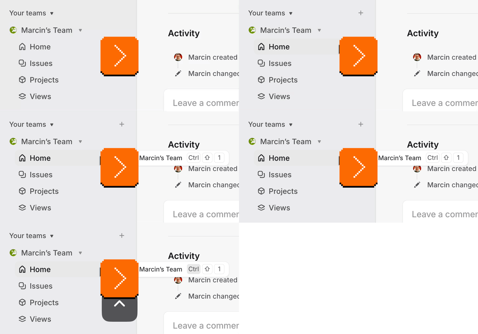
The task manager app Linear does something interesting I have not seen before. In the keyboard shortcut tooltips, it highlights the modifier keys you already pressed, to give you confirmation you’re on the right track:
I think this is nice, particularly given that the modifier key situation is kind of a mess, and particularly if you consider some keyboards present their modifier keys like this:
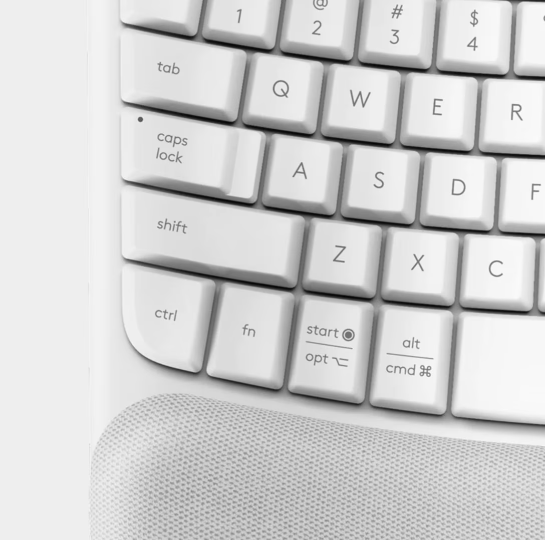
I think it’s valuable to offer a connection between your fingers touching keys and something happening onscreen in real time – similarly how the blinker arrow in your car pulses exactly at the same rate as the sound it makes, to help you connect the two.
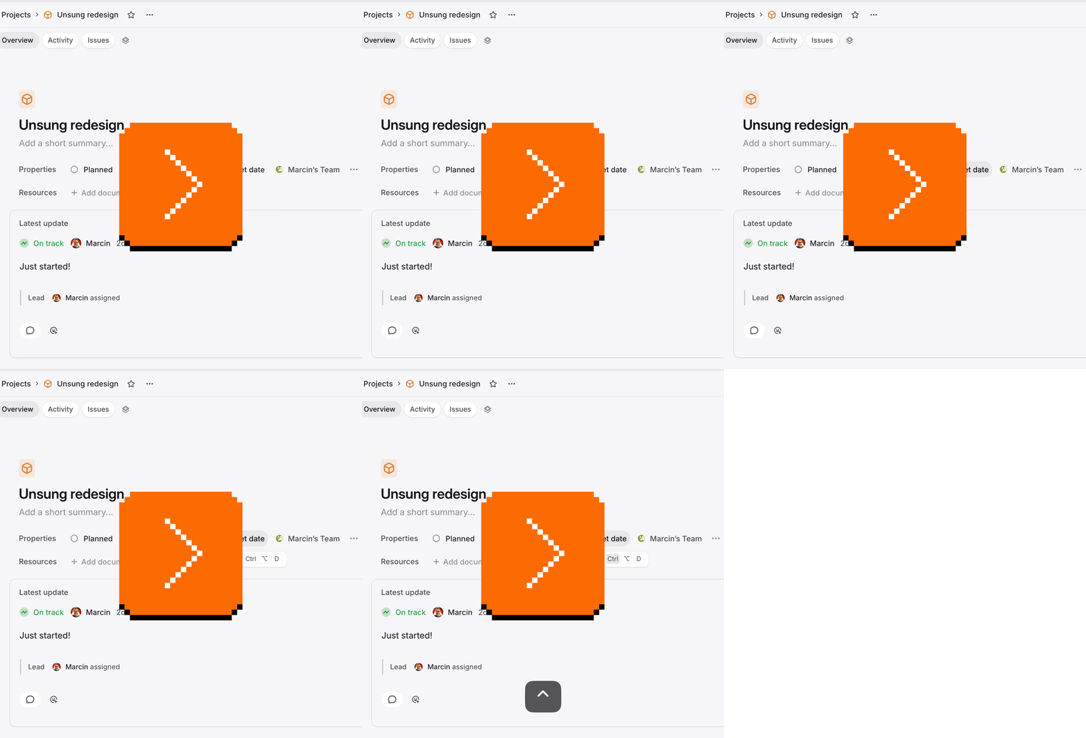
However, Linear does not do this in all the contexts:
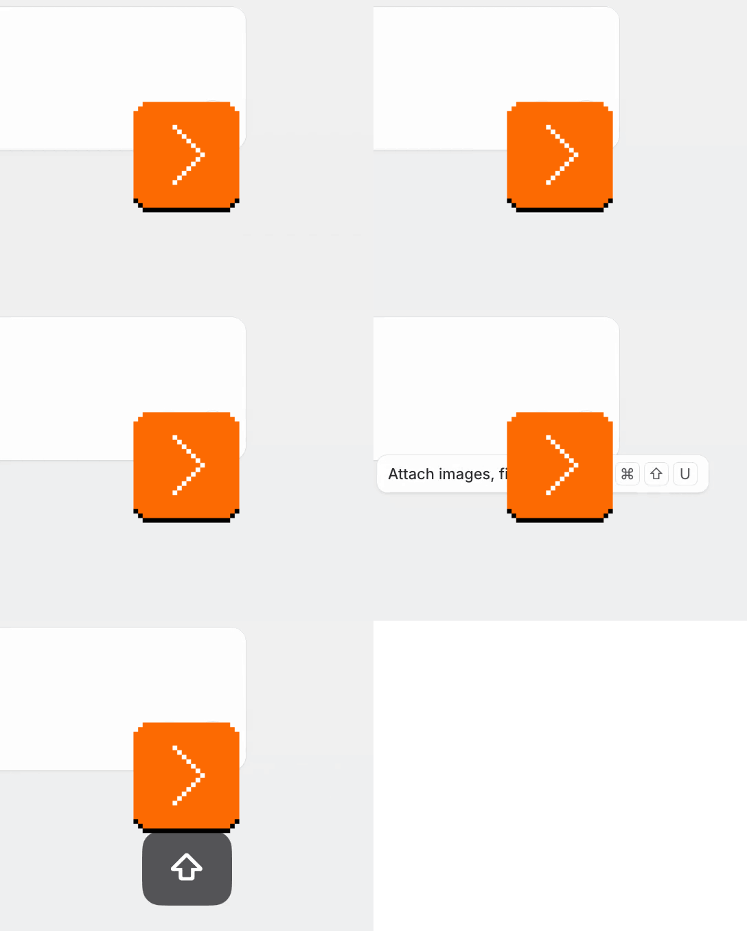
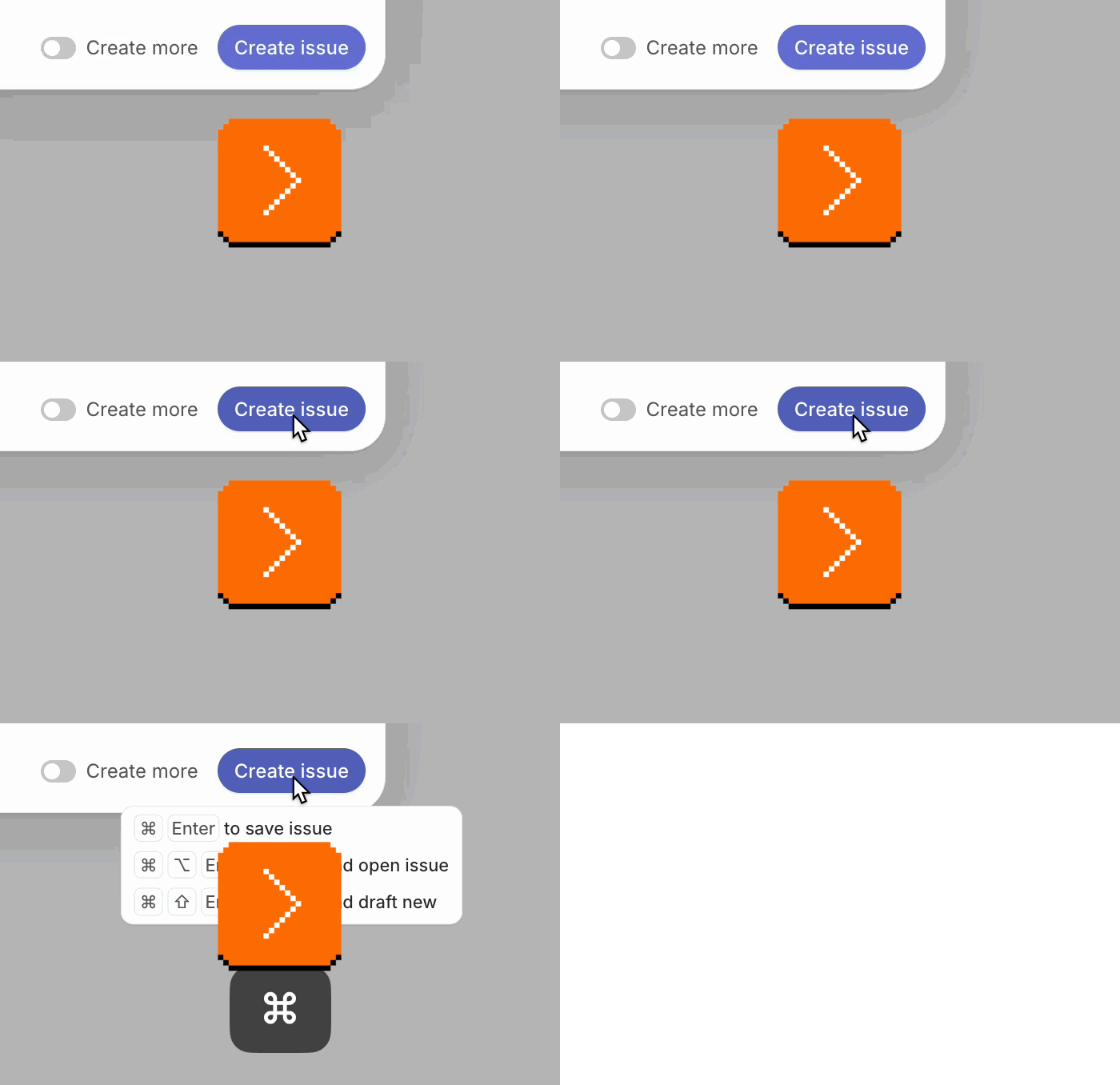
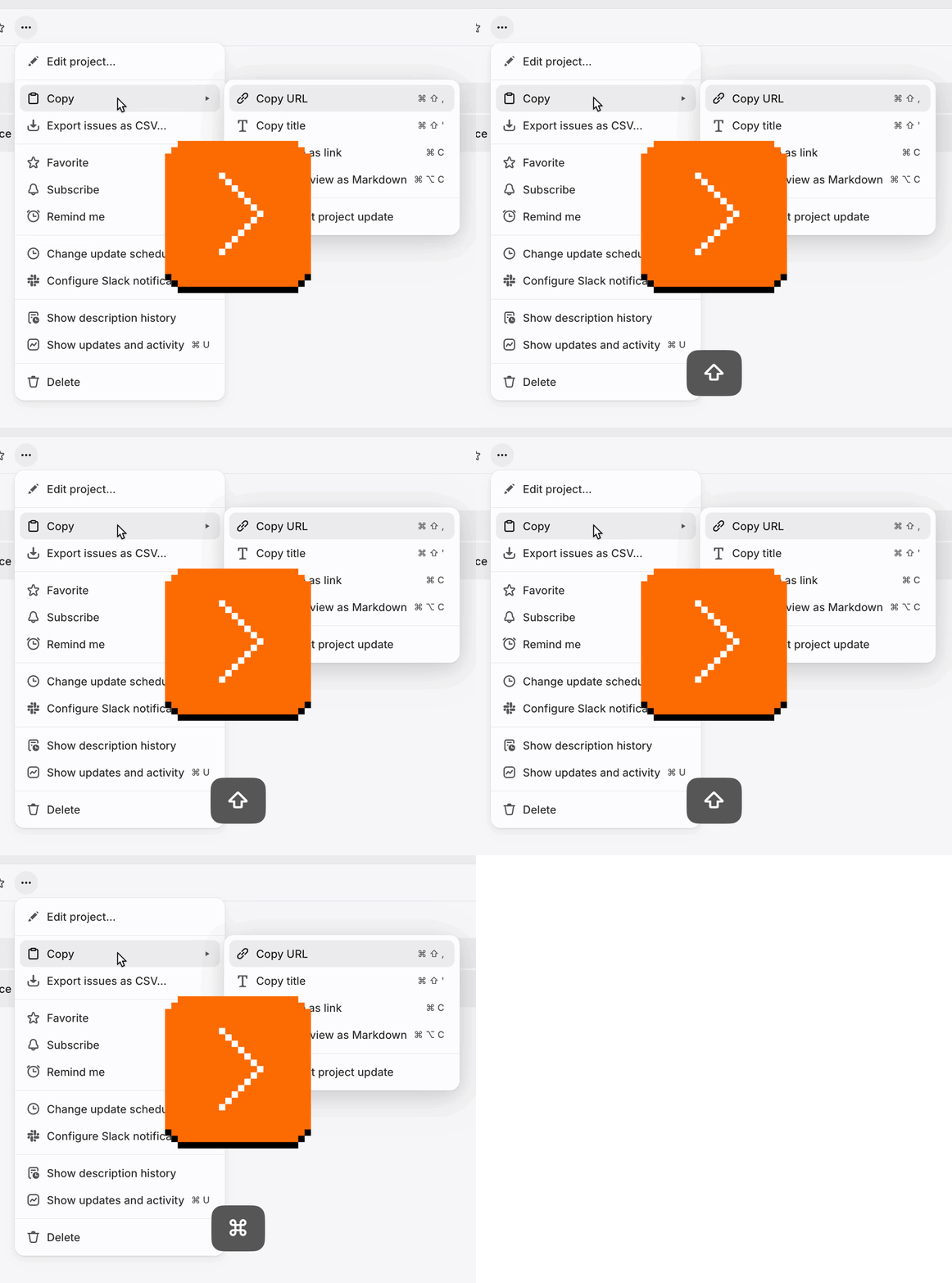
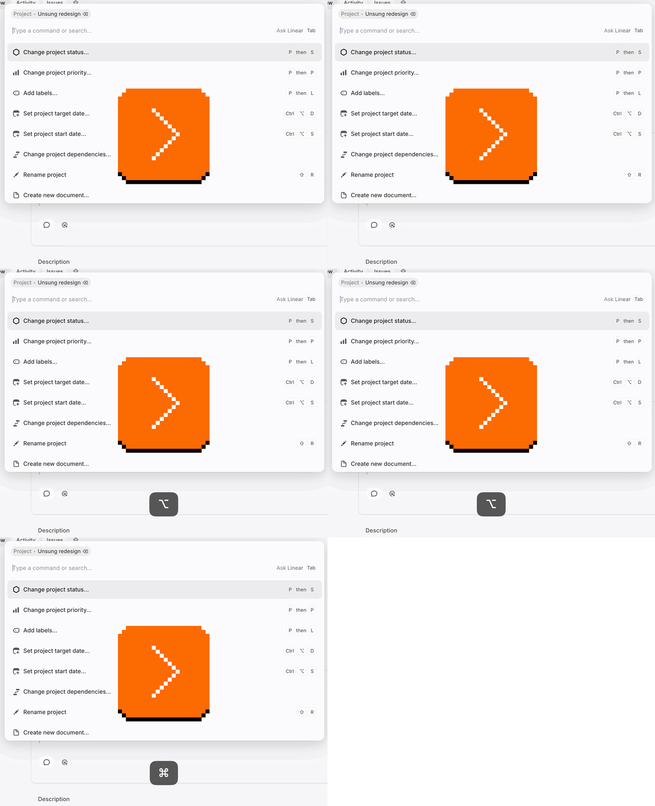
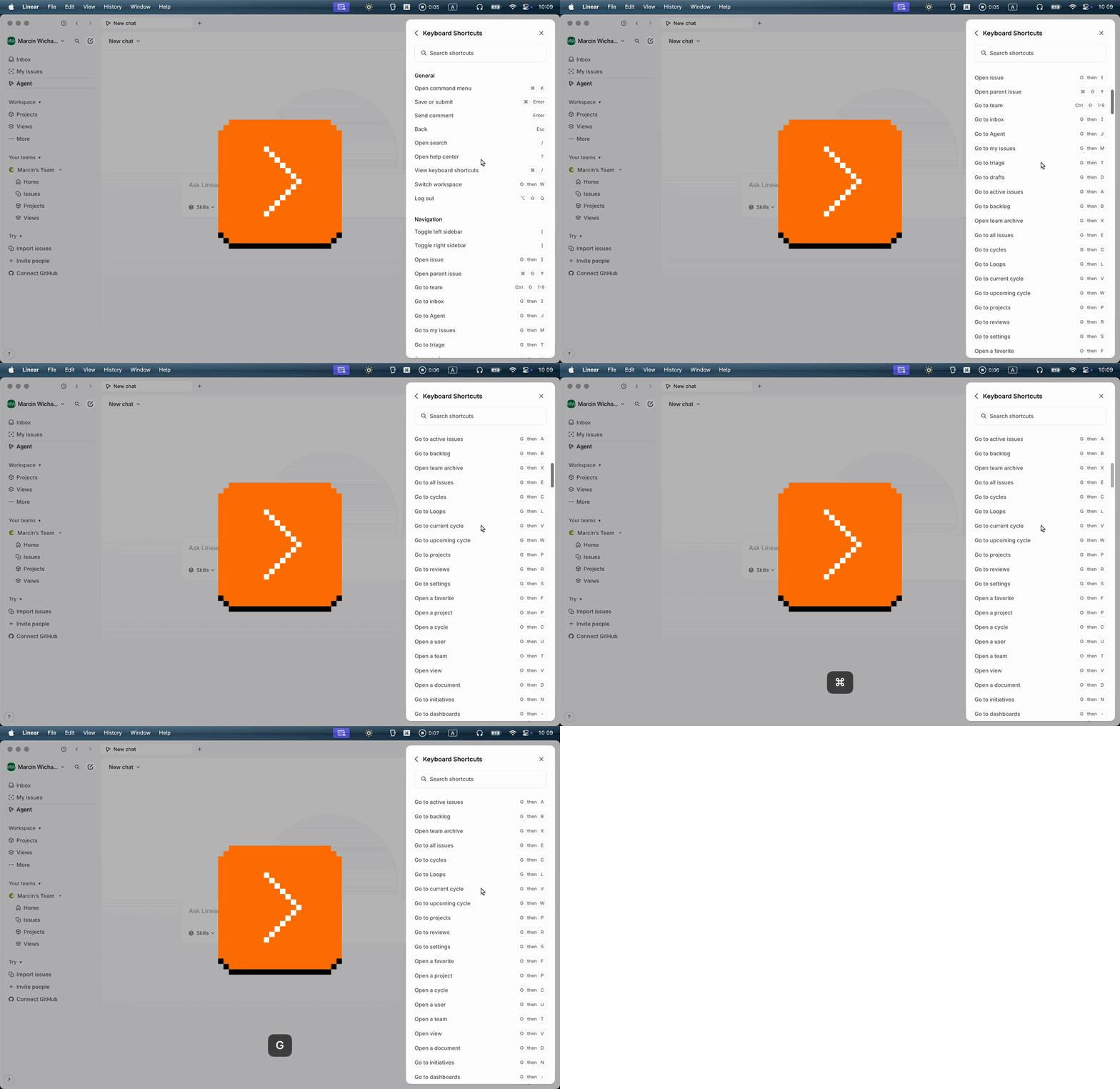
While the first two videos might be simply bugs, I am not sure about the last three. It’s entirely possible this was done intentionally because these surfaces – the menus, the command palette, and the keyboard shortcut pane – do not support actually invoking the shortcuts. (Pressing the listed keys would not actually achieve anything.)
But I still wonder if this was a good call. One of the most important things for any new systemic pattern is building trust: making sure it’s consistently applied in all the nooks and crannies so that the user can understand what it does, learn to rely on it, and form the habit. Just one place where it doesn’t work might make it easy to just give up on it altogether.
Perhaps this is an example of how hard it is to design a cohesive system, which in Linear’s case is compounded by the fact that a lot of shortcuts start with regular keys like G and O and P, exacerbating focus issues. Either way, it’s delightful to see someone doing something new in this space.
Monday, August 10 / #above and beyond / #keyboard / #linear / #system design
A bug becoming a feature (1972 edition)
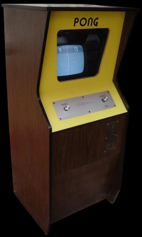
I just learned something fun this weekend. The seminal videogame Pong from 1972 looked like this:
But there was a problem. Here’s Al Alcorn, the designer/engineer of the machine:
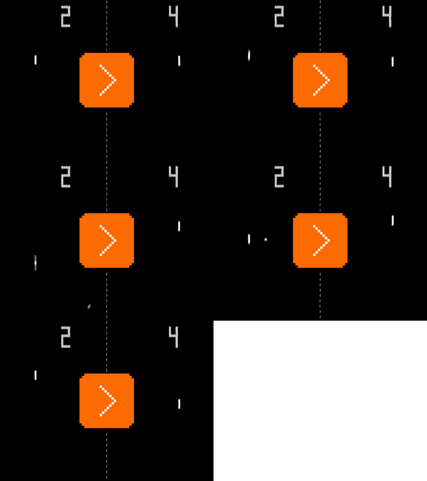
The paddles on the original Pong didn’t go all the way to the top. There was a defect in the [circuit] – I used a very simple circuit, I had to, to make the paddles, but they didn’t go to the top.
This meant that there could be situation where the ball sneaks up past the paddle at the very top of the screen, and the player cannot do anything to stop it.
You can see it in this video:
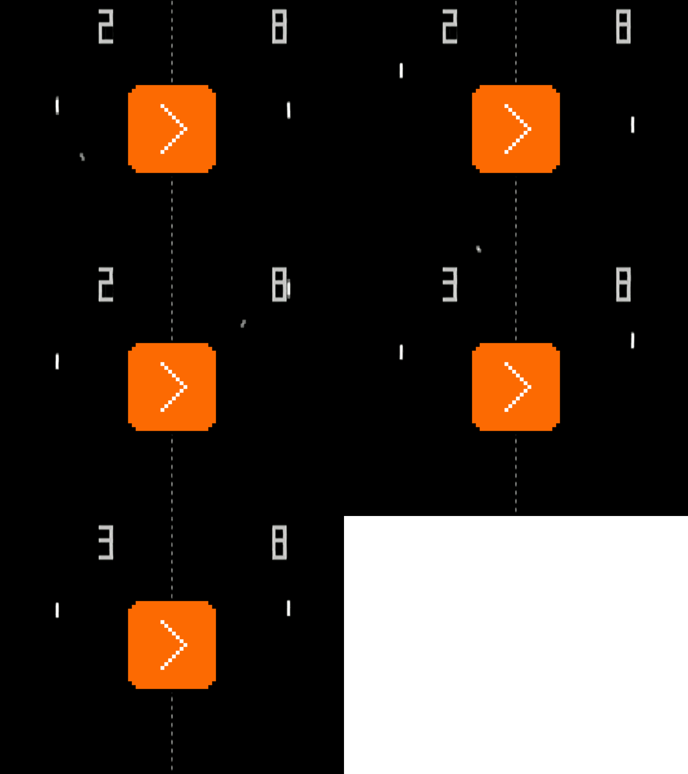
But Alcorn decided not to change that:
I could have fixed it, but it turned out to be important, because if you get two good players they could just volley and play the game forever. And the game has to end in about three or four minutes otherwise it’s a failure as a game. So that gap at the top, again – a feature. So that was sort of a happy accident.
“Happy” primarily in the context of the industry – the goal of an arcade game was, after all, to bring in quarters, and this here was the unexpected equivalent of the zero in a casino roulette game. But I wonder if some of this bugginess/randomness also helped the game feel challenging and surprising, even for skilled players.
Tuesday, August 11 / #bugs / #games
Tap to top: Bear
I praised the note-taking app Bear before for its memory; the app would always remember your last-visited note and the precise place within it, even if it had every right to forget it.
But there is a general problem here: memory that kicks in when not expected can be frustrating, as you have to undo its results and “reset to normal.” For Bear that’s not a problem, though, right? The whole iOS has a nice “tap near the top to scroll to the top” gesture that would work here as well, making it easy to recover if you return to the note where you last happened to type.
Except, with any writing app, the very bottom is as valid of a destination as the very top.
Bear designers understood it and tried to solve it in a new way, by adding two gestures: a two-finger swipe up takes you to the very top, and a two-finger swipe down to the very bottom:
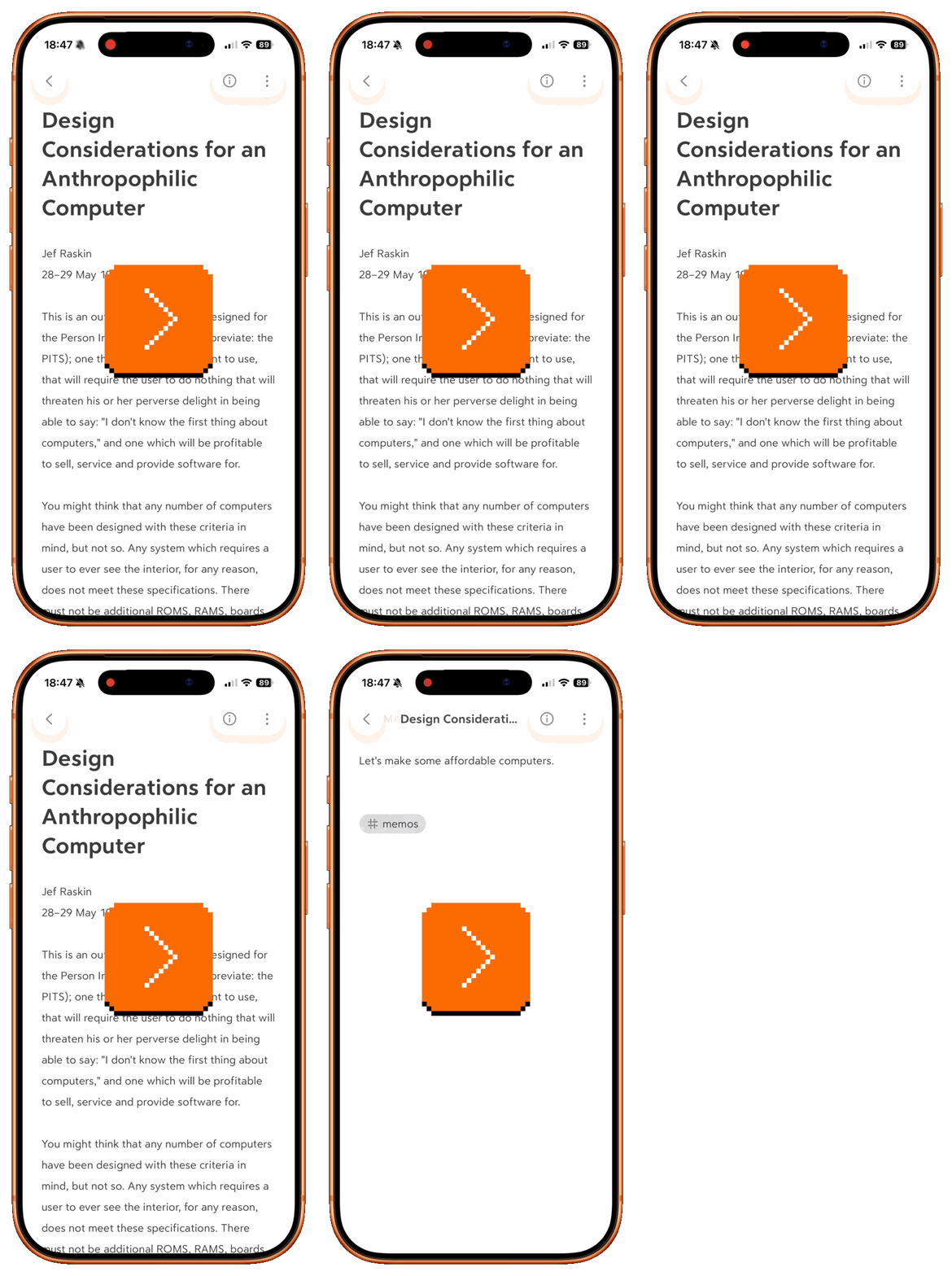
It doesn’t quite work as well as I hoped – for some reason, it scrolls way too far down, and does feel a bit sticky mechanically.
It’s also, like any complex gesture, not very discoverable. But here’s where Bear tries to help, by… adding even more gestures atop these two. There is a two-finger swipe left or right for jumping back and forward in history…
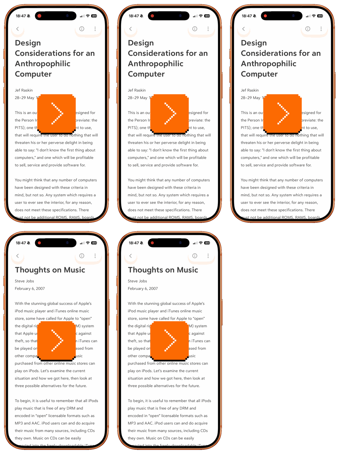
…and even a two-finger tap to reveal a navigation menu.
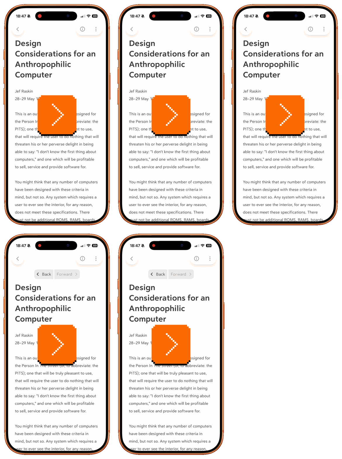
That last one feels like overkill to me, but there is something interesting about the app building an entire little universe of compatible gestures – “Come here for all your navigation needs!” – knowing that it increases the chances users will develop a habit of learning and using them. (The gestures also work whether you’re in view or edit mode.)
I am curious, though: Would allowing to tap somewhere near the bottom edge not work as the “obvious” solution to get all the way down?
Wednesday, August 12 / #bear / #system design / #text editing / #touch
Tap to top: Ivory
Safari broke tap to top for tabs (say it three times fast), and Bear added two-fingers gestures. Ivory – a Mastodon client for iOS – tries a different approach in a slightly different setting.
The normal tap to top gesture works as expected, but tapping the top again returns you back where you were before:
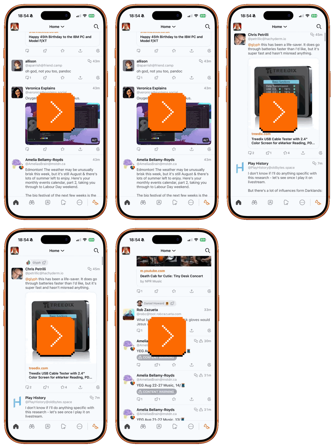
I believe this is meant to be a small gesture of help if you tap to top accidentally, yet I am not entirely sure it’s effective. Would you, in a moment of panic, decide to do the same thing again, after years where every other gesture like this in the entire system taught you those taps are idempotent?
It gets a little bit worse, too. There is another established standard of going to the top – tap the selected tab again. This works across the entire operating system, too. But Ivory changes it, requiring you to tap twice, not once:
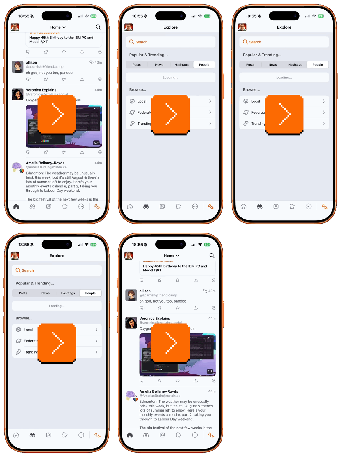
I don’t have access to the combined feedback of Ivory’s users, but I am much less of a fan of this than of Bear’s approach, as it doesn’t feel like it comes together as a system.
At the bottom of the screen, the interface teaches you that you have to tap one more time than usual, likely putting in your fingers the idea that you just have to tap many times, especially if you never figure out it’s a double tap and not two taps that trigger the interaction.
But then, at the top, this is how the interface reacts like this when you do exactly the same thing:
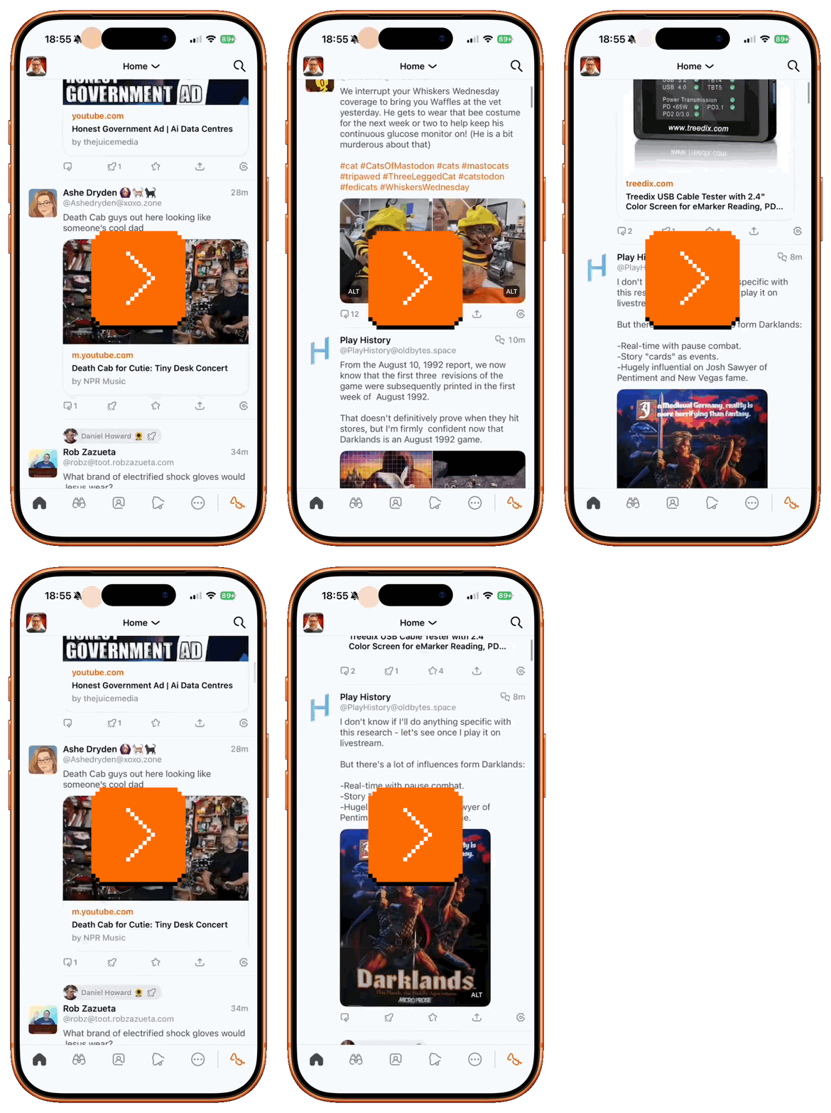
It feels like a system that’s well-intentioned, but inconsistent not just with the rest of iOS, but also with itself.
Wednesday, August 12 / #system design / #touch
Name pronunciation in Asana
A nice moment I spotted in Asana – you can quickly record your name pronunciation (the video below does not have sound):
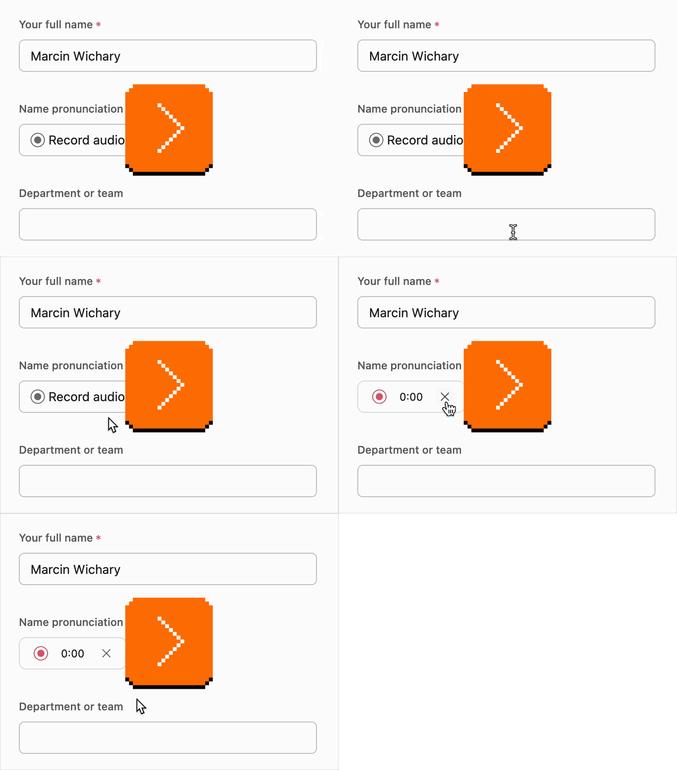
As someone who has “How to pronounce my name” in the footer of his website, it’s much appreciated!
The result appears as a simple icon next to your name:

For discoverability, if you spot this speaker icon on someone else’s profile yet, it shouldn’t be that hard to connect it to the microphone on your own profile that allows you to record: