“It’s unclear how Sopwith escaped to the general public.”
Welcome to this week’s digest of Unsung, a blog about software craft and quality. Here’s what was posted since last time.
Note: Starting today, these emails will show posts oldest-first.
View this issue in the browser with inline videos and better formatting
“Insights and ideas emerge from that interface.”
Yet we should never forget that the product of work isn’t only the work — it’s also the worker. Doing the work changes you; the up-close experience transforms your capabilities and even your desires. Insights and ideas emerge from that interface, and I believe the agent maestros lose a lot — too much — when they take their big step back.
But I suppose this is just my temperament, which I’ve written about before. I don’t merely want things done; I want to do them.
Friday, July 31 / #ai / #craft
One and one thing only
I wanted to show you a year’s worth of messages from my barber’s software, because this is what software should be.
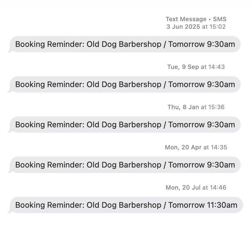
No spam, no upsells, no growth hacks, no unwelcome cuteness or puzzling verbosity. It’s so curt and straight to the point it should be set in a 1970s Helvetica: The appointment’s tomorrow. Any questions?
Friday, July 31 / #attention
You only get one chance to make a zeroth impression
Contra the previous post, just spotted this “Same settings, new look!” callout in Firefox, on a page I have never visited before, talking about a feature I have never used:
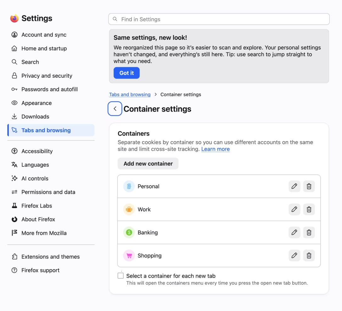
I mentioned this once – when you get someplace new, everything is new. This redesign announcement’s conditions were engineered poorly, because they didn’t even consider people who didn’t use the feature before the redesign.
I keep thinking of the very old computers from the 1940s, 1950s, and even 1960s, where the challenge wasn’t what to do with the computer, but with keeping the computer running. There was a machine called JOHNNIAC which gained a nickname “pneumoniac” because it refused to work on a warm day. On many other computers, there was a daily ritual of finding which of the vacuum tubes blew up and had to be replaced. Some teams had a literal downtime tax; they knew and communicated in advance that 40% of the days the machine would not be up to the task, consumed by tweaks and repairs to bring it just to the state of being ready to do work.
When I look at those kinds of pop-ups and callouts, I think how we’re unwillingly recreating the very same conditions. I deeply believe people are exhausted not just by changes in software, but also constant questions, pop-ups, unnecessary notifications, “STOP 2 END,” “tell us what you think,” emails to unsubscribe from, unsubscribes that don’t work the first time, and so on.
Software should not require the user to occasionally click on buttons just to keep it running.
Friday, July 31 / #attention / #onboarding
The monkey lives again
Speaking of computers that used to stop running if you looked at them funny, a few years ago I wrote about the Monkey app that was there on the original Mac. Many software engineers will recognize the premise – Monkey was just a chaos script randomly pressing mouse buttons and keys during the night hours, and if the computer crashed because of Monkey’s random actions, the team would be able to reproduce it and try to fix it.
I was also inspired to try a Monkey-like approach for something creative. In hindsight, it’s a very Unsung post, so you might enjoy it!
Also, in the post, I showed this boring version of Monkey:
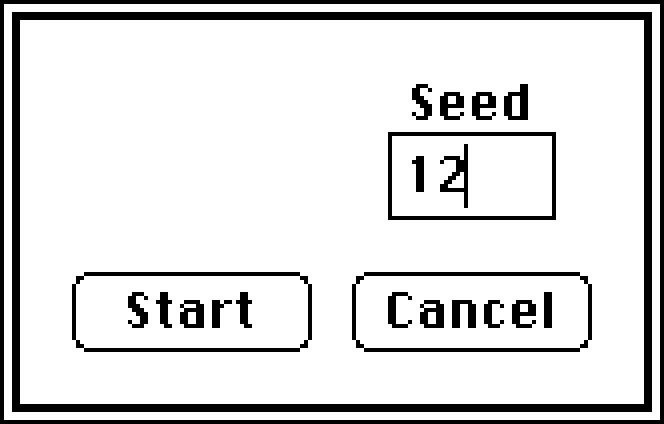
Since then, I discovered a different version with its own icon, perhaps designed by Susan Kare:
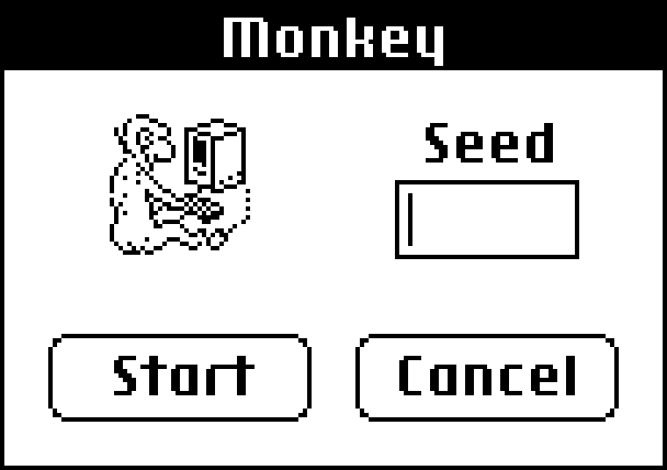
(If creative use of randomness rings a bell, here’s also an earlier Unsung post about a different take.)
Saturday, August 1 / #apple / #history / #marcin wichary / #process / #qa testing
Asana’s fascinating Tab shortcuts
If you’re a professional web app, your key shortcut situation is not to be envied. Once the operating system grabs the ⌘ shortcuts it requires (⌘M to minimize, ⌘H to hide, ⌘Q to quit, etc.), the browser has its turn, claiming everything from ⌘R, T, N, L, W for tab operation, to ⌘F, P, O, and S for other things. And then, some input controls inside the browser also need to listen to ⌘Z and XCV, and maybe even A (select all), B (bold), and I (italic).
At this point things feel barren, and some web apps start reaching instead for less common modifier keys (⇧, ⌥, ⌘⇧), and others go straight to no modifier zone, or override those of the above shortcuts that they can. Each approach, of course, has its own set of challenges.
It’s perhaps not a surprise that someone got fed up, and that someone was people working on the project management tool Asana, which did something relatively unique: it promoted Tab to be a modifier key.
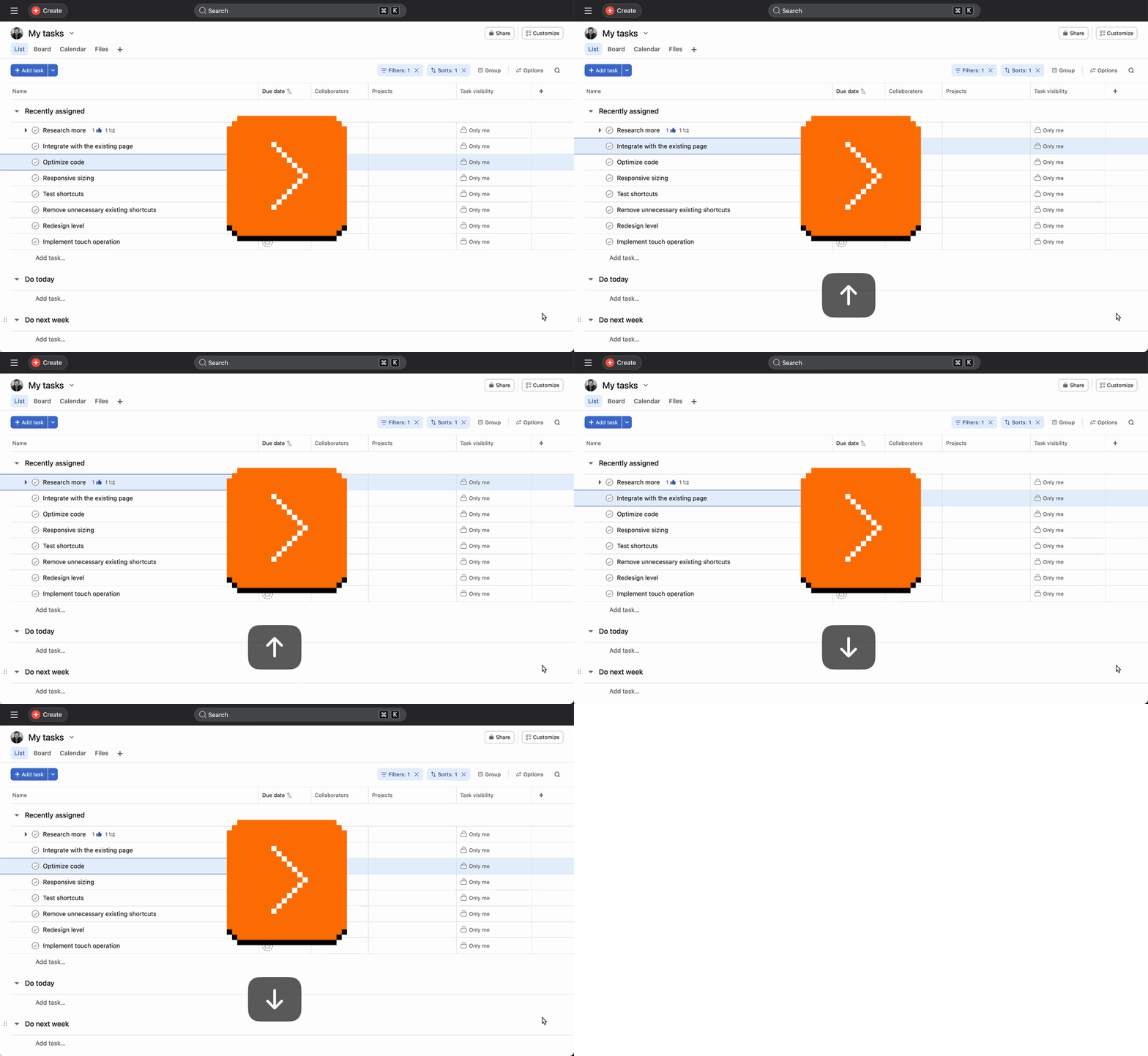
The video shows me using Tab+K to like tasks, Tab+Return to open a sidebar, Tab+Q to add a quick task, and Tab+H to return home. Here’s the entire official shortcut list, with Tab shortcuts emphasized:
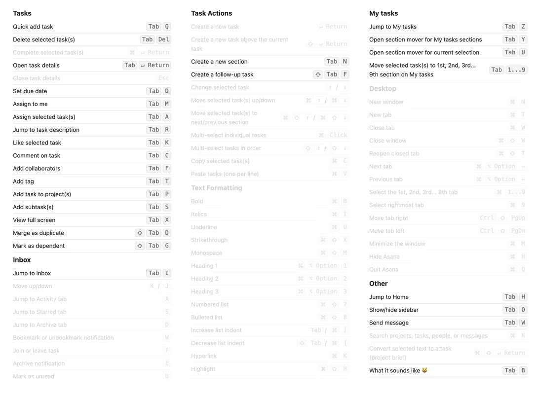
What’s fascinating about choosing Tab is that the key already has so much to do:
- it moves focus to the next UI control,
- it indents a bullet point or even just text,
- it accepts an autosuggestion or a placeholder (and similar things).
On top of that, repurposing a key to be a modifier key – especially one that already has a job or two – will also have a long tail of strange consequences. And, Tab is only on one side, which could wreak havoc with the ergonomics of keyboard use. (You are, technically, always supposed to use the modifier key with the opposite hand to the hand you’re pressing the main key with.)
But…
I am not ready to hate it quite yet.
Tab is not the worst key to use in this context, as it’s really the only available big key other than Caps Lock, which is impossible to mess with on the web. The other big keys – the spacebar, Return, and Backspace – would be radioactive for this purpose.
The asymmetry issue? Anecdotally, I understand that both right-handed and left-handed people most often use the pointing device (mouse or trackpad) with their right hand, and consequently often prioritize left modifier keys anyway.
Here is how Asana deals with some other challenges:
- When you press Tab to move focus around, the action can now only take place on key up, not key down, so tabbing (or, indentation of bullet points) feels slower.
- When you hold a regular modifier key and then change your mind and simply release it, no action occurs. But Tab already has a job as a regular key (tabbing or indentation, depending on context), so if you change your mind, something will still happen. This might be annoying. (You can press Tab+Esc or Tab+Space for a safe cancel, but that doesn’t seem very intuitive, especially in a moment of panic.)
- An action only on key up also means there can be no repeat when holding Tab. I am not sure how important this is, especially in the context of accessibility.
What’s interesting and I bet the main reason Asana approached it this way, is that Tab is a separate little island, far away from other modifier keys – and thus not just without any preexisting conflicts, but also impossible to confuse with other modifier keys. Asana could have kept all the shortcuts above but substituted Tab with Ctrl on a Mac and Alt on a PC, but those would then be packed among many other similar-feeling keys.
(There is a price for this isolation, as Tab backfires the moment you have to combine it with other modifier keys. Asana doesn’t do it very often – I have only seen Tab+Shift+D, G, and F – but I wish they didn’t do it at all.)
Overall, I’m surprised how positively I feel about it. If you use Asana a lot, I’d be curious how Tab-based shortcuts feel to you. If you work at Asana, I would love to know if you consider these a success.
The only thing that seems to be missing is an option to go back to regular shortcuts if needed, for people who might want it for motor control reasons. (It is possible to achieve that with tools like Karabiner Elements, but that tool is really unpleasant to use.)
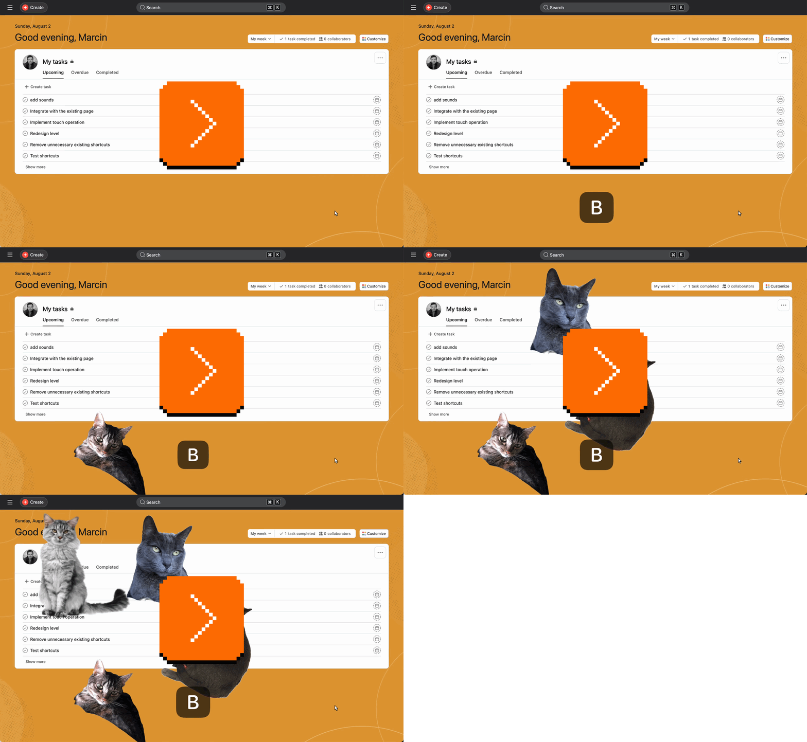
Oh, also. Tab+B does this, because, well, “tabby.” Cute.
Sunday, August 2 / #easter eggs / #ergonomics / #keyboard / #web
“As a Windows user, it’s a very surreal way to install a program.”
Mac’s operating system has a peculiar way to install apps. An app typically arrives in a file with a .dmg extension (it stands for “disk image”; my brain always reads it as “damage”), which upon double clicking becomes a kind of a drive. You go inside the drive, and there is the app icon.
But the journey isn’t over. While you can run the app from the virtual drive, the drive will eventually disappear after the reboot – or if you eject it – so it’s in the app’s interest to suggest a more permanent home for itself.
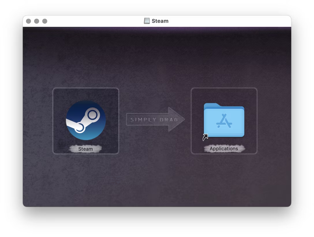
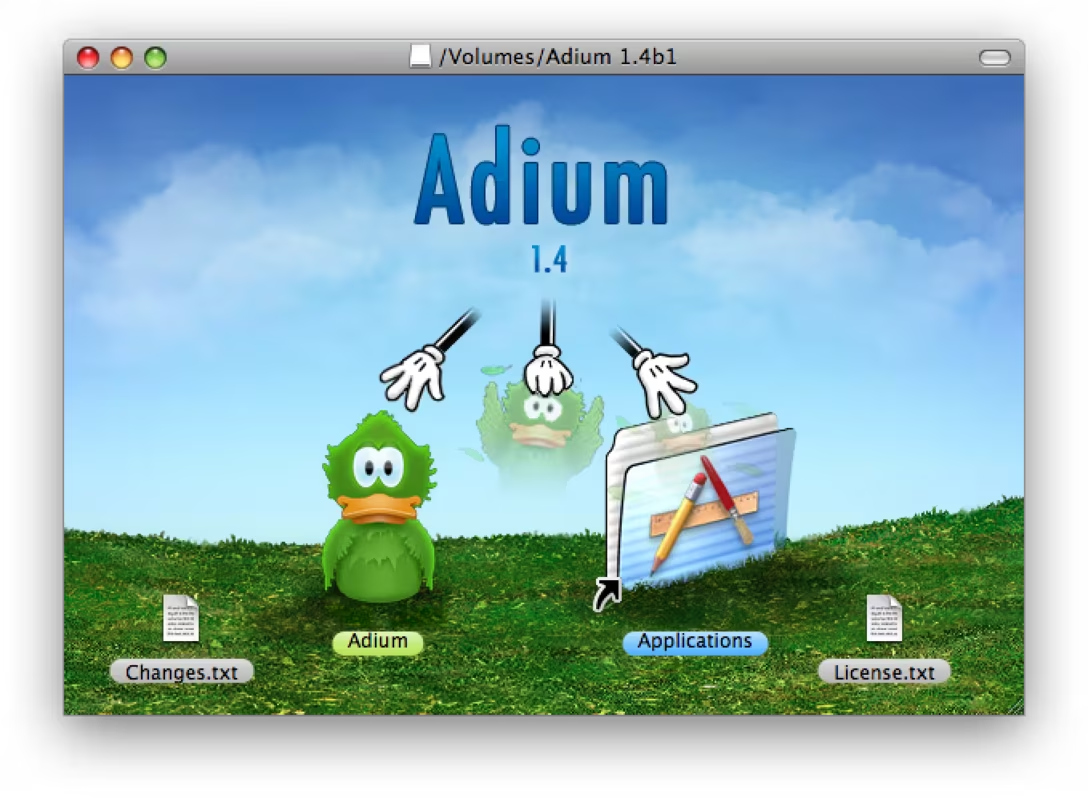
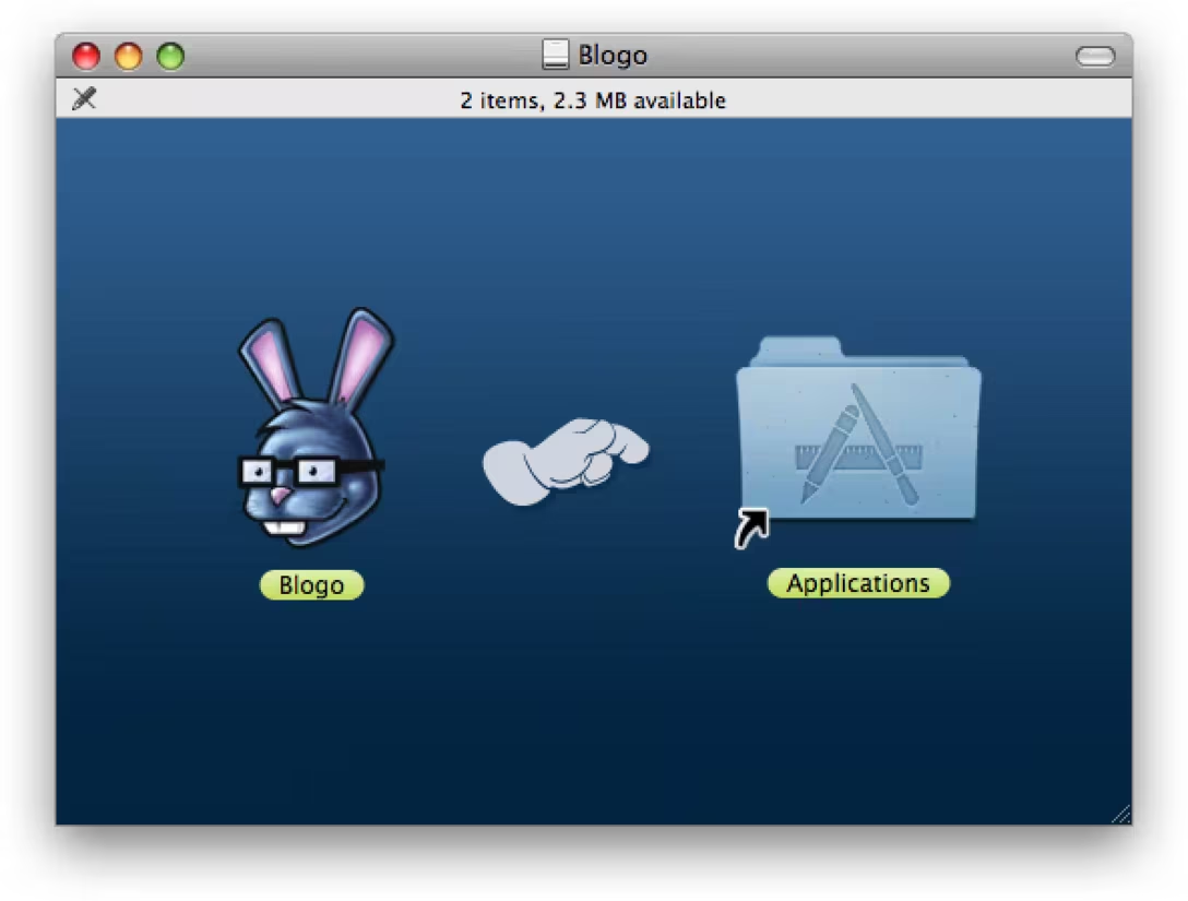
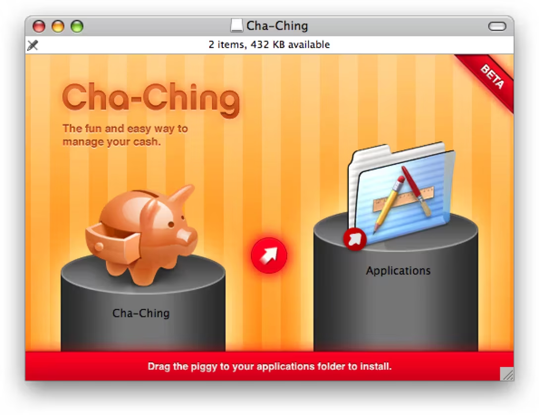
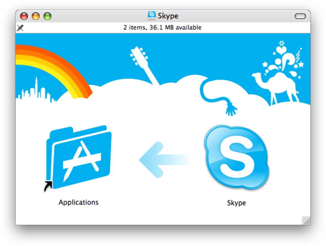
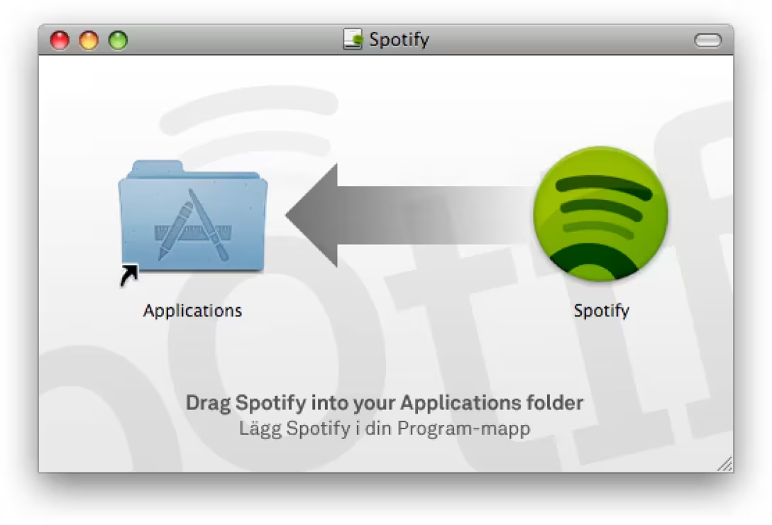
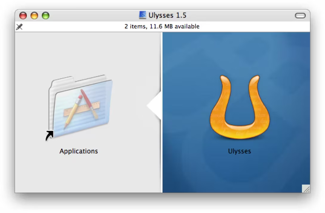
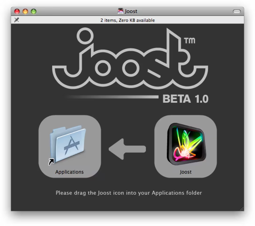
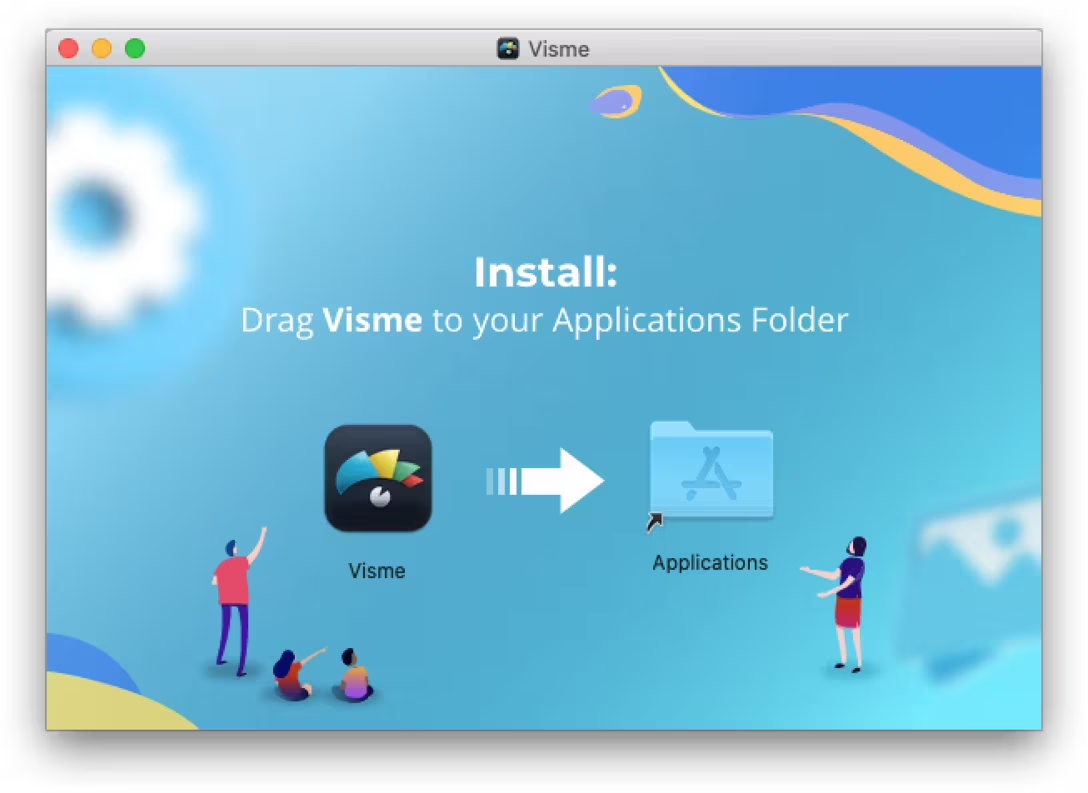
The way many apps choose to do it is by creatively combining a few of Finder’s options. Those options are available for everyone, in any folder, but perhaps not as known. The first stop is removing the toolbar and the sidebar, and any other bars. The second is switching to the icon view, and picking the right window dimensions. What’s needed next is a link to the Applications folder. The last ingredient? A custom background that’s placed underneath and creatively uses the fact the size and the position of all the icons are known:
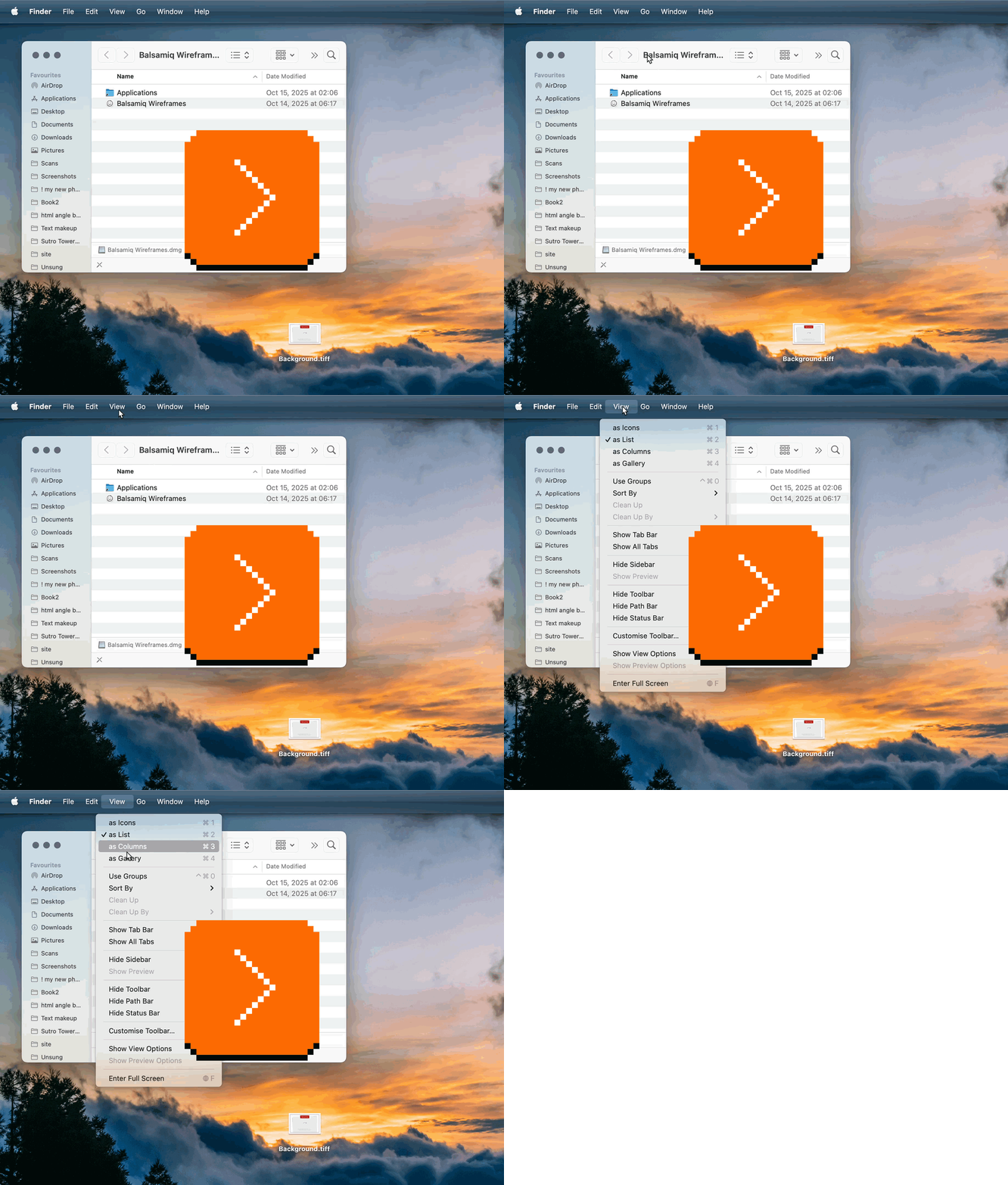
After this makeover, the Finder window resembles almost a specialized app window, and you can use all of this power to… tell the user to drag the app to the permanent folder:
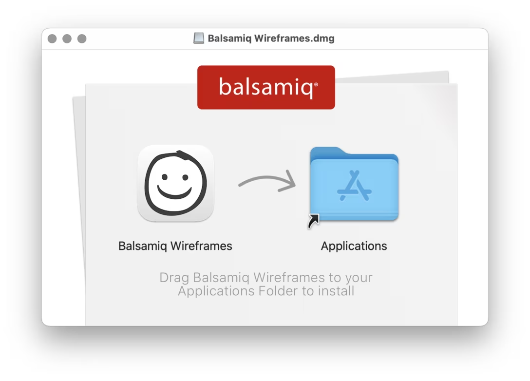
There are nuggets of something good in this flow – dragging an app icon to Applications is consistent with the other gestures you use to navigate the Mac, and teaches you that the app is just a file that you can place anywhere, or trash when done.
Overall, however, it feels quite a bit confusing, leading to spurious dangling drives, extra confusion, and attendant problems like these:
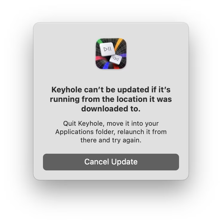
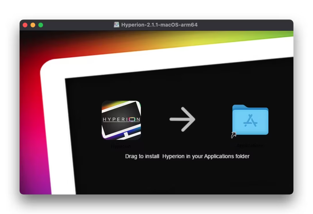
But I am not here to relitigate the flow itself, but to take a look at a few of those customized Finder windows. They became, in a way, a particular design playground with just enough constraints to make it interesting: an app icon, an Applications avatar, an arrow between the two, a typical size, and a bitmapped background tying it all together.
(Other historical playgrounds that got many designers excited: a calculator app, a weather app, a Twitter client… and outside of pixels, a watch face or a chair.)
Below, I went through many windows to find what I thought were the most well-made or interesting “drag to Applications” treatments.
The arrows
The first obvious place to start playing is the arrow, which can really be any shape and color… or maybe even not resemble an arrow at all:
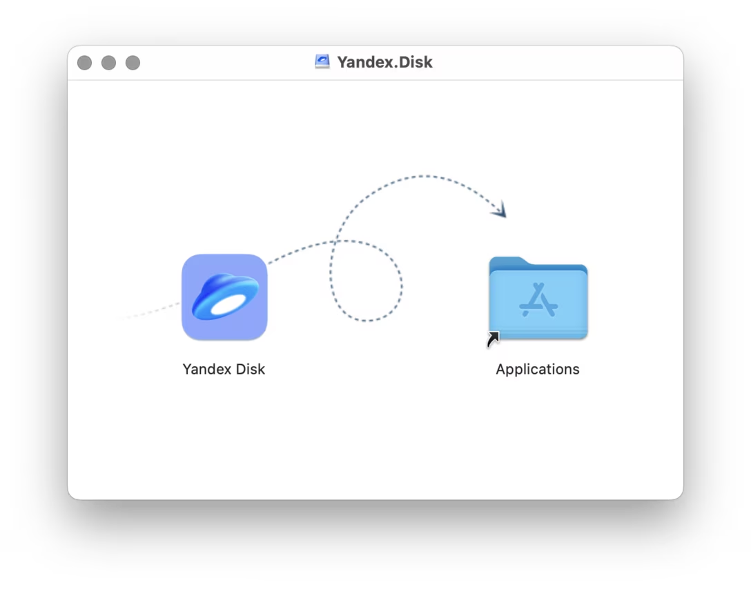
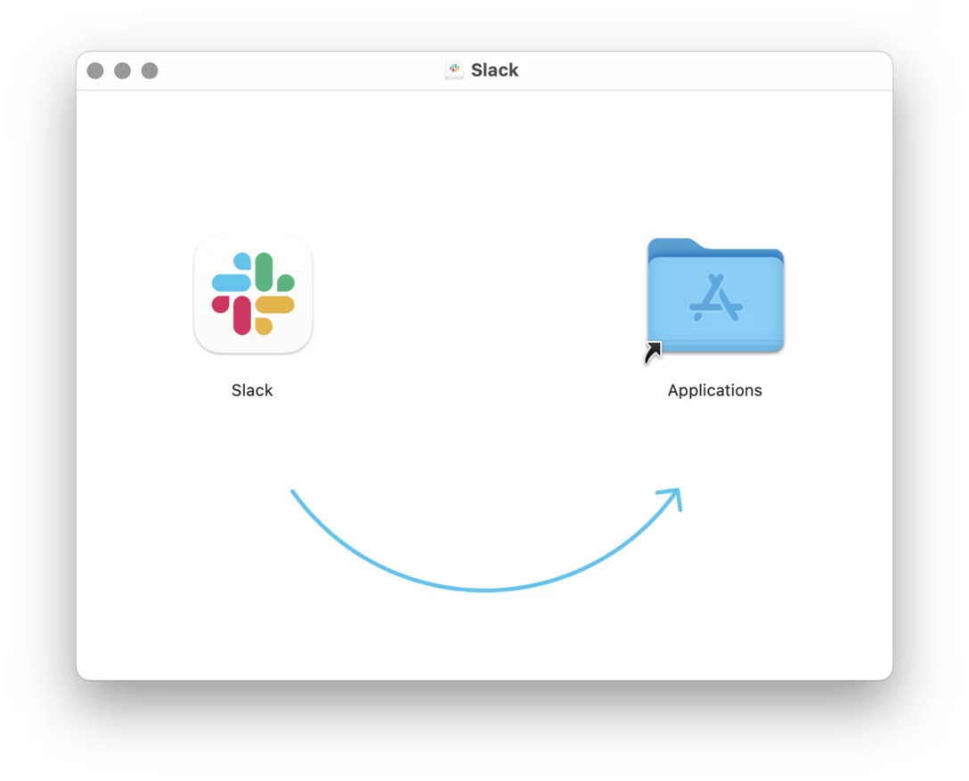
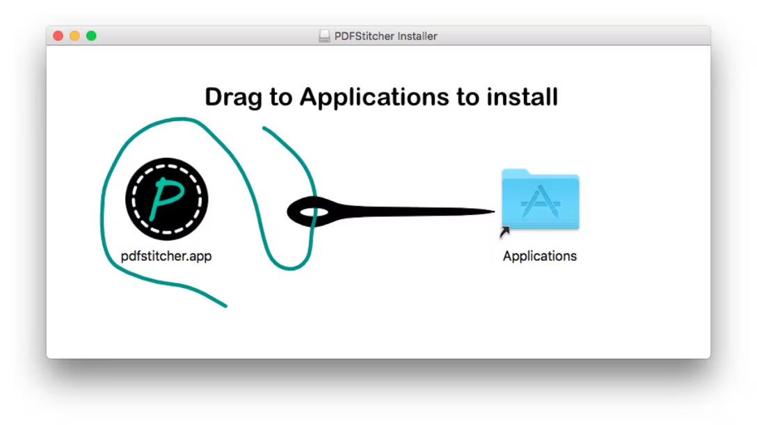
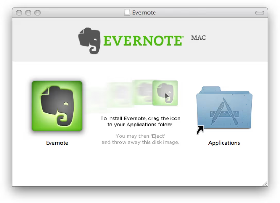
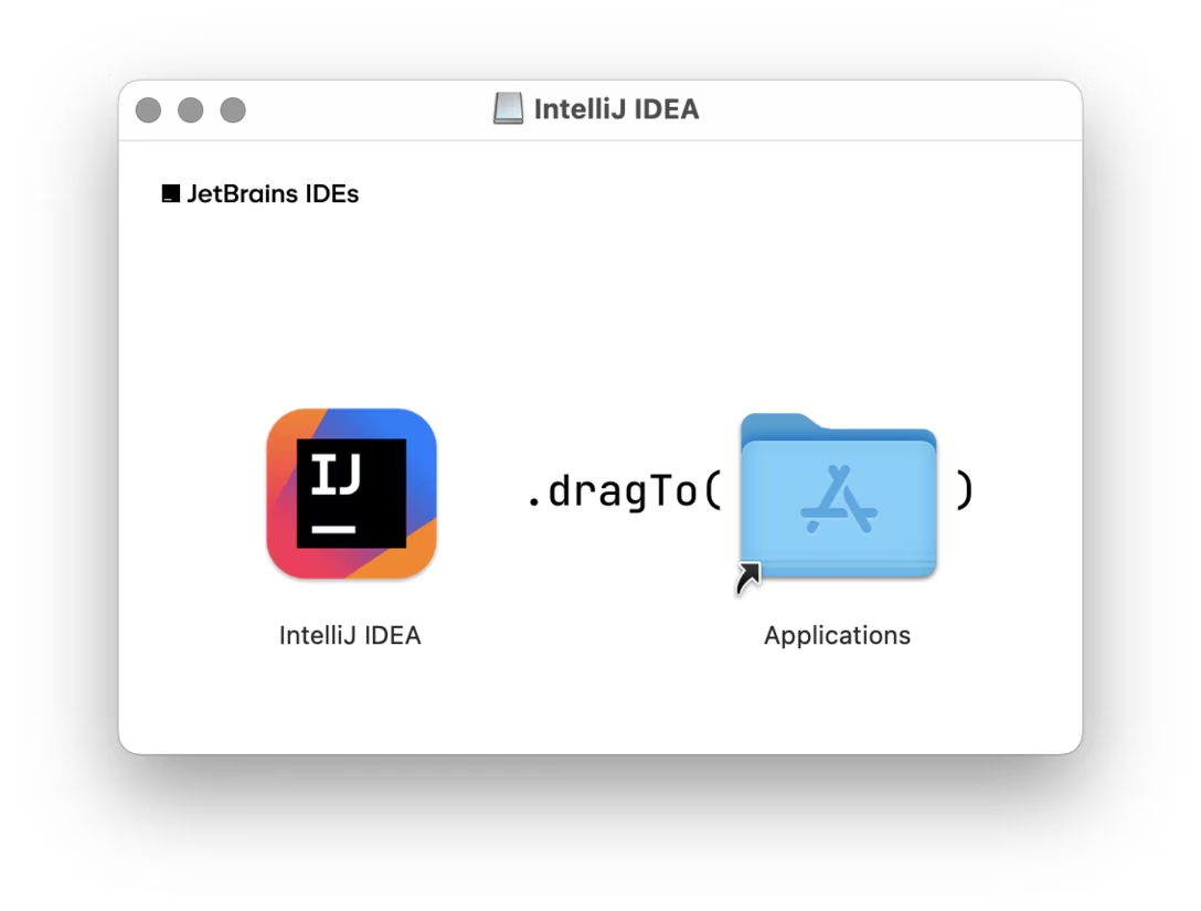
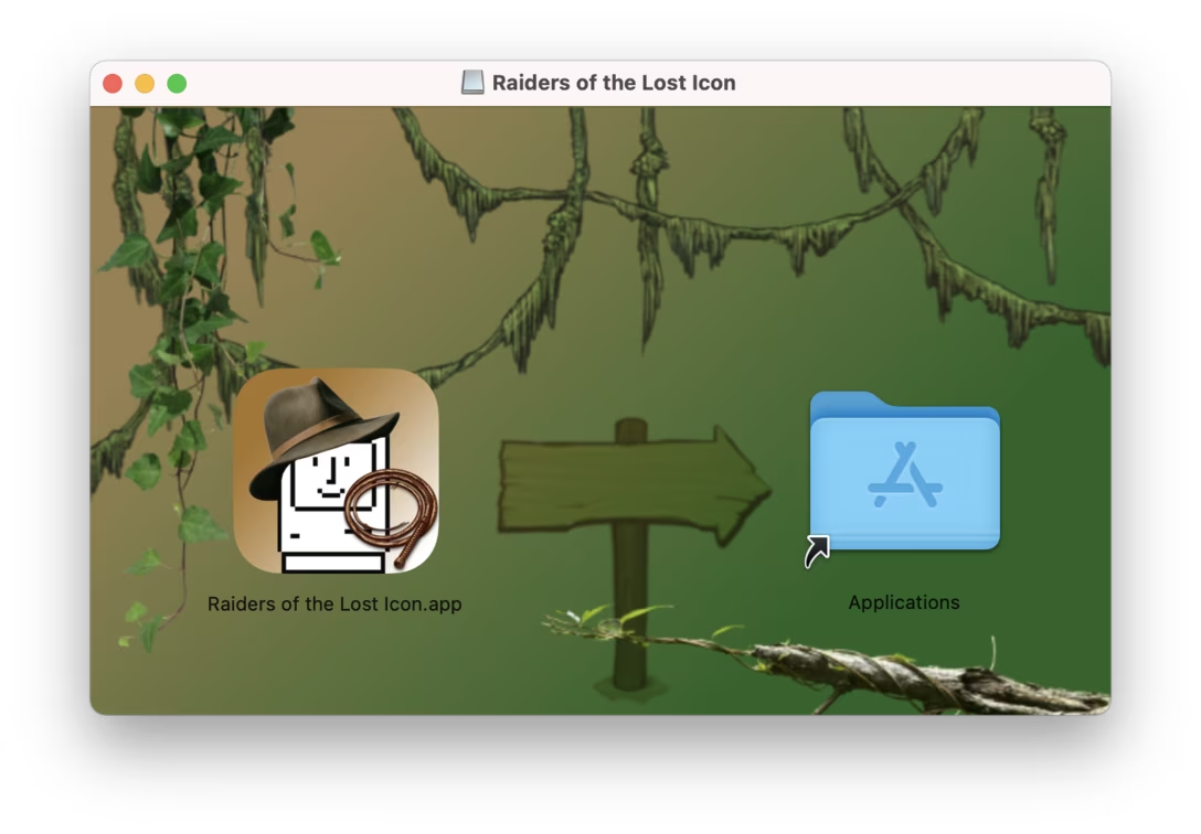
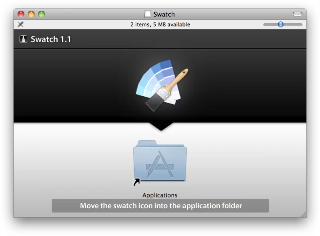
An unusual direction
That last window shows that although in Western cultures it’s customary for time and flows to go from left to right, it doesn’t mean we can’t choose a different axis. Here are a few more examples:
More specific instructions
You might have also spotted above that some places aren’t content with the arrow itself, and adorn the window with more explicit text instructions.
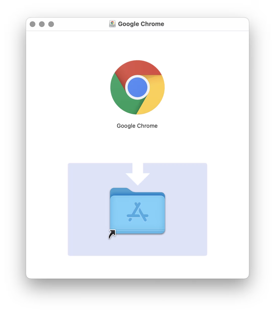
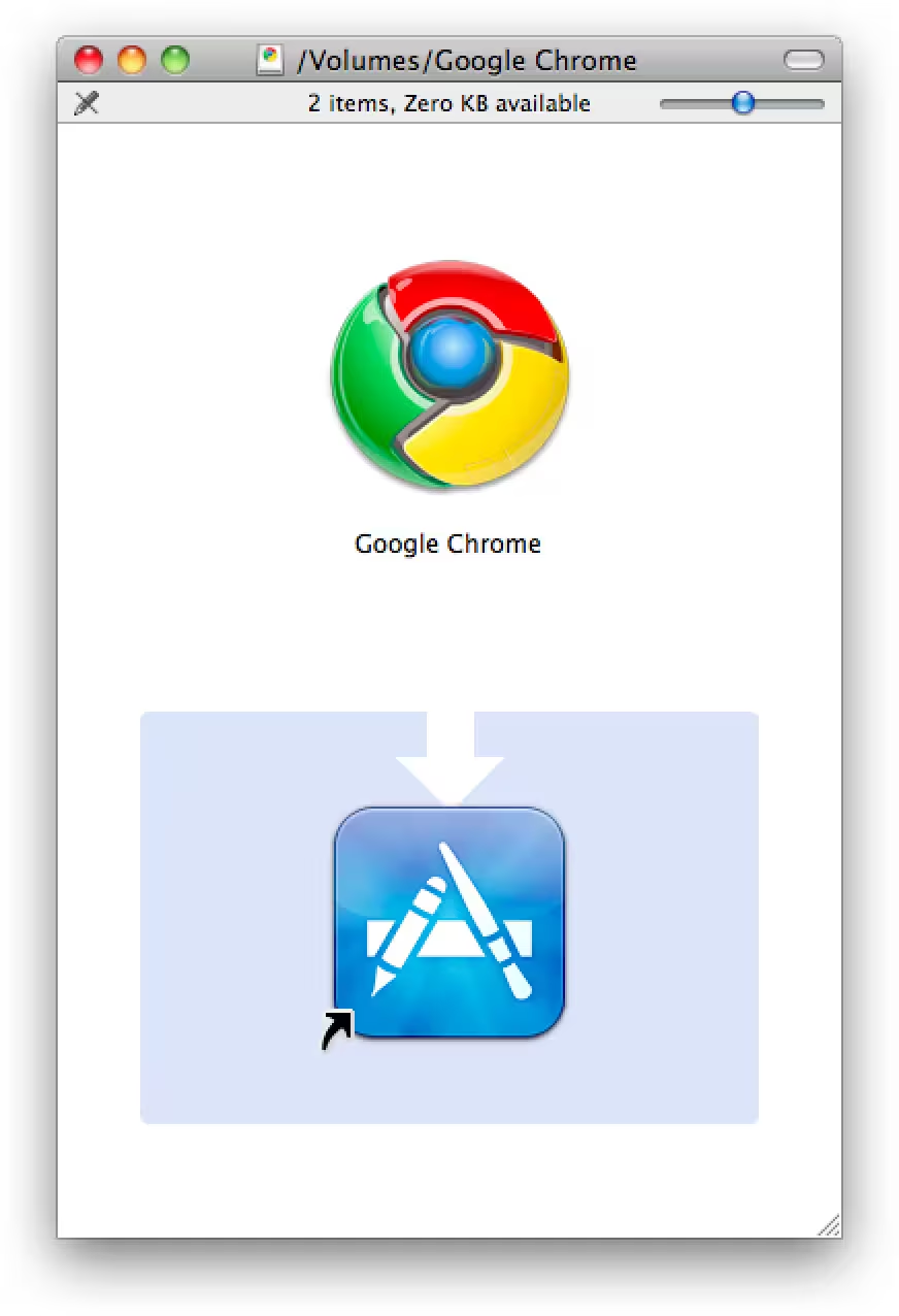
Here are more examples of that. This one adds a simple two steps, but also perhaps starts feeling like Arrow City:
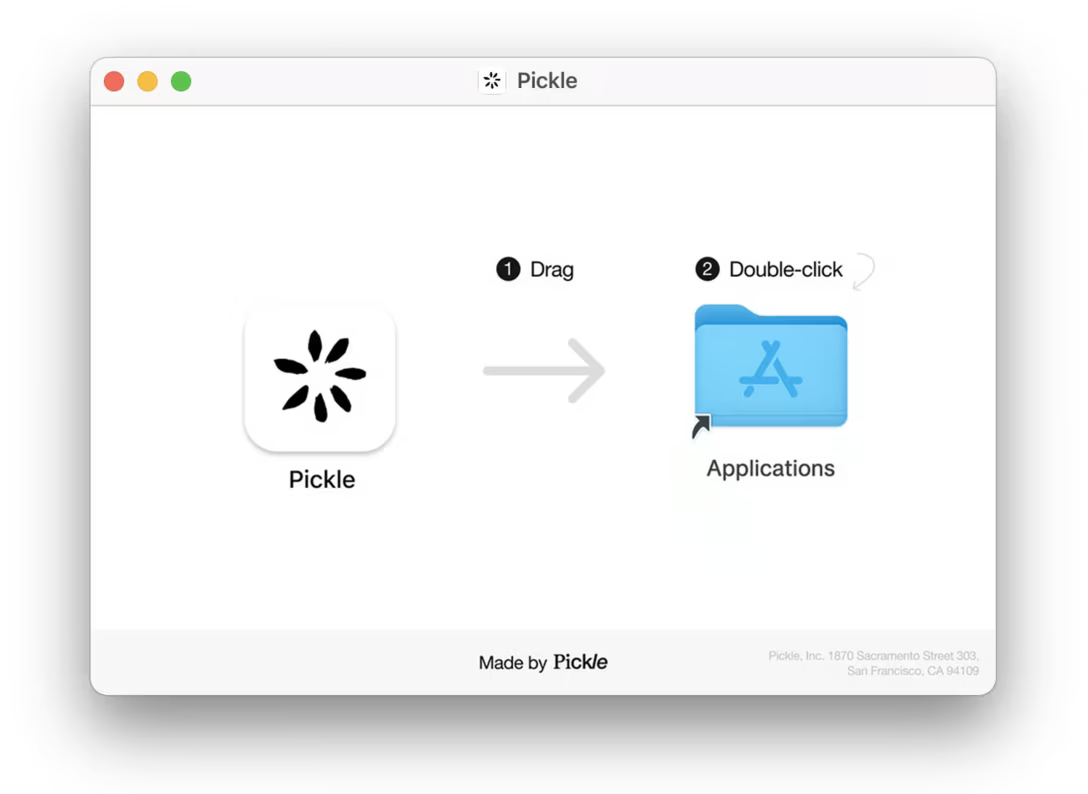
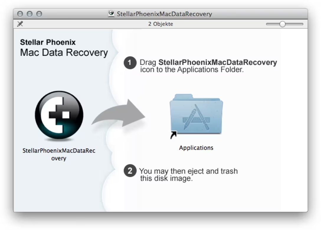
This one distributes the two steps differently and tries to cover the clean-up also, so you don’t end up with a dangling drive:
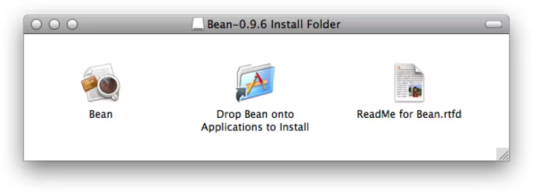
This one has a certain “cheapness” to it, but I find its minimalism endearing – the “link” arrow almost serves as the action arrow, and since you can rename the link itself, why not rename it into a set of instructions?
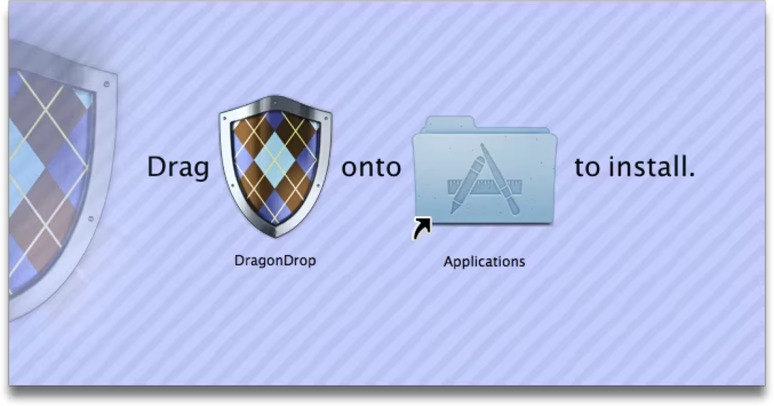
And this one feels like mad libs. Does this work, or is it more confusing to intersperse (passive) instructions and (active) objects this way? I’m not sure.
Scenes with icons
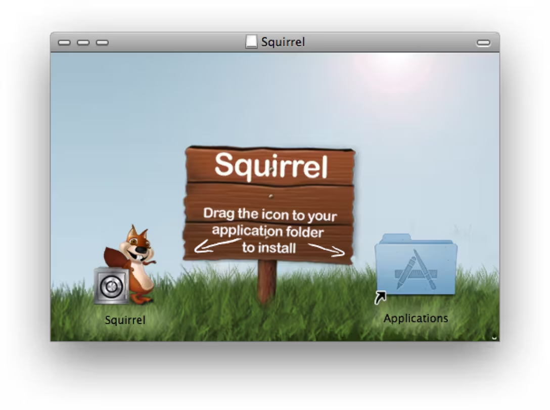
What I also noticed is a fun way that some of these used the dimensionality of the icons themselves, to place them in “the real world.”
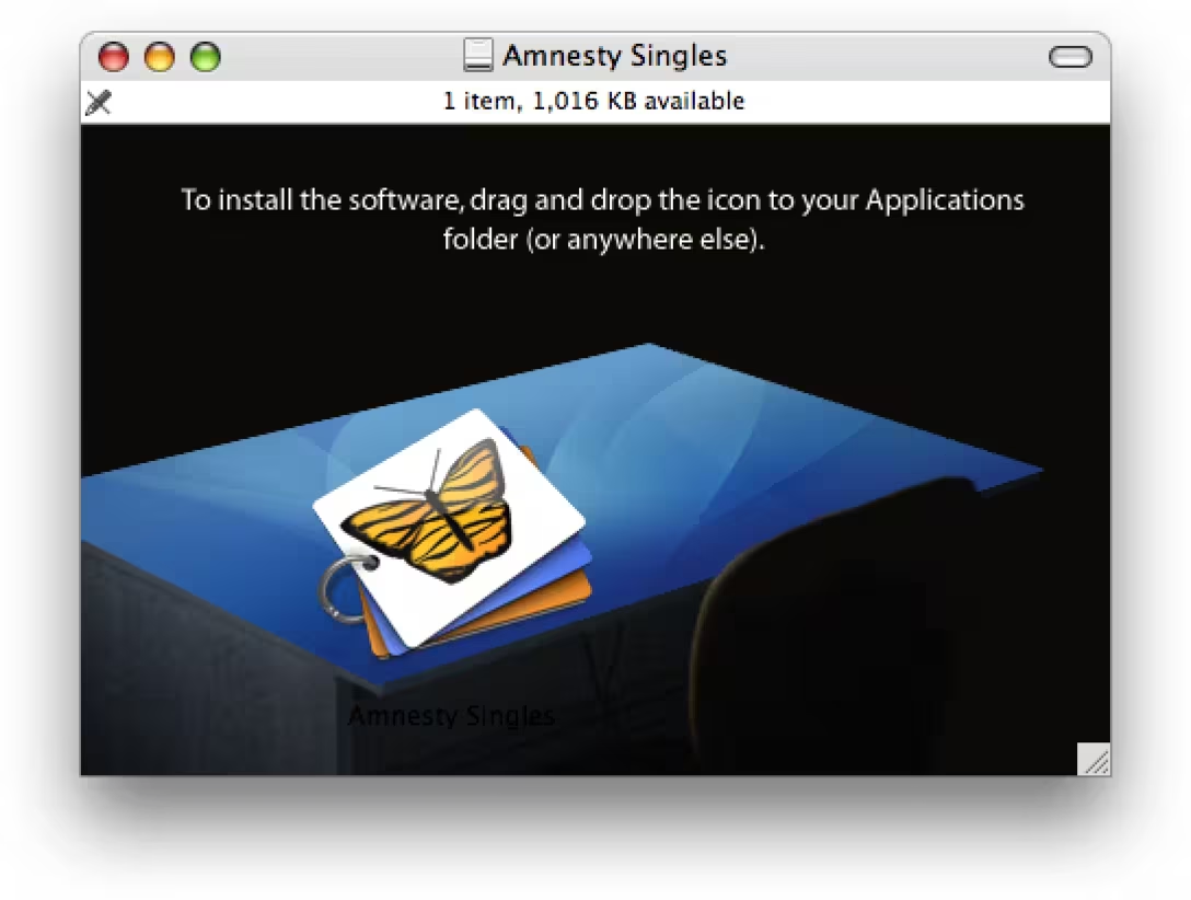
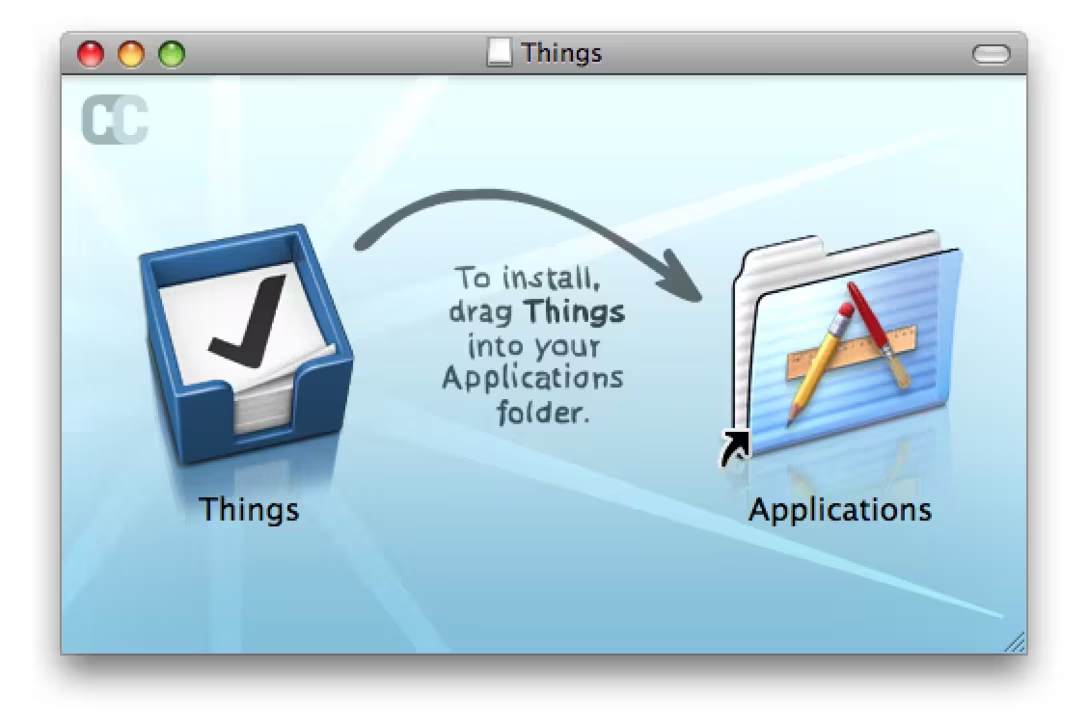
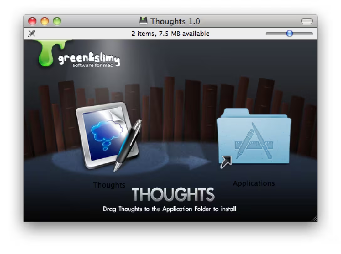
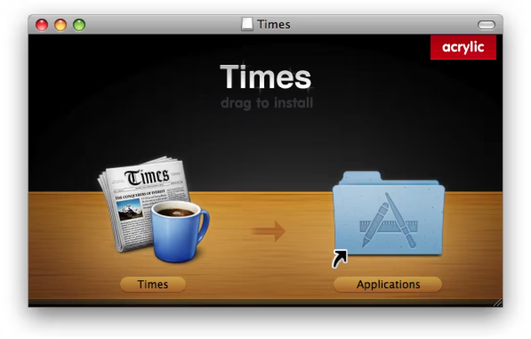
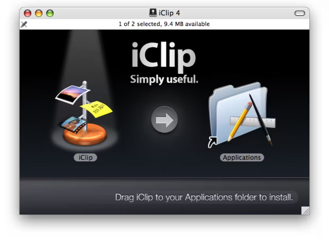
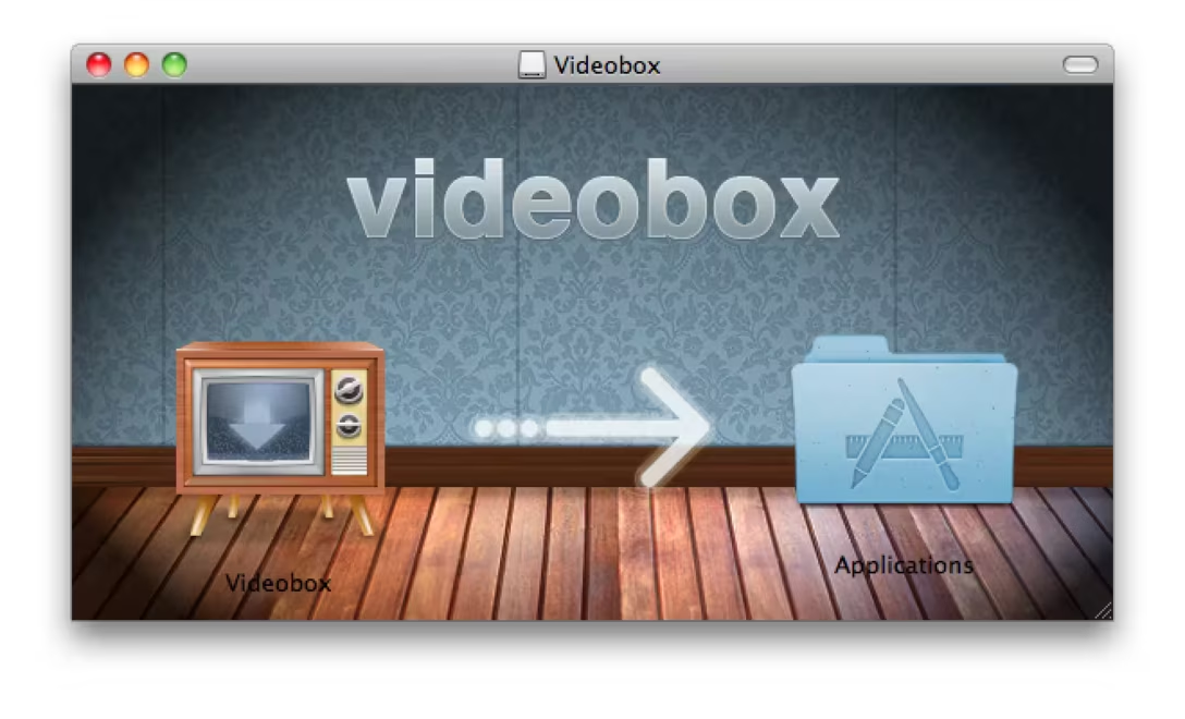
Issues with gestalt
These next few feel like they have some issues – specifically with gestalt – and I thought it might be informative to look at them.
The first one has a very strong left-to-right directionality, and I wonder if people try to drag the left blue folder onto the right one?
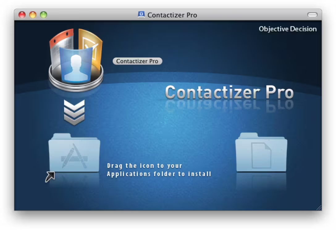
This one is an interesting lesson in how versatile arrows can be, but also how tricky it feels if you go against the convention:
This I’ve seen a few times – despite the arrow, this still feels like a 2×2 grid of equally important things, or can also be misunderstood as “drag two items onto the other two items”:
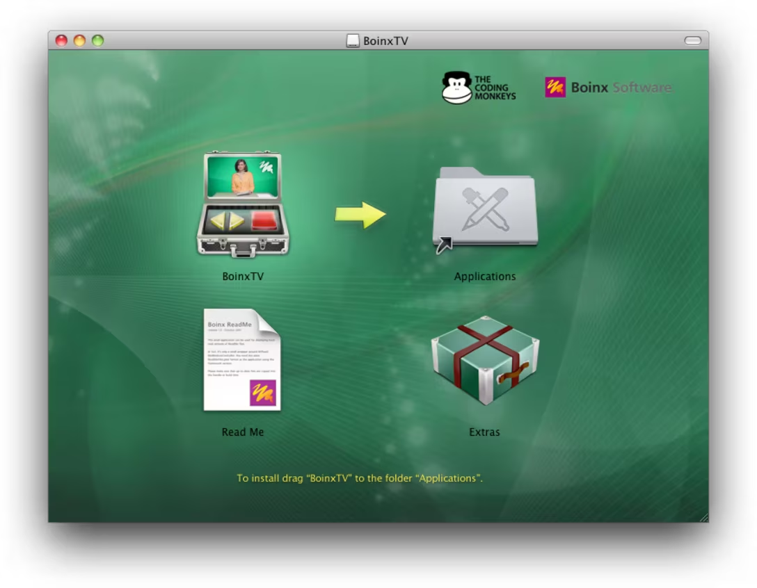
And this is a better example of how to accomplish something the above window botched:
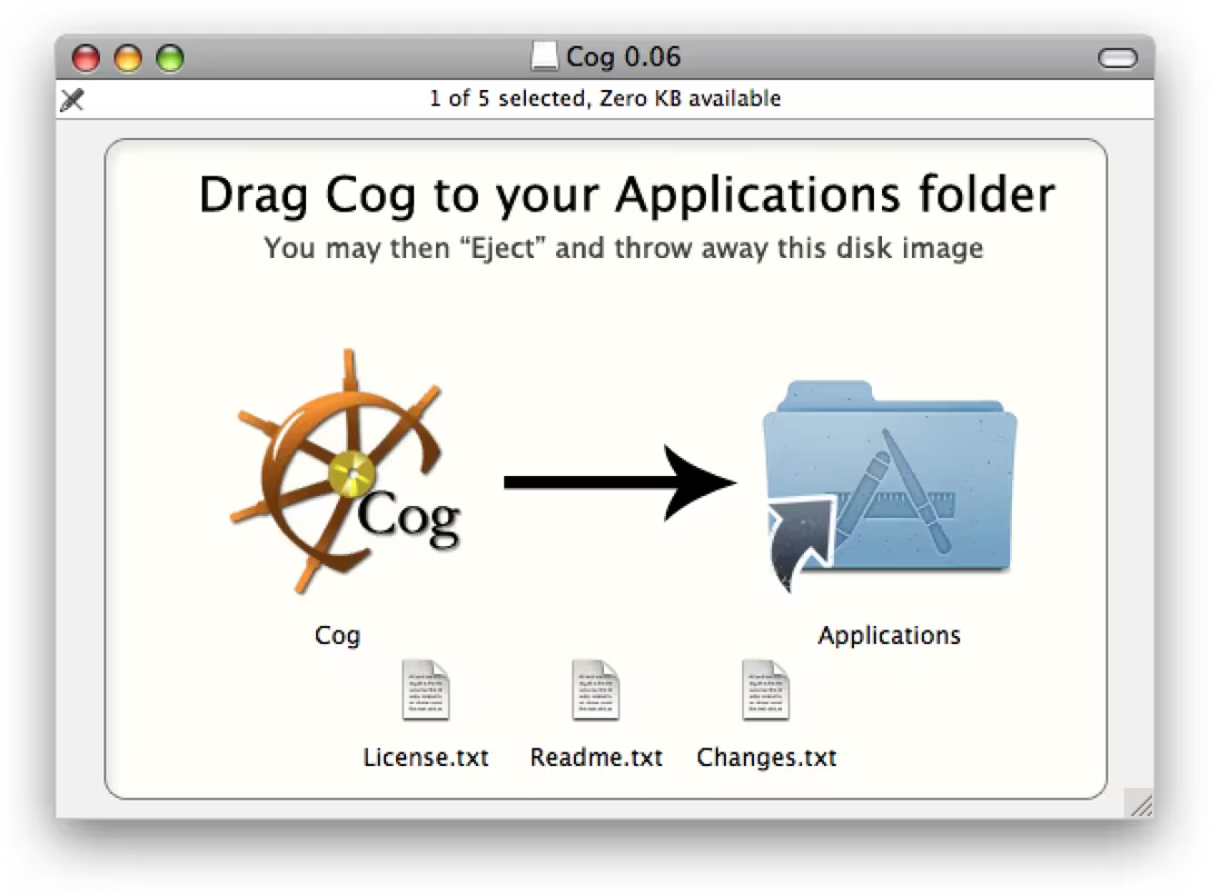
Different mechanics
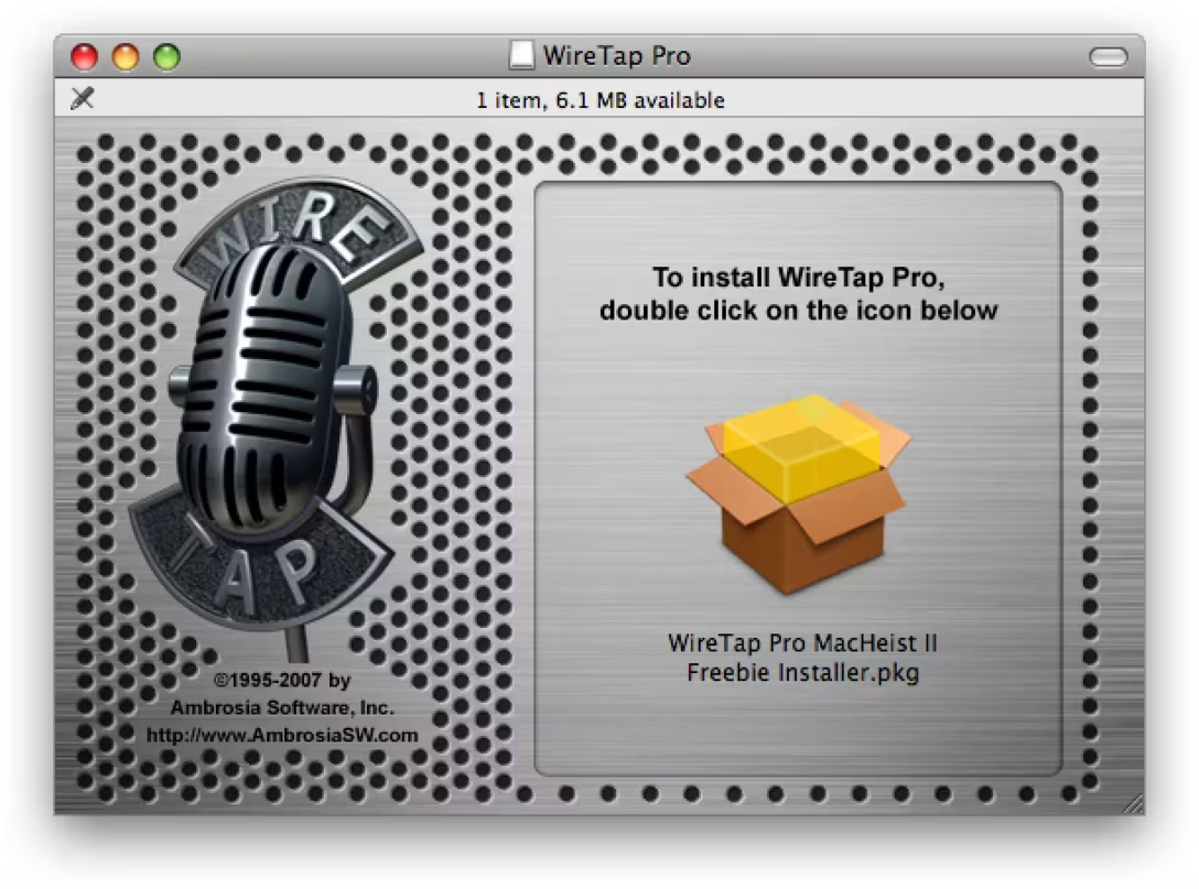
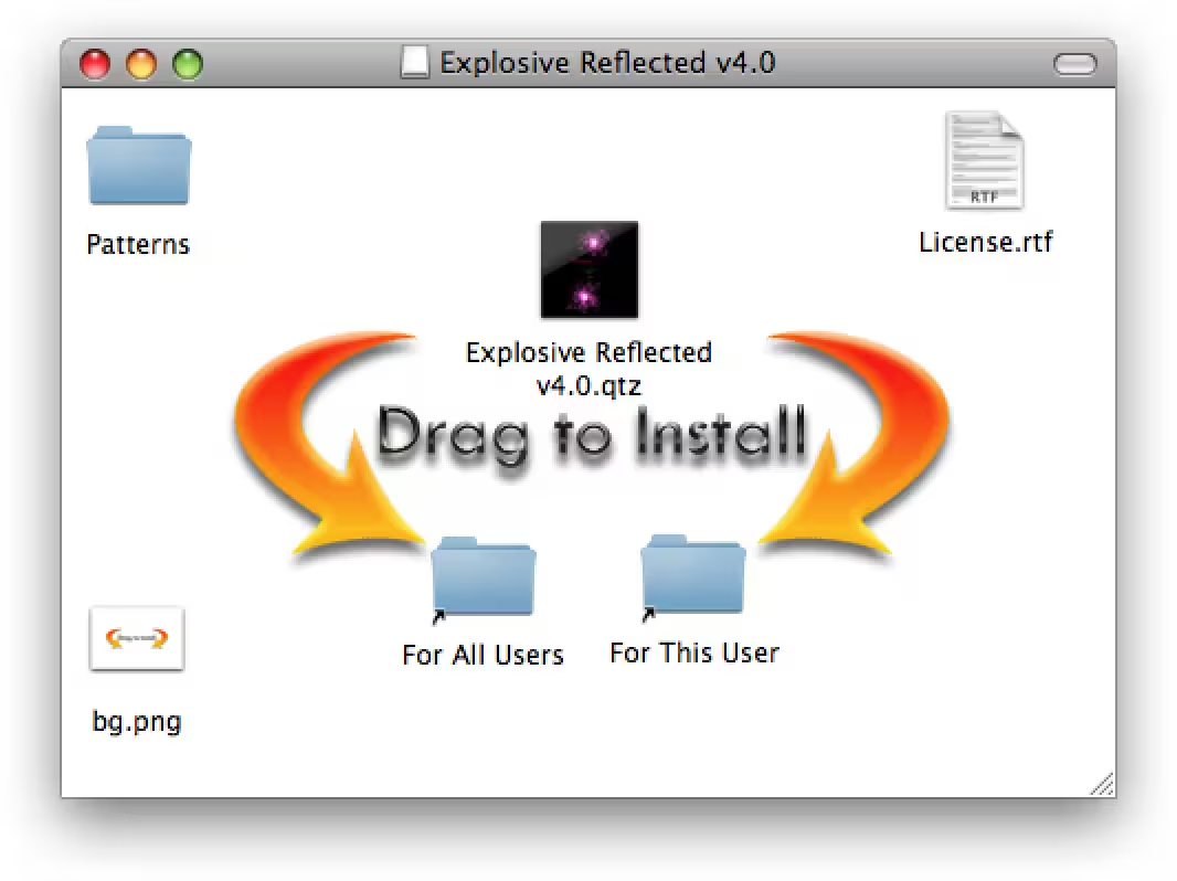
Not all the apps choose the arrow-drag mechanic, and some are not allowed to. Here are other treatments I particularly liked:
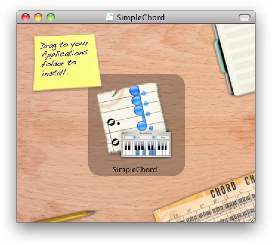
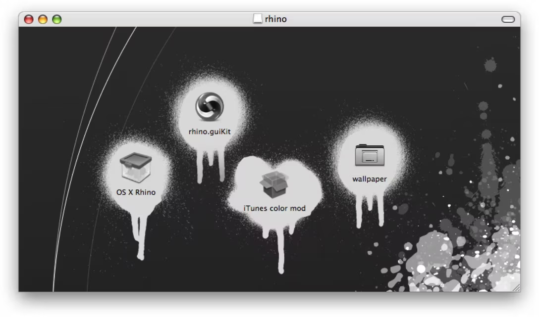
Fun visuals
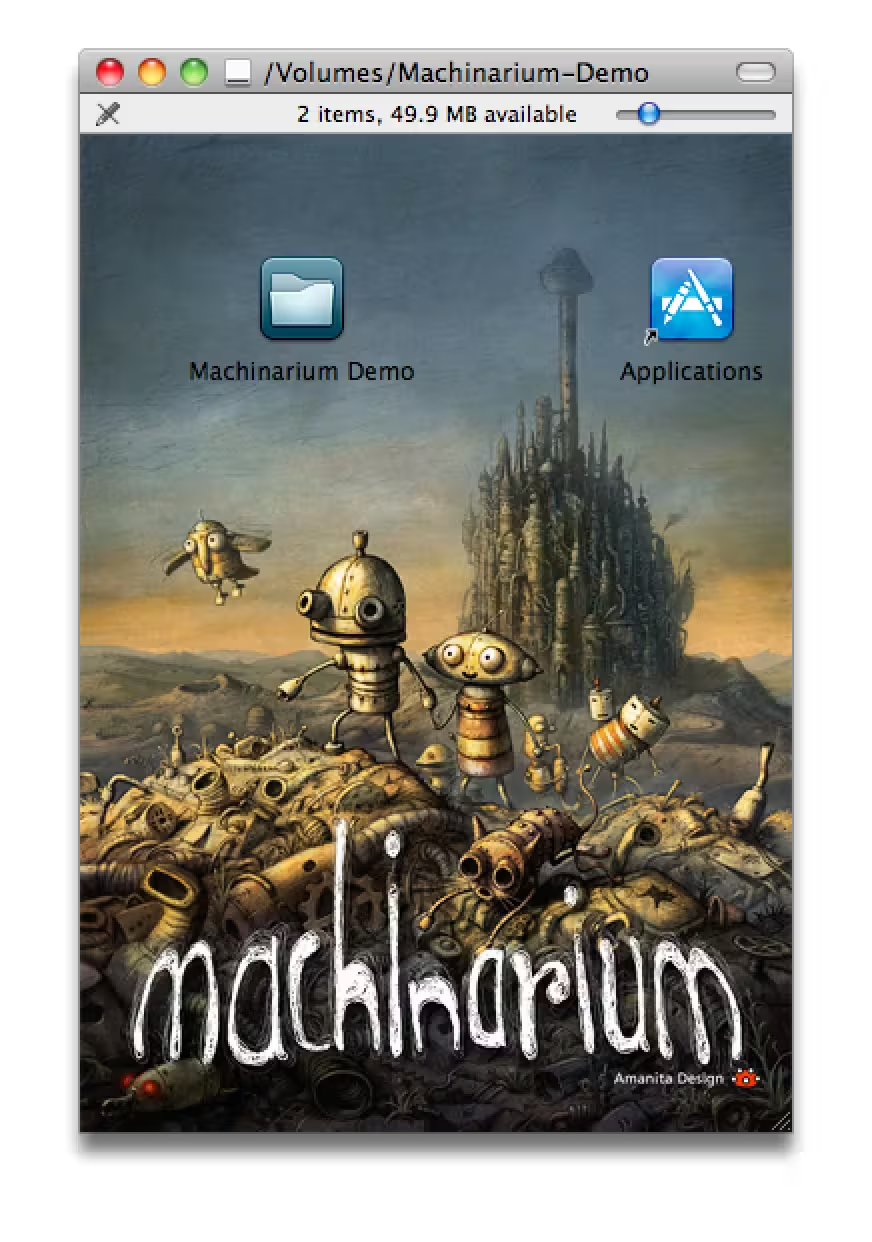
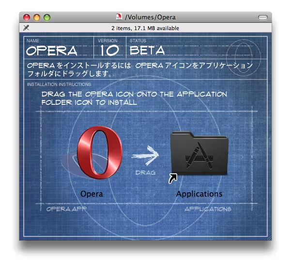
Some apps go deep on visuals. Here are a few I liked:
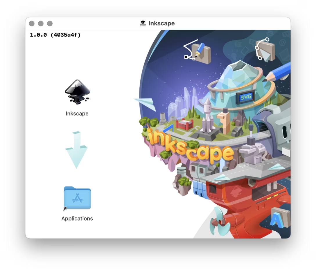
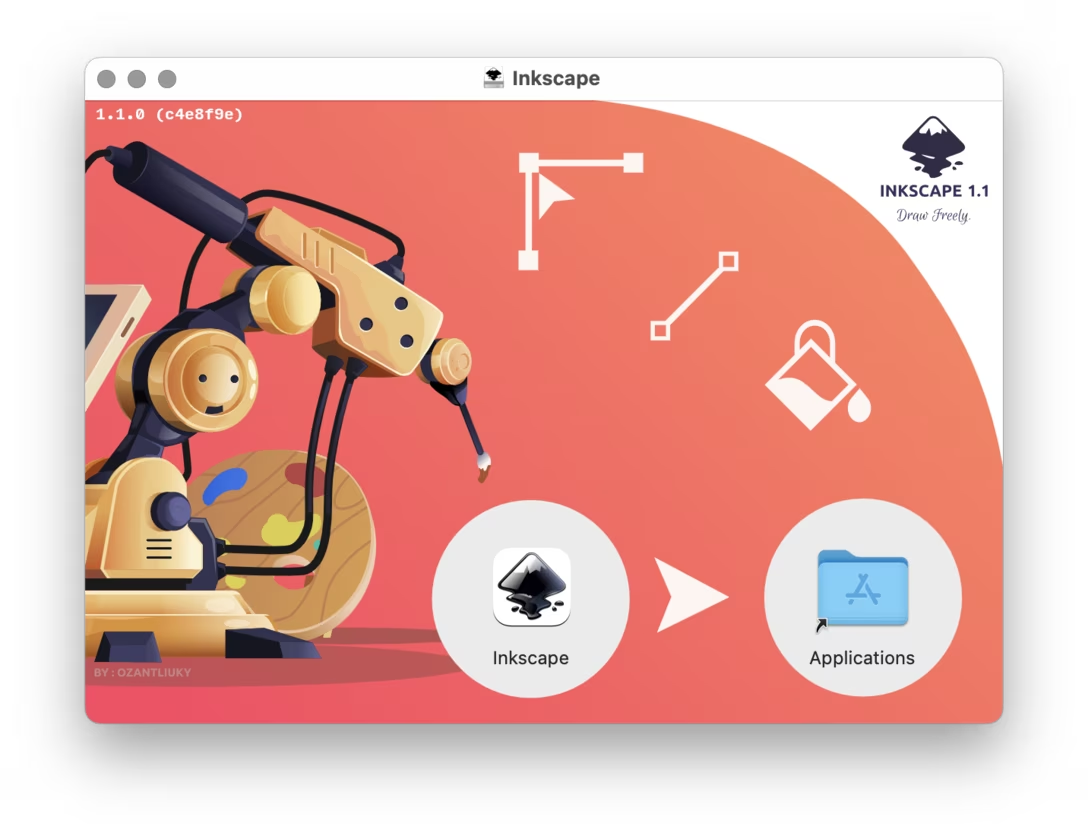
A modern app called Inkscape does something interesting:
[The Finder backgrounds] are designed by our users on the website in the about screen content. Held with every major release!
So I downloaded all the major releases of Inkscape to show you:
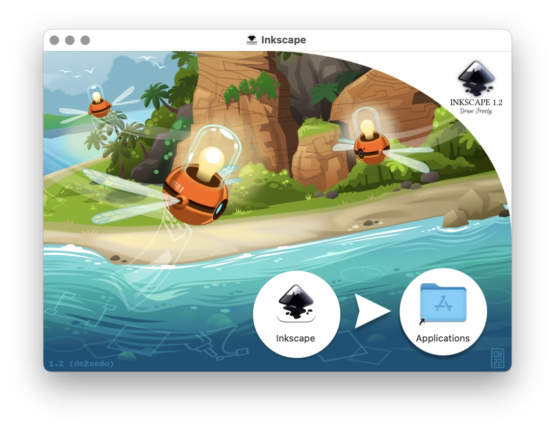
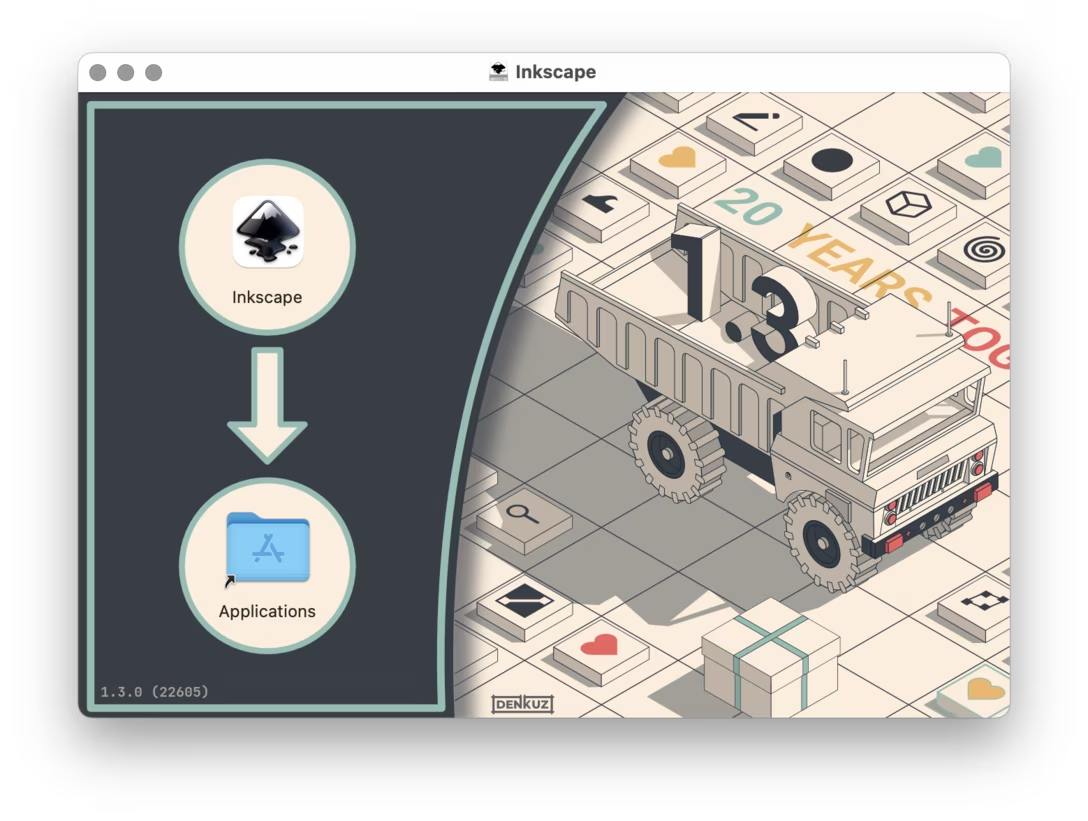
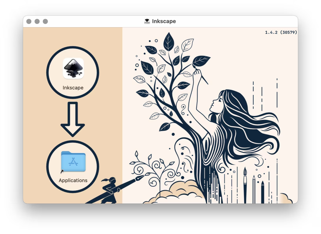
Today
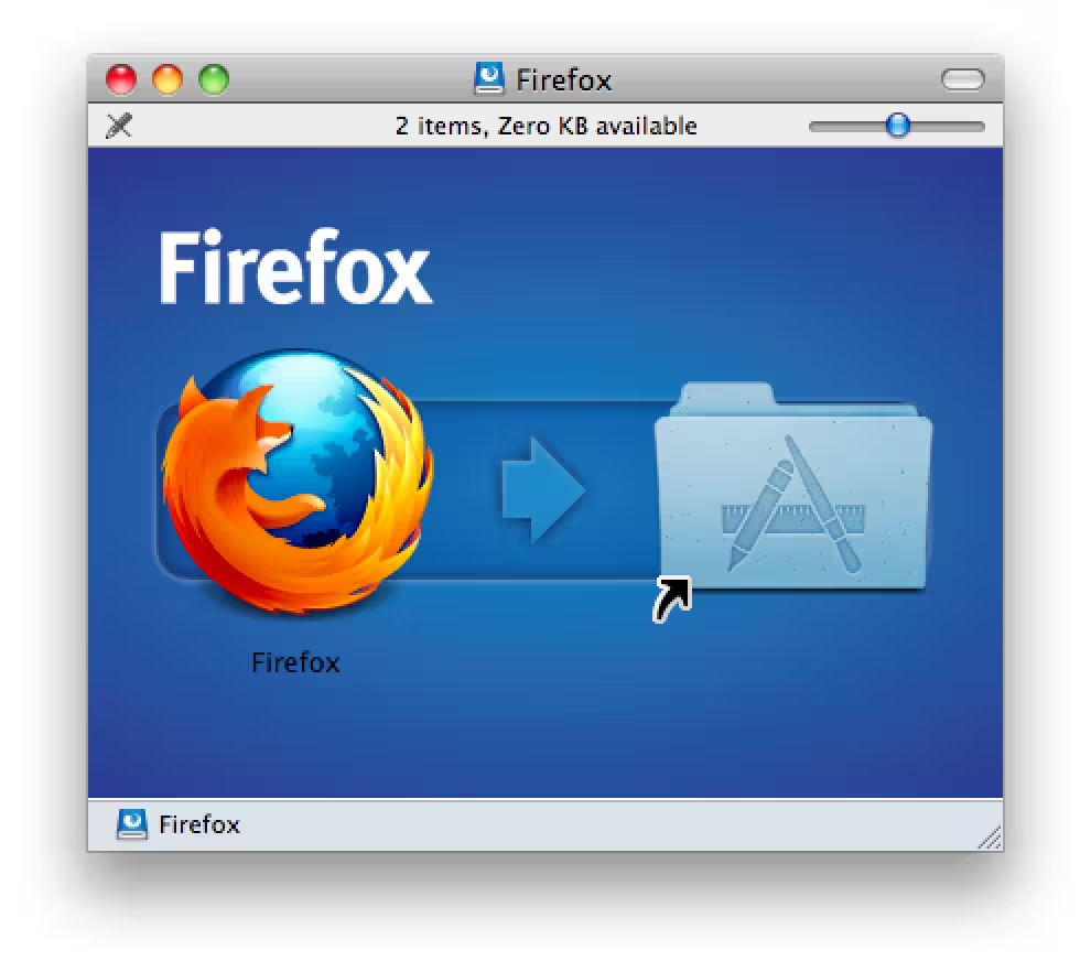
And that brings us neatly to today. I think Firefox deserves extra credit for keeping their Finder install window beautiful and elegant throughout all these years:
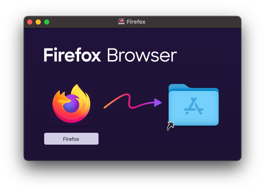
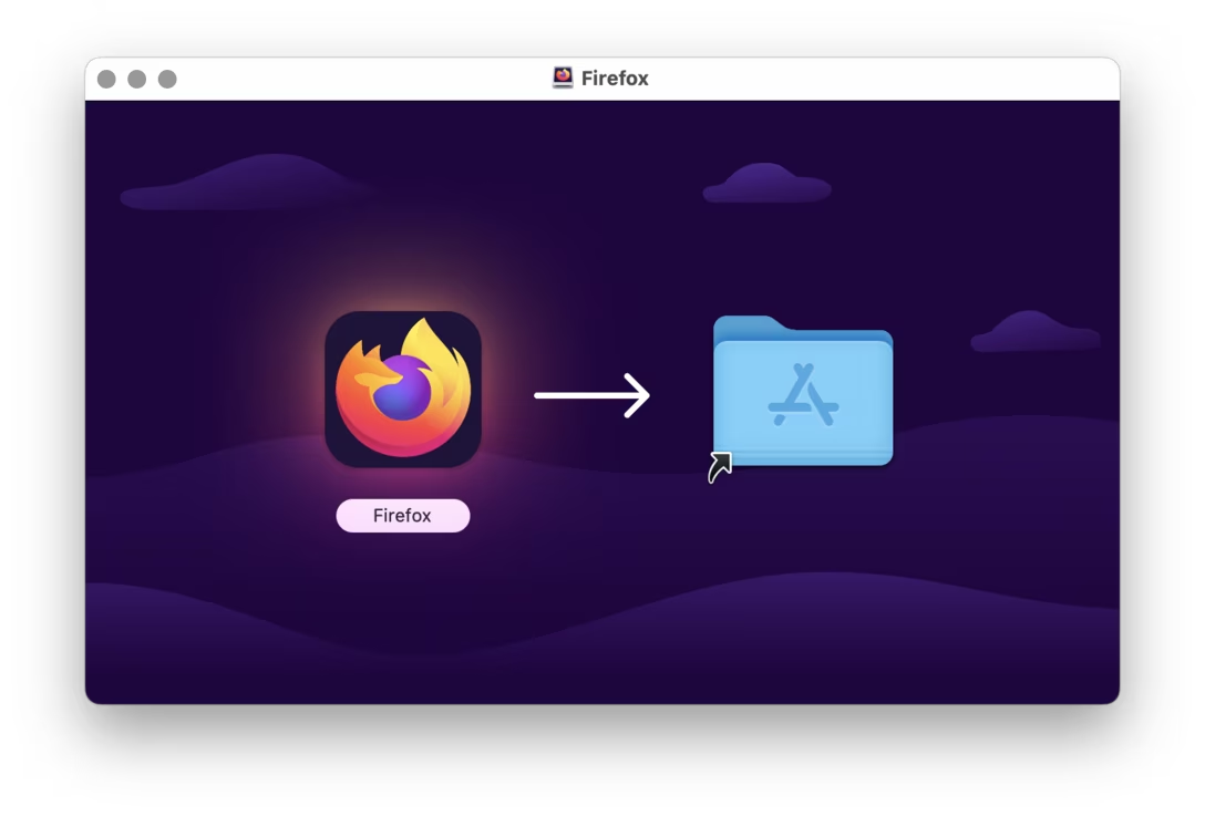
And let’s close this off with a few gorgeous modern examples. Many apps these days come from the App Store and skip the Finder flow altogether, but here are a few that still ask you to drag:
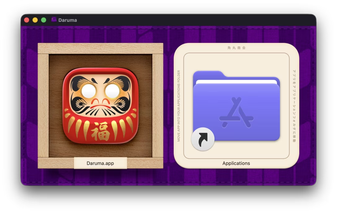
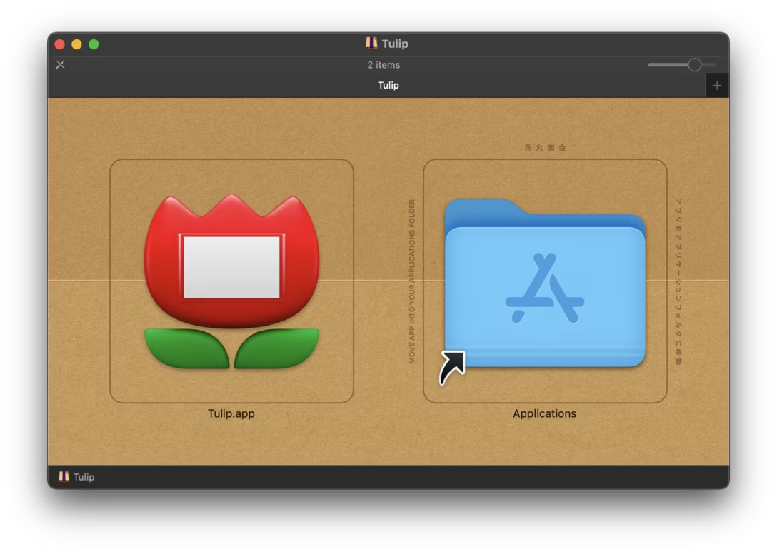
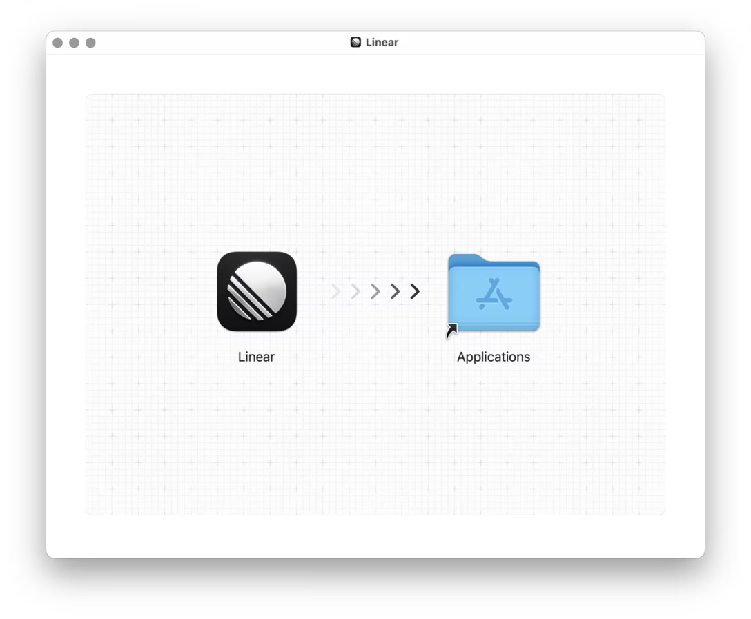
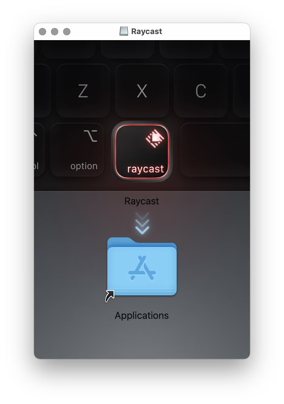
That’s it! But send me more if you have them!
Thank you to Chris Messina for creating the Disk Images collection which I pulled from extensively for this post. Additional thanks go to Jean-Michel Durand, Mindaugas Rudokas, Louie Mantia, Colin, mimi, Jeremy Visser, Luke Dorny, Oskars, and Peter Tripp. The title comes from a reaction to one of my social posts where I asked people to send me good examples.
Monday, August 3 / #iconography / #mac os
“Some guy named Paul”
An interesting 20-minute Config talk from the Instagram designer Rose McManus:

It covers some of the same areas we recently talked about: diacritics and Polish S (and a fun video about English conventions from a while back), but it tackles them on a higher level. McManus talks about how people express themselves via their usernames, how that changes in various countries of the world and for what reasons, how it intersects with some UI considerations, and how people use it creatively – and also, sometimes, abuse it.
This is the K-pop star IU. Uh her Instagram handle is “dlwlrma.” And I think at first this maybe seems already like complete hyperreality, like it’s bearing no relationship with her Hangul name, or even with her stage name. But actually, I think this is at the third stage of Baudrillard’s theory because really “dlwlrma” is Lee Ji-eun’s Hangul name typed out on a Korean keyboard but backwards, distorted, while that keyboard is set to render Latin characters, almost like a cipher. And then her display name is her Hangul name typed out with one of the characters changed, so it’s like a pun.
I didn’t feel the talk stuck the landing – in the end, I wasn’t very sure why the decision that was made was made. But there’s a whole lot of stuff before that was fascinating and thought-provoking.
Tuesday, August 4 / #conference talk / #localization / #youtube
When commit means cancel
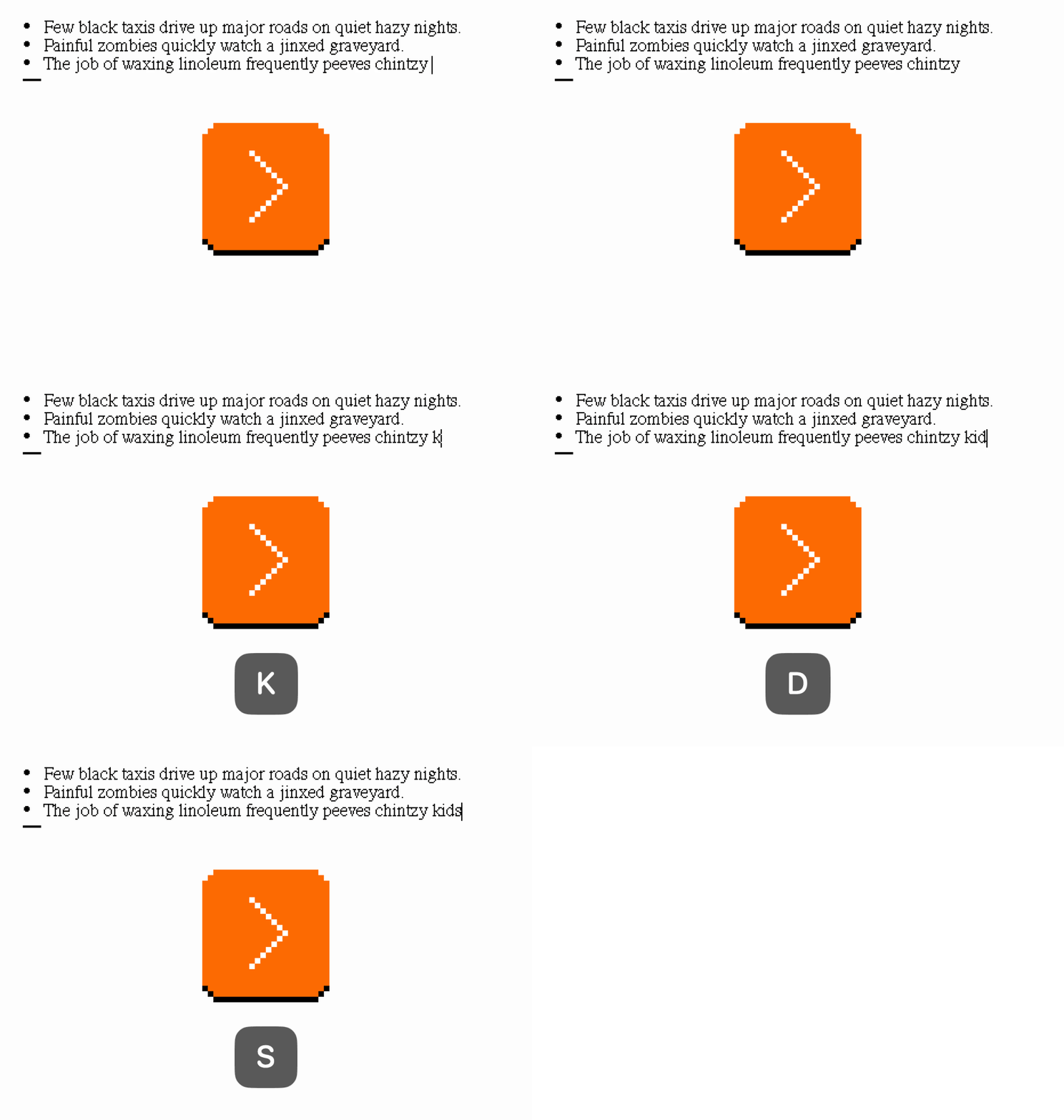
A strange thing happens when you press Enter on an empty item in a list in most text editors – the entire list item disappears:
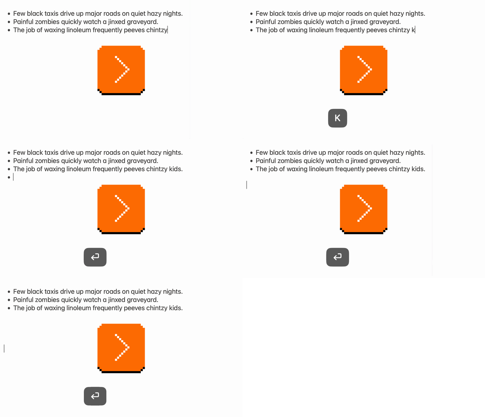
This feels counterintuitive. Isn’t Enter for committing and adding more things? Wouldn’t Backspace be the right key to press to break a list?
Yes, and no. I am not sure who invented this pattern (I spotted it first in Word 95), but that someone understood a strange interaction contract existing in text editing – Enter is actually an escape hatch. In text editing, no matter where you are, you can always press Enter multiple times to just create more room for writing.
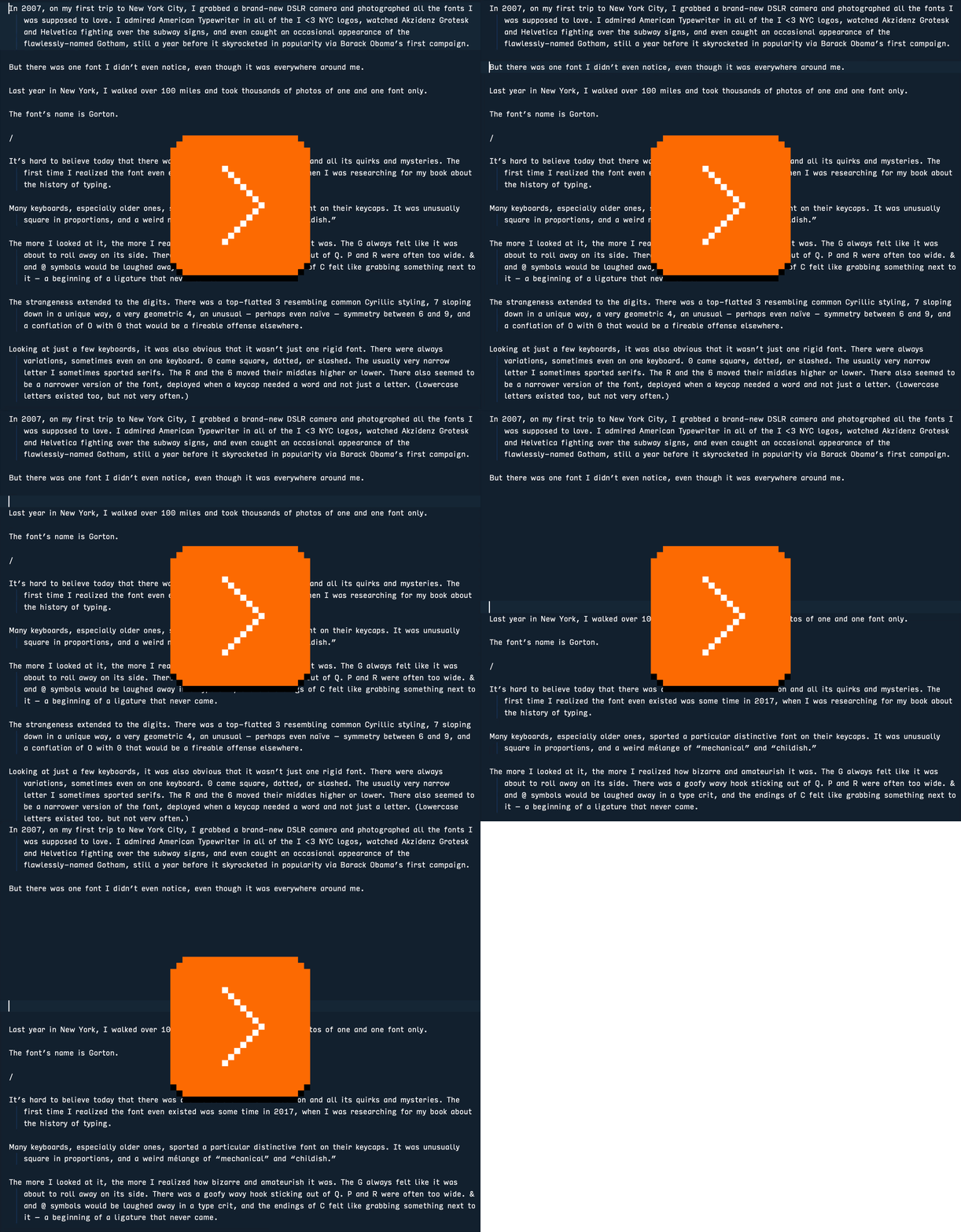
In an app that doesn’t cancel a list on Enter, you can face a terrifying moment where you get stuck in a list, and getting stuck is never fun.
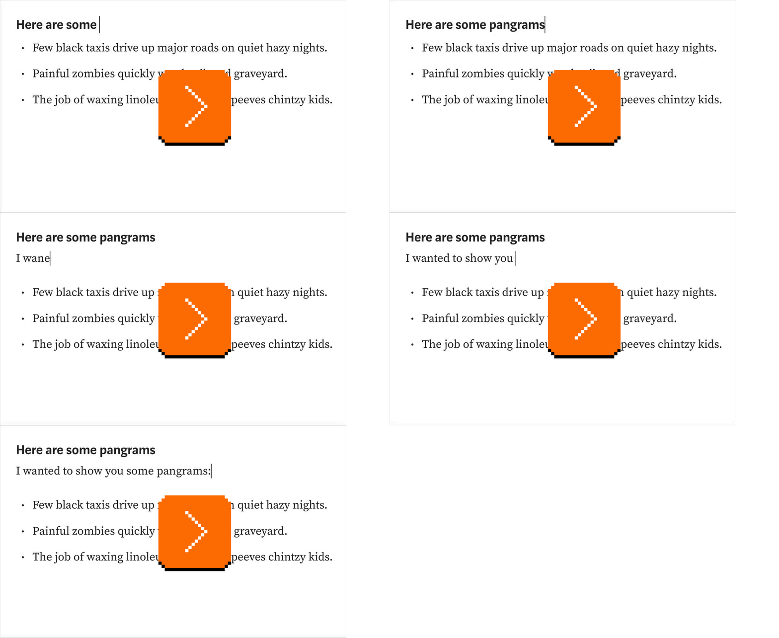
This principle feels so useful that I see more and more apps apply a version of it for other things. For example, in many modern text editors pressing Enter after a headline returns you to regular text, just so it’s not as easy to get stuck in a headline style:
Tuesday, August 4 / #errors / #flow / #keyboard / #text editing
“It’s unclear how Sopwith escaped to the general public.”
Sopwith is a 1984 videogame made by David L. Clark for the original, seminal IBM PC model 5150. It sports the distinctive 4-color CGA palette and an equally distinctive PC speaker soundtrack.
It’s also one of the oldest videogames still in active development, and I was surprised how enthralled I was learning about it.
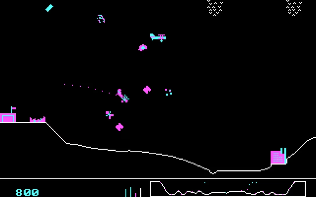
(First of all, you can play Sopwith in a browser. Choose “single player” and then “novice” first for the game to tell you about its unusual keyboard control scheme.)
The current maintainer of the effort is Simon Howard. He wrote about Sopwith’s interesting history; I appreciate this kind of approachable and caring preservation of obscure titles. The history is worth a read.
From that, I learned a fascinating factoid. The game was intended as a demo for networking hardware, and the original author didn’t realize the game was “in circulation” for many years:
Intended as a trade-show demo, it’s unclear how Sopwith escaped to the general public. David L. Clark didn’t even discover until around 2000 that it had “gotten out”. Little did he know, Sopwith had been circulating for years in collections of early games for the IBM PC. Only a couple of years after the first version was released, ads were appearing in magazines like PC Magazine advertising Sopwith for sale as part of collections of games for the IBM PC
The modern edition started by Howard is called SDL Sopwith (SDL being a cross-platform graphics library):
SDL Sopwith is directly derived from the source code to the original DOS versions, and still includes changelog comments that date all the way back to 1984.
What I particularly liked about the contemporary Sopwith is its guiding document/philosophy page, also worth checking out in full. Here are some choice principles:
- Sopwith has a long history that deserves to be honored and preserved. By default, the game should always play like the original DOS version. That means the gameplay in particular should be the same, without any significant differences. Someone who has just discovered the project should find it to be a delightfully accurate recreation of the game they may have played when they were younger. […]
- Some new features can be enabled by default, as long as they are subtle, unintrusive, carefully considered and can be turned off. An example is the medals feature.
- The game will never try to be “something it’s not”. This means that it will always have four color CGA graphics, PC speaker sound effects and a low resolution display. It will never add (for example) hi-res sprites or 3D models, digital sound effects or MP3 music. The goal is to be “a great old game” rather than “a mediocre modern game”.
- New features should be fun and recognize the comical aspects of the game. Features should be carefully considered before being incorporated, not just added arbitrarily and thoughtlessly.
There is something in all this that I feel a lot of software could learn from – not just vintage games. I appreciated Howard being thoughtful about growing Sopwith without forgetting its roots, but also with understanding that some things have changed since 1984. You could imagine remixing “The goal is to be a great old game rather than a mediocre modern game” to something like:
Better be a great focused app than a mediocre sprawling app.
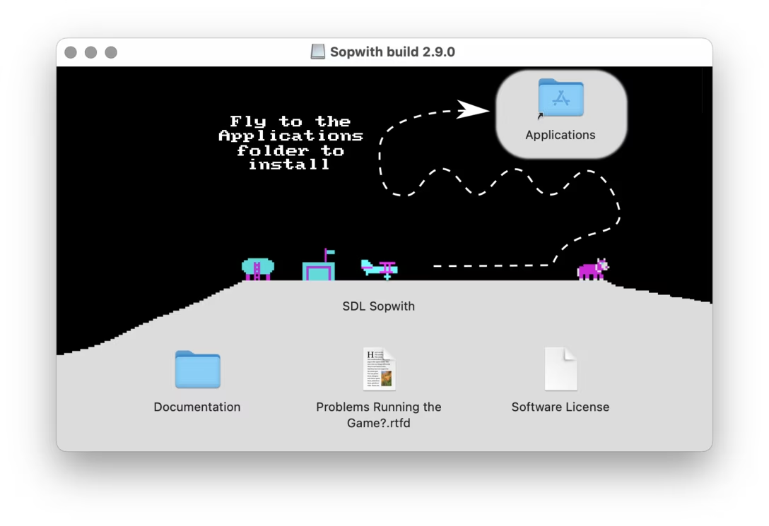
Lastly, how did I learn about Sopwith? Howard shared this charming installation visual with me:
Wednesday, August 5 / #change management / #complexity / #games / #history / #software evolution
Xcode’s clever minimap
Minimaps are an interesting UI element because they often feel very exciting – something about things being small, or responsive, or maps just being cool? – but fail to actually be useful.
I find minimaps for coding particularly tricky because, at least in my world, code all looks very much the same from far away. Seeing a thumbnailed/greeked version of it felt just like a more expensive and distracting version of a regular scrollbar, without any benefits.
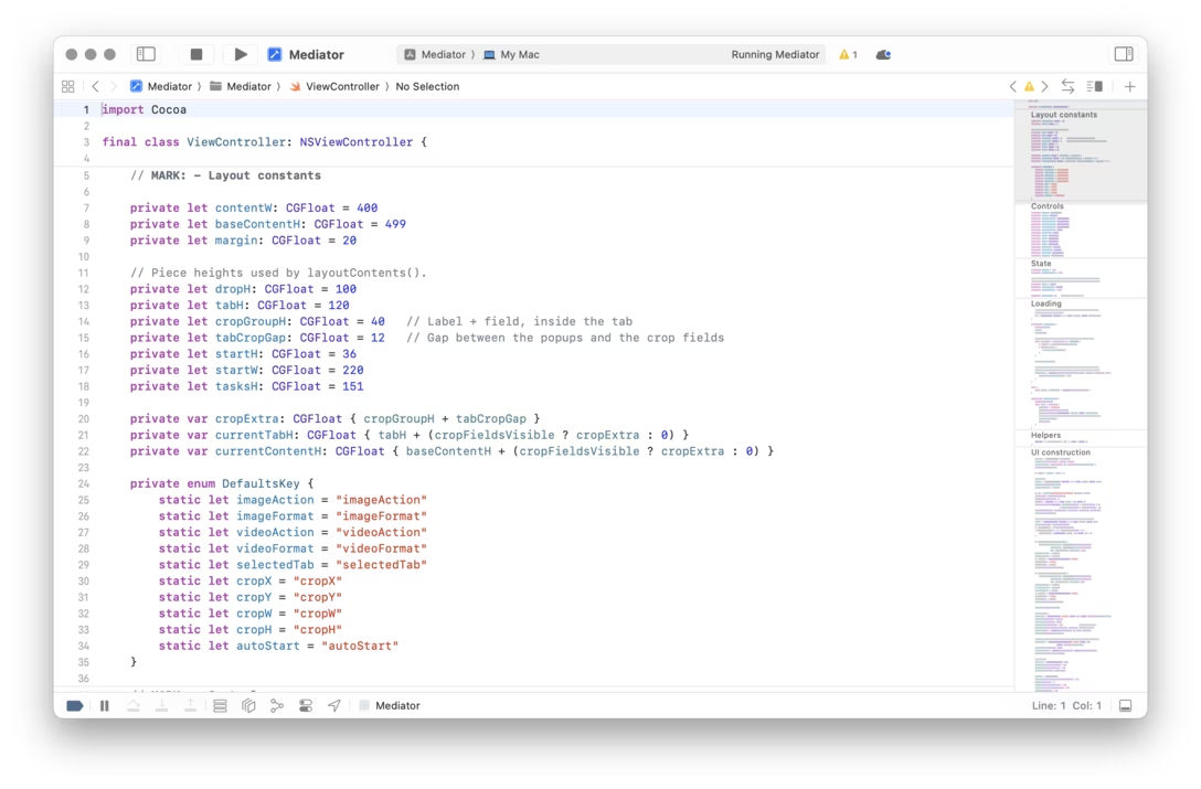
But Xcode does something interesting. It allows you to use MARK to create a sort of a “header” for the minimap anywhere you want:
The minimap then shows those headers not greeked, but as human-readable text:
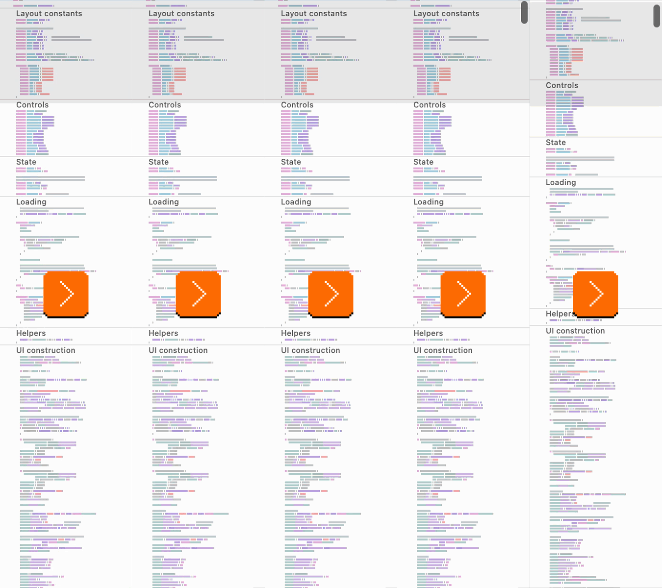
I thought this was clever, allowing you to see the bird’s eye view of the code not just in the most obvious visual sense, but also as a sort of “table of contents,” adding so much more utility.
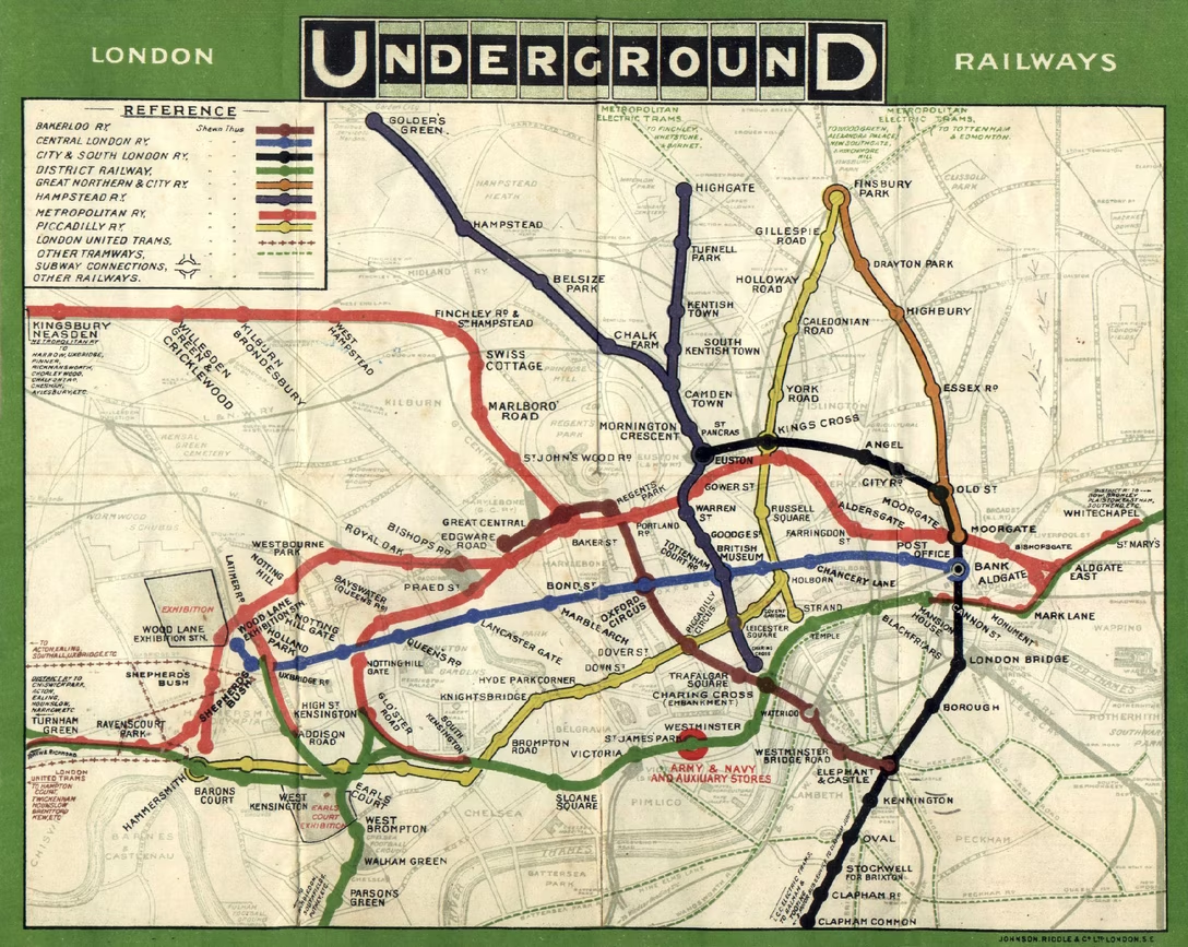
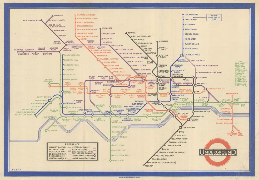
This, of course, is technically no longer a “zoomed out view” but then again, it’s not that there is some sort of rule that it has to be. As a matter of fact, quite the opposite; it all reminded me of the famous London subway map by Harry Beck, which also broke the expectations in a similar way.
The original, geographically accurate map of London’s tube looked like this:
Beck decided to take liberties with the geography and reimagine the map as a diagram to help the travellers, and ever since he’s done so in 1933, many transit maps followed suit:
Wednesday, August 5 / #coding / #text editing
“Microsoft’s most ambitious attempt to reinvent the start screen”
From Marton Barcza at TechAltar, a good 12-minute video analyzing what went wrong with the famed Live Tiles that Microsoft was pushing throughout most of the 2010s:
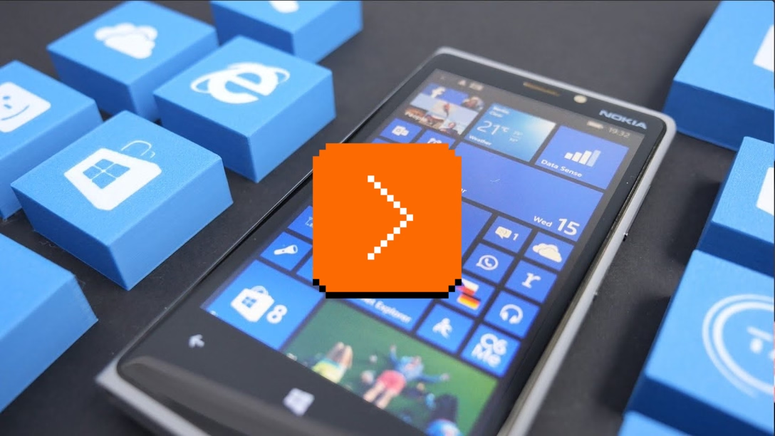
Now, among Windows Phone fans the pervasive opinion is that Live Tiles have failed because Microsoft did a poor job with them, which I think is at least partially true – after all, even many key Microsoft apps like Skype had broken Live Tiles half the time, the Windows 10 start menu was filled by Microsoft with Live Tiles that were clearly just animated ads rather than showing you something actually useful, and the company of course never built out any of their advanced interactive concepts either.
But while all of that might be true, the fact that every major company has walked away from this idea and nobody else has picked it up since, means that there probably are more fundamental problems with this idea. And I can think of three distinct ones:
- user experience,
- form factors,
- and horizontal integration.
Barcza goes on to talk about some specific interactions and problems, and arrives at the conclusion that Live Tiles ended up at this unpleasant intersection where they’re tried to be icons, widgets, and notifications all at once, not doing a particularly great job at either task. That, and there were also challenges with the design primarily being mobile-first, and struggling surviving a jump to a large screen. (Live Tiles were abandoned in the 2017, at which point desktop Windows reverted back to what it was before, and the mobile/tablet lines were altogether disbanded.)
What I found interesting in watching this today is that it feels Apple has made some similar mistakes in their Liquid Glass approach and wider platform unification desires (see: macOS Settings). Both these and Live Tiles attempted to create A System Of Systems, and both ended up occasionally feeling like they awkwardly crowbarred some wider concepts into places where they didn’t truly belong.
If it helps with your further research, I understand Live Tiles were part of a bigger UI effort called Metro and started in earnest with Windows Phone.