“This is a sphere getting exponentially angrier as time passes.”
Welcome to this week’s digest of Unsung, a blog about software craft and quality. Here’s what was posted since last time:
View this issue in the browser with inline videos and better formatting
“Next up? You know it. You hate it. It’s the invisible wall.”
Tangentially related to the previous post, this 8-minute video from CrowBranch is a fun tier list of various ways games try to keep you in bounds:
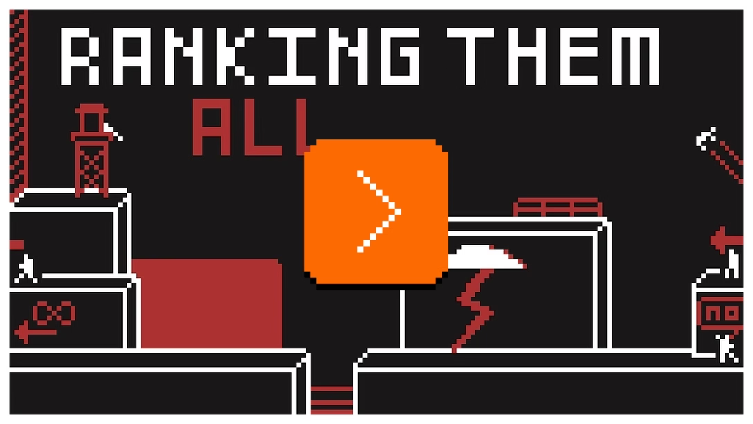
The limits here are I believe unrelated to precision, and rather to wanting to keep the player within a controlled, designed environment. (We once covered a story of this backfiring horribly, and also talked about skyboxes and streaming.)
The video also made me want to see people – especially designers with less experience slash less baggage than I have – doing a tier list of e.g. common interface elements. Or maybe I should make such a video…
Thursday, July 30 / #errors / #games / #youtube
“This is a sphere getting exponentially angrier as time passes.”
When you learn computer science, at some point you encounter floating-point numbers in all their peculiar glory. Floating-point numbers allow you to store values that are extremely huge or extremely tiny, but that comes with a strange price. The number is still just a number with a regular limited precision, but is accompanied by a floating point – another number that just says how many zeroes to put after or in front.
In effect, when your number is millions, you get a precision of thousands. When your number if billions, you can only count in millions, and so on. This makes intuitive sense, in a same way a billionaire doesn’t care about pocket change. (Go to a floating point visualizer, and you will see you can input 9000004 and 9000005 and 9000006 with no problem, but add one more zero and 90000004 will be rounded down to 90000000, and 90000005 up to 90000008. Bigger numbers get even less precise.)
This has a strange effect when it comes to videogames or graphic software: The further you move something away from the origin of your universe – where X and Y are 0 – the more you have to worry about its internal precision.
This is not a problem in real world. You can send a tiny, incredibly meticulous watch screw far beyond the solar system and back, and it will do fine. But now jump to the digital world, assume Earth is 0:0 – apologies to Copernicus – and now the further away you go, the more the floating point moves to the left, and at some point the precision of the number on the other side runs out; a value that can express billions of kilometers is too coarse to even consider millimeters.
This is a fascinating problem which is visualized nicely in this short video. This is what happens when you move an object with its constant internal precision further and further away:

There are ways around this – you can increase the precision, introduce a “floating offset,” have two precision centers around two floating points, or do a bunch of other things – but each one will cost you. So, sometimes, the best solution is the simplest one: do not allow the numbers to get too big.
And this is why Adobe Illustrator, Figma, and I bet at least a few other tools that promise infinite canvas, actually stop you if you stray too far away from the center. Precision is like atmosphere, the canvas says, thinning out the further you go. We cannot promise your structural integrity will survive going past a certain point, so we won’t allow you to do that.
Here’s Figma, where I at some point the canvas stops following your scroll commands:
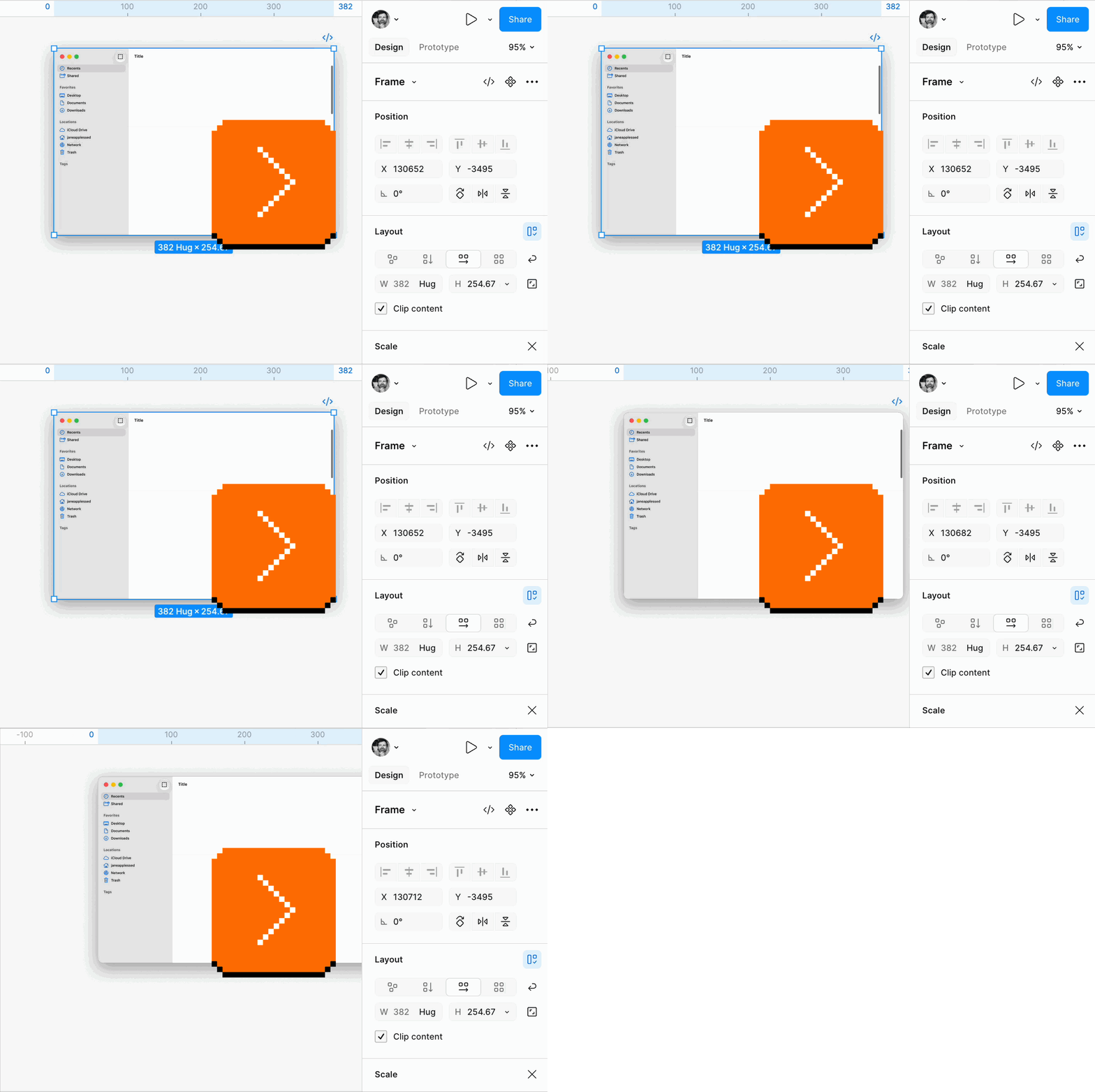
The first invisible X value is 131,072 and it’s not a surprise it’s one of these numbers that will look very, very familiar.
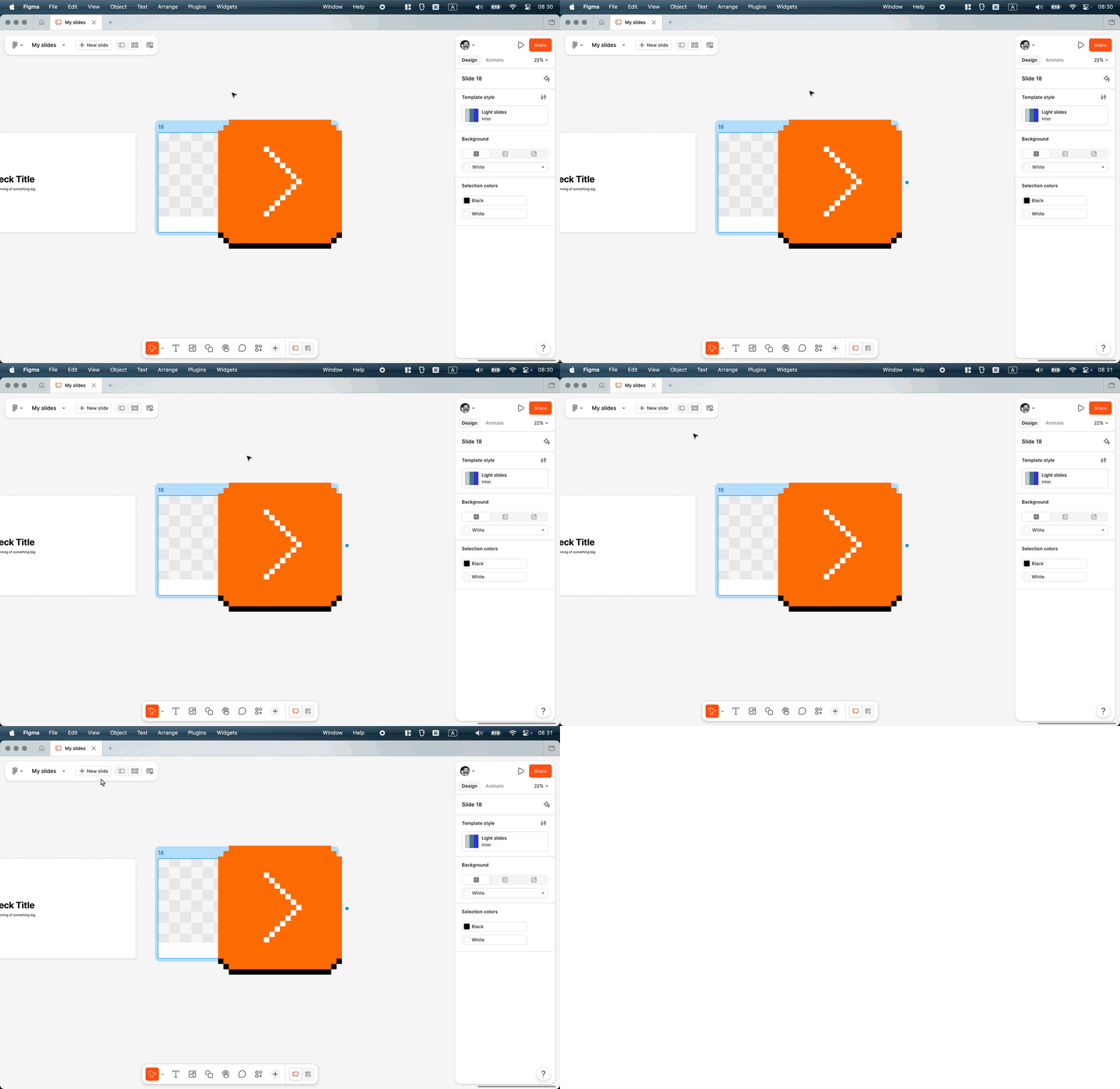
It seems like a huge enough value, but if you consider a slide in a slide deck is 1920×1080, it’s not as infinite as it might initially seem. And this is also why – in part – Figma Slides manually wraps you after 20 slides:
Thursday, July 30 / #graphics / #youtube
“Gravity is worth asking about.”
I’ve enjoyed John Gruber’s posts about ads appearing on an increasing number of Apple surfaces: the App Store, Apple News, and – soon, perhaps – Apple Maps. (Just for reference, here’s an example of such an ad.)

In a post earlier this week, Gruber likened ads to stickers on laptops, and shared a fun Steve Jobs story:
That’s what those stickers on PCs are: they’re ads. Intel pays for the “Intel Inside” stickers that booger up PC laptop palm rests. Longtime readers will recall that back in August 2007, Apple held a Town Hall event to introduce new iMacs and some iLife and iWork software updates. In a post-event Q&A (imagine that), Bob Keefe of Cox Newspapers asked “Can you say why you all are not participating in the Intel Inside program, putting the stickers on your new or previous Macs?” This question was so absurd from the perspective of those who covered Apple closely that it prompted outright laughter. […]
The 2007 exchange went as follows:
Keefe: Why are you not participating in Intel Inside program and not putting stickers on your Macs?
Jobs: Uh… what can I say? We like our own stickers better.
(In case it’s not clear, this was a joke; Apple didn’t and doesn’t put any such stickers on their products. They instead used to include Apple logo stickers in boxes.)
In May, Gruber posted about Apple’s ads, too, and brought up the zero-one-infinity rule:
I feel like a variation of Zero-One-Infinity is a good rule of thumb for ads, too. From the perspective of users — and probably developers — zero was the best number of ads for Apple to show in App Store search results. One was worse but acceptable. But now that they’re showing more than one, they’re on their way to infinity. They’ve started down the slippery slope. Remember when Google only showed one ad in search results?
“Slippery slope” is a perfect term. But I wanted to add something here. In my experience, in the realm of UI, there is no middle notch. I’ve seen it time and time again… the moment you open the door to One, Infinity starts exerting its pull:
- adding just one setting will send a message that We Do Settings Now and more settings will follow,
- one uncomfortable exception followed by weeks of deliberations will inevitably open the door to subsequent mindless exceptions,
- one cheap or lazy approach can spread through the interface like rust, subconsciously telling people “cheap and lazy solutions are okay here.”
Here are two examples I’ve been thinking about recently:
- This right click menu in Chrome started with just one fork (new window or new tab) – now there are three alts that I have to choose between, every single time, even if I only ever use one option:

- This – screenshotting in iOS – was originally just one fork: Save or Delete. Now it’s a staggering five options I have to choose from, every time, even if I never touch four of them:

Once you wedge one thing in the door, it’s really hard to stop. My theory is that this is because digital interfaces are pretty much all infinitely extensible. There will always be a way to add one more button, one more link, one more setting, one more ad. If something doesn’t fit, you make it smaller. If making it smaller looks bad, you add a scrollbar. If a scrollbar doesn’t feel right, there’s always overflow.
Not only is it very hard to create interfaces that have limitations, but a bad decision is not just precedent – it’s code that can be copied and reused. Existing code always had tons of… well, gravity, even before LLMs.
And so, products grow complex without anyone intending them to; a new team adds just one more thing, which in isolation always feels like nothing to worry about. The Hick’s Law, the extra mental load, the weirdness all grow in between those moments, in a no-man’s land no team typically feels responsible for. The logic is always circular: Why would the team adding a third option have to do something a team adding a second option didn’t have to do? Why would the team adding the second option worry in advance about option number 5?
This is why it’s important to hire and recognize people who will understand that those limitations have to be imposed arbitrarily, and empower them to be able to say, “Let‘s not add this. We like our own stickers better.”

My MacBook does have a sticker, which I bought and put on it since for some reason I find it really funny.
Wednesday, July 29 / #complexity / #system design
“Rather than fighting my tendency to type these two characters in my omnibar, I neutralized it.”
An interesting short story from Ernie Smith at Tedium, who ventured out to do the opposite of what we usually cover on this blog – disrespect his motor memory:
Recently, I made a realization: I have been unwillingly addicted to Facebook for a long time, and it’s not even because I like Facebook. Rather, it’s because I find it an extremely easy URL to type into a modern web browser’s omnibar. This sounds crazy, but the first two letters, f and a, are on the home row, and I don’t really rely on bookmarks, but my browser’s history function to type in URLs.
This creates a sort of recency bias. If I type in the same URL a lot, it’s the one that pops up the most. And so, if I’m at a browser with no clear idea of what my intent for the next page I load up, I inevitably type in “fa,” which would suck me in. […]
So, what I ended up doing was creating a URL that does nothing but forward to Google News. […] The result is that whenever I type in my new Facebook URL, I go to a news aggregator, which is inevitably what I was using Facebook for anyway. A week later, and my Facebook usage has gone down considerably.
There is something really interesting about creating your own URL for a purpose like this. Smith doesn’t disclose his, but you can imagine it’s something like facebook.aresluna.org that just redirects to a news aggregator. If creating a new URL is too difficult, there are always other options:
Wanna go to fatberg.com every time you load your computer? Or maybe faxtoy.net?
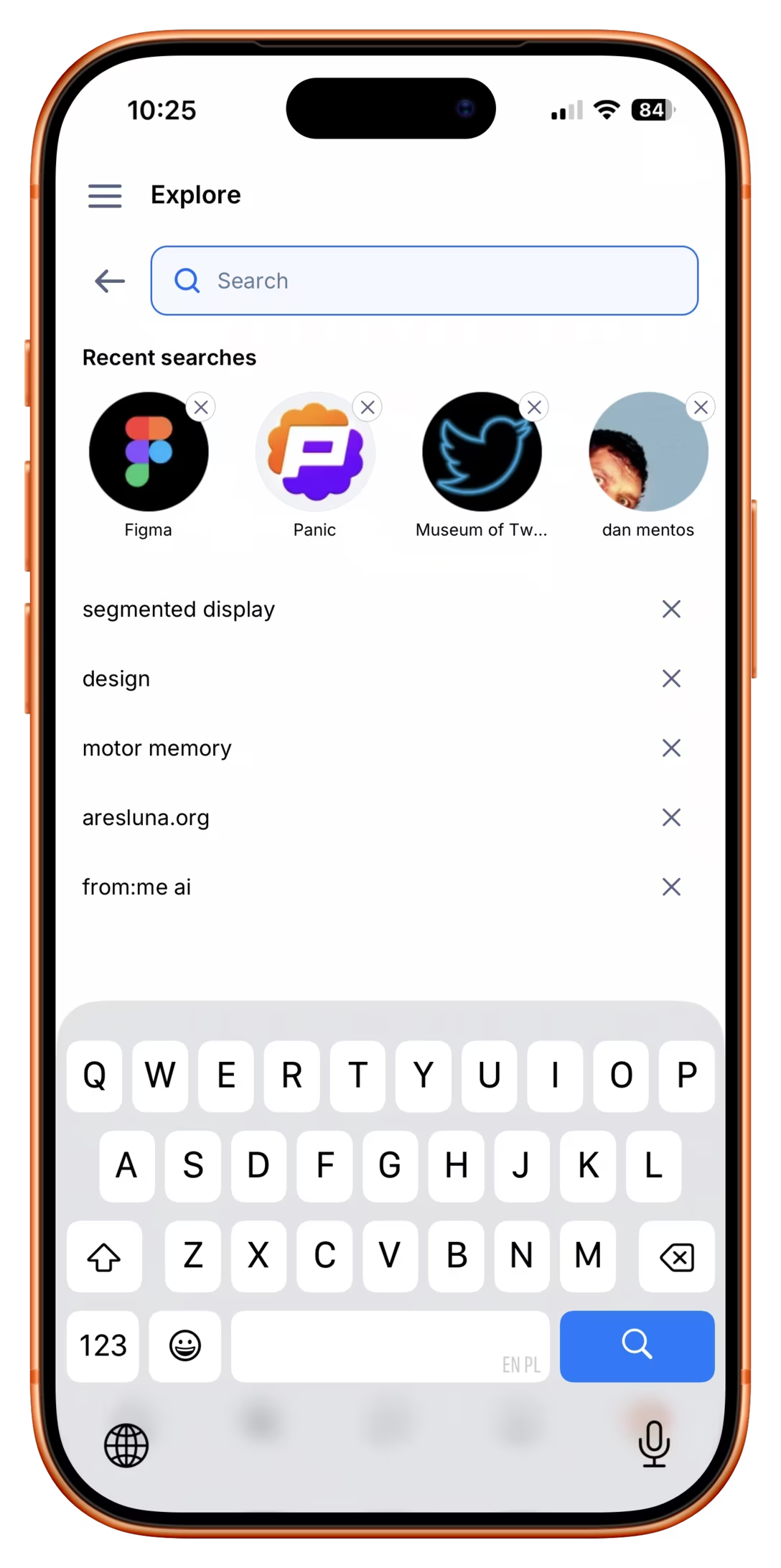
This is a good example of some of the challenges with “recent” interfaces I am such a big fan of. If you’re designing recents and you think they can turn against the user or otherwise get in their way, it’s good to offer not just a “clear recents” feature that gets rid of them all, like here in Apple’s Music…

…but also individual clears, like here in Bluesky:
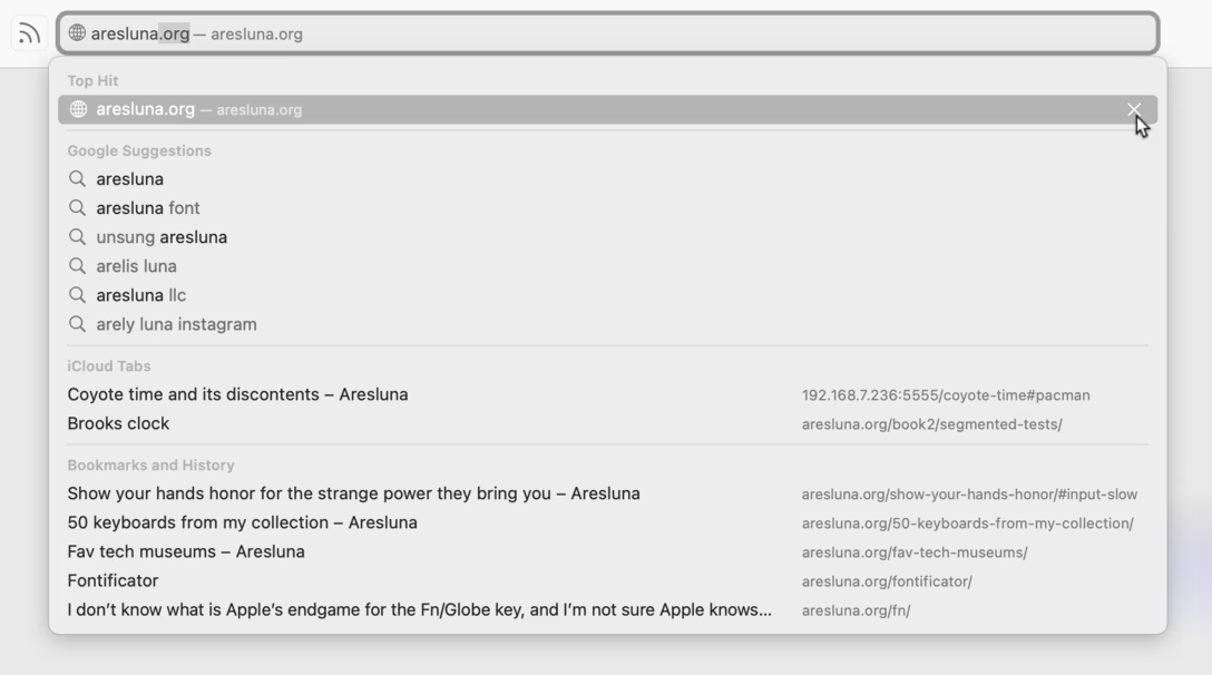
I don’t know if this is true for all the browsers, but in Chrome and Safari, you can also clear individual suggestions this way:
Smith writes a bit more about the addictive nature of computers, but I’ll let you read on your own.
Tuesday, July 28 / #attention / #keyboard
What it says on the tin
Nice moment in Slack and Medium – when logging in, the login code that arrives via email is already there in the subject, in addition to hiding inside:
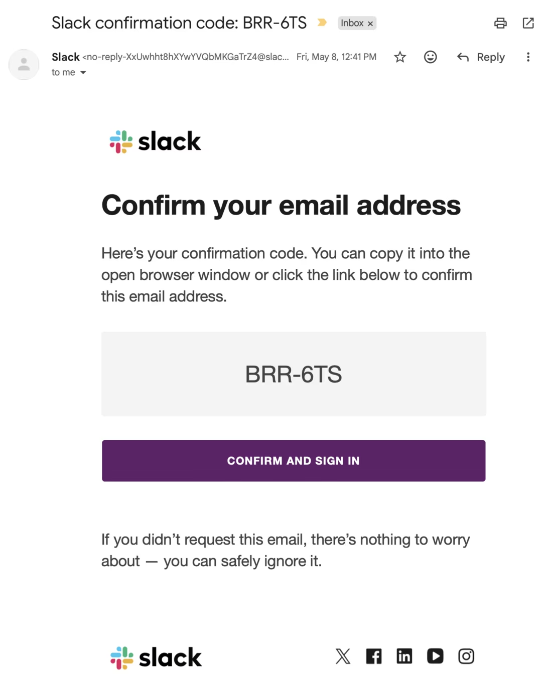
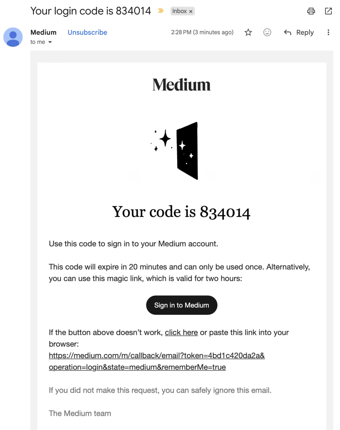
This feels good for two reasons. One is the obvious one: you see the code earlier, it might show up in a notification, etc.
But also, this should prevent multiple login codes to be threaded as a “conversation” inside your email client, since threading is based on the email subject – and threaded utility emails can be extra confusing.
Monday, July 27 / #flow / #security
In between the lines
Over the years, I acquired this weird collection of almost-invisible, but important signifiers of when I know a product really focuses on craft and thinks about its users.
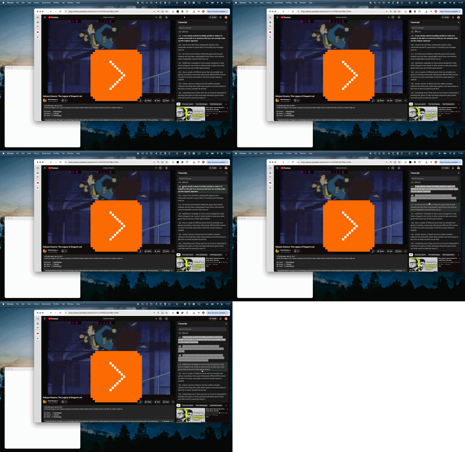
I thought about one recently. Here’s what happens when you try to copy a long block of text from YouTube’s (otherwise very useful) text transcript pane:
And here’s an analogous example from GitHub:
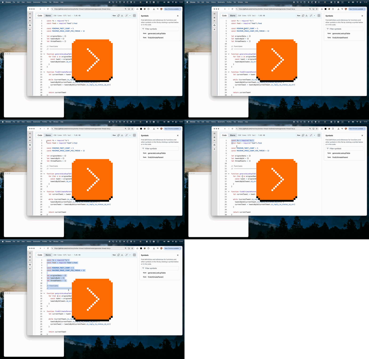
GitHub’s arrives ready to go. YouTube’s throws in a lot of messy things in between the lines.
Why does it matter? Because these both feel like places you’ll be copying a lot from, and dealing with a messy paste can feel so, so unpleasant.
You have probably seen this chart before, from xkcd:
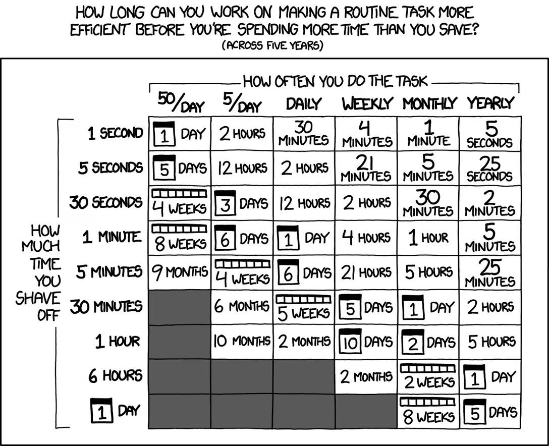
This is the fabled automation trade-off, or the high fixed cost vs. low variable cost dilemma.
Yeah, if you’re doing a lot of copy/paste, you might invest in creating some sort of a clean-up step, or even going through a programming text editor which has multiple cursors or other casual automation. But what if you don’t do that often, or if you don’t even know how much time it’d take you to automate it? Then the investment seems scary or insurmountable, and you’re stuck doing something like this, time and again:
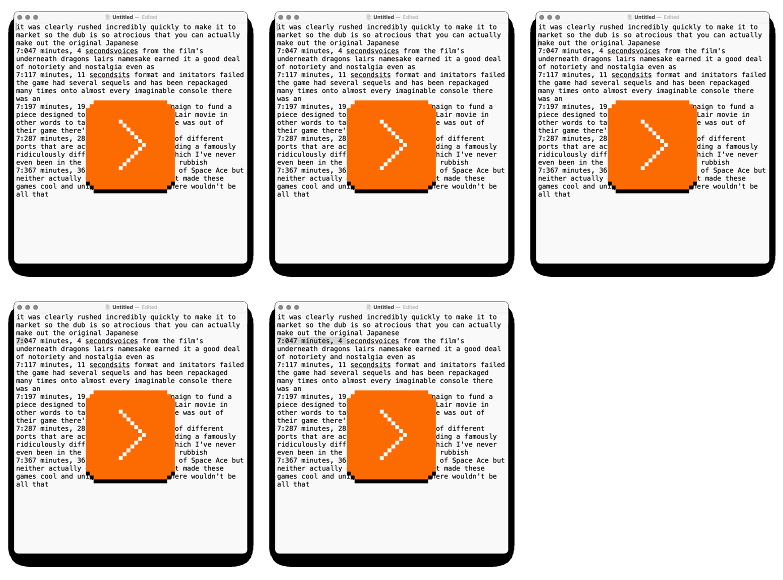
And it’s really nice to encounter a place like GitHub, where the team was thoughtful enough to save you all this trouble.
There is also an asymmetry that’s worth pointing out. I believe making this good doesn’t have to be a lot of work for people putting these surfaces together. Here’s me fixing the YouTube situation with two simple lines of CSS with user-select: none:
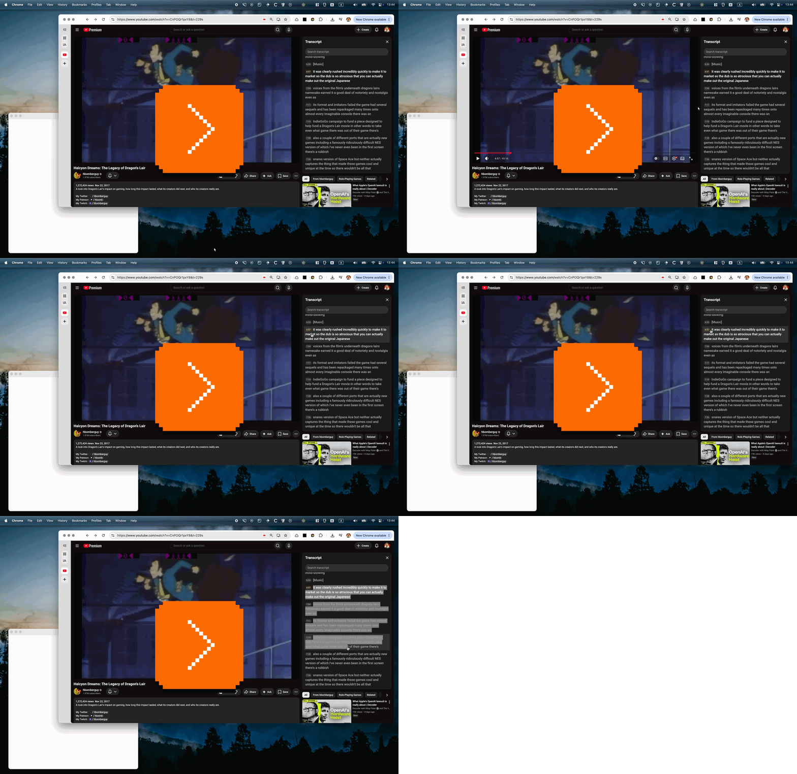
I don’t know if it’d be as easy for all big text block situations, but I think it’s good practice to look around a bit and think about what are tiny things that you can do on your side that will save your users minutes or hours of tedium (see also: recents and paste and even more recents).
Monday, July 27 / #copy paste / #selection / #text editing
“Every now and then some Unicode hyphen character makes its way into comments.”
Julian Fong, a software engineer at Pixar, wrote a short thread on Mastodon with an interesting take I haven’t seen before:
I still don’t use any AI code in my work, but I have to review more and more of it these days. One of the things bothering me about that these days is just how lacking in personality that code is.
RenderMan is a code base which is now over forty years old. It is a collection of idiosyncratic styles written by equally idiosyncratic people.
I’ve been in this code base for 26+ years and I can recognize the author of many chunks simply by looking at indentation, comments, or coding style. And I can often map style to personality quirks of the author.
Dan McCoy’s code for converting general polyhedra from 1990 still survives today. Probably one of the few pieces of code left that actually has a
for ( ; l; l = l->next)loop for linked lists. Dan is also the only person I’ve ever seen use the abbreviation R.N.G in comments.Tom Duff is the inventor of the Duff Device, so you can imagine what kind of code he might write. But he also left a comment in the implicit field code which was a quote from the Preface to Samuel Johnson’s Dictionary, from 1755. That’s just who he is.
(In a fit of hubris, many years later when I refactored the code, I left an answering comment which was a quote from the Preface to Noah Webster’s “An American Dictionary of the English Language. I’m not sure Tom ever noticed this.)
I was just thinking of Duff’s Device the other day!
I’ll let you read the rest on your own, but will excerpt the ending, too:
I could go on and on about all of our recognizable quirks, but living in a code base with that history is like living in a Berkeley Craftsman home. It’s old, it’s creaky, okay, it’s missing AC and you’re probably going to die when it hits 100 in the summer (which happens all too often these days), but dammit, it’s charming and it’s artsy. […]
[With Claude-generated code] there’s no typo or quirk that immediately recalls an interesting whiteboard discussion in the author’s office. It’s just code and comments repeating what the code does.
Code is art. I work at a studio full of ungodly talented artists, but I will still die on this hill. Code is often messy and dirty and it’s a pain to create and get right but the results reflect the personality of the creator and the pain of the creation. Just like the rest of art. Sometimes you have to look at the source code to see that, but it’s there if you look for it, hidden beneath the surface.
In the era of the telegraph, a century ago, you could listen to the dits and the dahs and decode the literal message, but you could also pay attention to the rhythm and the timing and the quirks of someone’s particular finger on someone’s particular Morse key – and learn to recognize not just a particular person, but also, sometimes, even their mood. There are stories of Allied spies knowing exactly which of the German operators they surveilled (but never met in person) was sending messages at a given moment, just by learning their tapping style, known as “fist.”
I found it delightful to read Fong’s stories of his coworker programming fists.
Sunday, July 26 / #ai / #coding / #craft
Meta on meta and Meta
In early 2023, Dan Olson at Folding Ideas made a scathing, smart, almost two-hour-long video essay about Decentraland, the metaverse that was one of the poster children of the web3 era:

Most of what Decentraland does, and what it fails to do, are things that would be considered forgivable or quaint in a Kickstarter MMO that had clearly bitten off more than the creators could ever chew, but given that this is a project founded on cryptocurrency, all of those foibles are laced with the language of finance and landlordism. Strolling down Decentraland’s spacious boulevards at 5 frames per second rewards the user with a seemingly endless parade of virtual billboards brightly proclaiming that the space you see is all available to rent.
In May this year, Nick Heer at Pixel Envy wrote a copiously annotated birds-eye overview of Meta’s metaverse attempts thus far, in an essay called The Metaverse Fever Dream:
Officially, Meta is still all-in on the concept around which it pivoted the entire company in 2021. It still has a whole marketing page proclaiming its belief “in the future of connection in the metaverse”. You can go shop its lineup of Quest headsets which Meta says represent the best and most immersive metaverse experience, though its flagship model is now two-and-a-half years old. It has awkwardly promoted its Ray-Bans as “A.I. glasses” despite them becoming the company’s most successful line of mixed reality products, and it is desperately trying to connect its newest muse of A.I. with its last one. The single mention of “metaverse” on its Q1 2026 earnings call (PDF) is when Zuckerberg claimed to be “excited for more of our metaverse efforts to be powered by the A.I. models we’re training as well”.
I linked to Meta’s metaverse reviews before, but I thought these two (very) deep dives are great to invest in, side by side. Both of the failed metaverses look similar only on the surface. They were spun by very different organizations, started with different goals and premises, and their creative and maybe even ethical bankruptcies have a very different dimensionality.
In the context of this blog, it’s also interesting to reflect on how poorly they’re both made, which is extra fascinating given the disparity of budgets of the efforts. My guess would be something like this:
- Mark Zuckerberg and Meta’s leadership do not understand design, so even though there might be a lot of talented designers at Meta, their efforts do not end up mattering as much.
- Decentraland is ostensibly “open source” – or at least open-source-flavoured – and open source generally struggles with attracting talented designers.
These are two interesting and distinct failure modes – although, as the essays make abundantly clear, no amount of design talent, execution, or craft could turn successful an idea whose entire premise is a house of cards made out of newsprint-grade paper and magical thinking.
Sunday, July 26 / #craft / #nick heer / #youtube
A time machine in Logic Pro
Here’s a nice moment in Logic Pro, a music app. Like with most such apps, you can press R to record playing an instrument. However, if you forgot to start recording, or were just goofing around and stumbled upon something wonderful, you can press ⇧R and the recording will appear anyway, as if you had a time machine. This is a quick TikTok video showing it in action:

The feature is called Flashback Capture. Of course, just as it was with undo send, this is no magic. The app is always recording the events quietly, and then offers you to make them “real” if you want.
I dug around and found a support document that offers a rare view into the mechanics of this feature, which are slightly more sophisticated than I imagined:
When playback is stopped, Flashback Capture creates a separate region containing all the MIDI events received since the last playback. However, after a pause of 20 seconds between incoming MIDI events, those initial MIDI events before the pause are discarded. If when playback is stopped, you perform some MIDI events and then pause for 1.5 bars or longer, those initial notes aren’t included in the visible part of your region. If you do want those MIDI events to be included in the created region, you can drag the left region boundary to expose them.
What it seems to say is:
- If there is a longer pause within your play, the notes are still recovered, but hidden. You can always drag to reveal them, but in effect, only the most recent of your notes are immediately visible – a nice touch. (The moment you start dragging, it also shows you a quick preview of where you’re going, which is extra thoughtful!)
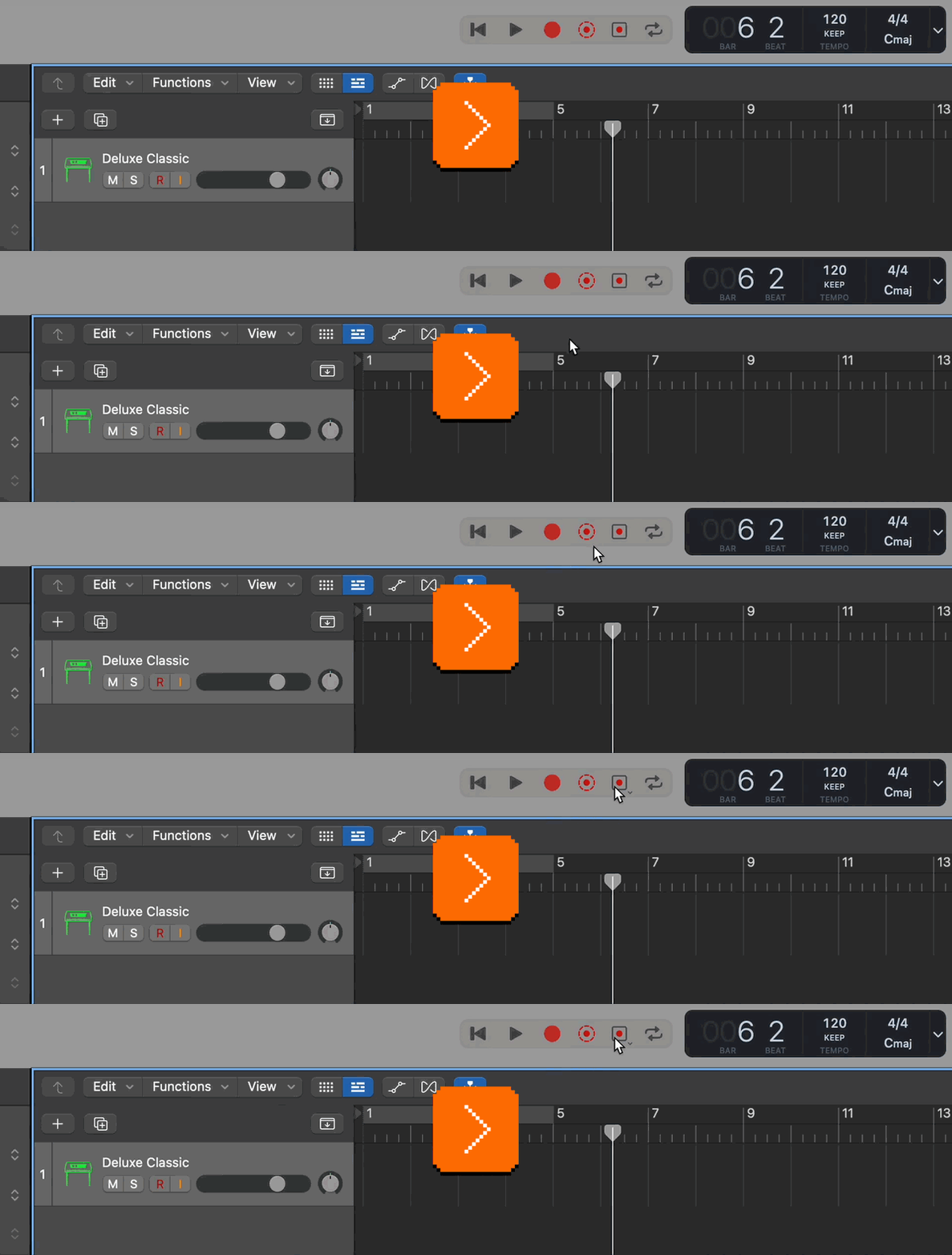
- If the pause is 20 seconds or more, all the notes before that pause are no longer preserved – presumably to prevent too much wasted data in your file.
- However, after you stop playing, you have infinite time to invoke Flashback Capture and recover the notes.
This seems like a good and thoughtful feature that prevents data loss, a sort of magical “reverse redo.”
Thank you to Chris Krycho for telling me about this feature, which is apparently also available in other music apps, e.g. Cubase and Dorico.
Saturday, July 25 / #above and beyond / #details / #errors / #preview / #undo
“A vicious circle of incompatibility”
A fun 16-minute video from PortalRunner with this premise:
This is an image file, containing a picture of my cat. But if I rename it to .MP4, it becomes a video file – also of my cat. If rename to .PDF, it becomes a text document containing the script for this video. It can also be a valid webpage, a .ZIP archive, or a PowerPoint presentation, all by simply changing the name. This kind of file is sometimes called a “polyglot” (although, usually that term refers to code that works in multiple programming languages).
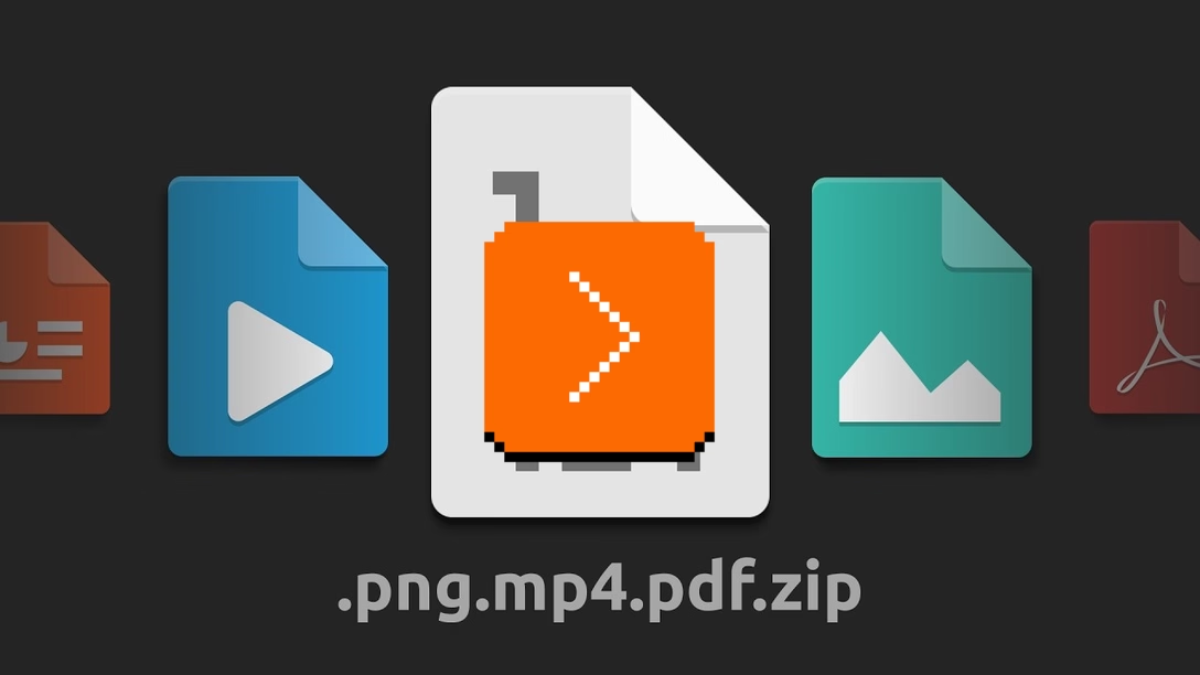
This kind of a file is not something that you will realistically need, but it’s a fun look into various approaches to headers and structures of file formats – something we don’t usually get to think about a lot.
Buried inside the video is also an interesting digression: is the file extension just a method of delivering the file to the right application? If I rename .jpeg to .gif, and both are routed to Pixelmator, should Pixelmator do its best to detect it’s a JPEG file under the hood, or fail with a “this doesn’t look like a GIF file” message?
The web has a similar challenge in the form of MIME sniffing – “MIME” is sort of the web’s equivalent of extensions, “sniffing” means detecting the file from its contents alone, ignoring everything else – and that had some security considerations, as it allowed bad actors to sneak in some malicious code under the guise of something more innocuous… basically what the video is doing for fun, but now weaponized.
This is all pretty technical for this blog, but inside the Wikipedia entry for MIME sniffing is this passage that caught my attention:
[MIME sniffing is still used by some browsers. However,] by making sites which do not correctly assign MIME types to content appear to work correctly in those browsers, it fails to encourage the correct labeling of material, which in turn makes content sniffing necessary for these sites to work, creating a vicious circle of incompatibility with web standards and security best practices.
Decades before MIME sniffing, Jon Postel captured the essence of that line of thinking by coining Postel’s Law – “be conservative in what you send, be liberal in what you accept” – but as enticing as it is, that has challenges similar to the above quote:
A flaw can become entrenched as a de facto standard. Any implementation of the protocol is required to replicate the aberrant behavior, or it is not interoperable. […] Ensuring interoperability in this environment is often referred to as aiming to be ”bug-for-bug compatible”.
While Postel’s Law was about data flowing in and out of computer systems, the premise is to me a more evergreen design question, applicable to so many other things. Feeling “liberal in what you accept” can feel helpful, but can teach users bad habits and have bigger consequences. For any project where this applies, it’s worth asking: should we go out of our way to help the user even if they mess up, or should we be more rigid and teach them to follow the rules more strictly, as it will benefit them in the future?
The Command Line Interface Guidelines I linked to before had a great example of that:
You can ask if they want to run the suggested command, but don’t force it on them. For example:
$ heroku pss
› Warning: pss is not a heroku command.
Did you mean ps? [y/n]:
Rather than suggesting the corrected syntax, you might be tempted to just run it for them, as if they’d typed it right in the first place. Sometimes this is the right thing to do, but not always.Firstly, invalid input doesn’t necessarily imply a simple typo—it can often mean the user has made a logical mistake, or misused a shell variable. Assuming what they meant can be dangerous, especially if the resulting action modifies state.
Secondly, be aware that if you change what the user typed, they won’t learn the correct syntax. In effect, you’re ruling that the way they typed it is valid and correct, and you’re committing to supporting that indefinitely. Be intentional in making that decision, and document both syntaxes.
Saturday, July 25 / #encoding / #errors / #youtube
Chrome’s breaking and entering
I got pissed at Chrome the other day. This is not the first user-hostile thing Chrome did – off the top of my head, I remember the updater fiasco from some years ago, and the more recent auto-installation of a 4GB file – but as you’ll see, this one is squarely in my wheelhouse.
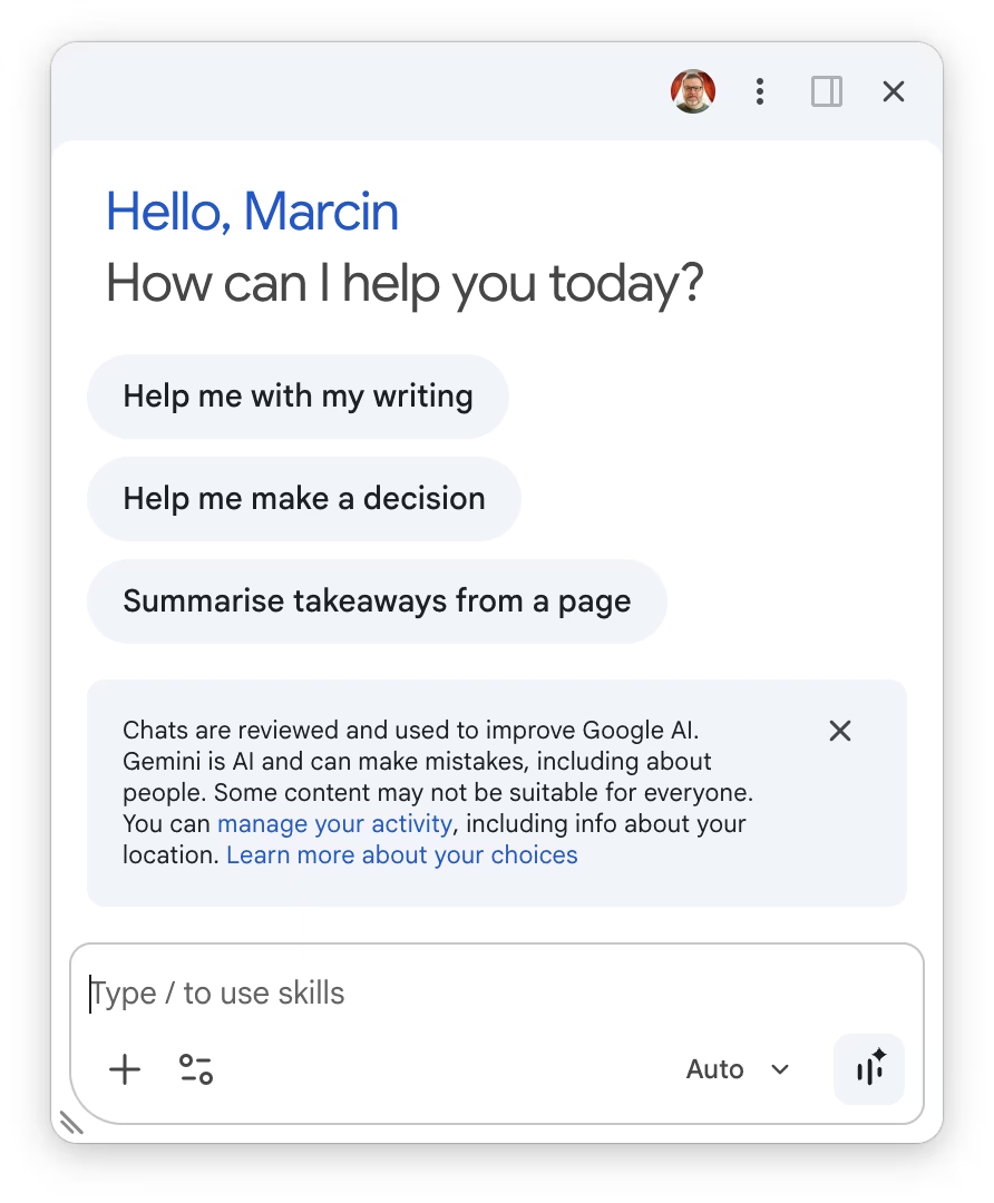
The transgression: Chrome took over a shortcut on my Mac – Ctrl+G – and it used it to throw me into Chrome’s version of Gemini that I have never used or was interested in using. Moreover, it decided it’s okay for Ctrl+G to put me there even if I pressed the shortcut outside of Chrome.
I was never asked by Chrome if it’s okay to do so. The way I found it installed it was in a very unpleasant way: I tried to use Ctrl+G in my coding editor to jump to a specific line, and I got this instead:
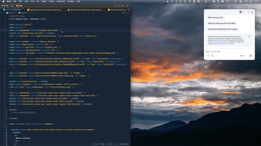
Stuff like that can make you feel like you lost your mind. I have no idea what this window is supposed to do, where did it come from, or even – initially – why it appeared. Note that it doesn’t even identify itself as either Chrome or Gemini, unless you read the scary caveat. It feels like the UI equivalent of breaking and entering.
Unsurprisingly, the pop-up doesn’t confess to stealing the shortcut, or allow you to toggle it off in any way:
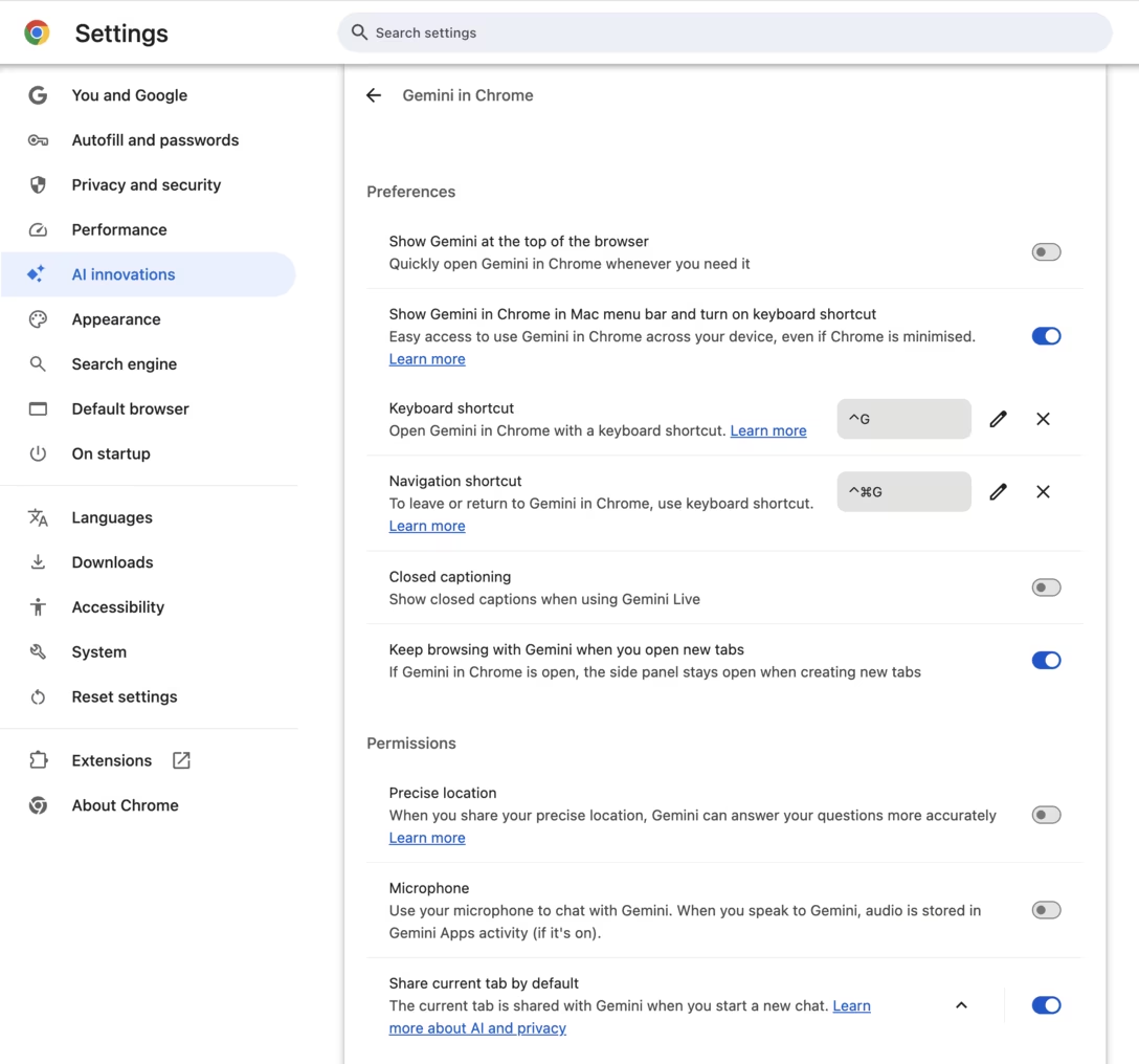
It is possible to undo that behavior, but one has to connect it to Chrome first, and then go deep into its settings – first by clicking on “AI innovations,” and then by clicking on “Gemini in Chrome” – to find it:
Let’s not beat around the bush: This is effectively malware behaviour. It’s bullshit. It’s cancer. It’s deeply disrespectful toward the user. It’s prioritizing hollow metrics at the expense of everything else. But I don’t want this blog to chase news of the day or feed the outrage machine, so let me try to turn my anger into something useful.
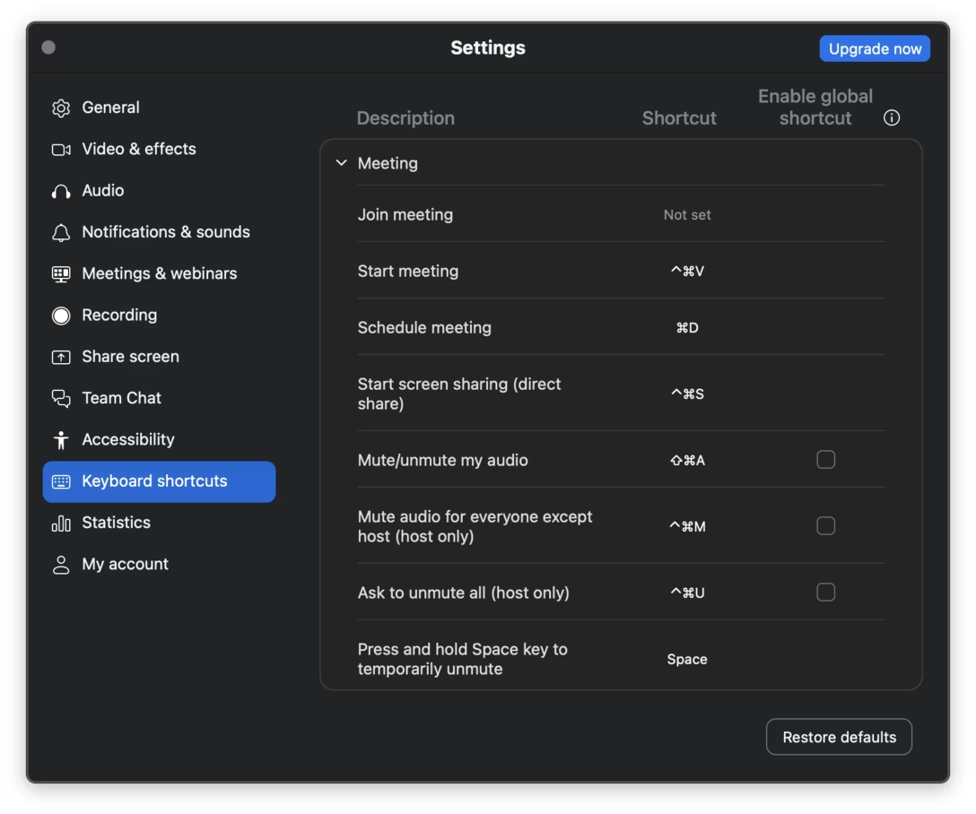
We can start here: There are some global keyboard shortcuts that are genuinely good. A video call mute shortcut, screenshotting, “next slide” if you’re presenting in Zoom. Everything related to computer operation – volume, brightness, media transport controls – needs to be available regardless of focus or context. (In my keyboard customization essay, I introduced my own global keyboard shortcuts, for example for scanning the next page.)
But, an app installing a global keyboard shortcut without user consent is bad. This can never be anything other than opt-in. At the very least, Chrome should have shown me a clear UI that said “We’re thinking Ctrl+G would be fun for you to use. You okay with that?” and a button for me to press to confirm.
(Note: Ctrl+G is the shortcut for Macs. As far as I can tell, on Windows it is Alt+G.)
From people’s reactions, it seems this shortcut is auto-enabled for a subset of users – perhaps people who used Gemini before, or people on a plan that happens to include it. No matter how specific or small that group is, or how useful they might find the Ctrl+G pop-up, the issue remains: I have never consented to the app doing this.
I also partly blame macOS for ceding its responsibilities here. Mac’s keyboard customization features are a mess, and Mac doesn’t have a modern command repository. It’s not just that apps can register global shortcuts as they want, without the user knowing. It’s also that there is no shared inventory of them; if an app “swallows” a shortcut but does nothing noticeable with it, it can be really hard to figure out why a shortcut seemingly just stops working.
(Other apps that I remember having problems with “stealing” global shortcuts, and apps that a few readers posted are: 1Password, Notion, and Perplexity. I’d be curious if you have other examples!)
In light of macOS’s deficiencies, as an app, if you offer any shortcut customization – especially if you allow global shortcuts – I think it’s important to have a page that lists all of them shortcuts in one place. This is not what Chrome does, as various shortcut options are hidden on various pages in settings. Even Zoom, which is not generally known for having a great user interface, does better here:
And, since we’re back to Chrome, what a fall from grace! When Chrome started in the late 2000s, it felt like a browser that had user’s interest in mind, and protected people from ill-behaving websites. Today, it’s the operating system that needs to protect us from Chrome.
Also, don’t call a tab “AI innovations.” It’s tacky as hell. The market gets to decide what’s innovative and what is not.
Friday, July 24 / #attention / #google / #keyboard / #mac os
“Creativity is fundamentally not an efficiency problem.”
A computer science professor Paul Cantrell, on Mastodon:
Creative work keeps taking roughly the same amount of human labor / attention / care, even as new technologies accelerate or remove things that used to take time.
This is because creativity is fundamentally not an efficiency problem; process is not just the means of producing output, but rather a labor vessel that holds the near-invisible work that is truly important.
One can feel the care that goes into creative work without being aware of that work, or even being aware that work of that type exists at all. This feeling is approximate, loose, vague, but cumulative and eventually all-important; work with no care behind it wears thin and tends to fade as people live with it over time.
This really resonated with me.
Elsewhere, Ginger Bill, in a recent – meandering, but thought-provoking – essay titled “Good tools are invisible”:
I constantly see some people praise it not for what actually makes it good, but by taking the things it’s bad at and turning them into a puzzle to have “fun” solving.
I’ve had people tell me how “fun” it was to build a macro to handle some one-off text-refactoring problem. But when I looked at what they were doing and how long it took, my honest reaction was: I could have done that in Sublime in a minute with multiple cursors, or just written a quick script. […]
That’s what I mean by “invisible tools”. When you’re proficient with your editor of choice—whatever it is—it disappears into the background. But the moment it cannot handle something easily, it stops being invisible. What baffles me is that so many people treat that friction—the effort of working around a tool’s limitations—as the “fun” part, and then advertise it as evidence that the tool is great. […]
The text-editor-macro anecdote I mentioned is really about a gap between feeling productive versus being productive. There’s a sensation of cleverness that comes from solving a fiddly problem, and it’s easy to mistake that feeling for actual output. A tool that makes hard things feel heroic and clever feel like an achievement can register as “powerful” while quietly being slow. The honest test isn’t how engaged or clever you felt, it’s wall-clock time and how many mistakes you made getting there.
This I had more of a mixed reaction to.
I think it’s necessary to expect from tools to get out of the way, but there’s also nothing wrong with having fun with them.
My simple go-to example is this: When writing code, I sometimes use Find & Replace All, and am done within a few keystrokes. But sometimes, I press Find and then replace one at a time, jumping methodically through the file, and seeing each string in situ before changing it. I know the tool could do it all for me. I know I could be more efficient. But this intentional slowing down allows me to refamiliarize myself with the code, visit its forgotten nooks and crannies, and make sure I understand where and how the thing I’m changing is actually used.
The editor I use allows me to not be efficient when I choose not to be. In my work, flow operates at different speeds; a good tool understands that and doesn’t force me into a particular one.
I think ultimately indeed, the tool does need to disappear, and make you be in charge of whatever speed you want to operate at, and how much friction or difficulty you choose to face (do you bump the lamp or not?). But it’s not as simple as always “reducing wall-clock time and mistakes.” Like Cantrell says above: Creativity is fundamentally not an efficiency problem.