“No such thing as too fast”
Welcome to this week’s digest of Unsung, a blog about software craft and quality. Here’s what was posted since last time:
View this issue in the browser with inline videos and better formatting
Safari and system design, pt. 2
Around the time I was writing about iPhone’s Safari breaking the expected “tap to jump to the top” gesture, a conversation on social media pointed to yet another thing that this tab control does strangely.
A typical use of Safari means two groups of sites: a regular set on the right, and “private” pages on the left (this is what Chrome calls “incognito mode”):
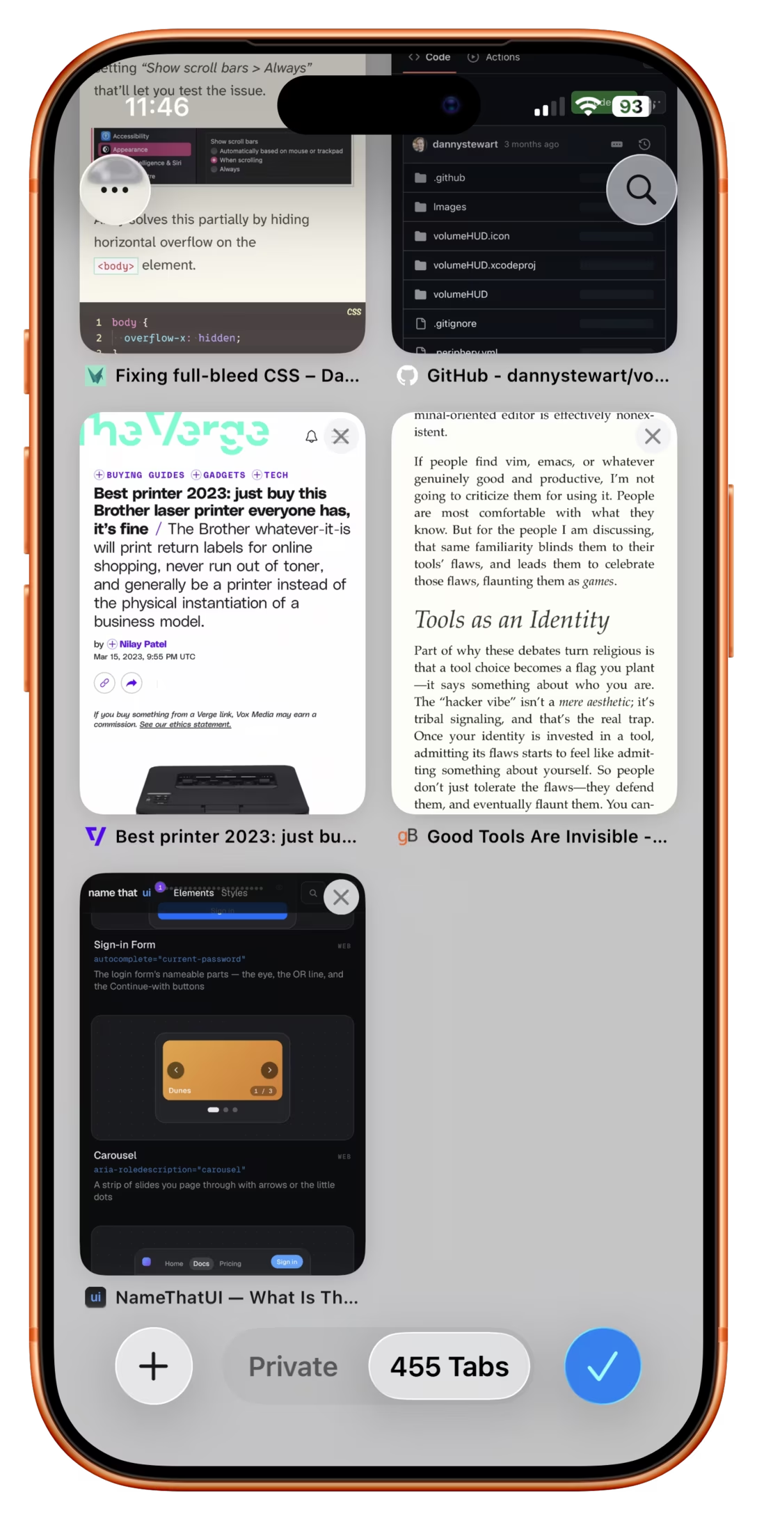
As expected, you can tap on either label, and switch to the relevant group with ease:
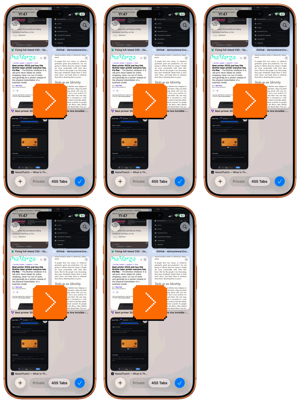
It also feels like you could slide it – and you can, except…
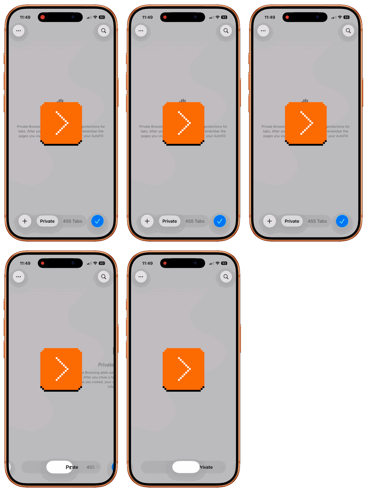
…you immediately encounter a Scroll Lock problem. You are not dragging the pill – you are dragging what’s underneath the pill. To switch, you have to go the other way:
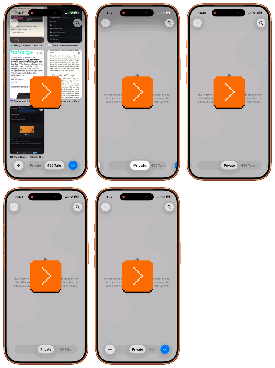
You can immediately intuit some inherent unpleasant complexity of the whole system – not just in it “going the wrong way,” but also in how it creates room and then contracts it, in two separate steps, after you’re done.
The reason is that you can actually have more site groups than just the initial two. You can even drag to where the new site group would be, and create it this way:
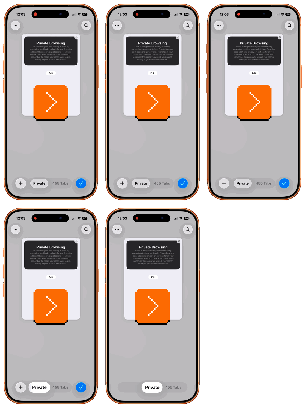
I normally welcome these kinds of accelerators. But here, this feels overdesigned and confusing, as if someone drugged the tab instead of dragging it. The very same natural gesture – a left swipe – that should feel safe and send you to Private, will now put you in a scary new full-screen/keyboard-out flow you almost never need.
Why this relates to system design is that on/off toggles in iOS were recently redesigned to resemble oblong pills:
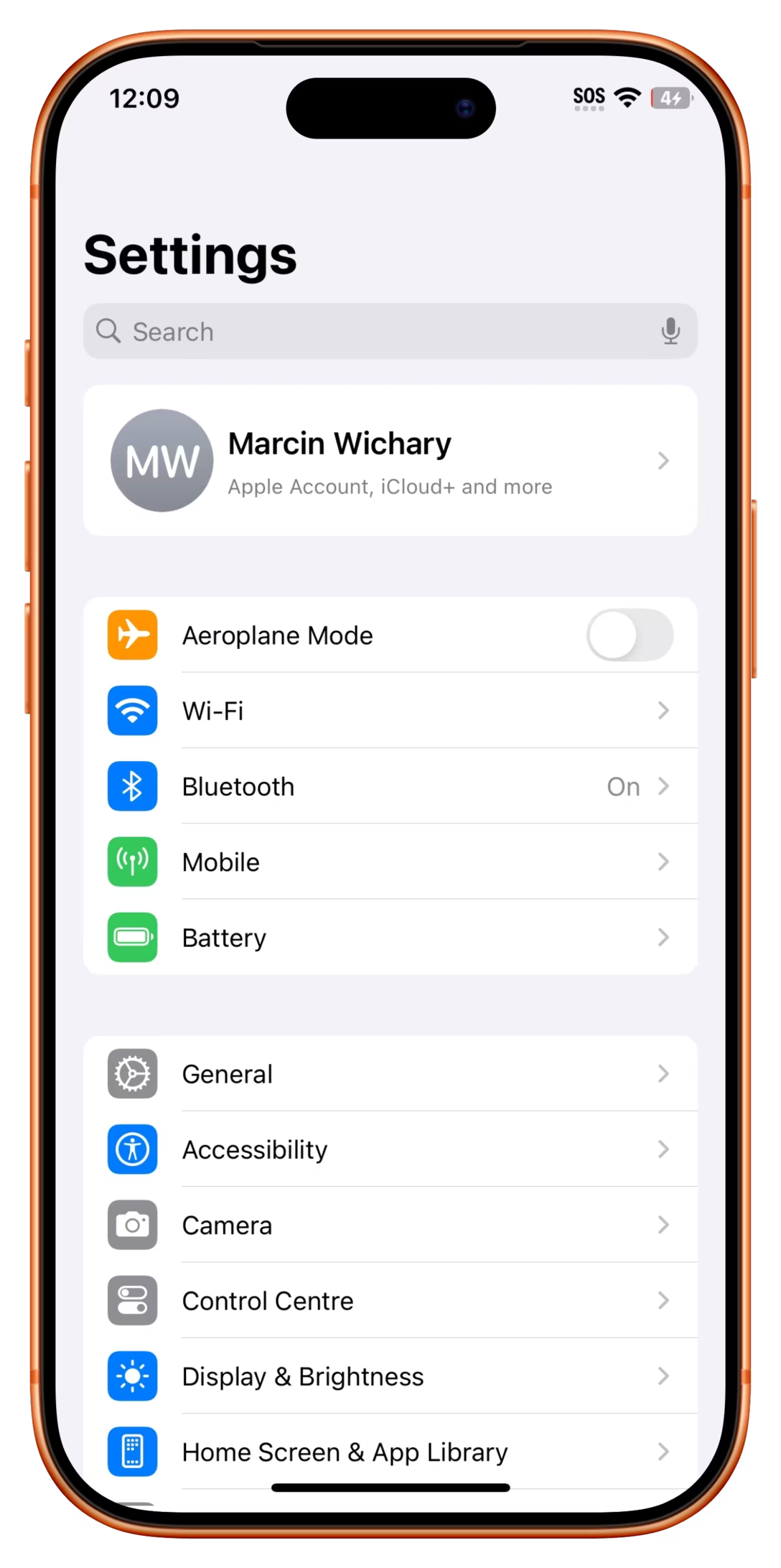
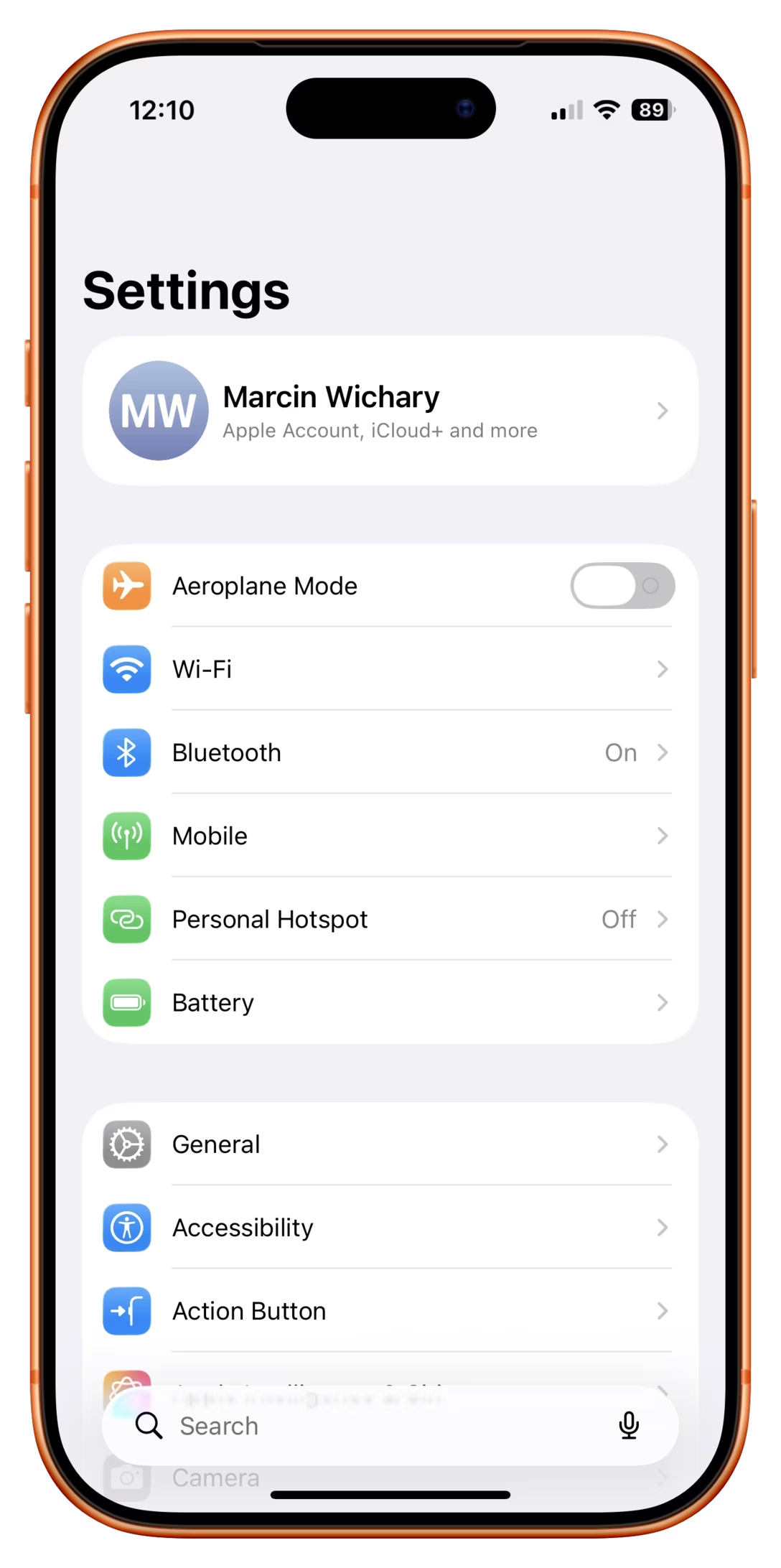
Those do respond to dragging as you’d expect:
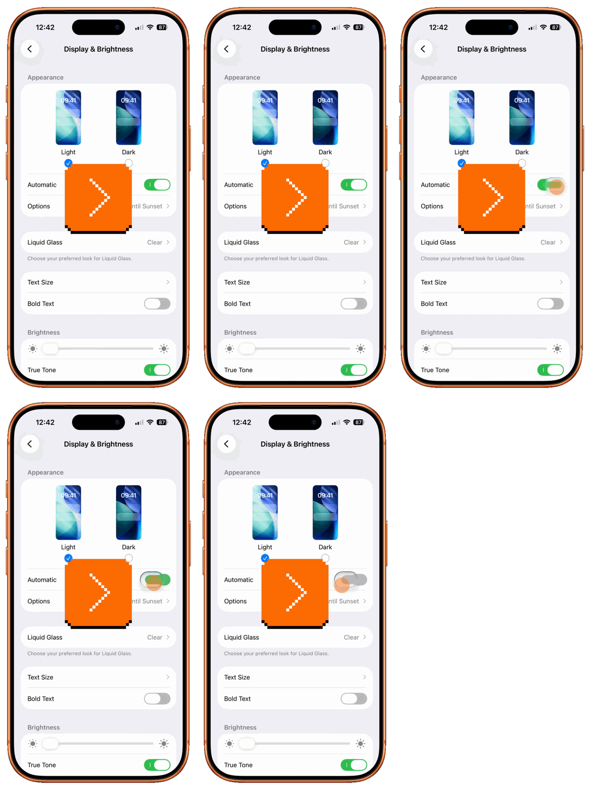
Along the same lines, on the springboard pagination pill, dragging to the right means the next page:
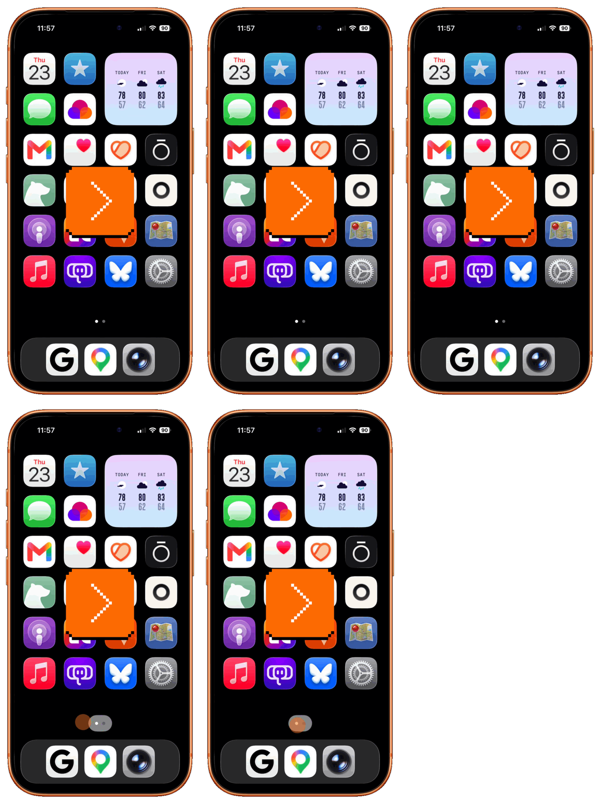
And so now the system is schizophrenic and identical-looking design primitives mean the opposite things. It’s as if the computer itself kept randomly pressing Scroll Lock for you, preventing you from developing a solid understanding of the system first, and motor memory second.
I think the mistakes made here were twofold. First, the design overoptimized for two unnecessary things: people actually using site groups (not common), and ease of use in creating site groups (not important). My slightly cynical hypothesis is that this design presented really well in demos, which sometimes can derail a project. A more cynical theory is that this led to “accidental discoverability” that made the site group metrics look better.
Second, and more important part: This particular design received an exception that it didn’t deserve. No one noticed the systemic challenge of similar UI elements doing opposite things, or people who did were not effective in pushing back. The metrics for new feature discovery are easy; the metrics for user confusion or frustration do not usually exist.
This is how interaction systems slowly fall apart. As I mentioned in the first part, it is likely that Safari’s exception will now be treated as “blessed,” and start spreading further. Given enough time, more and more pills will go in whatever direction they want when dragged – and people will learn not to trust any of them.
I know the feature is actually called “tab groups” but I called it “site groups” intentionally, because otherwise it’s a tabbed control controlling tab groups, and things get confusing really quickly. Also, thank you to Martin Hoffman for initiating this post.
Thursday, July 23 / #flow / #interface design / #ios / #process / #system design / #touch
“Jokes, art projects, or cruel and unusual punishment”
A fun 19-minute video from commonLuke trying to write a short Fibonacci program in increasingly esoteric languages:
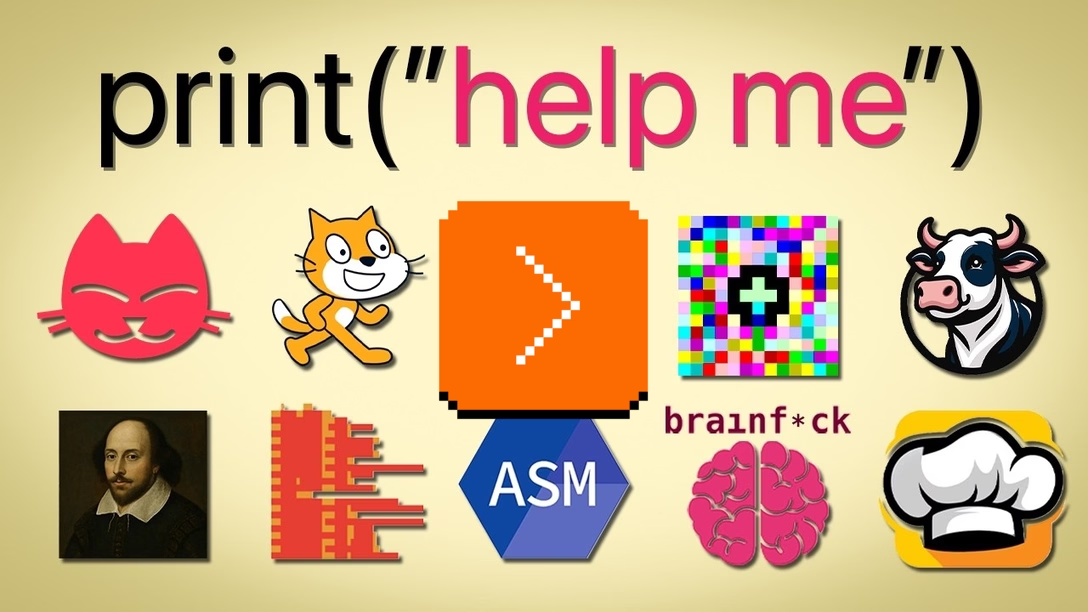
Here are the languages:
- Python, Scratch, and assembly (as control),
- LOLCODE, a language resembling lolcat memes of yore,
- Piet, a language whose output looks like Piet Mondrian’s abstract art,
- Brainfuck, whose programs are made chiefly of punctuation,
- COW, a version of the above where each of the few instructions is a variant of “moo,”
- Whitespace, whose code consists only of spaces, tabs, and returns,
- Chef, where programs resemble cooking recipes.
My favourite was Shakespeare, in which the whole program resembles a play. Believe it or not, but this code outputs “HI”:
A New Beginning.

Hamlet, a literary/storage device.
Juliet, an orator.

                    Act I: The Only Act.

                    Scene I: The Prince's Speech.

[Enter Hamlet and Juliet]

Juliet: Thou art the sum of an amazing healthy honest noble peaceful
        fine Lord and a lovely sweet golden summer's day. Speak your
        mind!

[A pause]

Juliet: Thou art the sum of thyself and a King. Speak your mind!

        Thou art the sum of an amazing healthy honest hamster and a golden
        chihuahua. Speak your mind!

[Exeunt]
It was interesting for me to see programming languages that intentionally remove some of the niceties and affordances we learned to take for granted. My guess is most of them are just art, or jokes, or a certain one-upmanship. But I couldn’t help but think of Arika Okrent’s excellent book In The Land Of Invented Languages. The book is about “human” languages like Esperanto and Klingon, but it’s much more interesting than I imagined, and maybe even quite a bit sadder: a story of people afflicted with a certain perfectionism who are not willing to accept languages simply cannot be perfect.
Thursday, July 23 / #coding / #craft / #youtube
Unsung Heroes: Repeat in Excel 97
As a teenager I adored Norton Commander, learned some UI magic from early videogames, and dreamed of a Mac my family couldn’t afford. But I think the first product that taught me something truly memorable in terms of user experience was, of all things, Excel 97.
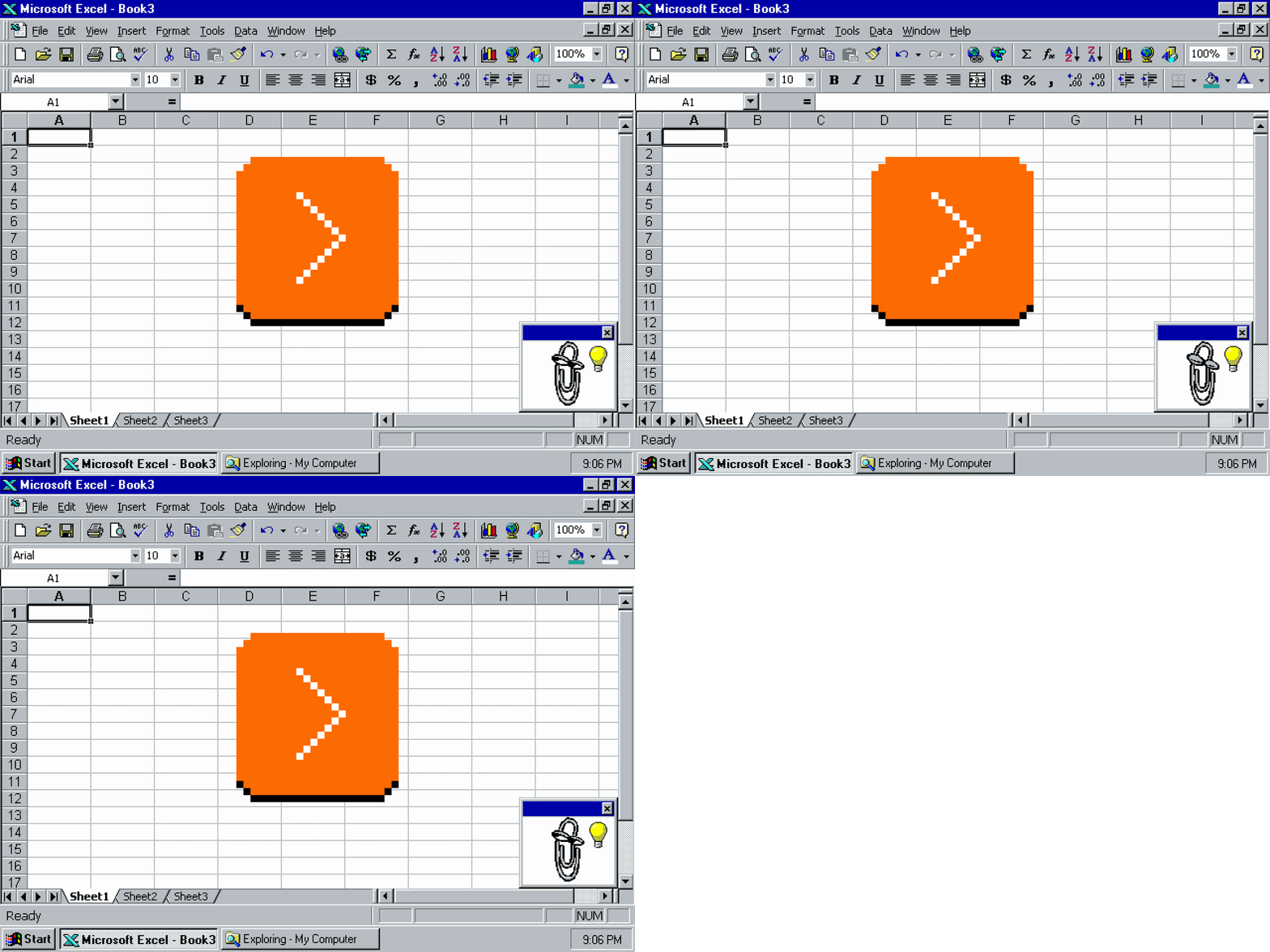
Excel 97 cooked. It was rendered in brand-new, gorgeous Tahoma, had keyboard underlines everywhere, and felt complete in terms of features. Sure, you could maybe sense the beginning of the bloat with the reorderable menus and the bolted-on Clippy, but Excel 97 felt tight and zippy even on an abominable computer put together on a high-schooler budget from used hardware pieces that were never meant to meet.
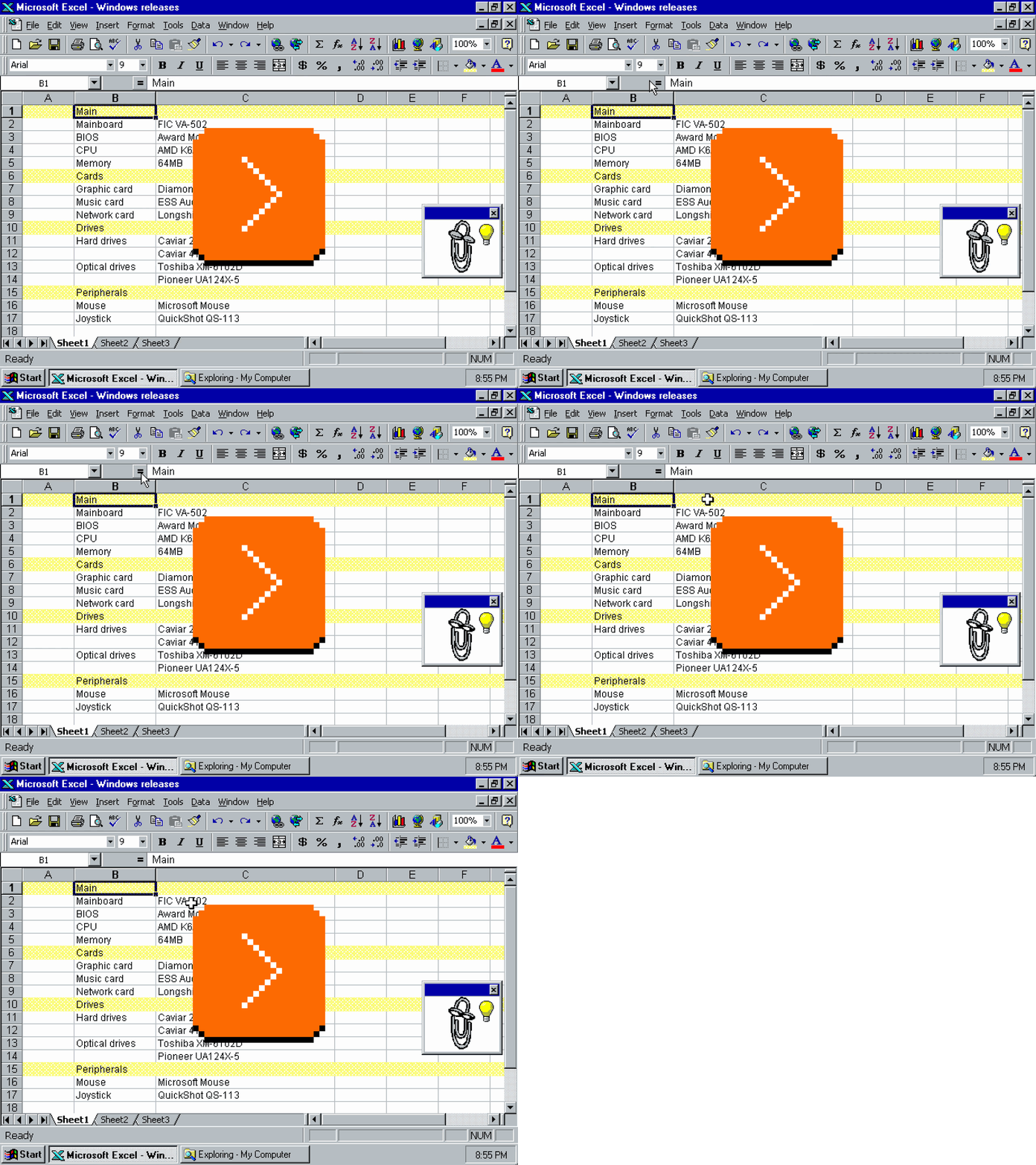
But what made me love Excel 97 was one specific thing: the Repeat command. You could invoke Repeat via Ctrl+Y, but my fingers learned to love its stranger alter ego, F4. This is what pressing F4 did:
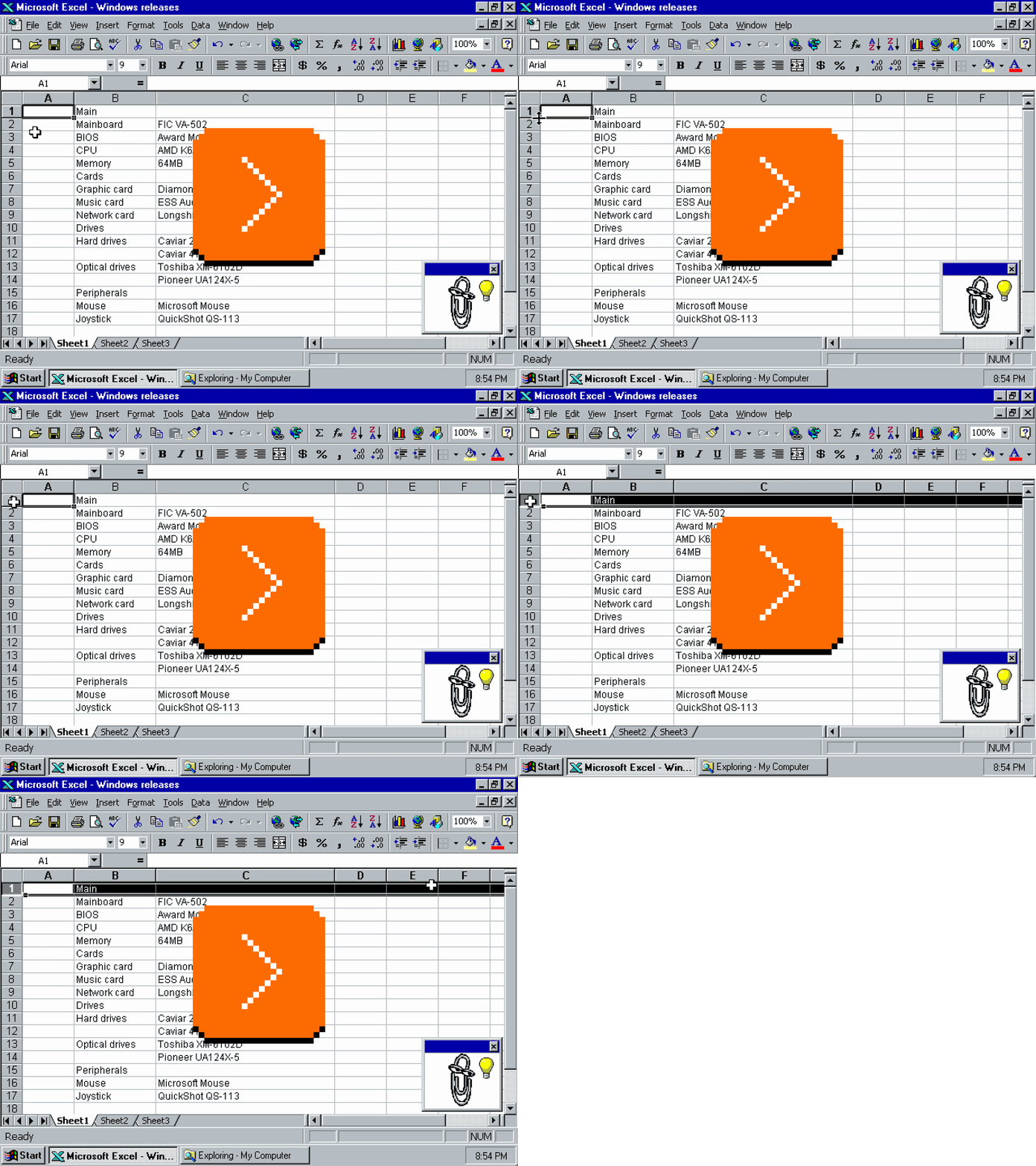
It was a bit more clever than just replaying the previous action. If you changed the font and its size, it would repeat both:
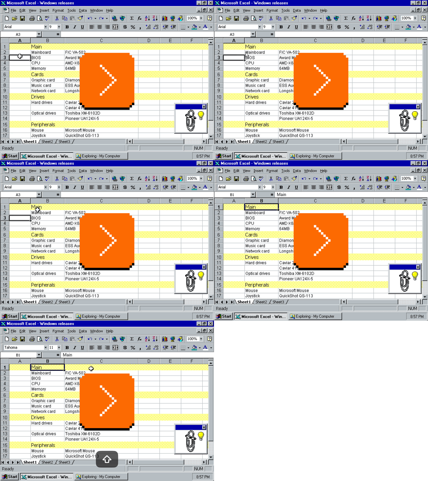
And it didn’t only repeat formatting, but also some actions, like inserting or merging:
There are, of course, many other solutions to make these things less tedious:
- make a complex selection first (if possible), and format later,
- use styles instead of naked formatting,
- copy/paste formatting only,
- paint format from one cell to another,
- record and repeat keystrokes,
- save individual actions into bigger macros and reuse them.
…and some of them were even available in Excel 97.
But it was Repeat that stole my heart. I think this is because it was two types of magic combined: the magic of motor memory + the magic of smart software.
The first part meant that soon, it didn’t really feel I was pressing F4. The shortcut lodged itself in my fingers and in time, it became a gesture as natural as pressing Backspace or arrow keys. All the other alternatives above required thought or bureaucracy, but Repeat was mindless – I would occasionally watch my hand perform it on its own.
The second part is that F4 felt like it was reading my mind. There were no options; Repeat just always seemed to do the thing I expected from it. As I understood this kind of functionality more, years later, I learned to appreciate the deeper thinking necessary to make it work. Repeat wasn’t actually repeating keystrokes and commands – it was some tricky dance of adjectives pretending to be verbs, with groundwork necessary so that the system felt stable and consistent.
The feature wasn’t flashy. It didn’t even have a separate toolbar button. But it was beautiful.
Repeat is still there in Excel on my Mac today, in Google Sheets, and a few other apps like BBEdit. It’s often an extension of redo, although I prefer thinking of it as something independent. Some apps like Sublime Text or Keyboard Maestro have a quick record/repeat function that feels similar, although it’s not as smart – this one is solely repeating keystrokes, and requires you to start recording first. (Part of Repeat’s beauty is that it works retroactively.)
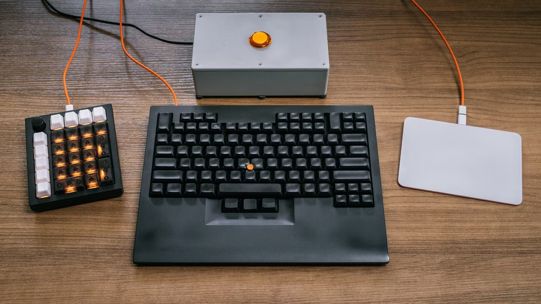
If you look at the keyboards on my desk, they all appear blank…
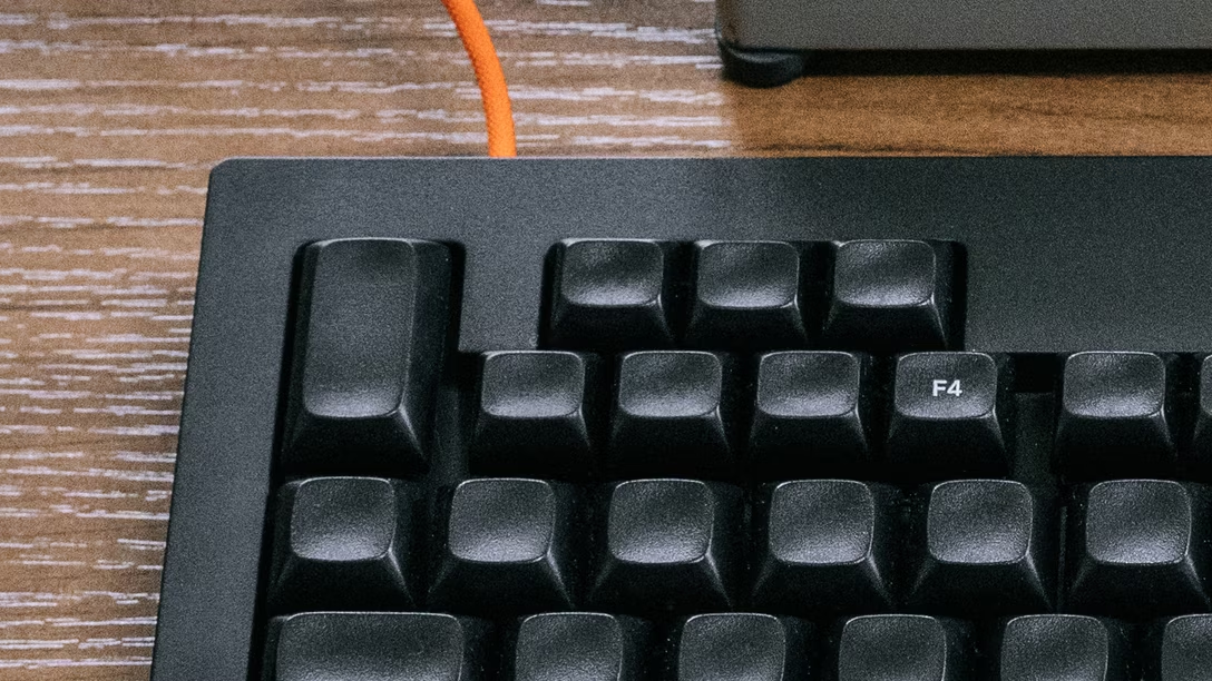
…with one exception:
Repeat was fantastic. I wanted it as a user elsewhere. Then, as a designer, I wanted it for my users.
In time, I learned to appreciate other things like it, but both the solitary legend on my keyboard, and the current favicon of Unsung, are an homage to the original, 1997’s Repeat. (Original to me, at least. Repeat existed in Office 95 too, and perhaps in some other apps before that.)
If I got to spend my entire professional life designing hard-to-make, invisible things that make other people feel powerful and awesome, it would be a life well spent.
Tuesday, July 21 / #above and beyond / #flow / #keyboard / #unsung heroes
“Something seems to be going crucially wrong with the frame rate.”
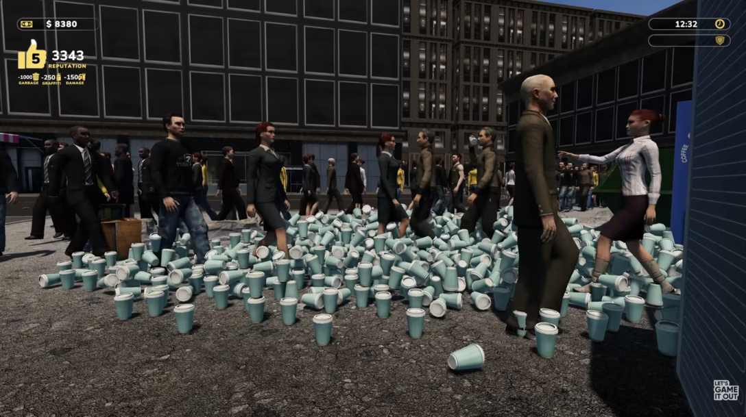
Let’s Game It Out is a YouTube channel where Josh Knoles occasionally grabs a modern videogame and tries to play it in a particularly creative way – finding bugs, breaking things, doing an action more times than anyone thought possible. What makes it even more fun is that what’s tested often are early access, unfinished games. Here’s an example 27-minute video of a game called Parking Tycoon:
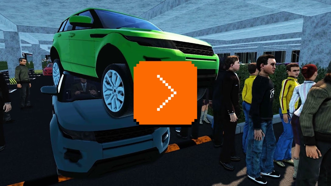
There are many more. I could tell you that occasionally putting one on teaches me something about bugs or lets me put myself in the mind of a very inventive user. Sure, occasionally, perhaps. But mostly these are just fun to watch.
Tuesday, July 21 / #bugs / #games / #humor / #youtube
Five moments in snapping history
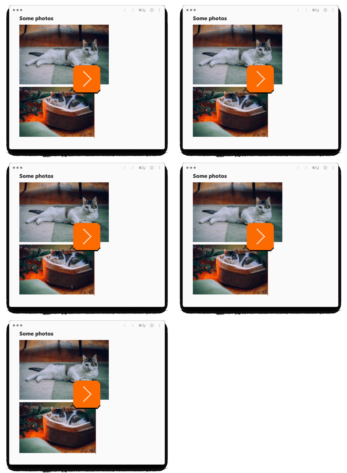
Bear (a notetaking tool) has simple image resizing, with one extra nicety – if your images are near each other, resizing one will snap to the width of the other:
In the Finder, columns snap to the width necessary to keep all the names untruncated – and not one pixel more:
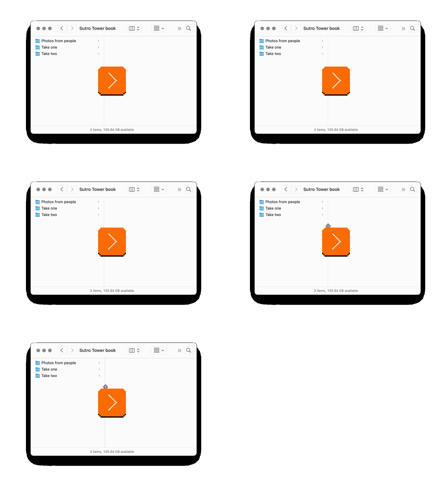
(Sidebar: This is also the only place I’m mentioning today that nicely uses the trackpad’s haptic feedback at the snap moment. I tried to indicate it in the video; this is not the final visual treatment I’m thinking of, but let me know if this kind of visualization of haptics feels useful to you!)
macOS does something really interesting when you get its windows close to each other. Instead of typical snapping – pulling the thing you hold toward the other item like a magnet – it instead prevents you from going further for a while, in either direction. Perhaps the right analog here would be glue:
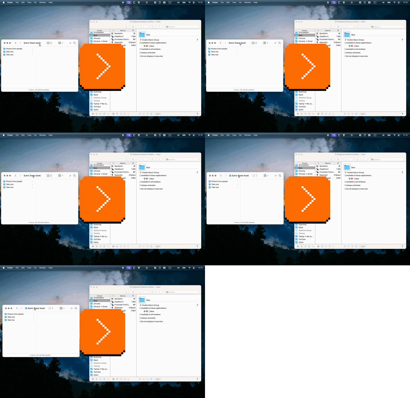
If initially feels a bit funny, but I think I like it. It’s less aggressive and avoids needing some sort of cancellation (an option or a modifier key) if you don’t want it, because it never feels in a way.
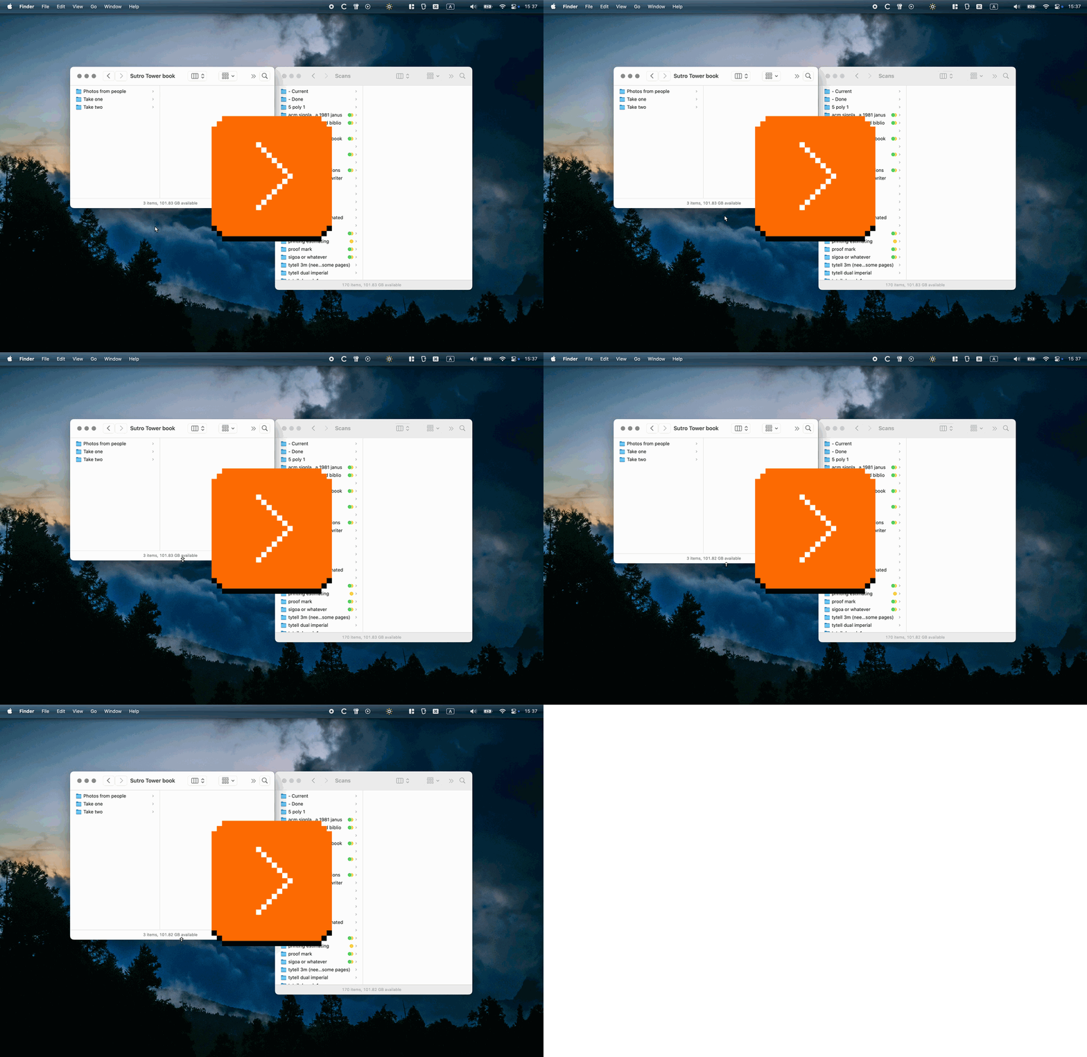
It also works for matching heights, like in Bear:
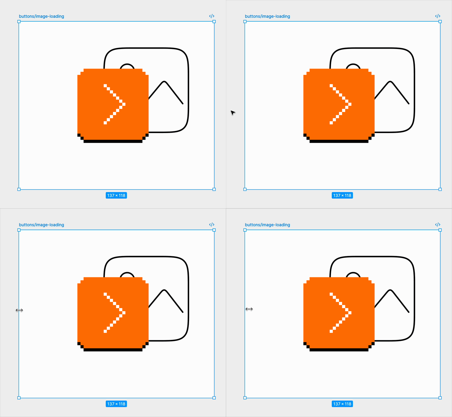
In Figma, building atop regular snapping, we introduced something I awkwardly called “self-snapping”: if your objects are inside a container, the container will snap its padding to whatever it sees on the other side, without any explicit auto layout/flexbox:
I am sharing these five examples (and one from before) because I think they exemplify a nice thing: precision without bureaucracy. In each case you could imagine an explicit heavy option somewhere in the menu…
- Bear: Set Image Width…
- macOS: Match Window Heights
- Finder: Restore Column Width
- Figma: Unify Padding
…that would feel slow and cumbersome.
Instead, these take the freedom of direct manipulation and sprinkle just enough almost-invisible structure in a moment where that structure is undeniably useful. (Of course, you still might want explicit options somewhere in the menu or your command palette, if only for accessibility reasons.)
I like that these quiet features have your back and make you look good, and that their creators understand that something almost aligned can feel worse than something completely misaligned.
Monday, July 20 / #bear / #complexity / #direct manipulation / #interface design / #mouse
“Try quickly typing 1+2+3. I bet you won’t get 6.”
Earlier this month, I talked about a rotation button in photos that behaved really nicely in iOS, and not so great on the Nothing Phone. Here’s a story of a similar fumble iOS once made that might bring the point home even more.
The calculator app has been preinstalled on iPhones ever since their debut in 2007. For the longest time it hasn’t been anything more than a standard four-function calculator with a decades-old feature set. If you’re not careful, however, you can mess up even that.
Ten years into iPhone’s history, iOS 11 introduced a problem just like the Nothing Phone rotation – quickly tapping on keys would show them as responding, but the actual action wouldn’t be registered. Michael Tsai’s aggregator’s first entry has a video from Stephen Heaps:
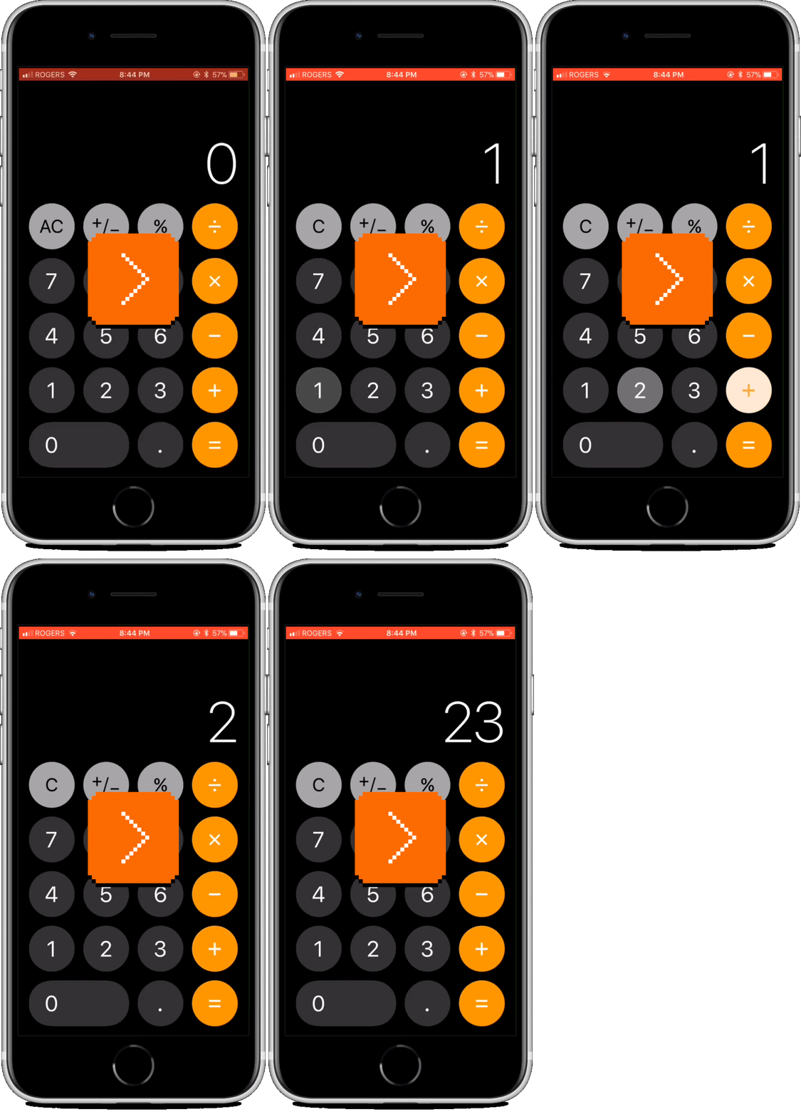
It shows typing 1+2+3+4 where iOS forgets one press of +, resulting in 1+23+4 = 28. Many more people posted about it afterwards, and showed various other examples.
It is oddly enthralling to see a computer fail at basic math. But what’s particularly historically interesting and perhaps even more embarrassing for Apple is the absolutely rich history of solving this kind of a problem.
Calculators evolved alongside typewriters as the earliest devices with button-like (as opposed to piano-like) keyboards. But the stakes were different.
Imagine a badly constructed typewriter and all the ways it can disappoint you: the letter might be faint if you press the key lightly or puncture the paper if you press it too hard, the output might be misaligned, or the typebars will jam in some way, forcing you to go again.
A typewriter has to work hard to divvy up a blank, analog piece of paper into a reliable, pleasant-looking grid via escapements, ratchets, and so on. But a calculator’s work to convince the analog world to be digital was much more important. After all, it’s not likely that the typewriter key you pressed will output the wrong letter – but on a badly constructed calculator, a light press of 5 could absolutely output 4, or 6, or 4.5.
And, while the typewriters only take your words verbatim, the calculator’s job is precisely to create new numbers out of the numbers you type. An imprecise mechanism can mess up that math. A jam could perform a partial or nondeterministic calculation. Adding 1 to 999,999 and the force necessary for the resulting cascading carry could break a device in the middle of work.
On top of all that, languages have a built-in redundancy. Evn if yuo mak many typoes, th sentece can stil be understod. But all numbers basically look alike. A calculator could make a mistake when it comes to a number that is absolutely vital for your payroll, for engineering, or for navigation – and you would never spot it.
Understanding all this, many calculator makers even already in the 19th century spent a wild amount of effort convincing people not just that their devices were helpful, and fast, and easy to use, but also that they could be trusted. Buttons were carefully weighted. Comptometers came with a locking mechanism. If a machine felt something didn’t go right, it would stop working and require a hard reset. The message was: “You can trust me, because I won’t ever show you bad math, and I’ll stop myself before I will ever lie to you.” Charles Babbage was so confident in his Difference Engine that he welcomed people to try to mess with its mechanical wheels in the middle of the calculation, convinced that even a sabotaged machine won’t ever make a mistake.
Just like with the Selectric decades later, those things were solved by people who cared, in the much harsher mechanical conditions.
Of course, I don’t expect everybody at Apple core iOS team to be a calculator UI historian (although it would be nice for at least one person on the team to be one!). It is embarrassing that no one on the team had enough imagination to realize that making a button respond to a quick press during animation, but not register it would cause all sorts of serious trouble. (The bug was fixed in iOS 11.2 by removing the animations, and subsequently the animations were brought back without the original problem in iOS 11.3.)
But maybe the bigger embarrassment is that Apple didn’t have a battery of tests to run on top of the UI at various speeds, mimicking fingers of what must be millions of people using the calculator app. That, too, has been a standard procedure for decades.
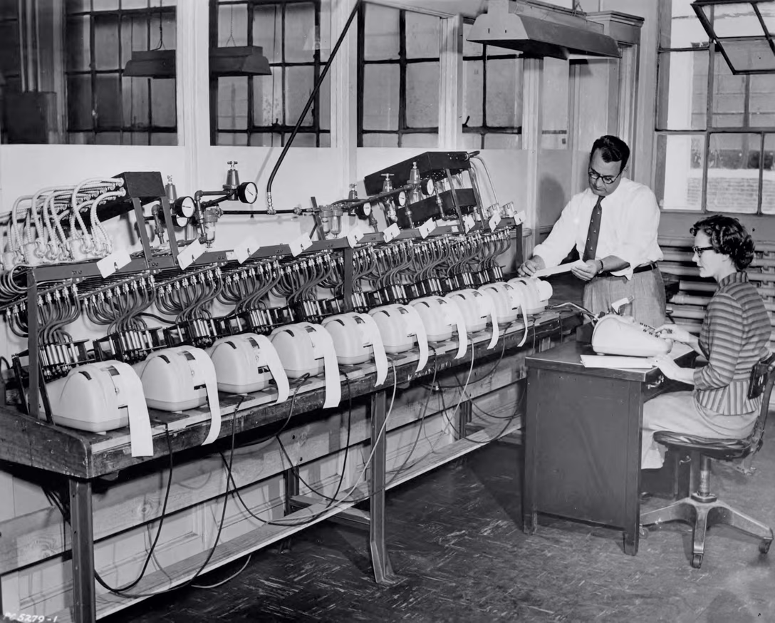
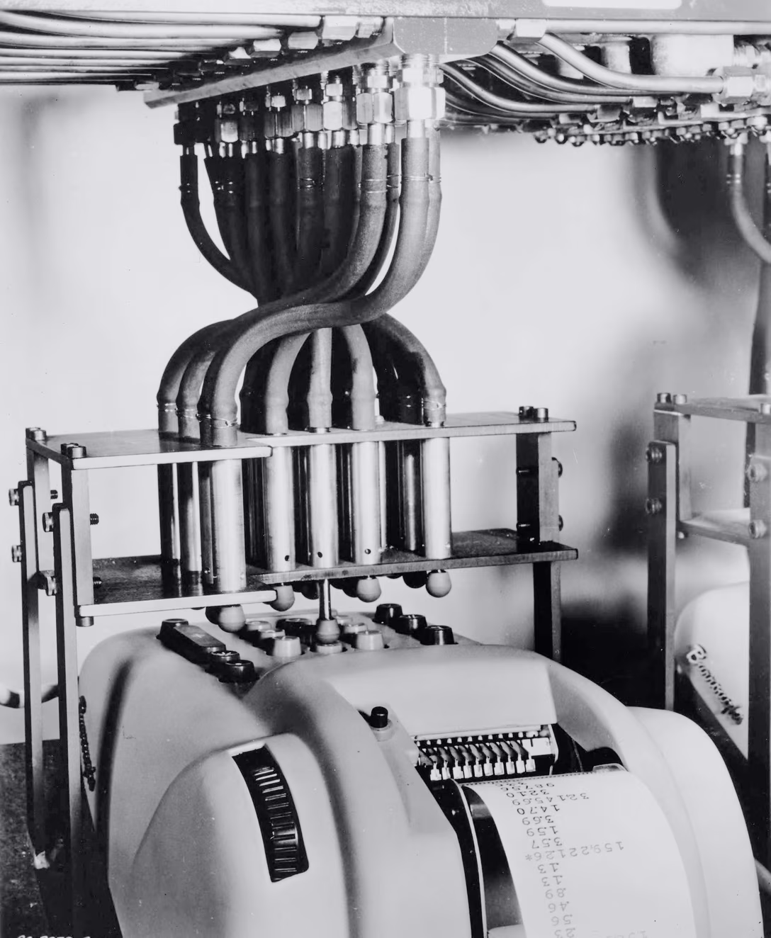
Those tests seemed missing in 2017. I hope 2+3+4 years later that’s no longer the case.
Monday, July 20 / #apple / #bugs / #flow / #history / #real world / #touch
“Is this acceptable? Not really. Is it understandable? Absolutely.”
When you visit parts of the website of the Driver & Vehicle Licensing Agency in the U.K. outside of standard office hours, you will see this:

It seems ridiculous, almost like the famous 500-mile email bug, but Dafydd Vaughan explains how it came to be. It won’t be a surprise that the story starts with an old computer system, built around a day/night cadence where people would visit the agency during the day, the information would be collected, and all the data processing would happen overnight:
At the time, many of DVLA’s services – particularly those relating to driving licences were still backed by an old IBM mainframe from the 1980s – fondly known as Drivers-90 (or D90 for short). D90 was your typical mainframe – code written in COBOL using the ADABAS database package. Most data processing happened “offline” – through batch jobs which ran during an overnight window.
The team upgrading it in 2013 decided to not attack too many things at once, and swap the innards but keep the day/night system intact.
I’ll let you read some details inside if you are interested, and if you want to learn why the 2013 decision is still a 2026 (or at least 2025) reality. Like many of these, it is a story of heavy financial and technical constraints. But I will excerpt this bit, because I think many teams in any company – design systems, security, or “core” (whatever that happens to be) – would relate to it:
It’s difficult for an organisation to keep its focus and attention on a complex upgrade – particularly without getting noticeable benefits along the way.
The tricky part is that in many places you do end up in a legacy situation that is exactly as absurd as “an internet service having opening hours,” but you might be too close to the problem to even realize it.
Sunday, July 19 / #maintenance / #software evolution
“Maze of pages, redirects, and confirmation emails”
Nikita Prokopov on his fun Tumblr-like site Grumpy Website that collects UI transgressions with light commentary:
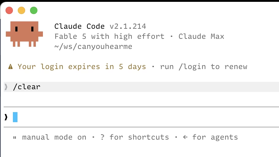
Why log in when you have to, when you can instead experience the same Kafkaesque maze of pages, redirects, confirmation emails, copying codes, and searching for a second device—all a week in advance?
I agree with authentication experiences being absolutely horrible, especially in the corporate context. But I think the “your login expires in 5 days” callout is actually positive. Your reauthentication will happen anyway according to the security regimen. Instead of it potentially surprising you at a wrong moment – for example just before, or in the middle of the presentation in front of a boss – you could get ahead on that process during the next moment of downtime, and have some peace of mind.
I know Slack has a similar warning, although I don’t happen to have a screenshot handy; I imagine a few other places do, too.
(However, that gesture doesn’t give apps permission to handle expiring credentials badly. There should be no excuse for losing anything the user is doing – for example writing a long comment – just because the reauthentication kicks in in the middle of them doing that. Even the app losing its mind for a while just as its separate parts are waking up to the reality of reauthentication at their own pace and throwing strange errors, but the login screen hasn’t reappeared yet, can be really confusing.)
Sunday, July 19 / #attention / #nikita prokopov / #security
The Swiss Cheese model, pt. 1
Have you head of the Swiss Cheese model? You see it sometimes in descriptions of how complex systems fail. The visual usually goes like this:
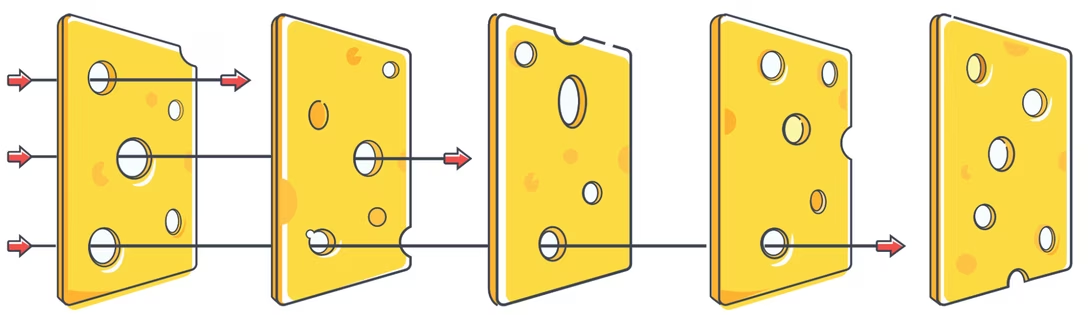
The whole idea is: even if you have multiple layers of safety – like many slices of cheese – there are always holes in each slice. Typically, a hole in any slice is covered by a non-hole in the previous one or the next one. (For example, a car might not allow you to grab your keys if you have not shifted to park – or, if you start driving with a handbrake on by accident, the car might yell at you.) But occasionally, the holes just happen to line up, and a larger disaster strikes.
The model is used in analyses of past accidents, and prevention of future ones. It has proponents and detractors. It’s hard to talk about its applications because the most common examples are horrific. In my book, I wrote about Therac-25, and that was a really unpleasant chapter to research and to write. Other go-to case studies are equally bleak: Chernobyl, Challenger, the Tenerife airport disaster, the Deepwater Horizon explosion.
But I wanted to share it because in my head it applies to UI design also, and sometimes helps me think of how small details add up to a larger whole.
In this first part, let’s start with a more traditional example, although a non-drastic one. Here’s a story of Knight Capital Group, a financial services and trading firm. I’m going to hand off the summary of the accident to Henrico Dolfing:
On the morning of August 1, 2012, Knight Capital Group opened its systems for what should have been a routine trading day, yet within minutes the firm began sending a flood of unintended orders into the U.S. equity market, buying high and selling low across dozens of stocks in a pattern that made no economic sense and could not be stopped through normal controls. What initially appeared as unusual market activity quickly escalated into a systemic failure inside one of the largest market makers in the United States, with algorithms behaving in ways that neither traders nor engineers could fully understand in real time. […]
By the time the issue was identified and the system shut down roughly 45 minutes later, Knight had generated more than 4 million executions across 154 stocks, covering approximately 397 million shares, and accumulated positions worth billions of dollars, resulting in losses of more than $460 million […]. The scale of the incident was not only financial but structural, as a single deployment failure had propagated through a system responsible for a meaningful share of U.S. equity trading. […]
Here’s what happened.
Long ago, the firm built a pretty boring function called Power Peg to automate some transactions. The function used a standard shared limiter that made it stop executing when all the required transactions were fulfilled. After some years in use, the function was deprecated in 2003 and stopped being used then, but crucially, the code was never actually removed.
Some time in between 2003 and 2012, the limiter functionality was upgraded, and the old code stopped being compatible with it. All code in production was rewritten to use the new limiter, but the Power Peg feature wasn’t, as it was already deprecated and not in use.
In 2012, the firm started writing a new program for automated transactions. Its creators decided to reuse the same software flag that previously activated Power Peg. The existence of the old code was known at the time, and the idea was that the code would be overwritten by the new program, so the reused flag would only trigger new code.
In July 2012, the new code was finished and the firm started to install it on all the servers, overwriting Power Peg. The firm intended to deploy the new code to all eight servers, but a mistake resulted in it only arriving on seven servers.
No one caught that mistake.
At this point, you can piece it all together. At this point, I imagine many of you have been wincing more and more with each passing paragraph.
On August 1, the flag for the new functionality was turned on. Everything was fine on seven servers, but on the eighth one, the flag reawakened dormant code that immediately started executing. As the old code was not compatible with the new limiter, it was never limited, cascading into millions of transactions in less than an hour, and a lot of collateral damage; the subsequent market reaction to the news of the firm losing over $400 million and caused its own stock to tank.
Oh yeah, I didn’t mention this yet – the failure killed the firm. (Well, it resulted in a merger, but that seemed to be a way to save face after Knight Capital Group almost went under.)
How does the Swiss Cheese apply to this? You can see it as five holes in five different slices of cheese:
- it was a mistake to not actually remove the old code
- it was a mistake to reuse the same flag
- it was a mistake to not deploy to all 8 servers
- it was a mistake to not have a procedure for someone to double check the deployment
- it was a mistake to not have a way of auto-detecting (and perhaps auto-stopping) the runaway processes when the regular limiter failed
What’s important to understand about this model is that either of these in isolation would objectively be a small mistake, and caught by the other slices. As a matter of fact, any four of these happening would still not add up to a catastrophe.
But in this case, the five mistakes lined up perfectly.
Many analyses of such accidents blame a single event in the chain – in this case often the sysadmin that didn’t deploy the code to eight servers properly – but this is primarily because we like stories of individual agency, and are not well equipped to understand stories of systems. (Even Star Trek added a Borg Queen.)
That’s the accident eventually dubbed “a Knightmare.” More examples of systems closer to our hearts in following parts.
Saturday, July 18 / #bugs / #definitions / #system design
text.makeup
I am generally not someone who cares much for easter eggs (unless they come with interesting stories), but John Gruber’s one-liner made me pause for an unexpected reason:
Joanna Stern explains why this emoji is correct today: 📅. (This one too: 📆)
I thought the two different calendars was some trickery, but the answer is simpler than that. I did not realize that, inexplicably, there are two distinct calendar emoji: one for calendar, and one for a tear-off calendar.
The way I learned about it was to use a tool I made a few years ago called text.makeup:
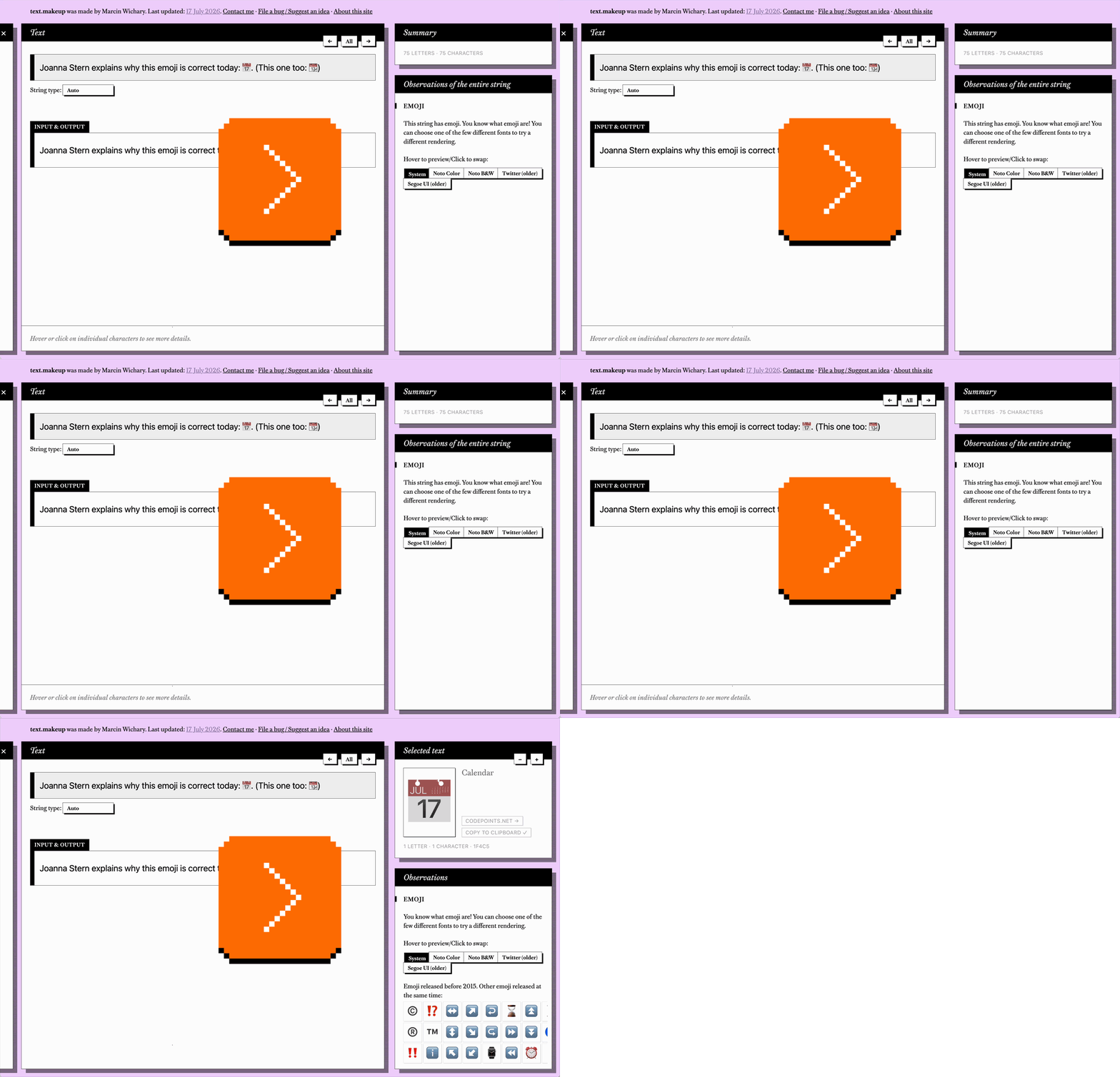
I thought this would be a nice opportunity to share it with you. If you’re debugging a string you don’t understand, or are just interested in learning about various Unicode or encoding secrets through playing (see the left sidebar!), it might be a fun thing to use.
I just updated it with the most recent emoji (and Unicode goodies) that will drop after September this year.
Friday, July 17 / #encoding / #marcin wichary / #toolmaking / #typography
“No such thing as too fast”
On Mastodon, Alex Russell, a product architect who’s worked on Chrome and Edge, and has focused on tech standards for a while:
Once Upon A Time At Google, a team presented results that had confounded them: making the system load several times faster increased engagement somewhat, but in line with Tammy’s findings, engagement went way up for every 100ms improvement below the 1s threshold.
Going fast enough to become “dial tone” changed user behaviour and expectations in a hugely positive way for the product.
This sort of “no such thing as too fast until you prove it” lesson is everywhere.
Phrasing it as “no such thing as too fast” is really interesting, and not something I encountered before.
(The way I understand the “dial tone” remark is commenting on reliability of landline phones in the second half of last century. The landlines were extremely reliable and even came with their own power source; you could pick up the handset and the dial tone – the system’s confirmation it’s ready for you to dial – was inevitably and immediately always there, already waiting for you. There was never any delay when the phone had to get ready for you to call.)
Russell links to a report by Tammy Everts:
If you make websites for a living, stop what you’re doing and read this research by Tammy Everts; it shows what many of us have been saying for a long time: even if there is such a thing as “fast enough” (there isn’t), it’s generally much faster than you are targeting.
The report itself is perhaps too deep and jargony for this blog, but the TL; DR seems to be: Google suggests the time for the site to finish loading its largest piece is 2.5 seconds, and Everts argues and shows evidence that it’s a lot less.
I have before focused on “finger speed” – making sure the interactions operate at the “speed of flow,” which requires sweating speeds counted in milliseconds. Everts’s and Russell’s comments confirm that millisecond-speeds matter for other reasons, too.