
“I just chose words carefully,” pt. 1
Welcome to this week’s digest of Unsung, a blog about software craft and quality. Here’s what was posted since last time.
This week’s issue had to be split into two because of a bug in Buttondown, my mailing list provider. I’m sorry about this!
View this issue in the browser with inline videos and better formatting
“They had no concept of a duty of care to their users.”
A Mastodon post by computer scientist David Chisnall has a very Unsung opener:
I have used vim since around 2000. I have written five books, a PhD thesis, a few dozen papers and over 150 articles with it. At this point, my higher brain functions are not engaged at all when I use a bunch of common vim commands, they just happen. Documents I wrote with anything else have random :w in the middle.
Chisnall goes on to talk about one specific vim feature:
Persistent undo is one of my favourite features of vim. […]
I don’t often need the persistent undo. But on the few occasions when I have needed it, it’s been invaluable: ooops, I deleted something from this file, maybe last week and one reboot ago, what was it? Undo until I find it, copy it, paste it into the current version. Or, a bit more commonly: I had this working, then I tidied it up ready to commit, now it isn’t working, what did I do?
Vim has kept this working across major version upgrades over a period of about 20 years. I don’t even think about it, it’s just part of Raskin’s First Law: A program may not harm a user’s data or, through inaction, allow a user’s data to come to harm. If vim or the computer crash, or if I close a file and come back to it six months later, my undo history is still there.
NeoVim is a fork of vim (in news for other reasons):
So I tried NeoVim when it was quite new. Vim that you are familiar with, but better? Great!
The first thing I noticed in NeoVim was that undo didn’t work. I tried opening the file in vim and undo didn’t work there either.
Neovim had changed the format of the undo files. It hadn’t upgraded the old one. It hadn’t used a different name for its undo files. It had just noticed the existence of a vim undo file, deleted it (losing all of the data in it) and replaced it with one that vim couldn’t read.
I raised an issue about this and was told that the persistent undo format was unstable and users should not rely on data being preserved in a feature explicitly called persistent undo. It had changed once and would probably change again.
And that ended my experience with NeoVim. The authors showed immediately that they absolutely could not be trusted with any of my data. Breaking persistent undo is something I could forgive as a bug, but the attitude that just because something is a persistent file on your filesystem that contains data that you might want is no reason for their program not to delete it meant they had no concept of a duty of care to their users.
I liked this post (which I quoted almost in its entirety), because it covers a few important things:
- I have never heard of the persistent undo like that, and it seems kind of amazing.
- People do remember when software loses their hard work or disrespects them.
- I can see how “It had changed once and would probably change again” can be such a powerful feeling.
I also loved it for the appearance of Raskin’s First Law. Jef Raskin, of Macintosh and Canon Cat fame, put together the three laws in his 2000 book The Humane Interface, and they go as follows:
- A computer shall not harm your work or, through inaction, allow your work to come to harm.
- A computer shall not waste your time or require you to do more work than is strictly necessary.
- An interface is humane if it is responsive to human needs and considerate of human frailties.
It was a very important and formative book for me to encounter as a young designer. I have no idea how these laws haven’t made it to Unsung before today.
Friday, August 28 / #change management / #principles / #text editing / #undo
“An absolute bare minimum of interactivity”
I mentioned Atari’s Pong recently, a game often considered to be the first videogame ever. It wasn’t, and as a matter of fact, it was a clone of one of the games from the first home console Magnavox Odyssey, released earlier in 1972:

This is a 34-minute video by FrameRater walking through the console and all of its strange games:
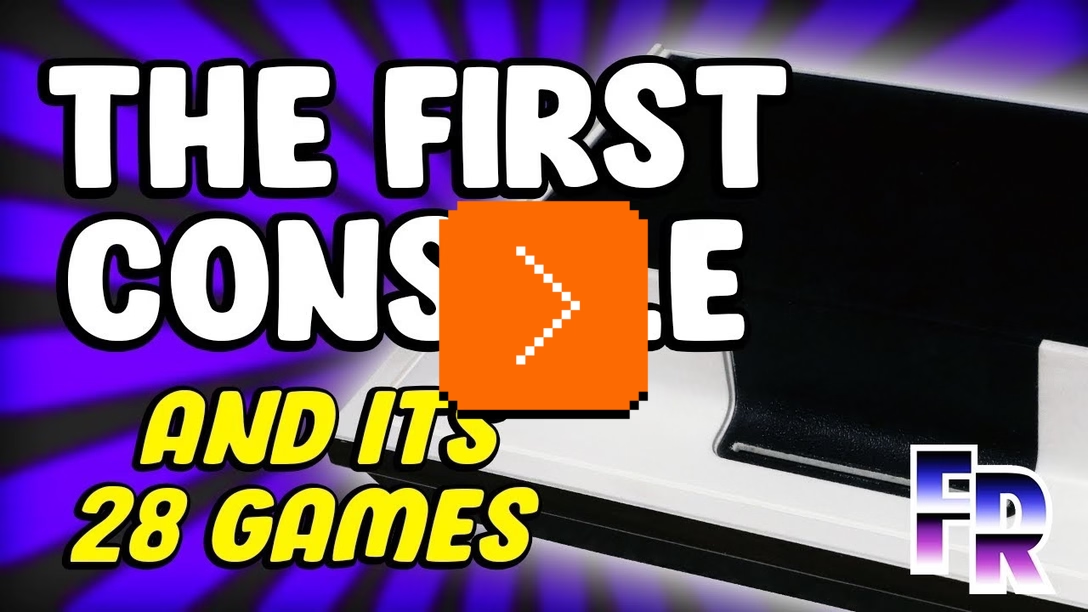
I found it a very interesting case study. The Odyssey had a version of Pong before Pong – but it also had many other games that could be charitably described as “Pongs in disguise.”
It all feels very, very convoluted for such a simple concept. You have to insert the right cart, tape an overlay to your TV of a certain size (the roll of tape is included), and understand the complex and poorly written instructions in the manual. Then, during the play time, you’d have to master the very strange controllers (left dial – horizontal movement, right dial – vertical movement), often do a lot of work that the console didn’t do (keeping track of collisions, or even scoring!), and deal will all sorts of accessories in the real world, like included cards, dice, stickers, and so on.
You can admire the scope of this all – when life gives you Pong, you make a pongolade – but it all feels so clunky and convoluted, which the video catalogs in detail. But, in hindsight, it doesn’t matter if the included Pong (here, called Table Tennis) is good, right?
Reader, Table Tennis wasn’t good at all. It wasn’t just the strange controllers, but also the really weird logic where you could twist the ball already in flight:
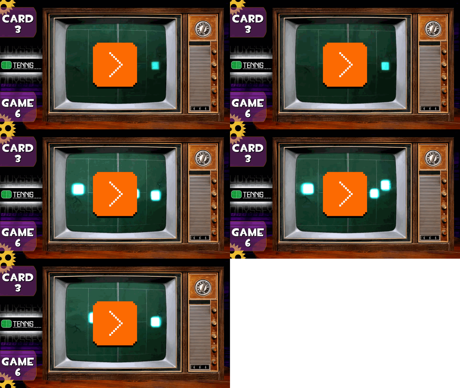
Only looking at this made me realize, some 50+ years too late, the true power of Pong.

Pong didn’t bother with many games, with complicated rules, with the breadth of it all. It just did one thing really, really well.
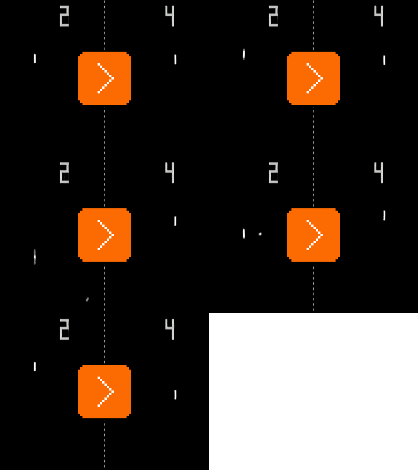
For the Odyssey, it seemed like a lot of games were about mastering the controller. For Pong, it was only ever about mastering the game. The interface was simple: you have one dial, so rotate it. The game was fun to play, with its logic both challenging and predictable. The instructions were sparse and barely needed anyway. There was automatic scoring, which Odyssey didn’t have. There were also sounds – turns out, people really liked sounds.
The Odyssey was clearly an in-betweener, a complicated hybrid device weighed down by its well-intentioned maximalism. Pong was simple, attractive, optimized to the bone. I feel that it offers universal lessons, feeling eerily similar to iPod’s release in 2001 – focusing on just the few things that mattered, and doing them really, really well.
Friday, August 28 / #complexity / #craft / #games / #history / #youtube
“We want it to really confuse people, but also really make people happy.”
I often link to John Gruber’s Daring Fireball posts with a nod, but this time around I want to offer an opposing point of view. About a month ago, Gruber linked to a Markdown editor written by Sean Malseed in 2026 for the early 1980s Macs, and commented:

I absolutely love that this exists. I don’t like the actual app at all. I guess “full screen” mode is the point of some “distraction free” editors, but I for one would never look twice at a Mac app that didn’t use windows. Full-screen mode just wasn’t a thing back then, except for games. ArtfulType is not a Mac-assed 1984 Mac app.
I posit: It doesn’t have to be. It’s not 1984, after all.
I actually really loved the creator of ArtfulType bringing back a few pieces from the future into the past: the fullscreen/distraction-free editing, the dark mode menu bar, the shy scrollbar. Those anachronisms felt exciting to me. They made me wonder: What if dark mode was invented decades earlier? What if Mac had a different windowing mechanism? What if we could do it all over again?
I recently linked to Sopwith, which felt interesting in the same way, and I thought I would expand on this and share a few favorite examples of similar projects that inspired me in recent years.
Playdate

Confession: I’m not a fan of Teenage Engineering. I find their products well-put mechanically, but lacking in thought and soul, a certain apotheosis of “capital D Design” that feels as incomplete as it is masturbatory. (Rabbit R1 was a perfect example, consumed by gimmicks and strange design decisions.)
Good news is that Playdate is not a Teenage Engineering project, and that it was actually initiated by the software company Panic, which gave it copious amounts of thoughtfulness and care. Playdate is a 2022 handheld game console, and a fun little device that’s intentionally anachronistic. Its design picks the best parts of each decade: the gadget excitement from the 1980s, the onscreen aesthetics of the 1990s, the social internet of the 2000s, the explosion of indie games from the 2010s, all wrapped in contemporary build quality.
Playdate is partly made out of metal and pleasant to hold and touch in a way no vintage gadgets ever were – this is where Teenage Engineering does deserve a credit – but sports an old-fashioned monochromatic display that seems to be harking back to the darkest years of the first Gameboy… which is very, very deliberate:
I love the black and white, 400 by 240 pixel Playdate screen. I kind of like don’t want to design in anything else anymore,” says [Panic designer] Neven [Mrgan]. “It is so freeing for me, personally, to not think about the color and not think too much about, like, even things like line weight and whatnot. ”
The quote is from a long read about the Playdate’s inception (also available as a well-made podcast ep), which is worth checking out.
Playdate’s games are equally spread across time as if in a horrible time travel accident – some with simple mechanics utilizing the gimmick of a crank, others with much more modern or artful sensibilities. Many, confusingly, with both. Some also come packaged in a novel system of seasons, where the games drip onto your machine at a pre-determined rate, meant to mimic surprises and serendipities one could encounter in record and software stores of yore.
PICO-8

I’ve been profoundly inspired by this talk by Joseph White, explaining his “fantasy console” called PICO-8, introduced in 2015:
PICO-8 is Playdate abstracted away. It flips the world order on its head – emulators are known to emulate existing hardware, but what if they emulated imaginary ones? Why not imagine a gaming console that was never made?
The wild part of this approach is that it automatically gets rid of a lot of unnecessary nostalgia, focusing instead on crafting “hardware” and software precisely calibrated to achieve things White wanted them to achieve.
PICO-8 has a puny 128×128 resolution that makes Playdate feel like IMAX (although with very deliberate 16 colors), and many other constraints that would feel ridiculous even 30 years ago. They are, once again, brought back from the past intentionally – chiefly, to avoid “design fatigue.”
At the same time, PICO-8 doesn’t revel in the past – it also comes with built-in suite of tools, and support for modern keyboard and mouse for development. Its cartridges are not only a single file to allow easy distribution on the web or otherwise – they’re also literally baked into PNG files so the spreading can be even easier.
From a 2016 AV Club article:
White’s software chimera works because he understands where nostalgia ends and the needs of modern development begin. PICO-8’s idiom, for example, is a custom subset of Lua, an easy-to-approach language likely familiar to many game programmers, whether they script emulators or use the free 2D engine LÖVE. Though PICO-8 initially ran BASIC to stay true to its ’80s pedigree, White switched because “Lua has a small footprint and is portable and quite fast. I think any language could have worked though, as long as it allowed the user to mess about in an unstructured way without worrying about programming style.” PICO-8 Lua feels snappy and sensible. There are just enough functions to get up and running quickly without the bulky overhead of complex libraries or object-oriented syntax. Need to draw a sprite? Provide an index and two coordinates. A circle? Coordinates, radius and color. It’s fast and friendly for programming beginners.
The conference talk above and the design of PICO-8 are dripping with intentionality; even the startup chime is meant to evoke a feeling. At some point White went as far as to consider whether his console would glitch nicely if its software was buggy, and then mentions “I designed a [more advanced] PICO-16 just to remind myself to not make that” – a really interesting technique to help him zero in on what he really wanted.
White also expressly states “I value design over content,” which is another thing his project has in common with Playdate.
PICO-8 saw all sorts of software developed for it since 2015 that you can all play online – from the absolute platforming classic Celeste, to a series of unofficial “demakes” like WarCraft III, complex games like SlipWays, or even tools like PicoCAD. The hardware is confusingly powerful enough for Poom (a clone of Doom) to exist, but then there’s also tons of delightful tweetcarts, cartridges whose code used to fit inside a single tweet.
Infinite Mac

PICO-8 started as an emulator for an imaginary thing. Infinite Mac, despite emulating really well-known Macs from the 1980s and 1990s, can also inspire in its imagination.
Made by Mihai Parparita in 2022, Infinite Mac is all about focusing on the right details. Emulators of vintage Macs existed before and, as a matter of fact, Infinite Mac uses those very emulators under the hood. But the glue that holds them together is Infinite Mac’s real and wonderful contribution.
If you’ve ever used an emulator, you know they are usually incredibly unpleasant to set up. You have to find a ROM that fell off of a back of a truck, set up the drives and the media inside, and fight with the poorly-designed settings and a UI that often feels like an afterthought, with the whole thing often feeling more rickety than the very 40-year-old machine it’s trying to approximate.
Infinite Mac awaits you in the browser, literally two clicks away counting this one (there is no step three!). It doesn’t show all the possible options, but curates the most useful machines instead.
The emulation is precise but Infinite Mac also – and this is my favourite thing – breaks the fourth wall in some truly useful ways. You can drag a file into the emulator and it just does the right thing with it. You also set up a magical folder that connects to the host machine both ways, in a way that was simply impossible to do back in the day.

There’s also a CD drawer underneath, and a wonderfully seamless integration with Macintosh Garden’s library of vintage software.
It‘s the same story as with Playdate and PICO-8: a lot of intentionality and effort and cherrypicking so you get the best of an earlier experience without the worst of it. Pick a Mac, and use it without worry; Infinite Mac keeps the Macs both faster and more reliable than they used to be. (In a beautiful repudiation of modern software practices, I have heard of people who launch Infinite Mac to write in old word processors not just because they’re simpler, but also because they’re faster than the modern native apps.)
Parparita occasionally writes about the project on his blog; those entries are rather technical, but sometimes also highlight various design considerations (I particularly enjoyed the NeXTSTEP entry).
Epilogue
I was at the Vintage Computer Festival West recently, and for the first time I noticed how many young people were there. This got me excited. It’s one thing to revisit those old machines just to relive your own years of (likely imagined) glory, but yet another to see people see them as inspiration: to encounter computers that were simpler, unencumbered, unenshittified, and with software you could understand, remix, and own.
I hope some of those people find inspiration in the past without succumbing to it as a whole, pushing and pulling on it like the creators of Playdate, PICO-8, and Infinite Mac did.
I think that kind of push and pull is important, especially today. I don’t love using Google Sheets, but my favourite spreadsheet is not Excel 97, either. My favourite spreadsheet is some hypothetical anachronistic version of Excel 97 that also has modern high-dpi typography, and a ⌘K command palette, and today’s trackpad gestures, and support for AVIF and HEIC.
Of course, there is immense value in studying the past just so we know what was already made or just explored, what is worth being aware of, and what could deserve remixing. But it’s not great to get stuck in history.
When you venture out to do some time travelling, you get the booklet with all the rules: don’t interact with another version of you, don’t flirt with your mother, definitely steer away from any butterflies. I love that these projects, and others like them, ignore all those rules.
The title of the post comes from the Playdate’s making of essay.
Friday, August 28 / #above and beyond / #conference talk / #dark mode / #emulation / #history / #panic / #podcast / #youtube
“I just chose words carefully.”
I don’t think anyone particularly enjoys typesetting in monospace.
Regular text is okay – at least as okay as it can be:

Right aligning is also fine, as long as you don’t mind counting spaces, but centering already gets tricky, as you don’t have a half space to make things truly even:

And full justification is where things get particularly weird. The spaces are just too large, and cannot be distributed evenly, creating a really unpleasant feeling:

The solution used in typesetting elsewhere is hyphenation, but in monospace hyphenation also feels unpleasant, with the hyphens drawing too much attention to themselves (and subsequently messing up copy and paste):

This is why you don’t see full justification in text files very often.
But there is one more option. You can rewrite the text to choose only words that precisely add up to the line length to avoid any double spaces.
This is exactly what rs1n did in the late 1990s for his guide to Super Metroid:

It’s astonishing, as it goes like this on for 17,000 more words, each right margin perfectly ending on a letter, no twin spaces in sight.
The author lightly covers in the FAQ at the bottom:
What program did you use to justify the text?
None. I just chose words carefully so that everything lined up on the right hand side. Everything was done with an ASCII editor.
I’m sharing this mostly as a curiosity; some rewrites for physical books are par the course to avoid widows and orphans, but you don’t see them as much in onscreen writing.
At the same time, who among us didn’t nod in recognition at least, having once spent hours massaging a button UI string or a tooltip just to get it to fit under the certain width in a densely packed interface?
Sunday, August 30 / #text editing / #typography / #writing
“This was not the first time the European Commission had attempted to correct for the permissions pollution.”
It seems sometimes that browsing the web these days is just constant closing of pop-ups and banners, and ignoring those that cannot be closed:
- old school modals and in-page ads,
- Substack-style “subscribe to my newsletter”on-scroll pop-ups,
- cookie banners and popovers,
- (relatively new) VERIFY YOU ARE HUMAN, HUMAN_ interstitials.
Yeah, it is somewhat unfair to bundle the cookie banners into this list, but stripped down to the user experience, they are a nuisance – the road to hell is paved with tiny, slow close boxes.
Nick Heer at Pixel Envy did the lord’s work of writing a succinct summary of recent efforts to fix this experience, and significant energy expended to derail those efforts.
At the core of it is the Kill the Cookie Banner initiative, which might be somewhat unfortunate naming; while companies like Meta want to get rid of the cookie banners altogether to avoid having to ask the user for any permission (automatic opt in to data collection), the initiative goes the other way, killing the banner but not its plumbing. It proposes an uber cookie banner inside the browser settings that the user could set up once in a “fire-and-forget” way, and all the sites would have to obey automatically without showing any annoying UI themselves.
The site also does a nice job explaining the problem and, if you are in Europe, offers a take action page.
Monday, August 31 / #attention / #nick heer / #web
“You can always click on the mirror icon to turn it into… a mirror.”
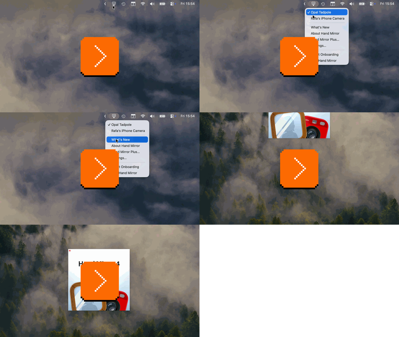
You know how much I love simple and clean release notes, and I just stumbled upon these supercasual video release notes by designer Rafael Conde, and they made me smile.
The video is just 45 seconds, and the following short thread is filled with a few other fun details of Conde’s app Hand Mirror. Particularly this one caught my attention – an about page mimicking software coming in physical boxes:
There’s a lot more delight and perhaps even sugar in these than I usually link to – but hey, it’s Monday.