
Let's have an art fight!
The devil squid is in the details
Hey friends, thanks for clicking in!
This week we’re talking about art, illustration and visual communication, and in particular the various uses of slop, stock, and collage. It’s going to get real German up in here, and also a little salty. I’m only going to mention fascism a little. There’s no way around it, though.
At the end, many fantastic sources of slop-free images. SO MANY.
Right after these messages…
[Past upcoming events snipped from archive]
If your team needs help with research, collaboration, or communicating across disciplines, get in touch about an in-house remote workshop, just for you.
Need strategy consulting, practice development, or anything else? We’re happy to receive your inquiry anytime: [email protected]
A Thousand Words
Belly up to the trough, we’re here to talk about slop, specifically illustration and photography.
The thing that put me over the edge last week was seeing multiple posts celebrating libraries as “the real data centers” accompanied by obvious slop images of libraries. Why? Why would you do that when, even on today’s internet, it takes just a few seconds to locate a photo of a real library you could repost. And then I thought, maybe it’s my problem. (Maybe I should spend more time browsing in actual libraries and less looking at my phone.)
Technology, society, economics, and visual communication have been intertwined for all of human history. Styles and standards change with the times and the context. And often when tools and techniques become more accessible to the masses, professionals and connoisseurs get itchy, and entire classes of work disappear.
Scribes weren’t keen on on the printing press.
In the 1980s, traditional commercial artists and typesetters thought desktop publishing was the end times. (I have a soft spot for 90s rave fliers. SF used to be ankle deep in pure graphic chaos.) Then it was the end times for all of print design when the web came along.
Is this just the latest iteration of painting is dead? Or yikes a train?
Yes and no. Mostly no.
It’s not the chatty linear algebra. It’s the labor exploitation, the lying, the moral injury to living artists, illustrators, and photographers, and the pollution.
It’s the overwhelming pressure to contribute to the conversation before you have something meaningful to say.
Visual communication is challenging because visuals are so compelling and they elicit so many emotions. The picture in your head, what you enjoy contemplating or creating, might not communicate what you intend to your audience, especially when placed in context. (The most effective interface is often dead boring in a portfolio.) This is why brand designers talk about the metaphorical (and often physical) landscape so much, and why graphic design is still a job. (Have you seen book covers lately? There is some gorgeous work out there.)
Most things are mediocre, or worse, by definition. So it’s not that slop images are simply mediocre, it’s that they are deeply, uncannily average in a way that’s hard to overcome, and there are actually easier and cheaper ways to communicate effectively, without the downsides.
It just takes a point of view.
A Case Study
I created probably my best known illustration ever for a November 2020 tweet.
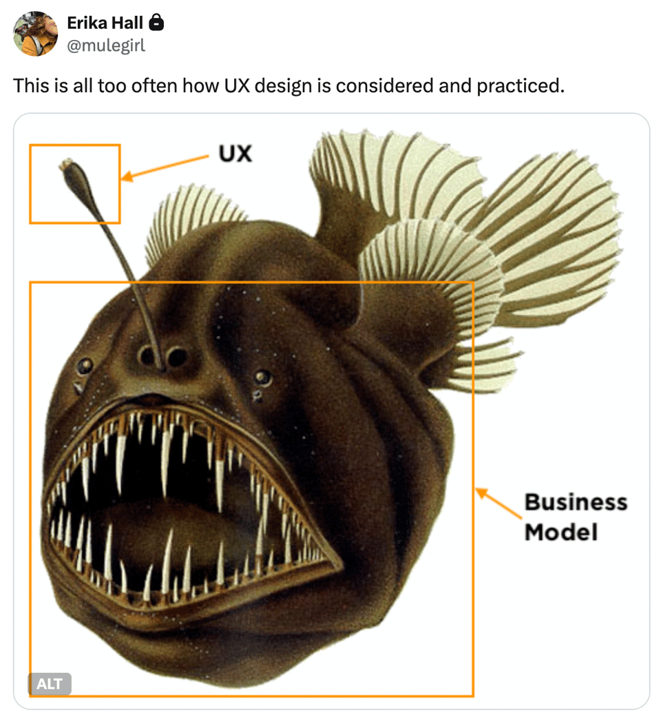
This has subsequently appeared in posts, books, and talks, attributed to me. I didn’t draw the menacing humpback anglerfish myself. That’s an illustration in the public domain I found on Wikimedia Commons. All I did was annotate the image to create a visual metaphor that I guess a lot of people have found resonant.
Once I had the idea, it required oh, say 5 minutes to find the right fish, because I’m fast at finding things (practice!). And maybe another 5 adding text and boxes in Preview.
No special talent required. Anyone could have done the same thing with any computer, or with a pencil and paper.
No one else did.
The unique value I added wasn’t in the drawing. (There are plenty of amazing drawings of anglerfish out there.) It was in what I was saying, my point of view (which is why so many people republish it with credit, and don’t just find their own fish to annotate).
You are free to annotate your own fish.
A glorious attribute of specific human artifacts (as opposed to the statistical likelihood of their attributes) is that they have provenance. They are more meaningful and valuable because of the circumstances of their creation and the happenstances of their ownership and use. These events connect us to each other over time and space, and participating in these chains of art and knowledge can make our little human lives feel so much bigger.
The Voyage of the Valdivia
When I initially sought my anglerfish, I only cared about the quality of the image and that it was clear to use. I was expressing something that popped into my head, not making a tweet for the ages.
Sitting down to write this, I got a little more curious. Who drew it? When and why?
Because Wikimedians are swell, the description was very helpful:
Humpback anglerfish (Melanocetus johnsonii), a species of black seadevil (Melanocetidae). From August Brauer (1863–1917): Die Tiefsee-Fische. I. Systematischer Teil.. In C. Chun. Wissenschaftl. Ergebnisse der deutschen Tiefsee-Expedition 'Valdivia', 1898-99, 1906
August Brauer was a German zoologist who participated in the "1898–99 German Deep-Sea Expedition (Deutsche Tiefsee-Expedition) aboard the steamer Valdivia under the leadership of Carl Chun. The purpose was to explore the ocean below 500 fathoms (3000 feet). There, now you (I) know what a fathom is.
In the mid 19th century, a Manx scientist named Edward Forbes had hypothesized that no life existed below 300 fathoms — the Azoic hypothesis. So then, of course, a whole bunch of other scientists went out on boats to prove him more and more wrong.
August Brauer was on the Valdivia expedition, but did he actually draw the anglerfish? Even after the invention of photography, scientists were often artists as well. I found multiple accounts of the expedition on the Internet Archive, which gave me my anglerfish in context with its friends, along with many other phenomenal illustrations. I don’t read German, but I suspected they had a dedicated illustrator.
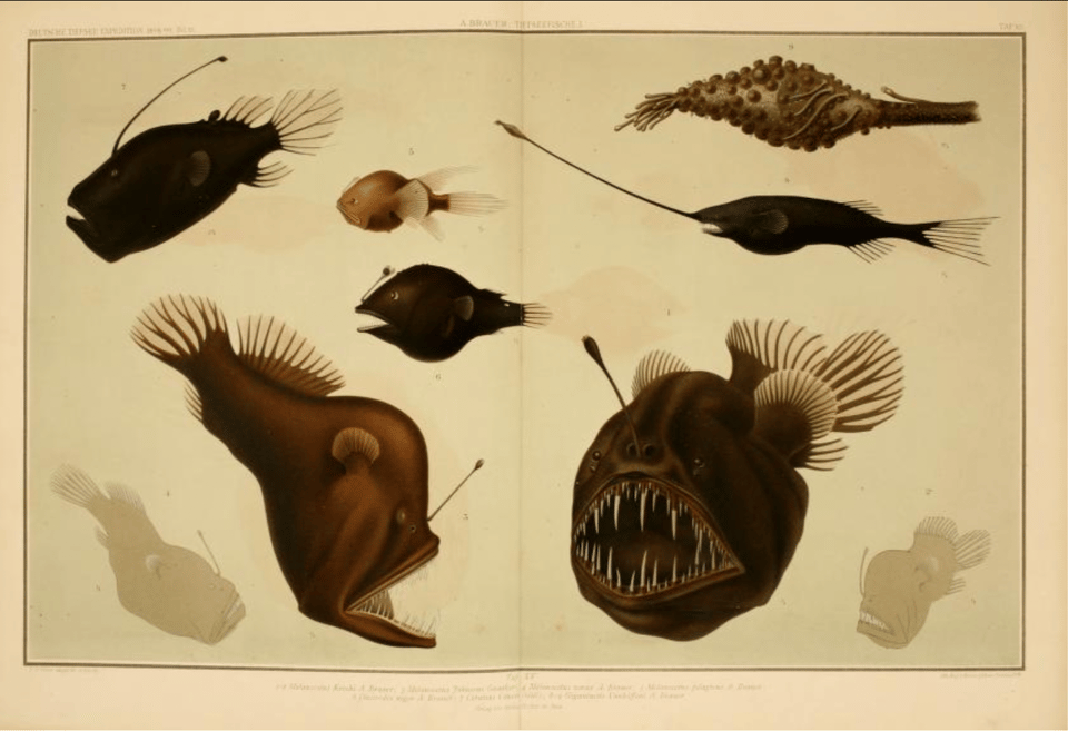
So, back to Wikipedia I went, where I learned there were 24 volumes of expedition findings, including Chun’s Die Cephalopoden in which he described the vampire squid Vampyroteuthis infernalis, the scientific name meaning "the vampire squid from hell".
I don’t know who designed the cover for this volume in 1900, but just look at it.

Turns out the expedition artist was zoologist Friedrich “Fritz” Wilhelm Winter, who was not the abstract expressionist Fritz Winter.

His take on all the weird stuff they found:
“One thinks that our Good Lord has hidden all the foolishness he has done in the depths.”
So, a belated thanks for that anglerfish, Fritz.
Maybe you had to be there, but it feels like we’re there again
I started using clip art when I made my first comics about karate fighting, because I was at a job and I couldn’t just draw. But I could sit at my computer, looking busy, but actually be making comics using clip art. I used to draw comics growing up, but I hated it, because it takes a long time and I really didn’t care about that element of it so much. I just liked the jokes and the dialogue. The clip art was so clean and efficient and quick that I just took to it.
— David Rees, interviewed in Mother Jones
Time to drink from the garden hose of Gen-X culture again.
For those of us who were online at the time, one of the most memorable works of post-9/11 dissent was Get Your War On by David Rees.
He channeled his grief, anxiety, and rage into a comic strip assembled from clip art and swears that started as a joke among friends, before it, uh, blew up into an extremely popular website updated daily, just like the terror threat advisory. When it felt like everyone in power was lying, the raw honesty of the text combined with the same few stock images reflected what it was like to go to work every day and perform normality in the middle of insanity.

A thing to remember about stock photos and clip art is that, while the imagery tends towards the blandly upbeat and sufficiently generic, it has historically been made by humans, many of whom are highly skilled. GYWO was certainly more effective due to the quality and level of detail in the renderings. It’s the same business guys (and women) over and over, but they are realistic, if slightly anachronistic, guys. Corporate Memphis would have hit different.
Most of the art came from Tom Tierney’s Office and Business Illustrations published by Dover in 1988.
“Just clip and use to add a professional touch to newsletters, reports, advertisement, catalogs, and almost any graphic project.”
Truly.
Tom Tierney is best known for his hundreds of books of meticulously researched and drawn paper dolls. Dover sold millions of his books. From everything I read, he found his niche and had a long and happy life as a working artist.
Be a braver bad
I understand why people who aren’t professional designers use slop images for their flyers, menus, and Threads posts. It’s cheap (minus externalities) and fun, feels fast, and the results are superficially polished.
I also think it’s good to provide feedback on a sliding scale of severity from, say, world leader to your grandma.
It’s the, let’s call them, communications professionals who get to me, the people who claim to be speaking from expertise but fail to demonstrate care for whether and how they are saying anything worthwhile and respectful of their colleagues and peers.
By the power of serendipity, also last week I stumbled across Jeff Greenspan’s post about Tibor Kalman’s manifesto.
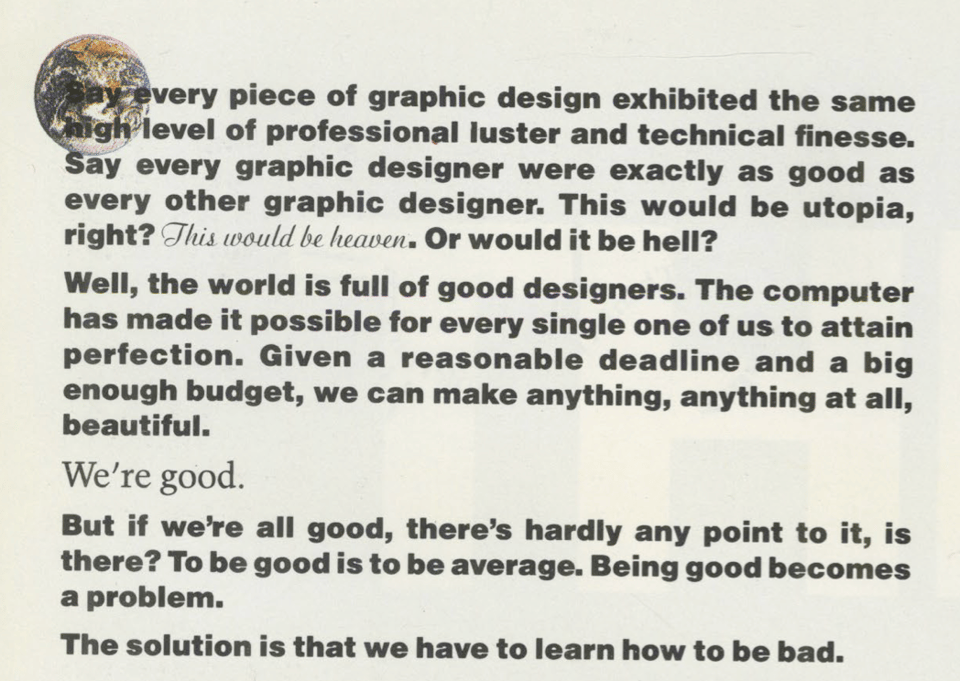
You may be more familiar with the legendary artist, writer, and dog lover Maira Kalman. Her husband Tibor Kalman was a legendary graphic designer. He was legendary for his point of view and for Colors magazine. Tibor died in 1999 when I was working at my first design agency job. I learned about his work, and got my own copy of Perverse Optimist, and then he was gone. The book is out of print now, but find one if you can. Benetton should just put all the back issues of Colors online.
We met Jeff at Beyond Tellerand in 2016. The experience of waking up on November 9th in Berlin, and then having to give a talk is unforgettable. We share that. The previous year, I spoke the same conference that Maira Kalman did, but I did not speak to her at the party because I was overawed, which she would probably find silly.
I can’t speak for Tibor, but I think he’d tap the sign, with a sledgehammer. What’s the point, without a point of view.
Scratching that kitsch
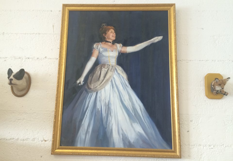
Some number of years ago, I spoke at An Event Apart during a special session at Walt Disney World® Resort. Of course I said yes to the invitation. My talk was scheduled on the last day, and it was the last time I’d be doing that talk and I was bored. So I decided to make it stupid.
Disney resorts don’t sell adult-size costumes or allow fully costumed adults inside the actual parks most days to avoid cast impersonation. So, I turned to Amazon (I know). Two days and $99 later, I was onstage living the fantasy.
The thing about a Disney convention center is that of course they have better lighting than any other hotel ballroom. Photos from that talk came out worlds better.
Inspired by our pal Matt Haughey, Mike ordered a painting from the same place in China as a surprise Christmas gift for me.
Reader, I was surprised.
It’s a good painting, clearly painted by someone with skills. The artist made choices. They removed the lavalier mic, and left the clicker in my hand.
We went to the frame shop, where the sales person initially suggested a thin silver frame to tastefully pick up the highlights in the dress. Oh no, we clarified. Look at what we’re framing. Good taste was not the brief.
Once it was framed, the painting went up in the studio, where eventually, to my eyes, it faded into the background, and I stopped noticing it. We have a lot of weird stuff, as anyone who has visited will tell you.
A couple years later, we moved the studio to a peculiar, delightful, and semi-subterranean space in North Beach, where our meeting room was in a basement directly under Vallejo Street. The painting went up on the wall, and I thought nothing of it. Until one day, when I was wrapping up a workshop and asked, “Any questions?”
A guy in the back raised his hand and asked “Is that painting…you?”
I looked around…at the cinder block walls, the people crammed in on (nice!) folding chairs, the harsh shop lights we were in the process of replacing, and the begowned and idealized portrait in a gilt frame that had been over my shoulder facing the class I was teaching all day. Only then I realized, we’d created a very particular vibe.
The word “kitsch” appeared in Munich, Germany around the 1860s, used by painters and dealers as a pejorative term for the popular, sentimental and derivative art showing up in the markets (just like how adults who enjoy Disney differentiate themselves from “Disney adults”). Munich at the time was an ascendent art center. The Munich Academy was attracting students from all over the world. And a growing middle class wanted decorative and aspirational items for their homes.
Garden gnomes were gaining ground a bit to the north, not too far from Jena.
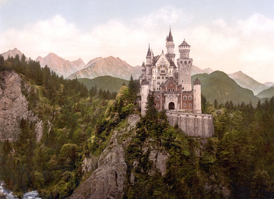
Also, around 1870, King Ludwig II of Bavaria went particularly hard for romantic nostalgia and the music of Richard Wagner (oh, no). He spent his personal fortune and a lot of other peoples’ money building the pinnacle of castle kitsch in the foothills of the Alps. Neuschwanstein (new swan stone, because of all the swans) as it was called after his death, became a huge tourist attraction and the inspiration for Disney’s castles.
When I visited Neuschwanstein in the late 90s, I met a couple from China on the train up to Frankfurt where they were living during a finance externship. They invited me over to their student apartment for dinner that evening and whipped up a phenomenal meal. That’s what talking to strangers on trains gets you.

To wildly oversimplify, kitsch was a cultural response to industrialization and urbanization, art as product of, contributor to, and escape from the aesthetic, economic, emotional, and social consequences of the industrial age. “Kitsch” was a visceral reaction to those products by artists feeling threatened by popular art while aristocratic patronage was giving way to market competition. It is a thin, thin line between kitsch and Romanticism.
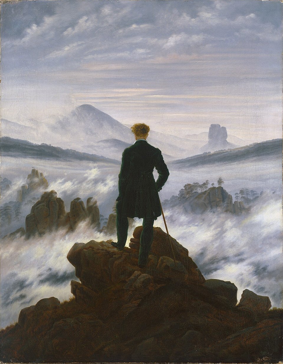
German Romantic painter Caspar David Friedrich, 1818
Then along came modernism and discourse about kitsch. It started in the early 20th century in Germany, or earlier, but New Yorker Clement Greenberg’s 1939 essay "Avant-Garde and Kitsch" for Partisan Review really sums it up:
“Kitsch, using for raw material the debased and academicized simulacra of genuine culture, welcomes and cultivates this insensibility. It is the source of its profits. Kitsch is mechanical and operates by formulas. Kitsch is vicarious experience and faked sensations. Kitsch changes according to style but remains always the same. Kitsch is the epitome of all that is spurious in the life of our times. Kitsch pretends to demand nothing of its customers except their money — not even their time”.
Marxists not beating the elitist allegations with this one. (What is Frederich’s Rückenfigur, if not an invitation to vicarious experience?)
A few years earlier, the Nazi party had come to power in Germany and Joseph Goebbels outlawed art criticism. Then in 1937, after Hitler (mediocre painter) denounced modern art as degenerate, Munich was the site of both the Degenerate Art Exhibition and the Great German Art Exhibition (the latter much less popular). Fritz Winter (the abstract expressionist, not the fish guy) was among the artists whose work was banned and purged. He was also drafted into the army and sent to fight in Poland, continuing to paint in secret when he was on leave.
I’ve seen some posts going around deploring how politics has recently devolved into culture war and I laugh and laugh.
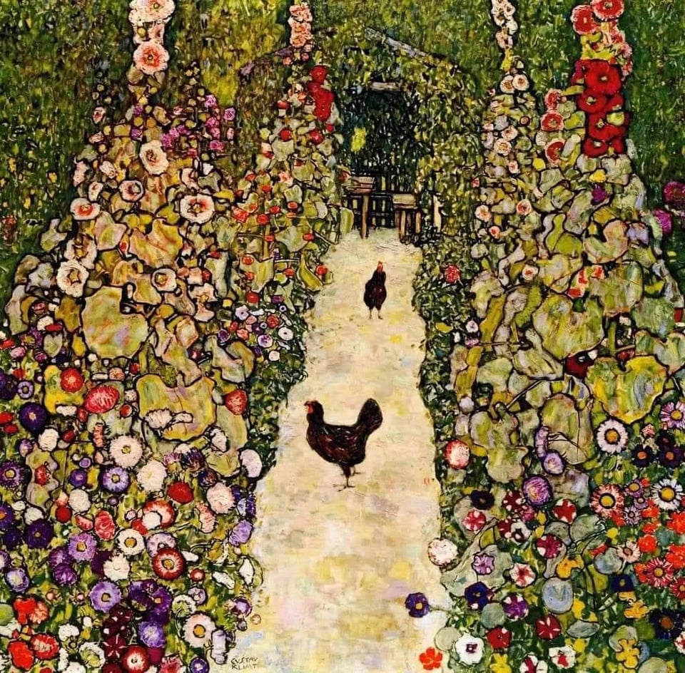
In 2013, a huge cache of modernist paintings thought destroyed were found in a Munich flat. Sadly the largest private collection of Gustav Klimt works had burned in a mysterious fire in the Austrian castle where they’d been stashed, including Garden Path with Chickens.
Chopping it up
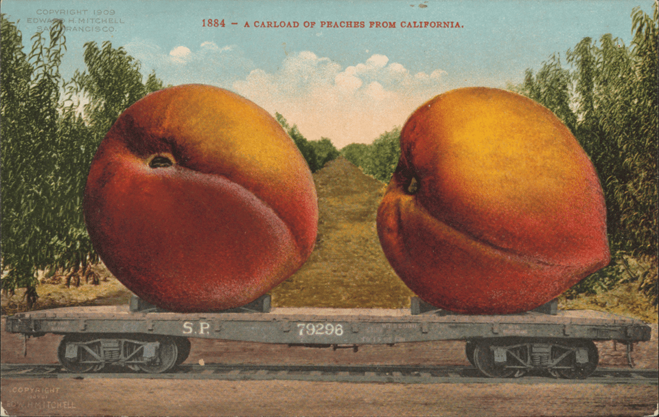
The invention of photography led to montage — compositing disparate images into one narrative — like the peaches up top, and collage — making one picture with various materials.
In Victorian England, photocollage was a very popular technique for postcards, visiting cards, and personal albums. All fun and cute.
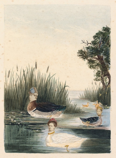
Collage of watercolour and albumen silver prints from the Victoria and Albert museum
European optimism about scientific discovery and technological progress and human rationality and empire building in the early 20th century really came crashing down with WWI.
Dada was a response to the carnage. Rational systems and scientific processes had produced horrors. Nothing made any sense, so artists turned to nonsense, cutting and pasting and combining familiar, commercial, conventional mass-produced texts and images to reflect and protest those horrors.
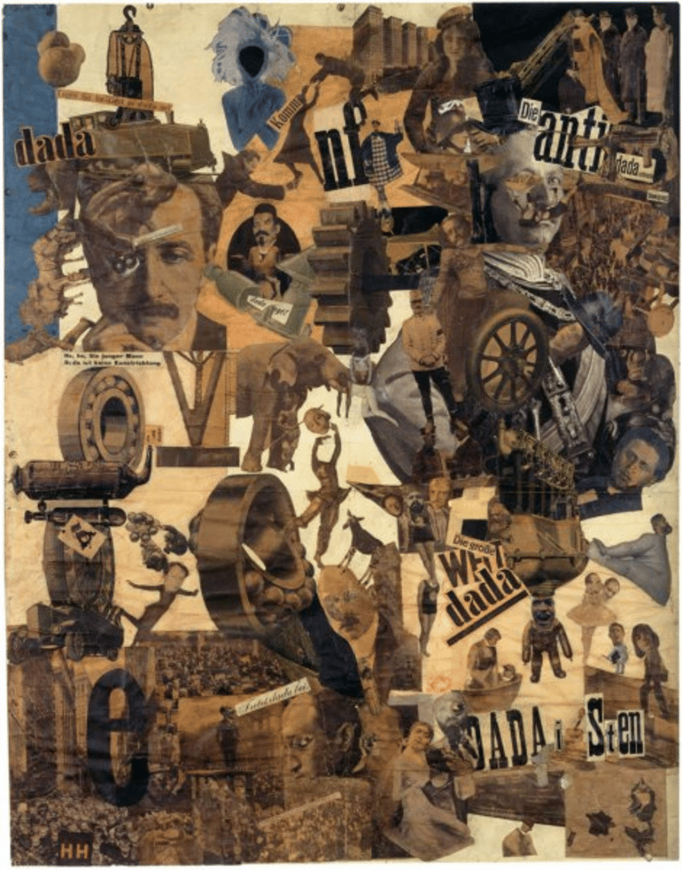
In Germany, John Heartfield (born Helmut Herzfeld in Berlin) studied graphic design at the Royal School of Arts and Crafts in Munich, then joined the Dadaists and the communists and attacked state power with photomontage. He anglicized his name to counter anti-British sentiment at the start of World War I.
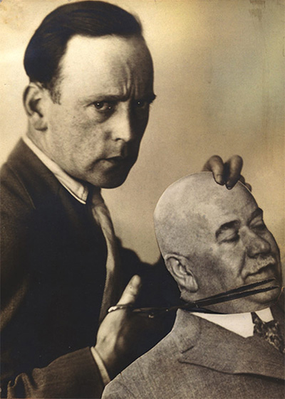
by John Heartfield
Using just scissors and paste, Heartfield made art so powerful, it rocketed him up to #5 on the Gestapo’s most wanted list. Good man.
In our own era of a resurgence of the far-right, Heartfield’s work is particularly timely. His subversion of Hitler’s populist fascist iconography sought to expose the capitalist and war-mongering interests which he believed were the real backers of the Third Reich. Heartfield's background in advertising enabled him to develop a powerful visual language to combat his opponents.
—curator Carla Mitchell, quoted in The Burlington Magazine
Find the seams and grab your scissors
This is all just to remind you to have fun with it. Find better ways to be bad and avoid the worst ways to appear to be good.
I’m not suggesting you add typos to your writing, but seek out the specific. Make intentional choices. Don’t be afraid to re-use, while acknowledging prior art. Think about what only you can say before you sand off your edges to fit in better. Be less beige. Tell a good story, but don't lie.
“Kitsch causes two tears to flow in quick succession. The first tear says: How nice to see children running on the grass! The second tear says: How nice to be moved, together with all mankind, by children running on the grass!
It is the second tear that makes kitsch kitsch.
The brotherhood of man on earth will be possible on a basis of kitsch.”
— Milan Kundera, The Unbearable Lightness of Being
And as promised
Here be inspo for made-by-human works you can use on a budget. Or, just to look at if you need to reset your brain.
As I mentioned in our last issue, everyone has a smartphone. People are making movies on iPhones. You can just take your own photos of everyday objects. It has never been easier.
Wikimedia Commons Obviously. For all your tardigrade needs. Check the licensing restrictions for each image. Not everything is in the public domain.
The Public Domain Review is so much more than an image repository. They’ve recently added a searchable image archive with a super fun infinite view.
The Library of Congress offers over 100 sets of free-to-use images.
Most NASA photos are in the public domain. Gorgeous, phenomenal stuff. Also good for a sense of perspective. Any work created by a US federal government employee as part of their duties is automatically public domain.
Heritage Library Vintage illustrations
Public domain movies. It’s in the name. Wow, so many of those old cartoons were really racist.
Rawpixel has some gorgeous vintage images. And also some AI-generated stuff. So, use those filters.
I get a lot of my chicken reference photos through my iStock subscription. Super fun to see the regional variation.
The Noun Project is chock full of vector icons and now, photos. Not free, but what a deal. The $40 a year for icons is so worth it.