Issue № 20 - University of Reading, Summer 2026
Sharing my experiences of starting my Master’s of Research at the University of Reading, my interview with Fiona Ross, and talks about the importance of looking beyond Latin scripts in global typography.

Issue № 20 - Fiona Ross & the University of Reading
This installment shares my experiences of starting my Master’s of Research at the University of Reading, my interview with Fiona Ross, and talks about the importance of looking beyond Latin scripts in global typography. Let’s dig in!
Long, Hot Walks in England
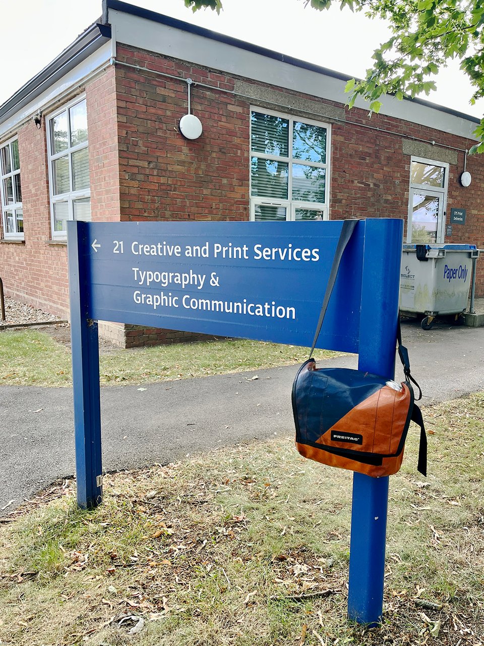
When I started my TDi weeks of study and research in England, I knew I would be staying in the dormitory buildings at the University of Reading. I had not slept in a dorm room in over 20 years, so that was going to be its own adventure, but what I didn’t know until I got there was that I would have a 20 minute walk to the typography building each day.
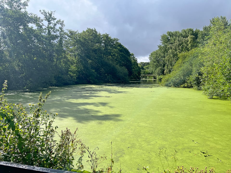
The University of Reading is well-known for two things: typography and meteorology and interestingly, both of the schools are located near each other on the far side of the campus, away from the majority of other university buildings. In-between my dorm and the typography building was a pleasant walk through large, open fields along a path which crosses a river and pond with ducks and (I’m told) very-aggressive geese during certain parts of the year.

My walk to and from the dorm room became a nice way to begin and end my days, even though there was a massive heat wave all over Europe and the UK is certainly not built for climate change. Good thing the university is at the forefront of studying climate science, right?
Primary Sources of History
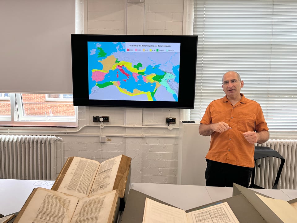
A great deal of the material I’ve been researching over the past three years has been published by the various Linotype companies themselves, which means I need to take all the promotional stories and educational articles with several grains of salt. This doesn’t mean the information is unreliable, but there is obviously the potential for them to gloss-over and soften-up the rough edges of the truth. Because of this, I’ve been pursuing primary sources whenever possible, which means interviewing people who worked with and at the various Linotype companies.
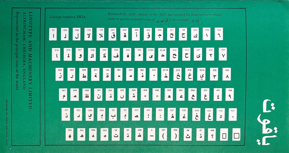
I’ve interviewed famed type designer Matthew Carter, historian Frank Romano several times, and even had an off-the-record interview with someone involved in the more-recent details of the company as it merged into the modern day Monotype company (which killed the Linotype name in 2013).
These first-hand accounts are vital for affirming and challenging my assumptions along with giving human-interest and emotion to what could otherwise be a dull history of a machine and a company. Thankfully, this strategy aligned with my studies at Reading this summer in a perfect way when I added another interview to my project.
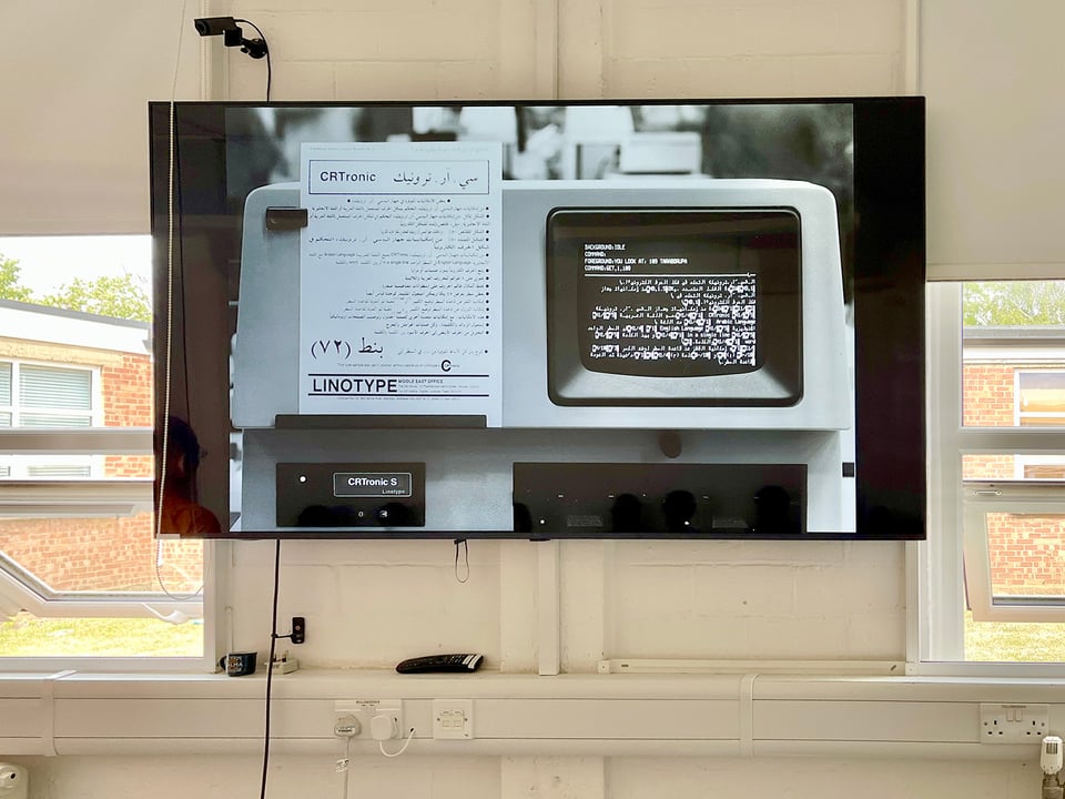
Fiona Ross: Beyond Latin
If you spend any time studying global typography, the name Fiona Ross will inevitably pop up. I’ve known that I wanted to interview Fiona for a long time because I knew she was involved with all of the “Non-Latin” (a dated term which she would like replaced by “Beyond-Latin”) typefaces developed and digitised from the 1970s onward at Linotype.
Fiona is a global expert in Brahmin-derived scripts used in Southeast Asia and respected by an entire generation of type designers who learned from her at the University. Simply put: Fiona is the most knowledgeable person on beyond-Latin scripts and how they were adapted to new technology in the entire world.
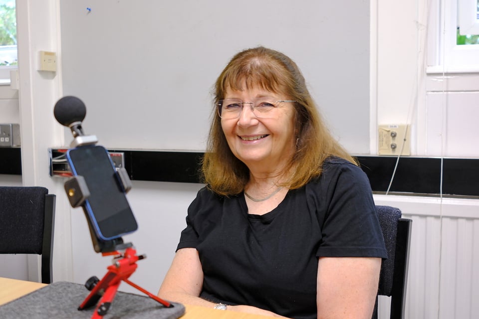
I know she would never claim this herself and would blush at the statement — but I can, since I’m an outside observer. Yes, there are plenty of people who are more knowledgeable about aspects of certain scripts, but no one has more understanding of the complexities of typesetting scripts in the early digital days than Fiona.
Interviewing Fiona
Fiona has immense experience in the technologies of typesetting beyond the hot-metal days, how Linotype merged from three separate companies (UK, USA, and DE) into just the German Linotype company, and how “Non-Latin” scripts were made to work with new digital technologies.
Something that hit me as I was talking with Fiona was her dedication to making the reading experience better for the end-users: readers of newspapers, magazines, websites, and books. Yes, there had been a few typefaces designed for the languages and scripts of India in the hot-metal days, but all of them required major compromises of the glyph forms and were often not fully adopted by the reading communities.
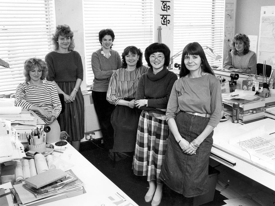
When Linotype was asked to make the first digital Bengali font, the original plans was just to digitise the outlines of the existing hot-metal fonts, which Fiona knew was “basically a mutilated script” and she wanted nothing to do with it. To be honest, she thought she would rather leave than be associated with another poor-quality font that was forced onto people living halfway across the world.
So instead, Fiona pushed Linotype to work with outside consultants who lived in the areas of India where Bengali was used. These experts helped inform, critique, and improve the new digital font that Linotype was creating. Fiona was the researcher, finding examples of how the script was supposed to look, while also making sure that the consultants agreed, and that the newly-designed fonts were working for the final clients (ABP newspaper in Calcutta).
After the Begali font was created, the same client requested a Devanagari because they were so happy with the work. This was back in 1981 and Fiona still works with the same publishers and clients today, which is a testament to her skills of coordination and determination.
Further Reading
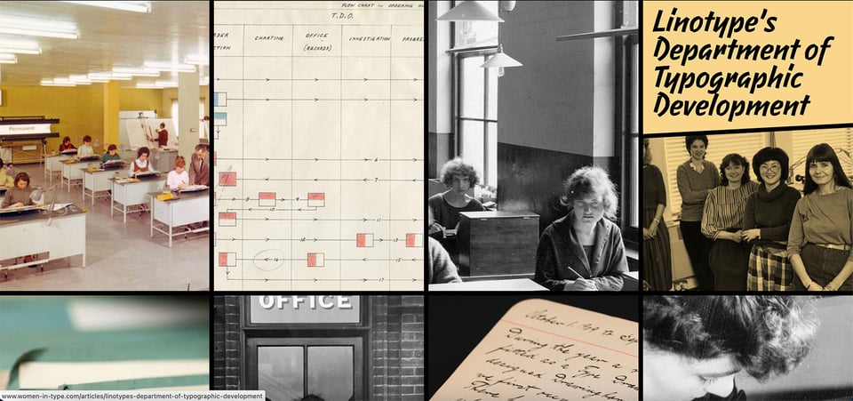
If you can’t tell by now, I admire Fiona and am excited that she is one of the professors for my Master’s degree. Over the years, she has trained multiple generations of type designers and researchers to push beyond limits and boundaries of what has been traditionally done — always with the focus of making the reading experience better — and not just for the western world.
Hopefully, I’ve piqued your interest in the impact of Fiona and other women in typography. If you’re interested in further reading, I highly suggest the articles at the fantastic Women in Type website by fellow Reading graduate Dr. Alice Savoie.
Two New Books on Hot Metal
As I am (not so) patiently working on my book, I’m excited to share two new books that prominently feature the Linotype.
The first is written by journalist Jeff Jarvis, titled “Hot Type: The Magnificent Machine that Gave Birth to Mass Media and Drove Mark Twain Mad”
Jeff and I have been in contact for the past few years, first meeting at a presentation talk in 2023, sharing research findings, commenting on each other’s writing, and generally supporting any book project that tells the praises of this revolutionary machine.
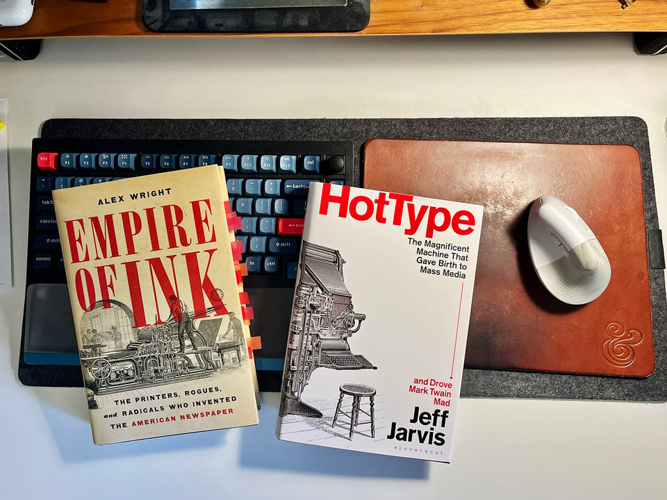
His book gets into some of the details that I won’t in my book and I’m especially thrilled (as a child of Missouri myself) that he goes deep into the history of author Mark Twain’s failed attempt to create a competing machine with the Linotype and nearly going bankrupt in the process.
The book was just officially published, and I was lucky enough to read the manuscript of “Hot Type” and I agree with this short review which says it’s worth reading.
The second book is “Empire of Ink: The Printers, Rogues, and Radicals Who Invented the American Newspaper” written by Alex Wright.
Alex’s book does a great job telling the story of the United States and its massive explosion of printing and newspapers from the Revolutionary War to the turn of the 20th century. From the explanation of a “Printer’s Devil” to my favorite part — when newspapers and inventors start trying to mechanize typesetting — it’s certainly worth your time to read.
Personally, it is very exciting to see more books being published about printing, newspapers, and typesetting machines. Rather than discouraging me that others are writing about “my thing,” it encourages me to keep working on my own book which will be quite different and shed more light on the importance and impact of the Linotype.
Coming up Next
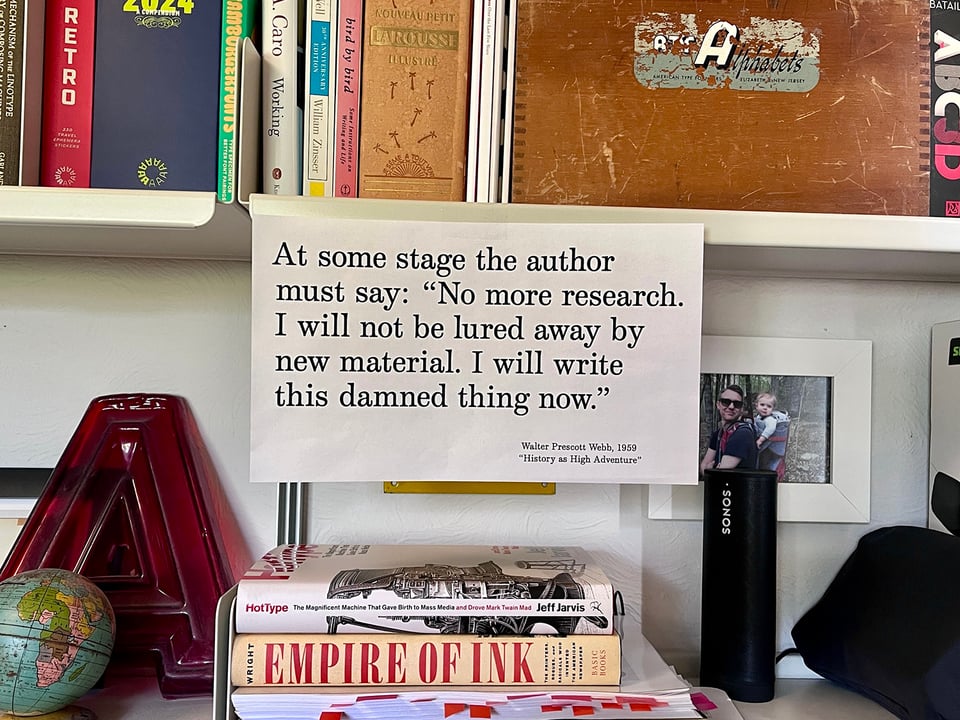
This is newsletter number two of three from my summer 2026 trip. Up next is “Manchester: The City of Red Bricks and Archives” and will detail my final research location at the Museum of Science + Industry which holds the archives for the British Linotype company.
Stay tuned and please share this newsletter and project with anyone who you think may be interested.
Waving from finally-cooling-off Denver,

Doug

