
NEWS LTR №24: Architecture! Words!
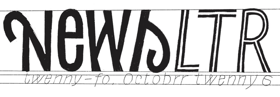
Lettering for the Kloosterkerk
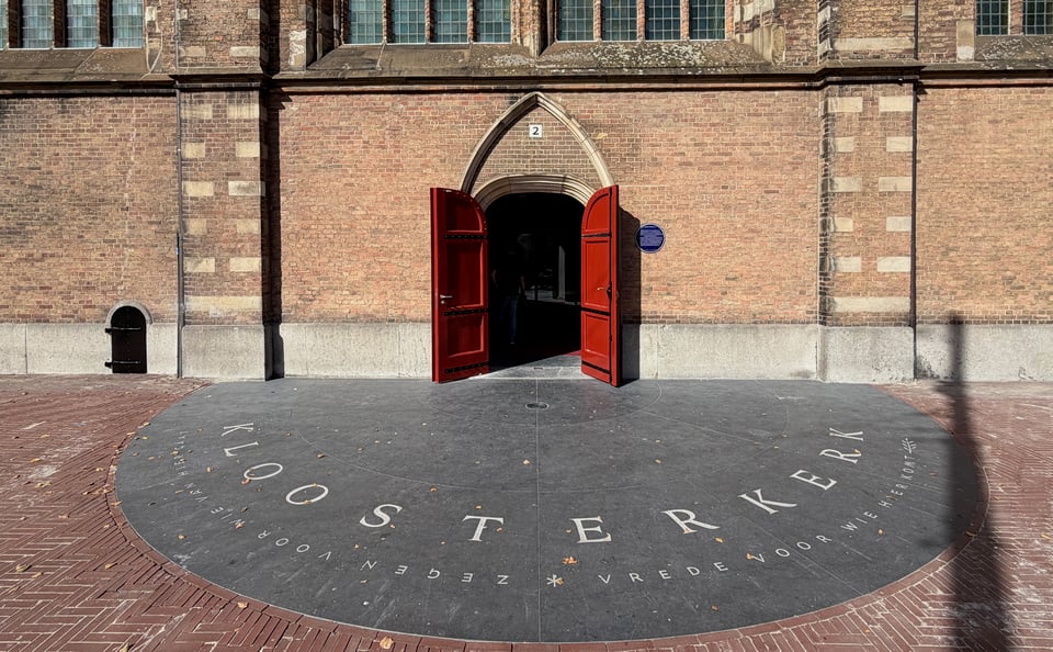
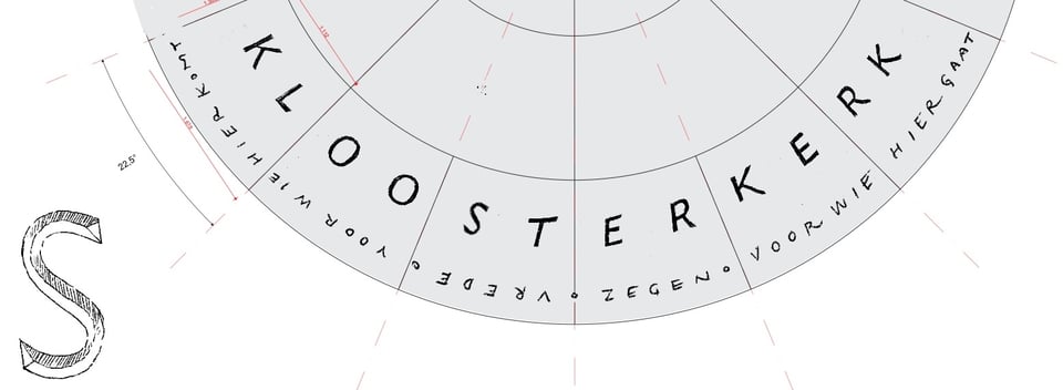
If you happen to be in The Hague, strolling through the historic city center on a sunny autumn afternoon for instance, have a look at the new lettering in front of the Kloosterkerk on the Lange Voorhout. Two newly drawn typefaces, a Chi Rho, and even an olive branch.
→ Kloosterkerk Article on LettError.com
New languages for LTR Kosmik
Are you considering font candidates for your new farmers market backdrop, lettering on your produce and baked goods food truck, a stylish price list for homemade artisanal coffees? Or perhaps a cover for a series of kids mystery books, or an identity and wayfinding for a young person‘s science museum? Or even, please, please, animated typography for your new claymation studio? LTR Kosmik will bring character, texture and sophistication to all these projects.
First published in 1993, right after Just van Rossum and I made a weird thing called Beowolf, Kosmik has been around for a while! It came about like this: the Dutch publisher of Donald Duck (a weekly magazine with nearly 200,000 subscribers) asked if we could build a randomised version of cartoon lettering because they were curious about digitising their cartoon production. We quickly saw that the Beowolf method would not work, but we had another idea and built a prototype. It was a… hack, “Flipper”, that could switch between static drawings and involved some brilliant handwritten PostScript as well as a detailed understanding of printer drivers. The same shapes would not repeat next to each other and thus only required three alternates. Very clever of course, but it did not manage to convince the publisher. Left with this shiny new bit of font technology, I drew a set of letterforms to suit it. Rough in texture and in construction, but with the remarkable overall calm and rhythm of a bouncy castle hopping with kids. A bit of the Noordzij skitchy-sketchy but not based on a classic model.
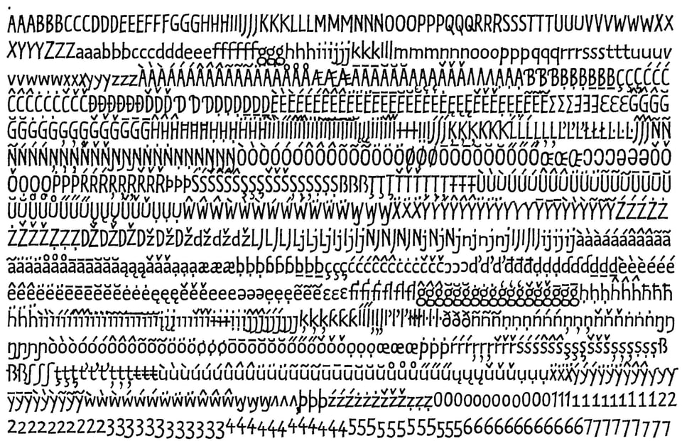
In the years that followed, Kosmik has been a constant and benevolent presence: mentioned when OpenType was first presented in 1997. And it volunteered when we needed a prototype for the first WOFF fonts to convince other foundries of webtype in 2008. The first post-mono release at LettError Type, a hazy 3 years and 1 quarter ago, already saw a big jump in the glyph count. Now it has received another boost and supports more languages (within Latin) than I can confidently name. Keep in mind, the commitment to three alternatives for each character makes any expansion a considerable investment. In 2023 Kosmik had 817 glyphs per style. In this new release the glyph count has more than doubled: 1495 glyphs for each style. I know these numbers will not convince you, but the Kosmik type tester on LettError.com just might! And for the careful reader 20% off with code TYPOMAN. Free update if you licensed since September 2025, get in touch.
New Typemedia website
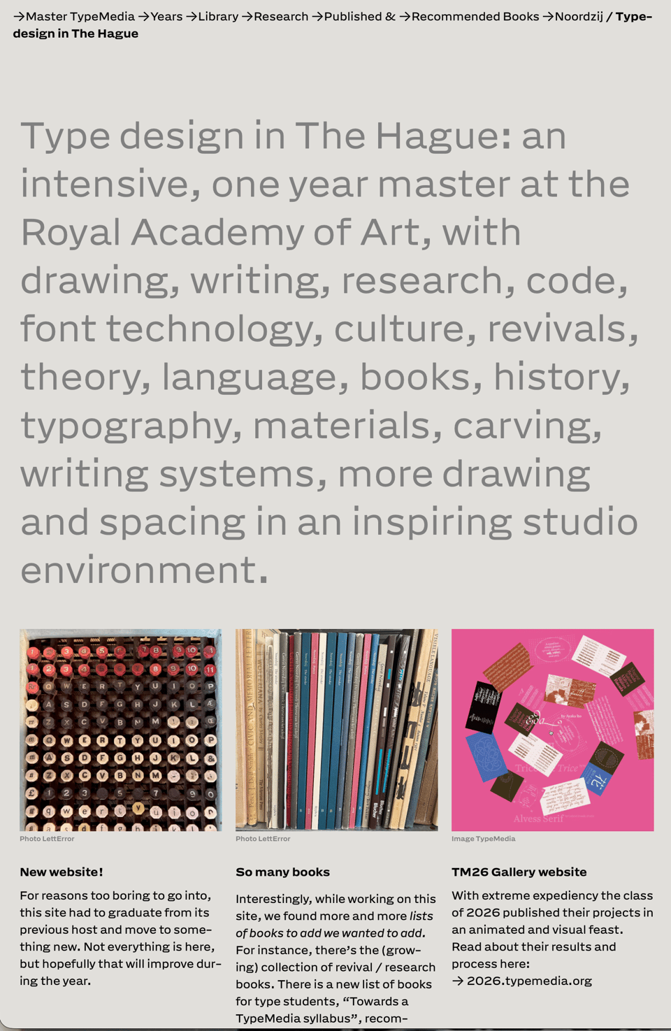
Earlier this year the TypeMedia website needed a new host, and that was a good moment to replace the machine that generated it. Eleventy, Nunjucks to generate and static html and css on the server. Very few moving parts.
Many more lists, of years and students and books. For instance the extended bibliography of Gerrit Noordzij, the books from the TypeMedia library, the results of the revival research, a list of recommended books, a list of Stroke editions. It became quite a bookshop with challenging typography. Engineering by PixelAmbacht, typography and bibliography by me. That robust sans workhorsey thing is Action Grotesque, what can I say.
Fuck AI
Not that you need another thought piece / hot take on using word guessing machines. But this is mostly an observation about the design process, a subject I can discuss confidently without any guessing. The argument is that when you make things, you can not help but think about what you're doing. One way or the other, making leads to understanding and the development of criteria. You learn to judge when and why the thing is good enough. If you skip the process of making, you also say no to learning about all of it. And that will have consequences.
→ On Generative AI (post hoc ergo fucking propter hoc)
Architecture in the Netherlands
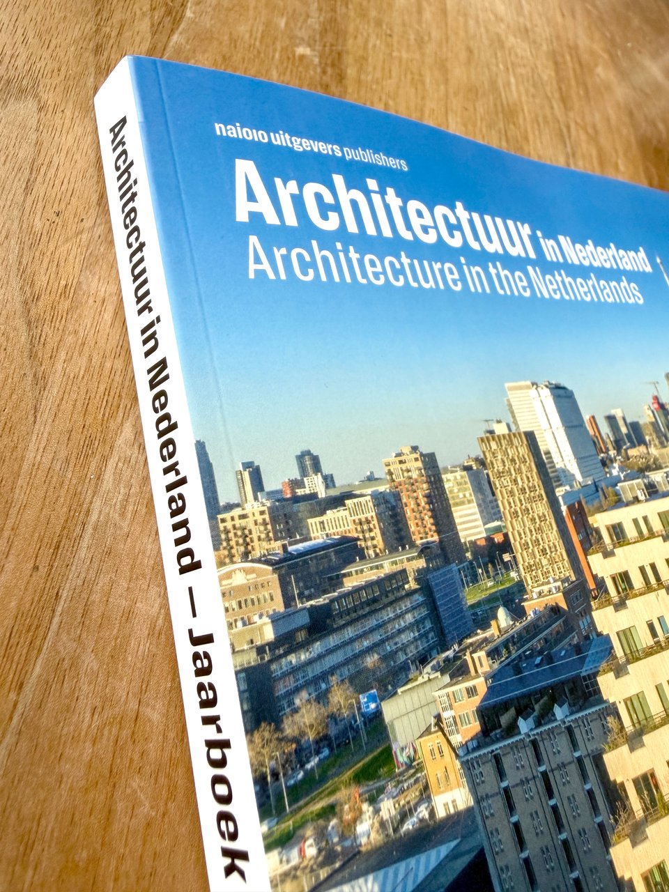
Oh, it was fun to see this one: the 2025-2026 annual for Dutch architecture has an article on the UvA library (the one with my letters), using another one of my letters, Action Text (at Commercial Type). → Fonts In Use has all the details about the book, publisher and design team!
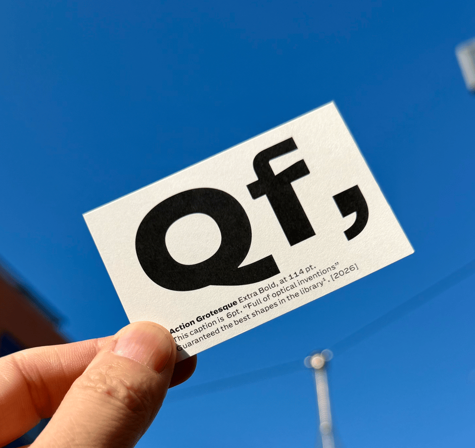
Capital letter Q, lowercase letter f, Action Grotesque Extra Bold in 114 pt, well you can read the caption. Which is the whole point. Exclusive new minispecimen (a card) intended for giving away (you) if you happen to ask for one!
Hey, thanks for reading all the way to the end, you are our most favourite reader! Sign up for newsletters from designers and artists you like. It may be old fashioned but by subscribing to this NEWSLTR you reach out and let us know you want to hear from us and that means so much. All of these words written by Erik and edited by Amy. No AI.
