
NEWS LTR №25: Hand!
Updates on LTR ErikRightHand, trial fonts, LTR Very Bauble
Hi! Some clocks have changed to wintertime and you have an extra hour to read. This brings news of the re-release of ErikRightHand at LettError Type. Just the RightHand mind, the LeftHand, Just’s, is left at M•n•tvpe. To put your mind at ease: there is no rift between Erik and Just, we are still friends! The fonts just live in different places.
ErikRightHand was the bold one of the two. Quickly written with a marker in 1990, the ink ran fast that day and made the ends of the strokes blobby, recording speed and urgency. These drawings were then transmitted by fax from New York to Berlin. For a moment the shapes whistled through space, only existing as sound. Later that day, after some thorough vectorising, Just replied “Look, I can write like you” and he could. A transatlantic collaboration in a still pre-web world.
I have seen ErikRightHand on

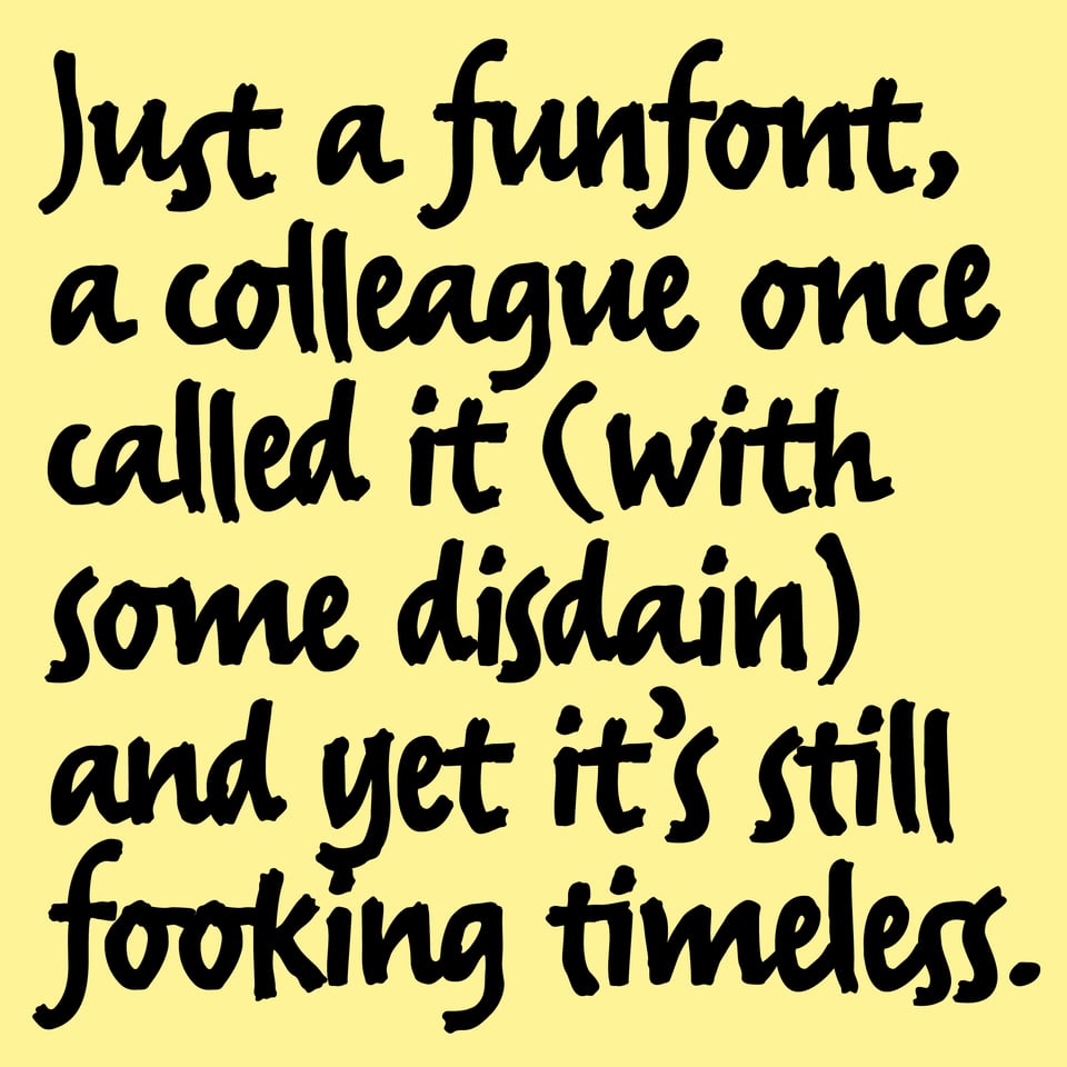
LTR ErikRightHand shows its age in places, and if I were to draw such a thing today I might do it differently. More variations, more weights, more like actual handwriting. But it would no longer be the same thing. Before OpenType, before alternates, ErikRightHand was raw and current. At the time ‘expert sets’ were all the rage so I included a full set of small-caps as a bit of a joke. They aren’t lovely, but then not everything has to be. This re-release is as raw and energetic as the original. It does, however, now have an uppercase Eszett and an asterism.
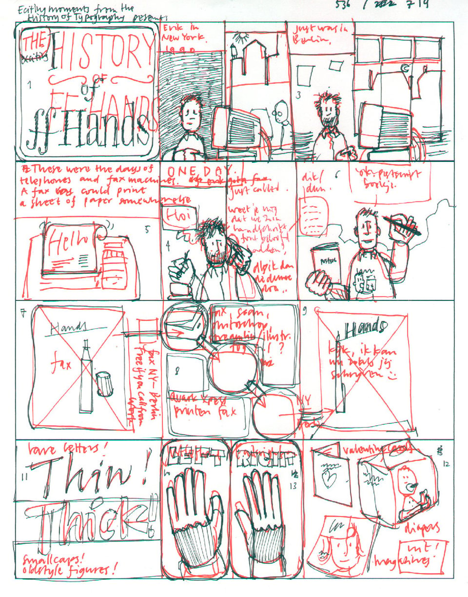
Check out the finished illustrated History of Hands, the origin story drawn for Jan Middendorp’s book on the history of F•ntF•nt from 2007. This is a sketch, never seen before, exclusive in this newsletter!
Pricing starts at €25 / Check out LTR ErikRightHand at LettError.com

LettError Trial Fonts
Some readers requested them, so I have added trial versions of our fonts here. These are very basic: only uppercase and lowercase. No diacritics, no OpenType features, no variation axes. But if you want to type your client’s name in the font of choice, you can. If you want to test the features and fancy interpolations or inspect the extended charactersets, use the font testers!
The conditions are straightforward: “The LettError Trial fonts offered on this page may only be used for trial purposes: your own evaluation, to get approval from a client, or in a student project. Any public-facing use, including professional (non-academic) work by students, requires the purchase of an appropriate license. The trial fonts cannot be used for training AI, LLM, or ML in any form.”
You will appreciate there is a considerable amount of trust in this offering. Of course you would buy a license if you go on to use the fonts because you are a kind and generous person who supports independent designers!
It’s the Season to be Bauble!
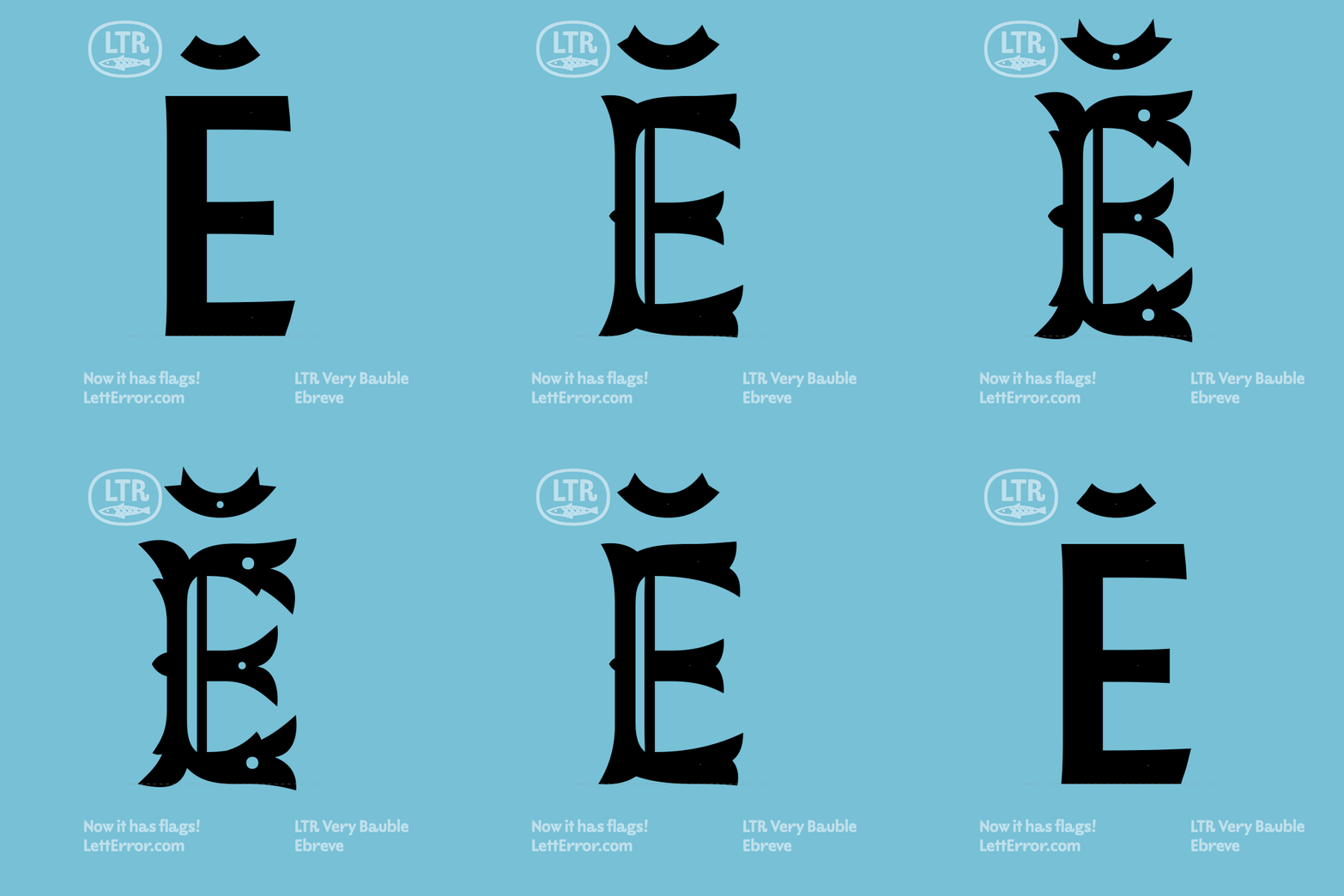
Our Baub is literally glowing with cheer and ho ho ho. If this is your first encounter: Very Bauble is a state of the art variable font, a classic sans caps and also a wildly ornamented over-the-top fish-tailed Tuscan! It is a floorwax and a desert topping! Very Bee would do great on packaging of confectionary and chocolates, and it would shine in animation as it unfolds its delicate features from modest to mild to mad. LTR Very Bauble outperforms AI by a whopping 237% in any kind of holiday season typographic extravaganza!
[Looks straight into the camera, sincere] Now you might argue that these times are just. too. grim. And you are not wrong, there is a lot of grimming. And you might add there are not be any vaganzas, typographic, extra or otherwise! That the holidays are cancelled! Where did we hear that before?
Oh dear aficionado of Dickensian doom, you deserve so much better. Just as Scrooge needed to talk to all the forking spirits before he could circle back, you need to make sure to follow Very Bee’s Serif axis from its single coal origins, all the way to the end of the slider where you will find Tuscan redemption and full fishtail love. Baub cannot solve the world’s mess, but it sure can make it more bearable.
LTR Very Bauble at LettError.com
Furore Magazine
For those in the know, my favorite magazine Furore has issue #32 available from the better bookshops in and around The Netherlands. The research in this magazine is always in a class of its own. On top of that, this issue’s typographic choices include headlines set in our Action Condensed and Action Grotesque. Chuffed, we are.
