
NEWS LTR №23: Typographic Summer

Friends of the written letter! You are surely familiar with the dilemma of how much compute to pack for the summer. But remember how we once traveled without any kind of digital machine? I did some cycling in hot summers and my bags were just stuffed with second hand books. Not nice antique titles, I mean trashy paperbacks; fiction, SF, ghost stories, anything. I’ve bemoaned the absence of bookshelf-shaped luggage before, now I’m advocating for hi-tec cycling panniers specifically for books. Could be a great product, in tasteful hi-viz yellow, with a NorthFace USB reading light.
Would you bring a computer on a holiday?
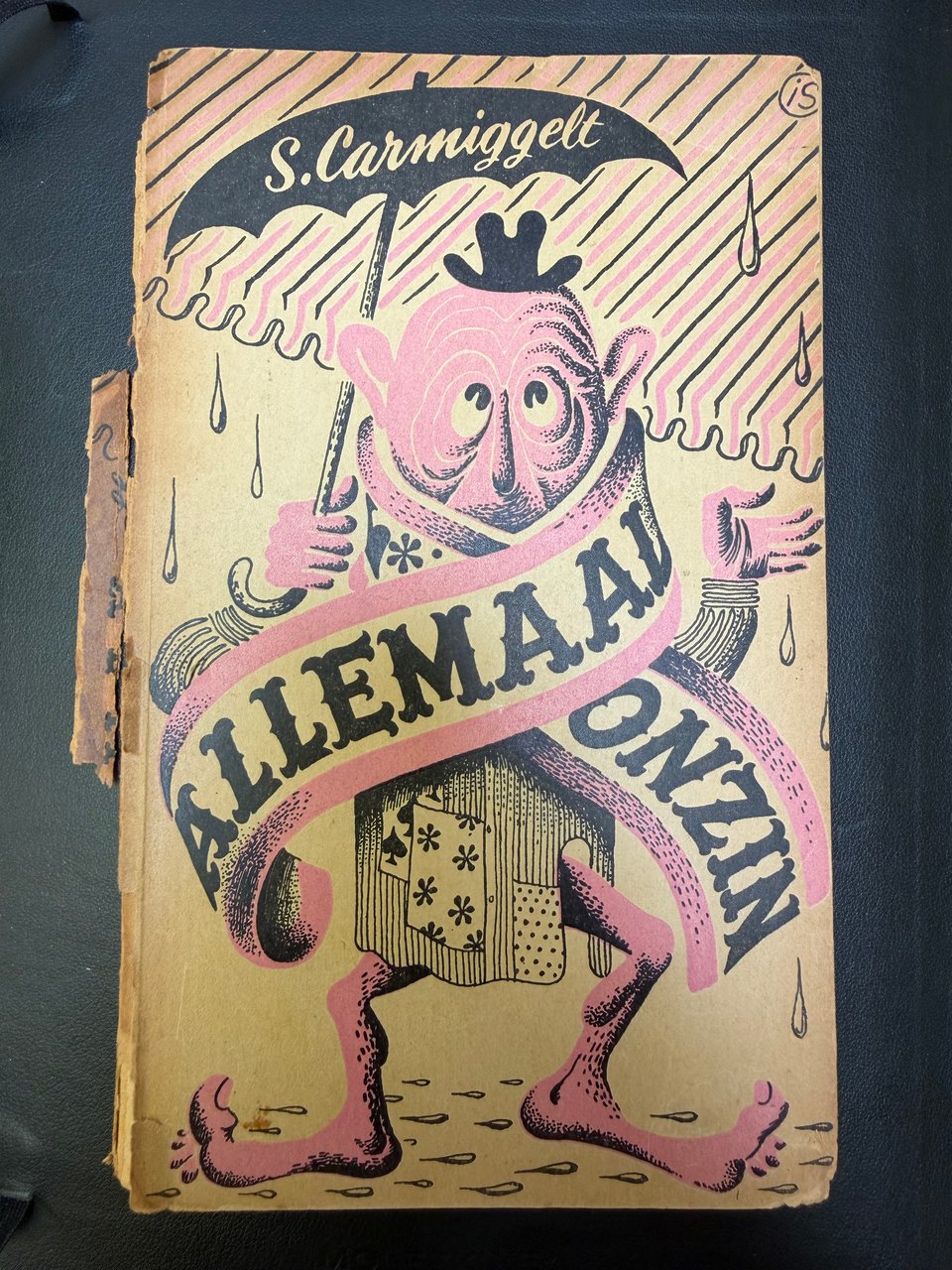
Allemaal Onzin
Dutch writer Simon Carmiggelt was already ooold when I was not, way back in 1987. Carmiggelt’s forté was the short story, lighthearted observations from life, written for Het Parool and Groene Amsterdammer. Now his titles show up on the cheap table at the book market. You know that says something about the average age of their previous owners who have, um, let’s say, returned their collections to the world. This particular one is from 1948. The cover, an illustration by Ies Spreekmeester, shows a weird figure under an umbrella. It wears a scarf that reads “All Nonsense”, drawn in a very capable tight Tuscan.
If we, for a moment, associate meaning to the letterforms: the script in the umbrella references the writer, that much is clear. The Tuscan then surely connects to the silliness from the stories? Not a grand novel, but a laugh and something poignant, as promised by a circus poster.
Maybe we can think of display designs as the typographic equivalent of the short story. A performance in a single act that ends with the artistes bowing to the audience while the circus orchestra toots out a final chord. This is the vibe for LTR Very Bauble!
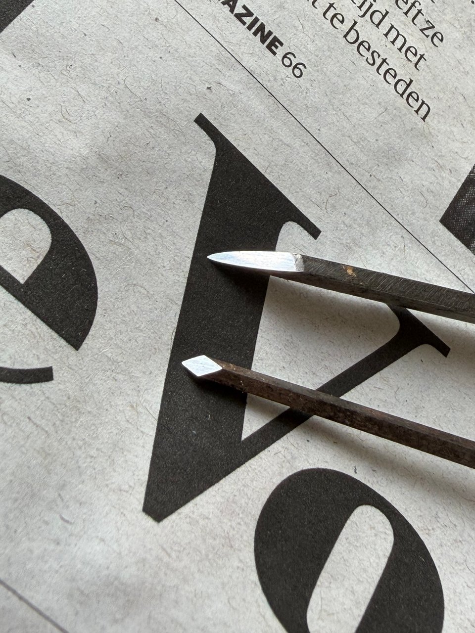
Burins
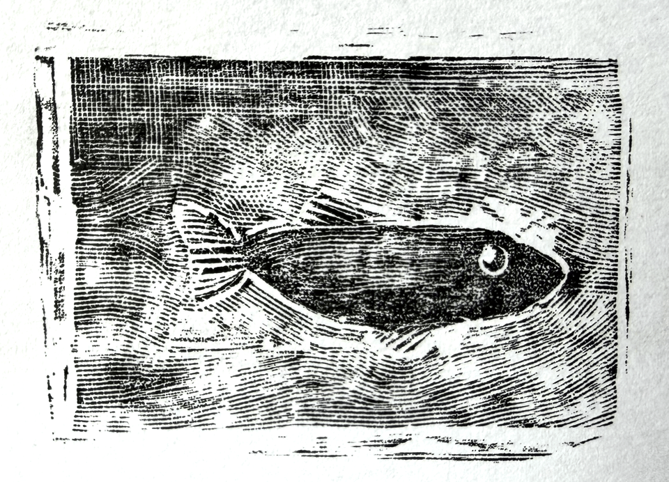
I spent an afternoon sharpening antique burins I borrowed from a friend. I’m slowly learning about their maintenance and what each differently shaped tool means for its cut. Currently I seem to be buying more books about engraving than making actual blocks! But there is value in learning, and this research is not on a deadline, so hush! Their fresh faces mean business: these will cut to the bone first and make you worry about tetanus after.
Casual use of Action Grotesque
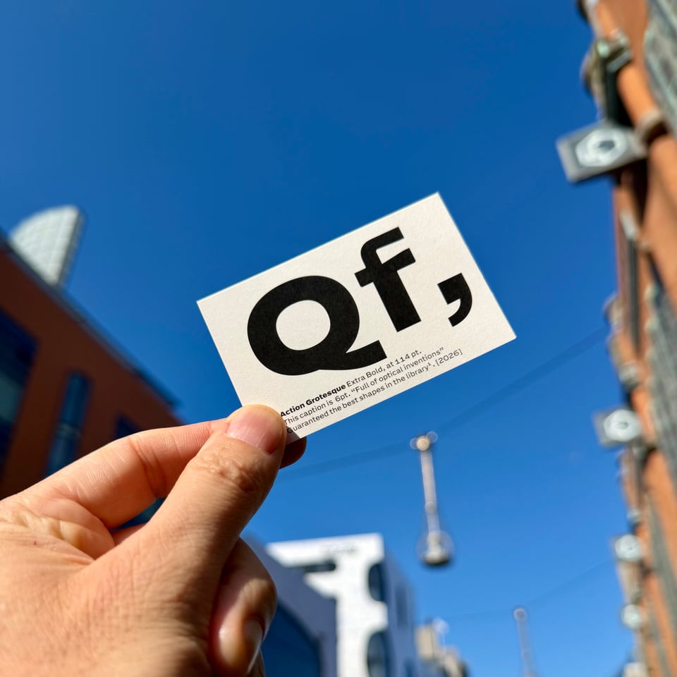
In preparation for the 2026 Grand Tour, LettError has printed business cards for all its executive travellers. Realised on premium 300 gram Biotop, 100% recyclable. Big letters and small letters on the front. Information set in Action Grotesque: “guaranteed the best shapes in the library“. Says so in print.
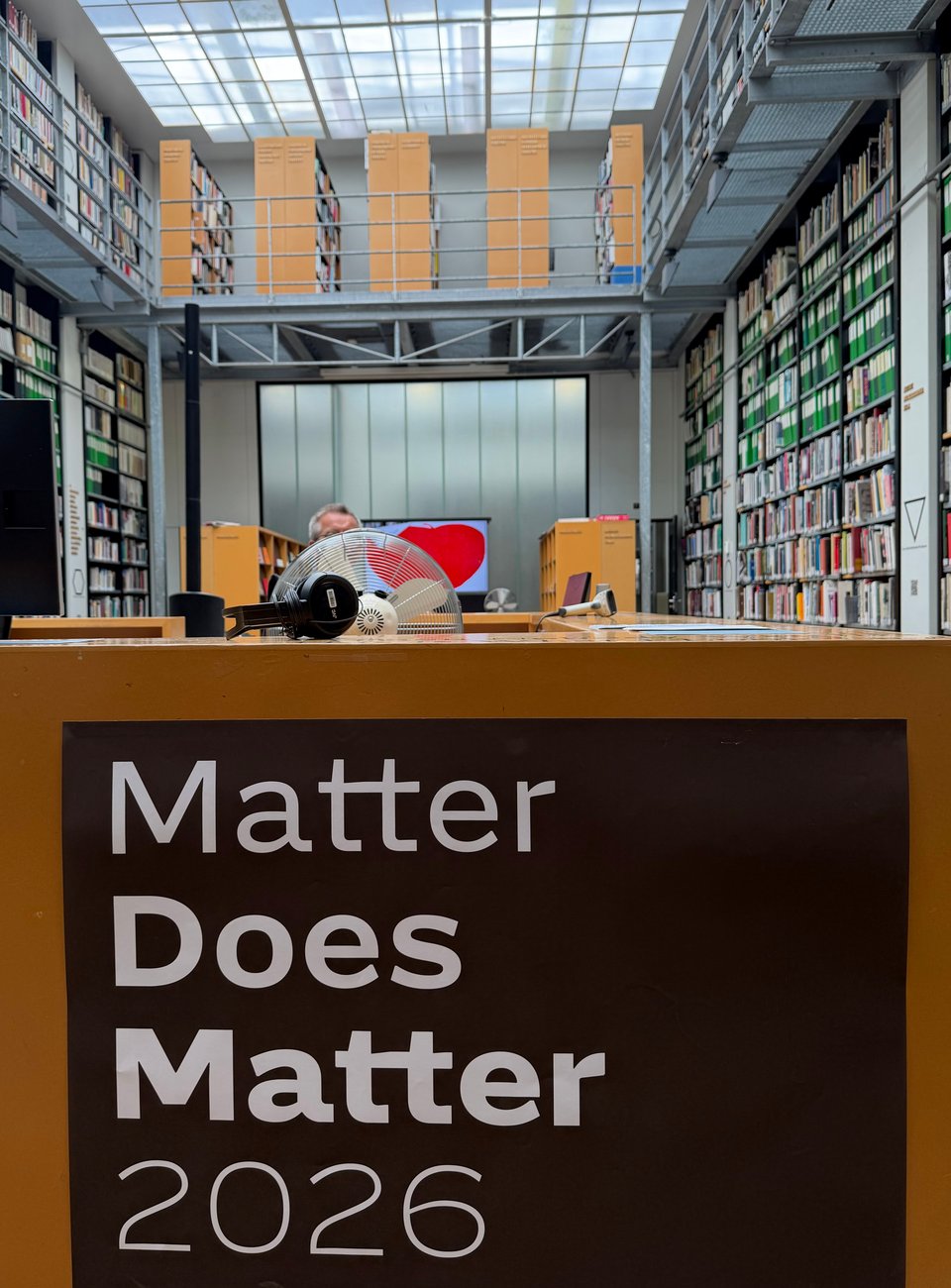
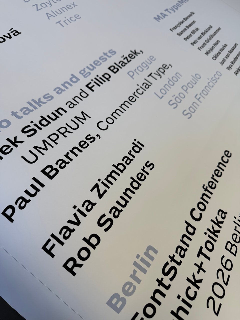
More off-the-cuff real-world use of AG, spotted around the KABK grad show. Check the performance of these precision-engineered shapes in big and bigger contexts! The Matter Does Matter exhibition in the KABK library, and the TM 26 credits poster. Both set in crisp AG weights and styles. What do we think about this shameless mixing of the commercial and the academic? Nobody minded and it needed to get done. Which is pretty much the vibe that AG was drawn for. Scroll through more big energy typography with Action Grotesque here.
Well done!
As a reward for reading this whole thing, some links. If you follow all of them you will have become a better person.
Action Grotesque, embiggened. A colorful list of loud statements. To amuse and eventually convince.
Pointy Head by Shapes For Cash: one of my favorite boutique foundries.
Have a nice summer!
