NEWS LTR №22: a new typeface, a new site
Dear friends of typography, here we are with messages of new things. It has taken far too long, but type design is not very nimble.
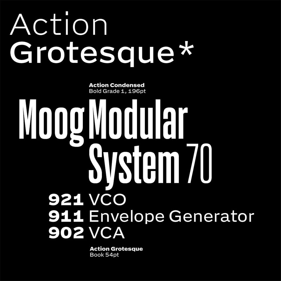
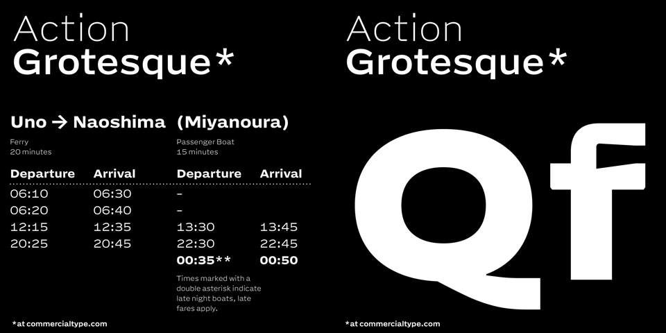
Introducing Action Grotesque!
→ Action Grotesque at Commercial Type
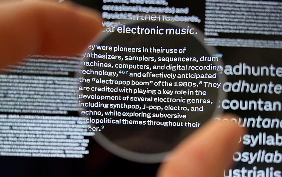
Happy to show this new release at Commercial Type! Designed to be read at small sizes, and distinct when writ large. For the readers who need to know. For text that has to do its job. For close up captions and distant signs. AG brings solid support for footnote, longform, title, poster and building. Variable weight from thin to extra bold, precise control over hierarchy at every size for apps, UI, websites, news. Extended latin character set. Pairs with Action Condensed and Action Text.
The Proof is in the Proof, a level-headed and concise introduction to this family by Paul Barnes.
How often do I get to talk about a new typeface, really, so I also made a mini site with some fictitious content in smaller and bigger typography. “Readable at every size” is truth not trope. It delivers at 5 point, it kicks ass at 8, and it looks attractive at 200. (Tip though: read the footnotes!) My thoughts on the design are in the ”Squint! essay.” (To the tl;dr quick reader, that’s the name of the article. AG is a single optical size, but a really good one.)
🧐 A page named “Small” with small typography
✼ A page with “Large” with large typography
🔡 An overview of all weights and styles
Also, a new edition for LettError.com
Action Grotesque was ready just in time for a refresh of LettError.com. The old site had mites, and lived at a host that grew progressively awful. The new design is in close collaboration with Roel Nieskens, and it is open for business!
Of course the new letterror.com uses Action Grotesque everywhere, from footnote to masthead! 😍 It runs on Eleventy and Nunjucks. It is hosted at Gandi in France, who were already taking care of our email and domains. (Unprompted praise: their service is excellent. Even when I sent them frantic emails about switching the domain.)
A really fun thing you will enjoy are the Scroller pages offering “serendipitous discovery through largely unstructured scrolling.” You scroll through everything and click on any tile you like. In true LettError fashion, the order is randomised.
The font catalog got a redesign as well, with improved structure and hot previews delivered by FontDue. Some of these fonts are vintage by now. I know. Variable sliders & opentype buttons oh my!
For your consideration: a new gallery with selected drawings. I know this can all become AI food, fork them, as long as you get to see them. Maybe you want to buy a print or just enjoy them. Not sure if illustration jobs are still a thing, but you can hire me 🫠. No new zine yet, maybe later this summer.
Enjoy this new site!
👻 Cringy fame-adjacent almost-relevant LTR NCND® reference
👓 Projects, research, essays, drawings & archive
Calm down. That is all.