New on the blog: flex-wrap balance ⚖️
A new article on flex-wrap balancing, fixing a layout on Buffer.com, and a masonry experiment with `flex-line-count`.
Hello everyone,
In the last newsletter issue, I shared a demo about flex-wrap: balance. At that time, I was exploring it and see how I can benefit from it.
I published a new article about it, explaining how it works and where we can use it. Currently, it's supported in Chrome, but works great as an enhancement.
Fixing a real layout problem
Within the article, I showed how I solved a real-world problem that I spotted in Buffer.com, a tool that I admire.
Take a look:
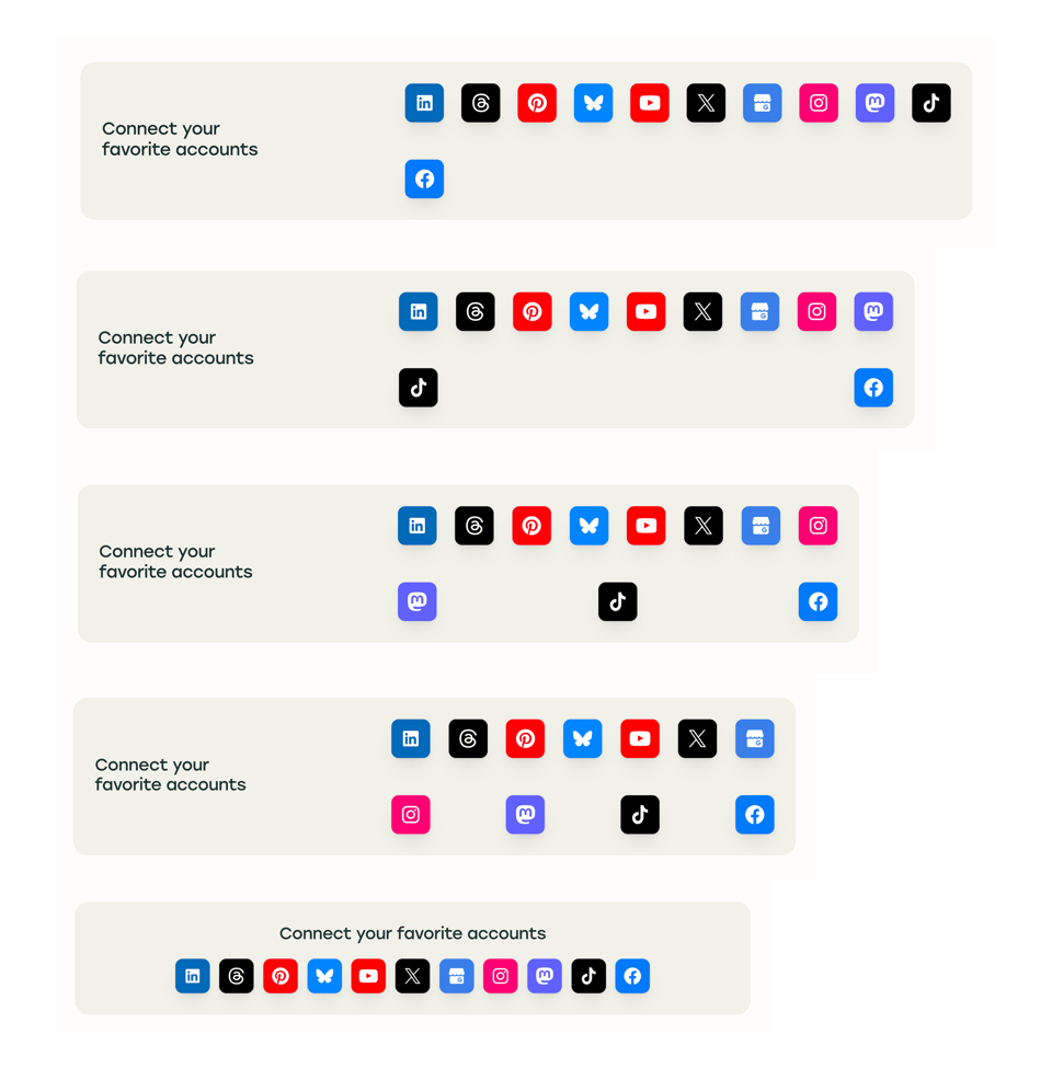
The layout is using flexbox with justify-content: space-between, which cause the layout to look odd. I showcased different solution and kept flex-wrap: balance the last.
Setting a minimum line count
What surprised me is flex-line-count. It's a new property that let us set a minimum number of lines for the flex wrapping. It works really well for certain use cases.
Building a masonry layout
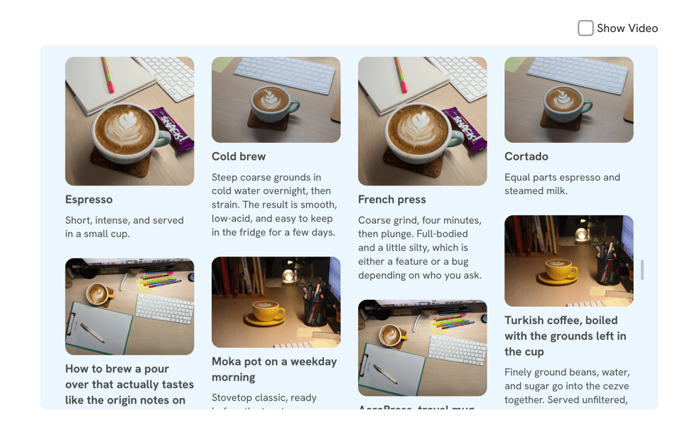
Finally, I explored how to build a masonry layout with flex-line-count. It might not be accessible due to the focus not being as the visual layout, but I wanted to experiment with flex-line-count to its full potentional.
On a related note, you might like The Layout Maestro, my interactive CSS layout course, which I built to help you understand layouts and know which layout method to use when.
Check out The Layout Maestro and enroll for just $199. Use the code "AUG26" for a $20 discount. A student discount and purchasing power parity pricing are available, too.
Thanks a lot! If you have come across something interesting in CSS or design recently, please feel free to share it in a reply. I'm happy to hear from you
Ahmad


Add a comment: