Better Icon and Label Alignment
How to keep an icon aligned to a label and exploring a new course idea.
Hello everyone,
Have you ever wondered how to solve the case where you have an icon and a label next to it? By default, the icon is vertically centered. When the text wraps, the icon stay centered but it doesn't look good to the eye.
Take a look at the problem.
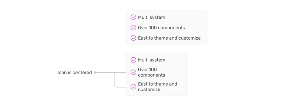
While working on a project, I solved that problem by using the line-height unit (lh).
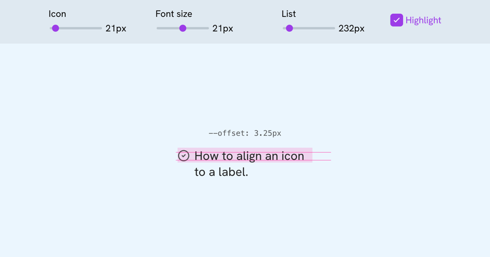
Here is the final CSS:
.icon {
  --size: 1.5rem;
  --offset: calc((1lh - var(--size)) / 2);
  transform: translateY(var(--offset));
}
But there are more details that affect the transform like the icon size and label font size.
A new course idea
I'm researching a new course topic about using and editing CSS for designers. It will teach the designer how Figma design terms map to CSS.
The course will be beneficial to designers who write some code, or designers who use AI tools to explore ideas but the output is limited due to not knowing what the result should be.
Would you be interested in this? If you are a designer with little or no CSS experience, how do you make sure that your design looks right in the browser?
The Layout Maestro September sale
You might like The Layout Maestro, my interactive CSS layout course, which I built to help you understand layouts and know which layout method to use when.
Check out The Layout Maestro and enroll for just $169 until September 30. No discount code needed. A student discount and purchasing power parity pricing are available, too.
Thanks a lot! If you have come across something interesting in CSS or design recently, please feel free to share it in a reply. I'm happy to hear from you.
Ahmad


Add a comment: