018: Six-time Eisner nominee Clayton Cowles hurt his hand on his pants
You heard me. On Saturday, May 23rd at 1:06 p.m. EST, I tripped up the stairs, scraped my hand on the seam of my pants, and it HURT. Signed, Clayton, age 38.
Also, I’m up for the Will Eisner Award for Best Lettering again!
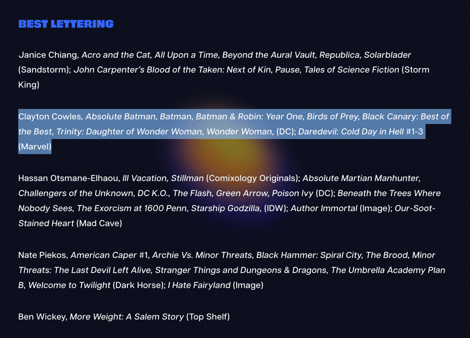
It’s stiff competish this year, but it’s nice to be nominated alongside three other full-time letterers. Throughout my career, it’s usually been two career letterers with three cartoonists who letter themselves (who I consistently lost to), so this is a nice change. Here’s hoping it lasts! Shoutout to Hassan, Nate, and Janice! Time for me to check out More Weight: A Salem Story. It looks pretty good. Voting closes on June 5, comic pros!
Just announced: Six of Us! It’s a MURDER MYSTERY, but with the cast of Friends! Created by Tom King, Gabriel Hernández Walta, Jordie Bellaire, and me! This is the gig I’ve been dreaming about since The Vision #1 back in 2015. I’ve been loving working on it, and I hope you’ll give it a shot!
Also just announced: Batman & Robin: Year One - Dynamic Duos! That first volume of Batman & Robin: Year One went pretty well, so we’re making some more! I just finished the first lettering pass of issue #1 and none of the momentum has been lost. We’ve all still got it! I’m being sincere!
We saw the Folk Art Guild exhibit at the Rochester Central Library, and that’s when I learned there’s a difference between folk art and outsider art. Through the unreliable means of cultural osmosis, “folk art” to me meant cats made of retired brooms, cityscapes that didn’t follow the laws of perspective, and creepy stuffed dolls in the back of a sugar shack. But the craftsmanship here was impeccable! It’s nice to learn new things. These pieces caught my eye:


I also stopped by the Rochester Indie Comics Expo, where I naturally failed to take any photos. But I did pick up some books!

Big thanks to Dave Chisholm, Will Perkins, Eugene Commodore, and Ethan Young for their time and kindness. Apologies to the friends I missed—I was tight on time that day. And love as always to Jackie E. Davis, just for being a pal.
Now, on to some content.
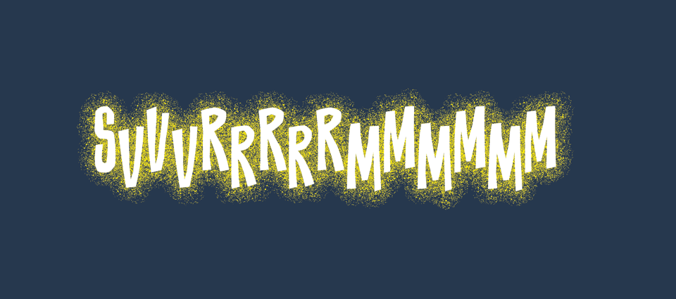
Sound Effect of the Month:
Q&A:
Q: Hi Clayton, and thanks for the great breakdown of caption boxes (see the previous newsletter).
Back in the early 2000s (and maybe the 90s?) there seemed to be a trend to have captions boxes with a gradient on them. So, for example, Spider-Man would fade from red to white.
My question is that was there an underlying reason for this trend, like new technology making it easier? And is there a reason it became less popular?
A: Thank you for your question! First, I should say that the adoption of gradients in comic book lettering happened before my time, but I think you’re right on the money. The still-young, vector-based applications (Adobe Illustrator and Aldus FreeHand) used by the digital lettering pioneers made gradients much easier to render, and they were adopted as a design/storytelling device. So you saw them a lot from the late ‘90s onward, especially in books lettered by Comicraft.
Gradient captions were still common when I first started out in 2009, and I was using them in most of my titles. But as time went on, I started using more solid color captions instead. The main reason was because fewer books were colored with the cut and gradient method (or cut and grad), and I thought using gradients in my captions would clash with that.
Cut and grad is a digital coloring method in which the colorist draws a shape with a lasso tool over flat colors, and renders light and shadow by filling the lasso selection with a gradient. Here’s a tutorial I found on YouTube. It’s probably what comes to mind when you think of turn-of-the-century comic book coloring, especially in books colored by Liquid! or Richard Isanove. It just so happened that gradient captions worked really well with cut and grad coloring.
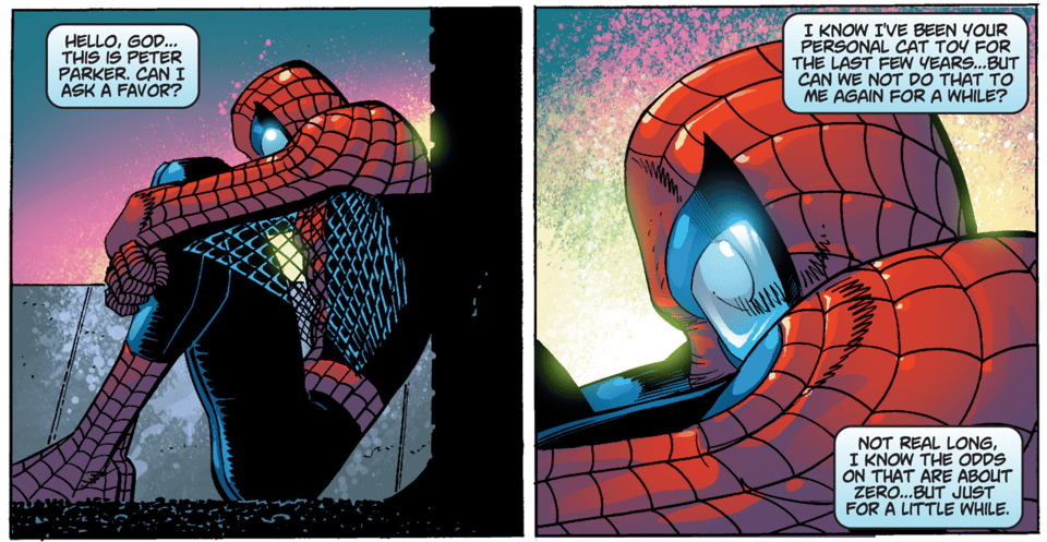
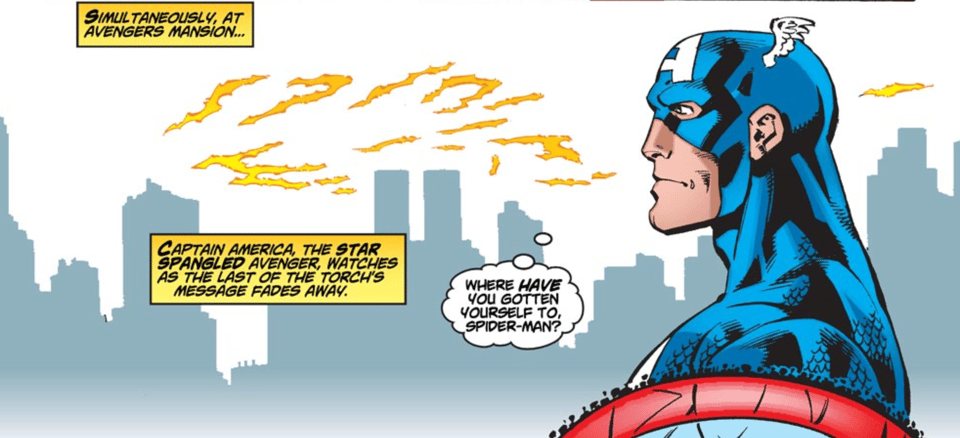
When Matt Fraction took over the Fantastic Four books in 2012, I made a point to give the two titles (Fantastic Four and FF) unifying but distinct lettering styles. They both got the same dialogue and locator fonts, but because the two titles were so different in look and tone, it didn’t make sense to carry over any other design elements. Pertinent to the caption styles, Fantastic Four was colored by Paul Mounts in cut and grad, and FF was colored by Laura Allred in…well, Laura Allred. As such, Fantastic Four got gradient captions, and FF got solid color captions, to better match the coloring styles.
After that neat little learning experience, I carried that wisdom over to future projects, and precedent was set. I reckon other letterers had similar thoughts about their own work as less traditional art styles became more mainstream, and cut and grad became less common. We’re artists at heart, after all.
I’ll admit, It’s not a hard rule. I used solid color captions in Uncanny Avengers, even though it was cut and grad, and I’m using gradient captions now in Uncanny X-Men, which isn’t.
As frustrating as this can be to hear, sometimes it just comes down to intuition. Sometimes using a gradient caption with cut and grad feels like too much gradient to me, and sometimes it doesn’t. Sometimes a gradient caption just feels right, even without gradients elsewhere, as long as the caption colors match the colorist’s palette (or I really need that one extra color, because all of those damn X-Men use primary colors in their uniforms).
Anyway, I guess the short version is that gradient captions became less common because cut and grad became less common. That’s my big theory. Hope this helps, and thanks again! I like talking at you all.
Community:
The employees of Dark Horse have announced they’re forming a union! Best of luck, comrades! You can support them by signing this petition!
I just wanted to highlight the friends and/or collaborators who also got Eisner nominations this year. Scott Snyder, Mariko Tamaki, Kelly Thompson, James Tynion IV, and Stephanie Williams are up for Best Writer; Elsa Charretier and Chris Samnee are up for Best Penciller/Inker; Nick Dragotta and Javier Rodriguez are up for Best Cover Artist; Mat Lopes and ol’ chum Jordie Bellaire are up for Best Coloring! Also, Javier Rodriguez with the hat trick is up for Penciler/Inker, Cover Artist, AND Coloring!
I was pleased to see The Fable of Erlking Woods up for Best Graphic Album—New. I was worried that it would have been lost in the shuffle, having come out so early in 2025 (it really should have been up for Best Publication Design too). I was also VERY pleased to see FML finally get some love with a Best Continuing Series nom, even if it’s up against Absolute Batman and The Power Fantasy (also, shoutout to Kieron and Caspar). FML got snubbed big time last year. Once again, voting ends on June 5!
Recommendations:
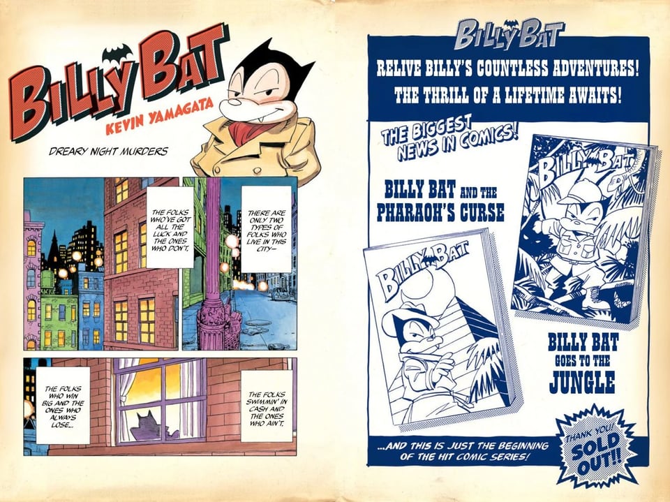
Comic: Billy Bat. This is more of a public service announcement than a full-throated recommendation (since it doesn’t come out until this coming Wednesday). Rejoice, Naoki Urasawa fans! After 18 years, it’s finally here in professionally translated English!
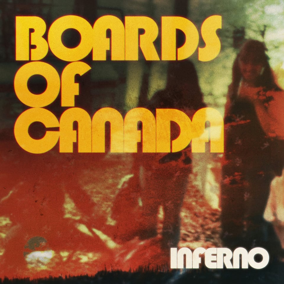
Non-comic: Inferno by Boards of Canada! My favorite experimental electronic band is back with their first album in 13 years. It’s fantastic! And frightening! Their best album since Music Has the Right to Children! Would recommend to fans of Mogwai, The Avalanches, and 1970s educational films you could only watch with a projector.
Stuff with my name in it (June 2026):
6/01:
X-Men Infinity #19
6/03:
Batman #10
Batman by Matt Fraction vol. 1: Daylight TP/HC
Magic: The Gathering: Untold Stories - Elspeth #4
Uncanny X-Men #29
The Visions: Marvel Premiere Collection TP
What If…? Uncanny X-Men #1
6/08:
X-Men Infinity #20
6/10:
Alien: King Killer #3
X-Men #31
6/17:
Captain Marvel: Highest, Furthest, Fastest Omnibus HC
Magic: The Gathering: Untold Stories - Jace #2
Predator: Bloodshed #5
Star Trek: The Last Starship #8
The Superior Foes of Spider-Man: The Complete Collection TP
Uncanny X-Men #30
Wonder Woman #34
6/24:
Moonstar #4
Showdown #2
Star Wars: Galaxy’s Edge - Echoes of the Empire #3
Venom #259
X-Men #32
And, finally, the cat photo:

Now to join my cat in the warm spring sunlight. See you in a month!
Got a question you’d like me to answer in a future newsletter? Ask away in the comments section!
-

Thank you for the long and detailed reply about gradients!
I have another question, if you don't mind: when you take-over as a letterer on an existing book, what thoughts go into whether you copy the existing style vs replacing it with something that you feel would suit the title better?
Add a comment: