017: Captions, captions, captions!
I was going to write you all a proper intro about my month of April, but I had a vivid nightmare last night where Scummy Dude (played by Dwight Yoakam) was abusing Poor Girlfriend (Alicia Silverstone), who looked me dead in the eyes and told me there was nothing I could do about it—and it all went down in a dormitory next to the ticket office of an early 20th-century train station. I’m sure it’s a subconscious allegory for the state we’re in and my place within it, but why it took the form of this weirdo The Station Agent/Sling Blade hybrid is beyond me. I didn’t even finish Sling Blade! So that’s where I’m at.
At least I got a cool hat. Shoutout, once again, to All Fantasy Everything, the only podcast that has ever existed. I now have one hat for each pole of my pop cultural personality:

And now, some content:
Charity Auction: Star Trek Lower Decks.

Again again again! I’m auctioning off all 18 issues of Star Trek Lower Decks (vol. 2)! Just as before, all profits will go to Trans Continental Pipeline, and I’ll be paying for shipping out of pocket. Anything purchased alongside it will also have its profits donated. So bid strong! It’s what those plucky young Starfleet officers would want (if they believed in money)!
Sound Effect of the Month:

Tip: Captions, captions, captions!
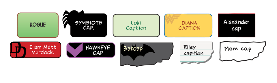
This month, I thought I’d write up a guide to the various captions used in comics. Captions are one of the trickier things to figure out in the world of comic production, and after writing this up, I better understand why. There’s a lot of them and they’re not easy to explain. Even choosing the order to show them was a challenge. Here goes nothing:
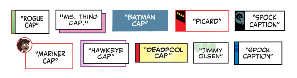
Voice-over: Indicates someone speaking out loud in a different setting. These are used to bridge two scenes and to narrate a short flashback. I asked some of my peers why the quotes were used to indicate this, and the only answer I got was that they were born out of necessity. Something was needed to indicate someone was speaking elsewhere, and that’s what was settled on. My non-corroborated theory is that the quotes are a third person narrator telling the reader “this is what this person said,” and I’m standing by it. These often use a colored element or character-specific glyph to indicate who’s speaking. Creators or publishers will prefer a single, fully-colored caption box with quotes (this is DC’s preferred format), but I prefer to keep the main dialogue box white, unless the speaker has a custom lettering voice to carry over (like Deadpool).
Thought caption: Pioneered by Frank Miller in the 1980s, these have edged out the thought balloon as the primary means of communicating a character’s thoughts. Usually these are in a caption box, but sometimes they’ll get a cool torn paper treatment, as if the thoughts are being transcribed to a journal. I like to give the boxes full coloring and a rounded edge to distinguish them from the voice-over captions, but sometimes that gets vetoed. These will get those cute little characters glyphs too sometimes.
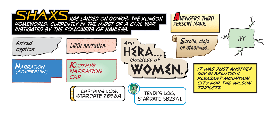
Narration: These captions provide—you guessed it—narration. These are used for both third and first-person narration, and this is where things get very tricky, because the line between first-person narration and other captions gets pretty blurry. Sometimes they’re synonymous with a character’s thoughts, sometimes they’re a literal log/journal entry, sometimes the speaker is speaking out loud to someone. But for storytelling purposes, the formatting is bent or abandoned (like quotation marks, which aren’t used for long-form flashbacks, especially when we don’t see the speaker throughout a full issue). These are the captions that are the most heavily deliberated between letterers and the rest of the team, with lots of back-and-forth taking place at the start of a project to nail down the correct format.
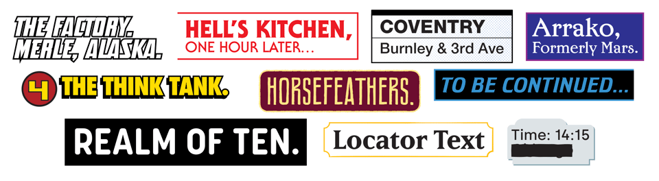
Locator: Establishes the setting of the scene, within both space and time. Typically formatted with a non-comics dialogue font. I try to match these to the font used in the book’s logo or design pages whenever possible. These used to have the same formatting as a third-person narration caption, but became their own thing with the advent of digital lettering and wider access to fonts.
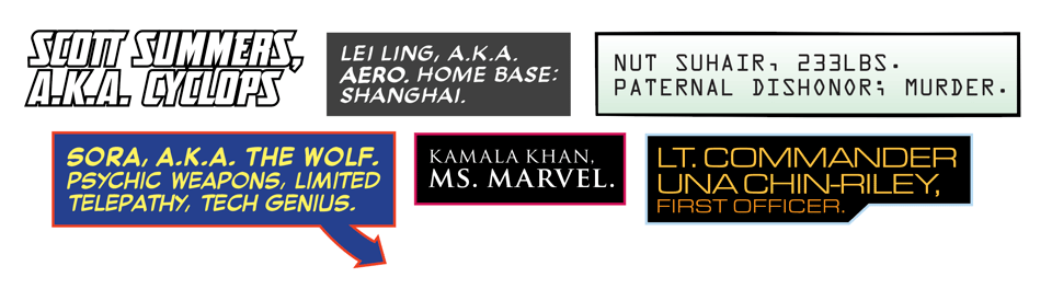
Character I.D.: The locator’s cousin. Often uses a similar format, but not always. Used to identify characters on a page, especially when there’s a bunch of them showing up all at once, and they can’t be gracefully called out within the dialogue.
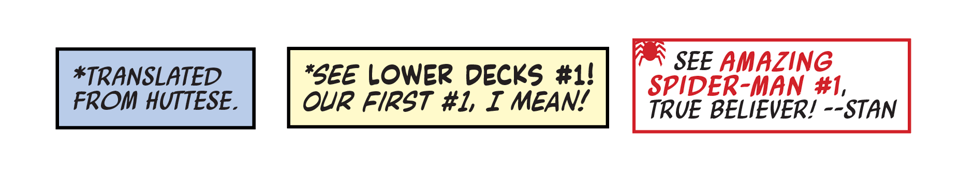
Editorial: The comic book version of a footnote, these captions connect to a corresponding asterisk (*) in a word balloon or other caption. Commonly used to indicate the translation of a foreign language, or to provide context to an event in another book. These got pretty funky in the 1990s and 2000s, when asterisks were substituted for tiny, franchise-specific icons (Spider-Man spiders, X-Men X-es, etc.), and since then, it’s been softly decided that these are more trouble than they’re worth. Rest in peace, tiny icons.
Whoof. I really hope this is useful. If any of you letterers reading this have something to add, please sound off in the comments section.
Community:
I got an early look at The Dogsitter #1 by Jamie S. Rich, Megan Levens, Nick Filardi, and Crank!. A dog-cultured romantic comedy isn’t exactly what I seek out on my own, but damn, this is a charming read! I worked with Megan before on Star Trek, and it was great to enjoy her work as a reader. She is a master of rendering body language (and every breed of dog), and Nick’s coloring is just incredible here. I’d buy it just for the colors. Unfortunately the final order cutoff was April 27th, but still, check it out when it lands on June 3rd.
Star Wars collaborator Alex Segura has a Kickstarter going for his comic, The Forgotten Five #1. I gotta say, “The X-Men mashed up with Love & Rockets” is a hell of a hook. Check it out!
Nickolej Villiger, a.k.a. Almosthomefree, just launched a Patreon! In addition to pinups, illustrations, etc., he’s sharing his comic Radio Daze—a perfect vintage music/teen angst comic. The kind of thing I wish I’d been making in my younger days. Bonus: It’s hand-lettered!
Recommendations:
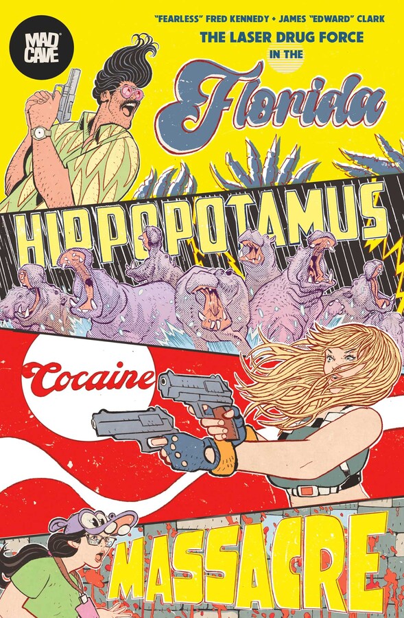
Comic: The Florida Hippopotamus Cocaine Massacre. Good news, it’s not just for speculators! H.P.C.M. is a hilarious, no-holds-barred, Robocop-level satire of the Reagan-era war on drugs/war for family values, with more violence than Rambo, Scarface, and David Attenborough’s Planet Earth: Africa combined. Art-wise, think The New World, but country-fried and with superbly-drawn hippos. Three of the four issues are already out, and the trade paperback is available to preorder. Friends, I haven’t had this much fun since Battle Pope.
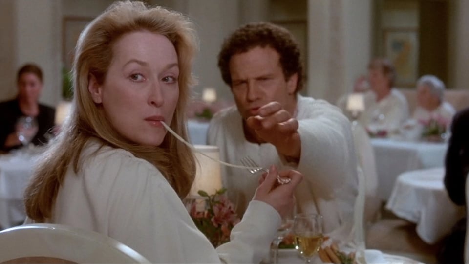
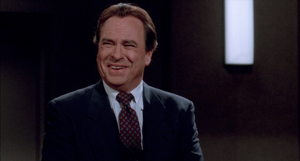
Non-comic: Defending Your Life. Me and the sweetie were deeply impressed by this film. Albert Brooks plays Daniel, who dies in a top-down car accident while singing along to Barbra Streisand (a nasty way to go). His soul arrives in an Earth-coded purgatory, where he is to defend the character growth he’s achieved throughout his life—but he’s not on trial! Or something! Depending on how he is judged, he can either go back to Earth and try life again, or ascend to the next phase of existence. Along the way, Daniel finds love in the form of the charmingly beautiful, fully-realized human soul Julia, played by the one and only Meryl Streep (the only Meryl Streep who has ever existed)! Also features the great Rip Torn, who plays Daniel’s attorney/the proto-Artie-from-The Larry Sanders Show. Nobody mugs better than Rip Torn.
Stuff with my name in it (May 2026):
5/02 (Comics Giveaway Day):
Alien, Predator & Planet of the Apes #1 CGD 2026
Amazing Spider-Man #1,000 / Queen In Black #1 CGD 2026 (Queen In Black story)
Armageddon/X-Men #1 CGD 2026 (X-Men story)
5/04:
X-Men Infinity #16
5/06:
Alien: King Killer #2
Batman #9
DIE: Loaded vol. 1: Zero Sessions TP
Star Wars: Rogue One - Cassian Andor #1
X-Men #29
X-Men: Age of Revelation - Book of Revelation TP
X-Men: Age of Revelation - Overture TP
X-Men: Age of Revelation - World of Revelation TP
5/11:
X-Men Infinity #17
5/13:
Knull #5
Showdown #1
Star Wars: Out of the Darkness TP
Uncanny X-Men #28
5/18:
X-Men Infinity #18
5/20:
Moonstar #3
Predator: Bloodshed #4
Star Trek: The Last Starship #7
Venom #258
Wonder Woman #33
5/25:
X-Men Infinity #19
5/27:
FML #8
Magic: The Gathering: Untold Stories - Elspeth #4
Star Wars: Galaxy’s Edge - Echoes of the Empire #2
Wonder Woman vol. 4: The Island of Mice and Men TP
X-Men #30
X-Men: From The Ashes TP
And, finally, the cat photo:

Got a question you’d like me to answer in a future newsletter? Ask away in the comments section!
-

Hi Clayton, and thanks for the great breakdown of caption boxes.
Back in the early 2000s (and maybe the 90s?) there seemed to be a trend to have captions boxes with a gradient on them. So, for example, Spider-Man would fade from red to white.
My question is that was there an underlying reason for this trend, like new technology making it easier? And is there a reason it became less popular?
Add a comment: