Is this what success looks like?
My career peaked early
The graph below tells a true story of my career. It peaked early and it was all downhill after that.
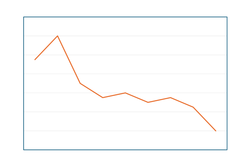
It’s a graph of how many hours I worked each week in the various roles that define my career.
Each point on the graph represents either a change of role (a promotion) or a change of employer.
The two points at the far left of the graph describe the start of my career in London, as a graduate trainee and as an account director. From the third point onwards I was based in Scotland at various agencies, progressing from account director to managing director, then reinventing myself as a strategy director. The final point on the far right of the graph represents my last four years as an independent consultant up to the present day.
So the X axis represents time, not in terms of years, but in terms of the different roles I’ve had at different places.
It’s the shape that matters. The shape is accurate. The peak corresponds to my time in account management in London, when I was working sixty hours a week, every week. That took half of my twenties sadly. Every other point on the line is a fair reflection of my weekly hours relative to that time in London.
The graph shows the beneficial effect of moving to Scotland. But the main story is that, even when I’m working hard as a consultant, I’m nowhere near as busy as I used to be in agencies. And it’s glorious.
Appearances can be deceptive. This downward graph tells a positive story.
An aside on Alt Text
It’s nigh-on impossible to adequately describe a line graph in image Alt Text, so I’ve included a table of numbers for this graph, and subsequent graphs, at the bottom of the post. The figures in the table are not “data” per se. They are just the numbers I used to create graphs with the correct shape. The right shape means that each point on a graph is at the right level relative to the others. That’s the story.
I’m indebted to Amy Cesal’s post on writing alt text for data visualisation. I’ve done my best to follow her best practice for the graphs in this article.
My career also peaked late
Here’s another true story of my career.
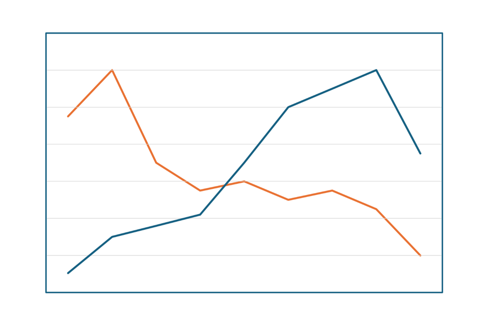
The dark blue line represents my earnings. It’s probably what you’d expect from a reasonably successful advertising career. My peak salary was about eleven times my starting salary as a graduate trainee.
The main story of this graph, for the purposes of this post, is at the far right, where it shows that the price of working fewer hours as a consultant, so far at least, is earning less money. That’s something I’m working on.
I’m working with a coach on a more structured and proactive approach to my pipeline. And we’ve been making good (rapid) progress in shifting me away from time to a value-based approach to pricing.
It’s tempting, but misleading, to view this graph as a simple work/life balance story. It’s misleading because there’s more to achieving balance than working an acceptable number of hours to earn an acceptable amount of money.
That’s what the next two graphs are about.
Putting the fun into line graphs
Literally putting fun into a line graph. The green line in the graph below represents how much fun I was having at various times in my career. I’ve overlaid it on the earnings line from the graph above.
You can see that, as far as I’m concerned, money and fun are independent variables. I don’t care too much for money. Money can’t buy me fun.
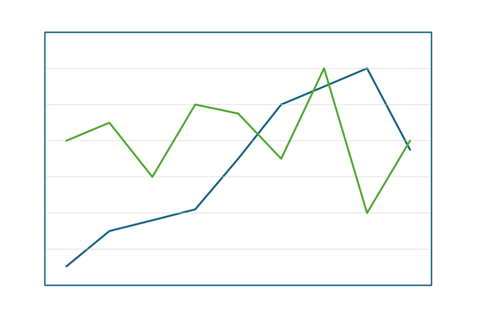
In fact the main story of this graph is that I was having the least fun when I was earning the most money. You might also notice that the period of least fun came immediately after the period of most fun. I call this the Great Fun Crash of 2016.
The Great Fun Crash was the result of a catastrophic culture implosion. Two culture-killing decisions by those above me - one decision in particular - destroyed morale and caused many of our best people to leave. I stuck around for a while but it turned out to be the beginning of the end of agency life for me as well.
Company cultures are made of cast iron. They appear to be strong. But they’re brittle and they shatter if you hit them in the right place with a hammer.
Right now, I’m enjoying the work of consulting but I’m missing the social aspects of agency life. I’ve joined a lively co-working space just to be around other people from time to time. I have to work at fun these days.
The best work of my career
This is a graph of pride. At each stage of my career how proud was I (am I) of the work, of the output?
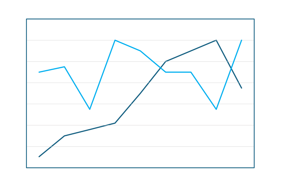
The headline here is that, in my humble opinion, I’m doing the best work of my career. That feels like the truth.
The whole truth, as revealed by the graph, is that there are two high points for pride in my work: one as I entered the middle of my career, and one right now. So it’s more precise to say that I’ve never been prouder of my work than I am now.
The first high point was also a peak, so pride did come before a fall. It corresponds to a crazy, and crazily good, body of advertising work from a swashbuckling agency. That was obviously a team effort.
The second high point relates to my work alone. I’m doing the best work of my career aged 58. Hopefully it’s not a peak. Hopefully I’ll be doing even better work aged 59. I’m doing the best work of my career in no small part because I’m 58. I wasn’t ready to do this kind of work to this standard ten years ago. It’s as much about knowing myself as it is about knowing my stuff.
I work in a notoriously ageist industry and I probably wouldn’t be given the opportunity to do this work in most agencies. Fortunately that’s now their problem rather than mine.
The time of my professional life
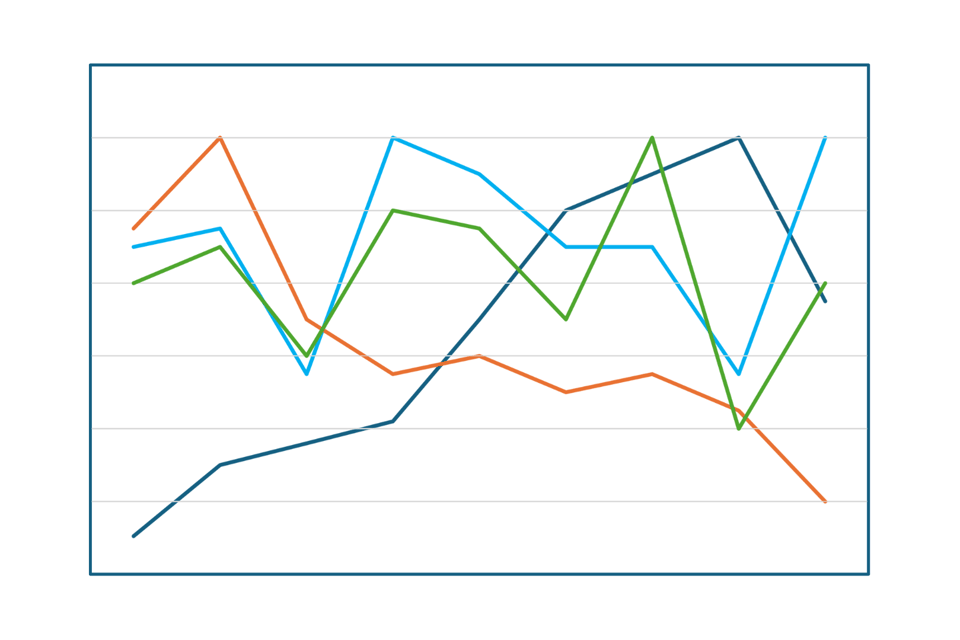
Is this what success looks like? Time, money, fun, pride all on one graph. On reflection, looking at this holistically, there are three candidates for the time of my professional life. And I’m grateful that one of those is now.
This article is an adaptation of the opening section of a guest lecture that I gave to students on the Creative Advertising MSc course at Napier University.
As mentioned above, here are the numbers used to generate the graphs. These are not data. They just give the graphs the right shape to tell four true stories of a career. I’m aware that this table probably looks awful on a mobile device, but it’s mainly there for screen readers.
Time | 4.75 | 6.0 | 3.5 | 2.75 | 3.0 | 2.5 | 2.75 | 2.25 | 1.0 |
Cash | 0.5 | 1.5 | 1.75 | 2.0 | 3.5 | 5.0 | 5.5 | 6.0 | 3.75 |
Fun | 4.0 | 4.5 | 3.0 | 5.0 | 4.75 | 3.5 | 6.0 | 2.0 | 4.0 |
Pride | 4.5 | 4.75 | 2.75 | 6.0 | 5.5 | 4.5 | 4.5 | 2.75 | 6.0 |
Join the discussion:
-
It’s a good observation and a useful Comparison between pride money time and fun.
Everyone should have a fun audit at least every two years.

Thanks Angus. Based on some other reactions to the piece, it sounds like other people have come to a similar conclusion. I've considered the things that matter to me. There are other metrics that might matter more to other people, and they should audit those as well or instead. Security might be of interest for example. If I'd included a line for that, it would be at its lowest point right now.
-
This is brilliant.
Thanks Milo. It's very nice of you to say so. Any comment is nice.. Comments like this are wonderful.
-
We often ask about “what does success look like” and KPIs when it comes to brands. This begs the question of “what does success look like for me”. I gave my bank a talking-to the other day when they assumed that I was measuring success in monetary terms as a self-employed person.
Thanks for taking the time to comment Sue. I hear you regarding your bank. I have a good relationship with my financial adviser because he took the time to deeply understand my attitudes to money, which I suspect are different to those of many of his clients.
Sounds like a good ‘un. Few and far between in the world of financial advisors!
Add a comment: