Inspiring Apple Vision Pro Apps

Inspiring Apple Vision Pro Apps
Having declared that all Apple Vision Pro Apps were boring just a week ago, there’s been an influx of launch announcements and information about further Apple Vision Pro apps (Mainly thanks to the tireless efforts of Steve Troughton-Smith) that will be available at or shortly after the device’s launch on the 2nd Feb. Going beyond a like-for-like port of the iPad version of their apps, there’s a few interesting interface and interaction trends I’d like to highlight that will hopefully inspire some others in their pursuits developing for the platform.
Windowing & Ornaments
This is probably the lowest hanging fruit, the next step from getting an app building and running on the device, but one that will arguably have the biggest impact. A thoughtful approach to window management and how to present interactive elements makes a few Apps stand out right from the bat such as how window’s content react to their size and how Ornaments are used for interactive elements.
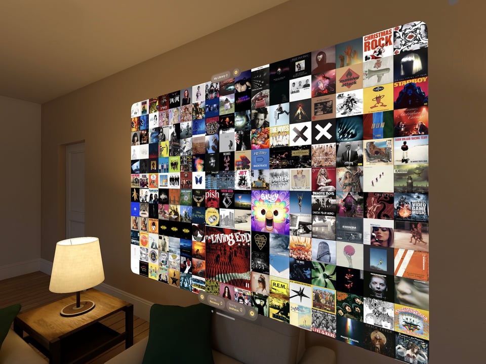
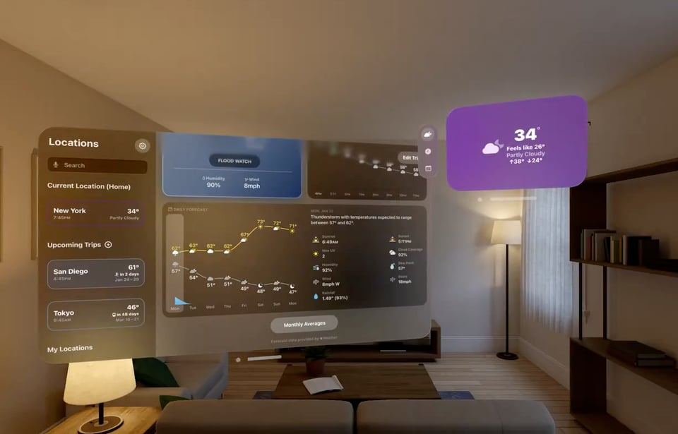
Apps such as Mercury Weather and Longplay change the information displayed in a window depending on the size. This gives the user more control of how much information they are shown at any time and takes advantage of both a small and large canvas in a (hopefully) intuitive way.
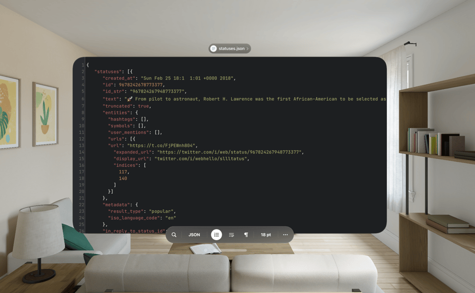
Runestone is using ornaments in a useful way to pin controls to the main window without getting in the way. I can see this shelf or toolbox approach becoming common, particularly if you add in the option to hide it when not being used.
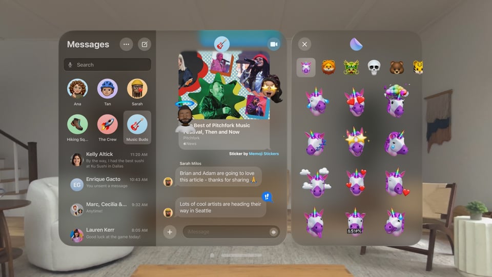
Popovers work on the device, but they are rarely the best option for presenting additional detail when you have an “infinite canvas”. Presenting a new window is a better approach, but how many windows is too many?
The direction I think will win out is similar to Apple’s iMessage, which has a sliding window mechanic (recreated by Steve Troughton-Smith on Github). It spreads out the content, without creating additional window managing load for the user. As usual Apple has also added some nice polish to the animation here too. I hope this becomes an API for everyone to use at this years WWDC.
3D Decoration
Cut the Rope is the best example so far here, where 3D is used as decoration to the 2D content. Unfortunately it doesn't appear to add anything more than whimsy to the experience from what the screenshots show, but it's a great idea. It’ll be interesting to see if there’s an evolution of this approach that could be used to add more to the experience than just a visual element.

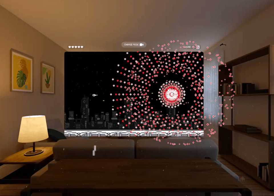
There are other examples of the 3D breaking free from the 2D interface such as the particles in Void-X, a retro space shooter, which is definitely the direction to go if it makes sense for the game as it does in this case.
Disney is going beyond this and using a volumetric scene as a place to watch content. I don’t know how practical it will be for others to follow this approach as each of these is a significant investment in content generation in itself. Will a skybox have the same effect, or will the fidelity of the device require these scenes to be 3D?
Volumetric
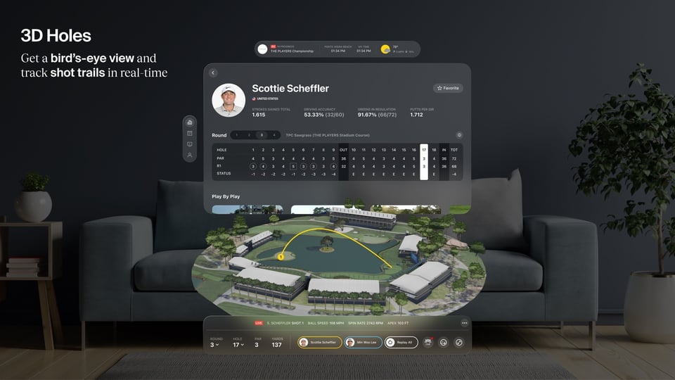
A step beyond decorative 3D is fully interactive volumetric elements. These, so far, seem to be a feature of the Sports category almost exclusively, but using data to provide additional insights and views of the action is a great example of what the device can do well. The NBA and PGA Golf seem to be leading the way in this category.
There was also a concept video doing the rounds this week on how adding 3D content, along with taking video beyond a static window can be used for F1 data. I can’t wait to see these concepts come to life in the coming months.
Collaboration
This is an area that seems to have a lot of potential, but will be difficult to develop for until device availability is more widespread. There are a few game examples that fit this category, the aptly named Vision Ploppy Pairs which promises SharePlay support. I would assume the board game simulation Game Room will also offer something similar. The interesting aspect about these types of apps is the sharing experience isn’t restricted by everyone having a Apple Vision Pro, SharePlay works across all Apple’s platforms, so multiplayer games or shared experiences can happen across devices. I am intrigued to see what developers do with this technology to expand the experience beyond the device itself for both multi-user and single user interactions.
Just Good Demos/Inspiration
Lastly, no launch should be without Apps that have a wow factor which will make them good candidates for testing out the technology, showing to others or for inspiration of what’s possible. Mostly these are full immersive experiences, or make good use of AR for interactive elements. Apple’s poster child djay is one for this, alongside the AR App Jigspace. Night Sky also looks fantastic and well worth playing with on any platform.
Without trying it though Game Room looks to combine all the above elements into the most impressive app that’ll be available for launch, but I’m sure there will be a few more impressive apps and games that we’ll see over the next week and beyond.