
Unsung (Weekly Digest)

Unsung (Weekly Digest)

Archives
Log in
Subscribe
October 23, 2026

“In every study that considered the question”

Welcome to this week’s digest of Unsung, a blog about software craft and quality. Here’s what was posted since last time:

New this week: I made some changes so that the newsletter should look better in dark mode. Please let me know if you’re seeing any unintended effects!

View this issue in the browser with inline videos and better formatting

“In every study that considered the question”

I spent most daylight hours yesterday driving in torrential rains in pretty bad visibility, and I was astonished how many cars didn’t have their lights on.

It looked something like this. The cars with tail lights on were somewhat visible, but the cars without them didn’t stand a chance:

Some drivers definitely lacked enough imagination to turn on their lights. But even though I knew to do that, I struggled, too – my rental car light interface felt so opaque that I almost chose to drive with the wrong lights on. And it all had to do with iconography.


Cars have two main settings for lights:

  • “regular driving,” meant to be used at night and during limited visibility – like in heavy rains,
  • “parking,” where front lights are less prominent, meant to only be used when stopped.

The UI for lights seems to typically look like this:

Without knowing, can you figure out which setting is which?

The left icon with two lights facing away from each other means the parking lights. The far-right icon with one light pointing slightly down (“low beams”) is regular driving lights. The latter is the right thing to do in the rain, but the assignment feels kind of arbitrary to me, and I could totally see the icons going the other way.

Also, the above is a somewhat gentle situation. In my car, the lights were on a stalk, and the setup looked more like this:
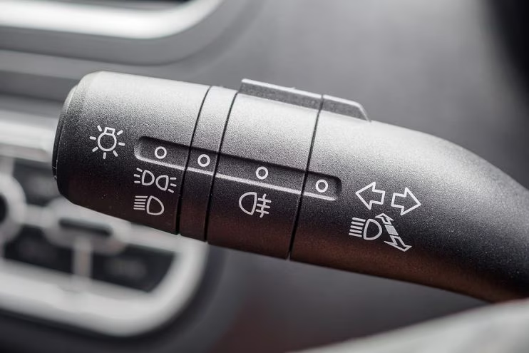
Here:

  • the lightbulb on the left is a meta indicator for “this is the main light setting” (you can see it above too, on the dial),
  • the middle part with the wavy line is fog lights,
  • the arrow-heavy thing on the right informs of two things: pull on the stalk for high beams (another mode), or rotate the stalk left or right for turn signals.

That’s a lot of stuff going on, and many similar icons that do not appear immediately understandable. The whole interface seems optimized for motor memory, but harder to approach at first.

In both modes, the feedback from inside the car is exactly the same – you see the interior dashboards illuminate, and the front lights go up. At night, you might spot the difference in the front light intensity. But in the daytime rain, it’s less likely – especially if it’s a rare intense rain you don’t encounter often.

(Many cars have an AUTO option now, but I wasn’t sure I could trust it, and if it would properly account for the rain reducing a lot of visibility.)


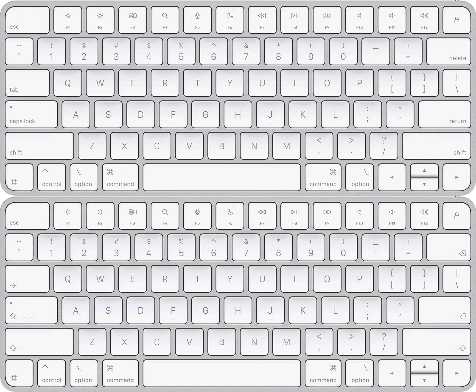
Lost perhaps amidst the recent conversations about icons in menus and app icons was another subtle change: Apple started embracing more iconography on buttons, too.

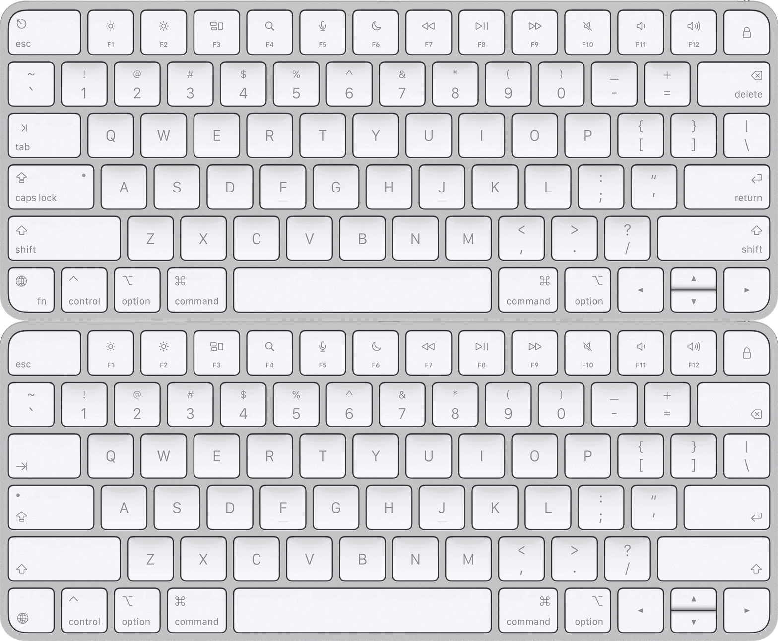
You can see it on keyboards, where the U.S. models followed in the footsteps of international ones, now showing symbols instead of legends for Tab, Caps Lock, Shift, Fn, Enter, Return, and Delete. Here’s the previous generation and the 2026 one:
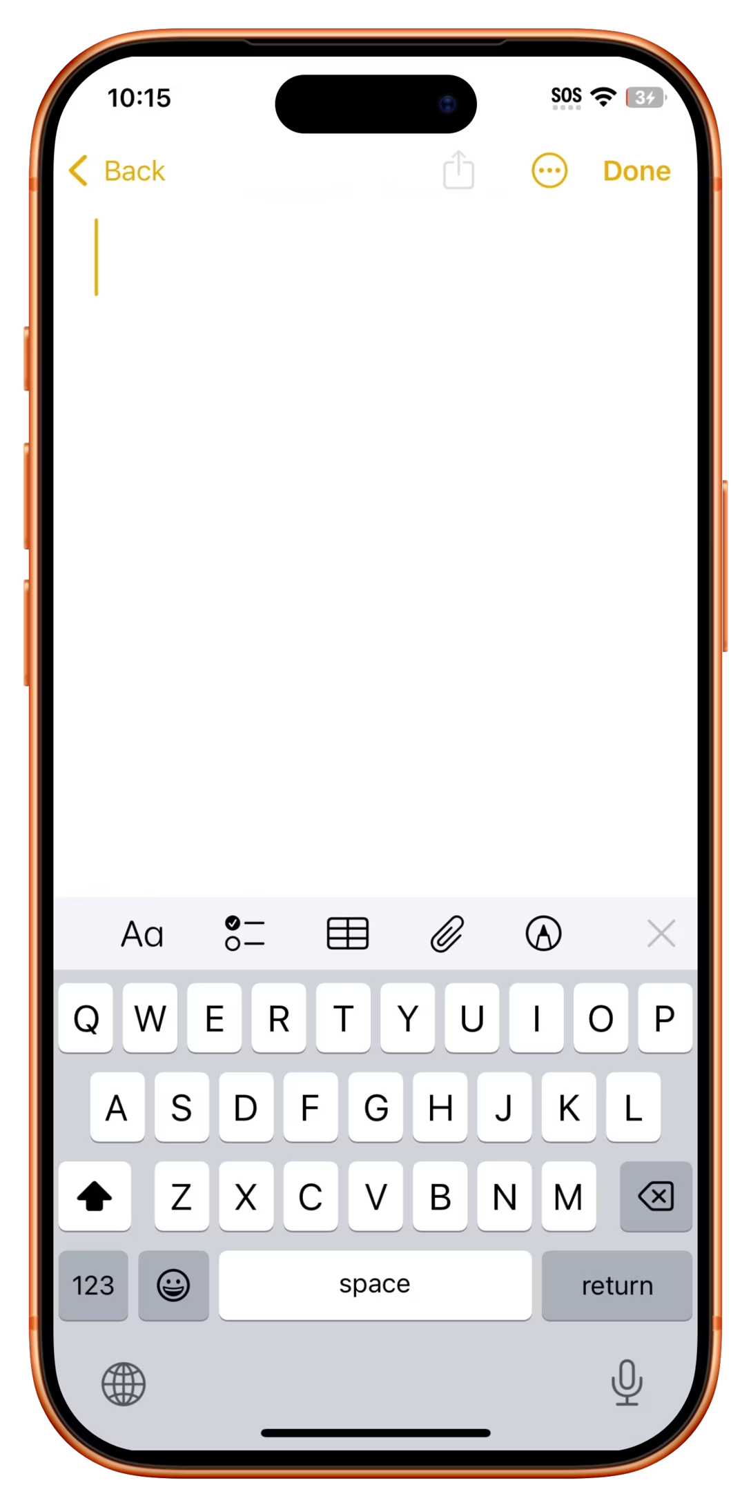
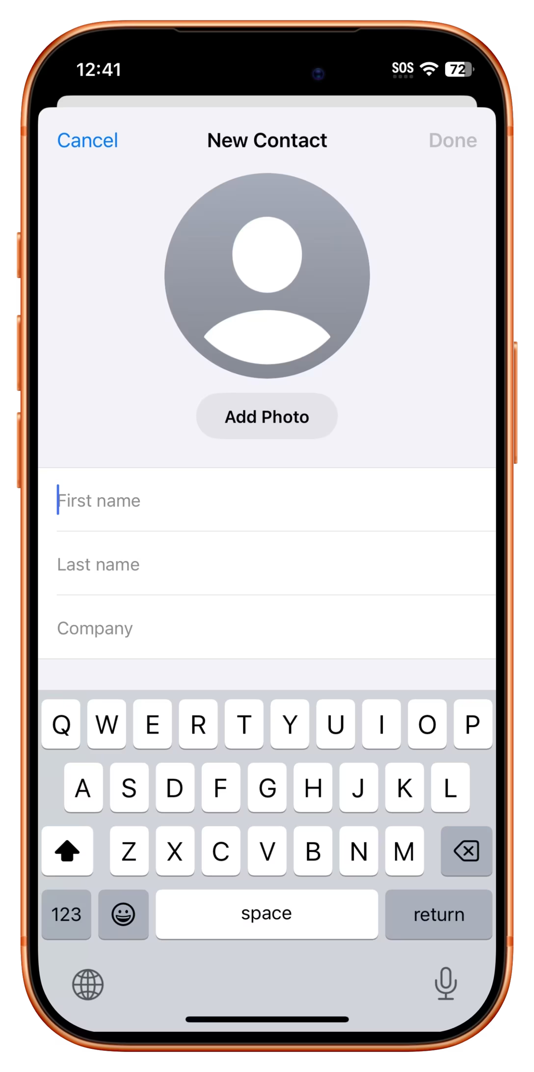
The shift also happened on screens. Below are examples from the last three versions of iOS (18, 26, and 27), side by side.

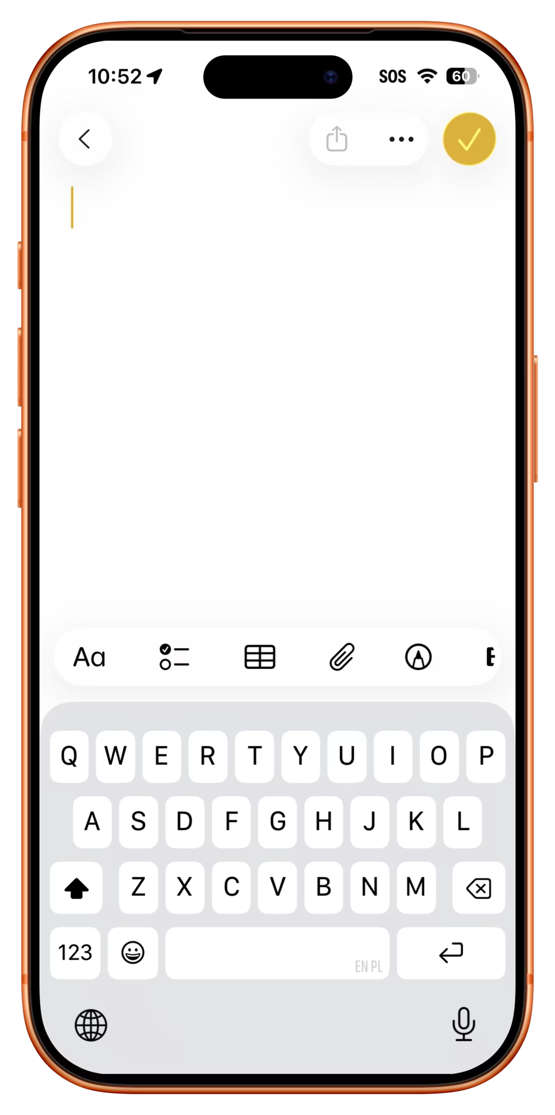
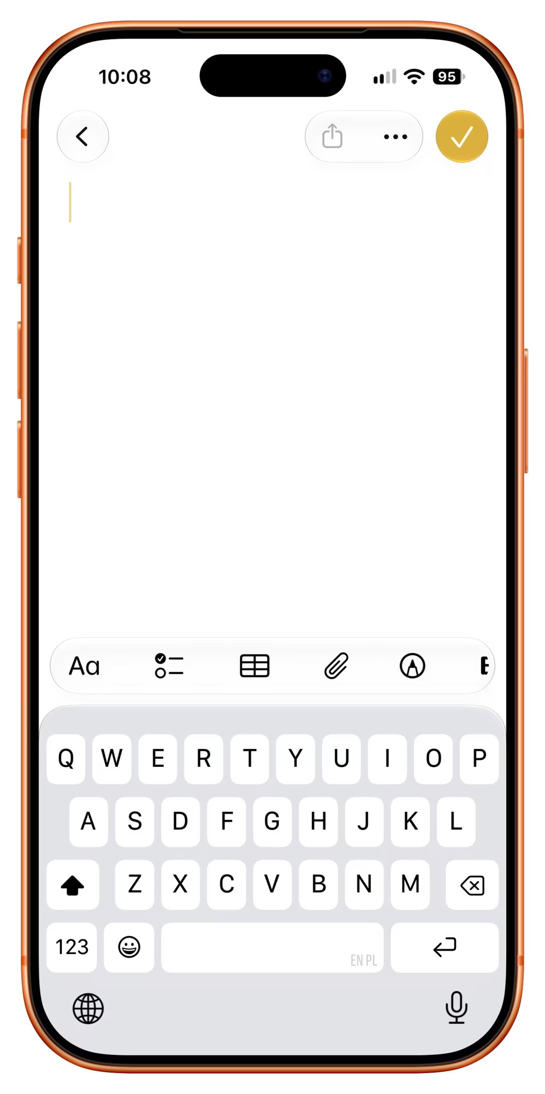
When starting a new note, it’s not just the keyboard’s ↵ that replaced Return. The back icon also lost its legend, and Done became a checkmark:
Here might be the best case scenario, with Cancel and Done swapped with icons:
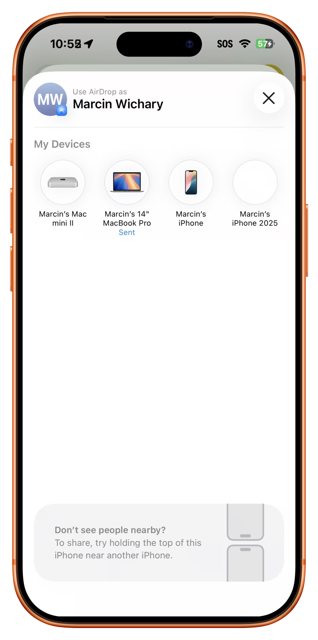
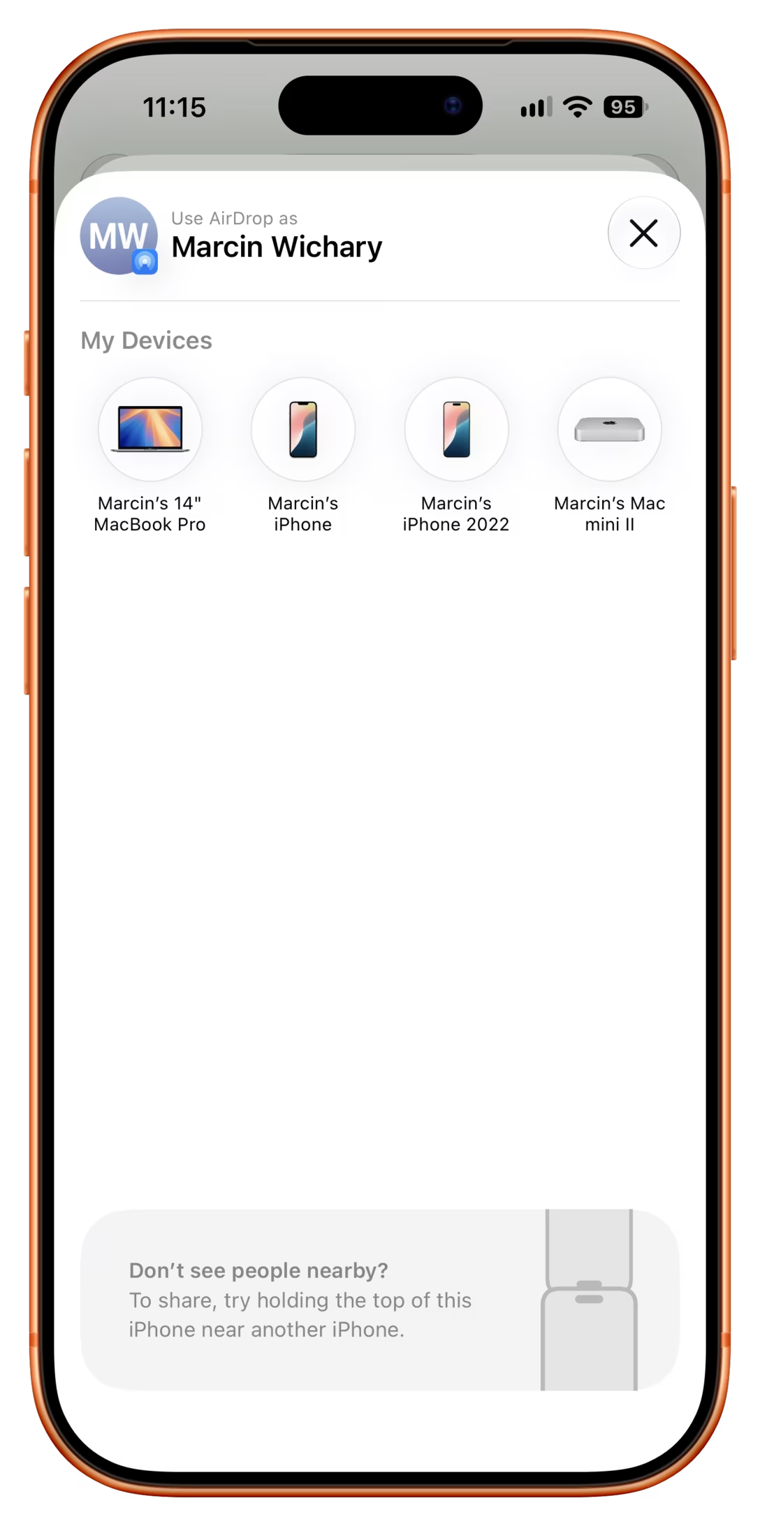
In this AirDrop screen, Done became a close box:
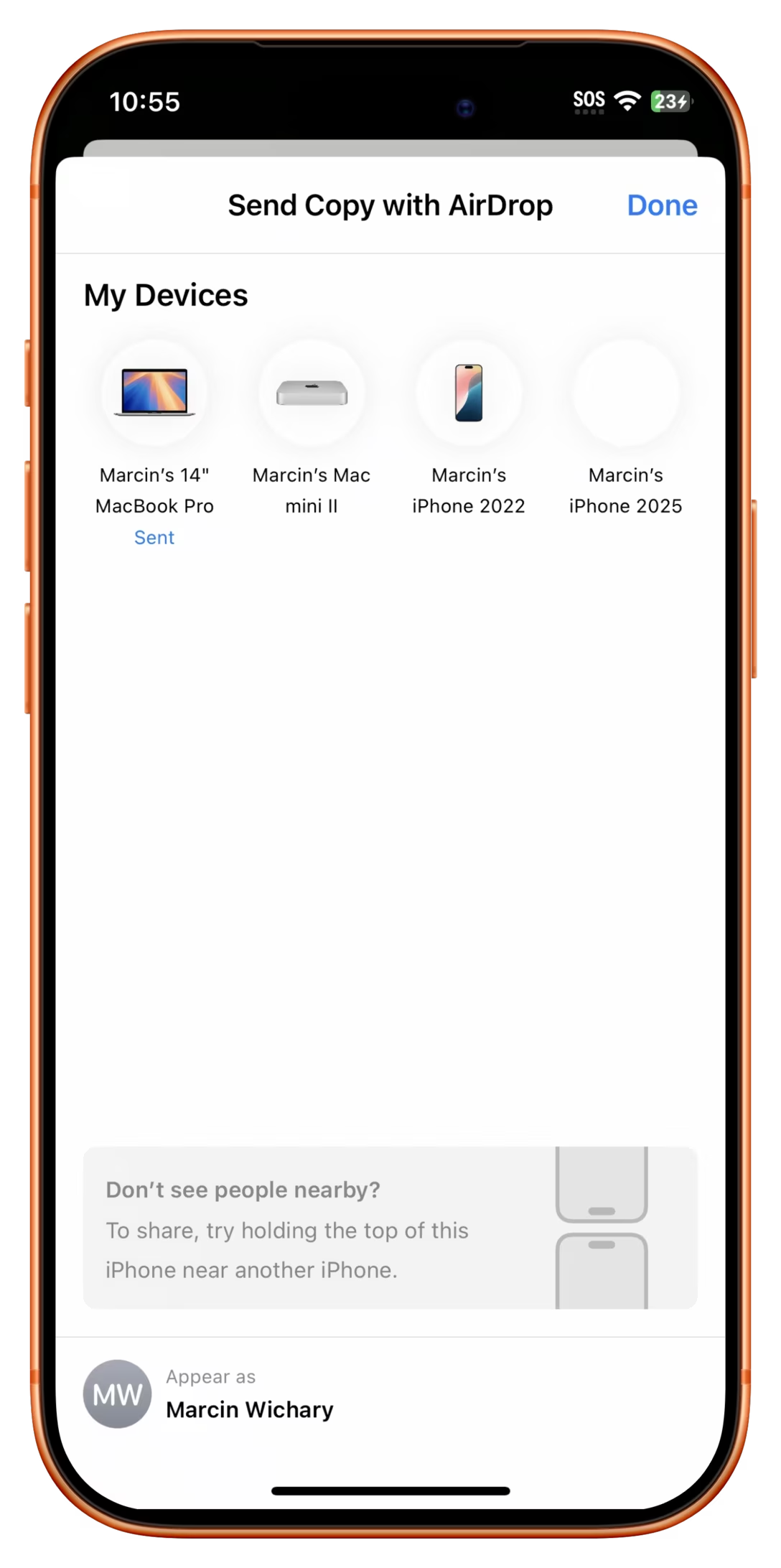
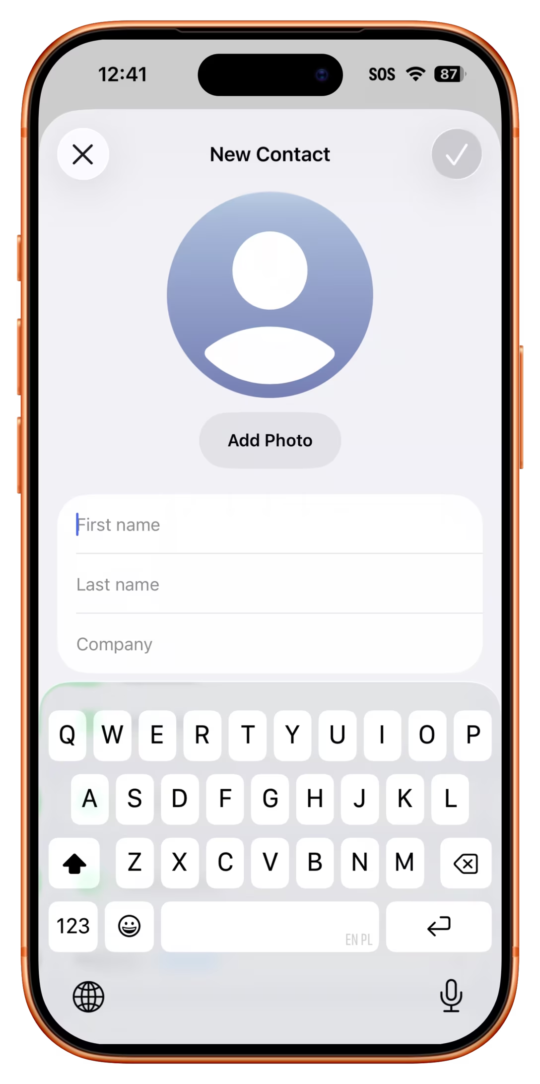
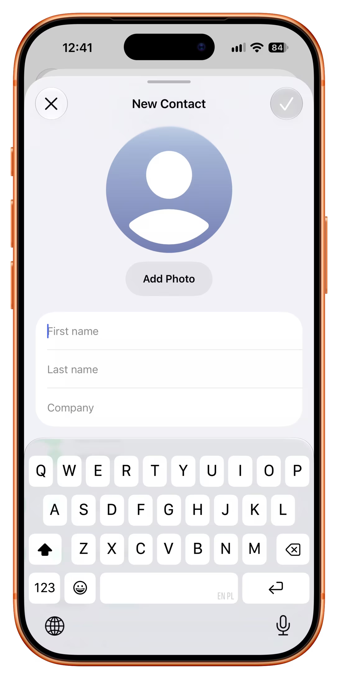
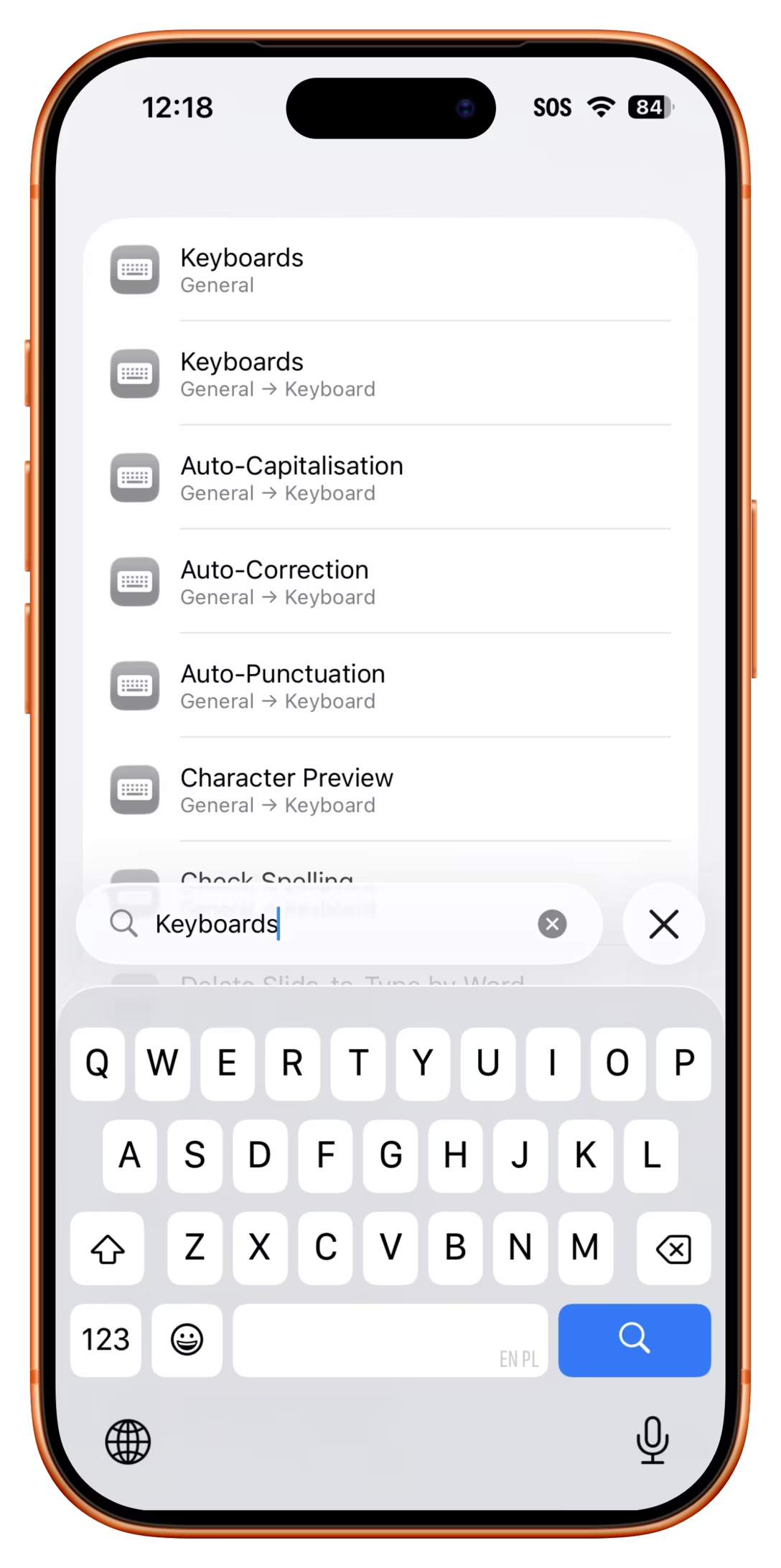
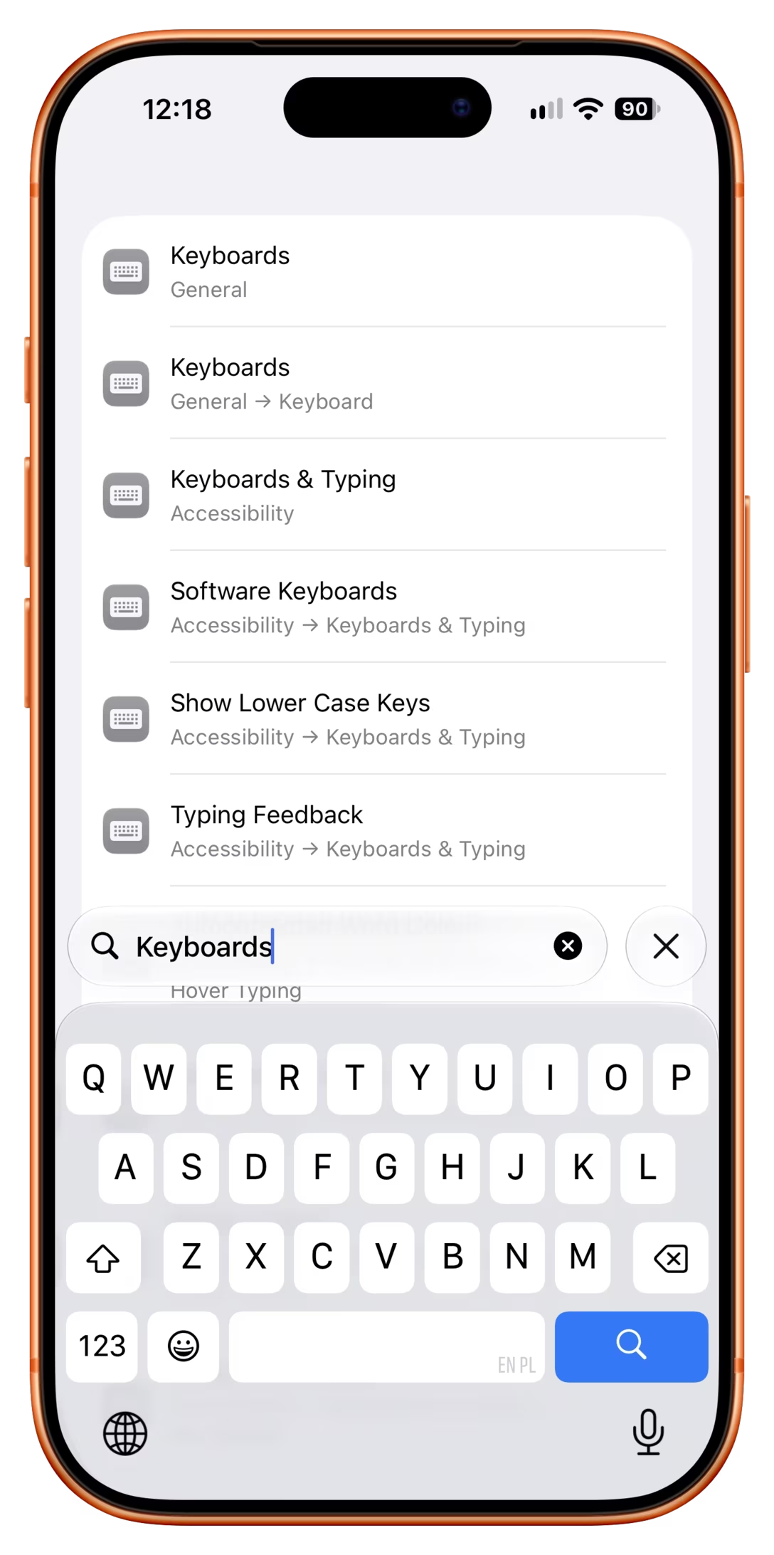
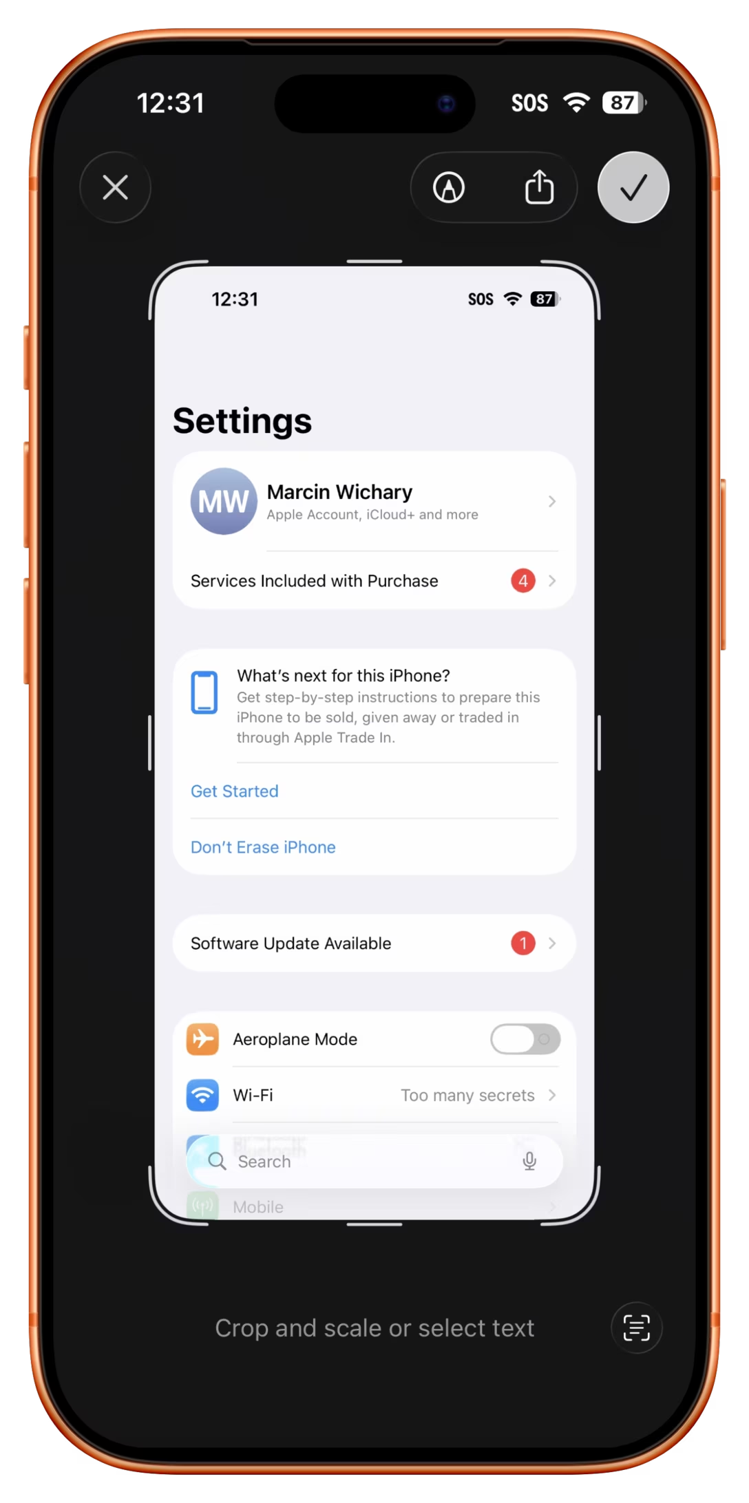
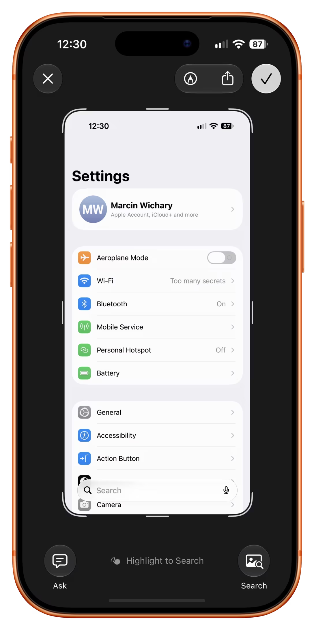
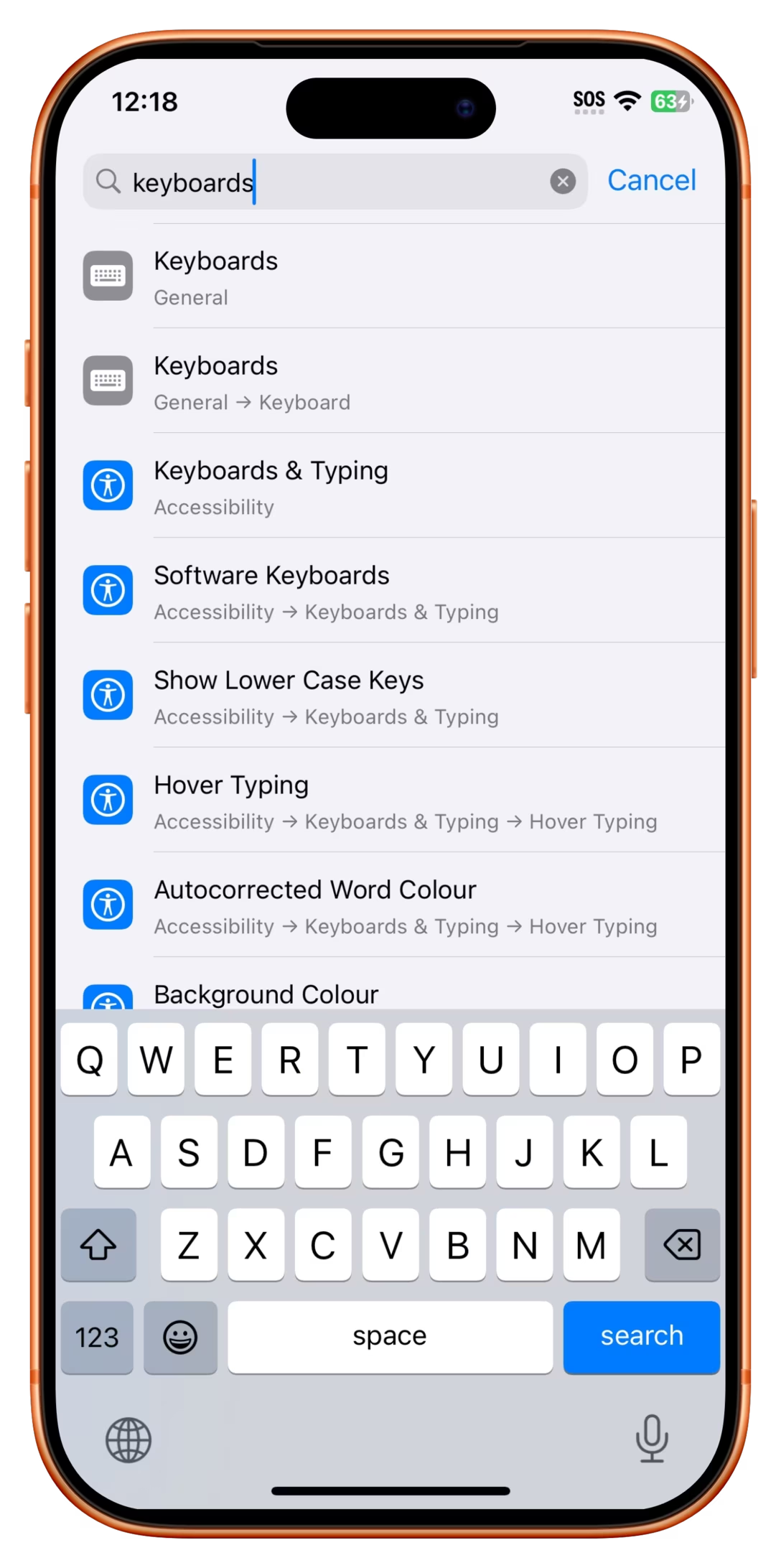
Elsewhere, Cancel morphed into ×, in an unfortunate position next to a different ×. Plus, Search on the keyboard became a loupe:
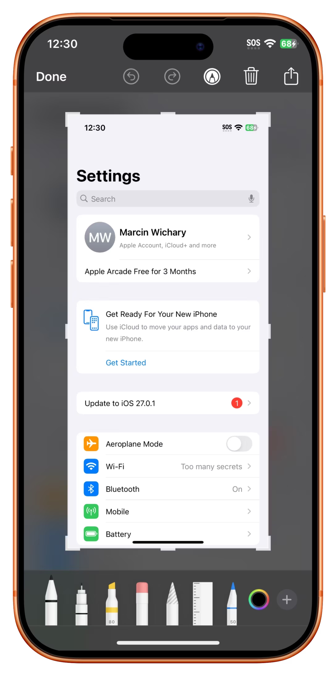
When screenshotting, Done was splintered into a checkmark and an ×:
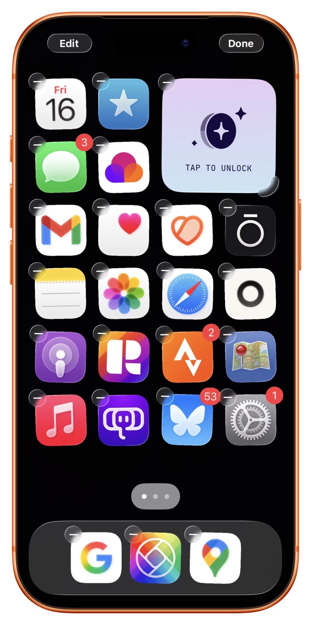
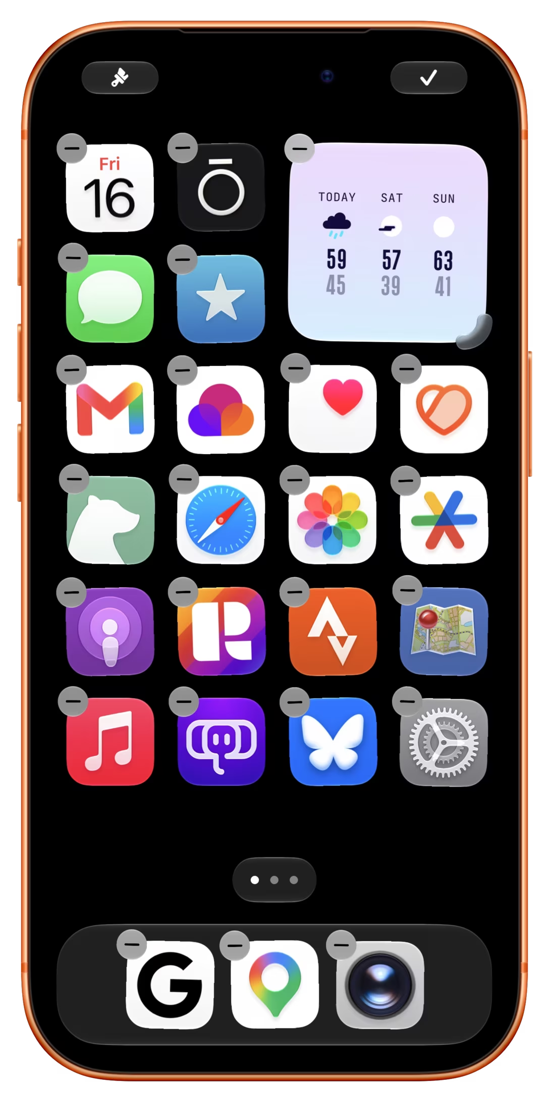
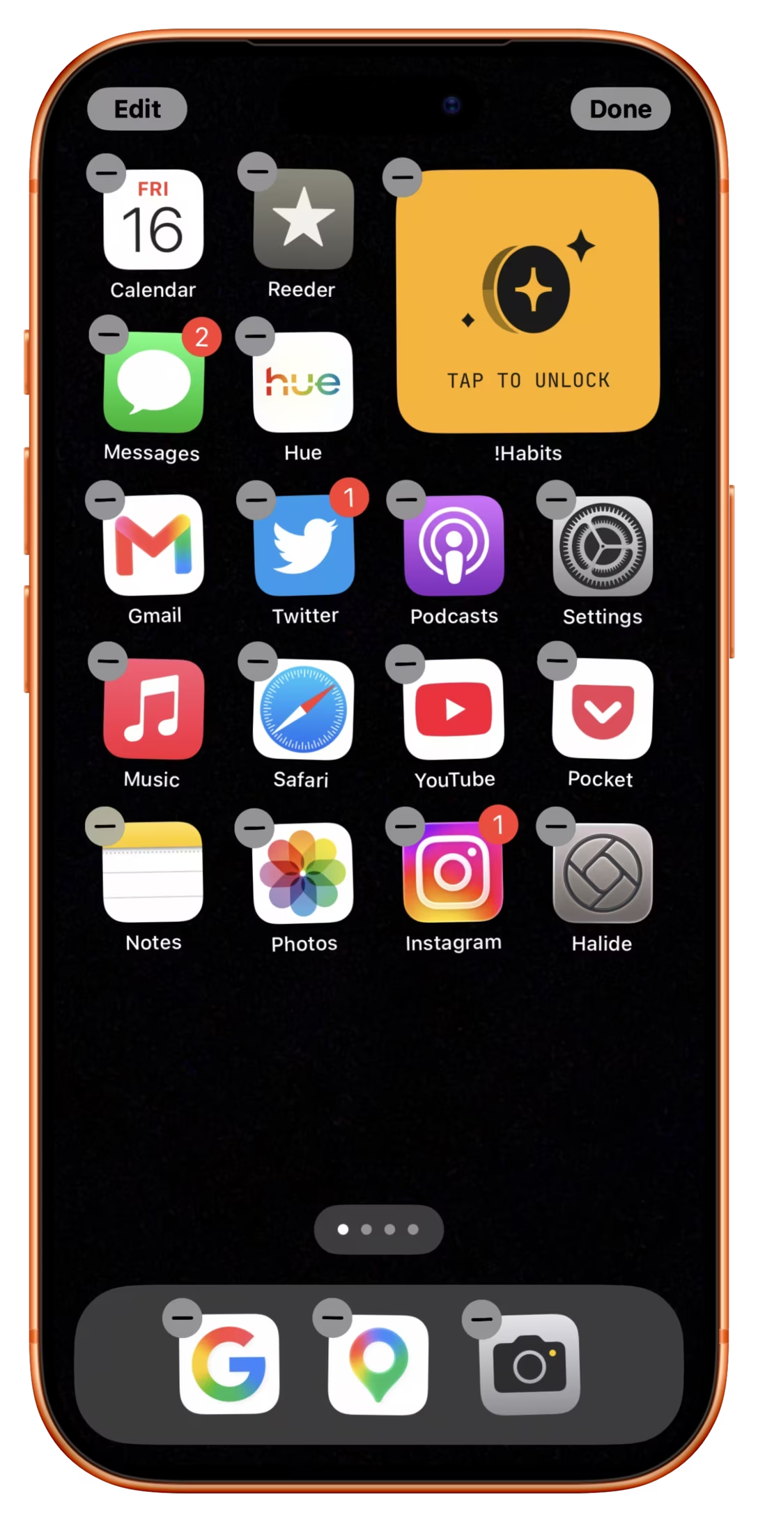
And here, Done transformed into a checkmark, while Edit became a new kind of a paint icon:

Seeing all this, I was reminded of this old post from Dmitry Fadeyev, titled “False simplicity”:

Sometimes, what appears on the surface to be simple is actually far from it. For example, there’s a trend in Twitter clients to use icons instead of text labels for buttons. Just icons, no text at all. These icons don’t take much space, look elegant and maintain that simple feel of Twitter, except…they’re actually just confusing.

Fadeyev also quoted Jef Raskin’s take on icons:

In every study that considered the question, icons were demonstrated to be more difficult to understand than were labels, especially at first viewing, which contradicts one of the most frequently cited reasons for using icons, namely, comprehensibility for beginners. […] Although it is true that tiny icons can take less screen space than labels, you have to ask: At what cost? The smaller a button, the longer it takes to operate it, and the more difficult it is to find; also, it is difficult to make a small icon distinctive.

I like that take.

Here’s my personal go-to cheat sheet when it comes to iconography:

  • icons are compact, allowing you to squeeze in “more UI,”
  • people probably understand only a few icons (close box, checkmark, plus, some chevrons), and can learn others – but the learning process will be harder than you think,
  • many icons are never understood, but people can still to some extent use them without ever understanding them,
  • icons can break the monotony of an all-text interface,
  • well-made icons make the interface look more attractive in a way type can’t.

I don’t believe Apple is doing it all just for aesthetical reasons. My guess is that it’s more about the first bullet point above: liquid glass added so much chrome and padding that Apple simply ran out of room for text labels encased in glass.

At the first glance, Apple is avoiding the car light problem by using popular icons. However, there’s a new challenge: most of these icons are too popular, and overloaded with meaning:

  • checkmark: “commit” or “to do item/​checkbox”?
  • ×: “close” or “clear”?
  • loupe: “search” or “zoom”?

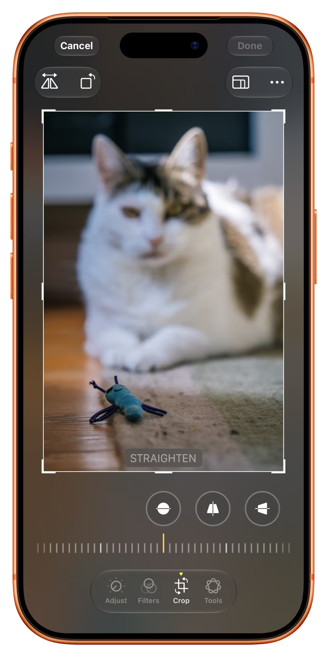
The only outlier is the edit icon, relatively new and likely unknown. With the extra challenge that on-hover tooltips don’t exist on touch devices, the way forward would be to use the paint icon consistently to teach it to people, but it seems Apple isn’t yet doing a great job at that. The below screenshots are all iOS 27, where you can see the leftover Cancel and Done labels in place, and a missed opportunity to put the new edit icon next to Customize to help people connect the concepts:
I wish I could peek inside Apple to see how these efforts are faring, and what’s in store.

To go back to keyboards, I am curious why Apple didn’t consistently apply text and icons for all the affected keys, like they did for the bottom row a while back. Here there was enough room:
And how could we solve the car problem, if we think iconography makes it harder for less experienced drivers? I could imagine a similar idea here as well:

But the funny thing is that most modern cars have a digital dashboard, so for the first time, tooltips are an option. You could imagine turning the stalk and seeing this kind of a message appear for a few seconds, the description and the icon side by side to help the user connect one to the other:

Of course, introducing a tooltip means “now you have two problems.” And, we might be attacking the symptoms here – the real reason might be a complex system underneath, whose complexity is relayed to the user without any translation. Or, perhaps the icons themselves could be changed to better represent “parking” and “driving.” But let’s save all those for future posts.

This post has been edited after I originally confused a few light modes.

Friday, Oct 16 / #apple / #iconography / #ios / #keyboard / #real world

“Hindered by its headline feature”

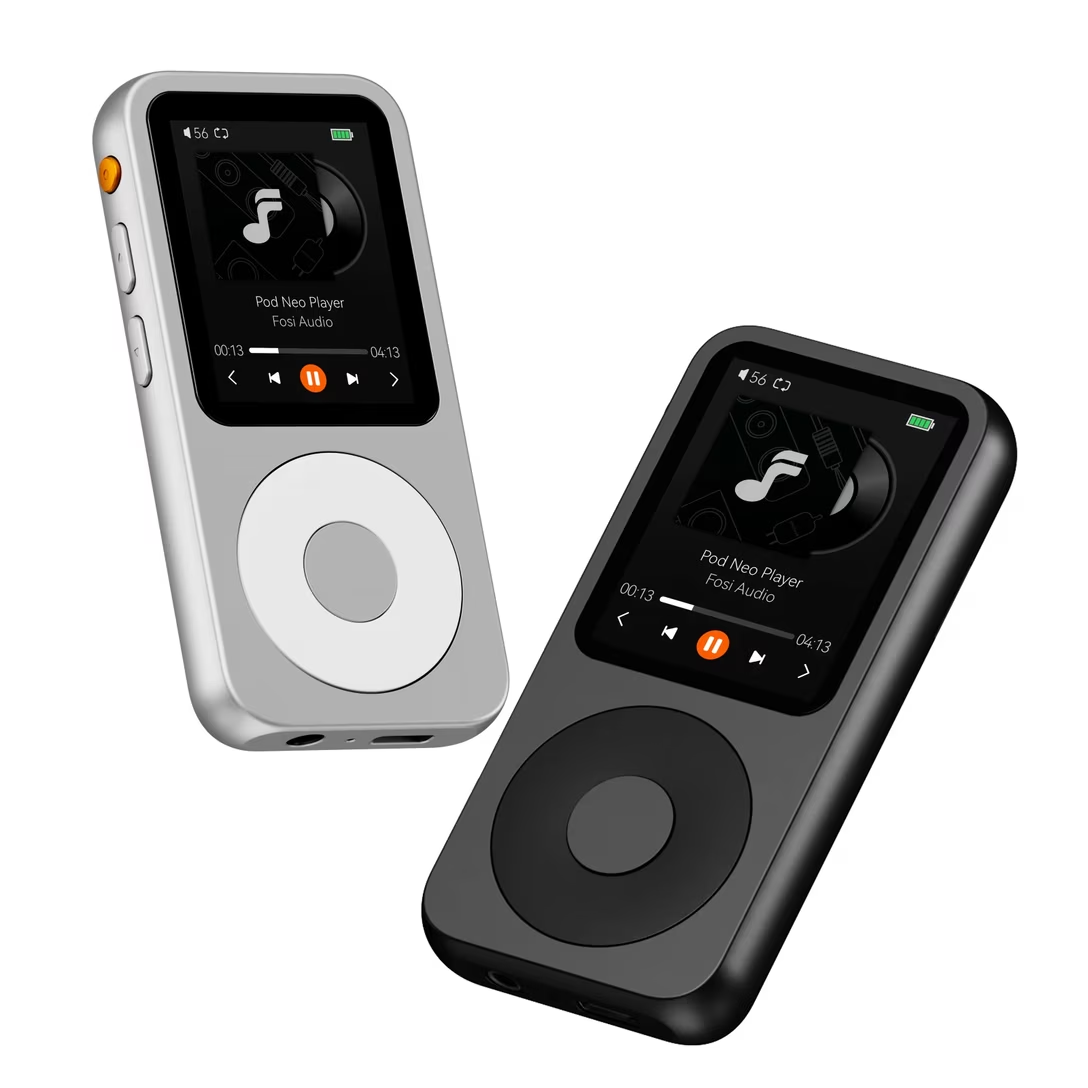
On his channel about new and old hi-fi equipment, Techmoan profiles a modern Fosi Audio Neo player.

Techmoan’s video was originally linked here, but I failed to notice it was an unreleased, patron-only video. If you want to see it, subscribe to Techmoan’s Patreon – it’s worth it! – or wait until Saturday when the video is released to the public. I will re-link it here then. I’m sorry about that.

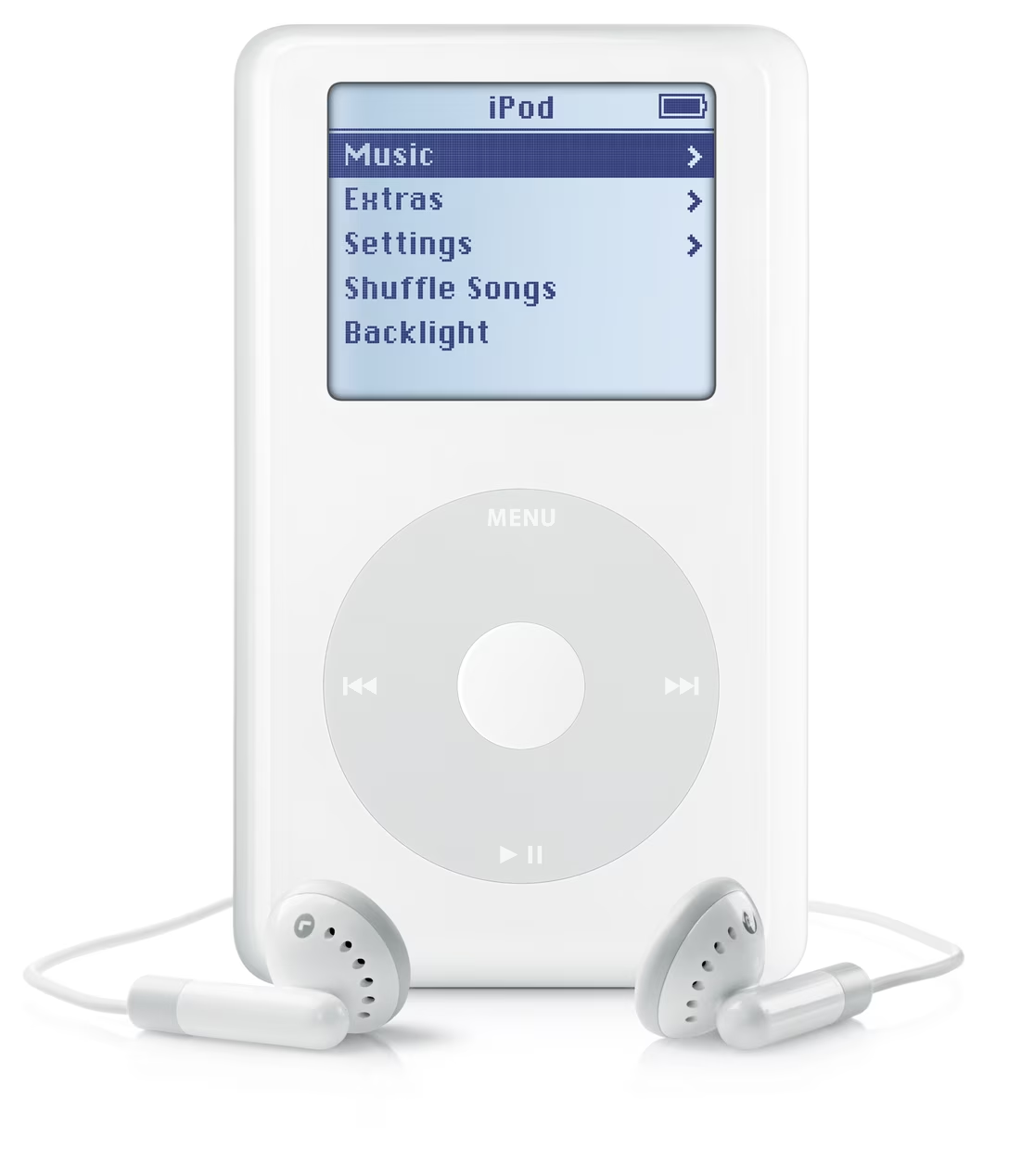
Fosi Audio Neo apes the iPod. At first glance, it looks exactly the same – a deck-of-cards-sized device with a wheel, and above it a screen showing either the currently playing track, or a hierarchical, textual menu:

But the reviewer quickly discovers that the iPod copycat is a disaster in use, its creators accidentally highlighting two important rules:

  • “simple” does not mean “fewer things,”
  • simplicity cannot happen without a lot of small details done well.

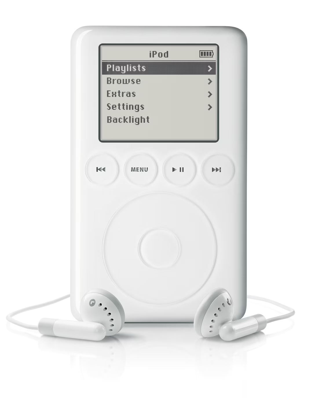
To the first point: iPod actually had five main buttons, not just one. This is most visible in the third generation, which put most of the commands above the wheel:

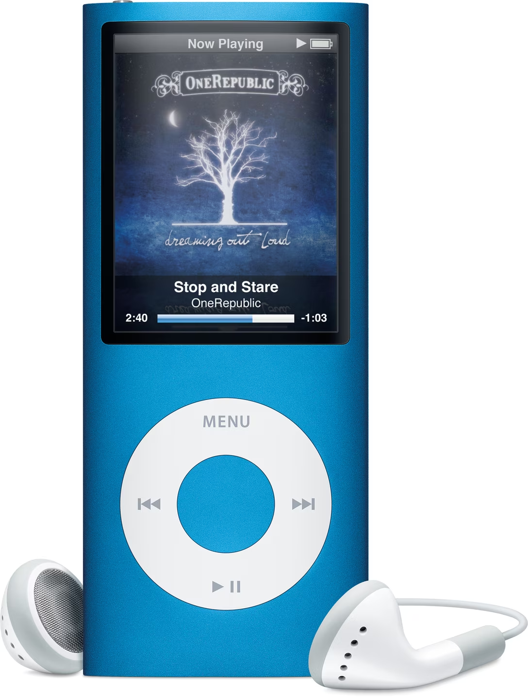
In all the other models, the buttons were integrated around, or even within the wheel:

But the modern product only has one button, and that’s too few for all the necessary functionality. Now “going back” means an unnatural long press. The other necessary commands – like pausing, next track, and previous track – are offloaded to an onscreen menu, which means extra modes and focus states that the original iPod didn’t have. By trying to be simple in a naïve way, the creators of the Neo made their device more complicated.

As for the details? The new player has no acceleration curve when you scroll fast, which would help you traverse long lists as quickly as short ones. It has no scrollbar to give you a sense of how long the list is. It has no haptic-like beeps to help mesh the fluid rotation with discrete item jumps (your mouse wheel is doing the same thing!). It has no side-to-side transitions to help you orient yourself in the hierarchy. And, the reaction to every click seemed so slow that it made even me, the viewer, anxious.

This second aspect is similar to Photoshop vandalizing its dialogs, or CleanShot bulldozing its settings. Here, the new player also underestimates the sophistication and thoughtfulness of the things it aims to copy. The difficult truth is that while software needs to be simple to the user, that simplicity is nothing but complicated to people designing it.

I tried to find a good iPod click wheel explainer, but I couldn’t find any. (There have been a few web approximations over the years, but they also get a lot of nuances wrong.) I wonder if I should create an online iPod simulator, walking designers through all of its important interface details.

Saturday, Oct 17 / #apple / #complexity / #hardware / #interface design

“We all hope you have a great week, even if you never buy a Playdate.”

In my inbox, over the years, in no particular order:

From: YouTube Premium
Subject: YouTube Premium Individual plan price update
Email summary: The monthly price is increasing from $13.99 to $15.99.

From: 1Password
Subject: Important: We’re updating the cost of your subscription
Email summary: The annual price is increasing from $35.88 to $47.88.

From: GeoGuessr
Subject: Upcoming Change to Your GeoGuessr Subscription
Email summary: The monthly price is increasing from $4.99 to $6.99.

From: DreamHost
Subject: Upcoming DreamHost Price Change
Email summary: The monthly price is increasing from $13.99 to $16.99.

From: Printful
Subject: Product and shipping price updates
Email summary: Some prices and shipping rates are increasing.

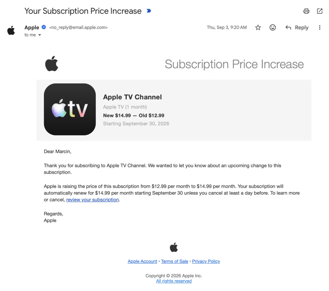
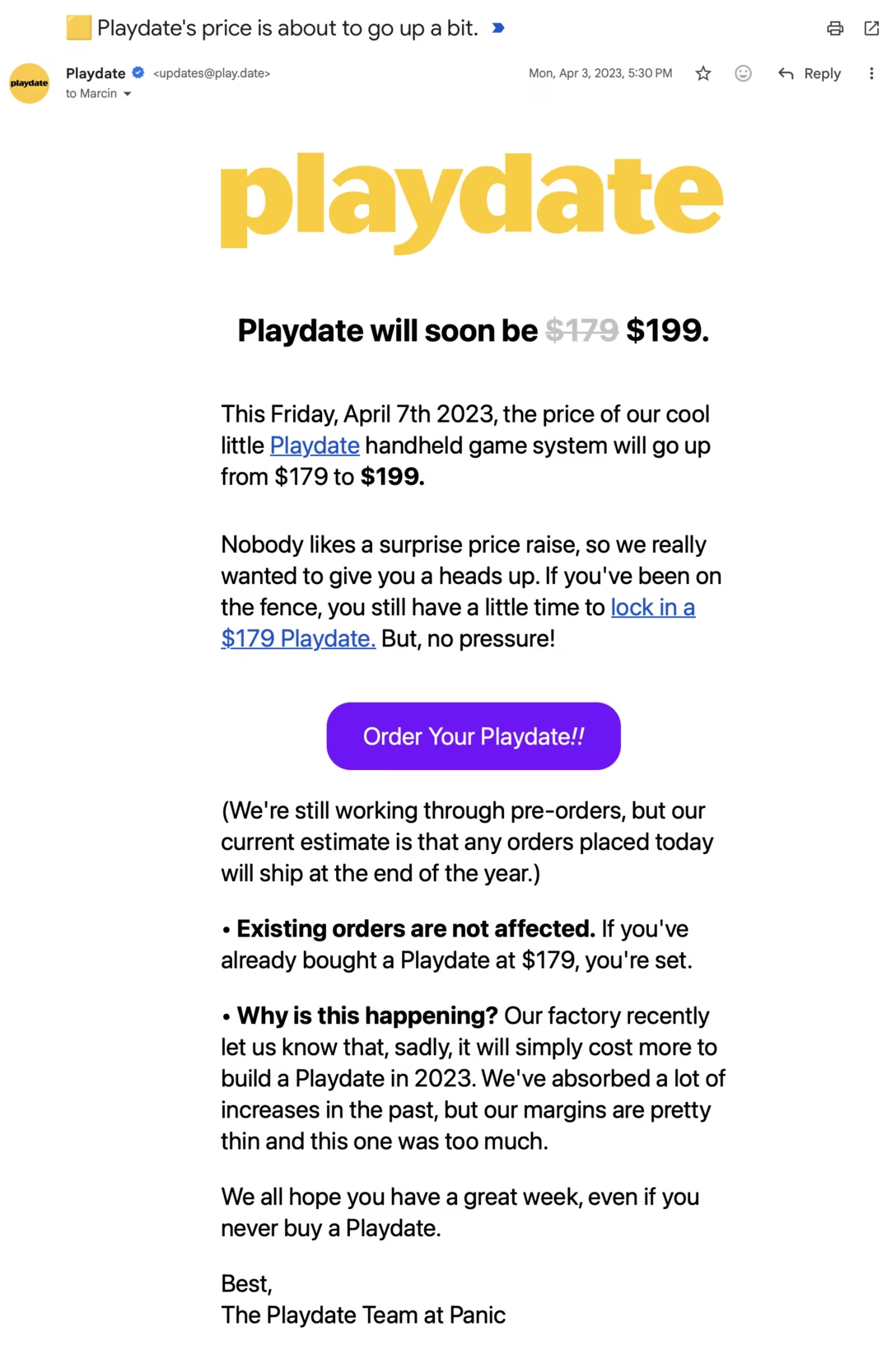
The only two emails I could find that were actually honest about the price going up in the subject line, instead of obfuscating it with terms like “change” or “update,” were Apple’s and Panic’s.

The former had a subject “Your Subscription Price Increase,” and looked like this:

The latter was titled “Playdate’s price is about to go up a bit” and looked like this:

Also note both telling you what the previous price was.

Saturday, Oct 17 / #apple / #panic / #writing

Motor, motor memory

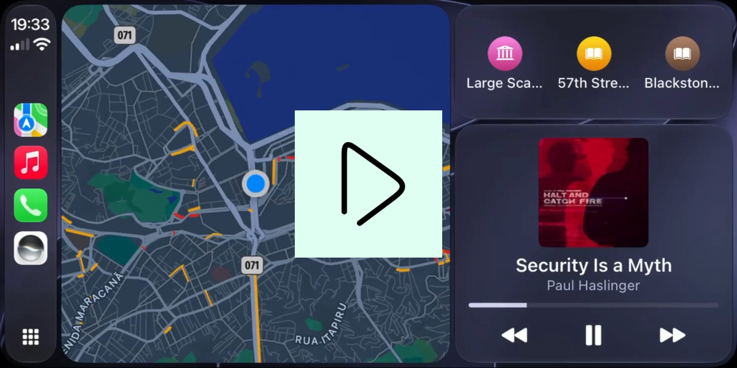
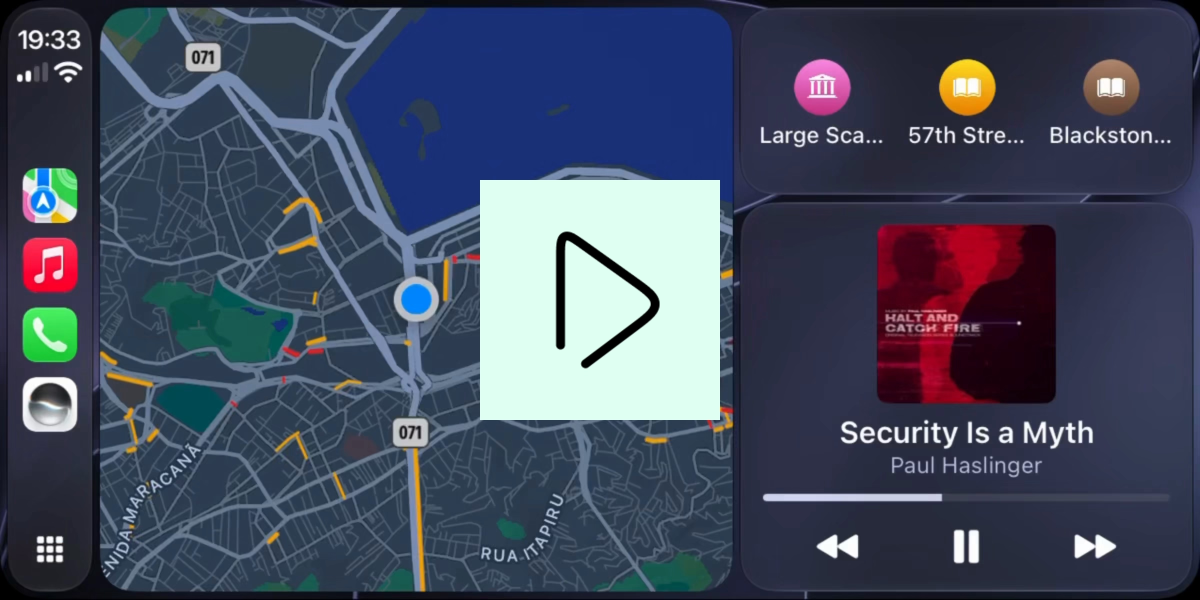
While I didn’t have as much fun with car lights, I experienced another nice motor memory moment last week when using CarPlay.

During my drive, I wanted to ask the new Siri something – but as only an occasional driver, and my phone out of sight, I was puzzled as to how to actually invoke it.

I did see the new Siri app icon appear in the sidebar on the car’s screen, but tapping on that only showed me a list of prior conversations. Sure, I could probably initiate a new chat by tapping the button in the top right corner, but that corner felt really far away from where I was sitting, and didn’t feel inviting to someone who – just as a reminder – was driving a car at that time:

So before giving up, I did one thing that somehow felt very natural – I pressed and held the “home” button in the bottom left corner:

And… it totally worked.

I feel that with any good motor memory story, your fingers do something seemingly on their own, and then it’s up to you to figure out why they did so.

I believe in this case they did so because Apple built a good set of overlapping gestures and expectations:

  • In many other places – iPhone, Apple TV – you long press a physical button to invoke Siri.
  • Also, on Apple’s touch devices and on Apple TV, “long press” on a touch target has been a consistent entry point to an “advanced function” in a same way right click is on desktop.
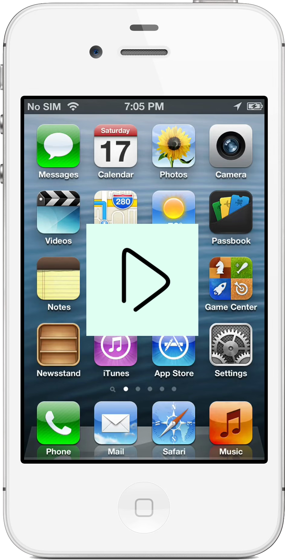
  • Lastly, on earlier iPhones asking for Siri was literally a long press of the physical home button:

So, kudos to the many designers on sustaining a stable gesture system that lasted decades, and embedded itself in my fingers so well that it felt completely natural to invoke in a situation I really wasn’t allowed to split my attention or play with the interface.

An extra delightful moment in that last video – note how the physical home button and the virtual Siri button match in size.

Sunday, Oct 18 / #apple / #flow / #system design

Obsessive about obfuscation

My perhaps strangest confession to date: I’m annoyed about all the common ways people obfuscate text.

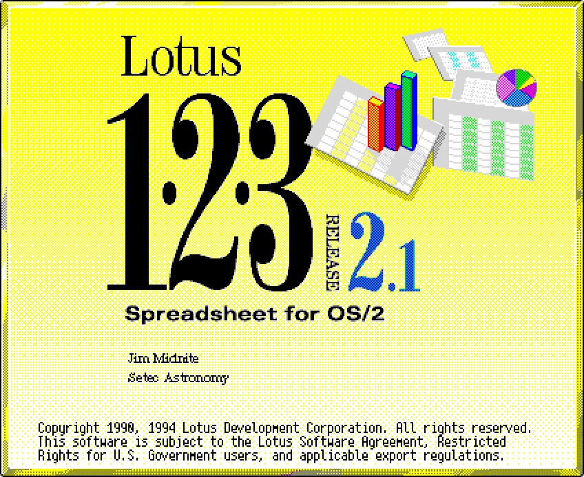
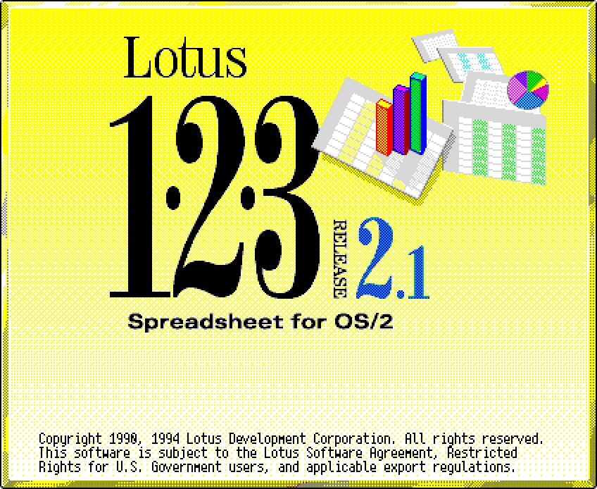
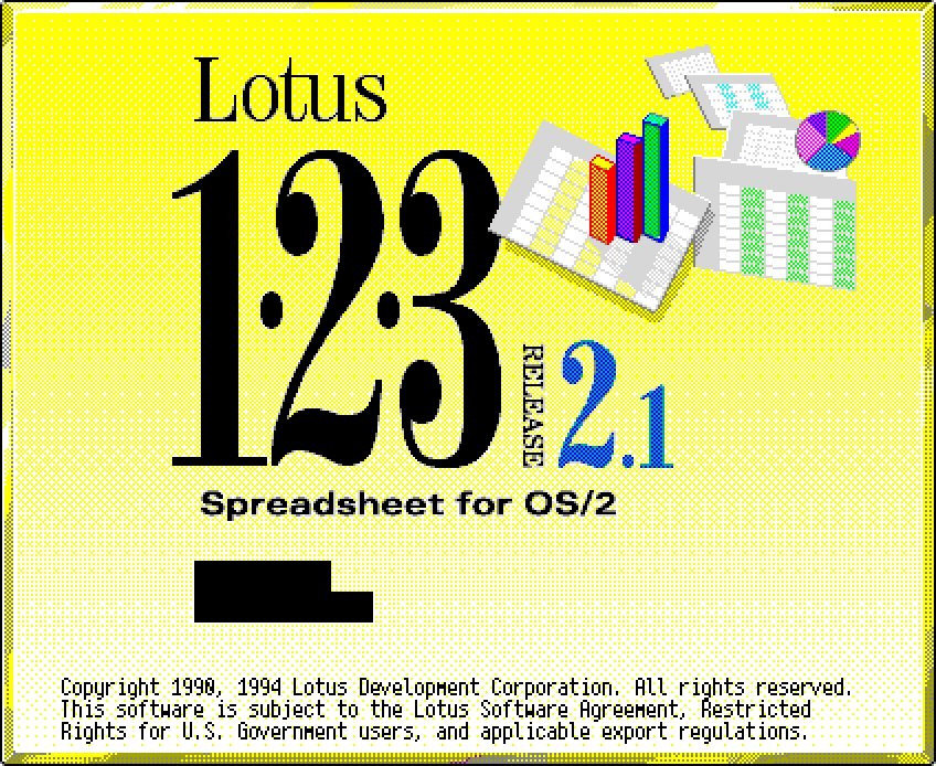
I think I developed this frustration during the GUIdebook times. In my gallery of splash screens, I would often be faced with this situation:

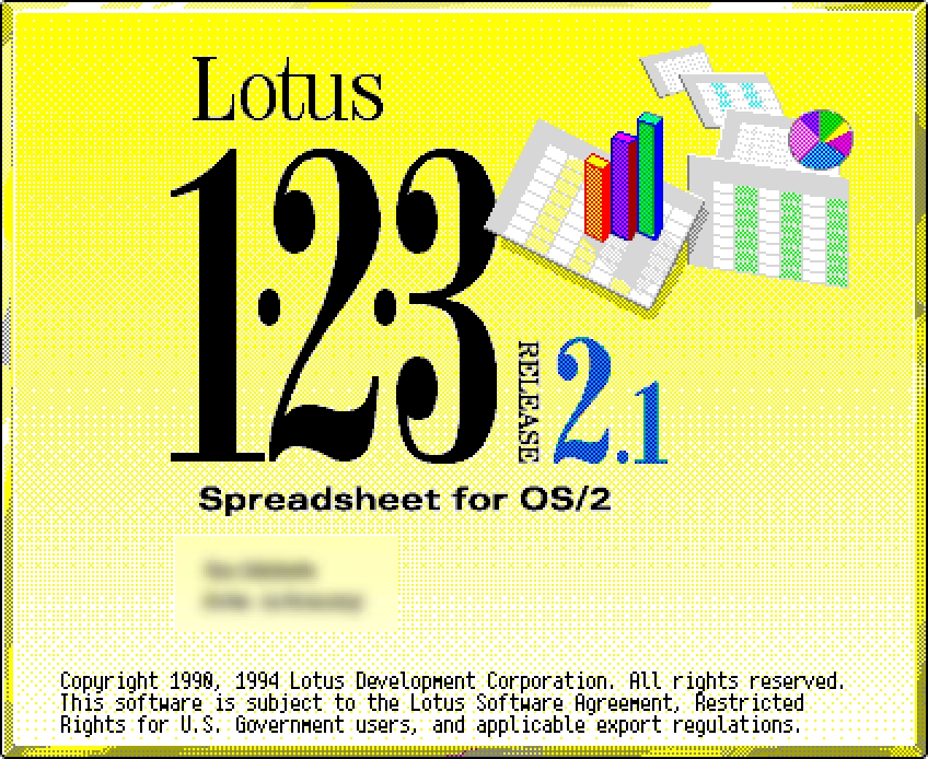
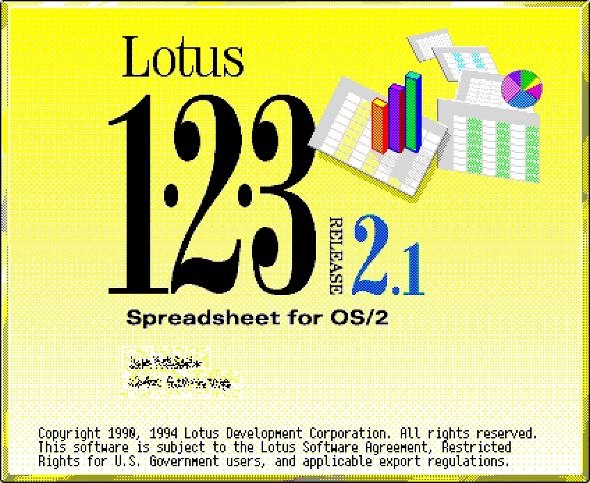
I didn’t want to propagate the registration info, and could think of a few ways to obfuscate it:

The first one felt okay, but it looked like the information just wasn’t there to begin with. Black bars and blurring didn’t look realistic, felt ugly, and drew too much attention to something ultimately not as important.

Eventually I arrived at the last solution – the Diffuse filter in Photoshop – which I felt kept the text’s “texture” (or, color in the typographical sense). You can see it everywhere in GUIdebook’s splash collection.

What somehow didn’t occur to me at that time was an even better solution: to modify the existing text instead of covering it. Make up a realistic name or serial number, typeset it exactly the same way, and plop it in the same place.

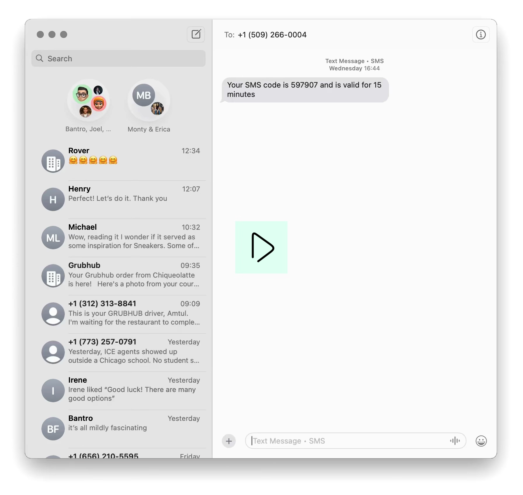
This is exactly what I did recently in the post about ⌘1 in Messages – it started with a regular screengrab, but I replaced all the names and avatars with fake ones.

I can tell you now: This approach is a lot of work.

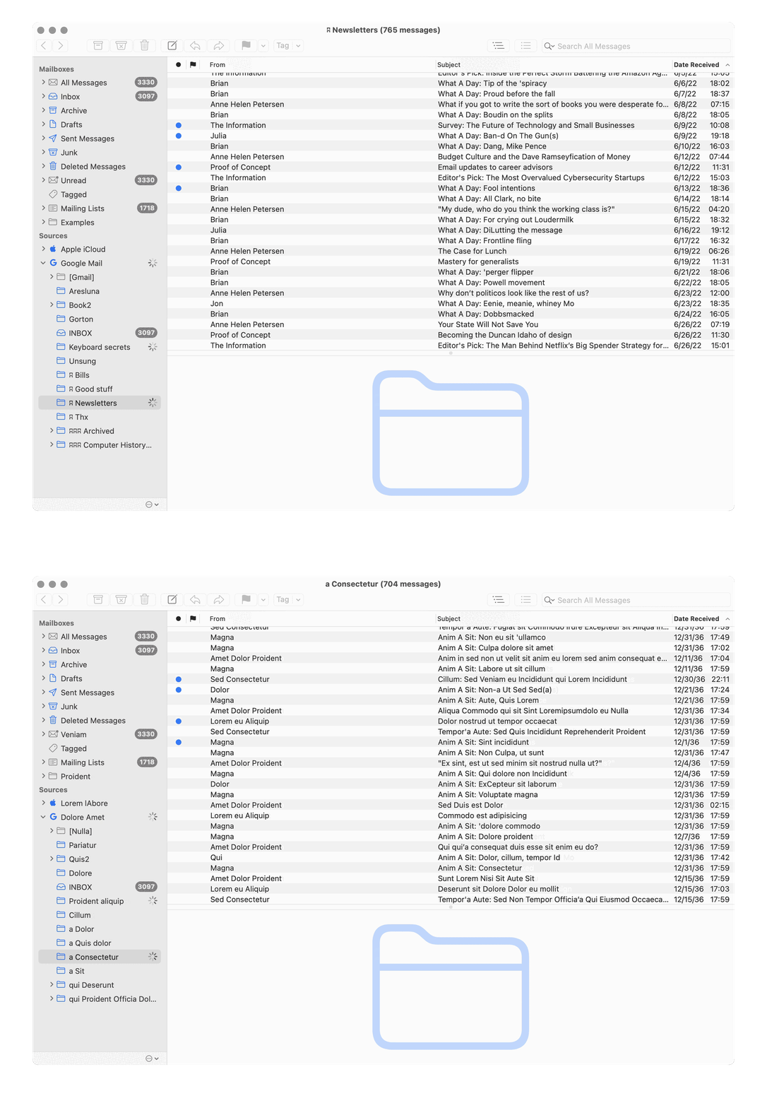
Which is why I was amazed to discover that a Mac email client called MailMate actually has this kind of a feature built in. It’s called Distortion Mode, and I believe it’s meant specifically to help in taking screenshots without disclosing anything – it replaces all the strings with fake Latin in a rather clever way, and even adjusts the timestamps!

The product person in me is a bit weirded out by the name and the whole feature even existing. In what universe is it important to make it easy to take screenshots of mail software? Why wouldn’t the team work on something that actually matters?

But maybe it’s okay and even desirable for apps to be a bit quirky this way. MailMate even owns up to it on:

MailMate is not for everyone, but if it’s for you then you might never have to switch email client again.

Plus, I mean, I started this post by saying “I’m annoyed about all the common ways people obfuscate text” – so let me pass the first stone to someone else.

Monday, Oct 19 / #typography

“We find many users write to us in a spirit of collaboration.”

From software company Linear, a blog post from last year titled Why we committed to a zero-bugs policy:

When we tell people that Linear maintains a zero-bug policy a common response is disbelief. It may sound like a ridiculous approach, but we do it because no other way makes sense.

The zero-bug stance means that we address bugs immediately, with the exact number of days depending on the severity: low-priority bugs need to be addressed within 7 days, high-priority bugs within 2. We formalized this approach two years ago. The impetus was actually a bug in a popular consumer app that I had reported to their team. Finally two years ago—and five years after I first reported the bug—I saw that it got fixed. I thought to myself, “wow, millions of users suffered through this bug for years for no reason.” If the company was going to fix the bug eventually, it would have been so much better to fix it right away.

That’s the big idea behind our zero-bug policy. We want Linear to be a solid, high-quality product, which means we’re going to address any bug that comes in. Fixing a bug takes the same amount of work whether we do it right away or put it off. But it’s not a zero-sum game: fixing it immediately gives us a higher-quality product and spares users unnecessary pain for the same overall effort.

It’s worth a read – especially if you’re a software quality process wonk – with some interesting observations on context switching and other things, for example:

I’ve heard stories of companies whose backlogs grow to thousands of bugs. Eventually, instead of fixing the bugs, they just delete the whole thing and start over. It’s a reflection of how when you put bugs in a backlog, in most cases what you’re really saying is you’re never going to get to them.

I also applaud the team for recognizing and pointing to the momentum boost and virtuous cycle on both sides – makers and their customers – when something gets fixed quickly after being reported:

It’s not uncommon for Customer Support to file a bug in the morning—often through our Intercom integration—and have it fixed by lunch. That kind of turnaround allows us to turn a bad experience—an encounter with a bug—into an excellent one that changes their whole perspective on what it’s like to reach out to a company when something is broken.

Over time these experiences have molded the way our user base reacts to imperfections in the product. Instead of coming to us angry or frustrated, we find many users write to us in a spirit of collaboration—working hand in hand with us to make Linear a better product because they trust we’ll respond quickly. It also often turns them into Linear advocates.

However, there’s one thing that feels unresolved. The post says “low-priority bugs need to be addressed within 7 days, high-priority bugs within 2” – but what if a bug cannot be fixed within these time limits? I can think of a few reasons:

  • a bug has a dependency on another, slower-moving piece of software (e.g. the browser or the operating system),
  • the fix is a bigger systemic or change management challenge that will take months if not years to complete (e.g. a keyboard shortcut change or an internal migration),
  • the fix requires a redesign larger than initially suspected,
  • the team disagrees internally on the fix and needs time to hash it out.

I know getting deeper into the weeds would not make for a nice post with a punchy ending, but I also think the system feels incomplete this way – as with every process, a careless application of a “zero-bugs policy” could fall prey to a sibling of Goodhart’s Law, as the team starts deluding itself into categorizing things as “not bugs,” or find other ways to avoid bigger challenges if they cannot be fixed within the given time limits. Black-and-white systems struggle with shades of gray, and I’d be curious what is Linear’s answer to tackling this tricky part.

Tuesday, Oct 20 / #bugs / #linear / #maintenance / #process

“Because most users do not use dates before March 1, 1900, this problem is rare.”

There are really only three contenders for the most popular spreadsheet software: VisiCalc, the first computer spreadsheet and a system-seller for some home computers in the late 1970s, Lotus 1-2-3 dominating early PCs in the 1980s, and then Microsoft Excel (preceded very briefly by Multiplan). Excel dominated the market since the 1990s – so long it’s easy to assume it has always been there, but even hiding within Excel are some quirks of its predecessors.

One of them is documented in an official Microsoft Excel troubleshooting document:

When Lotus 1-2-3 was first released, the program assumed that the year 1900 was a leap year, even though it actually was not a leap year. This made it easier for the program to handle leap years and caused no harm to almost all date calculations in Lotus 1-2-3.

When Microsoft Multiplan and Microsoft Excel were released, they also assumed that 1900 was a leap year. This assumption allowed Microsoft Multiplan and Microsoft Excel to use the same serial date system used by Lotus 1-2-3 and provide greater compatibility with Lotus 1-2-3. Treating 1900 as a leap year also made it easier for users to move worksheets from one program to the other.

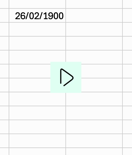
Yes, even in today’s version of Excel, you can easily get to Feb 29, 1900 – a date that never existed:

I find what follows in the same doc really funny, as you can sense perhaps a frustration of someone needing to answer this over and over again, or held to blame for the decision that wasn’t even theirs to begin with:

Although it is technically possible to correct this behavior so that current versions of Microsoft Excel do not assume that 1900 is a leap year, the disadvantages of doing so outweigh the advantages.

If this behavior were to be corrected, many problems would arise, including:

  • Almost all dates in current Microsoft Excel worksheets and other documents would be decreased by one day. Correcting this shift would take considerable time and effort, especially in formulas that use dates.
  • Some functions, such as the `WEEKDAY` function, would return different values; this might cause formulas in worksheets to work incorrectly.
  • Correcting this behavior would break serial date compatibility between Microsoft Excel and other programs that use dates.

If the behavior remains uncorrected, only one problem occurs:

  • The `WEEKDAY` function returns incorrect values for dates before March 1, 1900. Because most users do not use dates before March 1, 1900, this problem is rare.

But I also appreciate the details of what is a great example of bug-for-bug compatibility.

Tuesday, Oct 20 / #bugs / #change management

“No results” doesn’t mean “no results,” pt. 1

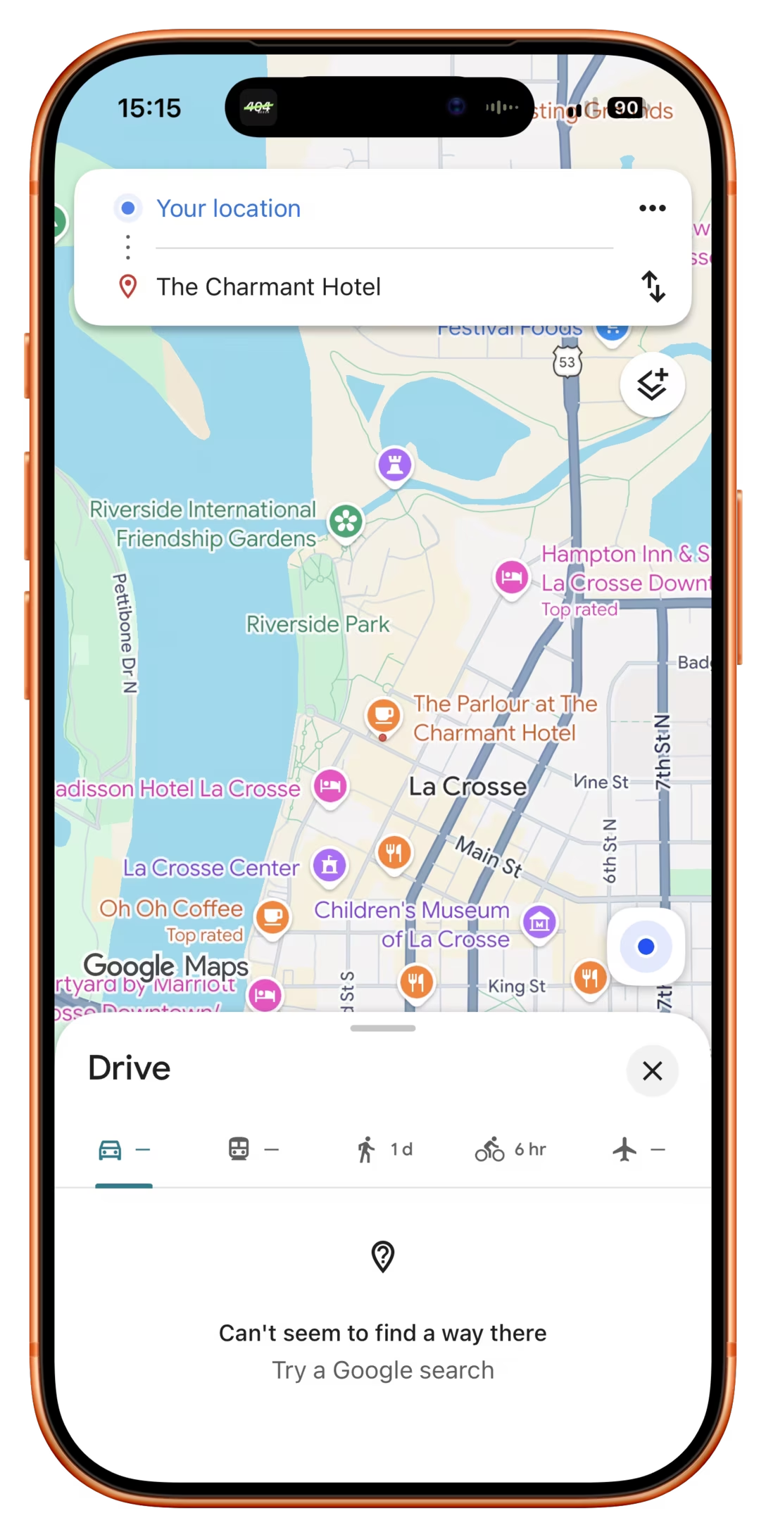
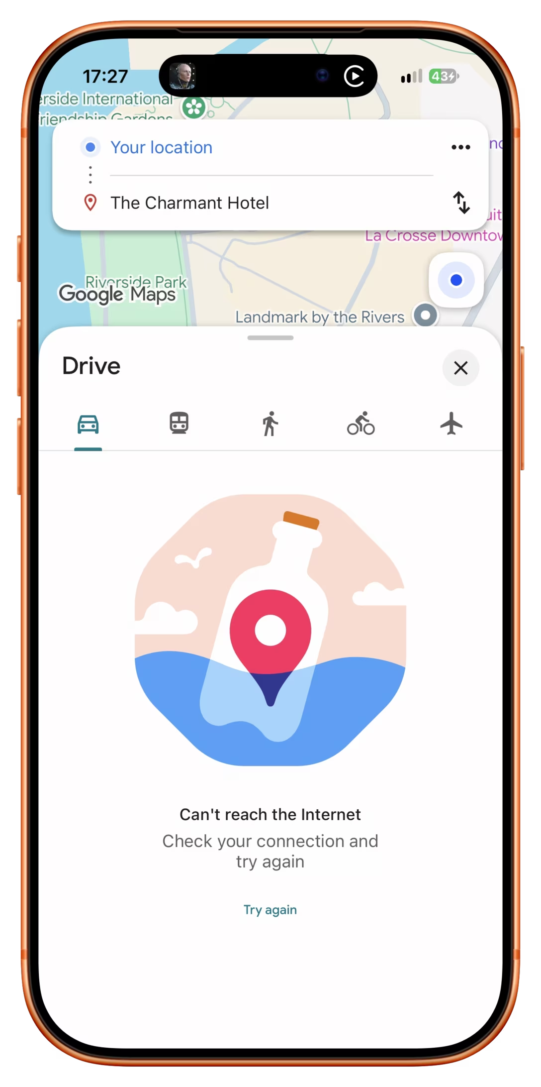
This is something I see time and again in Google Maps when plotting directions:

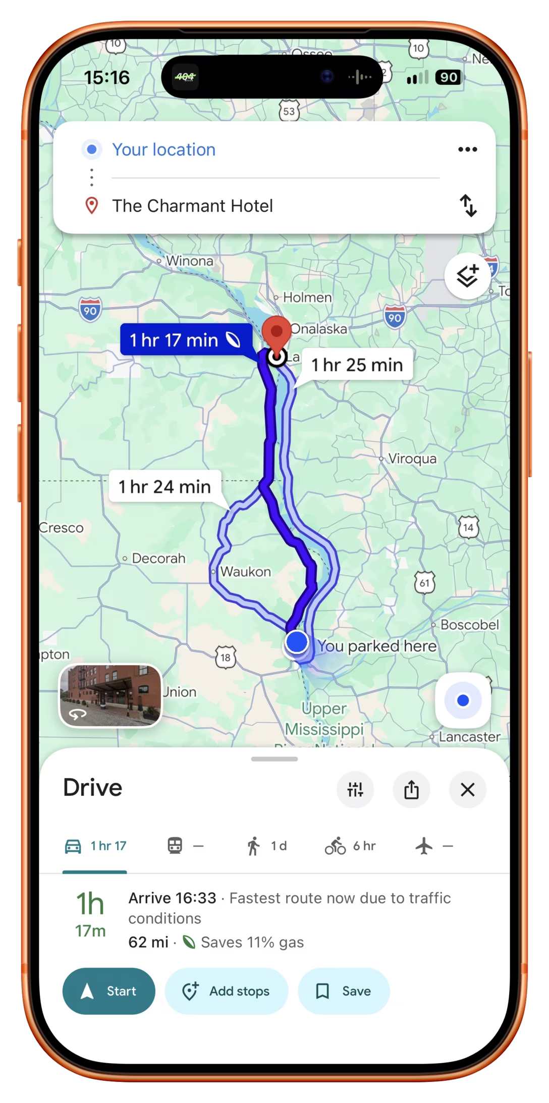
You might be thinking “this feels like a genuine error – not every two places on earth can be connected,” but that’s not it. I am in a good traffic corridor and, ten seconds later, doing the same exact thing again shows proper directions:

The clue as to what’s going on is elsewhere in both screenshots. My cell signal is low, and the Google Maps misrepresents no results arriving because of slow connection, with no results being there at all.

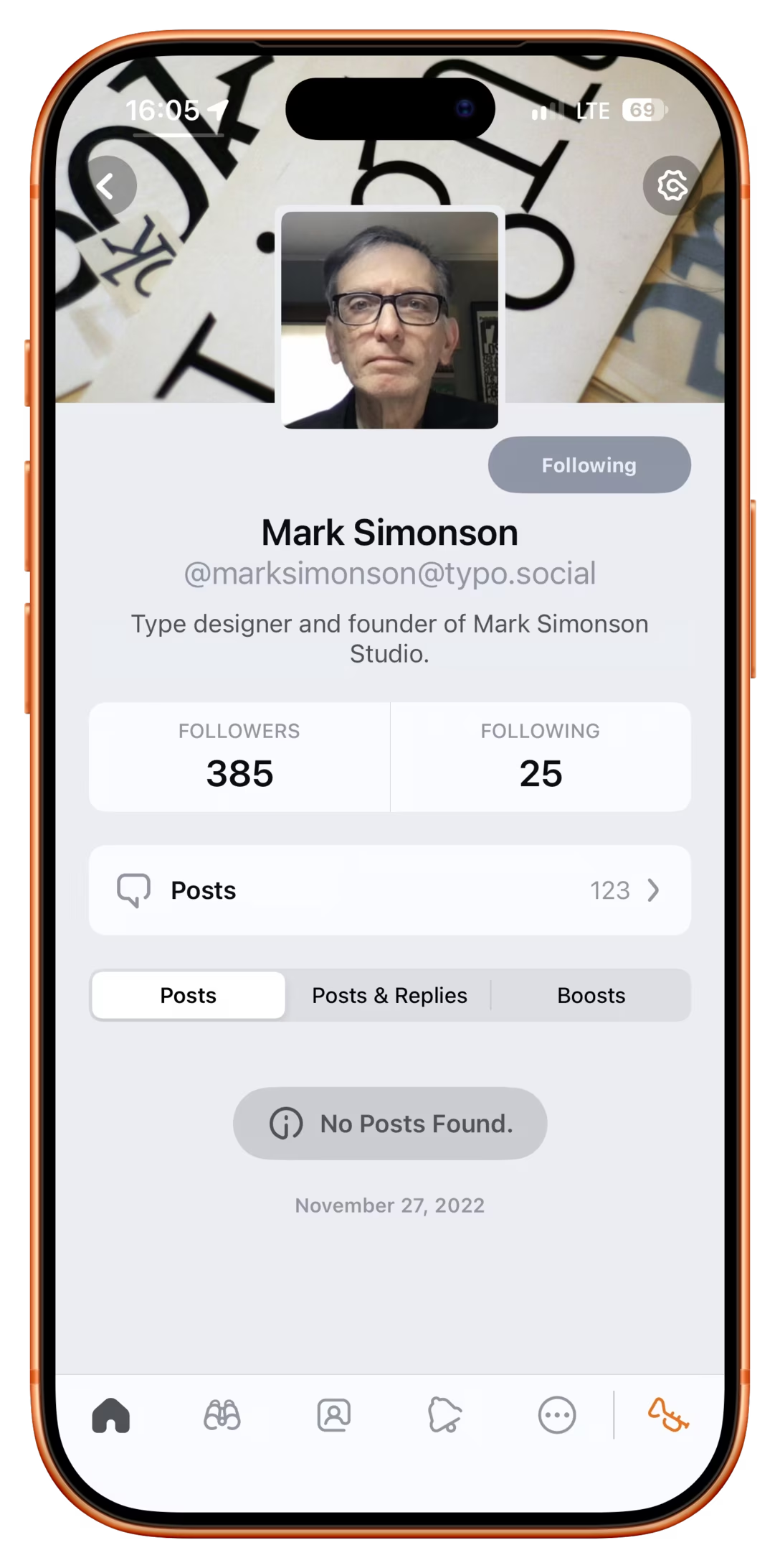
Just to get Google Maps off the hook, here’s a similar thing in a Mastodon client Ivory:

There are 123 posts to be seen here, as the page itself conveys elsewhere. But at this moment, the internet is slow, and Ivory jumps to a wrong “no posts found” conclusion, instead of saying “cannot retrieve the posts because of a bad connection.”

I believe what’s happening in these moments is that one kind of “no results” (software asked for posts, but the database results came empty) gets bundled with another (software asked for posts, but the database results didn’t come back in time, or transmission was interrupted).

This feels important to me, because the wrong kind of an error can really confuse people and make them jump to the wrong conclusions – I guess Mark Simonson isn’t active on social! I guess I can’t drive there! – or even create bad mental models. Also, while this was a temporary situation for me, for a lot of people bad connection is a constant fact of life, so they might encounter this kind of confusion on a daily basis. Software should differentiate between different ways something can be zero, and in this case, communicate that back to the user.

What’s really strange is that Google Maps has a separate “no internet connection” state that you can see in other moments – incl. an extra thoughtful and important manual try again button…

…but apparently still fails to use it in all the cases.

Wednesday, Oct 21 / #errors

Before pixels: Speed-Minder

As you could probably tell, I was driving a bit recently, and once in a while saw this kind of a sign, often equipped with a (beloved) segmented font, reporting your current speed as detected by radar:

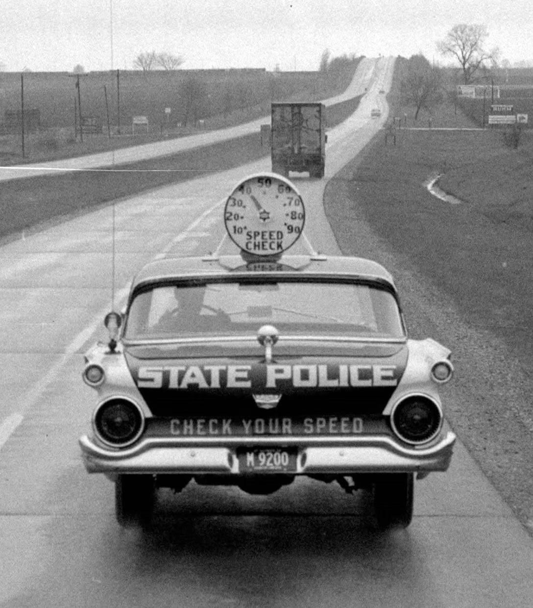
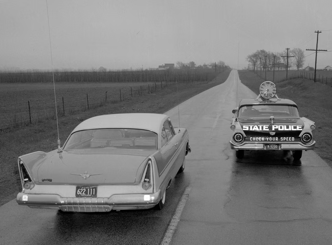
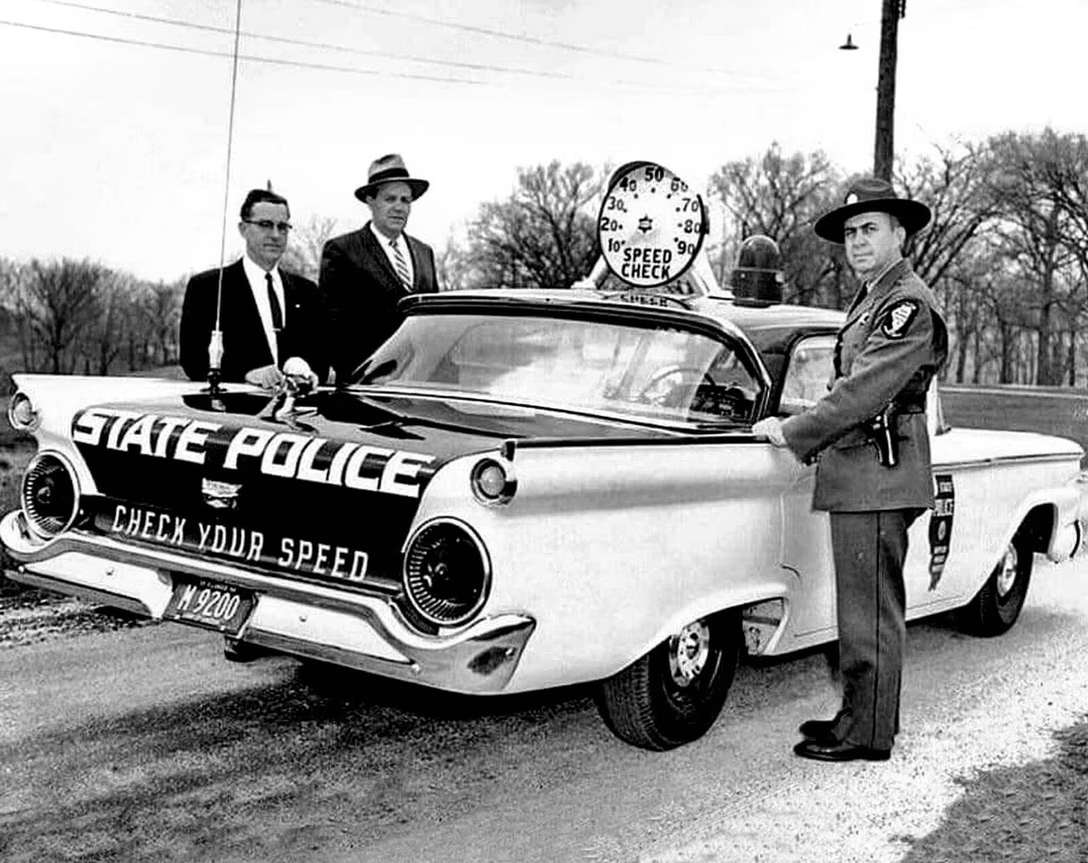
Just today, I learned of an early version of this idea:

This was a “Speed-Minder” deployed by Illinois State Police in the late 1950s or early 1960s. The car didn’t have a radar, it just reported its own speed, which I thought was clever. I am not even sure if it was as much to prevent drivers going too fast – I guess that’s what the name suggests – or just to help you calibrate your car’s own speedometer.

I can’t find a lot of information whether this was effective in any way, but I just liked this visual of a non-digital speedometer mounted atop an old police car.

Before Pixels is an occasional foray into design ideas before screens came around, shared for context, amusement, and inspiration.

Wednesday, Oct 21 / #before pixels / #history / #real world
Rough and smooth around the edges

It is one thing to draw attention to a hiding place that can be seen, but it’s a different challenge altogether to have to point to something that’s not even on the screen.

Let’s rewind to iOS 18 two years ago, and what happened when you swatted away a notification – the movement was nicely reversed, with the UI going back where it came from.

A year later, in iOS 26, the movement was generally similar, with a new, more bubbly and “physical” treatment – but also a rather big bug where the background disappeared on the way out. Yikes.

This year’s iOS 27 redeems itself in two ways. It not only fixes the animation quality, but it does something even better – it starts and ends the notification reveal in a little bar under the clock.

As far as I understand, iOS has consistently been using those kinds of edge bars as signifiers of available edge swipes ever since iPhone X, and this new transition feeds nicely into this system. There is a difference between top drag from the left (notifications), and top drag from the right (control center), and this not only helps convey that, but also perhaps teaches some users about what an edge bar means – so that they know what to do if they see it elsewhere.

I do miss the movement simplicity of iOS 18 – a lot of liquid glass feels too… liquid to me – but I like that this evolution also improved the animation on a slightly higher level.

Yet, one has to be careful.

Here’s YouTube’s animation that plays when you invoke “save to Watch Later”. It’s a concept similar to the iOS 27 choreography above – seeing the item hide itself inside “You” should help in knowing that’s the place to go to get it back – although the execution feels rough and not up to iOS standards:
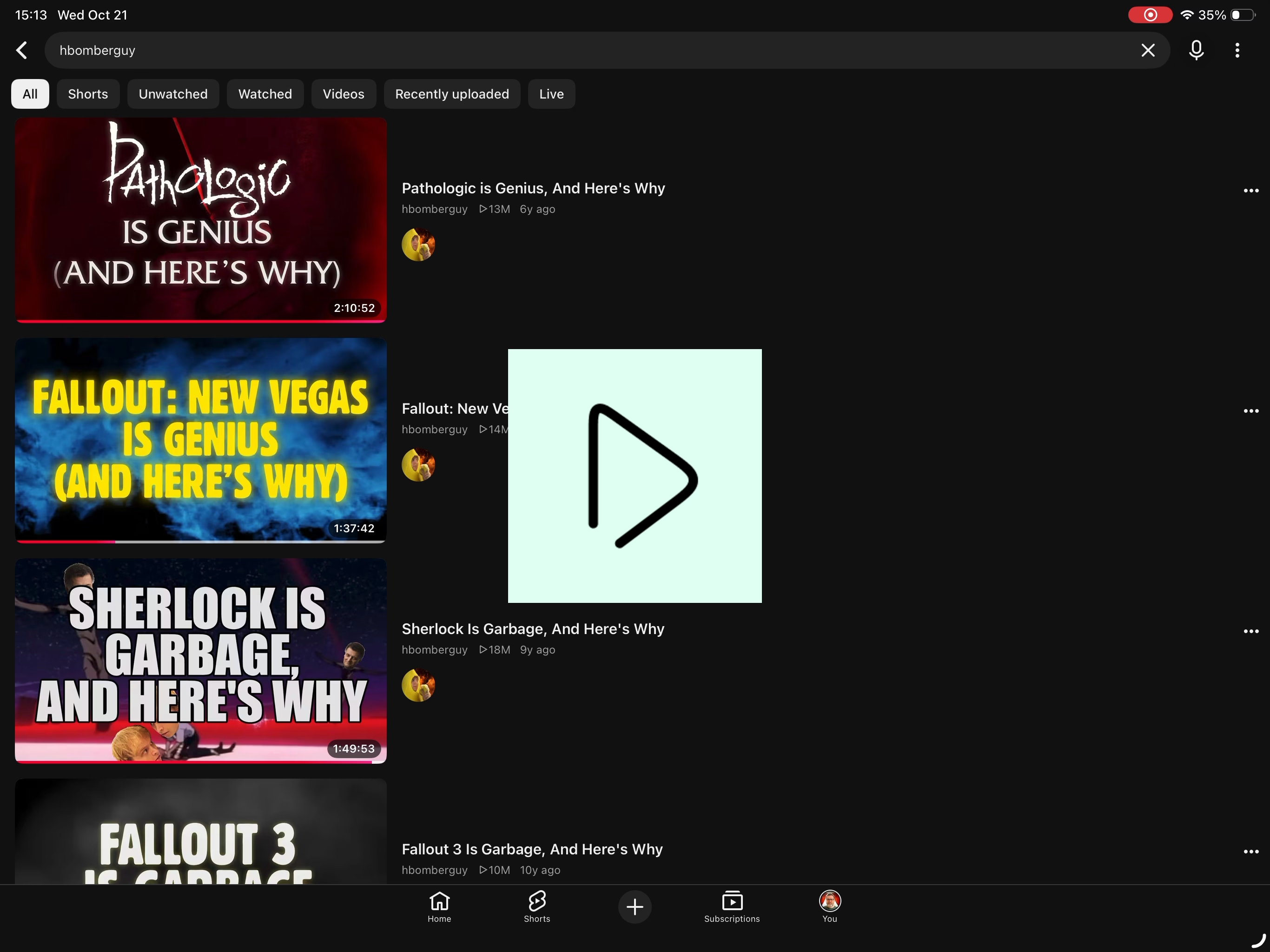

However, the team hasn’t fully thought through the implementation, and this is what happens on the iPad:

I believe this is a bug where the left padding from the toolbar below was not added to the confirmation toast position – but its consequences are not just the animation feeling janky. It also teaches the user a wrong lesson, as the item accidentally lands on the Home icon instead.

Wednesday, Oct 21 / #google / #motion design / #onboarding / #system design / #touch

Mailbag: October 2026

First of all, I wanted to send a thank you to everyone who ever sent me an email or a message. I read all of them, but can’t always respond timely – and sometimes at all – but I enjoy receiving those, and learn a lot from them.

I wanted to excerpt a few things I received in recent months, so that you can enjoy them, too!


Gabriel Roth pointed an obvious flaw in the Ishmael editor’s Ghost Cut implementation that completely eluded me:

You didn’t mention perhaps the worst thing about the Ghost Cut feature in Ishmael — sometimes I want to move text between apps! If I cut something in Ishmael and I want to paste it into BBEdit, I’m out of luck. The “solution” is to copy it first, but the idea of changing cut + paste to copy + cut + paste in certain cases but not others makes me shudder.


Ben Zotto sent in a 2006 essay by Joel Spolsky that covers the just-mentioned February 29, 1900 bug on a different occasion.

“So, it’s a bug in Lotus 123?”

“Yeah, but probably an intentional one. Lotus had to fit in 640K. That’s not a lot of memory. If you ignore 1900, you can figure out if a given year is a leap year just by looking to see if the rightmost two bits are zero. That’s really fast and easy. The Lotus guys probably figured it didn’t matter to be wrong for those two months way in the past.

Spoiler: Bill Gates makes an appearance.


A while back, I ended a post saying “Who would ever benefit from it behaving this way?” A reader wrote with this fun anecdote:

My work buddies coined an absurd acronym for those absurd UI misses: HCTPBWIW

How Can This Possibly Be What I Want


I received a letter from Pierre-Luc Gagné, explaining in some detail the mysterious Canadian keyboard with unique symbols I wrote about last month.

The answer to the mystery: this keyboard was used by Canadian government, which for a while mandated both this specific layout, and these specific icons. The layout originated by the province of Québec trying to improve French keyboards, and was meant to find a balance between the original American-centric layout, and the needs of French language:

[The previous layout] prioritized English by putting every accented letter except é under two keystrokes. Glyphs that are far less commonly used like « and < were their own keys, but è and à needed two keys to be written. Francophones write à all the time. This was basically a remnant of typewriters’ operations brought forward to computers. The [new layout] moved most accented letters to their own key. Only the circumflex (^) [requires] two keystrokes, but that accent is the least used.

The effort started in the 1990s. Gagné reports that by 2006 it was deemed okay to use the layout, but forgo the special icons – that explains the disappearance of those unique symbols from Apple’s keyboards – and some time after that, the federal government withdrew the order forcing the layout, as well. (It is now only a “guidance.”)

Shining more light at the mystery, Gagné writes: “The anglophone majority in Canada never adopted this keyboard, so it’s seldom talked about in English.” (If you are interested in researching this more, the keywords are CAN/CSA Z243.200-92, SGQRI 001, and ISO 9995-7.)


From social:

The argument that rounded corners reduces the clickable area of a button reminds me of the Mitch Hedberg joke that Kit Kat carving their name into each bar is robbing you of chocolate.


Lastly, Kevin Smith wrote this à propos updates, but it is also a good anecdote to follow the more recent post about Linear’s zero-bug policy:

I missed the deadline to submit mine, but here’s my folklore.org-type anecdote from my days at Apple: I personally wrote the novice-friendly Terminal warning about the sudo command in OS X. For the longest time, users were greeted with the 90s-vintage warning about properly using sudo: “We trust you have received the usual lecture from the local Systems
Administrator…” As an AppleCare support drone, I guided customers through a sudo command at least once per week, and always needed to reassure them about what this geeky text even meant.

Finally one day I filed a Radar (arguably something that was above my pay grade!) and provided a suggested revision to the sudo warning that was way less inside-baseball. To my utter shock, the Terminal team used my language word-for-word in an OS X update a few months later. I was never even notified that my change was used, it just appeared in Terminal!

As far as I know, the sudo warning was removed entirely from Terminal at some point. But as a low-level employee who never even worked in Cupertino, it was an honor for a few of my own words to live inside the OS for a number of years.


Thanks again!

Thursday, Oct 22 / #bugs / #keyboard

Don't miss what's next. Subscribe to Unsung (Weekly Digest):
← Newer “All these will be cherished and emulated as soon as they can be avoided.” Older → “I’m ready to throw up at any moment.”