Unsung (Weekly Digest)

Unsung (Weekly Digest)

Archives
Log in
Subscribe
October 16, 2026

“I’m ready to throw up at any moment.”

Welcome to this week’s digest of Unsung, a blog about software craft and quality. Here’s what was posted since last time:

View this issue in the browser with inline videos and better formatting

Subtitles on demand

Nice moment in iOS: when you reduce the volume to zero, subtitles come up automatically – and they go away the moment you increase the volume again.

This is from YouTube on the iPad, but it appears to be system-wide:

(Feels extra meaningful in the face of so many people playing their media on speaker in public these days.)

Friday, Oct 9 / #details / #ios

“They take one look at the UI and abandon it.”

Hiding inside this page on “user-driven UI” by Brad Woods are two useful things.

The first is the concept of “zone of proximal development.” The idea, as I understand it, is that possible tasks you face span a few categories:

  • stuff you already know how to do,
  • stuff you can learn to do on your own,
  • stuff you can learn to do with assistance (e.g. from a teacher),
  • stuff you simply cannot do or imagine doing.

The space between these things is a zone. A good book or a teacher would help you navigate the zone, by giving you tasks hard enough that they will expand the zone, or even teach you how to expand it on your own – but not too hard so that you give up in failure and frustration.

Woods argues that this doesn’t just apply to traditional classroom teaching, but also software, where the role of the teacher is taken by things like:

  • onboarding walkthroughs,
  • progressive disclosure,
  • tooltips,
  • help menus.

The second thing was this quote by Anthony Hobday, who made a few appearances on this blog:

  • Simple product is released
  • Lots of people use it every day
  • More features are added
  • It’s now complicated
  • But most people learned the basics when it was simple, so they don’t notice that it got complicated.

I think this is brilliant and spot on. I always knew the creators of an app would have a problem of not seeing complexity creep in, but this made me consider that the app’s early users might also be biased the same way, and not exert much pressure.

If you are familiar with an app, armed with your desire paths and motor memory, you have a lot of capacity to just ignore new menu items, new panels, and new complexity – provided it doesn’t get in your way. New AI option? Turn it off. New tab? Never click on it. New alternate way of doing things? Just continue with the old way.

But as a new user, you don’t have that history, or that experience-backed confidence that a bunch of stuff can simply be ignored as it’s not crucial to everyday operation. Add to this the industry’s perverse incentives that often present new additions as the most important ones, and it’s much harder to make a sense of it all as a newcomer. And all the while, the creators and existing users might not see the problems you do.

Saturday, Oct 10 / #anthony hobday / #complexity / #definitions / #onboarding

“A platform that for 30 years was considered unreachable”

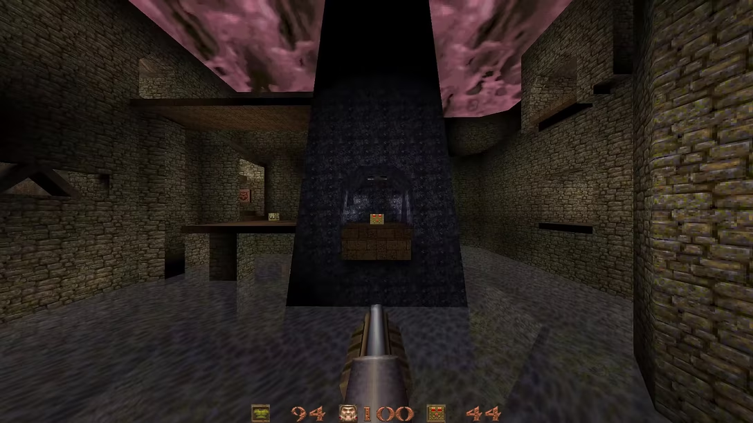
Yet another entertaining speedrunning video from Karl Jobst – this one about a recent new discovery in Quake:

What was really fun about this one was the fact that the design of the level puts a splinter in player’s head – you see a bridge above on the left, and you just have to wonder: is it at all possible to, somehow, concoct a jump to get there, and skip a lot of the normal level progression?

Turns out, it is – it just takes a lot of imagination, practice, and determination.

Which is another fun thing, only half-acknowledged in the video: I’m pretty sure that the speedrunner, Muty, did something that the creators of the game never thought was even possible. I haven’t personally made many video games, but even for “serious” software, it’s a special, always interesting, and often great to witness your user squeezing more from what you made than you yourself imagined or planned for.

(I write “often” because sometimes people’s hacks or creative solutions on your platform become your future maintenance problem… but that’s a story for a different post.)

Saturday, Oct 10 / #games / #speedrunning / #youtube

The beautiful, quiet power of motor memory

My favourite piece of writing I’ve done about motor memory remains “Shift + Shift” from 2018. I have linked to it over the years, but if you haven’t checked it out yet, you might find it interesting.

Just this week, I have had another similar moment, and amazing in a slightly new way.

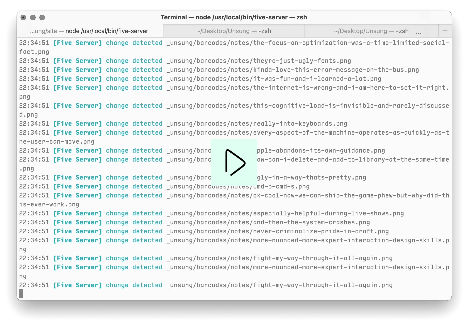
How many of you tap ⌘1, ⌘2, ⌘3 to switch between tabs? This convention has been there for as long as I remember, and so has been my fingers’s embrace of it. The system works in Chrome and Safari, in the Terminal (and Ghostty, which even shows the shortcuts on tabs themselves), in Nova, in Figma, and presumably tons of other places:
(Just about the only place where it doesn’t work is the Finder, and that’s only because ⌘1/2/3 keys there were first assigned to switching the view style – icons, list, column view – some time in the early 2000s, some years before the tabs came. Hard to change a shortcut people are already used to; luckily, I personally don’t use tabs in Finder.)

At this point, I press ⌘1 and ⌘2 and ⌘3 without thinking, just as instinctively as I would ⌘Z for undo, or ⌘C for copy.

So instinctively, in fact, that last week I was looking at Messages, I wanted to switch to the group chat, and my fingers just reached for ⌘1:
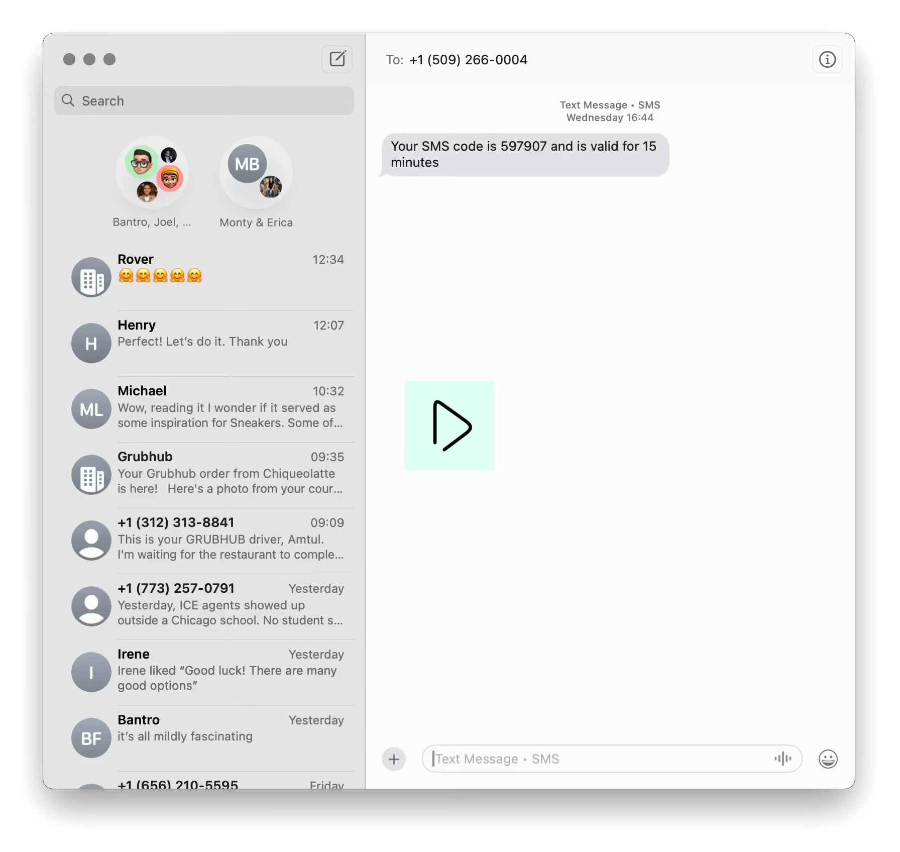
I have never done it before. I have not heard this was possible, nor seen it announced in the menu, or a tooltip, or via onboarding. I didn’t even think about it. My fingers just… did it. Completely on their own.

And it worked.

I was just there, looking at my hand amazed, piecing together what just happened as if I were watching someone else’s actions.

It’s funny to pause and think about such a seemingly tiny thing. After all, this happens all the time. Every time I slam Esc to dismiss a dialog I never closed before, every time I press ⌘V to paste something in a new location, every time I tab from one field to another in an app I just installed – sure, these might be system defaults in various places, but I see them break once in a while; when they do work someone might deserve credit for wiring them properly, even if I take it for granted.

In these moments, you only notice things going badly; as a matter of fact on the same day I pasted some bolded text into the very same Messages app, and tried to press ⌘B to undo the bolding – and that didn’t work.

And I think that’s why that ⌘1 in Messages is worth a little celebration. Over the years, enough apps and websites and operating systems quietly decided to spend extra effort to participate in the ⌘123 convention, together building a dependable interaction system that more and more people’s motor memories could learn to trust over time.

That included mine, including one extra thing that separates it from the story I linked in the first paragraph – and one you probably already noticed.

The Messages app doesn’t have tabs. My motor memory kicking in wasn’t just a recall of something that I’ve already done before. Somehow, in my brain, this convention felt so great that it quietly extended from “⌘1 = first tab” to “⌘1 = first content thingy,” without me even realizing.

And that’s so amazing, right? It’s stuff like this why I keep harping on Safari’s problematic tabs and other compromised interaction systems, and that’s why today I raise a small toast to the designer at Apple who thought about ⌘1 in such a clever way.

Sunday, Oct 11 / #above and beyond / #flow / #keyboard / #mac os / #marcin wichary / #system design

“I’m ready to throw up at any moment.”

I linked to his work before, and here’s The Art Of Storytelling with another interesting video – about what made Jobs such a good presenter:

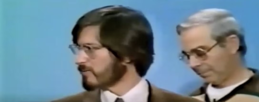
I’m not going to spoil the findings, which are presented well with good corroborating examples. But the most interesting thing to me was one short video snippet of Jobs being visibly nervous before a very early, 1978 presentation:

It made me think about other examples of Jobs being off his presenting game.

The most well-known one is likely the 2005 announcement of the “iTunes phone,” or Motorola ROKR E1, just over a year before the iPhone. It’s a really painful watch, seeing Jobs squint at the sort of interface he usually makes fun of, regretting the whole deal, very aware of the smartphone they themselves are working on, but unable to speak about it yet (the relevant part starts at 17:24):

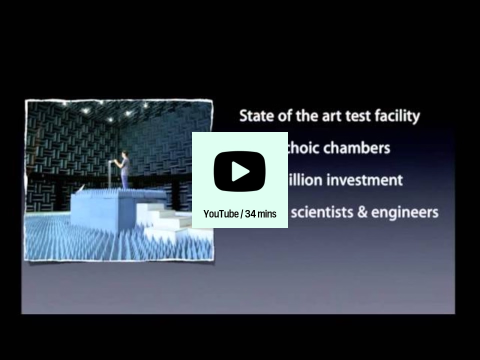
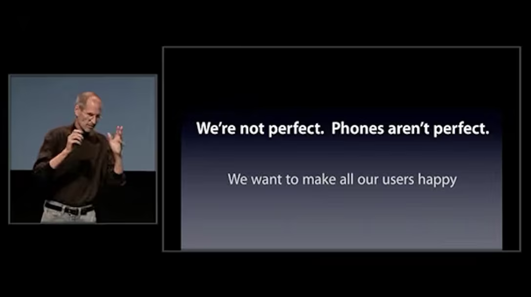
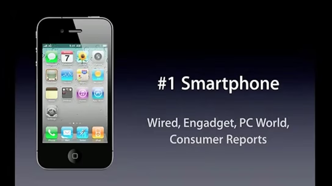
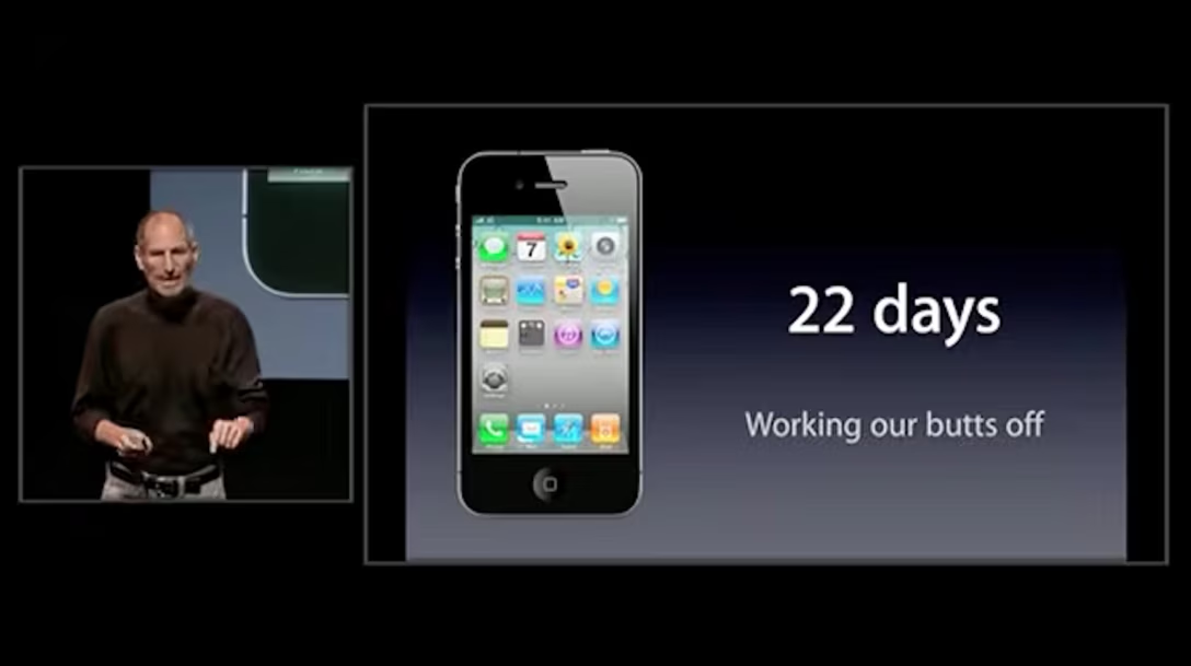
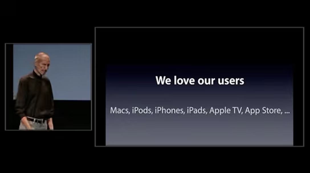
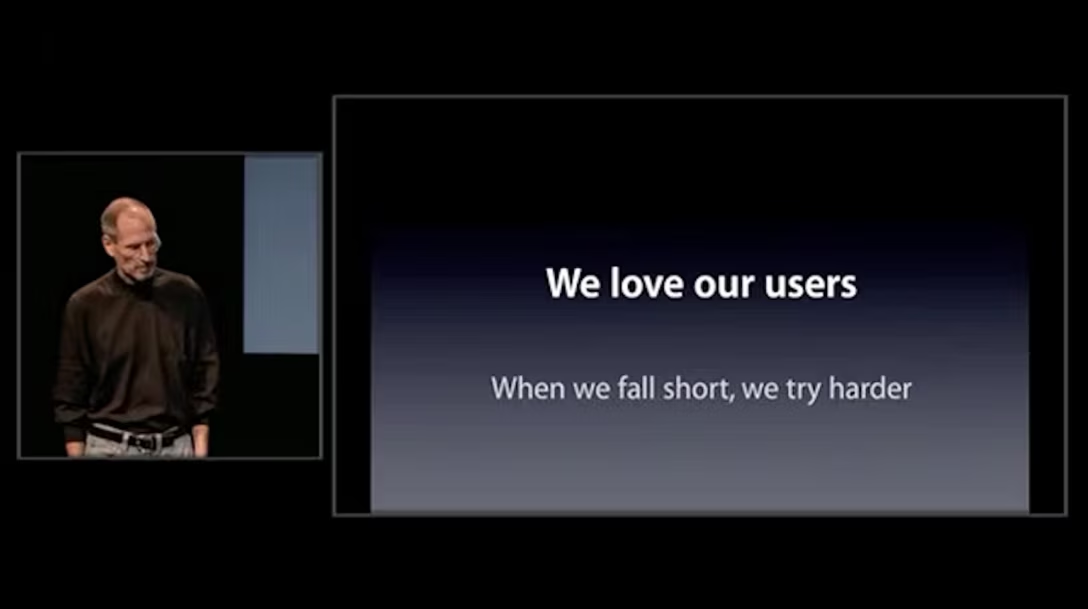
But I have another, trickier suggestion: the “Antennagate” presentation of 2010, where Apple had to do damage control over the issue of the iPhone 4 losing cell signal when gripped a certain way:

Now, this isn’t a bad presentation. I actually think it is a great one. The arguments are valid, the data solid, and the whole thing comes together well. In the recently leaked and generally rarely witnessed slide-less Q&A portion, Jobs displays understanding of the issue and answers questions well; perhaps I’m grading on a curve here, but even his one moment of anger/​frustration seems so much better handled than the famously impatient and immature Jobs would have done earlier in his career.

Both videos are worth studying and teach how to do damage control well, and how to tell stories of things you would otherwise choose never to talk about.

But also, early on, it was really fascinating to see Jobs reading off of so many generic, cheap-looking slides with literal sentence fragments, breaking the “show, don’t tell” rule, and – I think – generally using the slides as a crutch walking him through the narrative. It really took me aback because I don’t ever remember Jobs doing that as prominently.

It makes sense. Jobs had to rush back to work from vacation, and the time to put this all together was very limited. I don’t mean necessarily to pick on anyone here, but rather find in all this a confirmation of a universal truth. Sure, Jobs was smart and had a lot of charisma on stage. But in the end, at some point, slides are just like any other kind of craft. You design the slides, you revise them, you practice, you let the practice influence the content, you get feedback, you kill your darlings, you revise again, and repeat all that so many times you get sick of it all.
It’s clear to me that the team here ran out of time for this, and there’s something comforting in the fact that even Jobs couldn’t wing it, and still had to put in the work.

Monday, Oct 12 / #craft / #storytelling / #youtube

“They take time. Put in the time.”

À propos the last post, from music editor Marc Weidenbaum:

The first is don’t let anyone or anything, or anything acting like anyone, or anyone promoting anything, convince you that craft is outdated or will ever be outdated; you will only improve, only make the sounds you imagine in your mind’s ear and feel in yourself, by working steadily to achieve them. Also recognize that expected paths lead to unlikely ends the more patiently and curiously, guided by instinct and experience, you walk those paths. There is always an excuse to not put in the work. If you allow “AI” (I put it in quotes because it’s less a specific thing, in this context, than what is often cast as, to borrow a historical term, a specter) to become that excuse, well, it’s unfortunate, but there would have been other excuses. So, the best thing to do is put the threat you may perceive from AI in a tidy little box full of all those other excuses, don’t distinguish it from them, and get to work. […]

I’ll close now as I opened, with the bad news. These two suggestions, you may have noted, have something in common: they don’t happen instantly, at the push of a button. They take time. Put in the time.

Quote discovered via Robin Sloan’s newsletter.

Monday, Oct 12 / #ai / #craft

“Both of these games have had their heydays and then both went astray a bit.”

On the most recent episode of the Waveform podcast, the hosts talk about two new announcements in the MMORPG world (relevant bit starts at 1:21 and goes on for 14 minutes):

The context is this:

  • RuneScape launched in 2001, and World of WarCraft in 2004,
  • each game already had a “relaunch”: RuneScape via Old School RuneScape in 2013, and World of WarCraft with its Classic edition in 2019 – both revisiting and perhaps straight replaying the respective original game, but with some new improvements.

The new announcements are yet another revisit for each universe:

  • RuneScape announced RuneScape 4 – an old game engine but with more modern graphics,
  • World of WarCraft announced World of WarCraft: Forever, which feels like a cross between “reboot” and “rewind” – going back to the original, but creating brand new events and universes within.

I haven’t played either game, but the segment made me think: why have we never seen non-game software do this kind of stuff? I can think of multiple reasons, but at the same time I am surprised I can’t come up with even just one example of a software company doing something similar – I mean, rewinding the clock – with one of their bloated apps.

We have seen companies reboot their software – the most (in)famous examples in recent times I can think of would be Apple’s iMovie ’08 and Final Cut Pro X, Sonos software refresh in 2024, and Digg redesign in 2010 – but that feels different. Of course, time and again, we also see competition take another crack at a problem and steal the market from an incumbent afraid to cannibalize itself, but that’s also a different thing.

In a post not long ago, I wrote:

I think that kind of push and pull is important, especially today. I don’t love using Google Sheets, but my favourite spreadsheet is not Excel 97, either. My favourite spreadsheet is some hypothetical anachronistic version of Excel 97 that also has modern high-dpi typography, and a ⌘K command palette, and today’s trackpad gestures, and support for AVIF and HEIC.

…and I still think I would love to see “Excel 97 Revisited” today. But I’m not sure I’ve ever seen anything like it.

Please let me know if I am missing something obvious!

Monday, Oct 12 / #change management / #complexity / #games / #updates / #youtube

The distance between ⌘8 and ⌘9

One thing that might be fun to add to the ⌘1/2/3 tab post is this: while ⌘1–8 select tabs from the left, ⌘9 doesn’t jump to the ninth tab, but to the last tab:

I think it’s thoughtful – a recognition that both edges are important. (Previously we’ve seen Bear understanding that, too.)

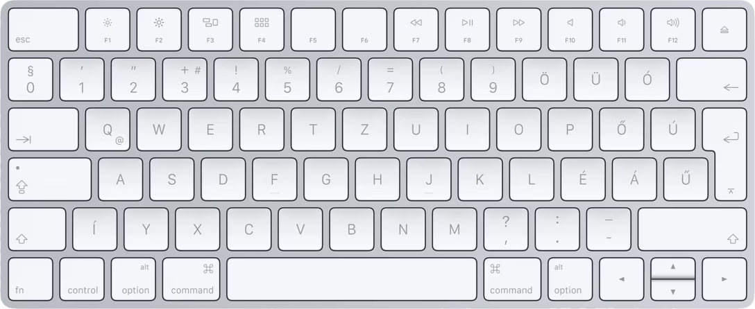
Why not ⌘0, though? Sure, you can say it’s not as elegant (0 is smaller than 9), or that it wouldn’t work in Hungary…

…but I think the Occam’s Razor is simply that ⌘0 has already been taken by a popular “zoom to 100%” command by then, and overlapped too often for comfort.

Tuesday, Oct 13 / #flow / #keyboard

“Is clip art actually dead?”

A good video from Linus Boman about clip art, most (in)famous from Microsoft Office, and specifically PowerPoint of the 1990s–2000s:

Turns out clip art is a lot older than I expected, and… it also never fully went away. On top of that, Boman covers a lot of aspects – from quality and perception, through the “user interface” of clip art, to how the means of conversion and reproduction changed it forever. I also loved the little “sidebars” in the video.

Even if you don’t care about clip art per se, a lot of the threads in the video will be relevant to things like shadcn, Inter, Google Fonts, Canva, The Noun Project, the Claude aesthetic, and so on.

Also relevant: Internet Archive’s MS Clipart Search.

Wednesday, Oct 14 / #graphics / #youtube

“No standard format for writing data to these tapes”

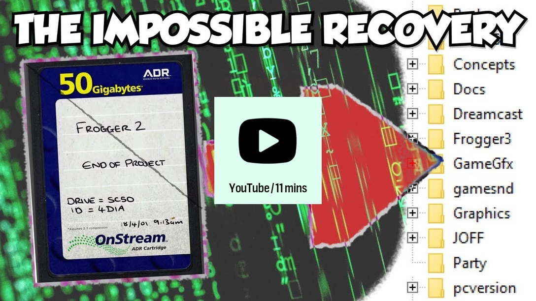
An 11-minute video from MattKC documenting huge effort to revive a backup tape from a 2000 game Frogger 2: Swampy’s Revenge:

This is a pretty harrowing story of restoration, including an extremely obscure backup tape made by a short-lived Dutch company, attempts to reverse engineer a poorly documented data format, a data recovery company that damaged the tape instead of restoring it, and a mad hack to trick the drive into reading it anyway.

Wednesday, Oct 14 / #games / #preservation / #youtube

“Traditional, but puzzling”

In the 1990s, users of some Unix-based operating systems would sometimes see a peculiar error. It happened occasionally when sending an email to a person you might have already sent email to before, and in addition to the error being confusing, the message itself was particularly bewildering.

Let’s say you wanted to send an email to “MWichary.” Instead of a confirmation, you would see this:

`550 mwichary... User unknown: Not a typewriter`

As many strange errors tend to be, this one was at an intersection of four different things.

The cause of the error was something many of you will recognize – code being anal about lower- and uppercase. Behind the scenes, a piece of software called sendmail always assumed lowercase user names, which was true early on. “MWichary” was quietly changed to “mwichary” – a user that didn’t exist – and the program reported the literal outcome, instead of its chain of reasoning.

The second part was a sort of a meta-error in the error handling routine. Sendmail correctly reported back “User unknown,” but then reflexively added whatever the system error value reported, for extra debugging color. These are usually helpful, reporting things like “Host is down” or “No space left of device” – I bet you’ve seen some of the very distinctive strings if you ever did anything adventurous in the terminal.

In this particular context, however, the system error was pretty useless. “Not a typewriter” meant basically “this is a program being run in the background; it’s not meant to accept any user input or write anything for the user to read.” It’s not an error as much as a condition, and is true for a lot of programs quietly doing the operating system’s bidding.

But… why was the message phrased this way?

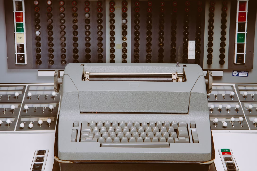
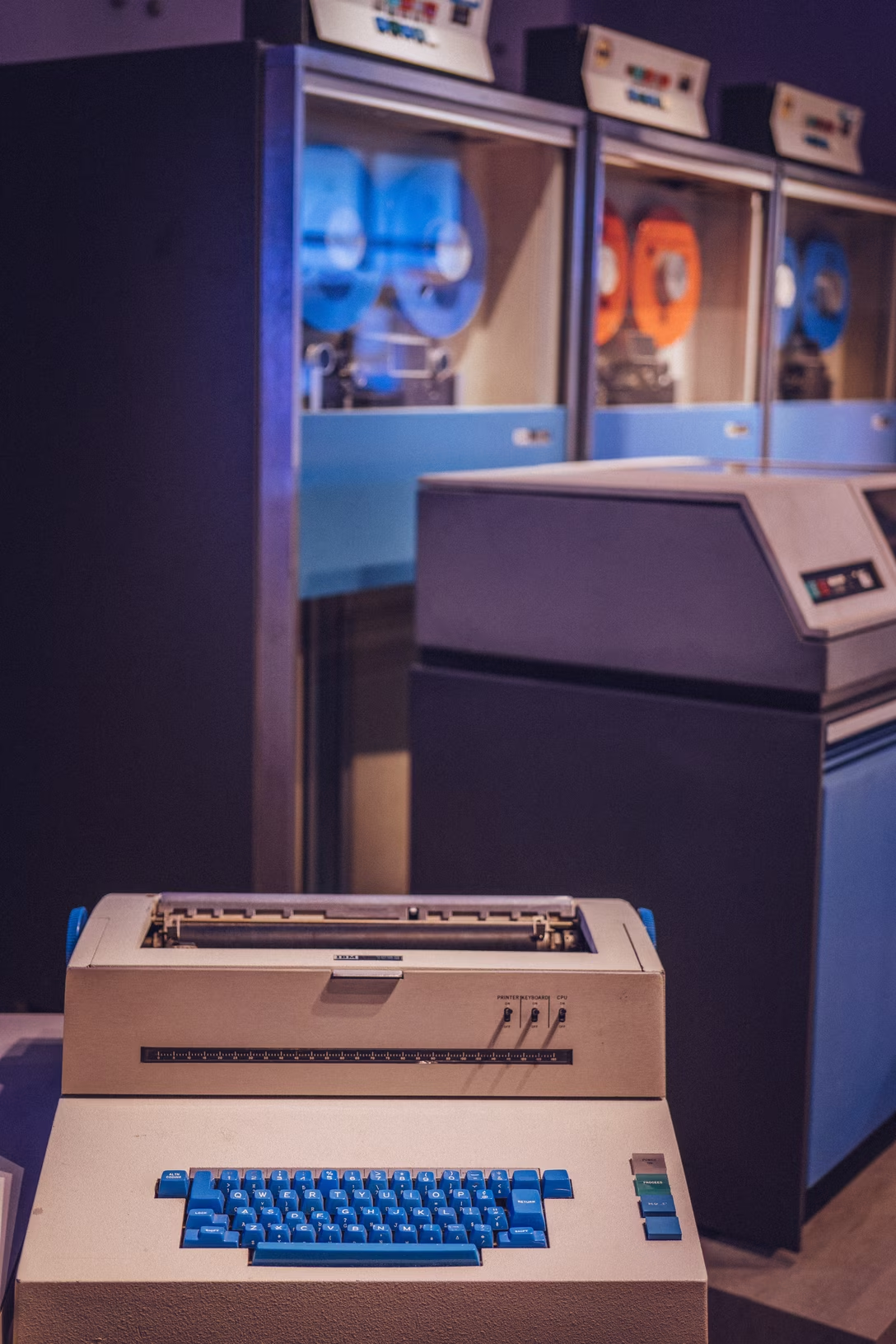
That’s just history. Computers were originally connected to typewriters as input/​output. Some of these typewriters were local, attached to the front panel, or console. Others were remote typewriters, or teletypewriters, often shortened to teletype or even tty. If you recognize these terms, that’s because they are still with us today!

You can see how “This doesn’t have input/​output I can do something with” can become a terse “Not a typewriter” in an era when every character feels costly, and a typewriter is your only option for input and output. Then, the string was simply kept a few decades too long, even after typewriters were replaced by teletypes, terminals with screens, and eventually Terminal and Console apps.

The fourth piece was fun with grammar: the simple choice of joining the two messages by a colon made it feel like the user was supposed to be a typewriter.

The message was eventually renamed. If you encounter it today, it will say “Inappropriate ioctl for device,” which I guess is an improvement. But its code remains `ENOTTY`.

It’s entirely possible it will still be named that decades from now, even after we all forget what typewriters were.

The title of the post comes from the explanation in the manual for the Solaris operating system.

Thursday, Oct 15 / #errors / #history / #writing

Don't miss what's next. Subscribe to Unsung (Weekly Digest):
← Newer “In every study that considered the question” Older → “But it would have bothered us the rest of our lives.”