
On typography in unimaginable conditions
|
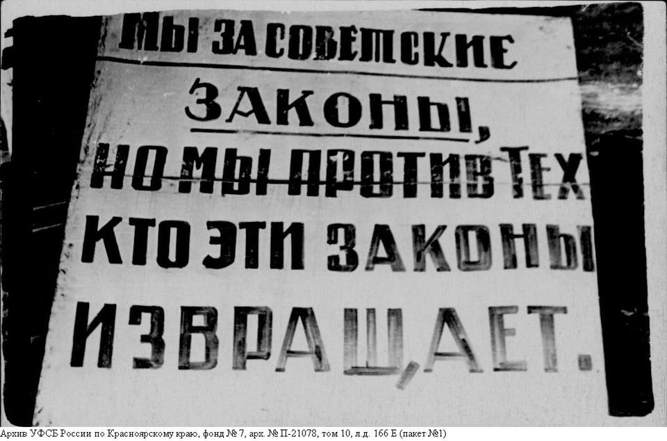
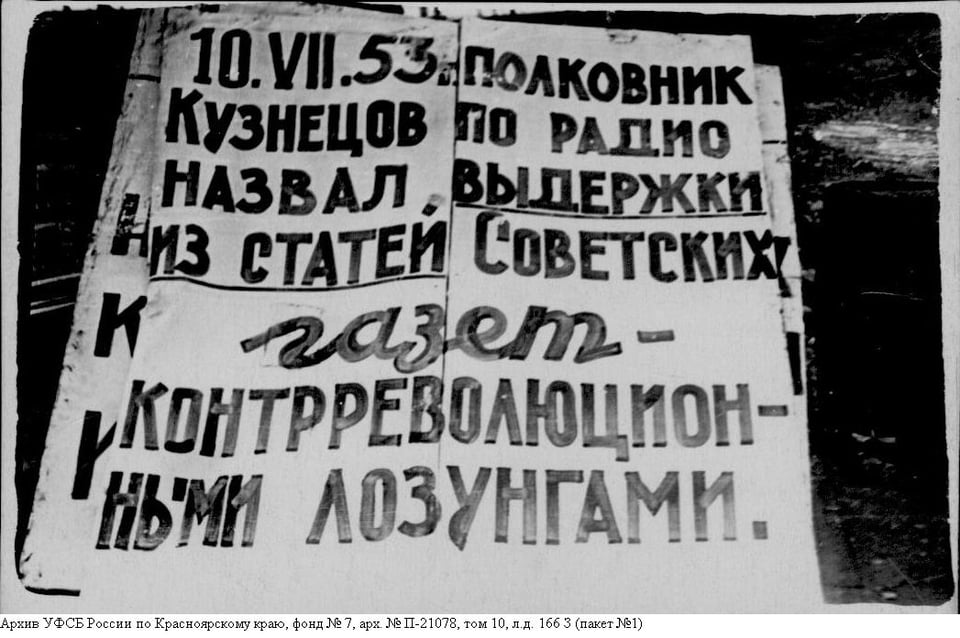
Hi there. I’m Dasha, the one in charge of the Journal and other communications at type.today. I want to share a story that I’ve been haunted by for quite some time. It’s about design — even though it might not seem so at first glance. One morning in May — I think it was my birthday — Artem, the editor, and I opened an email we’d been waiting months for. The email contained KGB archive materials related to the 1953 Norilsk inmate uprising — Artem and I were working on a long read about those events at the time. Inside were low-quality scans of dark, blurry photographs documenting pieces of evidence. The whole thing felt more like a creepy B-grade Netflix series. Except the facts were real. 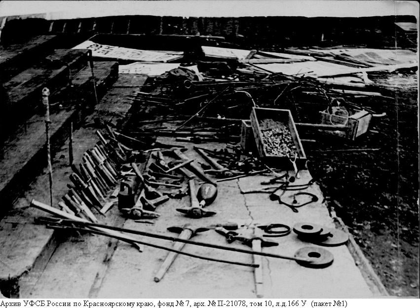 Life in Norilsk is challenging enough as it is. Most of the year, it’s winter, with temperatures plunging to −50 degrees and polar night lasting for 45 days. In the Norillag, a labor camp in Norilsk — as in many Gulag detention sites — the prisoners were held in torturous conditions. In Gorlag, a special camp for political prisoners, they were particularly harsh. In the spring of 1953, the tension was building: the guards — already tough — were on edge because the amnesty that followed the death of Joseph Stalin didn’t apply to political prisoners, increasing the chance of unrest. Besides, the overall anxiety of high-ranking officials — who, after the passing of the ‘Leader’ reasonably feared not only for their positions but also for their lives — was being transferred along the chain of command to the guards. Apparently, they were losing their nerve. The prison officers escalated torture and eventually started shooting prisoners. The inmates went on strike; the uprising broke out by the summer of 1953 and lasted as long as two months. The riot was eventually put down. However, it sparked a whole series of revolts in other camps, which eventually led to an overhaul of the entire prison system. Once the initial thrill of discovery, typical of our profession (after all, Artem and I were the very first to see these images if you don’t count KGB and archive staff!), passed and I finally managed to deal with a lump in my throat — which is an inevitable reaction to being exposed to such a massive dose of physical evidence of violence — I realised that there’s something else I see in these photos, something I really had not expected to see. I saw typography. 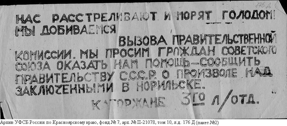
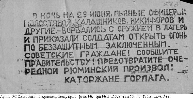 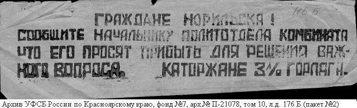 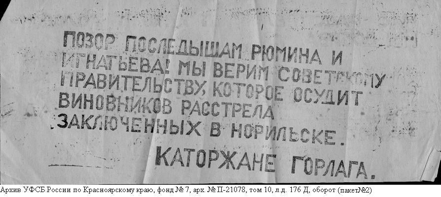 The inmates leading the uprising used paper kites to communicate between different sections of the camp and with the residents of Norilsk. They attached leaflets to the kites with cotton cord and then lit the cord so that it would burn through after a precisely calculated time interval, releasing the leaflets into the air. The text was printed using DIY printing plates. The messages on the leaflets left me numb. But then I also realised that these pieces of paper were, in fact, designed. They are beautiful. Even in conditions barely compatible with life, someone carefully laid out the text, using line breaks and spacing for emphasis and — each time with particular finesse — positioned the signature: ‘The Prisoners of Gorlag’. 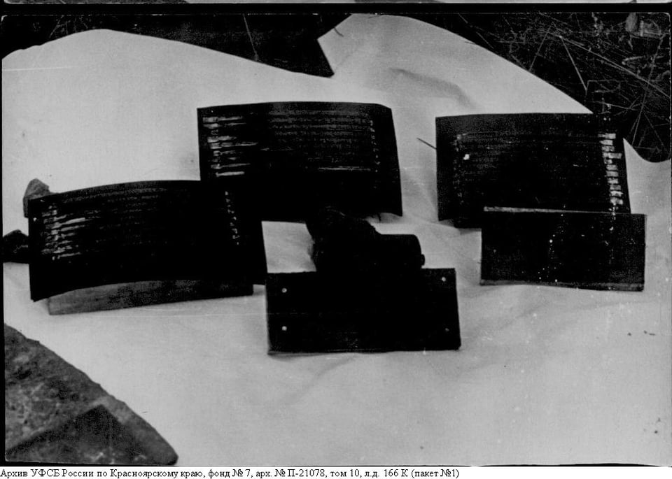 Their other means of communication, posters and banners, evoked even more complex emotions in me. Apparently, the person who created them was extremely skilled with a poster nib. The texts demanding an end to torture look like advertisements of a village cinema. Even in such a desperate situation, this person still found the strength to stay professional, choosing different lettering styles for different parts of a sentence and expertly introducing swashes into words like ‘humanity’ and ‘justice’. The contrast between how these posters looked and what they said — as well as the circumstances under which they were created — makes me return to these disturbing photographs over and over again. 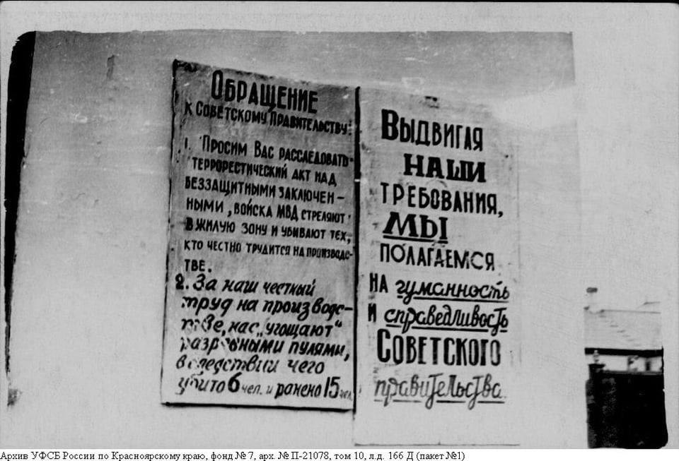 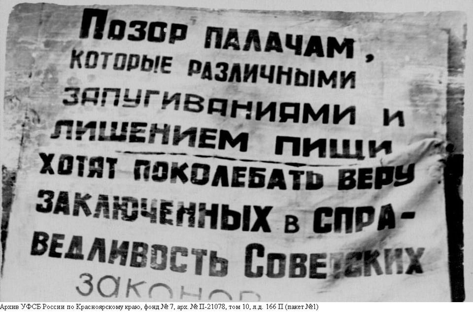 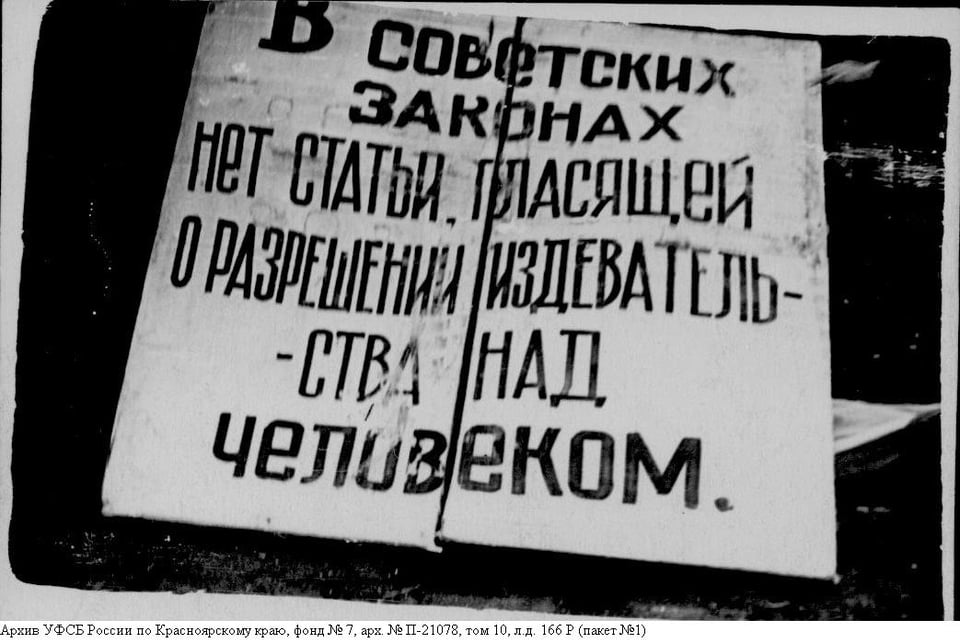 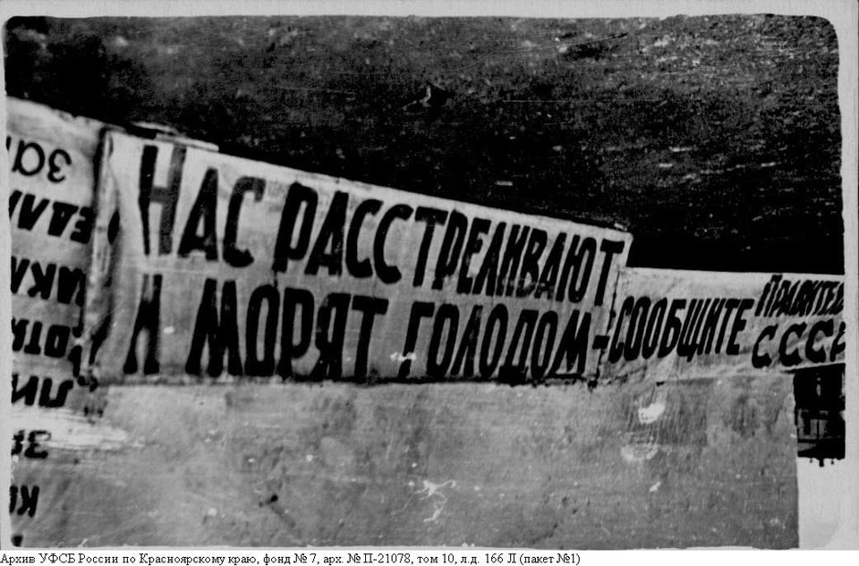
  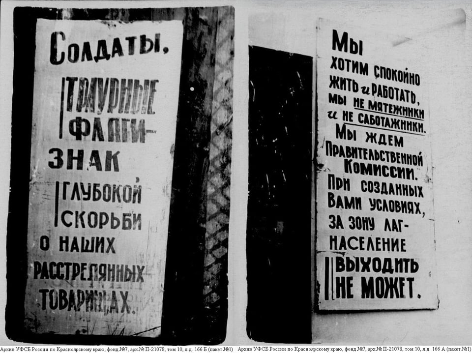 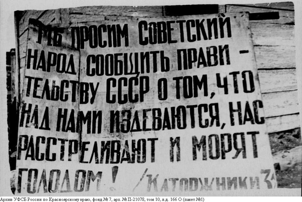 Now — when basically every new sandwich at a city coffee shop requires its own logo — whenever you need to set even a somewhat important message, your hand instinctively reaches for Times New Roman to be used on an A4 page with Word’s default margins, left-aligned text format, and no hyphenation. Each time I fight that urge, I think of a person I know nothing about. A person who, under extreme circumstances, while drawing the words ‘We are being shot and starved!’ — about themselves, at this very moment — meticulously compensated for the lowered crossbar in А with a raised crossbar in Е.
|
Over the past month, we published another issue of our digest, added a new (pseudo-blackletter) typeface to the Backslanted series, and spoke with Typotheque researcher Héctor Mangas about why type designers might need a cognitive psychologist.