
Nostalgia for Chicago on the Streets of Barcelona
|
Nostalgia for Chicago on the Streets of Barcelona Hi there! I am Ilya Ruderman, co-founder of type.today, and what you’re reading is the first newsletter in our new, updated format. About a month ago, we agreed that each member of the type.today’s team would write a small piece on whatever has been on their mind lately. The first thing that came to my mind was to talk about Barcelona’s street typography — which never ceases to surprise me. But I’ll start somewhere else. Believe it or not, I still remember Mac OS 7. I am a huge fan of that operating system. I loved the way windows collapsed into a bar. I enjoyed being able to allocate a specific amount of memory to a particular application. But most of all, I loved the simplicity of its interface: its black-and-white design, its bitmap nature, that rather primitive, yet extremely confident visual style. I miss that simplicity. Now that interfaces have become sleek, adaptive, and sometimes too nice, that straightforwardness appears to be particularly valuable. A very important element of that ecosystem was, naturally, the typeface — Chicago. One of the great typefaces developed back in the 1980s, it now looks more like something vintage. That's why my story about Barcelona's street typography will begin with a brief reminder of what Chicago is. 
The typeface was designed by Susan Kare specifically for interfaces: menus, system elements, and all those other things normal human beings typically never pay attention to until a type designer comes into their lives. Apparently, Chicago was created with Steve Jobs’s direct participation, who at the time was actively involved in everything going on at the company. Actually, legend has it that Steve Jobs was the one who came up with the idea of naming fonts after geographic locations — so we owe him names like Geneva and Chicago. Though, for the record, Apple has preserved the tradition with its newer typefaces such as New York and San Francisco. If you look at Chicago from today’s perspective, you’ll see countless irregularities. It’s rough, angular, at times even stubborn. But it had a certain charisma you couldn’t forget. The font stayed with us for quite a long time — it even lived to see the early iPods. I’ve always associated it with Apple products, products I’ve been using for many years. Nobody really noticed how it stopped being used. But I still miss that typography, that almost analogue, lo-fi simplicity. Now, why am I telling you all this? About a year ago, I started noticing ads for this project on the streets of Barcelona. Politically, I didn’t really relate to it, but graphically, I found it extremely interesting. Supporters of the initiative were putting up these posters all over the city — which is generally quite consistent with the nature of street typography: it is almost never a result of agreeing on placement format and going through three rounds of edits. 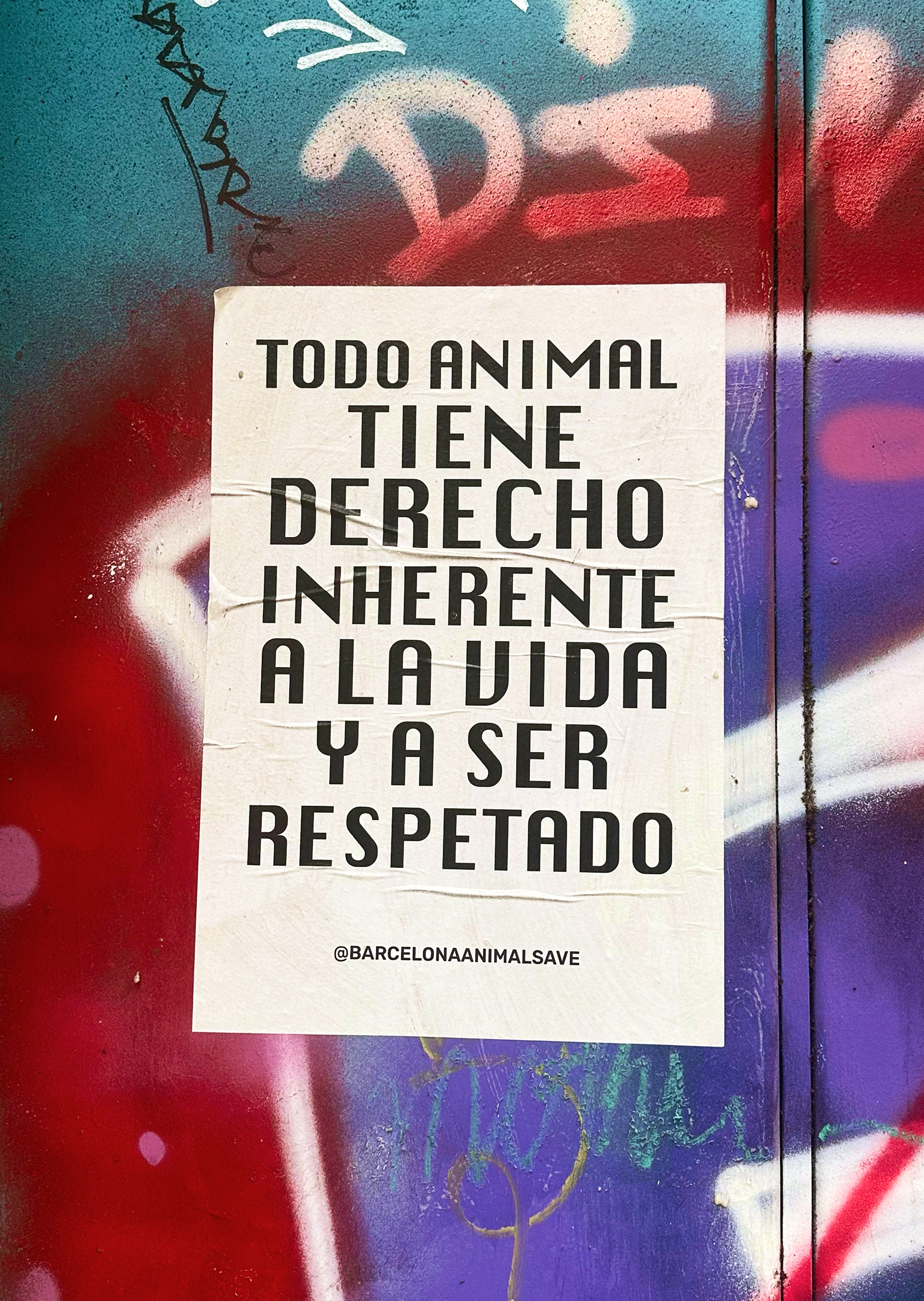
and to be respected’, set in Chicago The ad stood out for its incredible simplicity and, at the same time, a certain typographic precision. One series of posters was set in that very same Chicago. And it resonated with me immediately. Imagine this: you’re looking at a wall covered in graffiti, with a white sheet of paper posted onto it, and then suddenly something vaguely reminiscent of Apple products stares back at you from that sheet. It’s as if the old Mac OS had stepped out of the computer and engaged in a street campaign in Barcelona. I felt as if an unknown colleague was speaking to me in a language I also speak — a person with an obvious soft spot for typography. Though, perhaps, they chose Chicago simply because the typeface ‘looks fun’. Still, I like to believe there was some subtle cultural gesture behind it, that it was addressed to an almost secret typographic brotherhood. Even though the campaign was relatively short, a year later I still see these posters on the streets. They are gradually becoming a cultural layer: slightly faded, here and there half-covered with something else, or even partially peeled off. And whenever I walk by, I stop. And every time I see them, I feel connected to them. Needless to say, I am a somewhat unusual person when it comes to the target audience for this sort of typography. But that’s precisely why it resonated so heavily with me. For some, it’s just an illegally placed piece of paper. For me — an encounter with the ghost of an old interface on a wall in Barcelona. 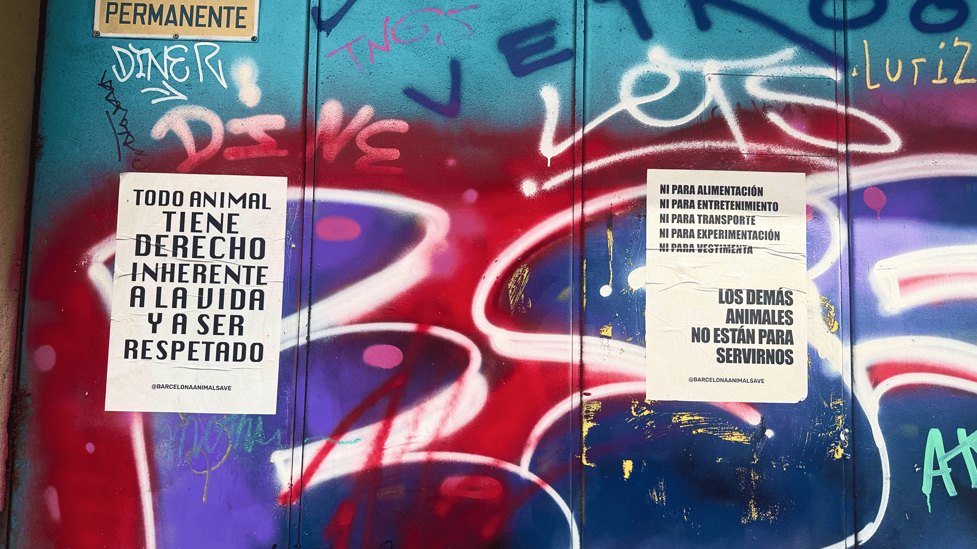
We would be truly happy if you shared your impressions of this letter with us in any way you want. I’ll now hand things over to my colleagues. Thank you, bye!
|

Recently, we published a conversation between two Tomorrow curators — Timur Zima and Nikita Nelikhov — and spoke with Christian Schwartz about the future of the industry. We also released Crimp by Font Club Belgica and launched an open call inviting designers to create posters on the theme of Routine using Algorytm by Interval Type.