Excel-lent Football Facts 1
The FIFA Men’s World Cup is 50 days away and as someone who loves soccer/football (for simplicity, I’m going to call it football for the rest of this newsletter) and spreadsheets, I couldn’t resist starting to build one for the occasion. And if I’m going to pour a bunch of energy into a spreadsheet, why not share my “findings” with you all, my beloved subscribers?
FIFA has its problems, and this World Cup in particular has had Not Great news related to it for years. I’d love to dig into that, but there are many more well-equipped and informed writers doing that. But no one, as far as I’ve seen, has been delving into the hard-hitting issues like which side of the road the World Cup qualifiers drive on. So I will take on the harrowing task for this series, which I’m calling:
Excel-lent Football Facts
I probably could have come up with a better name than that, but here we are.
When I was a teen and the internet had not yet evolved to the cesspool that it has become, one of my favorite sites was the CIA World Factbook, because I was a really cool kid who knew how to have fun. I would look up a random country and learn all kinds of useful-to-cool-6th-grader data points like the national area, population, government, economy, etc. So I figured what better way to kick off our Excel-lent Football Facts than a little comparison of those basic stats between the countries that did and did not qualify this round.
First, my methodology for these charts: as is my self-imposed rule for this sporadic newsletter, all data must be found in charts and tables on Wikipedia. That CIA world factbook story was a little bit of a red herring I guess. I looked at a variety of pages that were all in the vein of “Countries by _____” such as “Countries by population” and “Countries by landmass.” I found that while the bulk of what Wiki-editors consider “countries” were consistent, there were some inconsistencies around protectorates, colonies, disputed territories, etc. To determine what counted as a “country” and keep things as consistent as possible, I decided to use the list of 222 FIFA members as my country list. This unfortunately means that I won’t get to include all the Vatican City stats I’d hoped to use, but all artists must make sacrifices in the pursuit of art.
Once I got my Country list nailed down, it was time to start filling in the data. I found about 5 different tables on Wikipedia representing populations, none of which were in accordance with each other. I found similar issues with most of the data points I decided to include. Therefore, when choosing which data I would actually use, I employed a specialized algorithm1 based on perceived completeness, accuracy, table formatting and vibes.
I made the table three times, because twice I accidentally included data for Vatican City and Western Sahara2 and it threw everything off. I’d be embarrassed, but I’m literally just vibing in excel on my days off, so we’re not judging here. Because I got a little tired of the exercise by the third time around, things ended up a little paired down and simplified.
Next, a caveat: As they have been doing for centuries, the United Kingdom kind of ruined everything. See, while most countries have a 1:1 ratio between FIFA representation and country, the UK is holding a nice 4:1 ratio as they have four FIFA football organizations, not including protectorates and colonies and all that. We’ve got England and Wales, who both qualified for the World Cup and Northern Ireland and Scotland who did not qualify. This kind of muddies the statistics because the UK is literally one country, even the CIA World Factbook agrees. But it’s got 4 teams.
I know things are a slightly more politically complex than that, but really, for a country of less than 70 million to have two teams representing them in the Cup while China has zero… I don’t know, it just seems extremely on-brand of the Empire.
In trying to figure out how to represent these four, it was really late at night and I was tired, so I gave up and just let all the UK stats exist four times which is arguably the worst solution, but again, this is a free newsletter that I write mainly for my dad, who also likes spreadsheets, and like, five other people. My hope is that since we have 2 qualifiers, and 2 losers, they’ll balance each other out and statistically actually erase the UK entirely, which is fun for me.
World Population
Only 21% of the world population has a team in the World Cup. This huge imbalance is partially because only 32 teams are represented, while there are 222 FIFA members. But it’s also because China and India both have pretty terrible football teams, and that’s nearly 40% of the world population right there.

Even though nearly 80% of the global population won’t be able to watch their countrymen kick the ball around the stadiums in Qatar, it is expected that 5 billion people will tune in to watch this year’s competition, which is roughly the same as if everyone in the world except the population of India and China were to watch.
So basically, if India and China weren’t so salty about having really bad football teams, we could have the whole world tune in. That’s how numbers work, right?
Global surface area
Again, India and China are skewing things here, and Russia was banned (Because FIFA is better at sanctions than most governments apparently), and those three combined represent about 20% of the global landmass.
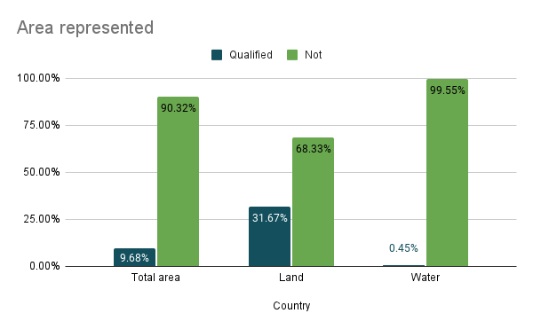
But I think the real revelation here is the vast underrepresentation of merpeople and other water dwelling entities. 3
Right-hand road traffic
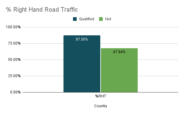
So, this chart is a little confusing, that’s my bad. Neither configuration really looked great. But whatever. The main takeaway for me here is that a lot more countries employ left-hand road traffic than I realized, and not all of them are current or former UK colonies.
Average Human development index (HDI)

The HDI is a composite index used to rank countries into four tiers of human development. It is calculated as the geometric mean of the Life Expectancy Index, Education Index, and Income Index, which looks like this:

-
Life Expectancy Index: LE is national life expectancy at birth. When the LE=85 years, the LEI=1, when the LE=20 years, the LEI=0
-
Education Index: MYSI is Mean Years of Schooling (MYS) divided by 15 and EYSI is Expected Years of Schooling (EYS) divided by 18. Here, the MYS is the projected maximum national mean, and EYS is the average years needed for a graduate degree.
-
Income Index: GNIpc is the gross national income per capita.Yes, this one uses the natural log. Very fun stuff.
So once you calculate these three, you take the geometric mean and voila, HDI.
Don’t worry, Wiki did this for me.
The HDI ranges from 0-1 in theory, but the lowest current HDI is South Sudan with 0.385 and the highest is Switzerland with an HDI of 0.962. I kind of wished I’d adjusted the scale to reflect that, but I didn’t, and I can’t be bothered to go back and change it now. Instead, we have the above chart. The actual numbers wouldn’t change if I adjusted it, just the look of the chart.
The fact holds: The qualified countries have a higher average HDI, which is not shocking, since that means they probably have more resources, tangible and otherwise, to invest into football programs. Speaking of resources…
Average Gross Domestic Product
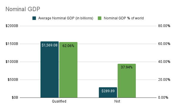
Again, I probably could have set this chart up differently, but this was the best way I could find that would allow me to have different scales on the left and right axes.
It’s not surprising to see such a wide gap between the GDPs of the Qualifiers and the Losers. When you remove India and China from the Loser calculation, the average GDP drops by over 60% to about $106.8B, representing about 12% of the global GDP instead of 38%.

I said I’d mostly avoid the problems with the World Cup and FIFA, and I will, but I can hardly drop these charts and not acknowledge the discrepancy.
Part of what makes football such a wonderful global pastime is the comparatively low bar of entry: you need only a ball and a few pieces of litter to mark the goal, versus other sports that require much more to even start playing.
That said, once you start progressing to the elite levels, the financial bar begins to climb exponentially, both for the individual and for the organization. A chart I will not be making, because I didn’t find it on Wiki, is one comparing the spending on the national football organizations, but suffice it to say, the World Cup, like most things in our society, is pay-to-play.
Okay, back to somewhat meaningless information…
Average internet speed
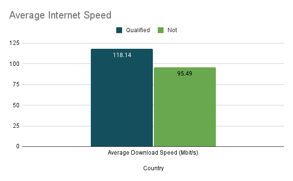
The data available here was not complete, with speeds for 101 countries, out of 222 FIFA teams. And they seemed kind of random. But I didn’t see any explanation on who was and was not included. For some frame of reference to these numbers, the slowest internet speed was qualifier Senegal with 35.32 Mbps and the fastest was loser Singapore with an average download speed of 245.5 Mbps.4
While there is a slightly higher speed among the qualified countries, when you look at the individual countries, there’s actually a pretty even dispersal of qualifiers and losers throughout the list. In fact, South Korea, Denmark, and France are the only qualifiers in the top 10.
There was no data in the wiki page for qualifiers Ecuador, Morocco, Iran, Tunisia, or Cameroon, though a little bit of searching showed they all had average speeds around or below 30 Mbps, and several below 10 Mbps. If they were factored in the average qualifier speed drops to 104 Mbps.5
Average military spending

I said I wouldn’t do a chart that factored in football spending, but I did want to bring in a little spending data here and found some pretty good data for military spending. Of all the datasets I looked at, this one was the least complete. I don’t know if that’s to do with incomplete reporting, lazy data collection, or some countries choosing not to spend 4% of their GDP on the military, like we do in the States.
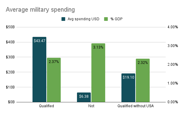
In fact, the US represents such a high proportion of the military spending among qualified countries that I decided to make this second chart that includes the spending of qualified countries without the US spending included. Because, see, the US spends more on the military than literally any other country. The most recent stats I found show US spending to be nearly $780 billion annually, with the next highest spender being China at just over $250 billion. God, I’m tired.
Those numbers just made me too tired to continue, so I’m going to end the first installment of Excel-lent Football Facts here. Keep an eye out for upcoming installments in which we’ll look closer at the qualifying countries, their kits, and whatever else I manage to scrounge up between now and kick-off in late November.
As I mentioned above, I made and broke this spreadsheet twice, so the third one is not as clean because I kind of gave up, but you can find the data from today’s newsletter in this spreadsheet.
-
Read: arbitrarily picked ↩
-
Around the same time as my CIA World Factbook era, I memorized all the African countries based on my mom’s 1976 atlas and it said Western Sahara was a country, but come to find out, it’s not technically a country. It’s a disputed territory and has been since Spain withdrew in 1975. ↩
-
In reality, I have no idea what the story is behind that 0.45%. It can’t include all the territorial waters, because that percentage is much higher. But it made me laugh so it stays. ↩
-
If you live in the US, for another frame of reference, our average in this dataset was 192.25 Mbps. These numbers all come from Ookla, which you can run quickly if you want to compare to your current internet speed. ↩
-
I chose not to do this because there were an equal if not greater percentage of Loser countries without data as well, so I figured I could call it a wash. ↩