Zero Hour 30th Anniversary Special #1 (October 2024)
Zero Hour 30th Anniversary Special #1 (October 2024)
OH NO! A residual time vortex left over from Zero Hour has transported us from October 1994 to October 2024! Before a Linear Man comes to take us back to our proper time and/or shoot us with a giant gun, let’s look at the Zero Hour 30th Anniversary special that came out this month, and absolutely nothing else. (Not because I don’t wanna learn too much about the future to protect the integrity of the timestream, but just because it looks kinda depressing…)
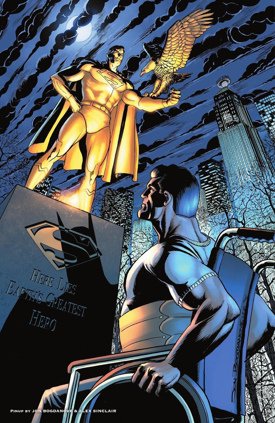
Click above to read my take on the recent Zero Hour revival special, which has a very Green Lantern-centric plot and only features Superman as a statue, hence it being posted to my @greenlantern94to04 side blog. The art, on the other hand, has a LOT to do with our fav'rit Superman era, given the legendary artists involved – including Jon Bogdanove, who contributes this dramatic “World’s Finest Post-Doomsday/Bane” pinup:
So, naturally, our own Don Sparrow wasn’t gonna miss the opportunity to talk about this issue. Take it away, Don!
Art-Watch (by @donsparrow):
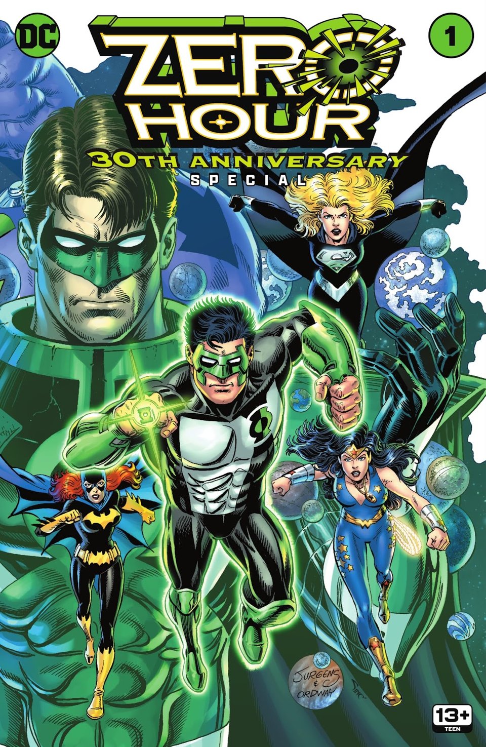
We start with the cover, reuniting two of four members of the Mount Rushmore of great Superman artists, Dan Jurgens on pencils and Jerry Ordway on inks, and it looks terrific. In the first place, I love seeing the original Kyle Rayner costume, one that in my opinion they never really improved upon, despite all the different attempts to update it. Featuring Kyle and the Parallax-influenced Hal Jordan is a great callback to the events of Zero Hour, and the strangeness of the unfamiliar costumes of Supergirl and Wonder Girl are enough to grab the attention of the reader and let them know this isn’t just a rehash of the 1994 story. Ordway’s inks look appropriately thick and varied here—of late, it has seemed to me like he’s favouring more of a technical pen look (more Micron pen than dip pen, for you art gearheads reading) but there are some thick lines here that indicate a brush was used as well, and it’s a nice touch.
In general these anniversary issues can be revealing, from an art standpoint. Sometimes, they’re a welcome homecoming to artists no longer featured regularly on the monthly shelf, which can be a real treat. But other times, it’s a reminder, perhaps, of why these artists are no longer on a book regularly, having lost some of the polish once associated with their work. This book is largely the former, with a couple examples of the latter.
(Before diving in, let me be absolutely clear: every artist featured in the ZERO HOUR 30TH ANNIVERSARY SPECIAL is operating on a level I deeply admire. Even on their worst day, they are creating work that surpasses anything I could accomplish on my best. That said, I’m taking off my artist hat and putting on my critic hat for this review. The critiques that follow are offered with full recognition that these are seasoned professionals, and any observations come from a place of respect for their craft and contributions to the medium.)
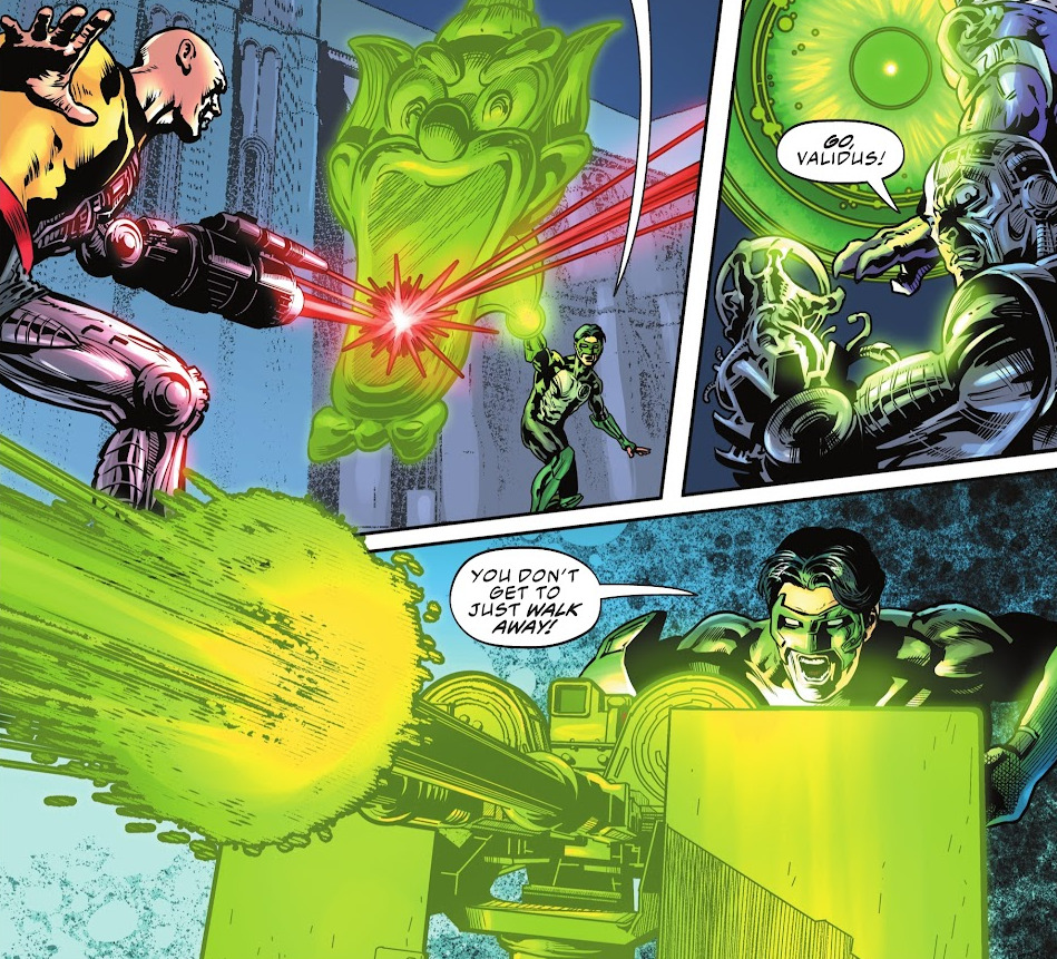
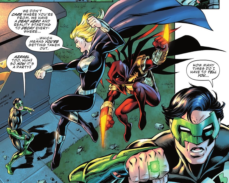
The first story, a very 90s team up between the legacy heroes Wally West Flash and Kyle Rayner Green Lantern showcases that Darryl Banks hasn’t lost his fastball. His composition and surface textures look just as good as they did in the mid-90s, when he designed Kyle in the first place. It’s all good stuff, but particular highlights are when Kyle scans Gotham looking for Wally, and then later a reaction shot of Kyle witnessing this Wally West get zapped by Validus. I had almost forgotten how varied and creative Kyle’s ring constructs were, so it’s a fun reminder to see Gatling guns and funhouse mirrors get dreamed up with a thought.
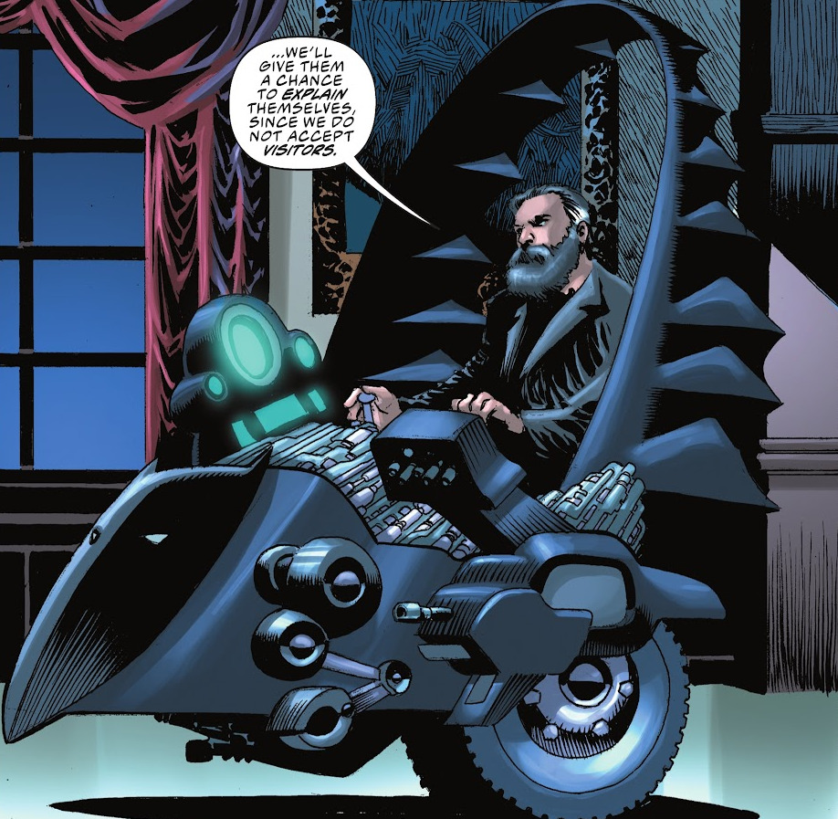
In the next story, I have to say, using Kelley Jones for a 90s throwback story really works, as an idea—his covers were so iconically linked to the Knightfall era of the Batman books, so seeing his name among the credits got me interested. But, putting it gently as I can, this issue is not his best work. Granted, Kelly’s moody, cartoonier Bernie Wrightson looking figures were always better suited for covers than interiors but there’s so many odd shapes here that are pretty distracting. Jones seems to particularly struggle with the usually beautiful Barbara Gordon Batgirl, whose face looks downright strange in pretty much every panel in which she appears. Jones also seems to push the envelope with her physicality, defining what appears to be her nipples straining against the material of her costumes, which definitely would have been a no-no 30 years ago. Not to say that there aren’t highlights, the Chief-from-Doom-Patrol looking Bat-wheelchair Bruce Wayne cruises around stately Wayne Manor is a great design.
Unfortunately that quickly gives way to the nadir of the story, a sequence of panels where aging Bruce looks for all the world like Saddam Hussein. Not the ‘90s callback I was expecting!
The next chapter is a real highlight, as the great Tom Grummett’s pencils are so consistent and tight, this could very easily be an unpublished story directly from the actual Zero Hour era. Norm Rapmund is usually seen with super-teamster Dan Jurgens, but seems a good match for Grummett as well, lending line weight and shadow appropriately, without looking too hatchy as he sometimes can. The floating citadel above Coast City is a nice piece of design, and I love the design on the all-black Supergirl suit. Tom also includes a fun callback to the Fleischer cartoons through Kyle’s ring, where the wayward Robot 5 is generated by Kyle to defend him against Supergirl. Great stuff. Then, just as I thought it couldn’t get 90s enough, we get a cameo from the Joe Quesada designed Azrael, and the Joe Quesada designed Ray, making my '90s heart happy.
Also making my heart happy: Jerry Ordway’s art appearing in a book of consequence like this one! No one does dynamic realism quite like Ordway, but there are hints that this issue had a short deadline, like the unfinished background trees in the interrogation scene. A highlight of the story though, is Machlan/Ordway creation Obsidian materializing from shadow, and then giving us the treat of a history of the DC universe section (even if it’s a bummer that they’re all being destroyed by the entropy rift). I would guess the inks here, unlike the cover, are mostly marker based rather than dip pen, but I could be wrong—there’s just a slightly scribbly mark-making here that I’ve noticed in Ordway’s work of late (look at the shine on Hal Jordan’s legs, for instance).
Paul Pelletier’s chapter is a slick one, and a great showcase for his smooth pencils. To my shame, I had forgotten how great he was on the criminally underrated “Emerald Knights” storyline in the post-issue-100 Green Lantern comics (can’t wait for Max’s reviews to reach that time!) but he’s a perfect choice for a Hal/Kyle showdown. It’s great seeing '90s staples like Starman, Vuldarian Guy Gardner, Connor Hawke GA, etc.
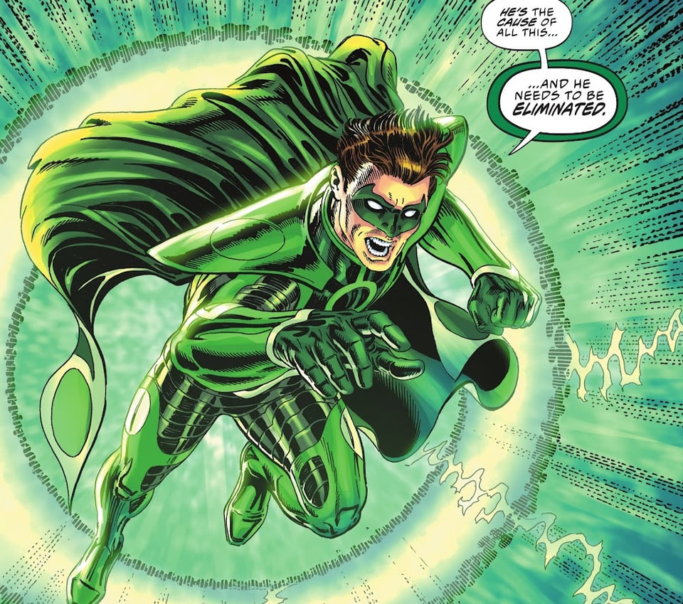
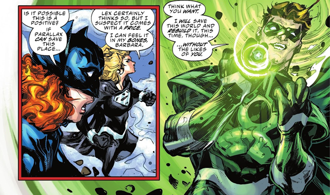
The Howard Porter chapter is a disappointment—his work alongside Grant Morrison on JLA in the late 90s was what brought be back to comics after leaving for years, so I’m certainly an admirer, usually. I don’t know if it’s related to his severe thumb injury from the early oughts, but there’s definitely a stylistic shift at play here, with the little texture lines having him look a little like Kenneth Rocafort’s surfaces. Certain panels look rushed, leading to downright weird versions of identifiable logos (like Supergirl’s shield) or distorted faces (sure, the Parallax version of Hal is corrupted, but he shouldn’t be ugly!).
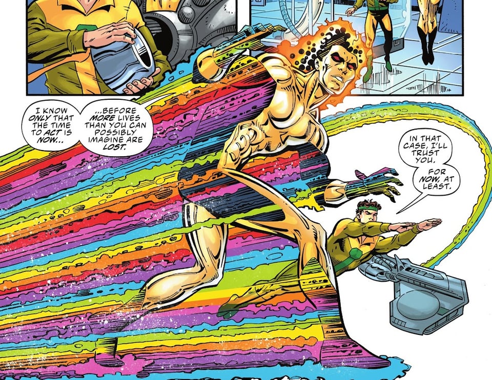
Finally, we get the classic Waverider team of Dan Jurgens and Brett Breeding, and they’ve hardly lost a step either, Waverider’s metallic shimmer looking great. It was great seeing the telltale timestream rainbow as he’s freed by Invisible Kid to take on Parallax.
Then there’s the pinups, which are a nice assortment of either '90s callback characters by modern artists, or '90s famous artists rendering the alternate timeline of this book. Bog’s pinup looks good, and is a return to form after the bald Superman issue a few years back. Tony Harris’ Starman looks like it could have been a cover back then. It was nice seeing Legionnaires’ Chris Sprouse’ clean lines on Legion characters again, and Nicola Scott is making me wish that the alt-timeline all-girls JLA was a thing.
SPEEDING BULLETS:
Could we get a more appropriate epitaph for Batman than “Gone, Not Forgotten”?
Could the line “Batgirl has a lot of numbers” be a pleasing reminder of her 90s role as Oracle, researcher and superhero dispatcher extraordinaire?
Missed an issue? Looking for an old storyline? Check out our chronological issue index!
This newsletter is free and always will be, but if you'd like to support us with $1 a month or more, you'll get access to extra articles about non-continuity '90s Superman stuff (shows, video games, Elseworlds, etc) and cool giveaways. Click here to become a paid SUPporter!
Add a comment: