10/10, no notes. Seriously. I went digging for Christmas ads of the strip mall photoshoot and middle school essay variety and came up empty handed. Instead of the usual fare, I found fun, memorable, and compelling spreads, like the one above.
Santa as an expert database manager hits all the right notes. It’s an unexpected combo that still manages to immediately click, passing the cavemen test without using the product name in the H1!
The only thing you can ding Microrim on is the entirely unexplained reference to Clout, which just so happens to be my second favorite Christmas ad of 1984:
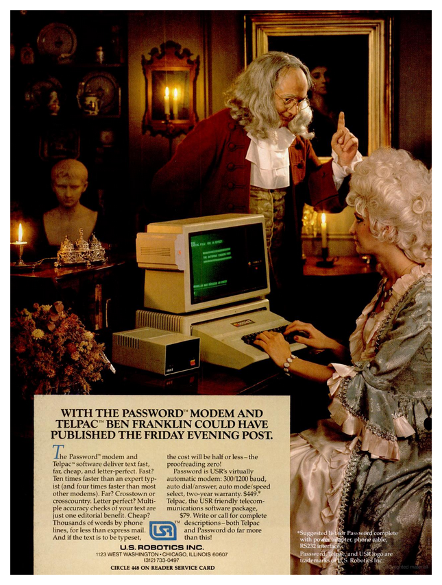
They could’ve referenced Benjamin Franklin the inventor when introducing their new modem. Or as one of the five original drafters of the Declaration of Independence when mentioning editorial benefits. Maybe his stint as the first postmaster general? Nope! They went with an oblique reference to a magazine launched 33 years after Franklin’s death.
And where in the ad is the Password modem? (Yes, they had the trademark) Clinging to the side of the display in the least eye-catching way possible. “Easily portable, it parks almost anywhere thanks to the convenience of Velcro strips.” (InfoWorld August 1984)
U.S. Robotics’ unassuming little gray box was an auto-dial, auto-answer modem. “One of the most advanced communication devices in the world,” according to its instruction manual. An assertion their marketing team worked hard to reinforce by setting all of their ads in 18th century America:
[Page one out of five, this one standing alone on the right side of the layout]
Excuse the unannounced hiatus. I have been abroad. Well, that and digesting this disgustingly long ad, wherein Midwest Micro went to war on a dozen different copywriting and typography principles.
Appearing in PC World’s August 1995 issue, there was not one but two illegible fonts (a Curlz MT copycat and another that seems Jester-adjacent). Both bad enough typefaces in their own right, made exponentially worse by mixing them together, along with inconsistent sizes and weights, often within a single word.
Even if the entire page was printed in Arial, it advertises nothing but…Clue: The boardgame? And badly, at that, considering the ad’s wordcount is higher than the intro in the game’s actual instructions.
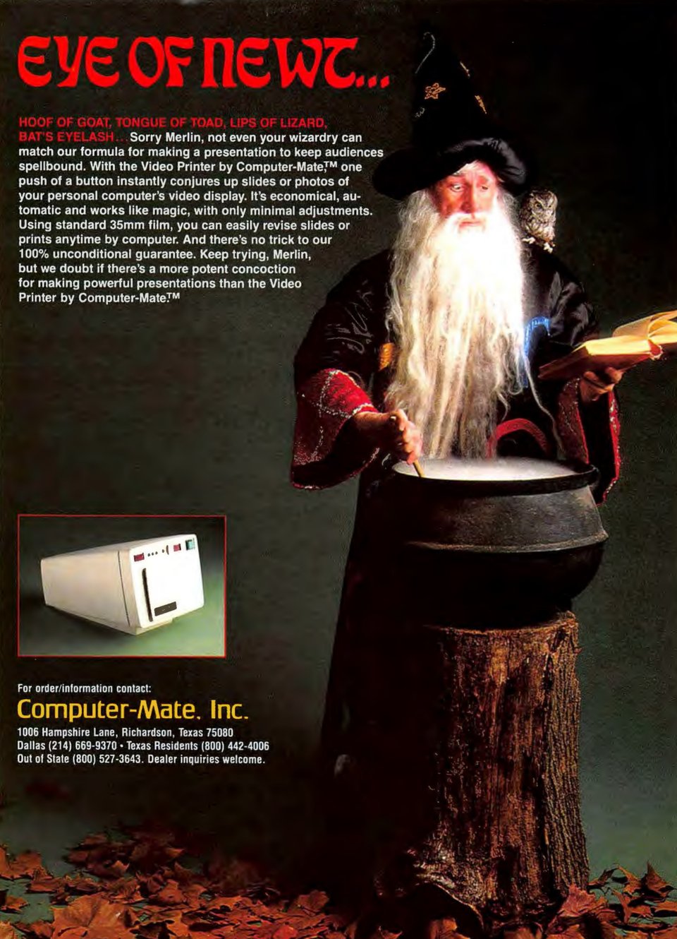
Merlin seems more aware of how this ad reads than the copywriters who drafted it.
The first 14 words are utterly devoid of meaning. The 11 that follow do nothing but argue that Computer-Mate Inc. was really good at making presentations.
But boy oh boy does it stand out from the black-and-white, text-heavy pages that bookend it!
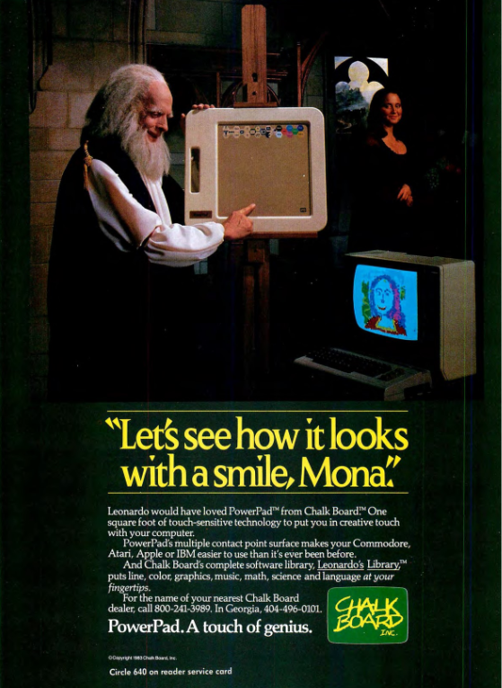
Ah yes, if only DaVinci had painted the Mona Lisa with digital finger paint. If only he had been blessed with a chunky beige slab boasting 14,400 switches crammed into a 12”x12” prison of lost potential. If only.
This 1984 full-page ad for Chalk Board Inc.’s PowerPad is such a superb representation of tech advertising in the 80s and 90s. It is hilarious, outlandish, and baffling.
Why is pervy Leonardo standing to the side of and behind the easel?