quantum of sollazzo logo

quantum of sollazzo

Archives
Sponsor
Subscribe
August 22, 2026

preview 672: quantum of sollazzo

Quantum of Sollazzo

NO. 672 ·

alt text

Did someone forward you this email?
If so, you can subscribe here.

You can view this email online here.

In this issue...

Morning, folks. Taking this week a bit easy after a friend's wedding last weekend. I'm visiting old friends in Zurich, and doing a bit of data wrangling on the side. You gave me a lot of feedback about MapSplit, and I'll add to it in due course. Maybe turn it into a game, who knows 😃

Quantum #671 had an open rate of 28% and a click rate of 8%, and the most clicked link was the brilliant 200ms interactive.
Also, someone made me realise that the past few newsletters were over the 102KB Gmail threshold, and this likely explains while open rates suddenly dropped – I had attributed this to peak August leave. Interesting observation, and something to look into. I'd never looked at how big Quantum was, and I've suddenly realised because I could no longer read it all on my mobile in signal-free areas. You never stop learning!

·

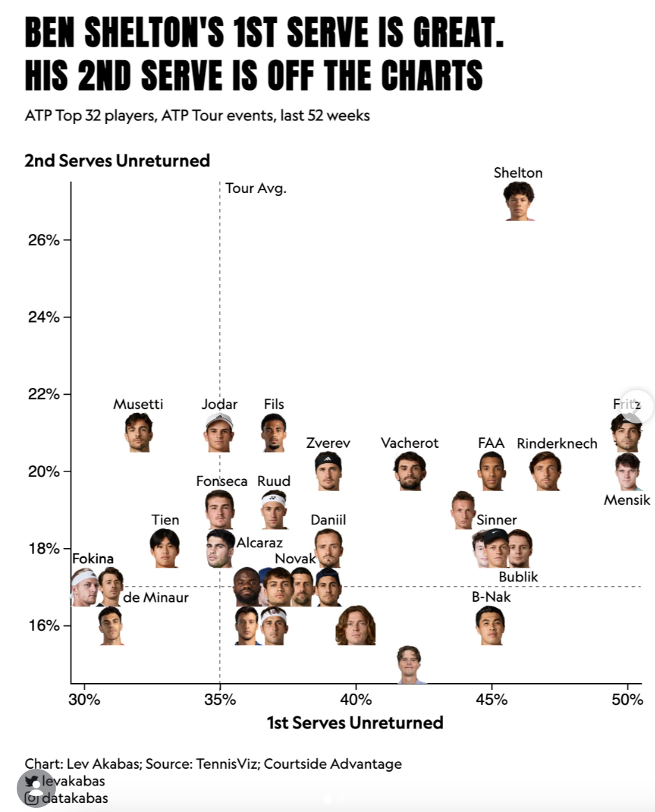
The one article that caught my eye this week is in the Dataviz section and it's about tennis. Ben Shelton, the American tennis player, has a notoriously powerful serve. I'd say, as a tennis amateur, that his serve is probably the best in the circuit. What I had never noticed, and the chart excels at showing, is how bonkers is second serve is. You know that in tennis you have 2 attempts at serving: usually the first is your best, strongest one, aimed at preventing the opponent to return, while the second is a "just make sure it's in". It turns out that Shelton is a statistical curiosity in that his second serve has an unreturned percentage that is way above that of any other pro. Obviously, a serve isn't everything in tennis. But you're here for the data, not for the tennis, right? 😃

Last week at work I had a great chat with some tax advisors about the use of AI in tax. One of the clear questions was "how can we trust that AI does the right thing?", or "how do we correct errors made by AI in tax processes?". I found myself saying: "these are very good questions, but can I ask: how can you trust that humans do the right thing? How do you correct errors made by humans in tax processes?"

Fundamentally, I think this is the crux of any AI deployment, and they're all about learning how a human process works and what's its baseline error before we can deploy AI effectively. This is one of my favourite side-effects (in my case, it's becoming more and more an intentional, by-design choice) of working in AI-driven innovation: the ability to point the finger at what doesn't work now, in a non-AI process, and – finally! – develop the right performance metrics. I always say that I'm a data guy before being an AI guy, and this is increasingly true. I told my colleagues that I'm not a true believer in AI and I'll never be; but I'm also not a true believer in humans 😃 And what I mean by that is that capturing the right metrics (and I mean the right metrics – which is a tough question in itself) should be the basis for any process analysis and improvement. No hype, no doom. Just evidence.

·

This week's LOL:

LinkedIn post
·

'till next week,
Giuseppe @puntofisso.bsky.social

Topical

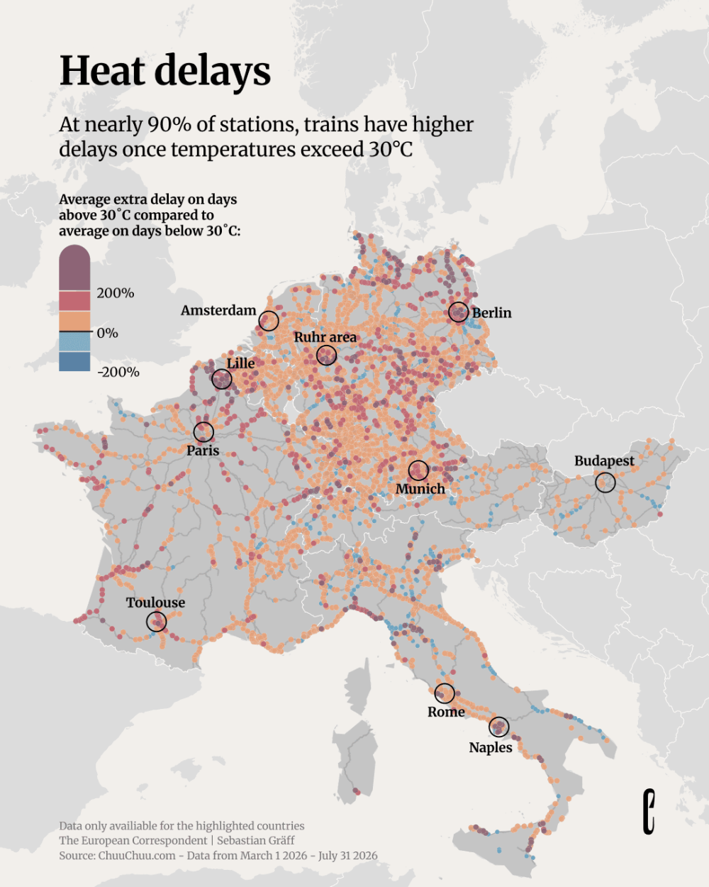
Summer heat delays our trains

European railways face significant challenges during summer heat waves. The infrastructure is proving inadequate for extreme temperatures. In Germany, where delays are rather common already, things got really bad. Trains lacking air conditioning and metal tracks that expand in high heat are big issues.
As someone who did an interrail during the heatwave of 2023, I had a pleasant surprise in learning how good aircon was on Italian and French trains.

Summer_heat_delays_our_trains_7d1edfe5_2_chosen.png

Sponsored by Jane Street

Jane Street depends on all sorts of messy, real-world data to understand financial markets and the global economy: think world news, decades of weather patterns, deidentified credit card spending, or packet captures of stock exchange market data feeds.

We're hiring Data Engineers to turn datasets like these into reliable inputs for trading. Working closely with our researchers, you'll evaluate unfamiliar datasets, build robust ELT pipelines, develop deep domain expertise, and decide what's worth exploring next. 

The job requires a mix of engineering, data analysis, and product sense. If you love the detective work of investigating a weird dataset and figuring out what it actually means, we want to hear from you. No financial background is necessary.

We have openings in New York, London, and Hong Kong.

Tools & Tutorials

SpiderFoot

SpiderFoot is an open source intelligence (OSINT) automation tool, integrating numerous data sources and providing both a web-based interface and command-line functionality for reconnaissance and threat intelligence gathering.

Doodle Scan

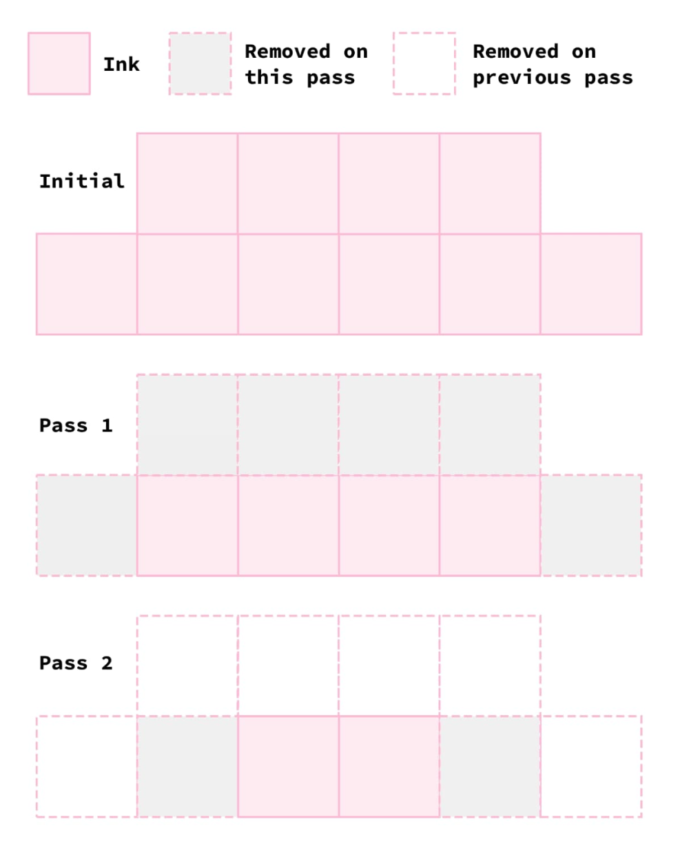
Robb Knight developed a web-based tool called Doodle Scan to remove backgrounds from scanned drawings and doodles. "Now I'm 'done' with this I can loop back around to where I started which was making some illustrations for my new website design and all I had to do was build an entirely new tool to do it."

Doodle_Scan_Robb_Knight_b3ea61ba_9_chosen.png

Compression is prediction

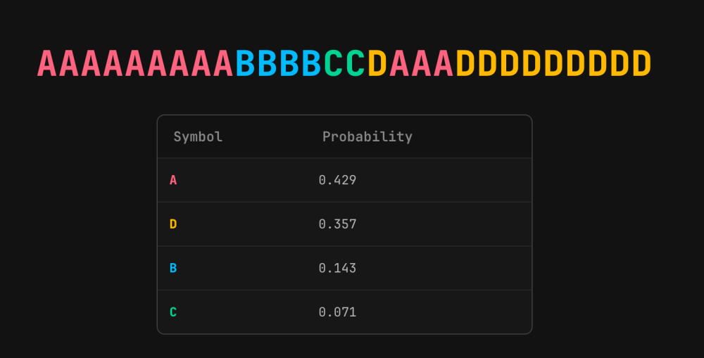
This blog on ngrok.com discusses the interesting connection betwen compression algorithms and large language models: they fundamentally solve the same problem, prediction. The article concludes that "compression is prediction, and LLMs are compressors", with similar underlying mathematics, both minimising entropy.

Screenshot_2026_08_20_at_20_59_18_uploaded.png

A before/after image slider in 2 lines of JavaScript | Marko Denic

How to create a before/after image slider using minimal JavaScript (just two lines of code), without employing jQuery or React.

A data font, from the inside out | All about Ken Hawkins

Datatype, a variable font by Frank Tisellano, transforms text strings into inline charts using OpenType ligatures. For example, writing {b:30,70,50,90} renders as a bar chart directly.
"The font isn't a better tool for the reader. The font is the data."
There is however a critical accessibility gap: chart strings read aloud become incomprehensible.
(via Glenn Mercer)

Screenshot_2026_08_20_at_20_59_52_uploaded.png

2026 Summer Workshop on Agentic Workflows with Claude Code

This webpage shares contents for a summer workshop focused on agentic workflows using Claude Code. Part 0 covers installation and introduces the concept of "persistent returns to expertise" in agentic coding. The contents seem pretty good, and the website seems accessible.

Screenshot 2026-08-21 at 08.26.06.png

PondPilot

"PondPilot is a blazing-fast, lightweight, 100% client-side AI-enabled data exploration tool that helps you analyze local & remote data with zero setup. Powered by DuckDB-WASM and integrated AI assistance, it runs entirely in your browser — no install, no servers, no cloud uploads, complete privacy. Whether you're a data analyst, scientist, or engineer, PondPilot helps you get your data ducks in a row without the overhead of traditional data tools." It's open sourced here.

Prototype on a laptop, scale to 16 billion rows: one Polars query

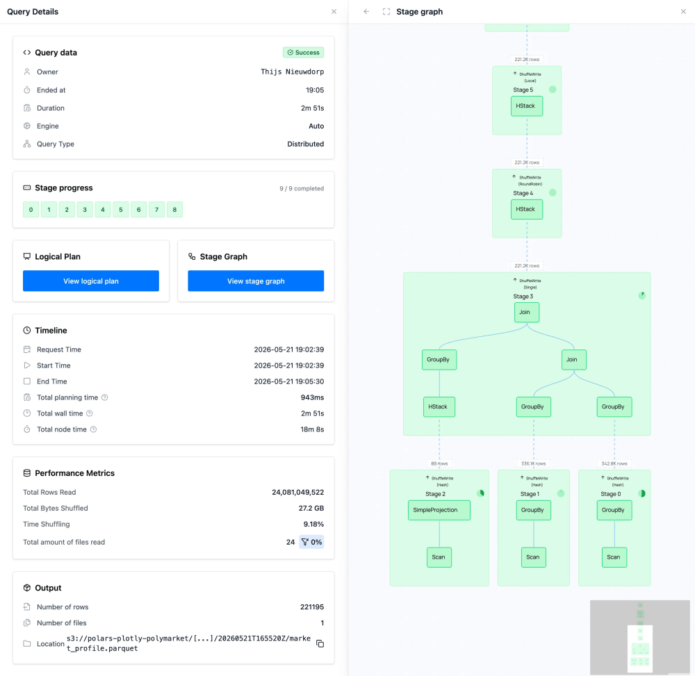
This article discusses a unified workflow that eliminates the common data engineering pattern of maintaining separate implementations for local exploration and production-scale processing. It uses Polymarket order book data as an example, and Polars, to show a 97-million-row subset on a laptop and the full 16-billion-row dataset on a distributed cluster. "The only difference is how the query executes".

Prototype_on_a_laptop_scale_to_16_billion_rows_one_Polars_query_2405fca7_4_chosen.png

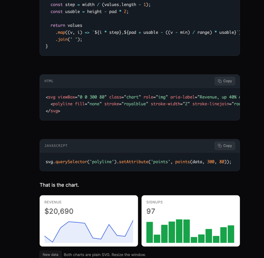
A real chart in 15 lines of SVG, no library

The same author as the 2-liner above shows how to create simple charts using pure SVG instead of heavy charting libraries.

Screenshot_2026_08_20_at_21_02_06_uploaded.png

Untitled

Data Thinking

Why creativity matters in data visualisation

Nicola Rennie argues that creativity is essential in data visualisation beyond traditional metrics of clarity and efficiency, with three key aspects: visualisations must be attention-grabbing to ensure people actually look at them, memorable so information is retained, and emotional to inspire action.
"In a world where people are passing novels into ChatGPT for a summary to avoid having to actually read a book," default chart designs won't capture attention.

Dataviz, Data Analysis, & Interactive

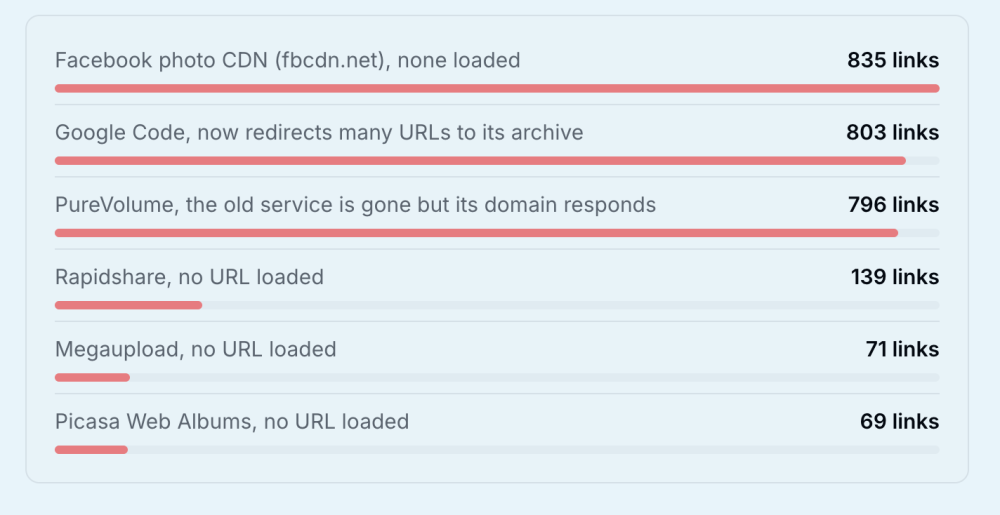
Where did the old web go? We followed 657,607 links to find out.

In August 2026, the team behind 0.mk, a URL shortener, discovered an old database backup containing 657,958 links created between 2009 and 2014. They restored and tested 657,607 records to see what survived.

Screenshot_2026_08_20_at_21_02_38_uploaded.png

Ben Shelton's 1st serve is great. His 2nd serve is off the charts.

This is honestly bonkers.

Screenshot_2026_08_20_at_21_02_57_uploaded.png

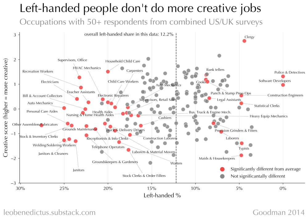
Left-handed people probably aren't more creative

A dataset of 47,914 workers from a 2025 scientific paper to analyse the stereotype of lefties being more creative. TL;DR: there is no clear pattern supporting the creativity myth. If anything, there's "a slight tendency for left-handed people to do jobs that are less creative (or cognitively complex or whatever)."

Left_handed_people_probably_aren_t_more_creative_d6e1b906_3_chosen.png

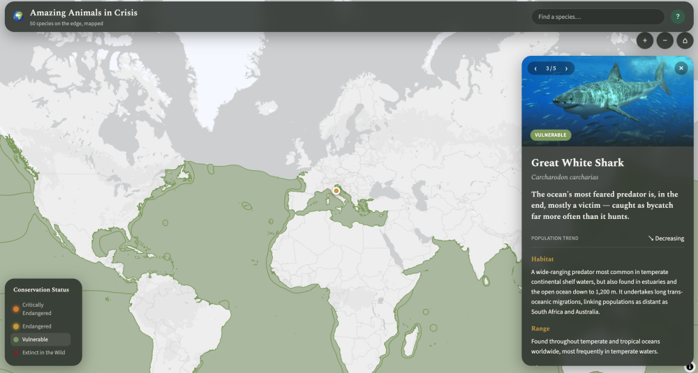
Amazing Animals, 1st try - Claude Code is a step up! - KnowWhere

Steven Feldman's last attempt at LLM-assisted map creation: an interactive map of endangered species.

Screenshot_2026_08_20_at_21_04_09_uploaded.png

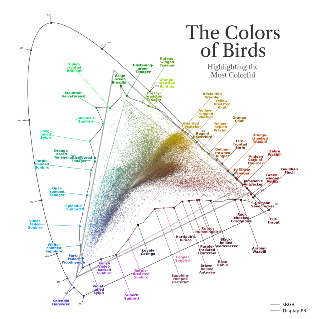
Fairly Ranking the Most Brilliant Birds

Ryan Moulton presents a detailed mathematical exploration of ranking the world's most brilliant birds using color data from BirdColorBase. An interesting quote (that I'm going apply to much more than birds): "Fairness to me means being able to look at and describe the motivations for every part of the ranking, justify them as reasonable criteria to rank one thing over another, and never feel that what it is computing is some BS."

Fairly_Ranking_the_Most_Brilliant_Birds_67918b4b_4_chosen.png

AI

9 Big questions benchmarks can help answer

Epoch AI's nine fundamental questions about AI capabilities. These are what drives Epoch AI's benchmarking work. The questions address both economic impact and technical drivers of AI progress. Key questions include whether AI can perform complete jobs rather than narrow tasks, cybersecurity capabilities, the performance gap between frontier and trailing models, whether AI can conduct AI R&D (potentially leading to recursive self-improvement), learn on the fly without weight updates, and more.

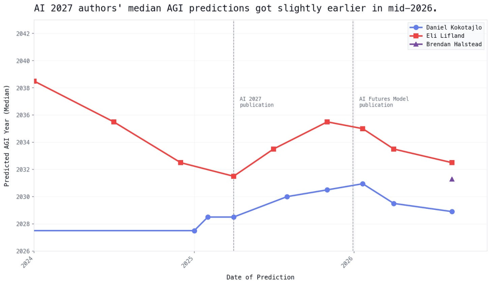
Q2.5 2026 Timelines Update: Uplift and Revenue

The AI Futures (popularised by the famous AI 2027 article) Project team has updated their AI timelines forecasts, finding they've shortened slightly, while confidence has increased due to improved modeling. When grading their previous AI 2027 predictions, reality appears to be progressing at 70-90% of the predicted pace.

Q2_5_2026_Timelines_Update_Uplift_and_Revenue_7b28ff62_20_chosen.png

DID YOU LIKE THIS ISSUE?

Buy Me A Coffee

You're receiving this email because you subscribed to Quantum of Sollazzo, a weekly newsletter covering all things data, written by Giuseppe Sollazzo (@puntofisso). If you have a product or service to promote and want to support this newsletter, you can sponsor an issue.

quantum of sollazzo is also supported by Andy Redwood’s proofreading – if you need high-quality copy editing or proofreading, check out Proof Red. Oh, and he also makes motion graphics animations about climate change.

Logo for ProofRed

The Quantum of Sollazzo grove now has 50 trees. It helps managing this newsletter's carbon footprint. Check it out at Trees for Life.

Quantum of Sollazzo. · The data newsletter by Giuseppe Sollazzo

(c) 2012-2026 Giuseppe Sollazzo · London · UK

Unsubscribe

Don't miss what's next. Subscribe to quantum of sollazzo:
Older → 671: quantum of sollazzo
Powered by Buttondown, the easiest way to start and grow your newsletter.