preview 665: quantum of sollazzo
Hello, reader!
Quantum #664 had an open rate of 46% and a click rate of 13%.
The most clicked link was this data-driven analysis of the prominence of South America in football.
From this issue of Quantum, we have a returning sponsor: quantitative trading firm Jane Street Capital is looking for data engineers. Read below for details.
Over the past few weeks I've been pondering about three aspects of AI adoption, both in and out of work.
The first is in reference to Tom Loosemore's updated definition of "digital". Tom argues that his original definition, "Digital: Applying the culture, processes, operating models & technologies of the internet era to respond to people’s raised expectations", grounded in the expectations that were typical of the Internet era, needs to be updated to encompass "the basket of technologies that comprise Artificial Intelligence, and what utility is unlocked by these new forms of intelligence, for the good or for ill of humanity."
This is very apt and I broadly agree with it, with a caveat: that people's expectations seem to be including a dysfunctional view of AI being visibly present, as opposed to AI doing something useful. Many problems don't need AI, or don't need the AI to be visible to the end user, but we all seem to be wanting to see it.
This bring me to my second reflection, which is about how we use AI and how to make the best use of it. In my "playtime" with AI, there is surely a benefit in using some of it as a drop-in technology for specific problems: automatic transcriptions, summarisation, web scraping, coding, and so on. These (with adequate guardrails and caveats!) can bring a lot of improvements to existing processes. But the most mind-blowing advantage of using AI has been, in my experience, the ability to brainstorm and redesign entire processes. Using AI as a sounding board for a creative process has massively improved my imagination (see my Eurovision article: the back and forth helped me refine what was a very rough idea, helping way more with that than with the actual coding). We don't talk enough about this, which is where I'm finding the most gain in productivity.
Finally, there is an open and very fuzzy conversation about token costs estimates. This is not totally different from the similar FInOps questions that started to be framed about 15 years ago when we moved to the cloud, but with much more uncertainty as hyperscalers still struggle with fully grasping the economics of it. We're all getting free access for some time, only to then see usage-based charges that blow up budgets (see the case of Uber running out of their yearly token budget in just 4 months). What worries me is that even the cloud FinOps issue hasn't been conclusively addressed and we still struggle with forecasts. I'm not sure the token question can be easily addressed at the pace required by innovation, and I'm still debating of where that leaves us all.
Any views on the above, please just hit reply :-)
'till next week,
Giuseppe
Topical
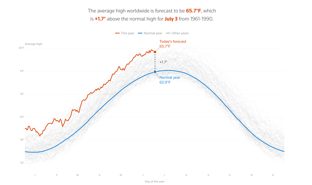
Reuters Climate Monitor
The Reuters Climate Monitor is an interactive tool that visualises real-time global temperature anomalies by comparing current conditions to historical averages. The system uses hourly temperature records from the ERA5 reanalysis dataset. The map displays anomalies showing "how much hotter or colder today's high temperature is compared to what used to be the typical high on that date."
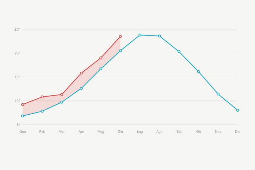
Quanto fa più caldo nel tuo comune rispetto al passato
Related to the above, but in Italian, this article from Il Post presents an interactive infographic showing how temperatures have risen across Italian municipalities compared to historical averages. It uses data from the Copernicus Climate Change Service. The analysis reveals that "la temperatura media in tutti i comuni italiani è decisamente più alta rispetto al passato" (average temperatures in all Italian municipalities are decidedly higher than in the past).
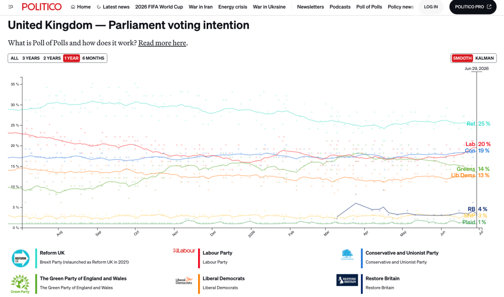
POLITICO's Poll of Polls
Online political magazine POLITICO has created a pretty comprehensive polling dashboard which tracks British political voting intention trends.
Jane Street depends on all sorts of messy, real-world data to understand financial markets and the global economy: think world news, decades of weather patterns, deidentified credit card spending, or packet captures of stock exchange market data feeds.
We're hiring Data Engineers to turn datasets like these into reliable inputs for trading. Working closely with our researchers, you'll evaluate unfamiliar datasets, build robust ELT pipelines, develop deep domain expertise, and decide what's worth exploring next.
The job requires a mix of engineering, data analysis, and product sense. If you love the detective work of investigating a weird dataset and figuring out what it actually means, we want to hear from you. No financial background is necessary.
We have openings in New York, London, and Hong Kong.

Tools & Tutorials
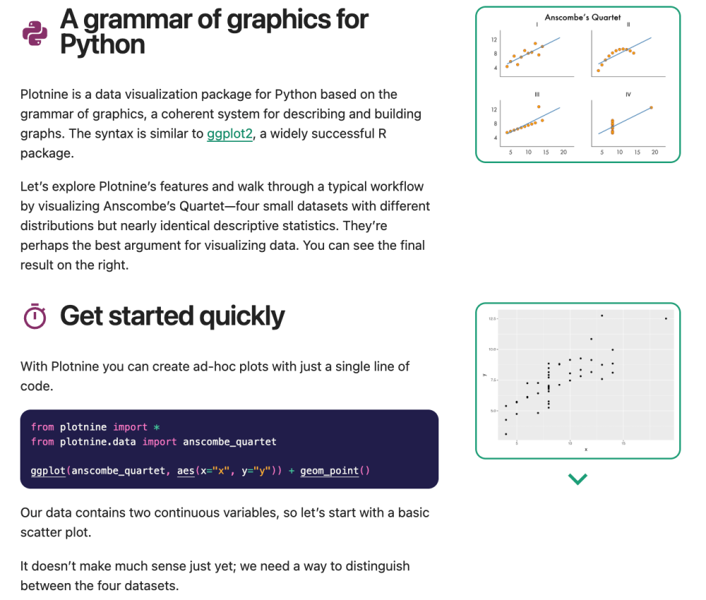
Plotnine – plotnine 0.15.7
Plotnine is a Python data visualization package based on the grammar of graphics. It offers syntax similar to R's ggplot2.
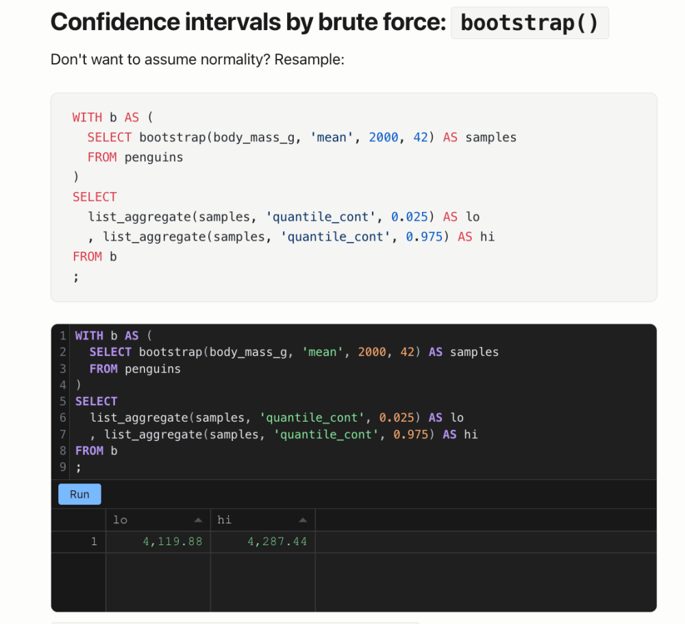
the-stats-duck v0.6.0 – statistics that live in your SQL – KoliStat
the-stats-duck is an MIT-licensed open-source DuckDB extension that enables real statistical analysis directly within SQL.
browser-use
Browser-use is an open-source Python library that enables AI agents to automate web browser tasks. As a project, it's got significant traction with 102k stars on GitHub.
What happens when you run a CUDA kernel
A rather deeply technical post that traces the complete journey of a simple CUDA vector addition kernel from source code to silicon and back. The author follows a one-line kernel launch, vadd<<<4096, 256>>>(da, db, dc, n), through the entire stack.
Working With AI: A Concrete Example
Carson Gross presents a debugging experience with hyperscript to illustrate AI's strengths and weaknesses in software development. AI excelled at investigation and test generation but struggled with architectural considerations that prevent technical debt accumulation.
When a user reported a parsing regression involving the as keyword, Claude AI quickly identified the root cause: an overly aggressive refactor that inadvertently expanded the grammar. However, its proposed solutions were problematic: the first was too hacky and narrow, the second introduced unnecessary complexity through a new parser flag. The author suggests that "having a human in the loop, working with an agent and with a good understanding of the underlying infrastructure, can be much more effective in controlling complexity than an agent left to its own devices."
ORWG Guide: Reusing Open Datasets
This is a one-page poster guide published by the London School of Economics and Political Science's Open Research Working Group (part of a series of open research resources designed specifically for LSE researchers). It addresses the growing availability of openly accessible research data by providing practical guidance on how to reuse existing open access datasets for new research purposes.
Fundamentals of Wrangling Healthcare Data with R
"In this course we will review some of the tools of the trade, namely, R’s tidyverse - a collection of R packages designed with a common framework to aide in common data wrangling and data management tasks."
It's aimed specifically at healthcare data, but it applies more widely.
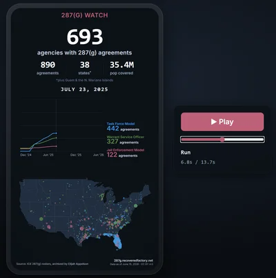
How we turn live data into a shareable video, automatically
Recovered Factory's automated workflow for converting live website data into social media videos without traditional video editing software.
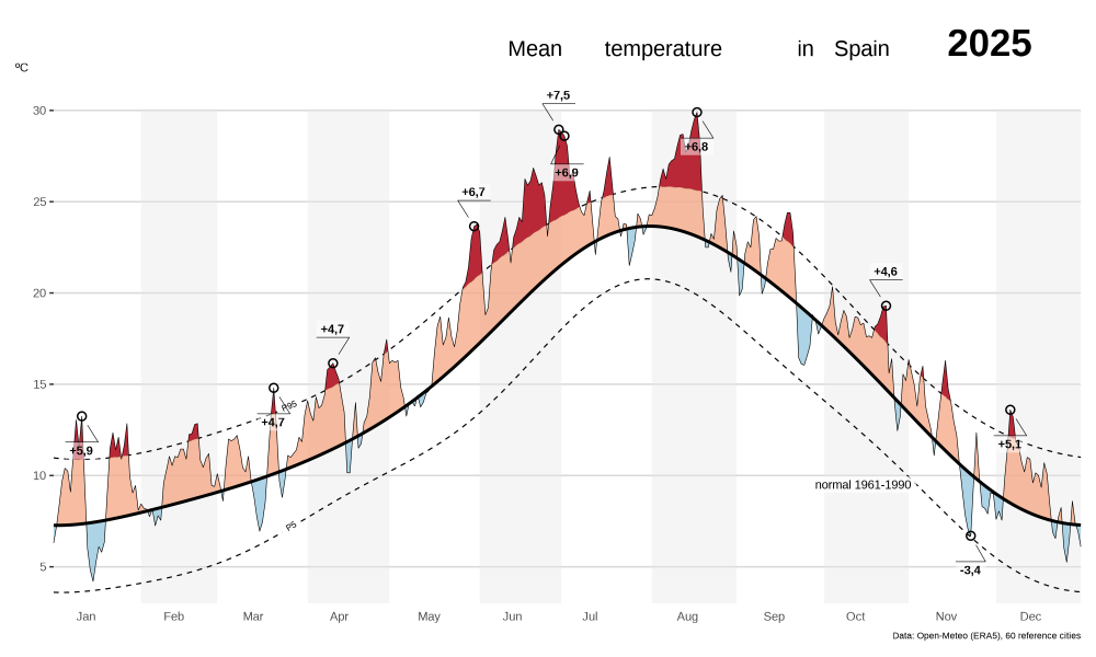
A data-driven normal for the Spain temperature chart
Dominic Royé: "This post has two goals. The first is the obvious one: walk through how the chart above is built, end to end, where the data comes from, how “Spain” is defined as a set of locations, and how to turn 30 years of daily values into a single reference curve. The second goal is the one I find more interesting: how do you smooth a daily climatological reference?"
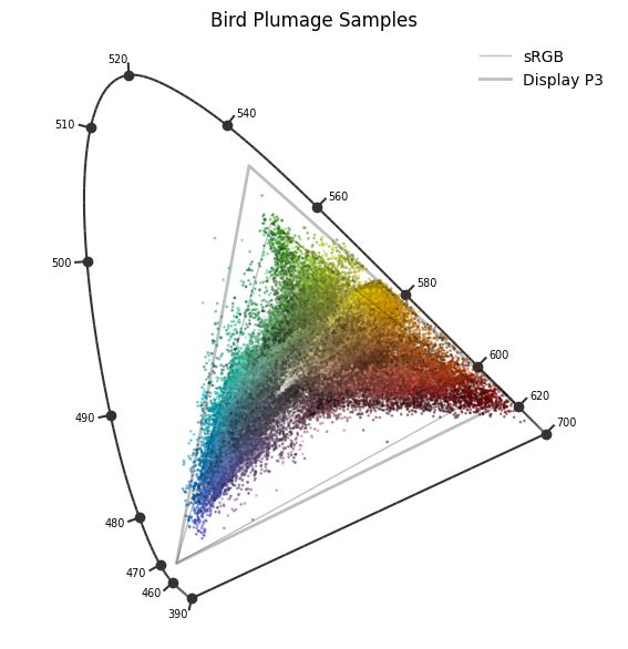
Where to Find the Colors Your Screen Can't Show You
"There are colors that I want to show you, but I can’t. They exist in the real world. You probably saw some of them today, but I can’t show them to you on a screen. A digital photograph can’t capture them, and your screen can’t display them. No game you’ve ever played has contained them. Unless you have specialized equipment, they are entirely absent from the digital world.
Most of them are cyans. On screens we live a life starved of cyans. It is shocking when you see one in person. They seem unfamiliar and intense in an otherworldly way. I want you to experience that, but again, I can’t show them to you. Instead, I have to show you how to find them in the real world."
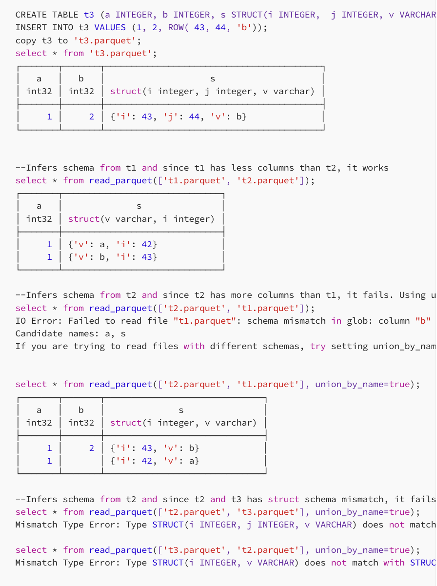
Query Faster, Query Smarter: Our Move to DuckDB and What We Learned
"Over the past 18 months we migrated thousands of SQL queries across three different engines — Athena to Trino to DuckDB — and cut our query costs in half along the way. This post covers what broke, what worked, and what we wish we’d known on day one."
Data Thinking
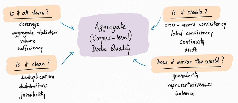
On Data Quality
"This is the first of two essays on data quality. Today’s essay is about the basics: what is data quality, and how should we think about it? The second essay, publishing next week, is about the fun stuff: data quality in an AI world."
Dataviz, Data Analysis, & Interactive
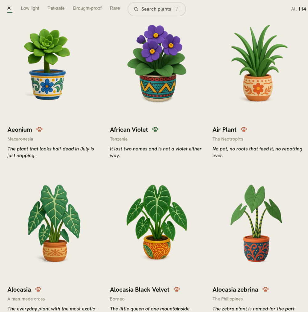
The Houseplant Atlas
The Houseplant Atlas is a field guide presenting 114 common houseplants, noting their wild. Highly visual, the guide provides information about where each plant originally comes from and offers care instructions to help keep them alive.
(via Web Curios)
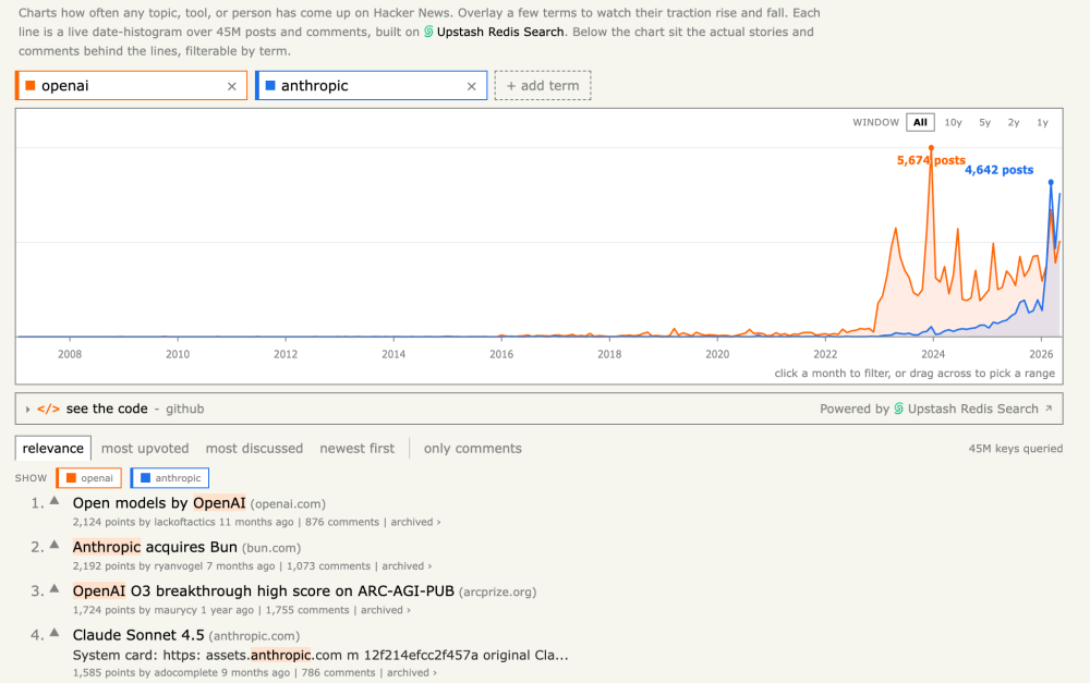
Hacker News Trends - Search & Chart Any Topic Over Time
Hacker Trends is an interactive tool that visualises how topics, tools, and people have trended across 18 years of Hacker News discussions, and it allows comparisons between different search terms.
6 Culture Trends Worth Watching: Widow's Bay, Jesus Bets, Michael Jackson's Comeback, and More
Various good data points in this issue of StatSignificant. "A data-driven look at explicit music’s decline, streaming’s biggest shows, World Cup virality, Love Island, hockey romance novels, and more—plus recommended reads and datasets."
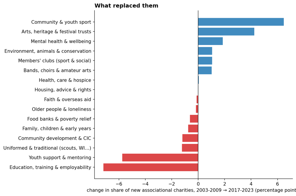
The Great British Clubhouse Is Still Standing. Nobody's In It, Least of All Where It's Needed Most
Lauren Leek: "I tried to measure the decline of British community life by counting clubs. That was the wrong place to look. What’s disappearing is participation especially where deprivation is high."
Leek was initially expecting to find a collapse in club formations, however, the data reveals a different story: organisations still exist and are being founded, but participation has plummeted. Formal volunteering dropped from 45% in 2013/14 to 28% by 2024/25. The analysis also highlights the stark geographic divide.
Analyst Notes: Government data and America's founding
USAFacts notes that America's founders were deeply invested in data collection from the nation's inception, with the constitution mandating a population census just 200 words into the document (before establishing a President).
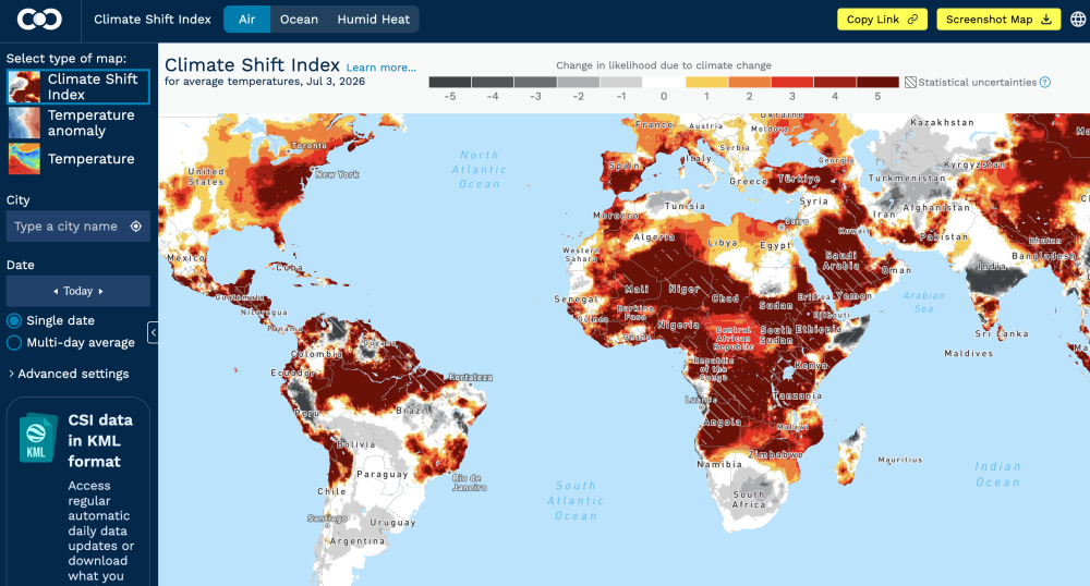
Climate Shift Index Global Map
Climate Central's Climate Shift Index Global Map is an interactive map that visualises how climate change is influencing daily temperatures around the world. It displays today's data, showing which regions are experiencing temperatures that have been made significantly more probable due to climate change.
(via Durand D'souza)
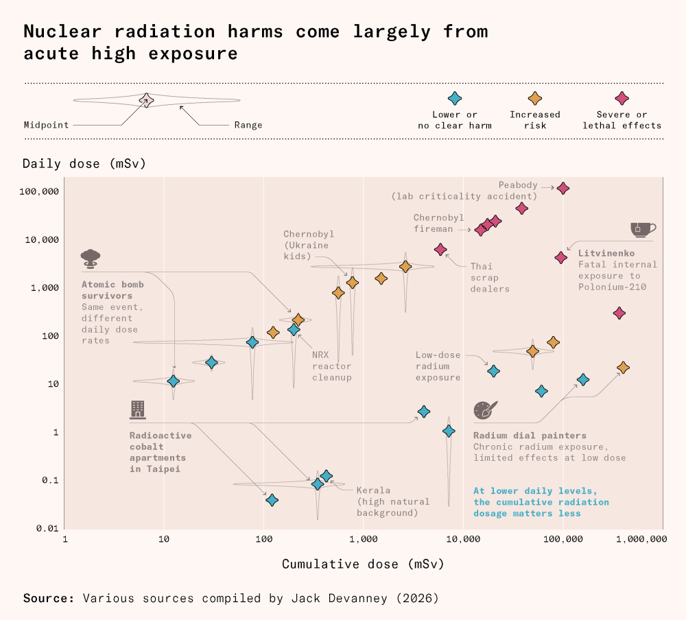
How to lie about radiation
I've thought a long time before linking to this article, because I don't quite understand the science, and I know it's such a polarising topic. So... draw your own conclusions :) The reason why I link it, though, is that I find the chart below pretty clever, using what I'd describe as an "augmented scatterplot" to visualise 5 variables (cumulative dose, daily dose, harm, midpoint, and range).
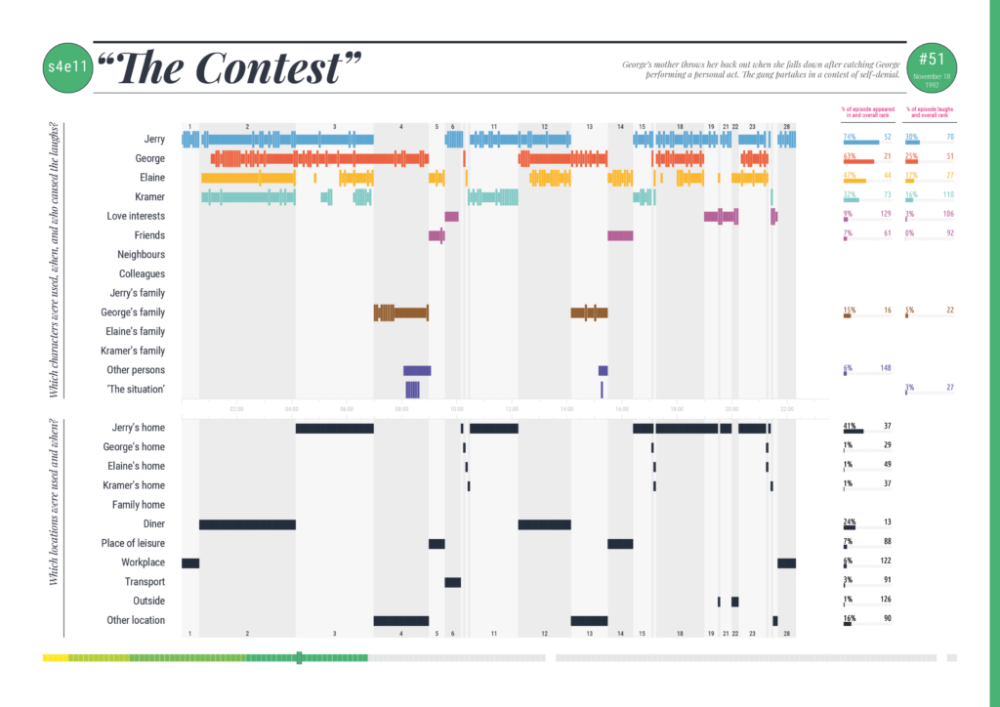
The Seinfeld Chronicles
Dataviz guru Andy Kirk wasn't a Seinfeld fan but created this amazing data-driven analysis of every episode of the sitcom Seinfeld. It includes data sonification.
(via Loud Numbers)
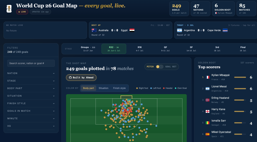
World Cup 26 Goal Map
Goal tracker for the 2026 FIFA World Cup.
Life, liberty, and the pursuit of happiness: A 250-year performance review
Amanda Shendruck looks at America's 250-year performance against the three "unalienable rights" enshrined in the Declaration of Independence: life, liberty, and the pursuit of happiness.
AI
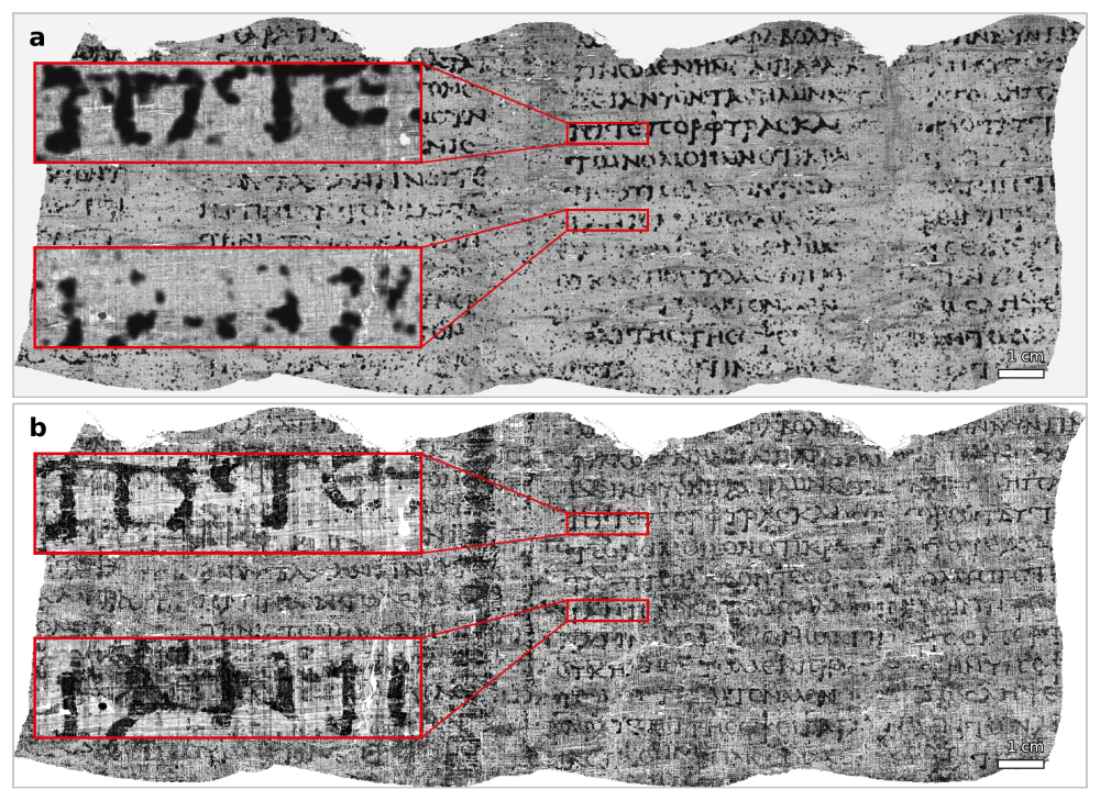
An entire Herculaneum scroll has been read for the first time | Vesuvius Challenge
This is an amazing AI story, which I've been following for a few years. For nearly 2,000 years, the carbonised scrolls of Herculaneum have remained sealed, since Mount Vesuvius erupted in 79 AD. They were too fragile to physically open without destroying them. Now, researchers have completely virtually unwrapped and read one of these scrolls without touching it, using high-resolution X-ray scans and image AI. All data and code have been released openly.
The twilight of the chatbots
Ethan Mollick argues that AI capabilities are accelerating beyond exponential rates, fundamentally transforming how people work with artificial intelligence, and emphasises that organizations struggle to adapt because "institutions that move at the speed of people (or worse, committees) try to track a capability curve that is very much not human in nature".
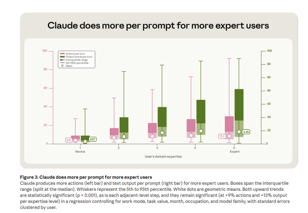
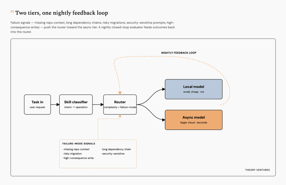
Most AI Work Can Wait
Tunguz maintains that AI system architecture should prioritise intelligent routing over model selection. Most teams incorrectly choose models first, when routing should be the primary concern. A well-designed router can direct 70-80% of traffic to free local models or asynchronous models that cost 90% less than real-time inference. The routing system is made up of three layers: a skill classifier identifying the task type, a router assigning it to an appropriate model tier, and a model selector choosing the cheapest option meeting confidence thresholds. "The real question is narrower: what fraction of work needs real-time answers? Surprisingly little, once the system can queue work."
AMA – Ask Me Anything! Submit a question via this anonymous Google form. I'll select a few every 4-5 weeks and answer them on here :-) Don't be shy!

The Quantum of Sollazzo grove now has 40 trees. It helps managing this newsletter's carbon footprint. Check it out at Trees for Life.
'till next week,
Giuseppe @puntofisso.bsky.social