quantum of sollazzo logo

quantum of sollazzo

Archives
Sponsor
Subscribe
August 11, 2026

670: quantum of sollazzo

Quantum of Sollazzo

NO. 670 ·

alt text

Did someone forward you this email?
If so, you can subscribe here.

You can view this email online here.

In this issue...

As I write this issue, I'm enjoying a few days of holidays visiting my family in the South of Italy. It's pretty warm here, and this has given me some incentive to spend the hot hours in the shade or indoors with aircon. Loads of family and friend time, loads of food, but also lots of newsletter writing, and coding 😃

Quantum #669 had an open rate of 31% and a click rate of 10%, and the most clicked link was this useful Eclipse Map. I hope you get to experience it on Wednesday!

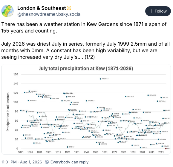
There are quite a few articles to flag in this issue. In the Topical section, you'll find a concerning data point about the drought that has been hitting the UK: the weather station at Kew Gardens has recorded no rain for the whole month of July, and it is the first time that it does so since records began.
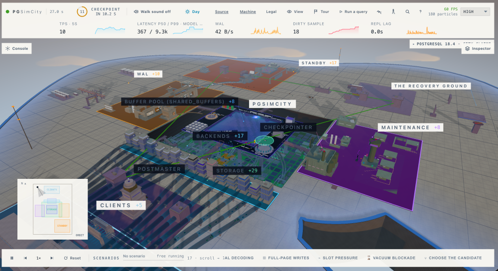
A couple of interesting tools this week include GeoLibre, a cloud-based GIS, and the really quirky PGSimCity, a live visualization of PostGreSQL as a... simulated city. Don't ask me why, but it makes a few things much clearer. Also, if you're one of my geeky medical readers, don't miss the DICOM data reader app, especially as all the code is open source.
I personally enjoyed playing with The Pudding's lawn-mowing simulator, and the results are out - you find them in the Dataviz section, where you'll also see a brilliant analysis of London pubs, on a quest of finding the most "equidistant" of them.
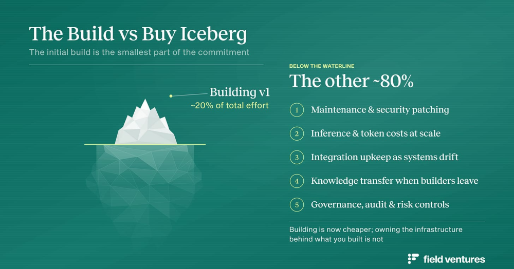
Don't miss the "build vs buy" commentary in the final section. Many in the industry are forgetting that building a prototype (or the first iteration of software product) is never the most expensive part of adoption.

·

It's been 10 years since I published an article called "The Open Data Delusion" on a now defunct news outlet called "Broken Toilets". You can still read it on my own blog.

Of the many examples I mention, the Great British Public Toilet Map (ok, there's a theme here) is still going strong. But it is maintained by a spin out, rather than a public authority: the system never absorbed it, and Open Data still needs a lot of advocacy work to be extracted out of public systems.

In my article there was no doubt some naivety about how Open Data could be powerful to fix things in public service, despite my critical stance. I maintained that "Open Data is ultimately powerful when it represents a conversation between data experts inside the system and data users who access that system." I talk about "the Open Data killer app."

A lot of time has passed and the Open Data killer app never materialised. Well, in a way it did, but it's not an app. The Open Data killer app is Artificial Intelligence. US federal agencies are deploying MCP servers so generative AI systems can query public datasets directly, while in the UK, the Government Digital Service published guidelines in January 2026 on how to make government datasets "AI-ready". My argument that schemas, documentation, update frequency, and licensing, were much needed still holds true. But the demand for Open Data as a tool for humans never truly materialised until AI started to tap into it. The killer consumer of Open Data is a machine, which makes me smile nostalgically when I read again that line about a "conversation between data experts inside the system and data users who access that system".

We've also spent a lot of time counting dataset released rather than asking what they were empowering and what guarantees they had to comply with. News in the media of various Governments stopping the publication of open data and, in some cases, withdrawing existing datasets are concerning. But the good news is that nobody has still managed to fully block the publication of data and, especially in Western countries, any stop to publication has often been reverted. But the process of open data publication is still not part of wider information rights. It never truly caught on. "Number of datasets" was not just a bad success metric based on vanity, it was a metric that treated open data as a stock rather than a commitment. My 2016 self worried the UK's league-table position was hollow; the 2026 version of that worry is that league tables measure something that can be deleted on a Tuesday.

In 2016 I also worried that the shift from Open Data and Transparency to Data Government Programmes would mean a retreat from public engagement; but also was a promising sign that Governments, and particularly the UK Government, were treating data as something to build strong foundations on, especially in operations. I now work in Government Data, and my move was motivated by optimism that this was a good thing. I still believe this to hold true, and the operational data government I half-hoped for is genuinely being built, and I'm part of this alongside many others who started as Open Data enthusiasts in the 2010s. Engineering has also improved, and we're also seeing good work to build a National Data Library.

There's also a sense that some of the energy of the "Open" data days has been lost, and I believe this to be part of a wider reduction of mutual trust in Western societies. Clearly, I think this is all eminently fixable if we focus on real user needs and data (and AI) as tools to deliver them, which is very much the driving force in my current day job. History moves in cycles, and I do see strong signs that the appreciation for openness is getting stronger in the age of AI.

·

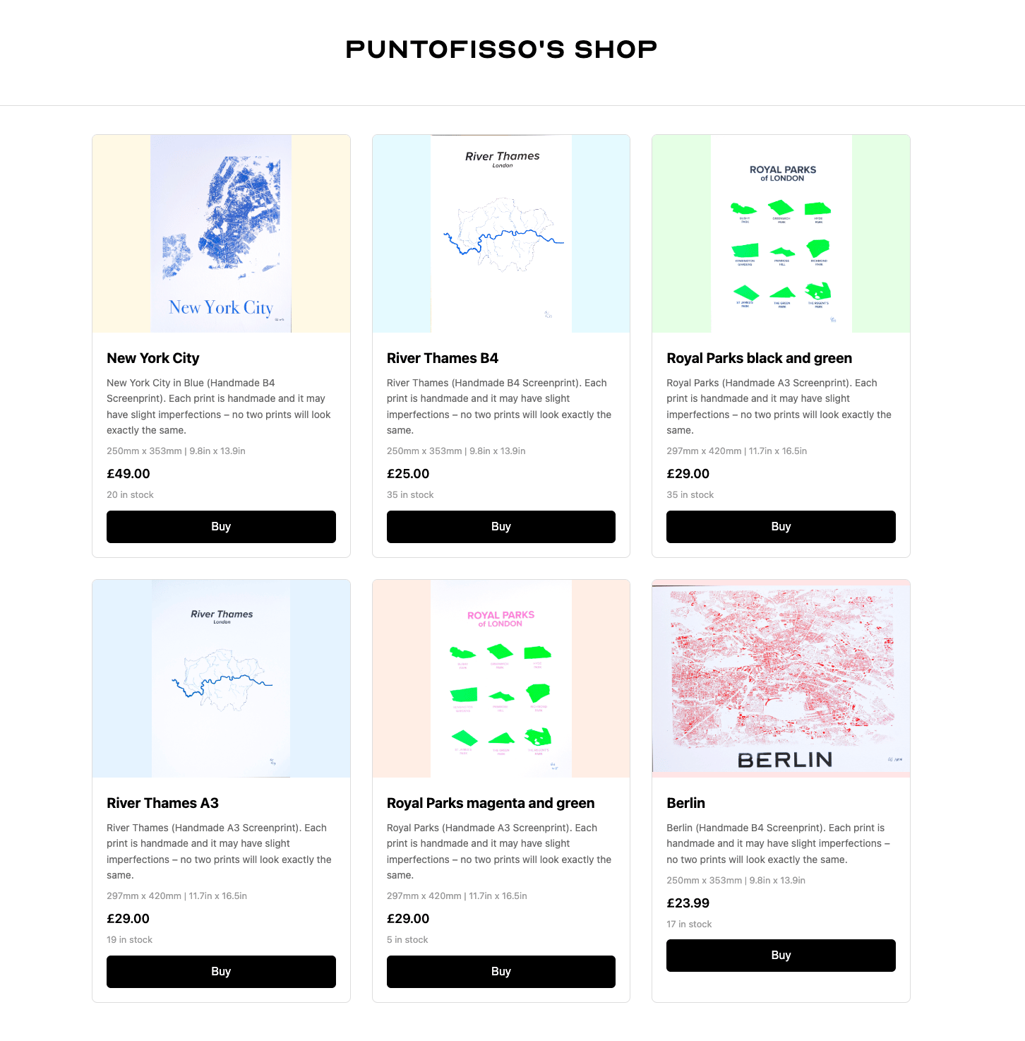
I want to reduce my print shop stocks, as I've started printing again. Anything of interest here? It's all very affordable, and map geeks tell me they love them 😃
LinkedIn post

·

Finally, this:

LinkedIn post

'till next week,
Giuseppe @puntofisso.bsky.social

Topical

The driest July on record?

Historical weather records from the Kew Gardens, where no rainfall was detected, suggest that July 2026 was the driest in 155 years. The BBC also talks about it.

Bluesky_post_by_thesnowdreamer_bsky_social_about_Kew_Gardens_weather_records_da84c1b1_screenshot_chosen.png

Sponsored by Jane Street

Jane Street depends on all sorts of messy, real-world data to understand financial markets and the global economy: think world news, decades of weather patterns, deidentified credit card spending, or packet captures of stock exchange market data feeds.

We're hiring Data Engineers to turn datasets like these into reliable inputs for trading. Working closely with our researchers, you'll evaluate unfamiliar datasets, build robust ELT pipelines, develop deep domain expertise, and decide what's worth exploring next. 

The job requires a mix of engineering, data analysis, and product sense. If you love the detective work of investigating a weird dataset and figuring out what it actually means, we want to hear from you. No financial background is necessary.

We have openings in New York, London, and Hong Kong.

Tools & Tutorials

GeoLibre

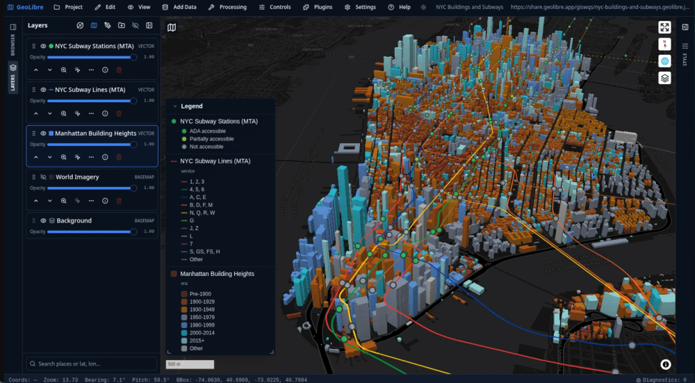
GeoLibre claims to be "a lightweight, cloud-native GIS platform". It's a free, open-source GIS platform designed for visualising, exploring, and analysing geospatial data across multiple environments. It offers a collection of "1,000+ geoprocessing tools that run entirely in your browser on WebAssembly" covering terrain analysis, hydrology, LiDAR processing, remote sensing, and vector analysis.

Screenshot_2026_08_06_at_16_58_52_uploaded.png

Asynchronous I/O in DuckDB: Work, Thread, Work

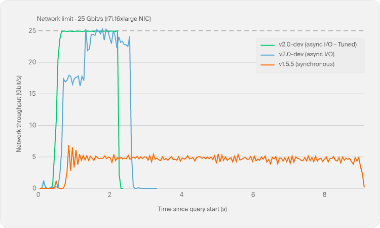
Starting with DuckDB 2.0, asynchronous I/O support for Parquet and CSV files will significantly improve query performance on remote storage setups like EC2/S3.

Asynchronous_I_O_in_DuckDB_Work_Thread_Work_2be5258b_10_chosen.png

PGSimCity · How PostgreSQL Works, in 3D

"PGSimCity is an independent, non-commercial educational visualization of PostgreSQL internals", through interactive 3D graphics. The project presents PostgreSQL as a working model, using a city metaphor to illustrate how the database engine operates. Quirky.

Screenshot_2026_08_06_at_17_04_41_uploaded.png

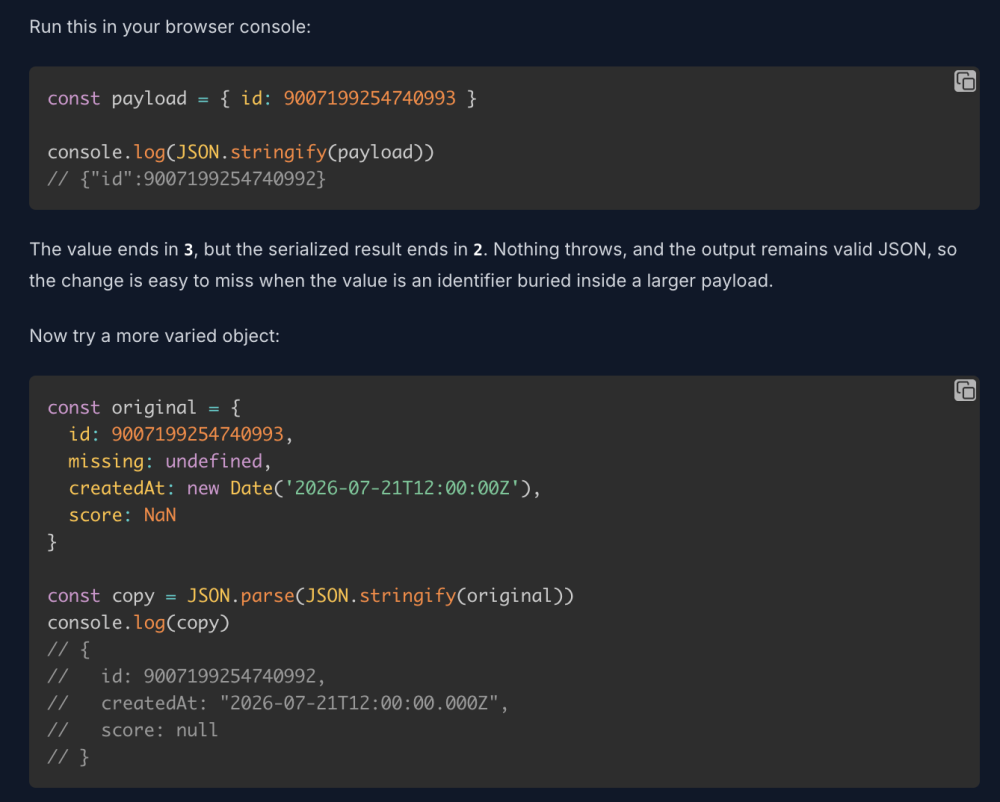
Your JSON Is Lying to You

This article shows how JSON serialisation in JavaScript silently transforms data in ways that can introduce bugs.

Screenshot_2026_08_06_at_17_05_40_uploaded.png

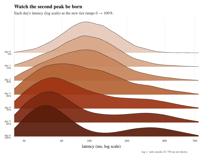
The mean means nothing

Single summary statistics can mislead when evaluating performance changes. The author of this blog describes a scenario where a new caching tier rollout appeared to worsen latency based on mean values (112ms to 122ms), yet the median showed dramatic improvement (99ms to 54ms). This contradiction was explained from the data being bimodal.

The_mean_means_nothing_Farid_Zakaria_s_Blog_cd9108f3_5_chosen.png

DICOM-player

DICOM Player is a native iOS application built with SwiftUI that enables users to view DICOM medical imaging files directly on iPhone and iPad devices. It is fully open source, so here's the code on Github.

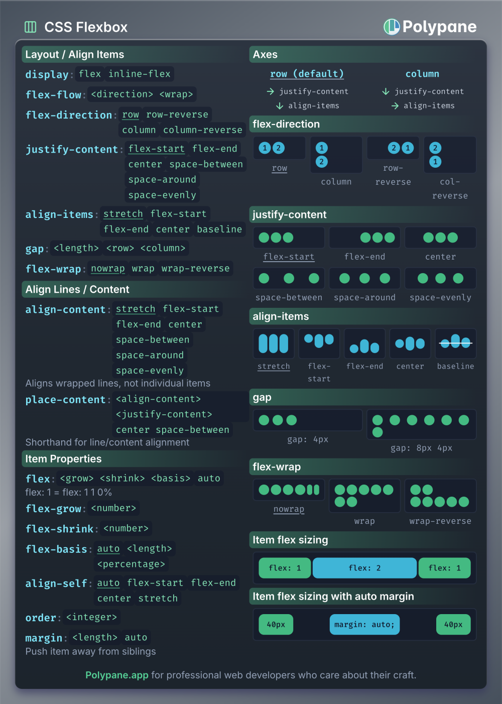
Cheatsheets for flex, grid, anchor positioning and invoker commands

Polypane created four CSS cheatsheets for their booth at CSS Day in Amsterdam, covering Flexbox, Grid, Anchor positioning, and Invoker commands. Here's an example in the screenshot.

Cheatsheets_for_flex_grid_anchor_positioning_and_invoker_commands_Polypane_4027d61c_4_chosen.png

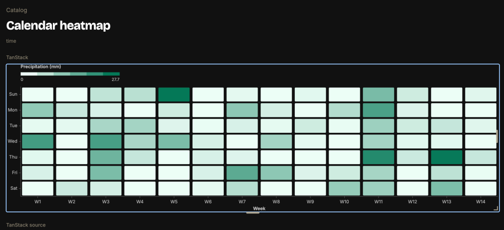
TanStack Charts

TanStack Charts is a compact, type-safe charting library built on the grammar of graphics framework. It comes with an extensive example gallery which showcases diverse visualisations including distributions, networks, hierarchies, geographic maps, and interactive charts.

Screenshot_2026_08_06_at_17_09_23_uploaded.png

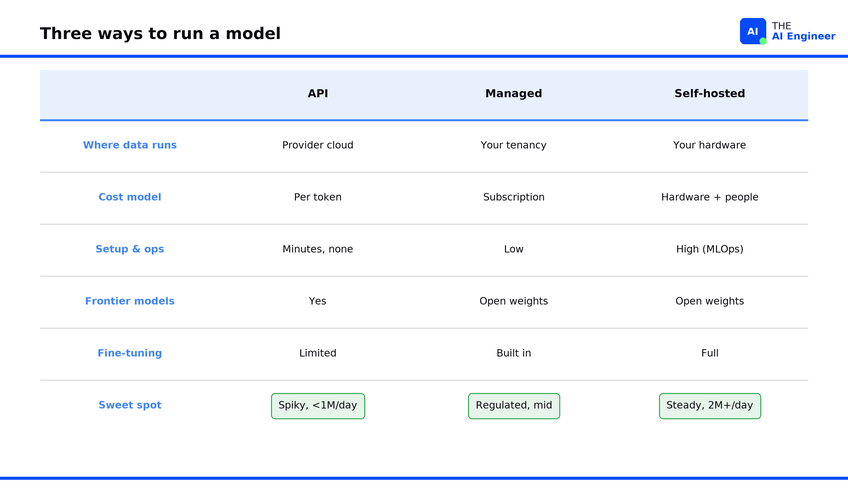
Should You Self-Host LLM Inference? Cost and Risk Guide

A quick look at the economics of running your own AI models versus using hosted APIs. TL;DR: self-hosting becomes cost-effective only beyond approximately two million tokens daily.

Should_You_Self_Host_LLM_Inference_Cost_and_Risk_Guide_77527644_5_chosen.png

Dataviz, Data Analysis, & Interactive

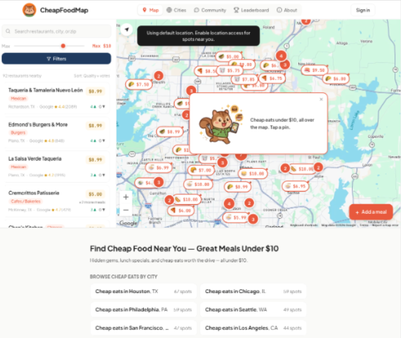
CheapFoodMap

CheapFoodMap is a crowd-sourced directory dedicated to finding affordable dining options across the United States, featuring meals priced under $10.

Screenshot_2026_08_06_at_17_02_23_uploaded.png

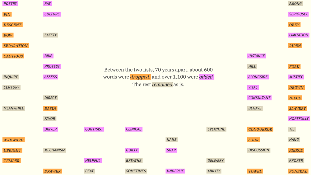
How the Words We Teach English Language Learners Changed

The Pudding shows vocabulary shifts between two essential English learning lists created 70 years apart: the 1953 General Service List and the 2023 New General Service List. About 600 words were dropped and over 1,100 added. The most striking pattern shows a movement away from concrete, tangible vocabulary toward abstract concepts.

Screenshot_2026_08_06_at_17_12_24_uploaded.png

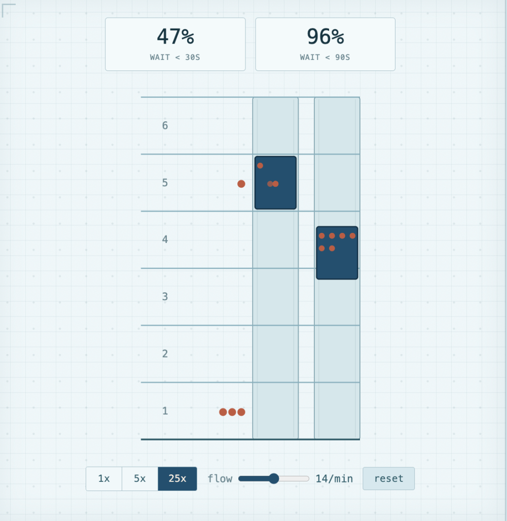
Elevators

"Over the course of this article, we'll unravel the mysteries of elevators. The way you push their buttons, and how they push yours." Little nerdy memory: I loved studying elevator algorithms at uni.

Screenshot_2026_08_06_at_17_13_36_uploaded.png

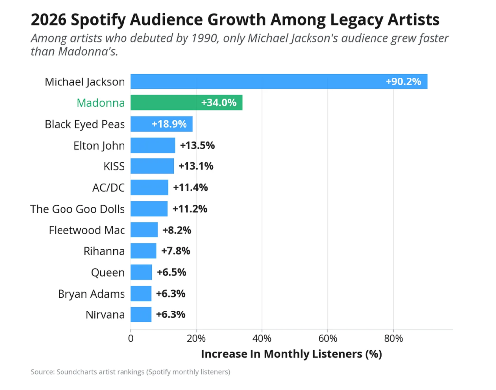
6 Culture Trends Worth Watching: Madonna, Avengers Doomsday, Million-Dollar Jackets, and More

"A data-driven look at the Emmys’ cultural relevance, Hollywood’s latest layoffs, country music’s mainstream rise, and an overpriced leather jacket—plus recommended reads and datasets."

Screenshot_2026_08_06_at_17_14_39_uploaded.png

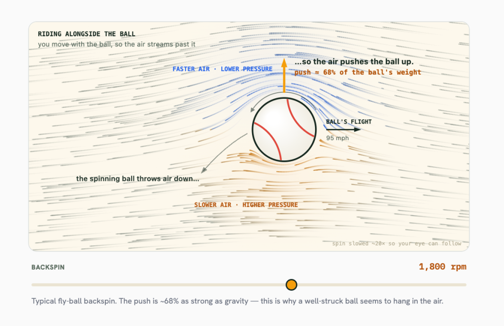
How The Heck Do You Catch A Fly Ball?

Another excellent interactive exploration by Rob Moore of PerThirtySix. tAfter embarrassingly misjudging a fly ball in his first softball game since childhood, the author investigates the science behind catching fly balls, exploring physics and more. The article includes interactive simulations, MLB Statcast data from over 106,000 fly balls, and mathematical derivations explaining why even professional players struggle with pop-ups and head-on shots.

Screenshot_2026_08_06_at_17_16_00_uploaded.png

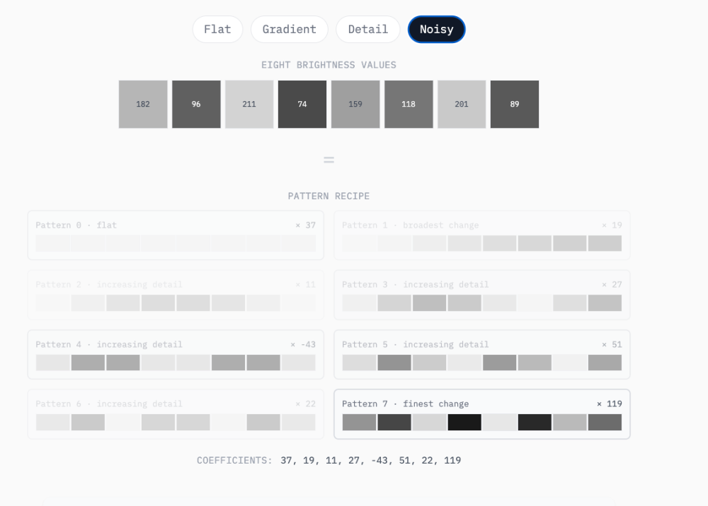
How The Heck Does JPEG Work?

Second PerThirtySix article this week (they truly deserve the attention!) 😃 This one explains how JPEG compression reduces photo file sizes.

Screenshot_2026_08_06_at_17_16_54_uploaded.png

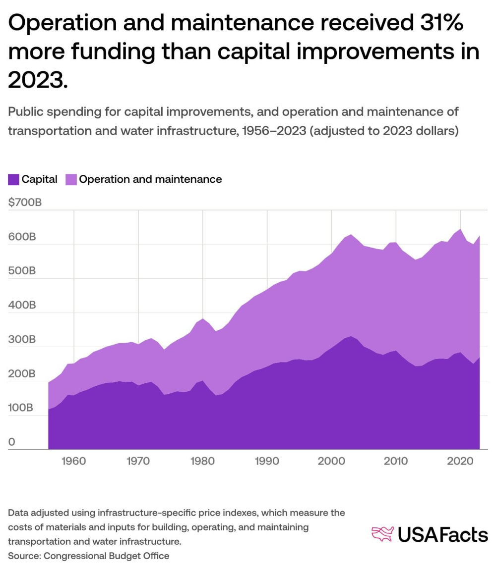
How much does the government spend on transportation and water infrastructure?

USAFacts: "Since 1956, the majority of water and infrastructure spending has been by state and local governments."

How_much_does_the_government_spend_on_transportation_and_water_infrastructure_a1c973f8_3_chosen.png

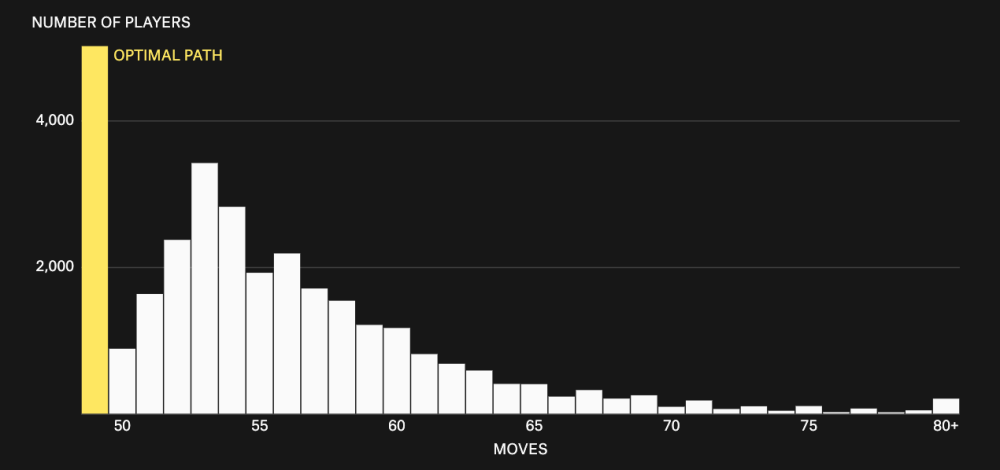
Why some people mow a lawn better than others

Another Pudding visual. This is the result of a long-running experiment I was part of, where 30,000 of their readers tried to explore mowing a virtual lawn, which equates to solving the Coverage Path Planning problem.

Screenshot_2026_08_06_at_17_19_19_uploaded.png

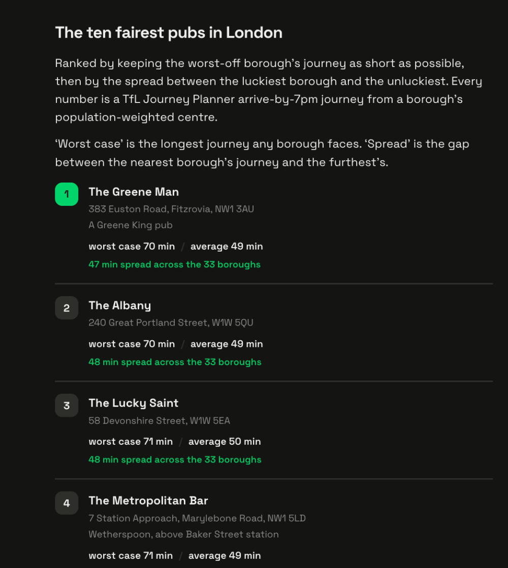
London's most equidistant pub

3,170 London pubs analysed to reveal that The Greene Man at 383 Euston Road is the city's most equidistant pub, measured by public transport journey times from all 33 boroughs' population centres.

Screenshot_2026_08_06_at_17_21_14_uploaded.png

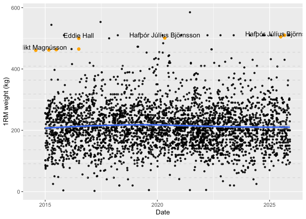
Exploring Gymflation with AI

"You might be familiar with super hero inflation? Over time, super hero physiques on screen have become increasingly exaggerated. Batman’s progression from Adam West to Ben Affleck is a great example of this. Gymflation is much the same idea. As gym culture has skyrocketed, it seems like so too have people’s feats of strength - as recorded on social media. Going on YouTube or Instagram one gets the feeling that a 200kg deadlift is really rather average nowadays."
I won't spoil this for you... 😉

Exploring_Gymflation_with_AI_Chris_Bowdon_541ff1c6_3_chosen.png

AI

How to plant a nuclear plant in Iran

"Tonight I typed just one sentence into Google Earth and put refugees near the Mexican border. Then I planted a nuclear plant in Iran. Then I put a fatal crash on a street in Amsterdam. Google’s own satellite imagery underneath all three. What on earth is Google doing?" This is a critique of Google's introduction of AI image generation in Google Earth, allowing users to create photorealistic fabricated imagery overlaid on genuine satellite photos of any location worldwide by simply typing a text prompt. The images do contains SynthID watermarks, although the author's stance is that these are not meaningful. (via quote that asymmetry is not meant to be funny)

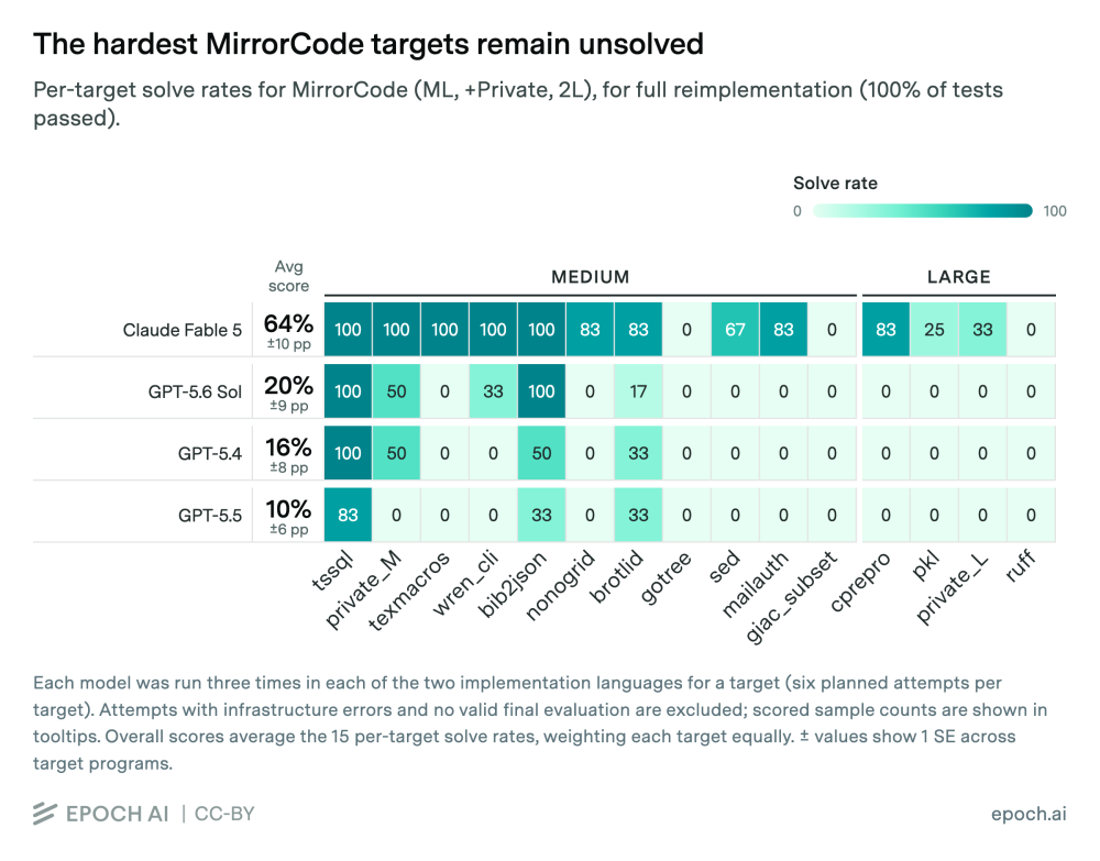
MirrorCode: What's the largest software project AI can complete on its own?

MirrorCode is a benchmark co-developed by Epoch AI and METR to test AI models on long-horizon coding tasks. It requires models to reimplement entire software programmes end-to-end without access to original source code.

MirrorCode_What_s_the_largest_software_project_AI_can_complete_on_its_own_224033ee_2_chosen.png

AI agents can't yet do open-ended AI research

Academics Sayash Kapoor and Arvind Narayanan in their latest AI As Normal Technology newsletter introduce their recent research evaluating whether AI agents can conduct open-ended research. After analysing hundreds of hours of agent logs, they identified recurring failures: agents lacked judgment for open-ended research, weren't aware of available resources (spending less than 50% of budgets), failed to respond creatively to feedback, didn't effectively backtrack from failed approaches, and ignored concrete instructions.

Other

The Loading Museum · the waits of your life, rebuilt

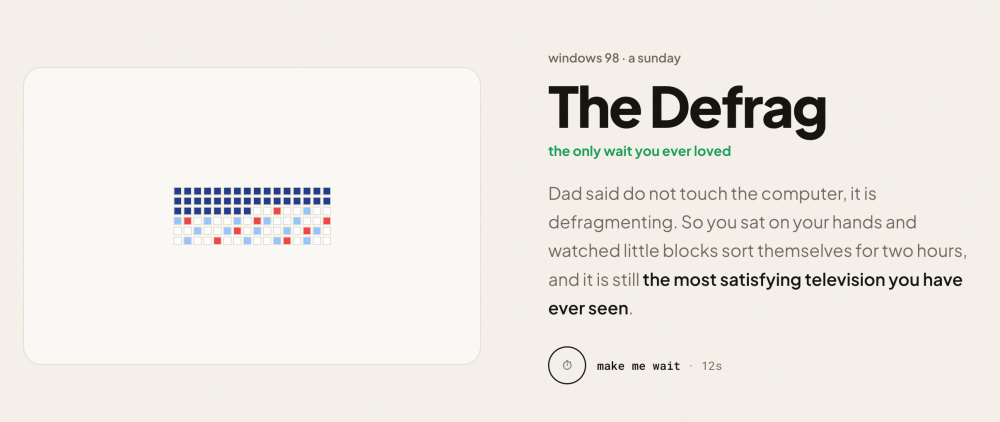
The Loading Museum is an interactive web experience that recreates 22 loading screens from different eras of digital life, from 1994 family computers to modern messaging apps. My favourite is obviously the one below.

Screenshot_2026_08_06_at_17_34_11_uploaded.png

The Build vs Buy Head Fake - Field Ventures Perspectives

The "Saaspocalypse", the panic that ensued following Anthropic's Claude Cowork launch in early 2026, was a trillion-dollar market value loss in software companies. It was entirely based on the fear that AI would enable companies to build their own tools rather than buy software. This "mistakes the easy part of software for the whole of it": while AI reduces initial build costs, it doesn't eliminate ongoing maintenance, compliance, security, and operational complexity that vendors provide. Which is always the problem whenever there's a bubble, always. "“Build vs Buy” Was Never About the Cost of the First Build"

The_Build_vs_Buy_Head_Fake_Field_Ventures_Perspectives_1a596510_4_chosen.png

DID YOU LIKE THIS ISSUE?

Buy Me A Coffee

You're receiving this email because you subscribed to Quantum of Sollazzo, a weekly newsletter covering all things data, written by Giuseppe Sollazzo (@puntofisso). If you have a product or service to promote and want to support this newsletter, you can sponsor an issue.

quantum of sollazzo is also supported by Andy Redwood’s proofreading – if you need high-quality copy editing or proofreading, check out Proof Red. Oh, and he also makes motion graphics animations about climate change.

Logo for ProofRed

The Quantum of Sollazzo grove now has 50 trees. It helps managing this newsletter's carbon footprint. Check it out at Trees for Life.

Quantum of Sollazzo. · The data newsletter by Giuseppe Sollazzo

(c) 2012-2026 Giuseppe Sollazzo · London · UK

Unsubscribe

Don't miss what's next. Subscribe to quantum of sollazzo:
Older → 669: quantum of sollazzo
Powered by Buttondown, the easiest way to start and grow your newsletter.