Hi All! 🤗
Let’s talk about the first thing many of your visitors will see and thus one of the most important places on any personal website: the home page. “The home” is where you leave a first impression and where people decide whether the website they are looking at – and the services you might be offering – are worth their time. But it is also where you set the tone for the entire time people will spend on your site.
Maybe that’s also the reason why, for a lot of people, the home is one of the hardest pages to get right. What should you put on your home page in the first place? And should the information be short and concise because nobody has time anyway these days? Or should it include basically everything about you and provide as much information as possible within a few scrolls? As always, there is no single right answer here. The perfect home page doesn’t exist and what you include depends on what you want to achieve.
You could, for example, start with the basics: visitors of your site should probably learn the most important things about you quite quickly. This can include things like your name, your job title, your skills, the things you do, or the services you offer. Again, what you add here is completely up to you. But putting on the hat of your visitors and thinking about what it is they might want to know about you is a good exercise to start with.
Some people also choose to display a stream of latest posts on their home, the most famous example probably being kottke.org. Blog posts, status updates, notes, links, photos, books you’re reading, music you’re listening to – the possibilities of making your homepage a vivid and diverse reflection of your individual perspectives and interests are endless. You could even think of this home stream as what in literature is called a “stream of consciousness”: a constant stream of the numerous thoughts and feelings which pass through the mind of a narrator. Your website is a way for you to share your stream of consciousness, your personal perspective on your little snippet of the universe, with everyone else – including your future self – in all its multitudes.
Whatever you decide to put on your home in the end, always remember that your personal website is yours and your home page is your opportunity to tell your story. Your home is your chance to start a conversation with your visitors about who you are and what you care about. And this also means that your home is a unique chance to create something unexpected and make someone say: wow, that’s magical!
When I asked all of you on Mastodon what your favorite home pages are, the answers showed a wide range of wonderful examples that all had one thing in common: they all were, each in its own way, special and interesting. So while there is nothing wrong about a home page that does nothing wrong, try to focus on building something with personality instead. Because ultimately, people won’t remember a personal site because the home page ticked all the boxes. They will remember the site that had character and a point of view. They will remember the site that was original, unexpected, entertaining, fun, joyful, bold, weird, and beautiful.
Over the years, many people have proclaimed the death of the home page, killed by social media. Nothing could be farther from the truth. It is about time the home page gets its revenge.
Links
Here’s another mixed bag of links. Please let me know how you like them! And if you can think of someone who would enjoy reading this newsletter today, feel free to forward along.
Web Design Engineering With the New CSS
A few weeks ago, I had the huge honor to speak at the 10th edition of CSS Day about my favorite design programming language, which also happens to be the most powerful design tool for the Web today: CSS. The video of the talk is now available and I’m curious to hear what you think. Also make sure to have a look at the other talks and subscribe to not miss out on more talks that will be released over the next few weeks.
How to build a writing habit
Writing regularly has so many advantages. It allows you to preserve and evolve ideas, it clarifies yours thinking, and it makes you a stronger communicator. Many people struggle with writing regularly and consistently though. In this guide, Peter Suhm shares a lot of useful and actionable advice on how to build a writing habit that sticks.
Guide: How to start a writing habit
A short guide to help you build a habit of writing consistently by Peter Suhm.
Filters
Now that the web is being flooded with AI-generated content and search engines – amid deteriorating search result quality – are turning into chattering answering machines, thereby eroding trust into their filtering abilities and the accuracy of the information presented to us as truth, the question becomes: How can we still make sure that what we read is of high quality and was actually written by a human? A great piece by Jeremy that mentions, among other things, a promising and timeless solution: human curation.

Adactio: Journal—Filters
A web by humans, for humans.
Ghost adds support for ActivityPub
Throughout this year, Ghost is adopting ActivityPub and connecting with other federated platforms across the web and soon, Ghost publishers will be able to follow, like and interact with one another in the same way that you would normally do on a social network — but on your own website.

Building ActivityPub
Ghost is federating over ActivityPub to become part of the world’s largest publishing network.
Jetpack Social: Unlimited Sharing, Threads Support and More
The popular social sharing WordPress plugin Jetpack Social has just announced a few promising additions like unlimited social sharing, support for Mastodon and Threads, and an improved user interface. Great news for everyone still (or again?) blogging on good ol’ WordPress.

Jetpack Social: Unlimited Sharing, Threads Support and More
Sharing your content on social media helps more people discover you. Posting regular content reminds people who you are and what your message is about.
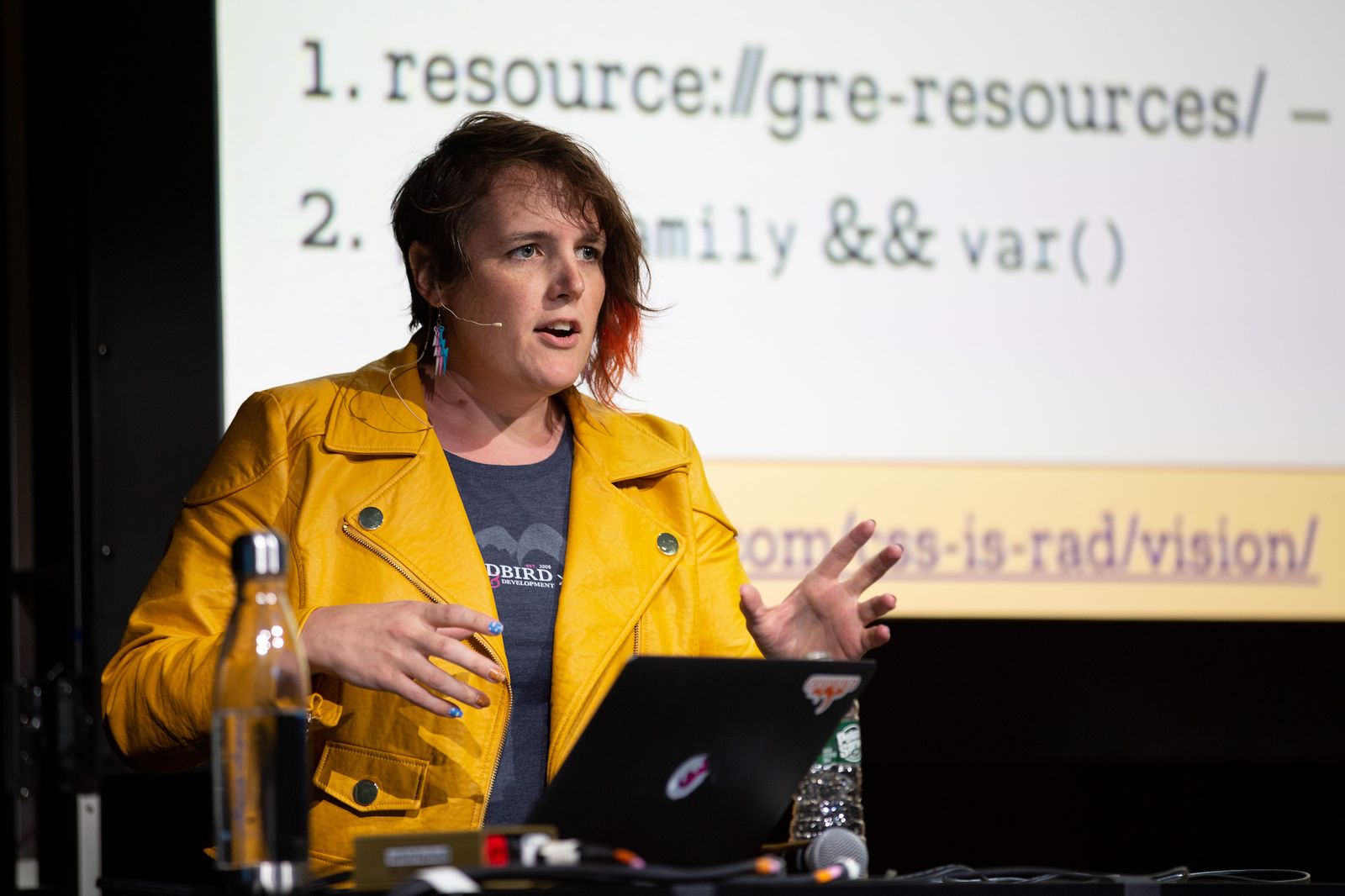
A Slash-Why Proposal
Miriam is working on a site refresh and part of the process has been considering what slash pages she wants to include. And there is one little manifesto page she’s had for quite some time now – which you might want to consider adding, too: /why
A Slash-Why Proposal | Miriam Eric Suzanne
What are you aiming for?
🐈 Personal Site of the Week 🎹
Eva Decker == https://eva.town
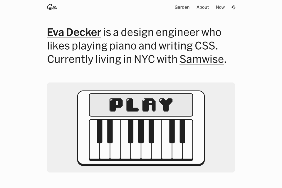
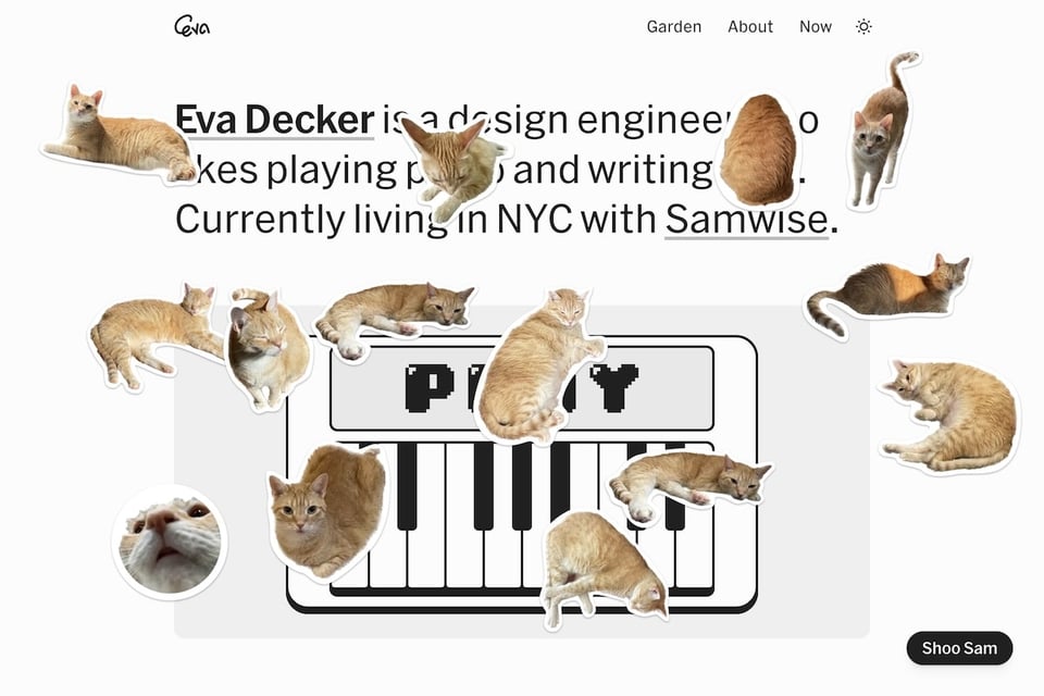
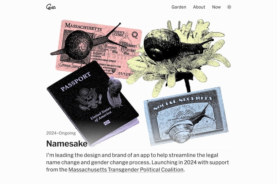
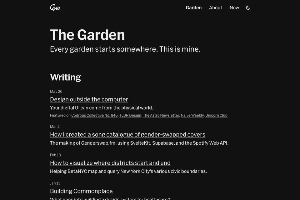
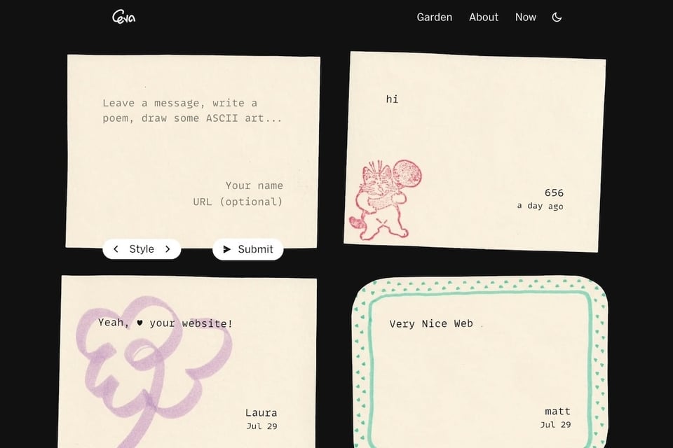
Eva Decker is a design engineer from New York City. From the neat little logo animation to the snappy color theme switch to a cat sticker collection to the carefully designed sticky notes in the guest book – Eva’s lovely personal site is full of playful, little details that make visiting and exploring the site a lot of fun. The highlight of the home page, though, is the little keyboard you can use to play a tune, which even turns into … a fart machine.
And that’s it for today. How did you like this issue? Which one of the links was your favorite? What do you want more or less of? Do you have any other suggestions on how to improve this newsletter? Hit reply now and let me know.
Cheers! ☀️
– Matthias
