Hi All! 🤗
One question I’ve heard repeatedly from people getting started with their personal website is “what pages and sections – like blog, photos, about me – does my site need to have?” I asked myself the exact same question when I first started with my site. I looked at other people’s websites and eagerly listened to folks arguing that a personal website must have this section or that section. But I’ve since come to the conclusion that maybe this isn’t how you should approach it. Maybe, the first question you should ask yourself about your site is:
What is it for?
Answering this simple but powerful question will help you get clarity about quite a few things, like:
What is the primary purpose of your site and what do you want to communicate with it? Is it a professional portfolio site or a personal space – or maybe both? Do you want to share your expertise, contribute to a community of like-minded people, document your life, or create a playground for your experiments and passion projects?
Which audience do you want to publish for? Who are the people who will visit your site? And how might that influence the tone of voice of your site, your writing style, or the presentation of your content?
What content do you want to post on your site, after all? It makes a difference whether your goal is to write long-form blogposts, short stories, or microblog-like notes. It makes a difference whether you want to post illustrations or photos, stories from a road-trip, the books you read, or a collection of links or bookmarks. If you are very specific about what content types you really want to publish, the sections of your site will automatically fall into place. And it will also make it much easier for you to keep on posting regularly and turn it into a habit that sticks.
Of course, you can also decide to not target any audience at all and just post whatever you like. Isn’t that what makes having a personal website so beautiful, after all? It’s yours and you can do and explore whatever you want. Just make sure that this decision is a conscious decision and not just the most comfortable one because you are avoiding to be specific. Being specific about what your site is for also means that you will have more clarity about what it is not for. Suddenly, it will be much easier to leave out the things that are non-essential, allowing you to put your energy into the things that matter most and that truly reflect who you are and what you want your site to be.
But in case you have no idea yet what your site is for or what you want to publish, remember that, just like with all the other things we covered in previous issues, this should never hold you back from getting started. You can always start small with only the most essential things, try out different ideas and content formats, and see what sticks and what works best for you. Sometimes, the answers reveal themselves through the process and by just putting something out there.
Links
Here’s another mixed bag of links. Please let me know how you like them! And if you can think of someone who would enjoy reading this newsletter today, feel free to forward along.
Giving Yourself Stakes
Chris Coyier has some useful advice for anyone who wants to get started in design and development today: give yourself stakes, for example by building a personal website or a site about something you are passionate about.
Giving Yourself Stakes – Chris Coyier
Say you were getting into web design and development right now. What’s the best way to get going? Dave and I talked about that on the last ShopTalk Show. My best advice: give yourself some st…
Sharing links
A personal site is a great way to save your favorite links in a central place. It is easier to find them again and others can benefit from your collection, too – especially if you also provide an RSS feed. In this post, Hidde de Vries writes about why and how he has added a link section with a low-threshold publishing workflow to his site.
Sharing links | hidde.blog
This blog has a new section where I share links to posts I read in other places.
Don't Change Your RSS URL
It can be very frustrating if people update their sites but don't redirect their RSS feeds. Kev Quirk shows how you can easily prevent this and stop your feed URL from breaking.
Don't Change Your RSS URL | Kev Quirk
I love RSS. My RSS feed reader is the page I visit most on web, I think. So it's very frustrating when folks update their site, but don't redirect their RSS feed - please remember to do it, people.
Just write.
In this inspiring and often-quoted article, Sara Soueidan, who recently released her Practical Accessibility course, shares her writing journey and encourages us all to write and share our opinions and our own unique perspectives.
Just write.
Even if only one person learns something from your article, you’ll feel great, and that you’ve contributed — even if just a little bit — to this amazing community that we’re all constantly learning from.
👉 https://www.sarasoueidan.com/desk/just-write/
Anytype
Anytype is a local-first, peer-to-peer, open-source writing and knowledge base app, comparable to Notion. You can compose all kinds of templates and database structures and visualize connections using graph and database views. And: scheduled for release in 2024 are features like a personal portfolio and public blogs. 👀
🎉 Personal Site of the Week 🎉 Adam Stoddard == aaadaaam.com
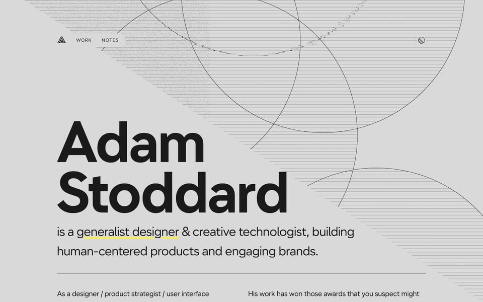
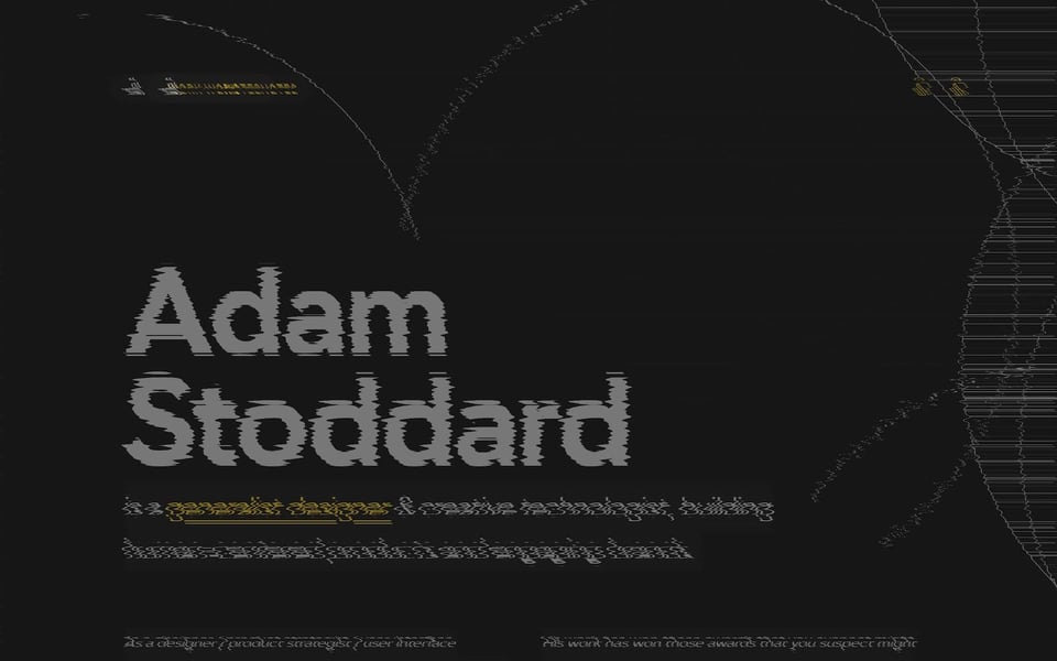
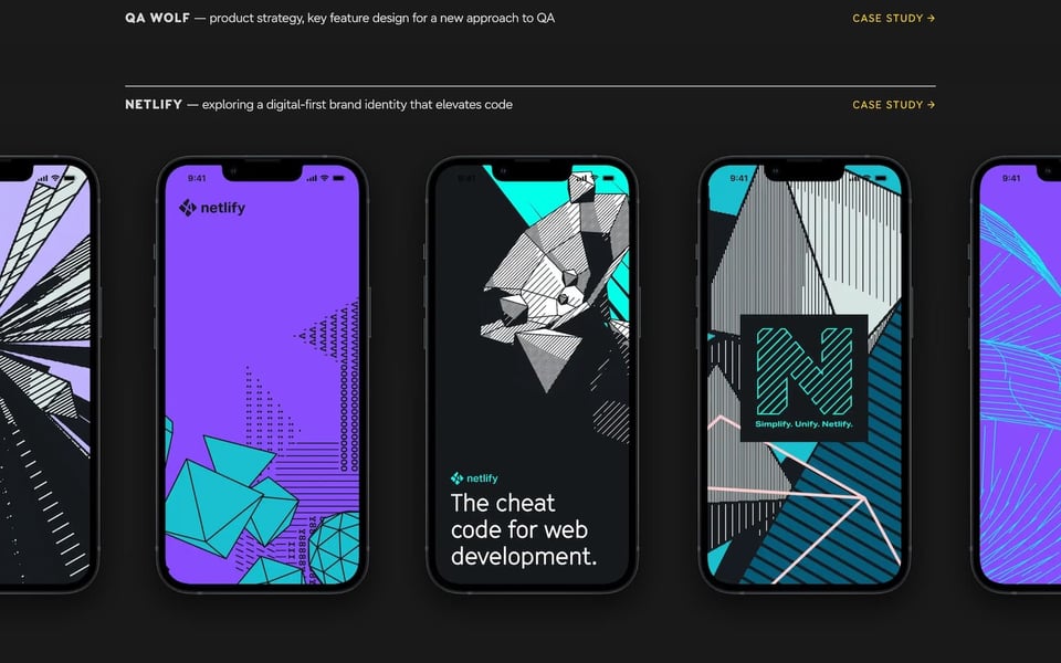
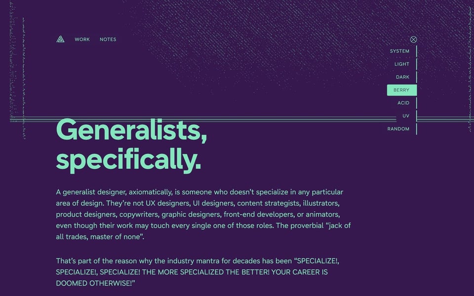
Adam Stoddard is a generalist designer and creative technologist who now leads design at Status Hero. His site, built with Eleventy, is both professional portfolio and blog (RSS feed), and the design – “made purely of ‘web matter’” – beautifully combines the sturdiness of Arrow Type’s typeface Name Sans with a series of noise filter experiments, different color schemes, and nice details like animations and view transitions.
And that’s it for today. How did you like this issue? Which one of the links was your favorite? What do you want more or less of? Do you have any other suggestions on how to improve this newsletter? Hit reply now and let me know.
Cheers! ☀️
– Matthias
