Hi All! 🤗
In the previous issues, we looked at how having a personal website can change your life and what’s in a domain name. Once you’re fired up and registered your domain though, your next decision is probably the one which will have the biggest overall impact and also something that a lot of people asked me about via email: what tech stack, platform, content management system, framework, static site generator and so forth should you use to actually build your site?
This is a tough one, because picking the right solution involves a lot of considerations, like:
Does the system have all the features I need?
How easy and how quick will it be to set up my site?
Do I have the necessary skills and technical expertise?
Will it be hard to customize the site to my liking?
Do I need a database? And what is a database?
How convenient is it to publish new posts?
How well does the system age? And are there regular updates?
And how much maintenance will I have to do to keep the site alive?
And this is just a quick first list of things, you can probably come up with even more questions.
Once again, I got curious and because it had worked so well in the past, I asked the people of Mastodon: If you have a personal website: what platform, CMS, SSG, tech stack, or service are you using?
…and the whole internet replied. 🤯 At the time of writing, the post has received more than 240 replies with people sharing their various setups and favorite tools. An exciting and invaluable insight into the personal website community and also proof that the community is indeed alive and kicking!
It would take forever to mention all the diverse, unique, and sometimes quite sophisticated setups. So, if you are interested in the full picture, have a look yourself. Here are a few observations though:
First of all, It was amazing to see how many different tools you all are using, some of which I had never even heard of!
I also noticed that most of you seem to be happy with their current solution. Of course, this could be an example of the choice-supportive bias or even the IKEA effect, but above all, it means that most of us should be able to find something that works well for them.
A lot of you still use good ol’ plain HTML, CSS, and JavaScript for your sites! Obviously, that’s still a valid and also a beginner-friendly way to get started – and keep going for years.
With 54 mentions, Zach Leatherman’s static site generator Eleventy is the clear favorite of the people replying. 🎈
The top five is completed by WordPress (35 mentions), plain HTML (35), Hugo (18), and Kirby (16), closely followed by Jekyll (13), people creating their own static site generators or content management systems (13), and the rising star Astro (12).
However, the long tail of mentions is just as interesting and includes various solutions that might be worth a look as well, like Ghost, Craft CMS, Wagtail, Zola, or the WordPress fork ClassicPress.
If you’re interested in a full list of all the tools mentioned, you can have a look at this Notion table I created.
As you can see, there are as many ways to build and run your own little corner on the Web as there are stars in the Andromeda Galaxy. There is still a need for services that make it really easy to get started for people without at least a little bit of coding experience. In this case, I’d suggest you look into something like WordPress.com, Ghost, or Micro.blog. But I also can’t stress enough how valuable and enjoyable it can be to learn a bit of HTML and CSS and build or tweak something yourself. So don’t abandon that idea too quickly. It might be easier than you think once you get started.
And if you already know how to write a bit of code, pick something that sounds like fun. Maybe because it is a tool that you’re already familiar with. Or because it is the complete opposite – a chance to learn and get to know a new CMS or static site generator like Kirby or Eleventy.
I’d always keep in mind that the tool you pick should be able to serve you well for several years. The latest and greatest JavaScript framework might therefore be a less reliable choice compared to a tried and trusted CMS that has been around for years or even decades. The way you author and publish new posts should also be as convenient and enjoyable as possible. Also, migrating your content after years of blogging can be a challenge. Which is why flat-file systems or static site generators that don’t require a database are so popular: if all your posts live in plain text or markdown files, it is easy to jump ship.
In the end, which tool you choose comes down to personal preference. But even if you’re not perfectly sure yet which solution is the right one for you, remember that, just like picking a domain name, finding the “perfect” platform, content management system, or static site generator for your site should never hold you back from getting started in the first place. You will grow with the challenge and even if you change your mind later, there is always a way migrate your content to another tool. The journey is the destination. So pick your adventure, build something today, and then, make it yours.
~
I’m still curious: what is your setup or, in case you haven’t found the right tool yet, what are you struggling with? Feel free to quickly hit reply and let me know.
A Little Giveaway
Shortly after I sent out issue 3, this newsletter passed the magic number of 1000 subscribers. 🤯🥳
Thank you! 💚
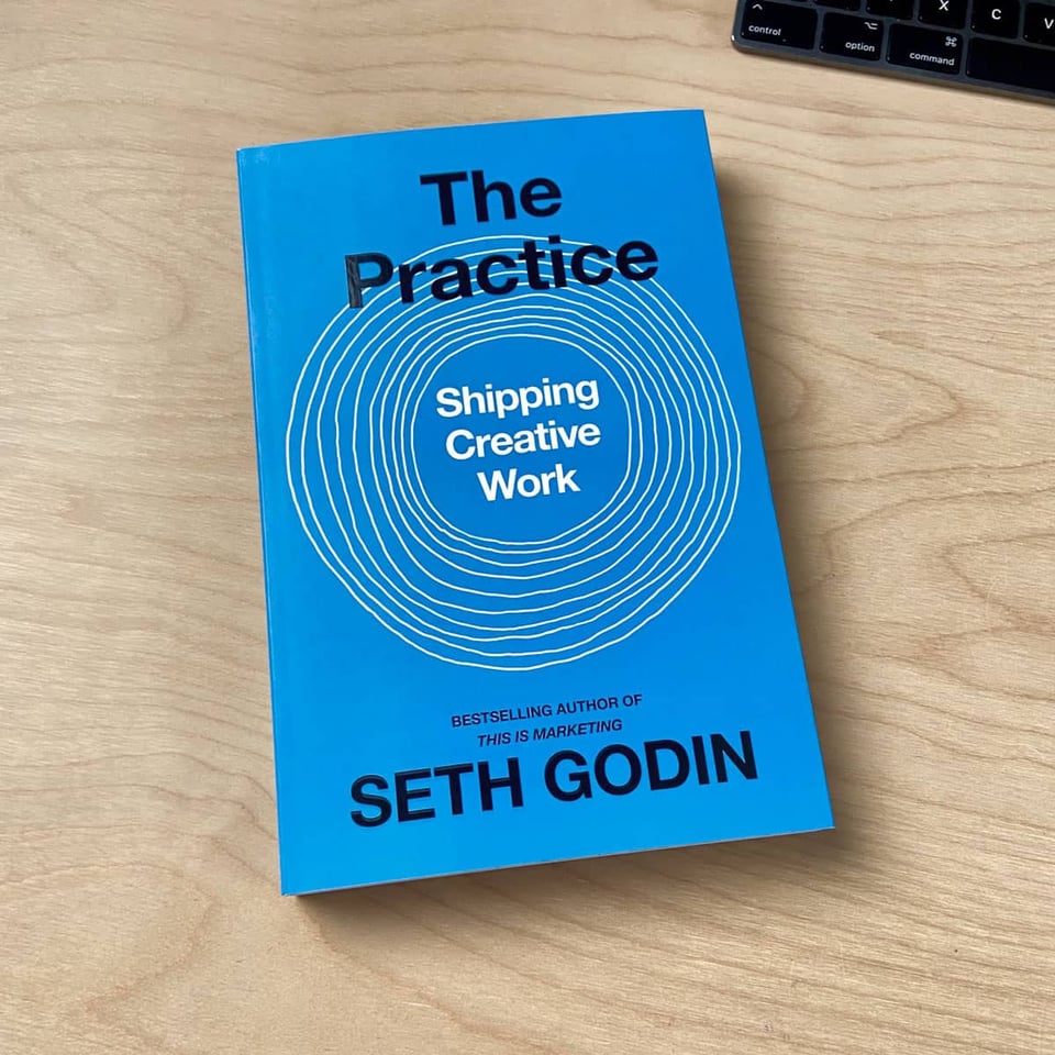
To celebrate this milestone and as a little thank you, I’m giving away a copy of Seth Godin‘s inspiring book The Practice: Shipping Creative Work to one of my subscribers when the next issue goes out. So, in case you are reading this and are not a subscriber yet, you know what to do. 😉
Links
Here’s another mixed bag of links. Please let me know how you like them! And if you can think of someone who would enjoy reading this newsletter today, feel free to forward along.
Kirby 4
Bastian Allgeier and his team just released version 4 of the much-loved flat-file CMS Kirby – and it’s a major milestone. The new Kirby comes with a completely new design for the backend (the panel), a new link field that lets you link to basically anything, faster page creation, the ability to freely move pages in the page tree, focus points for images, a language editor, and so much more. Kirby is on sale for 20 % less until December 20. The perfect chance to start your personal site with Kirby. And if you want to learn more, join Marc Thiele and Bastian for a special release show next week for free.

Kirby 4 | Kirby CMS
Kirby 4 is all about a new editing experience for users, with a brand new, stunning Panel design.
Writing With AI
My writing app of choice, iA Writer, just released a new version as well. iA Writer 7 comes with … drumroll … an AI feature! But it is not what you might expect. Instead of hastily integrating an AI like ChatGPT that conveniently blurbs out pieces of text, like every other company does at the moment, Oliver Reichenstein and team took a step back and looked in depth at how AI can actually support us in the writing process. In which cases is it in fact useful for writing? When is it not? And what does this mean for an app that facilitates a thoughtful approach to creating written pieces?
AI can and will ruin your voice and credibility if you lazily let it write in your place. As writers we can not allow AI to replace our own thinking. We should use it to simulate the thinking of a missing dialogue partner. To write better, we need to think more, not less.
All their considerations are summarized in this brilliant piece. And the resulting feature:
The new iA Writer shows you which words you typed and which you pasted. It highlights the text you craft yourself, and it keeps track of your sources. So that your voice is what comes though on the page.
Writing with AI
When ChatGPT came out one year ago, we wanted to know whether and how it could be used for writing. We put it to the test.
HTMHell Advent Calendar 2023
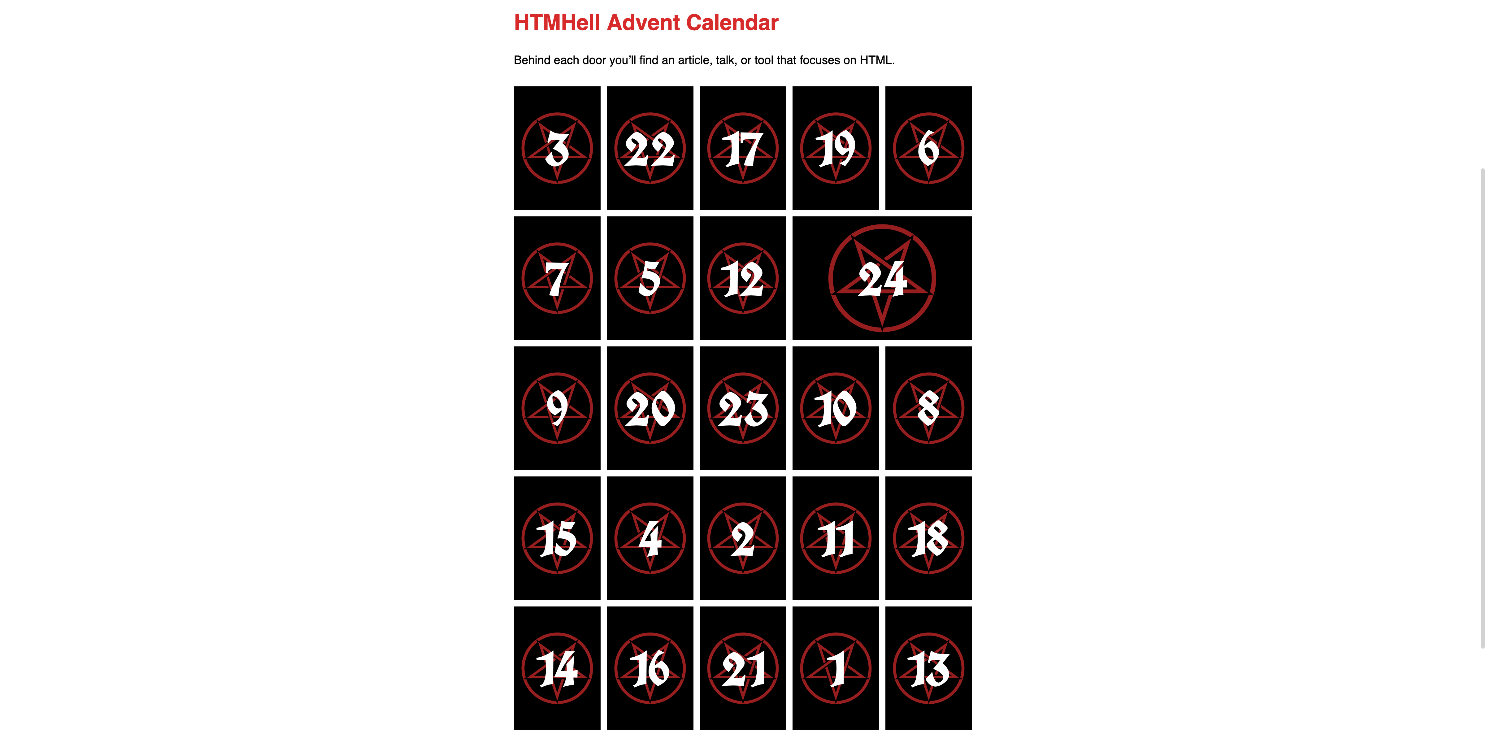
Manuel Matuzović is back with another edition of the HTMHell Advent Calendar. Twenty-four authors worldwide contributed fantastic articles on security, accessibility, UX, performance, and – you guessed it – HTML. And Manuel will publish them one by one, starting with The UX of HTML by Vasilis van Gemert.
HTMHell Advent Calendar 2023 - HTMHell
An article, talk, or tool that focuses on HTML every day until Christmas.
What to Blog About When You Don’t Know What to Blog About
But what the heck should you blog about? Especially when you don’t know what to blog about? Michelle Barker has a few answers for you:

CSS { In Real Life } | What to Blog About When You Don’t Know What to Blog About
OH!2023 Keynote by Anil Dash
Anil Dash, OG blogger and CEO of Glitch, gave a wonderful, empowering keynote at Oh the Humanity! about the social web and having your own site. Anil starts with a look back on the intoxicating and inspiring early days of the Web and the power of self-expression on the Open Web:
HTML was a new form of paint or clay for a lot of people.
However, after Facebook and other social media platforms had started to systematically dismantle the ecosystem of open platforms to centralize their growing power, Anil felt disillusioned. He lost faith in the idea of “The Web We Lost“, an interoperable version of the web where we would all have control over our data and have our own sites, connected to each other through open standards, instead of using the “privately owned public spaces” that Mark Zuckerberg and others had created as a free lunch.
But things change. People kept working on open standards like ActivityPub or the Fediverse and the public started to feel ever more uneasy about the big platforms’ hyper-concentration of power. The inflection moment for Anil was when he saw the success of the online game Wordle, and the creative outpour that happened around this plain HTML website:
It was a sign for me that people were ready. Something new was happening. There was now another generation of people who had independently arrived, without prompting, at the same feeling we had had at the beginning of the social web. Shouldn’t I be able to make something that is fun, for my friends, for my community? Shouldn’t it be on the Web?
[…]
The thing I had given up hope for, the thing I had lost faith in, the idea that the Open Web would empower people, came back on its own.
[…]
Power is shifting. I find myself more inspired than I ever was.
👉 https://www.youtube.com/watch?v=x9wbRUW57sc
🎶 Personal Site of the Week ☕️ Simon Collison == colly.com
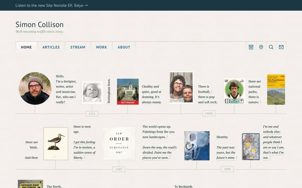
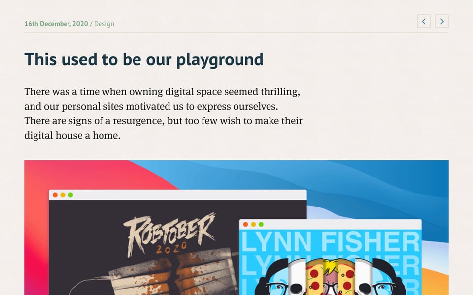
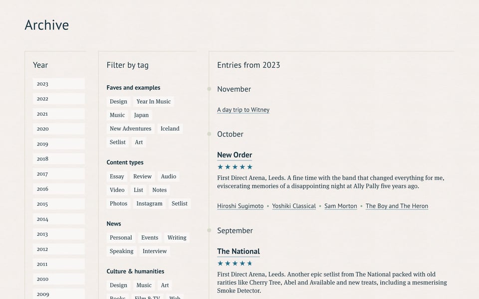
Simon Collison’s personal website is among the sites that stand out because they immediately resonate with you on so many levels. There is, first of all, the beautiful timeline on the home page that takes you to key moments of Simon’s life. There is the balanced typography combining PT Sans and FF Meta Serif as well as the overall careful and elegant design of the site. And then, there is the content: great articles about design, music, travel, books, art, technology, documenting your work, the Web, and so much more, a stream of quickfire posts, and a section showcasing Simon’s work as a creative director and digital designer. And everything can be filtered by year and by tag in the archive. A prime example of a personal site that is full of personality and carefully documented thoughts and experiences.

And that’s it for today. How did you like this issue? Which one of the links was your favorite? What do you want more or less of? Do you have any other suggestions on how to improve this newsletter? Just hit reply and let me know.
Have a wonderful weekend! ☀️
– Matthias
